


Gothamite
-
Posts
36,227 -
Joined
-
Last visited
-
Days Won
277
Posts posted by Gothamite
-
-
I don’t know, I rather like this approach. More subtle, and more unusual to boot.
-
 1
1
-
-
Ugh. Throwback fail.

This “squatchee matches the crown, not the bill” thing is strictly a modern style. And an abominable one at that.
-
4
-
-
That Biscuit mascot logo is so much better than their standard misshapen thing.

Love it.
-
4
-
-
6 hours ago, mjd77 said:
The Brewers would be a prime candidate for a Houston / Toronto fauxback makeover. Those teams did it right and the Brewers certainly have the pieces from past looks to do it as well.
Hell, they’re halfway there. They already created a gorgeous fauxback home uniform, they just need to do the same with the late 80s roads and they’re done.

-
1
-
-
Makes it even more notable that every time anybody wants a tribute to the Brewers, they do it in royal and gold. Even the Brewers themselves. So how come we’re stuck with the horrible bland uniforms?
-
2
-
-
Even the farm club a thousand miles away knows what the Brewers should be wearing.
-
2
-
-
39 minutes ago, NicDB said:
If they were to adopt this permanently, they should affiliate with the Brewers.
And then the Brewers could pick up the Hillsboro Hops as their short-season Single A club. We're getting a decent IPA together.

-
3
-
-
That's an awesome idea, and I love the stein logo, but there's something off about that wordmark. The two vertical strokes of the "H" aren't parallel, rendering it jarring and out of place.
-
1
-
-
3 hours ago, MBurmy said:
Name-the-team contest in MKE down to final 10:
- Crop Dusters
- Cheesers
- Farmhands
- Haymakers
- Broilers
- Barn Owls
- Cow Tippers
- Bovines
- Milk Men
- War Pigs
Milk Men was actually the name I submitted...because of all the logo, mascot, uniform and promo possibilities.
I love "Barn Owls", but could easily see something good coming of "Haymakers" or "Milk Men",
"Broilers", I presume, refers more to the art of grilling than the chicken intended to be cooked upon it? There's some decent food-related possibilities there.
But c'mon. A Milwaukee-area minor-league team that doesn't use "Bubblers"? Major missed opportunity.

-
2
-
27 minutes ago, CaliforniaGlowin said:
War Pigs could be a good military style logo.
Which is a very good reason to vote for another name. Any other name.
-
2
-
-
On 3/9/2018 at 10:56 AM, CC97 said:
To those expressing frustration, I get it, from your perspective it seems like I'm intentionally ignoring or being rude.
Of course it's not at all like that; I'm simply just buried under all this stuff... keep in mind that I'm just one person, I can get a few hundred messages a day (in between being a stay-at-home father of two young kids) from both readers and the actual teams/leagues themselves about updating or correcting the logos site, about making sure we cover a particular news item, and usually there's someone upset they were banned or suspended from these forums.
If it's a slow news day I can get to maybe 10% of these each day? Things will get missed, often... I'm sorry that happens, I want to cover everything, I want to be as accurate and up-to-date as possible. Reality says otherwise and the reality is most days I'm exhausted by the end. I can only do so much, I can't afford to hire anyone.
So if you're wondering, the best chance to get my attention these days is through a Twitter DM (@sportslogosnet)
That only works if you follow us. I hate to clutter your timeline with follow requests....
-
2 hours ago, kimball said:
"CREATING A BRAND IDENTITY: HOW CHARLOTTE BECAME THE BOBCATS"
Can't wait for the sequel PDF, "How Charlotte Came to its Senses".

-
10
-
-
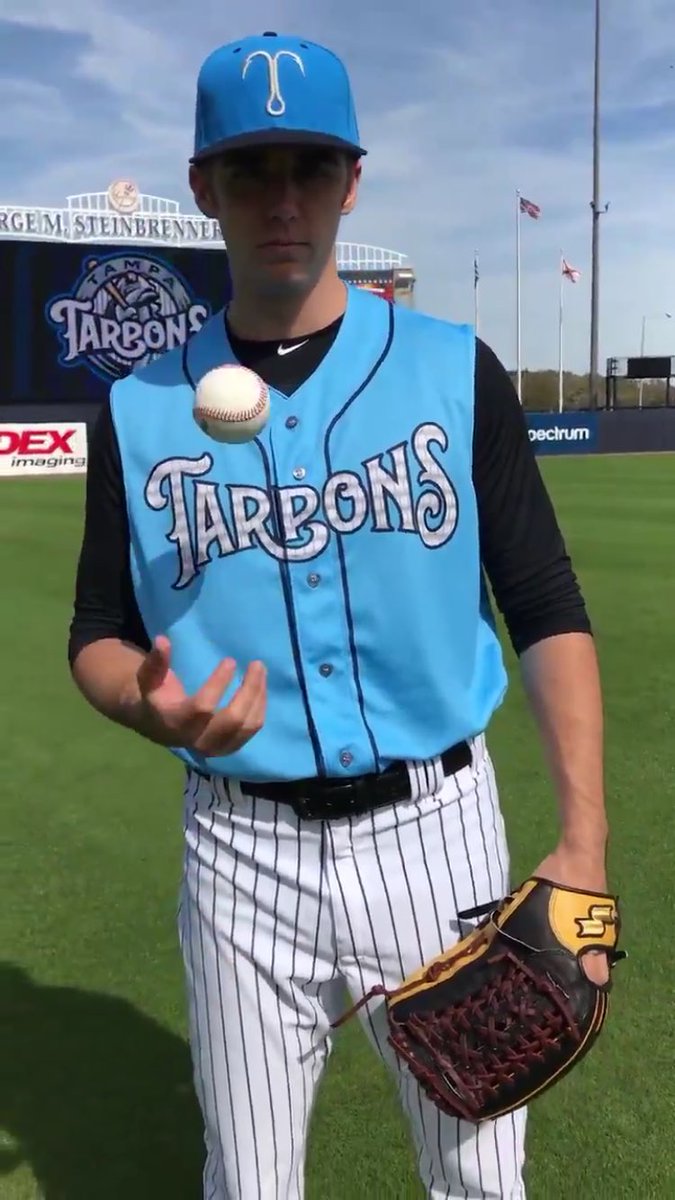
56 minutes ago, Ferdinand Cesarano said:
I don't see the problem here. I like the way the P nestles in the extended arm of the R.
Nestles into the extended arm, turning a P into a B. Which is the problem. "Tarpons" is not a strong enough word to easily read when one of the letters is so fuzzy.
56 minutes ago, Ferdinand Cesarano said:But that T from the two wordmarks needs to be the cap logo. Just the T, no fishtail; and there's no point at all in an additional T logo, the one made of a hook. Most important, wearing that busy blotch of a logo on the cap is a mistake; I think it clashes aesthetically with the rest of the uniform.
Here I agree completely. They have far too many cap logos.

I actually don't mind the fishtail-T as a supplement to the wordmarks. And if they need a mascot cap logo, so be it. But two is more than enough, and the hook just doesn't mesh well with the rest of the set.
-
18 hours ago, Atomic said:
I really want to like this, but I can't stop seeing "TarBons". Otherwise, it's a great set.
Yeah, the more I see of this, the more confusing the wordmark becomes.

It's a shame, because the "Tampa" mark is great.
But the way the "r" and "p" interact is just... woof.
-
Those Tarpons uniforms are nice. They still have a few too many logos, but overall it's a solid set.
-
1
-
-
On 1/25/2018 at 3:47 PM, nickp91 said:
Love the new XFL logo with the red, white & blue standing proud and promising to be family friendly
“Family friendly”? Because the NFL isn’t?
Do you think replacing black with blue is supposed to be telling us something?
-
2
-
-
Interesting.
Would love to see a horse like this one against the D as an update to their classic logo.

-
6 hours ago, Lights Out said:
Crossposted from the NBA Changes thread:

Now that is how how you do Irish Rainbows.
-
3
-
-
On 1/12/2018 at 3:56 PM, Thaumatrope said:

An absolute night-and-day improvement (pun most definitely intended).
The white space between those last four letters drives me crazy. Why not just fill it in?
-
3
-
-
That’s correct, this site is no longer hosting images. Way, way too expensive.
Use Imgur - free and easy.
-
10 hours ago, mfoster said:

What’s a “Blueat”?
-
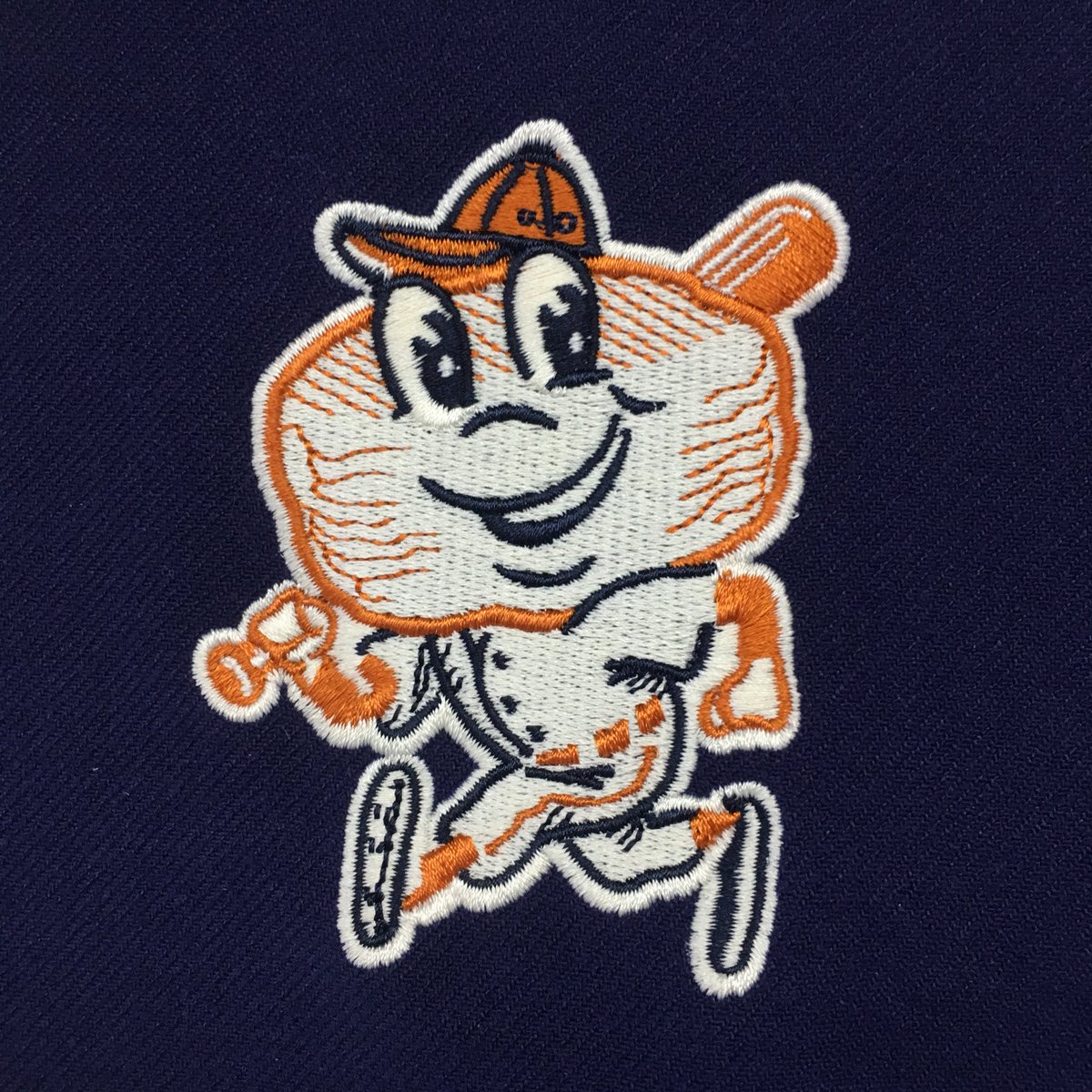
8 hours ago, Sykotyk said:
Every time I saw this logo, it looked like the Tarpon was holding a pick ax. And I couldn't fathom why I kept seeing that.
And then I realized. The bat rests on the front of his chest, slightly on his shoulder. The bat goes behind the roundel, yet his eyes/head are in front. It's clear by the length of the bat, it's nearly straight up and down. So, it shouldn't be going BEHIND the roundel if his bulging eyes are in front of it. Unless it's a ridiculously long bat. It loses the 3-D look and makes the roundel seem part of the bat, to me. And I can't unsee it. I like the logo. And think for a fish logo they did a good job and incorporated the Yankee pinstripes. Yet, that bat just keeps throwing me off.
Well, damn. I don't think I'll ever be able to un-see that.
-
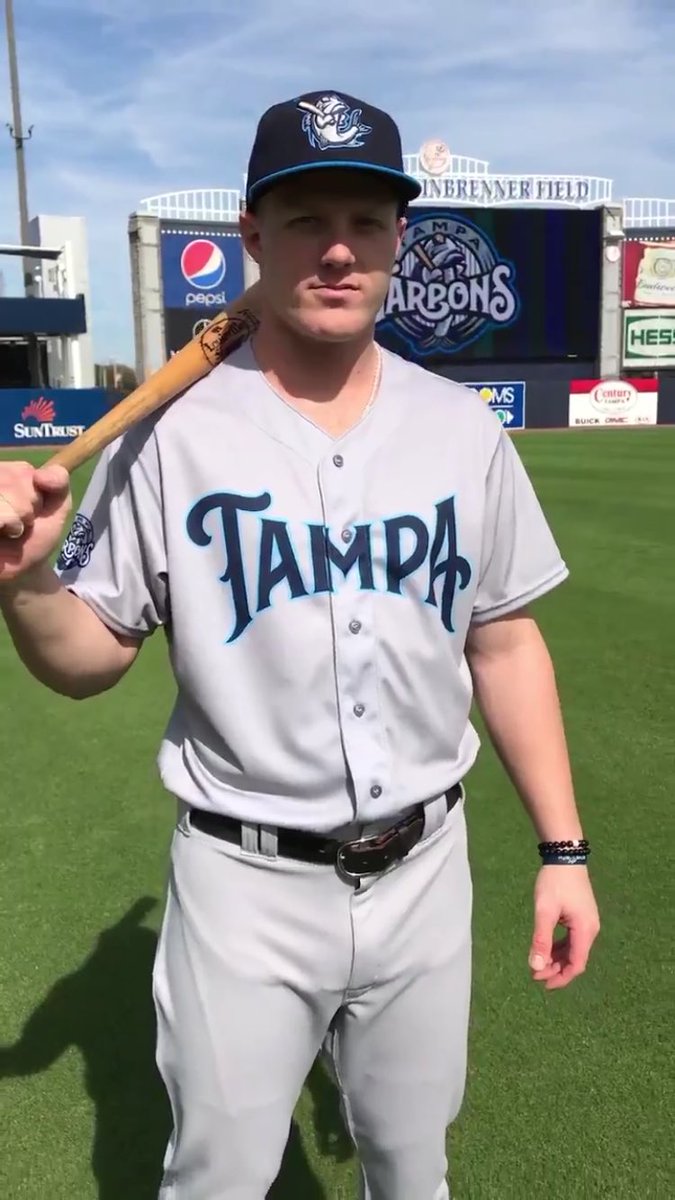
On 12/11/2017 at 10:22 AM, Waffles said:
The Tampa Yankees are now the Tampa Tarpons:

A great step toward making the Yankees farm system more interesting, identity-wise.
That's a great wordmark. The name is perfect, with three decades of history in the city.
I don't love the logo, but the subtle pinstripes are a great touch. Wonder what the cap logo will be like - an isolated T from the wordmark?
-
2
-
-
My goodness, are those logos amateurish.
I like the home-plate G, they could have done something interesting with it. But the fish/hook/baseball stuff is way too complicated.
-
2
-


Minor/Independent/Collegiate League Baseball Logo/Uniform Changes
in Sports Logo News
Posted
The Brooklyn Cyclones have another food-based promotional identity for this year:
This is probably the best one-off they've done yet. I might actually consider getting that cap.