


Gothamite
-
Posts
36,227 -
Joined
-
Last visited
-
Days Won
277
Posts posted by Gothamite
-
-
The Penguins started using their triangle stripe design before the EDGE takeover. And Pittsburgh itself has a history of using the triangle as icon.
-
 3
3
-
-
True, that's a possibility. But it would have been stupid for CCM to do so, just as it would have been stupid for CCM to offer all teams mountain-range hem patterns.
-
2
-
-
9 hours ago, mania said:
The logo is over-shaded in a PDW-esque way, but I still kind of dig the look overall.
The Griffins wordmark, while not perfect (the G and the r connecting just seems weird), will still probably look very good on a jersey.
I dunno - that awful connector might look equally bad on a jersey. Shame, because it's not bad apart from that.
-
Yeah, it's there.
Whimsy has been lost, replaced by an uninspired mess.
-
1
-
-
Wow. Never seen that. Not even outlined in gold.
That means the Brewers had at least three different prototype jerseys in 1970.
http://www.borchertfield.com/2013/06/back-in-blue-part-iii-more-on-brewers.html
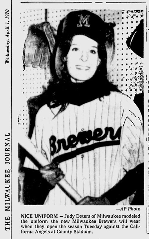
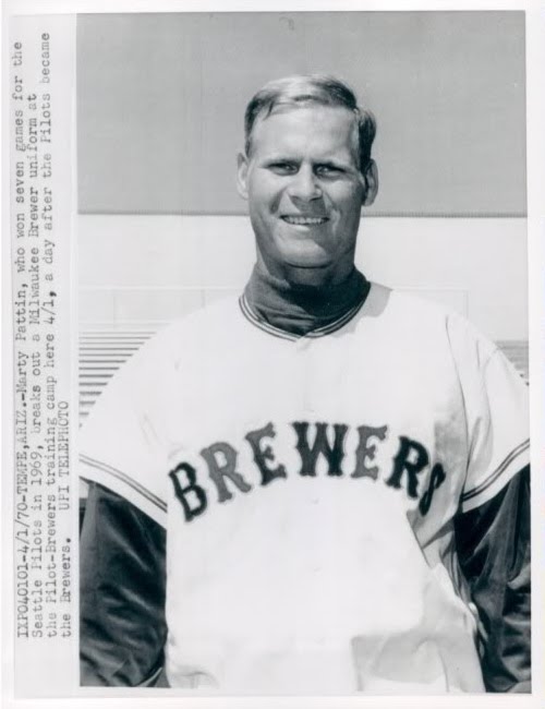
and now this one.
-
1
-
-
Don't think you're being an ass. It's an interesting conversation.
-
1
-
-
The Brooklyn Cyclones are having another food-related promotion this summer, when they will for one day become the Slices.
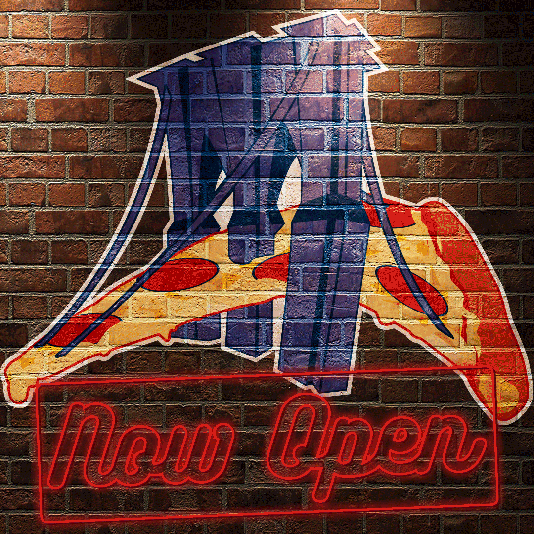
These are the uniforms:

And the justification:
QuoteBROOKLYN, NY – March 17, 2017 -- In a society with countless choices, and even more opinions, there is one thing that we can all get on board with…pizza is the greatest food of all time. There is nothing that hits the spot quite like a steaming hot slice of cheesy goodness fresh out of the oven. The perfect combination of sauce, cheese, seasonings and crust mixed together into a seamless cornucopia of flavors, there’s nothing better!
But, while we can all agree on our love of pizza, there is a heated debate about the style in which that delicacy is prepared. On Friday, August 4th the Brooklyn Cyclones, Short Season Affiliate of the New York Mets, and the Myrtle Beach Pelicans, Single-A Affiliate of the Chicago Cubs, will join forces for a one night only promo in two different ballparks to try and settle the age old debate of who makes the perfect pie – Brooklyn or Chicago.
At MCU Park on Coney Island, the Cyclones will change their name to the Brooklyn Slices to pay homage to the deep seeded history of pizza in NYC when they take on the Tri-City Valley Cats. The first 2,000 fans in attendance will receive a Slices “Pizza Delivery Cap” so fans can show their support of Brooklyn as the pizza capital.
At TicketReturn.Com Field, the Myrtle Beach Pelicans will be kneaded into “The Deep Dishers” during their game against the Salem Red Sox.
“Pizza in Brooklyn is more than just food, it’s a religion,” said Cyclones Vice President Steve Cohen. “Everyone has their favorite spot to grab a slice and even if you move away from Brooklyn, you are always willing to make a pilgrimage to that special place and grab a slice of cheese covered perfection. If you ask 10 people in Brooklyn who makes the best pizza, you’ll probably get 10 different answers. But they’ll all agree that Chicago-style pizza has nothing on Brooklyn pizza.”
As part of the night’s festivities the two ballparks will have a series of competitions between players, front office staff and fans to try and decide once and for all which city can truly lay claim to the title of Pizza Capital of the World.
"Much has been made about the pizza in both Chicago and New York, and we're always appreciative of a crisp, Brooklyn slice," said Pelicans president/general manager Andy Milovich. "However, Myrtle Beach is independent of each city, and I can confidently say this area has been shown the light on deep dish pizza by our friends in the Midwest. The Chicago artisans have truly perfected the pizza pie."
For additional information on the night in Brooklyn or to purchase Brooklyn Slices merchandise visit BKLYNSlices.com in the coming weeks. Single game tickets for the 2017 Cyclones season will be available starting Saturday, April 22nd at 10 AM. Full season, partial season and group tickets are currently available by calling 718-37-BKLYN.Two things:
1. "Brooklyn pizza"?
2. This would be much better if the two teams were actually playing each other.
-
2 hours ago, panthers_2012 said:
@Gothamite I do wish it was a little bit better, but I'm okay with it. For me, I would rather have a great fan experience than a great logo. I think it works for an Independent League.
Well, yeah. I'd also have a winning team with a bad logo than a terrible team with a great one (and I've certainly been there). But how fortunate we are that this is not an either/or. There's no reason the team can't have a great fan experience and a not-embarrassing logo. They just didn't do that.
-
2
-
-
9 hours ago, panthers_2012 said:
@The Mojo Maniac no worries. When our owner talked to me about it, he was expecting people to bash it. Some of the comments on our FB page are mean and we can't control that. I'm more upset for the people that won't give it a chance. The owner stated before that he didn't want to change the colors and uniforms to make a quick buck... He wanted to embrace the identity that was introduced back in 2009. I wasn't expecting anything mind blowing with the logo and I'm very happy with the logo. Like every logo, it has it issues and you can't make everyone happy. I'm looking forward to this season working with them again and I think the fans will warm up to the new identity.
The identity is okay, but that logo is shockingly amateurish, for all the reasons listed above. Although I'm not sure that anybody pointed out the letters on the grape's logo are carelessly overlaid without any attempt to make them appear to be part of the cap.
Shame, because the idea is really solid. But they should have hired a professional artist to render that graphic.
-
4 hours ago, leopard88 said:
Are you suggesting he wouldn't be able to drive if he still had his eighth tentacle?
The Amazons used to cut off one of their breasts so it wouldn't interfere with drawing back a bowstring. Maybe that eighth tentacle just gets in the way?
-
1
-
-
Hmm. That's not on all versions of the logo - this is their twitter profile pic.

Note also the wings.
-
2
-
-
2 hours ago, leopard88 said:
They're both bad logos, but at least the Tornados logos reads as Tornados. The W completely disappears on the Towers logo.
Yeah, it's too clever by half.
-
1
-
-
Cool. So was it an image prepared by the league at the time?
-
That's apparently pretty common mistake from back in the day - what was the context in the video?

In the days before digital files, it was common. There's a thread devoted to these kind of misaligned logos in the 1960s:
-
1
-
-
2 hours ago, Zeus89725 said:
Worked well for Colorado.
Well, I can see that. But they've also almost managed to abstract that C, with the circle in the middle. I think a monogram is something else altogether.
-
1
-
-
I'm glad you like it, but letters don't make for good flags.
I'm working on my redesign now, and I'll post it here after I've sent it to the Mayor.
")
-
I'm glad they don't use the city seal, since the odds are wherever they got it, it would be wrong.
But I'm thrilled they're using the city flag. I had this one made up before last season and we brought it to every match:

Do do you think somebody from the club noticed us waving it at Yankee Stadium?


-
4
-
-
No, they didn't change it. The only thing they did in the 1970s was change the date. "Corrected" isn't really the right word, since even the city historians admit that 1625 is meaningless and arbitrary, chosen more to tweak the British than for any historical justification.
The thickness of the strokes varies a lot from flag to flag, but that's a weakness of using the seal. As is the shield, which changes from white to blue based on the manufacturer. It's why I don't particularly like using the seal on the flag.
-
On 1/24/2017 at 5:40 PM, Ice_Cap said:
That's what makes it work for me. I would be for ditching the seal on the NYC flag if it was overly detailed. They've simplified it and sharpened it though.
They've simplified it in terms of removing the Latin motto (although there are plenty of versions out there with the lotto included). They've done nothing to "sharpen" it, though.
-
I too have been wishing NYC would just use the tricolor instead of including the city seal.

In our case, it's the city seal minus its Latin inscription, which I guess is a plus.
-
13 hours ago, AstroBull21 said:
I don't get it, what was Donovan doing that was improper or illegal?
I'm guessing that posting high-quality, color-corrected versions of team logos was considered to be aiding counterfeiters. Chris has been on the receiving end of C&D letters and the graphics on this site aren't as large as the ones Donovan posted.
Some teams also consider their Pantones to be proprietary information they don't want shared, but I don't know if that also would have been enough.
-
2
-
-
-
59 minutes ago, DaytonBlue said:
I feel like they are trying to emphasize the "authentically Memphis" image by putting Memphis on the home jersey.
That might work just a little better if they didn't have a huge St. Louis logo on the sleeve, the only blotch on an otherwise sterling set.
-
He's checking out that pretty little raven in the front row.
-
3
-


Fun With Flags!!!!
in General Design
Posted
I'd check Ali Express; you can get very inexpensive flags there.