


Gothamite
-
Posts
36,227 -
Joined
-
Last visited
-
Days Won
277
Posts posted by Gothamite
-
-
Looks to me like their standard primary logo. The city name is hard to see against the reddish background.
What are you seeing?

-
 1
1
-
-
1 hour ago, Lights Out said:
Remember that Padres prototype that everyone went crazy for? Here are two of the caps that were considered to be worn with it:
/cdn0.vox-cdn.com/uploads/chorus_asset/file/7565315/Rare_Proto_Cap.jpg)
Nice color scheme.
-
4
-
-
Very good, but the home cap logo doesn't match what we see in the full rendering. And do they really need two different "BC" logos?
Other than that, a solid set.
-
29 minutes ago, KittSmith_95 said:
Okay, this is a great look. These colours are what the Manitoba Moose should be wearing if they really wanted to stick with the double blue.
Also, I hope that baseball-spider is on a hat.
Structured or unstructured? Take your pick.
-
1
-
-
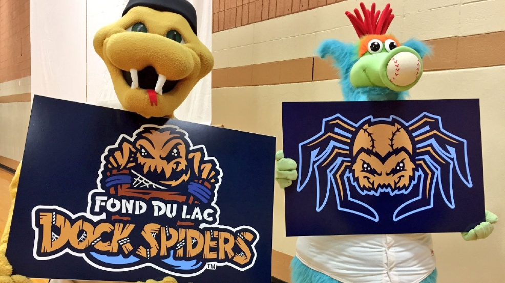
I love the secondary logo with the baseball-spider.
-
That's exactly what it is - a white circle intended to give the logo some definition (and relieve them from having to draw legs). But that circle is too small, and only glimpsed in part, so the effect is totally lost.
Out of a bad set, I think that's the worst individual logo.
-
2
-
-
I don't have an opinion on Montreal, but the Tampa Bay Area has a shameful attendance history. Even when the Rays were good, even when they led the AL East every single day of the season, the players were reduced to calling out their own fans for lack of support.
Maybe a new stadium would help. Maybe not. But in the meantime it's been nothing short of embarrassing for baseball. So if you're wondering why relocation keeps coming up in these discussions, that's why.
-
9
-
-
6 minutes ago, the admiral said:
I haven't had a good Racine kringle in years.
Neither have I. Might have to rectify that over Thanksgiving.
-
6 hours ago, B-Rich said:
Also, a lot bigger than a doughnut-- they are, as hjwii says, more like a larger, glorified cinnamon roll in terms of consistency and taste. You don't pick it up; you cut and eat a piece, like cake. Some-- the more traditional ones -- have a glaze with colored sugar ( #1 below); some others now have way too much thick icing and colored sprinkles (# 2 below, which I don't like). And rarely are they round anymore; most are oblong:
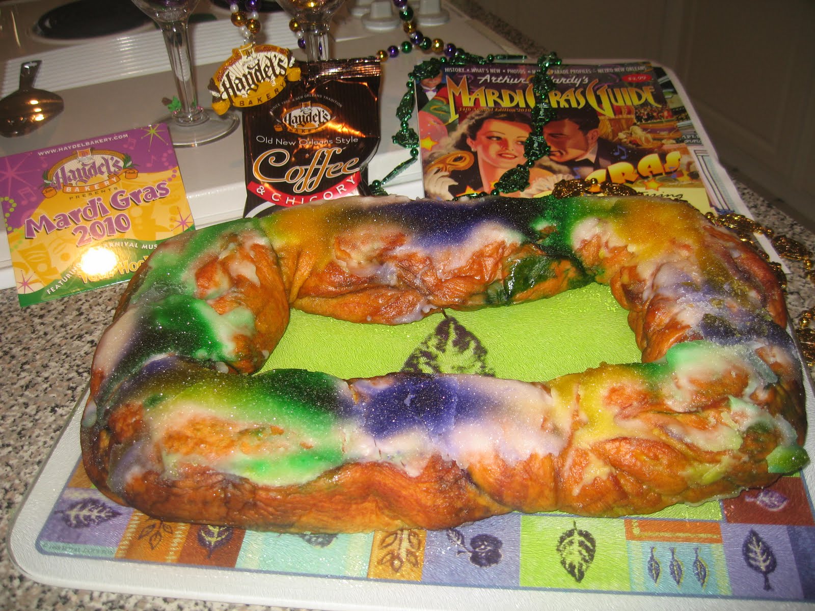

Oh, so it's kind of a thick kringle with a trinket inside.
-
25 minutes ago, KCDesign said:
Despite the terrible name, I think the two Pelicans throwbacks they included in their set are pretty sharp.
Sure are.
-
-
7 minutes ago, conesbeans said:
one can buy Mudville Nine merchandise in the Visalia Rawhide web site store
Which boggles the mind. I had no idea they were still doing this fifteen years later.
-
1 hour ago, KGeeX5 said:
I like them except the boxer one, looks uneven to me. Mets colors would've helped tho, their Brooklyn Cyclones affiliate was Red, Blue and yellow, tho they are now the Coney Island Franks lol
Only for one day.
-
1
-
-
Yep, it's a shrimp boil And that's supposed to be corn.
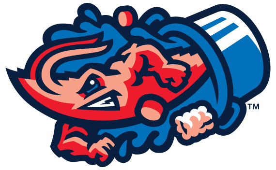
Full gallery and silly explanations here.
Two military jerseys (ugh), and that Columbia blue one is the BP jersey.
And I wish somebody could tell me why the water swirls around his arms but stops behind him. That's nonsensical, even for a cartoon logo of an overly-muscled crustacean grinding his teeth,
-
1
-
-
I think the discs are Andouille sausage. Don't know what that other thing is supposed to be.
That looks like the makings of a fine gumbo to me - don't know why the little fella is trying to escape.
-
1
-
-
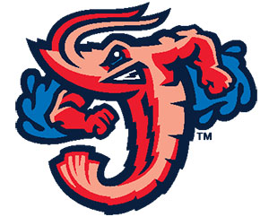
No, he's groping it.
Grab 'em by the Pensacola.
-
7
-
-
37 minutes ago, panthers_2012 said:
Remove the water from the shrimp and you have a mediocre logo.
Is that's what it's supposed to be? If so, why doesn't it continue under his right arm?
Confirmed: "Bold City". Stupid.

Almost as stupid as that alternate of the shrimp escaping from a pot. Almost.
-
3 minutes ago, Ferdinand Cesarano said:
At least those guys are all wearing their stirrups and pants correctly.
I dunno - that guy on the end, in the Columbia blue, his stirrups look like they're on backwards. Larger hole goes in the back, big guy, and the rose goes on the front.
-
1
-
-
5 minutes ago, AstroBull21 said:
Can anyone tell what the red jersey says?
Some stupid city nickname? The only plausible one I see on Wikipedia is "River CIty".
1 hour ago, BigEd76 said: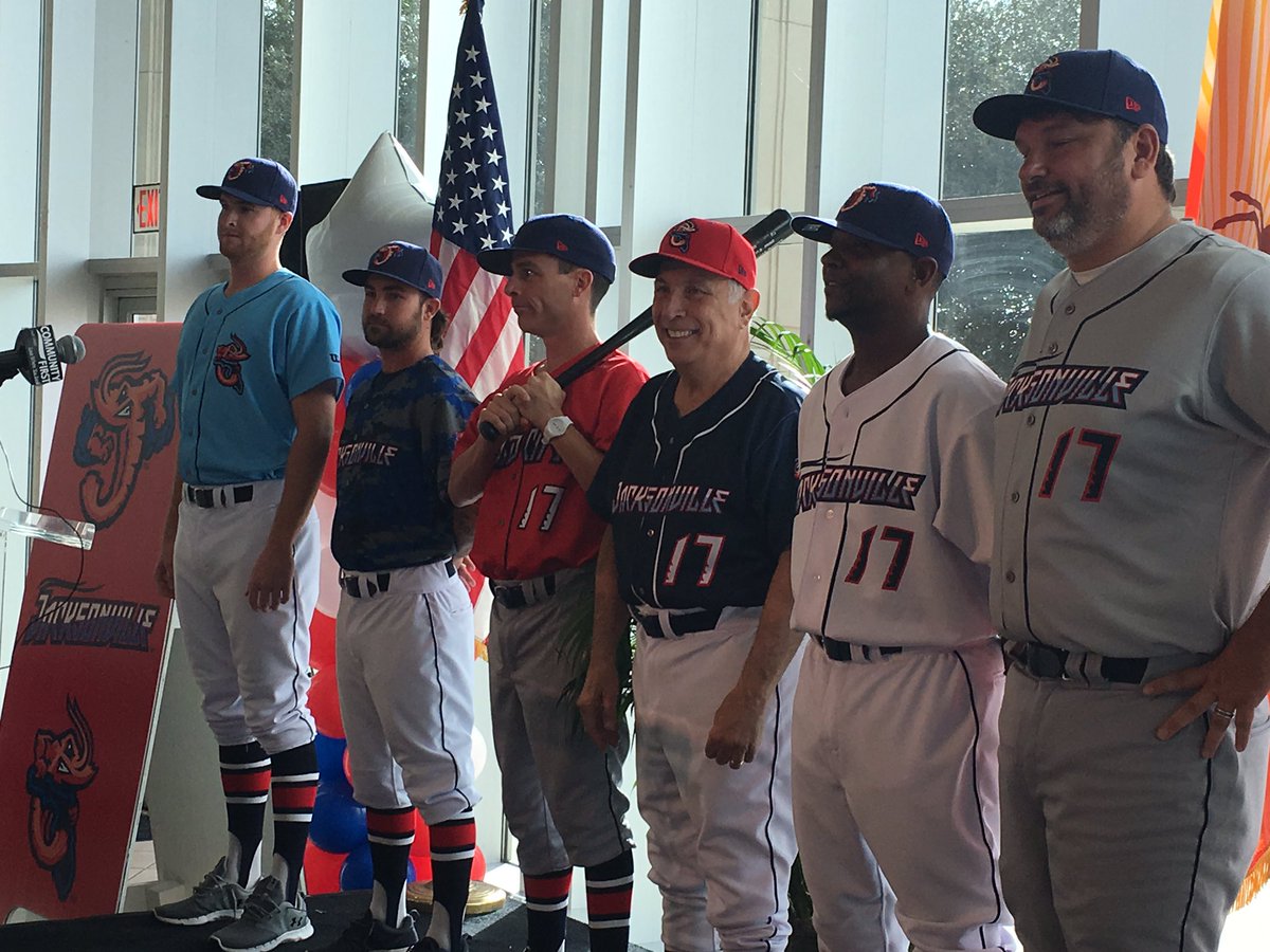
And holy
 , that chrome-ified drowning wordmark is hideous.
-
1 hour ago, MBurmy said:

That's not a bad "J" logo on its own, but what the hell is up with the water wings?
The backwards version where he's groping Florida is just awful.
1 hour ago, BigEd76 said:
-
Still looks like a football helmet logo. Are they using the "L"-foot on alternate caps?
-
32 minutes ago, FinsUp1214 said:
Back to Lynchburg...I can't help but look at that whole identity - especially the primary and the wordmark - and think "football". It all looks better suited for a football identity than it does a baseball one. Not saying you need a neon hillcat swinging a bat, but these just for some reason don't look like they "fit".
I think you're really on to something there. The oval head appears designed to fit on a football helmet, and the full-body version sure looks like he's trying to stiff-arm a defender while running with the vall tucked under his left arm.

It's kind of generic, as if somebody grabbed a set from their spec portfolio, dusted it off, and presented it to the baseball team.
-
2
-
-
No, but that's one way to stand out in a crowded marketplace.
I love minor league whimsy, but there's a fine line between that and plain stupid. And when the owner talks about his decisions like this:
"This is a high-energy, impactful, bold move," Babby said Tuesday
It leads me to believe he's firmly on the side of stupid.
-
2
-
-
2 hours ago, AstroBull21 said:
True, but this link goes over the reason for the name:
"Fire Frogs won the vote," said team president Joe Harrington, who spent the last three seasons as general manager of the Aberdeen IronBirds. "The name came from two fan submissions. Kara Morrison, from St. Cloud, suggested 'Fireflies.' Steven Strickland, from Orlando, submitted 'Coquis.' That's a species of frog native to Puerto Rico. So we merged those two into one made it part of the fan vote."
Yes, but it's a particularly stupid reason for the name.
"Dragonflies" was a finalist, and that could have been the basis for a solid identity. So long as they dropped the terrible "Florida" moniker.
-
1
-


 , that chrome-ified drowning wordmark is hideous.

Minor/Independent/Collegiate League Baseball Logo/Uniform Changes
in Sports Logo News
Posted
Oh my goodness, that's a gorgeous cap.
And I'm with you - this is a fantastic update to the old Cardinals logo.
I don't think I ever saw this 1970s music note "M" logo before.