


Gothamite
-
Posts
36,227 -
Joined
-
Last visited
-
Days Won
277
Posts posted by Gothamite
-
-
I'm not convinced navy blue was ever seriously considered for the Packers; the reports I've read seem to conflate Wolf's metallic-gold rebrand with the NFL 75th Anniversary throwbacks introduced around the same time.
-
Pretty sure you're going to find that's a custom-drawn wordmark, Chewie. Not a font.
-
I think it's a combination of teams wanting what other teams have used and Brandiose sometimes phoning it in.
-
Other than being straight-on views of a horse's head, I don't see any resemblance.
-

Strictly speaking, that's not an unused logo - at least one of their corporate partners (a bank, IIRC) used it in their promotions.
But it's certainly not one I wanted to see in real life.
-
Designs of the Next Super Bowl ring - Diamond Cutters International is one of four companies bidding to create the next Super Bowl ring
Could one of these Championship Ring designs wind up being the next Super Bowl ring?

Yes, one of these two Championship Ring designs shown above could be the next Super Bowl ring, if Houston based Diamond Cutters International wins the selection process.
Of all the championship rings I have ever seen, in my humble opinion (and many in the jewelry and championship ring market-place agree), the design and making of the shanks (the sides) of the last Diamond Cutters International Super Bowl ring was awful - The Broncos Super Bowl XXXII ring.
Those designs are pretty awful, too. The double-Seahawks concept should never have gotten out of a brainstorming session. Not to mention using the old logo.
-
The logo doesn't use the words "Soccer Bowl" because that's no longer the name for their championship game. "Soccer Bowl" now refers to the entire playoff tournament, which is profoundly stupid.
-
Indeed.
The logo is puzzling, though. I get wanting to have a blank face, but why is an umpire batting?
-
You're right that opponents tend to be more vocal. But that doesn't automatically mean that they're in the minority. In fact, it doesn't tell us anything about the numbers.
-
the vocal minority
We don't know that.
-
And I feel that there is irony in the fact that the Patriots last three AFC trophies (2014, 2011, 2007) will be of a football with no air inside the football!
That's a clever line, but the current design wasn't unveiled until the 2010 season.
-
I would suggest, based on that evidence, that you are an outlier...
-
Perhaps.
I'd be really interested in knowing how many NFL fans even realized the trophies had been changed, and could have remembered what the old ones looked like if they did. There may not be a single trophy downplayed quite so much as the conference champions.
-
I love the old trophies and am thrilled to have won one a Giants NFC trophy at Lealands a few years ago.
The trophy was classic and elegant and paid homage to the roots of football.
The new trophies are modern art but lack any character. Should we take the Heisman trophy and make it much shinier and modernize that too? After all the trophy lacks a face mask.
Maybe tiffany can update it to look something like the AFC/NFC tropies. Would that be progress?
How many football fans could draw the old trophies from memory? Or even pick them out of a lineup? Your Heisman comparison falls flat right there. If the conference trophies were half as iconic (or as interesting) as the Heisman, they'd still be around.
I don't love the new ones, but they're certainly no worse than the previous ones, which were clunky and undistinguished.
I'm not usually accused of being overly modernist (or at all), but this was a good change in my eyes. I'd rather they were updated to a better design, but I'm not sad at all that they were updated.
-
They changed the league championship trophies because the old ones were ugly. These aren't great, but they're better than the old.
There's no danger of the Lombardi Trophy being altered, since these new conference trophies are intended to reflect its iconic design.
-
Perhaps he bought a replacement a year later?
-
It's not quite the same as yours (nice tat, by the way). That's closer to the 1950s version, the one you have (superimposed over a football) was introduced in the early 60s.
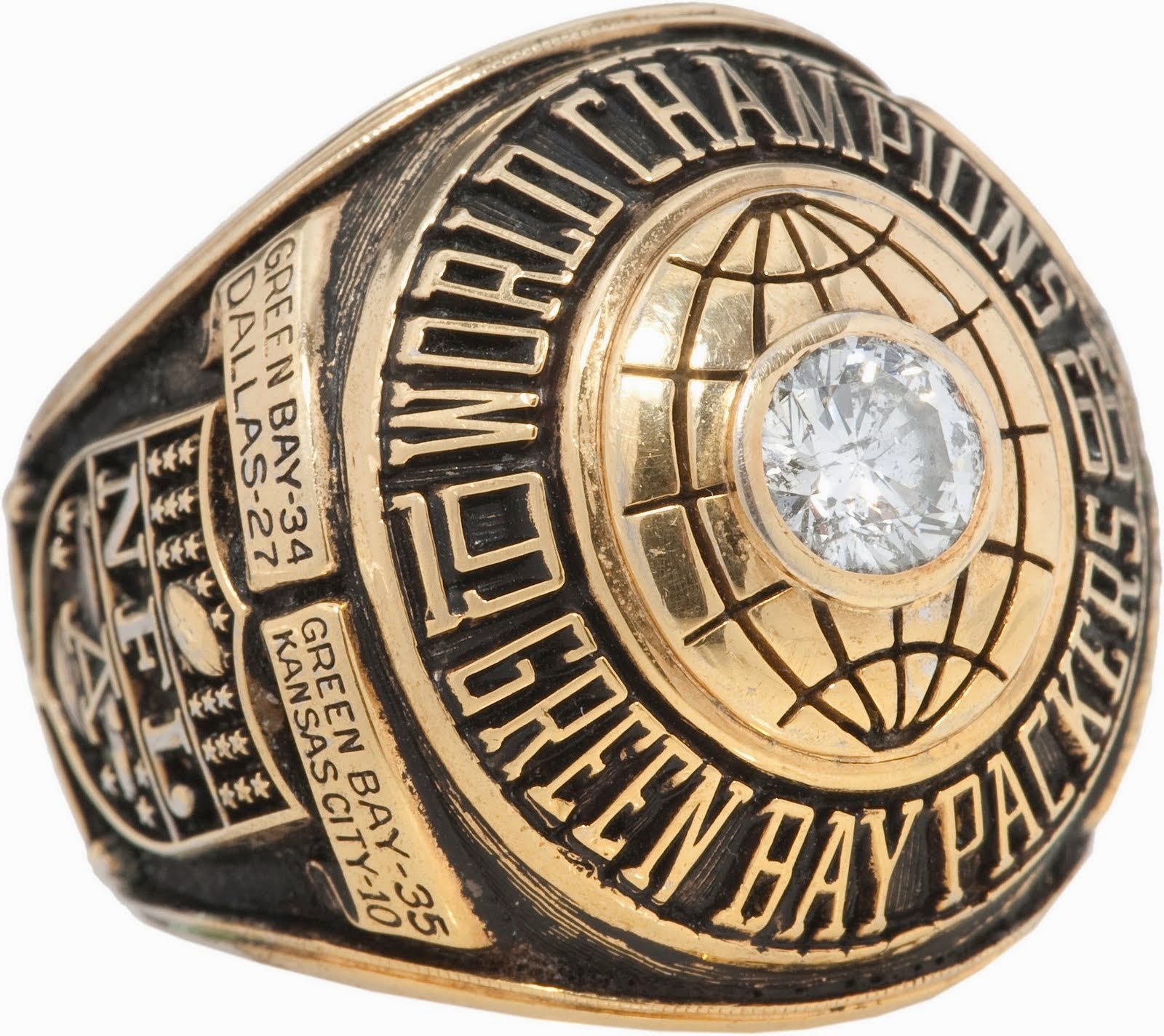
Actually, that's not quite what the paperwork says. It reads "This is the same price the Packers paid when they bought in a quantity of 55." It doesn't say when the Packers bought their rings. And why would Lew Anderson buy his own ring if they were issued by the team that year? He was a valued scout and friend of Vince and Marie Lombardi.My understanding is that anyone who wasn't on the 1961 club had the option of purchasing a ring. So while still very rare, it may not have been the only one.
The photo of the paperwork clearly states that the Packers ordered 55 rings before Lew's order was written up.
I guess this means that Lew's 1961 ring is not the only ring (unless the Packers cancelled the order and went with watches). If the order did go through, and I can't see why it would have been cancelled, then there appear to have been at least 56 rings made.
That seems like a lot of people, purchasing their own championship ring, so perhaps the Packers offered a ring or a watch to members of the organization.
The design for the 1962 ring was identical to the 1961 version. If there was indeed a choice, makes sense that anyone who got a ring in '61 would opt for a watch the following year. Or maybe this is indeed a one-off purchased by the scout himself, on which Jostens gave him a favorable rate because of their history with the Packers.
-
My understanding is that anyone who wasn't on the 1961 club had the option of purchasing a ring. So while still very rare, it may not have been the only one.
-
I got that picture saved on my computer. Reminds me of Jerry Kramers picture.
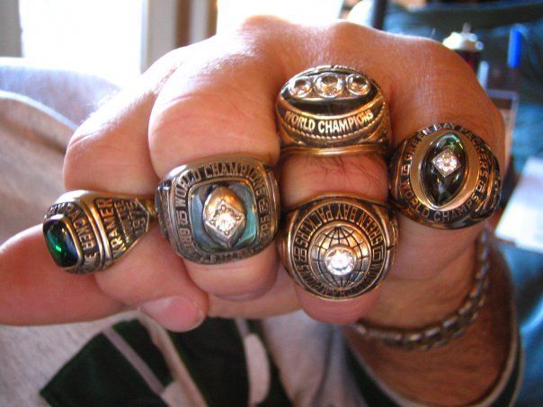
That one on the left is his Packers Hall of Fame ring. He won five World Championships, but the Packers gave out watches instead of rings in 1962.
-
Or, in other words, exactly what I said above.

-
Considering the Packers don't use a green "G", I'm not sure I want to see that.
If cut stones are so important, replace the stone tablet with a series of cut emeralds next time.
-
Yeah but it's just a piece of plastic. Not a gem stone.The Packers used green on their last ring:
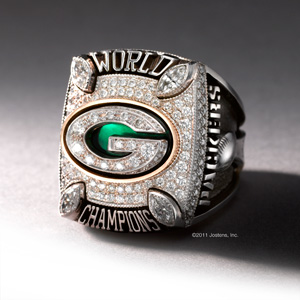
But maybe more next time.
Sure it is. It's just not an emerald.
-
The Packers used green on their last ring:
But maybe more next time.
-
Following up on those Super Bowl I rings, I remembered that the cufflinks given to team officials featured emeralds atop the globe. Here's the set owned by then-team president Lee Joannes:
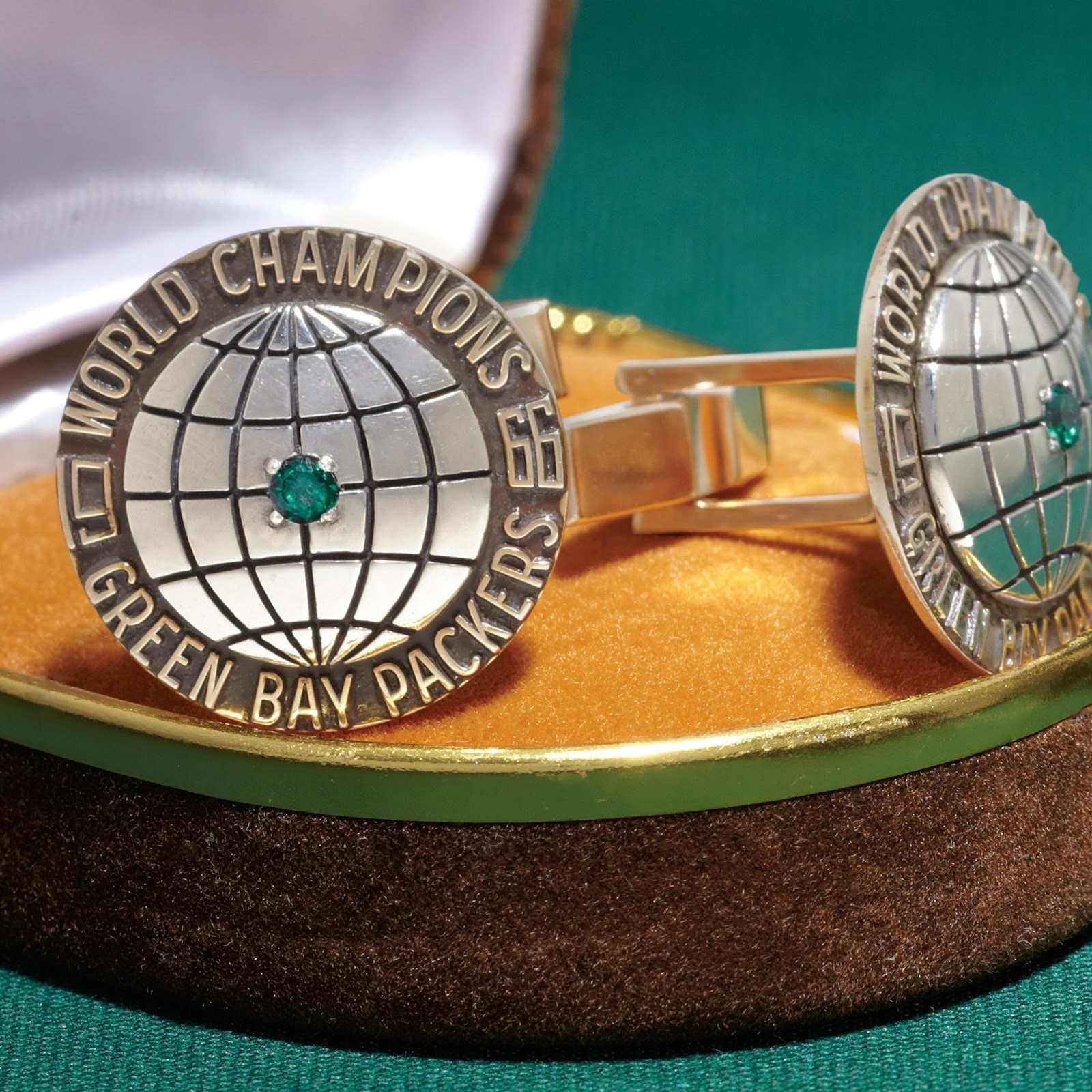
That gives us an idea of what the rings would have looked like, had Lombardi not insisted on a diamond.

sportslogos.net missing logo thread
in Sports Logo News
Posted
The NASL section is pretty bare overall - just looking around, I don't see any of the Cosmos' wordmarks or secondary logos, or anything from Minnesota before the current rebrand, etc.