


Gothamite
-
Posts
36,227 -
Joined
-
Last visited
-
Days Won
277
Posts posted by Gothamite
-
-
Moving it to the US, surely. Media exposure, opportunity to boost the game in a still-developing market, infrastructure well in place. Who knows? If NYCFC builds their park big enough they could host a marquee game.
-
Here are pictures not on that website:


The bacon script is fine, but the cap is a wasted opportunity. Warp the bacon into an L, maybe, and it becomes genius.
-
-
Well, back then the rings were supposed to be, you know, worn. All day, every day. Now they're just nicknacks, statues to be placed on a shelf, preferably with a pin spot on them at all times.
-
So they averaged 4600 fans a game.
Yep. That's Bettman's hockey-lovin' sunbelt, alright.
-
 1
1
-
-
Vegas. Sounds just like the caliber of expansion markets Bettman is famous for.
-
Nobody can work miracles.Except Atlanta, because screw that place, apparently.
It's also worth noting that Atlanta's move helped take pressure off the Coyotes by eliminating the one immediately compelling relocation site. So Bettman got to keep his pet project while blaming The Failure of the Thrashers on "because Atlanta".
-
What in the Holy Name in Jesus H. Christ, Santa Claus, God, Buddah and Moses is Gary Bettman's opsession with Glendale?
Sun Belt hockey is his legacy, his singular contribution to the sport (sure isn't labor peace). Doubt he'll ever admit that it was anything less than a spectacular success everywhere.
-
1
-
-
No. Not until Seattle's arena is built, and the NHL doesn't like Canada.
-
While not minor-league, the new Kenosha, Wisconsin-based franchise in the summer-collegiate Northwoods League has unveiled its name and logo.
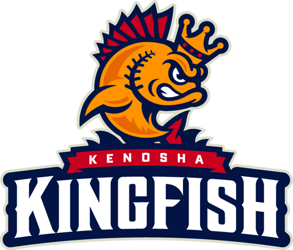
Kingfish General Manager Jake McGhee said that the name was chosen in the wake of community members and focus groups telling the team that the "image of Kenosha was Lake Michigan". This being the case, McGhee went on to say, "We wanted a name that would connect with the lake, but also... ties in with both royal and nautical themes".
The team's colors have been designated Lake Michigan Blue, Vintage Cream, King's Gold, and Cardinals Red.
The logo was designed by Madison, Wisconsin-based Shine United. The firm was responsible for creating the logo of the Northwoods League's Madison Mallards franchise, which is owned and operated by the same group that controls the Kingfish, the Wisconsin Rapids Rafters, and the Green bay Bullfrogs.
I
 ing love it. That's better than some AAA clubs.
 -
Can you post it, for a true before-and-after?
-
Well, the entirety of the Premier League is absent from the page.
For good reason - they asked Chris to pull them down.
-
I like it, although the S having two tails seems a little strange to me.
Hard seeing the caps etc on my phone, so I'll check those out later.
-
Bring back the pullovers, Meat!

-
1
-
-
Silly rabbit.
Nobody can actually wear those rings...
-
A move to the New York City area would be a disaster
Depends where they put them. Long Island? Disaster. The Bronx? Disaster. Brooklyn? They become a top-5 team in attendance and merchandise sales.
It's not going to happen, but that one would be an easy home run. And the renamed Rays would finally have a market worthy of them.
-
Don't forget the Illuminati - they were in on it too. And the Vatican. And Colonel Sanders.

-
Don't understand how Jersey is always in the mix.
It's a mistaken notion that they could tap into the NYC market, which could absolutely support a third team (provided it's branded correctly). They're wrong, but that's the idea.
-
"Somebody has to be last"?
Wow. That is, unfortunately, about the most coherent rationalization of the Rays' pathetic attendance I've ever read. Which means it's long past time to move this team.
-
Maybe they don't - there's something special about back-to-back wins. It puts the team in an elite category, and is worth celebrating in its own right.
When the Packers won their third in a row, they put three diamonds on the face of the ring to commemorate the feat.
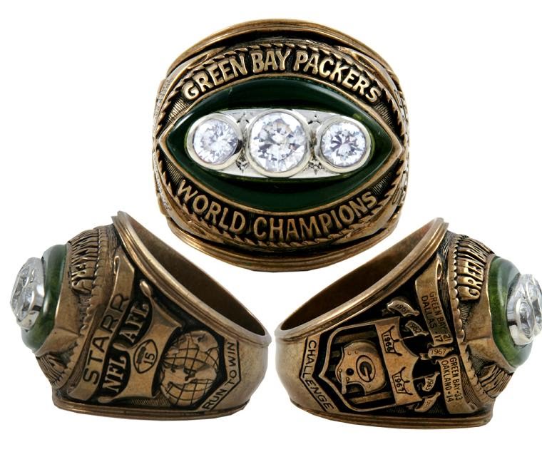
Now, that was the franchise's eleventh championship. Heck, most of the players on that 1967 team had won five titles in green and gold, but you'd never get that from the 1967 ring.
Were the Packers wrong back then? I don't think so, nor do I think the Heat are wrong now.
-
As do I. Good bird logos, nice wordmark, solid "R" logo for the cap.
-
Still doesn't change my thought process behind my comment. They are making it more about LeBron and less about the franchise. There should be THREE trophies on the FRONT of the ring. If they want to make a note about LeBron or the three players coming together or whatever, then do it on the SIDE. I'm not a fan of what they did...maybe its just me.There's three trophies on the side of the ring
I'm no fan of his, but I think you're wrong here. When you've got back-to-back championships, I'm okay with celebrating that on the front of the ring at the expense of all prior titles.
-
1
-
-
While, sure, many of Brandiose's products look the same, someone living in Akron who goes to the ballpark isn't going to not buy a hat "because this is in the same style of that El Paso team in the PCL."
For that reason, I tend to look at minor league identities in a vacuum and looking at it that way, this is IMO an awesome design and name.
I agree that every identity should be evaluated both in a vacuum and in the context of other teams in its league (too similar there might indeed impact sales).
Still, even in a vacuum the logos are dreadful. Contorted, contrived, poorly conceived and poorly rendered. Whether these bad logos are similar or not to other bad logos doesn't even enter into the equation.
-
Name is good (although it would be better if it were two words, as in the thread title).
Logos are flat-out awful.

 ing love it. That's better than some AAA clubs.
Qatar 2022 World Cup Discussion
in Sports In General
Posted
The Gold Medal game? Surely. But it would be good to get a high-profile match held in NYC itself.
As for football stadiums, I don't know about that.