


Gothamite
-
Posts
36,227 -
Joined
-
Last visited
-
Days Won
277
Posts posted by Gothamite
-
-

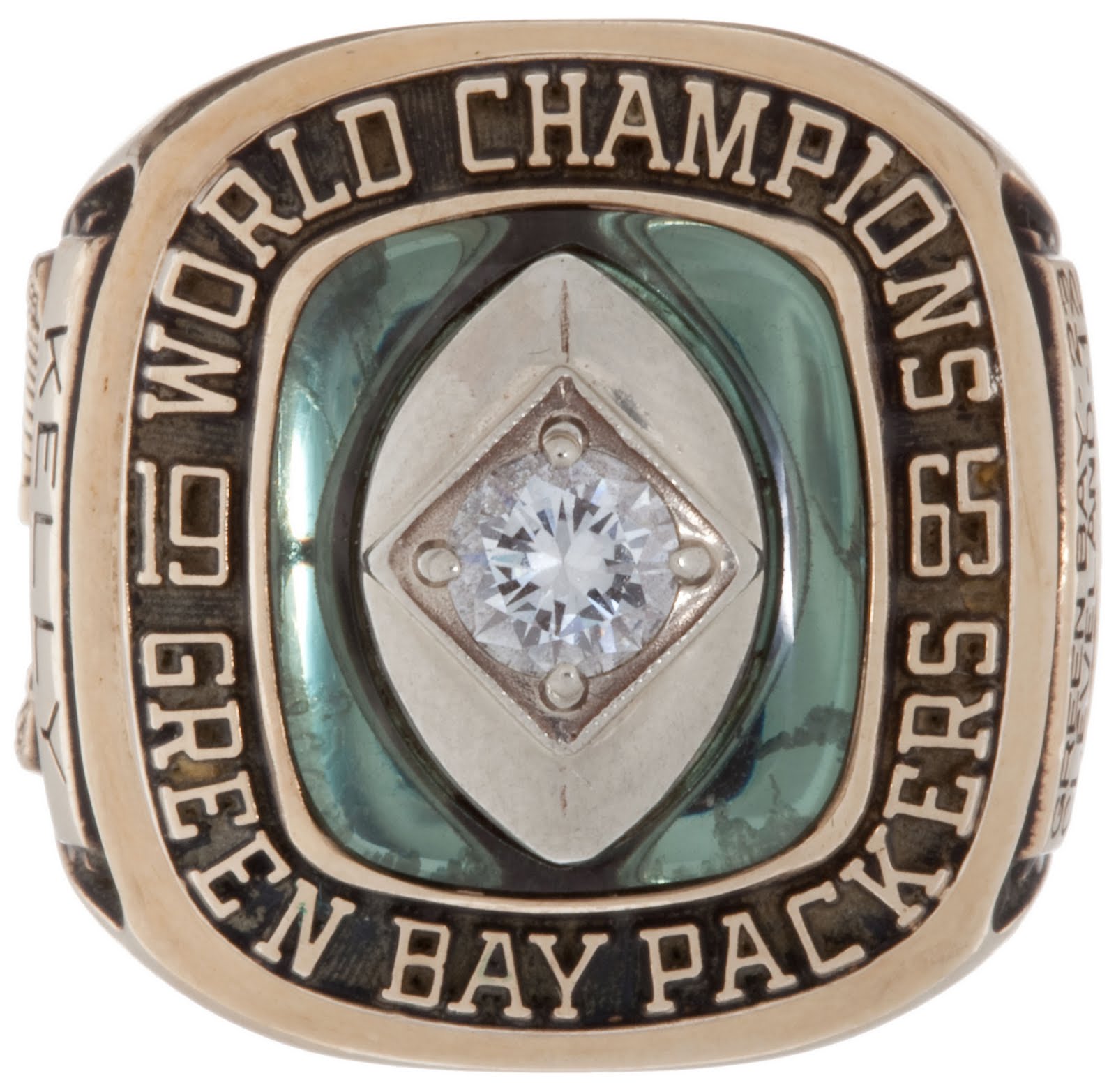
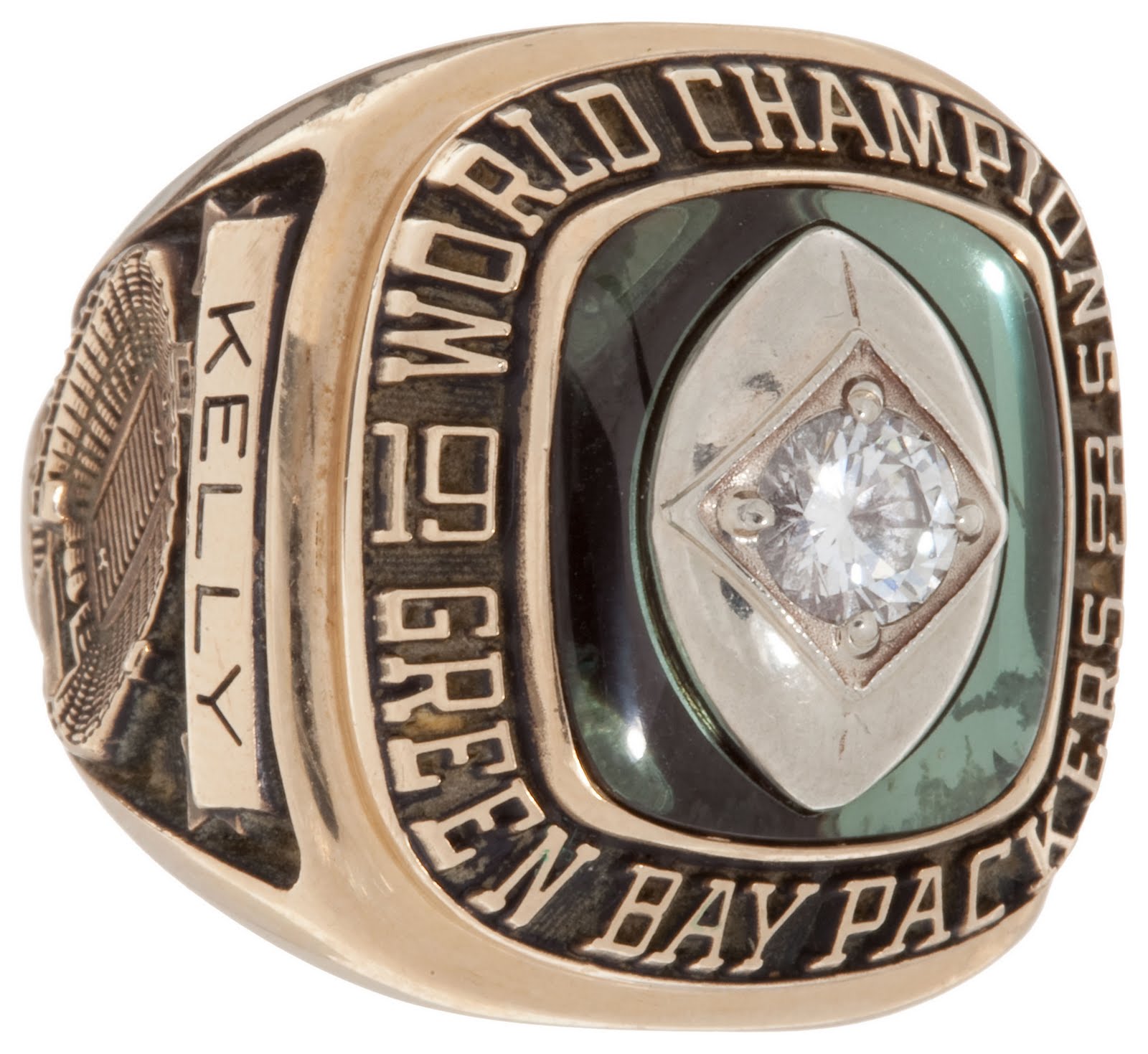
That Chiefs ring looks like the Packers' World Championship ring from 1965.
The Chiefs buy from Jostens as well? Was that one of their stock designs?
And, while you probably know this, the stone at the center of the glove of that Packer Super Bowl I ring was originally supposed to be an emerald. Vince Lombardi liked the design but insisted that "my boys deserve diamonds!"
-
Yeah, but if they knew what they liked, they wouldn't live in Amarillo.

The good people of San Diego, on the other hand, have taste and refinement.
-
That happens to be one of my favorite World Series rings, so I approve of the new National Championship ring.
-
There's the beginning of a good logo for the Whiskey Jacks - I like the rendering of the bird. On the whole, though, no.
-
As I understand it, something like this --

Yep. With pants to match.
-
True enough - the team that wins the Super Bowl in February 2015 will be the 2014 world champs.
-
Not me. I like the Roman numerals.
-
-
Sigh.
And we were doing so well. Two really great re-brands, and now this dud.
-
The star could be the MiLB version of those incredibly stupid Stars N Stripes caps MLB had last year.
-
Sure is. The Platonic Ideal of a minor-league set. The more I see, the more I like.
-
 1
1
-
-
Why is he carrying his bat on the base paths? A turtle can get hurt that way.
-
Love that interlocking SB logo.
Wow, two great minor league packages in one day.
-
Well, do you think the odds are better the Iowa team would choose your beautifully-rendered Oaks or PorkChopzz with eight alternate logos and twelve caps?
-
Wrong. it's great for regional teams like the Cubs, Cardinals, and Braves. It doesn't work quite so well for teams on the coasts, for some reason.The only time the minor league team should have the same name as the parent team is never.
Wrong. So long as we're making bold declarations.
"Staten Island Yankees" and "San Jose Giants" work every bit as well as "Iowa Cubs" and "Gwinnett Braves".
-
Don't forget the too-clever "OKLA" logo.

Not a huge fan of the uniforms:

There's also a white one, the same as the parent club with a locally-themed patch on the sleeve.

That's the Skydance pedestrian bridge:

Nice to include a local landmark.
-
The updated picture shows that the OKLA City patch is on a white Dodgers uniform.
That's the Skydance pedestrian bridge:
Nice to include a local landmark.
-
Whoa.
Is that an 80s pullover jersey with the "OKLA" graphic?
And why do they need a version of the Dodgers' "home run ball" logo if they have their own shield logo?
-
Ugh
Is there some resonance to the bricks? Do they play in an historic ballpark or in an industrial part of town or something?
The "OKLA" mark is a clever idea, but the execution is pretty poor. I guess the "O K C" monogram is good enough, although it would be the weakest element in almost any decent team package.
I would love to see them use that wordmark script on their jerseys instead of the Dodgers' usual one. It would set them apart from the parent club, even subtly, and besides, somebody should. It's gorgeous.
-
Good - that's a positive association for both clubs.
-
My ring display
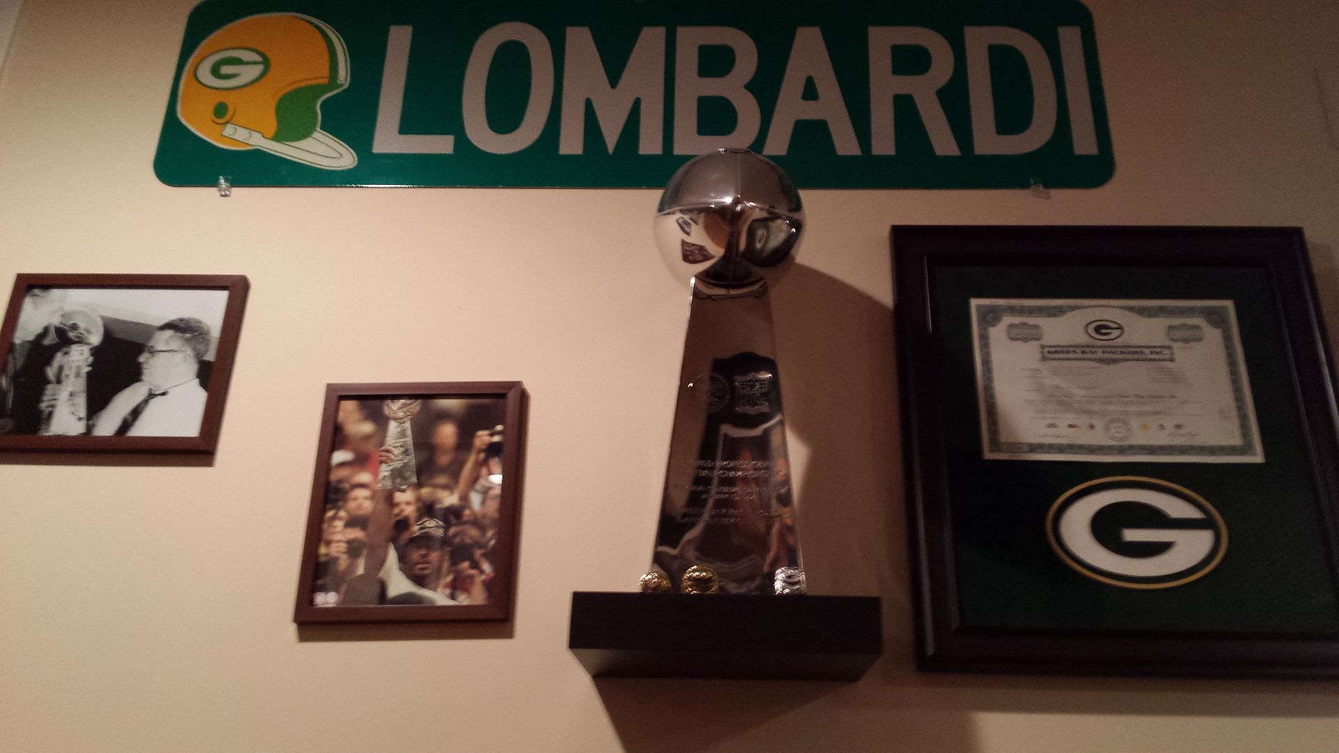
Nice. Where'd you get the street sign?
-
I think it's a little of both. The clients want to keep up with others, and perhaps designers like Brandiose are all too happy to keep giving them this kind of nonsense that promotes them as much as the team.
Just out of curiosity, what team is that?
-
Interesting shout-out to the Brewers' script in that "B".
-
They pretty much fixed everything that was wrong for every team.
Really?? That's good to hear. How long ago did that happen? Have they fixed the NY Giants stuff too?The MLB fixed all of those Brooklyn cap marks...will post soon.
Back to 1900. Recreated every uniform script, cap mark and sleeve patch.
Anything I don't have now, is due to trademark issues...if the MLB couldn't secure a trademark for it (older logos and scripts usually), it was not included.
I'll be posting as much as I can on my own site in the near future - I'm in the middle of rebuilding my site right now...should be up in a week or so.
Just realized - is that why this logo has finally made a comeback after decades of obscurity?

The one listed as the 1970-77 primary on the mothership is wrong.

They almost never used the Barrelman alone, it certainly wasn't the primary. And look at the angle - in the 1990s, when MLB was putting its digital files together, some designer fixed the angle so that his left foot was level; that's how the original version was back in the 1940s, but from 1966-1977 he was at that funny angle pitched forward. It's especially noticeable on the motion lines around his bat.
Anyway, I was shocked to see that tshirt available and immediately bought four of them. If they're finally correcting those digital files, it makes sense the proper logo has finally resurfaced on merchandise.


CCSLC Championship Ring Thread
in Sports Logo General Discussion
Posted
The prototype is in a private collection; pretty sure the broad strokes of the story are true.