


Gothamite
-
Posts
36,227 -
Joined
-
Last visited
-
Days Won
277
Posts posted by Gothamite
-
-
So then why invoke the Pulaski Yankees as the starting point? I'm confused.
-
-
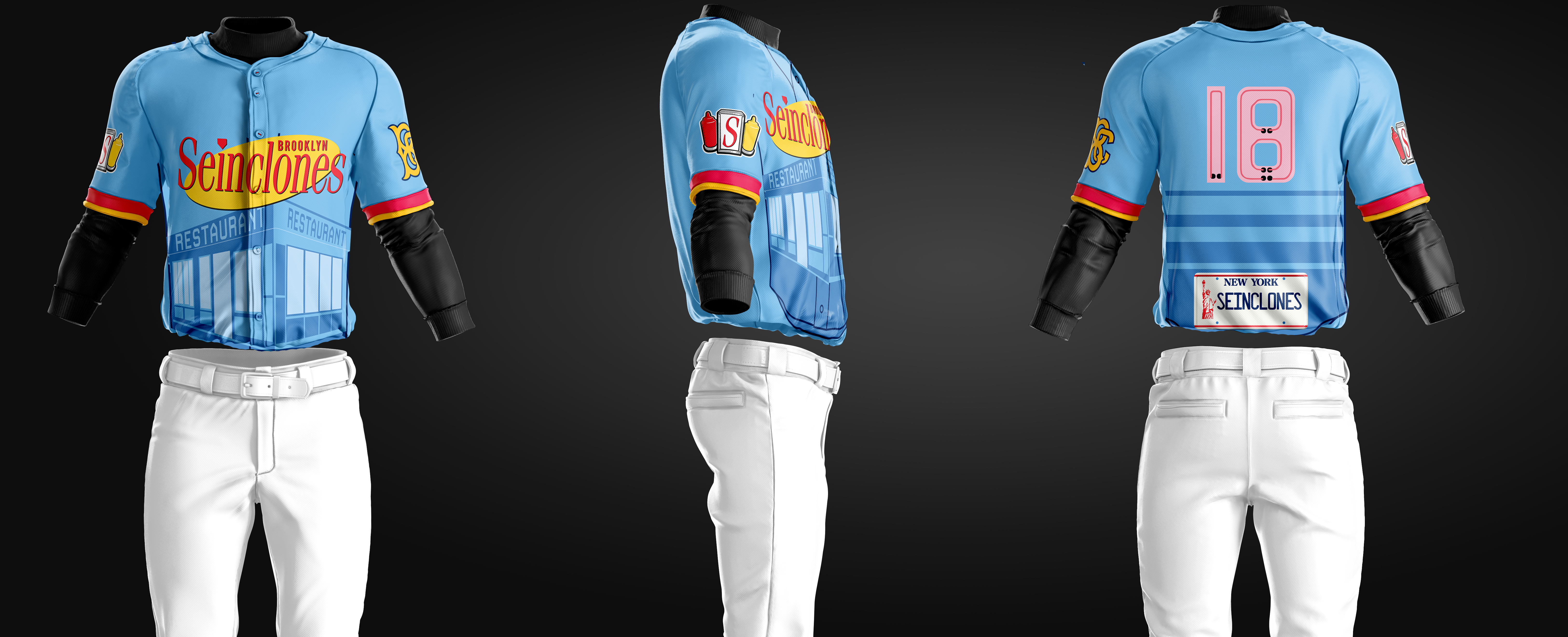
The Brooklyn Cyclones are have unveiled jerseys for their annual Seinfeld Night.
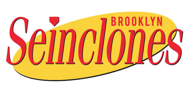
And in 2019 news, the Cyclones are also letting fans vote on their one-day name change for the next year's Seinfeld Night.
They will be the Brooklyn Marble Rye, Double Dippers, Long Island Dingos, or Rockaway Whales. And they're selling t-shirts with each of the four names, which give us our best look at the logos.


I don't know enough about Seinfeld to know if those are clever or not.
-
 7
7
-
-
10 hours ago, DNAsports said:
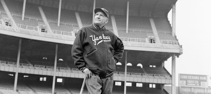
I was looking through MiLB team logos and I saw the Pulaski Yankees wordmark.

I then realized that with a few tweaks, dropping the "Pulaski" and possibly thickening the stroke while changing the color to white, the New York Yankees could place it on their blue spring training jerseys and call it a day.

You do know that the Pulaski logo is based on the New York Yankees logo, right?
They've used versions of that script on jackets since at least the 1940s, although I don't think they've ever put it on BP tops.

-
1
-
-
8 hours ago, NicDB said:
Since the Bulldogs are moving out of Green Bay proper, but to another town on the river
Well... technically. But they’re moving to a contiguous suburb of Green Bay, and an innermost neighborhood to boot. The new stadium is, what, four blocks from Lambeau Field?
-
Holy
 , that's a terrible list. There's a fine line between whimsical and stupid, and they've crossed it on every single one.
Pikas would be good, except for that adjective.
-
5
-
-
I disagree - this is pretty bad.

The basic idea is good, but there's just too much there. The baseball seams in the eyes are especially egregious. The two uses of stars are also odd. I even think it might be better with one-color lettering instead of adding an outline to that font with its fairly busy serifs, or at least flip it to make white text with a red outline. The whole thing becomes a mess at smaller sizes.
-
1
-
-
Ew. That’s pretty bad. The color scheme has promise, but... yeah, that’s about it.
-
22 minutes ago, M4One said:
Ah, minor league baseball. Where you expect it to be one thing and it ends up completely something different. Definitely was not expecting a rocking chair to be in the logo.
That's the best part - High Point, North Carolina styles itself the "Furniture Capital of the World".
-
1
-
-
@Thaumatrope said it all on the megathread.
1 hour ago, Thaumatrope said:Wow...there’s a whole lot going on here, to the point the design as a whole is weaker than its constituent elements.
I like the High Point script quite a bit, but it’s dwarfed by the giant Rockers block text with the inexplicable chrome/hotrod font. Worse still the NC on the chair looks like an afterthought (and introduces a third font).
Another issue with the NC is that it distracts from the fact that the back of the chair is meant to be home base...which goes nicely with the balls and bats integrated into the rocking chair. But could someone explain to me why the chair is rocketing through space? It’s like the team decided on the name, but then started to worry that it was too boring.
The whole thing looks like a case study in logo design by committee...or a cautionary tale on what happens when you give a client everything they ask for regardless of whether it makes good design sense.
-
On 1/9/2018 at 12:49 PM, RichO said:
But what is the right uniform for Kurt Russell?
The Portland Mavericks.


-
5
-
-
9 hours ago, pHiL Kizer said:
When I said "back to", I was referring solely to the Whalers. Regardless of how small a state CT is, it has a ton of dedicated pro sports fans. The fact that Hartford was a consideration for the Patriots is proof enough for another major sports team to make it's home in CT.
But it really wasn’t. Kraft was bluffing, using the state of Connecticut for leverage. He never had any intention of leaving Massachusetts.
-
1
-
-
1 hour ago, pHiL Kizer said:
I really hope some major pro sports teams comes to (and back to) Connecticut.
Other than the Whalers, what major pro sports teams has Connecticut had? There was Kraft's idle threat that he would move the Patriots there, but that doesn't count because we didn't believe him.
I think Connecticut has essentially the same problem as New Jersey; it's sandwiched in between two major markets, and isn't necessarily big enough to have its own teams. The Devils at least have close proximity to New York City and can cater to those western suburbs and satellite cities.
-
2
-
-
Yeah, it's totally out of place.
Frankly, the whole identity is a mess. They should start over.
-
1
-
-
44 minutes ago, Cardsblues02 said:
What the **** is a god**** Yard Goat?
Slang for a small locomotive engine used to ferry trains around a railyard. Unfortunately, the team doesn't use any railroad imagery, instead fostering confusion by using an actual goat logo.
EDIT: I forgot they do use a wordmark borrowed from an old railroad line logo.

-
3
-
-
Quote
Rock Pigeons (Staten Island is known as the rock)
No, it really isn’t.
Stop trying to make “the Rock” happen, SILive.com. It isn’t going to happen.
-
1
-
-
“Honor the military.” There’s a nice change of pace.
Seriously, that could be the most hideous wordmark in all of minor league baseball, if not professional sports.
-
Huge improvement over the Baby Cakes.
-
3
-
-
45 minutes ago, buzzcut said:
On June 26, for one game only, the St. Paul Saints will play as the Raccoons.
Only took them fourteen days, That's how you capitalize on a meme, Staten Island.
-
5
-
-
Another of the rare one-offs that’s superior to the team’s regular identity.
-
1
-
-
Of course, Brandiose being Brandiose, there was a "swingin' mascot" logo. They just left this one on the drawing board.

And look @DC in Da House w/o a Doubt - toppings! Pepperoni!
Seriously, though, how do you look at everything on these pages and say "Yeah, we want that kangaroo-over-the-slice. That's our best choice."
-
3
-
-
A day late, my good bot.
")
-
26 minutes ago, C-Squared said:
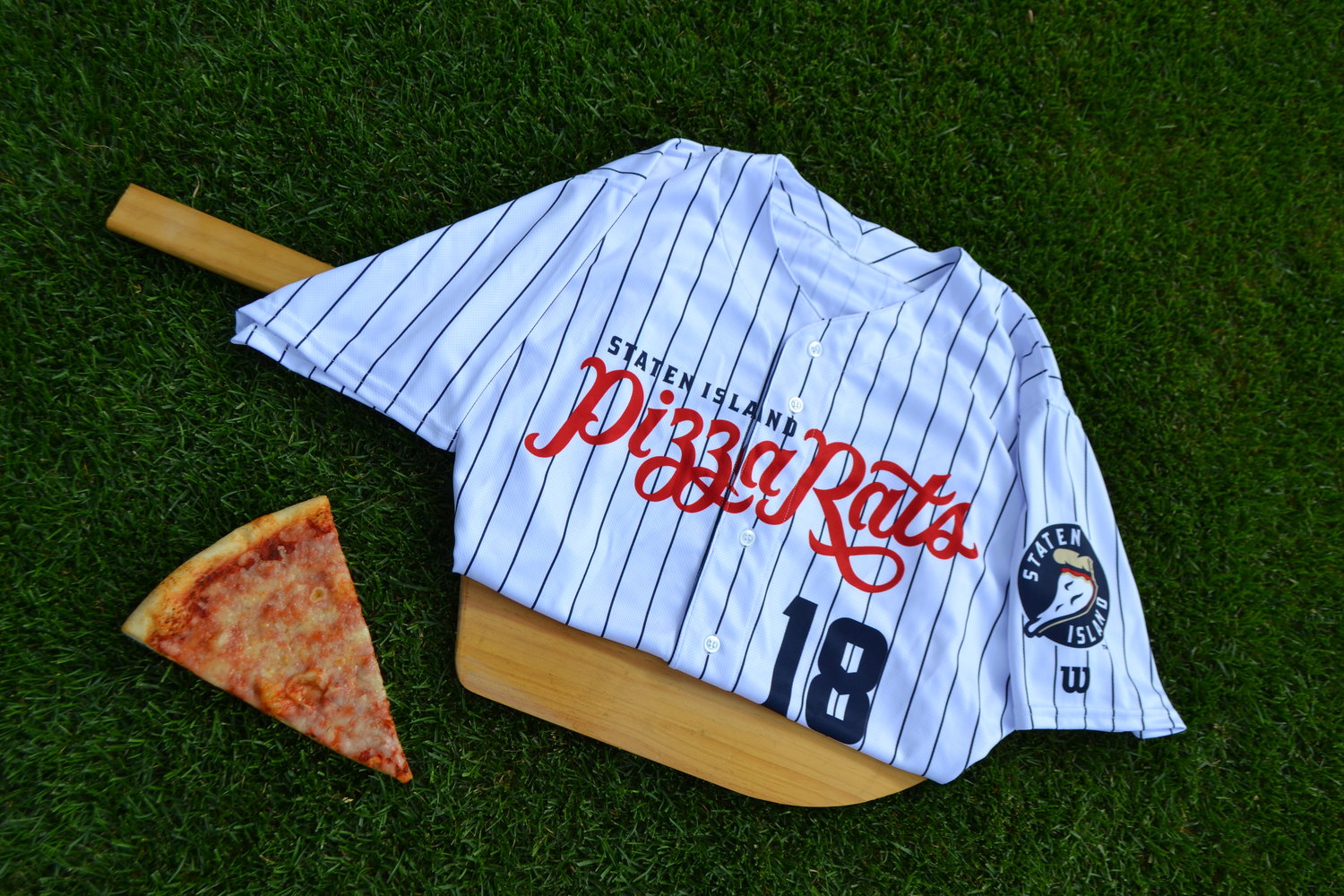
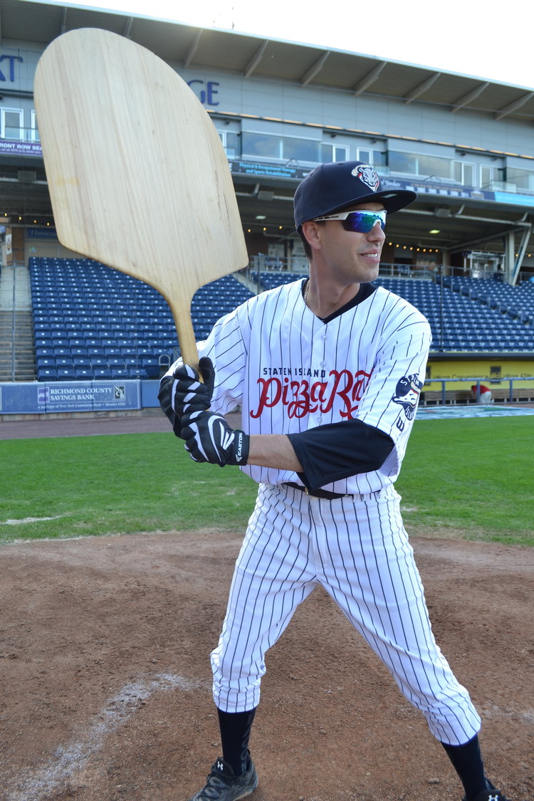
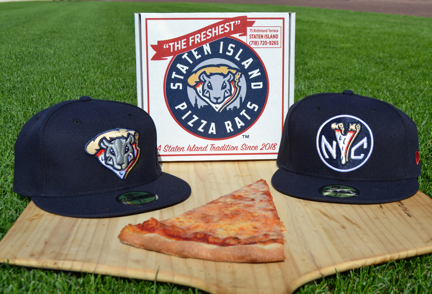
Getting old fast, but I will say that the Pizza Rats script across the jersey is beautiful.
That bit sure is. Putting "Staten Island" across the top seems too minor league even for a short-season Class A ballclub. Especially when it's right there on the sleeve patch. And I think this is one that could benefit from a keyline. But I love the script.
-
1
-
-
Guess if we can have a separate thread for the Brooklyn Bagels one-off, we can also have one for the Staten Island Pizza Rats for Saturday night games


 , that's a terrible list. There's a fine line between whimsical and stupid, and they've crossed it on every single one.
Minor/Independent/Collegiate League Baseball Logo/Uniform Changes
in Sports Logo News
Posted
Oh, I get that.
I was just wondering why you said "the Yankees should use the Pulaski Yankees wordmark on their BP jerseys, only take away the "Pulaski bit" instead of just saying "the Yankees should use their wordmark".
Doesn't matter, no biggie. Just thought I was missing something with that roundabout path.