


Gothamite
-
Posts
36,227 -
Joined
-
Last visited
-
Days Won
277
Posts posted by Gothamite
-
-
I took from the article that the logos aren’t legit.
QuoteHe said what he is most worried about fans buying the gear then being disappointed that it looks nothing like the official merchandise.
-
Wow. That’s a new one.
-
13 hours ago, colortv said:
That's why I find this Chargers stuff in the other thread so silly.
They have a market from the Mexican border in the south to basically Santa Barbara in the North, stretching 230 miles North to South with 20 million people.
You would have to try to fail in order to do so.
No, they don’t. They would have, if they hadn’t spit on San Diego on the way out of town. Now the Rams have a better shot at the southern half of that market than the Chargers do.
As for not failing in a major market, it’s shockingly easy to do. Major markets have more competition for eyeballs, for sponsorships, for those entertainment dollars. Especially when the product is viewed as unfavorable or inferior, as the Chargers are in danger of becoming to the Rams.
The Islanders are the perfect example. They moved to the very heart of the largest metropolitan area in the country. Twenty four million people. And they failed to make a dent, slinking back to their original little slice of the metro area. I can easily see the Chargers wanting to do the same.
-
 4
4
-
-
So easy to miss that Wikipedia didn't even realize it for a couple years.
-
The city of Anaheim was quite desperate to become "more well known", so they paid the Angels to take on their name. Fortunately, that licensing deal has long since expired.
-
3
-
-
10 hours ago, SFGiants58 said:
Cleveland Browns, not St. Louis.
Oops.

-
1
-
-
1 hour ago, pmoehrin said:
I always hear people bring up how the Browns moving to Baltimore is a move that shouldn't have happened.
You do? What a profoundly dumb thing for anyone to say.
-
2
-
-
Interesting. Could just be a negotiating tactic to secure a better deal in Anaheim. Or maybe they're on the move?
QuoteAngels tell Anaheim they're opting out of their lease on Angel Stadium
By BILL SHAIKIN OCT 16, 2018 | 12:35 PM
The Angels opted out of their lease with the city of Anaheim on Tuesday, setting the stage for another round of negotiations over whether the team remains in their longtime host city or finds a new home elsewhere in Southern California.
Angel Stadium, which opened in 1966, is the fourth-oldest ballpark in the major leagues, behind Boston’s Fenway Park, Chicago’s Wrigley Field and Dodger Stadium.
-
11 hours ago, pepis21 said:
Real photo of Milwaukee Bucks alternate from 04/05:

Love that script.
-
8
-
-
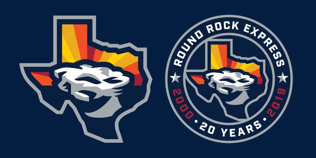
28 minutes ago, mmejia said:
The sunrise stripes are nice, but that's not a great rendition of the Round Rock itself. That swoop at the bottom is odd. I think they were going for this lighting effect, but it doesn't quite work.

The swoop is too tall, and the light source too high.
-
2
-
-
On 9/19/2018 at 1:29 PM, NicDB said:
There is, I'm not denying that. But how does that actually connect to the Milkmen identity apart from being a baseball team and vaguely referencing the era when the Braves played here?
If they were going for Braves nostalgia, it wouldn't have been hard to call the team the Milwaukee Hammers. Which also would have been a much stronger connection to the actual Milwaukee of the 1950s.I think we're conflating my own idle speculation with something intended by the team.
I don't know that they ever intended any connection with the Braves at all. I personally think that they wanted to go for something kinda kitschy, kinda retro, and settled on an identity that referenced Wisconsin's dairy themes without at the same time being too rural for Milwaukee County. Perhaps we shouldn't read anything more into it.
-
3 hours ago, NicDB said:
The idea that the 1950s had some sort of lasting impression on Milwaukee is pure Hollywood fiction for the most part. The Braves left, the breweries Milwaukee was known for at the time are no more for the most part, and people are still shocked to learn our mayor at the height of the red scare was a socialist.
Eh, I think the Milwaukee Braves still have a wistful but strong following in town. The sense of nostalgia is very real. I don't think people realize how turbulent the 60s really were in Milwaukee, and a lot of old-timers I know pined for those lost days for a very long time. But also don't forget that there's no nostalgia as powerful as a fondness for a time period you didn't actually experience, and the 50s are ripe fodder for a slightly-campy throwback like this.
3 hours ago, NicDB said:Ironically, this is a team that plays in Franklin, which incorporated in the 1950s because it didn't want to be part of Milwaukee.
That's the interesting part to me, whether a Franklin team can appeal with the name "Milwaukee". We will see.
-
1
-
-
They use red on the website - a small dash would make all the difference.
-
From the megathread:

Click to embiggen.
-
Here's the full logo slick.
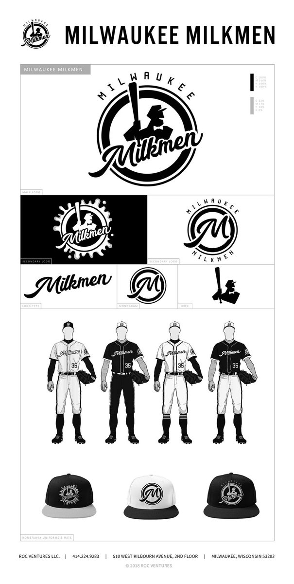
Good, but they really don't have a strong cap logo.
And I really, really hate this modern trend of matching the squatchee to the crown, not the bill. Terrible.
-
1
-
-
57 minutes ago, Thaumatrope said:
Agreed. Now that we've seen the whole brand I can't help but question the insistence on a monochromatic palette. I realize they're trying to channel the classic milkman uniform, but even within that space there's still room for a touch of color. A nice light blue would be a natural choice (especially in conjunction with the off-white cream...which is definitely the best set of the bunch), although a judicious use of medium value red could add a nice "pop" to everything as well. That being said, I give the designer a lot of credit for restraint. In this age of six color cap logos (I'm looking at you Brandiose) it's refreshing to see an organization take the "less is more" approach.
I agree on the "less is more", I just don't think the logos they have are quite strong enough to anchor such an approach.
As for the red, they're already using it on the site. A judicious application, as you say, would really look good.
-
I think I may be in the other camp - the name is fine, but the logo and uniforms are lacking.
I do question whether people in Franklin will be eager to support a “Milwaukee” team, but think that could be overcome by a more interesting logo set. As it is, I don’t know if the design will appeal enough to Milwaukeeans for them to support the team either.
-
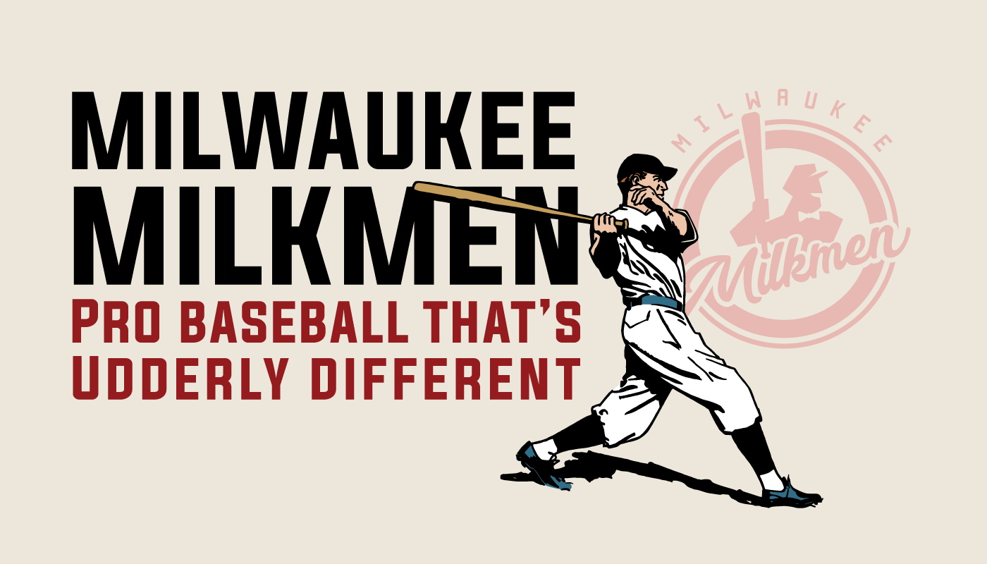
Yeah, I think there’s something of a disconnect between “Milwaukee” and “Milkmen”.
Unless they continue to lean on the “deliverers of milk” theme more than “producers of milk”, in which case Milwaukee could be a good choice for the 1950s associations, be it the Braves’ glory days or Happy Days.
Not enthusiastic about what we’ve seen so far - Black and white can be a striking color combination but can also be exceedingly boring. And with the complicated logos shown, it’s not a great choice.

Here’s the uniform set:
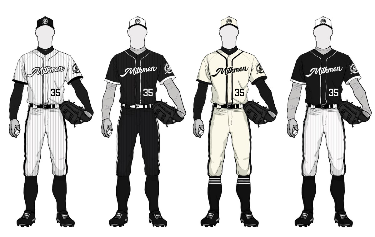
Bonus points for a cream alt, but no “Milwaukee” jersey?
The cap logos are pretty terrible - they really need an “M” logo. Something better than the M on their word mark, which is awkward.
-
1
-
-
1 hour ago, Ferdinand Cesarano said:
I love the contrasting numbers. This feature also looked great on the Orioles and the Marlins.
I think it looks better on the Orioles than the Marlins. The number should be the brighter of the two. Which it is for the Dodgers, always the textbook example of this style.
-
2
-
-
I liked the change to the pants, a single black stripe instead of the racing stripes. They could have done that to the jersey cuffs and called it a day.
-
1
-
-
Huh. I thought the White Sox changed their roads a couple years ago, when they dropped the white sox patch. Must have been thinking about the pants stripe changes.
And I'm pretty sure their black alts still use the 70s elastic cuffs, though. Still a relative rarity.
-
7 minutes ago, BJ Sands said:
I thought the same thing. But the pinstripe set has aged very well. Not sure these would have.
Yeah, I think most of the teams that adopted those elasticized color cuffs in the 1970s have since dumped them. Except, ironically, the Yankees.
-
4
-
-
I don't know that anyone thinks about the names that closely.
Why would anyone want to be on a team in a city that starts with "Pitt"?
-
1
-
-
Seven Finalists Unveiled for New Green Bay Moniker
QuoteAfter receiving over 900 submissions from Green Bay baseball fans during the initial phase, the team is now inviting fans help to zone in on the name of their hometown team by voting on the seven current finalists:
- Green Bay Booyah – Featured as the main dish in a plethora of fundraisers in the area, Booyah has a unique tie to the area. Did you know that the word Booyah was most likely the result of a Green Bay Press Gazettle reporter mistakenly interpreting area resident Lester Rentmeester’s French pronunciation of “Boullion” into Booyah? If selected as the name of the team, the joyful moniker would be accompanied by a fierce rooster icon in a logo. Music and other pop-culture references to Booyah would also be fun elements in this brand.
- Green Bay Cheese Curds – How many times have you insisted that your out of state guests try cheese curds before they leave Wisconsin? This simple Wisconsin staple has truly become an icon of the entire state. If Cheese Curds is selected, envision a tough cow as the character in the logo joined by the words. Obviously, there would be a focus on serving the finest fresh and fried cheese curds available in Ashwaubenon and beyond if this name squeaks out a win to become the name of the team!
- Green Bay Old Fashioneds – Another iconic part of Wisconsin life is the Brandy Old Fashioned. Everyone has their favorite recipe, or their favorite joint that makes the best one in town. No one uses bourbon or whiskey, for sure. Although this name considers that connection, the brand would be more reflective of an old fashioned way of doing things. Picture vintage uniforms, a hand operated wooden cider press serving fresh cider at games, hand painted signage throughout the ballpark, and a logo reminiscent of a simpler time.
- Green Bay Supper Clubbers – The Wisconsin supper club is reflective of the priorities of life in Wisconsin. Time with family and friends, great food, an opportunity to escape to a unique and out of the way destination and even the search for the next great supper club you haven’t yet visited are things every Wisconsinite appreciates. Supper Clubbers is a fun take on this great tradition that opens up rich opportunities from a branding perspective including offering a salad bar at games, kiddie cocktails, and an outstanding Friday Night Fish Fry.
- Green Bay Tailgaters – A tribute to the best tailgating scene in all of sports that occurs prior to every Green Bay Packers home game just ½ mile from Capital Credit Union Park. This tradition continues to build and Wisconsinites continue to out-do each other from both a culinary and tailgating vehicle perspective.
- Green Bay Under Dogs – Far and away the smallest community to host an NFL team, is Green Bay an under dog? Well, we’d like to hear from you on that topic. If selected, the brand would have a vintage feel that would celebrate everyone’s favorite team when you are watching a game that your typical favorite isn’t participating in, the underdog.
- Green Bay Wurst – A tribute to another iconic Wisconsin culinary creation, the bratwurst! Nothing says summer has arrived in Wisconsin much more than the first time you fire up the grill and fry up some great bratwurst. Eskimos have over 50 different words for snow, well, in Wisconsin we have hundreds of different styles of specialty bratwurst. This fun branding would open up a lot of doors for the team in the future and the media, alike.
Fans may vote for their favorite finalist at greenbaybullfrogs.com. Votes will be accepted from the list of current finalists through Monday, August 27. The team will award a special prize to all voters who select the name which becomes the new identity of the team.
"Supper Clubbers" and "Old Fashioneds" are about as Wisconsin as you can get. But they're surprisingly adult for minor-league ball, which leans toward the kiddie.

Minor/Independent/Collegiate League Baseball Logo/Uniform Changes
in Sports Logo News
Posted
Yeah, we covered that when it was first announced back in September. That’s the problem with an eight year-long thread over 153 pages. Maybe we need to start breaking this up by year.")