


Gothamite
-
Posts
36,227 -
Joined
-
Last visited
-
Days Won
277
Posts posted by Gothamite
-
-
5 hours ago, MJWalker45 said:
I'd love Nike to take a page from Rutgers' full sleeve jersey and make 3/4 length jerseys for the game.

Oh my gods YES.
Packers, I hope you're listening....
-
 6
6
-
 1
1
-
-
Yes.
And some reasons are more douchy than others. Brady was floating among the douchiest reason I’ve ever heard.
Even Joe Girardi, when he chose number 27, was talking about the club’s total wins. As in he wanted he team as a whole to win their 27th. He wasn’t talking about himself.-
8
-
 1
1
-
-
On 1/25/2021 at 1:06 AM, MDGP said:
I don't remember where in the thread it is and don't really have the energy to look, but they were supposed to have a new throwback this year but things got all jumbled with Covid, so it got pushed back a year. At least if I'm remembering correctly, that's what happened.
you are.
No details so far, but the rumors I’m hearing are that they’re moving away from navy throwbacks. That would likely mean Kelly green or gold jerseys.
-
8 hours ago, guest23 said:
The nfl is a cartel of 32 franchise owners and the league office was created to execute their collective will and act in the best interests of ownership.
Of course it is.
But that doesn’t mean everything they think is in the best interests of ownership is actually in the best interest of ownership.
The cartel is more or less capable depending on who comprises those 32 votes. And in the 90s, those 32 votes made some pretty bad decisions.
-
Fantastic - I hope my comment didn't come off as too snarky. One thing we know around here is that bad design isn’t always on the designer, and that the client is ultimately responsible for the end product.
Thanks for sharing the background!
-
2
-
-
6 hours ago, gosioux76 said:
That's a fair point on the helmet logo's repetitiveness. In that case, why have anything on the sleeves? There's not a lot of real estate there as it is. I'd be fine with just leaving it blank and letting the hoops be the star.
the logo is on the sleeves so it’ll be on the retail jerseys.-
5
-
-
1 hour ago, -Akronite- said:
Overall, I don't hate it but the marble design doesn't do much for me. I look at the helmet and it makes me think I should be looking for a logo that isn't there.
Agreed. Texture is no substitute for a logo.
-
I even like the home plate star by itself.
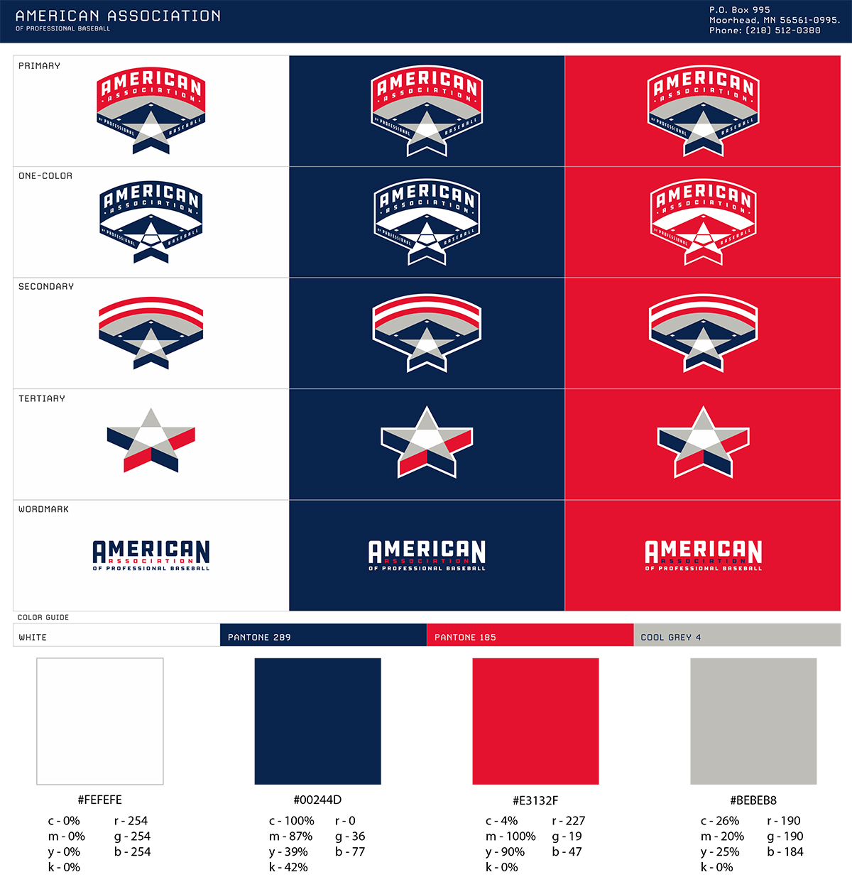
I wonder if they'll be adding that league logo to jerseys or caps.
-
4
-
-
This could be the single biggest upgrade of the decade.
I mean, wow.
-
12
-
-
I get it, I get it. I just don't like it.
-
12
-
-
2 hours ago, spartacat_12 said:
I would normally agree with you, but the Argos have used an A for so long that there's no changing it at this point.
If it helps you there is a small T in the negative space at the bottom of the A.
Yeah, doesn’t help.
And I know that it’s old. I’ll remember this the next time somebody accuses me of reflexively defending all old designs.

-
5
-
-
That’s such a huge improvement.
The only thing better would be swapping out the A for a T.
City initials > nickname initials.
-
8
-
-
On 10/1/2020 at 5:22 PM, Sec19Row53 said:
Gotcha. I hope it succeeds, but don't expect that it will. The assumption stated of fans wanting more football is wrong. Fans who want more football want more of THEIR football. That is far most often NFL or NCAA D-I FBS.
This is absolutely on point.All the new football leagues look to me like baseball in Boston. The Red Sox sell our every game, but that doesn’t mean the city is so desperate for baseball that a second team would be an automatic success.
-
4
-
-
On 8/25/2020 at 2:13 AM, osctheg said:
Is there a reason that the English Premier League is completely missing?
On 8/25/2020 at 7:07 AM, JayMac said:I think the Premier League does not allow for any use of its logos or its clubs' logos.
Yep. They sent Chris a cease & desist letter.-
1
-
-
4 hours ago, TenaciousG said:
MLS is just the worst. I kind of want them to collapse. Seattle and Portland and other cities that care will find a way to have a club still. Although I’m sure MLS will hold onto the trademarks for dear life even though they weren’t even the original creators in the aforementioned cities.
Fortunately they keep finding investors who keep finding more investors who keep finding more investors.
I wonder if there is a name for that kind of scheme...
Not what you're thinking. Because words mean things.
It's frustrating, because many of the recent unveilings have been very, very good. Austin, Miami, New York City, LA, Charlotte. All solid-to-excellent. But Nashville, Chicago and St. Louis are huge steps in the wrong direction. I guess we can say that all three of those at least use unique color schemes, which is why I'd put the MLS branding as a whole up against any other pro league in this country - no more clunkers than any other, and more color variety.
-
7
-
-
Here is St. Louis in context with the rest of the league.
I like the colors, but that badge is really not good. Bottom three in the league.
Which is really frustrating, since two of the bottom three are brand-new.
-
1
-
-
1 hour ago, CaliforniaGlowin said:
Is this April 1? Oof.
Minneapolis City has been on a tear since then, really having fun with it.
Now if they were really wanting to push it, they'd make that MpLS logo their avatar.
-
3
-
-
Quote
The new logo, at a glance, looks good but there is definitely a sense that “a diverse group of over 20 local designers”, as the press release states, had a hand in this and interestingly not one of them could explain what the angled lines under the Arch represent.
That is not surprising.
This is not a good logo.
-
8
-
-
1 hour ago, Digby said:
@Gothamite, if the backdrops of those squares are based on shirt color, Chicago ought to be changed, yes? (This is a correction that brings me no joy, maybe hold off til next year in the hopes that they sweep that whole thing under the lost-2020 rug.)
You are right, and I will correct that. That was a guess-slash-wishful thinking on my part, and I guessed wrong.
Thanks. I think.
-
38 minutes ago, Magic Dynasty said:
I'm almost certain their MLS badge colors will be red/pink/whatever on the top, blue on the bottom, with yellow in between. Basically the reverse of RSL's.
Possibly, maybe even probably. But I'm holding off until I see something from the club.
It's strange, because that usually gets released at the same time as the main badge. Charlotte put it in the reveal video, oftentimes it's a website graphic or appears on a piece of merchandise. But none the St Louis merch released so far has any MLS anything on it. No word, no logo, nothing.
-
Updated.
Just guessing on the Charlotte and St Louis shirt colors, and I'm not willing to guess on the STL MLS badge colors, so that one stays gray for now.
-
8
-
-
Whoops, St. Louis.
-
5
-
-
3 hours ago, Primzahl said:
is there an updated version of this?
2 hours ago, -kj said:I suspect @Gothamite will get around to it.
Ooo, that's an old one. There's been a several updates since then. New teams, one new badge, and a couple updated shields have since been changed.
Here's the most recent version, I just need to patch the placeholders for Charlotte and St. Louis.
-
5
-
-
Yes, but they're also about to move into a new stadium. Which makes this pretty standard timing.
:no_upscale()/cdn.vox-cdn.com/uploads/chorus_image/image/65134531/0F9F8F38_9BEE_453B_B257_D91E9A6FFFCC.0.jpeg)


NFL Changes 2021
in Sports Logo News
Posted
Jerseys are never used as standalone graphics in newspapers, on websites, and as part of television coverage. Helmets are.
Which means there's a pretty significant difference.
I mean, this is a pretty standard image in football; the helmet face-off. You don't see this with baseball caps, or basketball shorts, or hockey sweaters, or even football jerseys. Only helmets.