


Gothamite
-
Posts
36,227 -
Joined
-
Last visited
-
Days Won
277
Posts posted by Gothamite
-
-
I know it's not new with this rebrand, but I really hate styling the name as "Ualbany".
-
 5
5
-
-
18 minutes ago, Krz said:
I honestly hate the argument that this “won’t change anything”. No one is claiming that the black W or dropping redskins will solve everything. The truth of the matter is that these teams aren’t part of the government, and their actions hold no real political power. So when we argue that the actions have no value and won’t contribute to further legislation, it undercuts the real purpose of the change and leaves some mad at the team for something they can’t control.
More than that, I think these types of actions can and sometimes do result in real change.
Marriage Equality was a punchline until enough Americans said "wait, why can't gay couples get married?" Which happened in part because lots of people and companies started normalizing it. A whole bunch of seemingly empty gestures added up to change minds.
The more we can normalize companies and schools and individuals saying "yeah, systemic racism is a real thing", the more likely it becomes that we'll muster the political will to actually do something about it.
Individually? Yeah, probably pretty meaningless. But taken collectively, they can literally change the world. So I'm loath to dismiss any of them, no matter how self-serving or crass. If entities feel pressure to do the right thing, they're still doing the right thing.
-
5
-
-
It's a gorgeous flourish, and I'm glad that the University has adopted it as a symbol. But even though the inspiration for the logo comes from the Field House, I'm not aware that it's ever been considered an athletics mark. I'm pretty sure they designed the logo as something for the University as a whole.
-
46 minutes ago, doctorpeligro said:
It’s a relatively simple change to make. The administration would have looked like d*cks if they hadn’t agreed to it.
The biggest problem: for how long do they have to keep using it?
Well, that's always the issue. We're still stuck with many of the empty gestures inaugurated after 9/11, and some of the ones we were able to get rid of lingered until the last couple years.
I think the University would be best off saying "We're doing this for the _____ season/school year, to recognize this moment in our nation's history." Make it clear that it's a temporary tribute. Leaving it open-ended makes it hard to remove without seeming like you no longer care about the issue or that you're dumb enough to think the issue has been solved.
-
2
-
-
Thank you - I don't remember that at all.
Were you thinking of this one?

-
Ah, the Badgers’ website has this extra tidbit:
QuoteEarlier this summer a number of current and former Badger student-athletes publicly stated their desire to wear the university's "Crest W" on their athletic uniforms. The "W" in the crest is white, but will be changed to black on Badger athletics uniforms. UW Athletics officials worked with student-athletes to also include a black Motion W that will also have a presence on select athletic apparel.
Interesting. But I’m not surprised they’re also playing around with the, um, the athletics “W”.
-
2
-
-
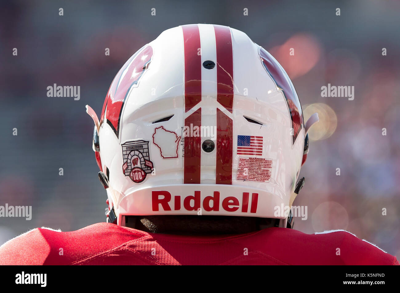
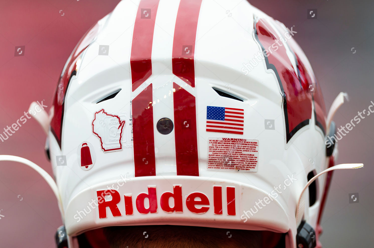
Is it on the helmet?
They might replace the state outline. Or it could just go where the anniversary logos go.
-
1
-
-
Fair enough.
I’m sure there are people who like the old Sabres logo and don’t prefer the term “Buffaslug”. But there we are. I see people refer disparagingly to the Brewers’ glove logo (which I have fond memories of, even if it’s not my favorite) as the “paw”.
I really don’t mean anything personal by it. It’s just a catchy nickname.
-
Maybe. Although that would have been harder to read.
Interestingly, Bucky's not on the football uniforms either.
-
11 hours ago, MCM0313 said:
It’s only on the university crest apparently. I didn’t even realize that was on their sports uniforms.
It hasn't been in the past. https://brand.wisc.edu/print/logos/
This is the "institutional logo", used in different versions by the University as a whole.
It is separate from the sports branding, which uses Bucky Badger and the motion-sickness W.
Those are only ever used by athletics, not the university itself.
I'm not aware that UW has ever "crossed the streams" like this before, using the institutional logo in a sports context. Wonder if this means the school will be using the black-W version in other applications; otherwise, why not just reverse the black and red on the helmet logo?
-
1
-
-
Look, we all know that nothing can get better until January.
But until then, we can all agree on one thing: this is so much better than the motion-sickness W.

-
1
-
-
On 6/26/2020 at 9:39 PM, Bobster said:
"a war between opposing groups of citizens of the same country"
It doesn't necessarily mean the American Civil War.
But I'm sure an institute of higher learning knows that already....
Ooo! I’ve got one too!
noun-
destruction or slaughter on a mass scale, especially caused by fire or nuclear war.
And yet, despite those dry words, when you capitalize it everybody knows you’re taking about one specific Holocaust.
The Civil War they're referencing was literally a fight against white supremacy. Not exactly the kind of thing we should be making light of by associating with a college football game.
-
11
-
-
Yes, that tilt at the top is real. And yes, it’s really poorly done.
-
2
-
-
I mean, this is bad.
It would be pretty good, except for the bizarre tilt to the top of the letters. Looks stupid when the C is by itself, and worse when the CLT are together.
-
10
-
-
Both true. Not every stadium can provide the bones to support a continuing series of renovations. But Angel Stadium absolutely can.
-
5
-
-
There’s absolutely no reason that the stadium can’t continue to be renovated. Dodger Stadium is still one of the jewels of baseball.
-
9
-
-
You’re absolutely right.
The uniform feels so cohesive in its final form that it really surprises me to learn that they got there by taking several small half-steps. Really impressive.
Those numbers, though - hate the oversized serif on that “1”.
-
4
-
-
Here's another look at the prototypes:
And here's what they actually wore.
I never knew that the logos and numbers were chainstitched.
-
2
-
-
Maroon and turquoise are a great color combination. That's a good call.
-
7
-
-
Those aren't pythons, they're cobras. And yes, I think @SFGiants58 is correct. To the extent there was actually a justification for the snakes other than "Looks kewl! And this is the 90s!"
-
4
-
-
On 5/24/2020 at 11:07 AM, mcrosby said:
Those are fascinating. I love the idea of using Mrs. O'Leary's cow, even though bovine iconography is pretty well covered in their neighbor to the north.
Just to keep these Fire concepts in context, this was Nike's original plan for the club:
-
1
-
-
Guess mine is the unpopular opinion, because I think this is a downgrade across the board.
The new blade reads less like a skate, and downplaying the diagonal makes the Q look more like an O.
-
Quote
That said, the new logo — which will be unveiled on June 5 alongside a new custom typeface — will not replace the Fiat Slug used by the UC Santa Cruz bookstore or the mark used by the school’s department of recreation.
Good.
-
The Athletic has an article about the Giants' aborted move to Toronto, accompanied by this graphic:
That cap looks very 1953 Tokyo Giants.
-
5
-


The Case for Restoring the Proper Detroit Tigers Home Uniform
in Sports Logo General Discussion
Posted
Good luck! Hope you can get the Tigers to reconsider their really dumb decision.