


ManillaToad
-
Posts
1,857 -
Joined
-
Last visited
-
Days Won
4
Posts posted by ManillaToad
-
-
55 minutes ago, gosioux76 said:
But it also shows how willing MLB is to turn a blind eye to an organization's predatory side just so it can get exposure to its audience.
nike uses child labor in sweatshops and you're worried about MLB partnering with a site because it caters to dudebros who like racy jokes and gambling on their phone
-
 1
1
-
 1
1
-
-
I disagree with the others about the helmet logo, the TB seems more like a sort of goofy secondary logo. Maybe if it was just the letters without the hat it could work on the helmet, but for me the horse rider fits much better, has been there for a decade, and looks even better now that it's been enlarged
-
3
-
-
-
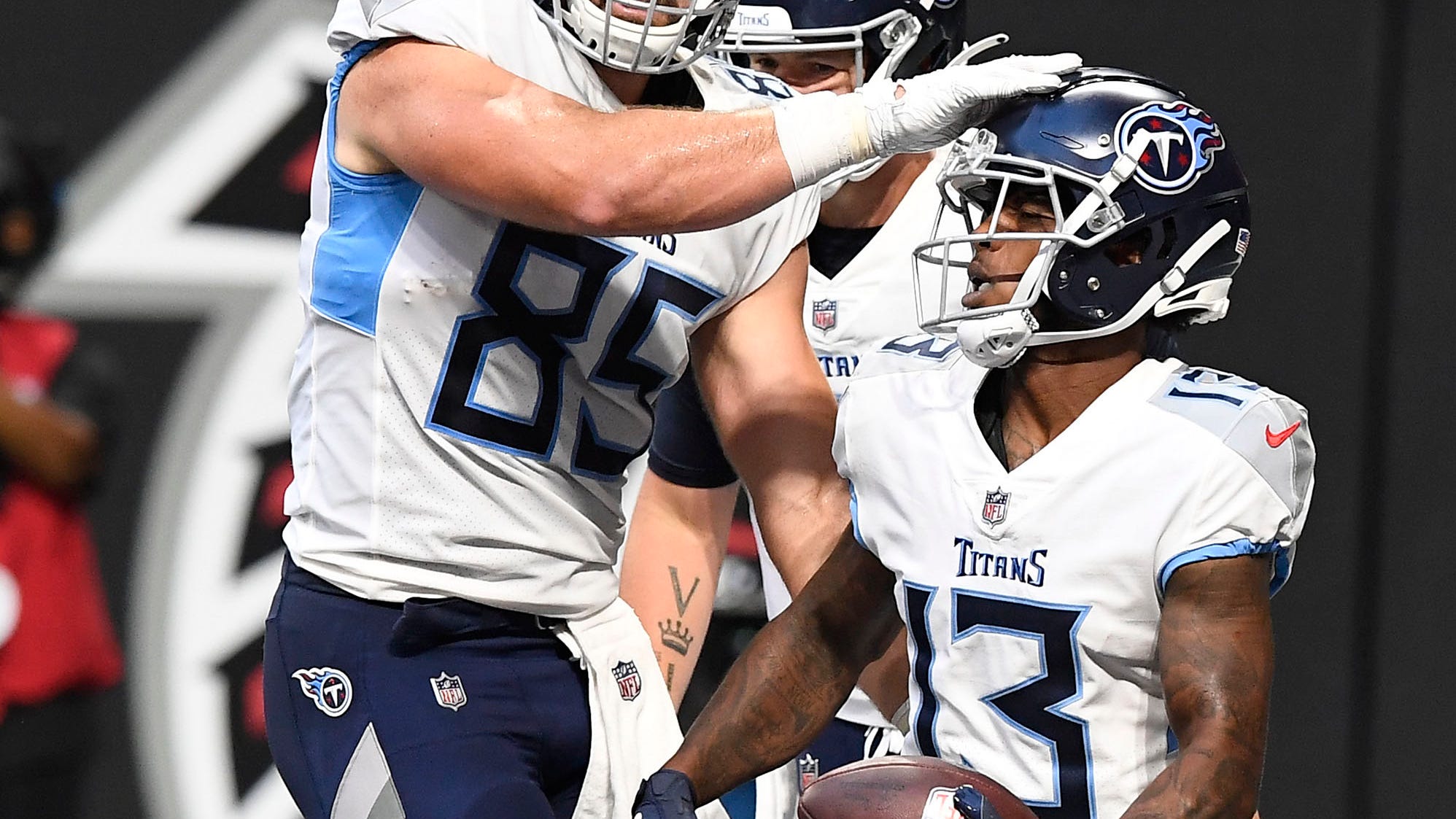
4 hours ago, nuordr said:
Let's hope that NO side panels occur on any colored jerseys. For example, the Titans side panels are trash:

Did they give a reasoning (nikespeak or not) for the pit stains when they debuted these unis? What could they have possibly been thinking when they decided to put them in the uniform?
-
1 hour ago, Meshmaster101 said:
oh lord alt helmet shells got approved be prepared to see
 like this on social media lol
yo these are clean

-
7
-
-
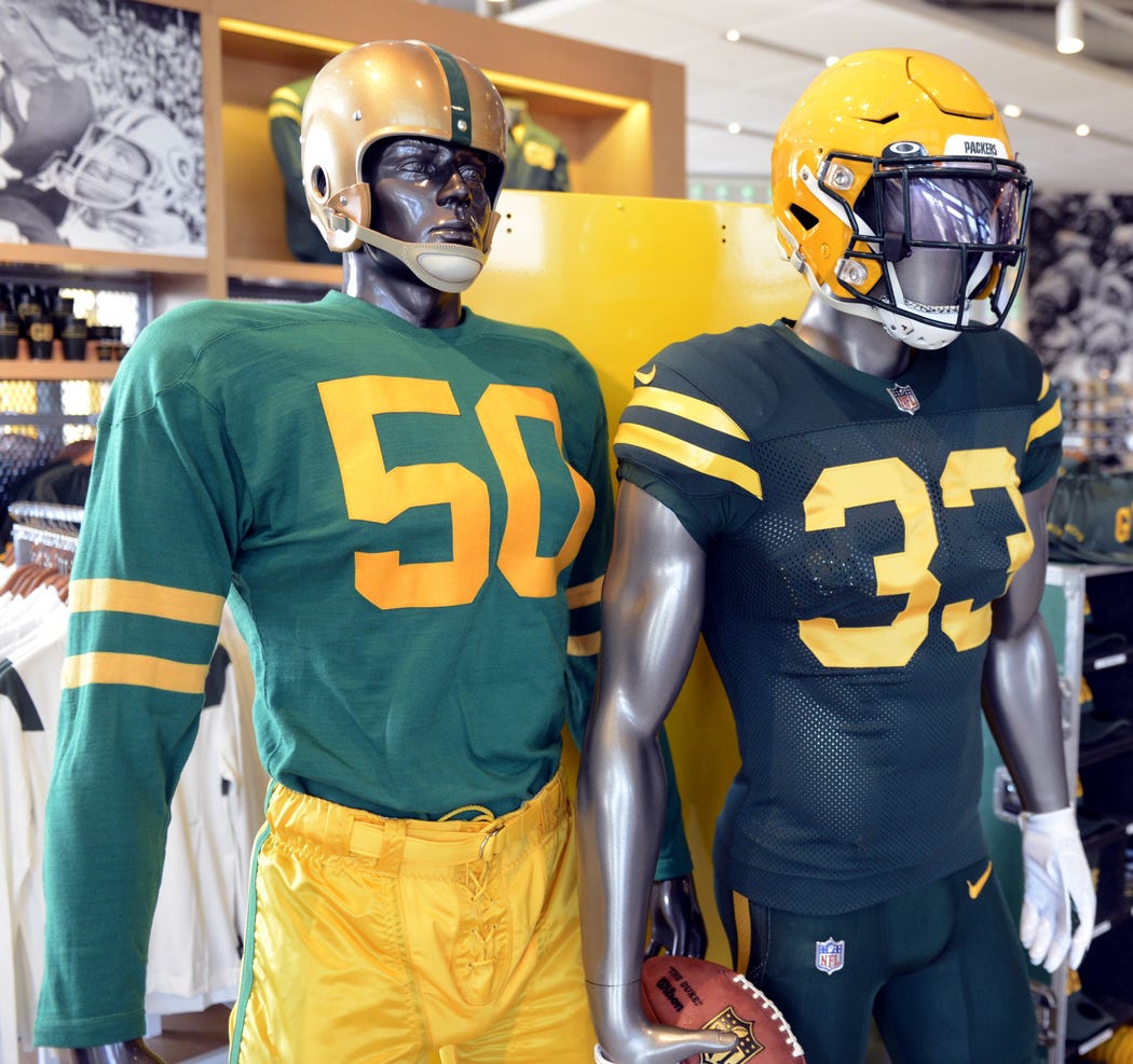
3 hours ago, Gothamite said:
So this is how the Packers are promoting the new alt in the Pro Shop, alongside a reproduction of the 1955 uniform.
I’m guessing the Hall of Fame didn’t have a mannequin in the 1950 uniform this actually recreates.
Lol wtf, it isn't even close. They clearly just wanted an excuse to make a green monochrome uni to be ugly alongside their white one.
-
4
-
-
2 hours ago, Gothamite said:
honestly, monochrome is the only real issue with these. The jersey is absolutely fine on its own.
Monochrome is the reason they're so well received
-
5
-
-
A color rush by any other name

-
6
-
-
Those are all solid names IMO. Logos are... eh...
-
9
-
-
1 minute ago, EddieJ1984 said:
Sorry but if you've stopped watching MLB because of a Nike swoosh on the jersey (Oh no how DARE I say the name of the company!) you weren't a real fan of the sport to begin with.
I put "manufacturer" in quotes because nike just slapped their logo on the majority of uniforms that were made by majestic. Which I believe makes them no different than your typical corporate advertising patch
 I apologize for not saying the name of what is apparently your favorite apparel brand, I didn't realize it would upset you this much. I also didn't mention the various other reasons that went into why I stopped watching baseball because they're all off topic.
-
4
-
-
1 hour ago, mcj882000 said:
I genuinely dislike how much advertising creeps into literally everything anymore. Frankly I envy y'all who say this isn't a big deal, because I've found uniform ads in the NBA and NHL so distracting that I have to turn the games off after a while; they just steal my focus that much. It sucks and I hate it.
Yeah I hate to say I envy people who don't care about ads, but I do a bit because I was in a constant state of frustration watching last season's playoffs and seeing those damn helmet ads every 15 seconds. I straight up stopped watching baseball because the "manufacturer" ad on the front annoyed me that much. No way am I toughing it out once the sweaters get patches
56 minutes ago, DC in Da House w/o a Doubt said:Thanking my lucky stars that the Caps won their Cup without GEICO on their uniform.
Oh man I can't be more thankful for the timing of St. Louis' Cup. Pre-helmet ads, pre-jersey ads, pre-covid.
-
1
-
-
2 minutes ago, philly97flyer said:
Maybe reading comprehension is difficult, so I’ll explain again. I’m not “flaming” anyone for not liking an ad creep. I don’t like the ad creep either. But to blame posters on this board and other people on the internet for this is some real galaxy brain stuff. Also, billionaires don’t bother me, and I really don’t care what anyone thinks about it.
Not liking ad creep but defending it online - for free - seems like a galaxy brain way to spend your day.
-
5
-
-
1 minute ago, philly97flyer said:
Yes I am SHOCKED that the masses are not rushing to the streets to protest…(checks notes)…ads on NHL jerseys. Also the people who are complaining about this were probably the most pro-lockdown people over the last year+, so guess what? That lost money has to be made up somehow. Welcome to the real world, bud.
Lmao if you're gonna rush to a sports aesthetic forum to flame the users for not liking ad creep you should get some better material than the same old "MUH LOST FUNDS" we always hear. Maybe you would have a better time feeling morally superior in your defense of billionaires on sites such as reddit or twitter.
-
10
-
-
1 hour ago, fouhy12 said:
What we were all afraid of with the helmet ads.
See ya NHL, it was nice following you

-
2
-
-
5 hours ago, JTernup said:
I get what you're saying about the Chiefs but what is the better alternative? They have kept their classic uniforms essentially unchanged for the entire existence of the franchise (I know there have been striping, number outline, TV number placement changes) so if you want a throwback it's going to be a minor detail like the facemark changing color.
Or they could be like many other teams in the league which have diluted and/or changed uniforms so much that fans are clamoring for throwbacks.
I'll take the Chiefs strategy over what a team like the Dolphins has done. Sure, we get great throwbacks occasionally but it's been at the expense of decades of uniforms that weren't as good as the throwbacks.
They should do a Texans throwback like they did for the AFL 50th anniversary. Shouldn't even need the two helmet rule thing since it's just a decal swap. They're even playing Dallas again this year
-
6
-
-
1 hour ago, Ridleylash said:
Jets officially retiring the Aviator Blue alternate in favor of the dark Heritage jersey as their new third jersey.
Those clips of the Jets in heritage blue playing Calgary in their throwbacks-turned-full time unis

-
8
-
-
16 minutes ago, mattr1198 said:
Based on the uniform schedule, looks like save for a 10th anniversary SB XLVI day versus the Rams, the Giants are dumping their gray pants on the road uniforms, going for white-on-white full time this year. Feels like a long time coming imo.
LAME
-
7
-
-
15 minutes ago, Delicate Genius said:
The Argos need some stripes on their jerseys.
This is the sloppiest looking pro uniform I've ever seen. I would have guessed this photo was taken during practice
-
1
-
-
1 hour ago, PlayGloria said:
I will never understand how the Caps still have that damn piping. Especially with the jerseys that they have from their history to choose from. They continue to wear literally the worst jersey of their history. They Flames did that too until they just perfected their look. The Flames are definitely top 10 in the league now
I'd bet it'll be changed within the next 5 years, either after Ovi retires or when he's got a year or two left
-
-
8 minutes ago, Stroboy said:
Well that's certainly unique. I don't hate it -
Looks good

-
RIP another name-changer removes the helmet stripes for no reason
-
33 minutes ago, Bruins said:
Probably an unpopular opinion, but anyone else kinda bummed the howling coyote is dead? It was a really unique modern look, well-executed & stately, and the shoulder patch kicked butt. Brick red really worked for the desert too.
We'll probably never see them again, and that's a shame. They're another helpless victim of the Retro-Trend Machine, which has done a lot of good for the league's looks (CGY, BUF, PIT, etc.) But I think those were all pretty clear upgrades, where as the 'Yotes are a team that had a really nice look going, and are ditching it to chase a fad that's growing staler by the day. I understand jersey sales are important here, but now they'll only have 3 to sell, from 4.
Not to mention how well the kachina complemented as an alternate, and I still can't put aside how muddy they look on tv.
Just my 2 cents.
Yeah it's a nice logo. They should keep it as a permanent secondary logo


 like this on social media lol


Your worst days of your life as a sports fan v2
in Sports In General
Posted
How did being a Nashville/Houston/Dallas/Dallas fan happen