


ManillaToad
-
Posts
1,877 -
Joined
-
Last visited
-
Days Won
4
Posts posted by ManillaToad
-
-
1 hour ago, BBTV said:
but the league drew a line in the sand that said "if you have an outbreak, you forfeit and pay the other team for lost revenue"
That was only if the outbreak was caused by unvaccinated players. Every Browns player who tested postive is vaxed
-
3 hours ago, QCS said:
The real solution to fixing the Rangers is to change the name.
They did, look at the post below yours. They're the Ŕangers now
3 hours ago, MJWalker45 said:
They had it before, then went with the state flag on the sleeve instead.
The problem with this one is that it's ugly
-
 3
3
-
-
9 minutes ago, Sodboy13 said:
I mean, it's "real," in the sense that the past two seasons of The Spring League got primetime slots on FS1 and FS2, and the FXFL actually existed for a season or two or whatever. That doesn't mean it's worth your time or attention for anything more than a casual flip of the channel to the Birmingham Spring Scrimmage League on a night when the schedules for the other sports leagues are very light.
I would rather watch C-tier football than any other sport
-
1
-
-
1 hour ago, Mingjai said:
Maybe my aesthetics are shaped by being a fan of college hockey, but I think shorter words look worse diagonally than longer words. I also don't think that the Rangers should own such a traditional hockey look just because they're the NHL team most associated with it.
All of those NHL ones look great imo
-
I like it, looks like it could have been one of the 70's SB logos
-
3
-
-
Why do the Rams get 1.5 billion people and an entire continent lol
-
28 minutes ago, tBBP said:
• Since being in Tampa, Tom Brady is 0-for against the Saints. We'll see what happens with that this coming week.
In the regular season*
28 minutes ago, tBBP said:• Something I've been curious about, but..how is it that somehow, Dak Prescott gets and has gotten the pass to continually be referred to by first name by all the media pundits (and fans in here)? Like, what is that really about?
Lamar, Baker, Cam, Mac, Russ, Jameis, Tua. Happens all the time
-
6
-
-
Bring back the Ranger ball as an alternate logo
-
3
-
-
If Gary wills it, it will happen

-
All I'm saying is, imagine the Scouts' KC logo on the kachina pattern jersey. It's worth the embarrassment of a mid-season relocation. Gary, give me this one thing before I stop watching next year and never have a good thing to say about you again. Praise Gary
-
16 minutes ago, IceCap said:
Patrick Roy probably helped there.
First,
 the Detroit Red Wings.
Second, any division that's "Boston, Buffalo, Detroit, Montreal, Ottawa, Toronto...oh and also Tampa Bay and Sunrise, FL" is a joke.
Third, the Metro is a dumb name.
Forth, so is the Atlantic if you actually look at where the teams are located.
Fifth, these divisions have led to a dumb playoff format compared to the relatively simple one before.
Sixth, the NHL is so in love with these dumb divisions they're going to keep a team floundering in the Sunbelt just to maintain them.
Seventh,
the Detroit Red Wings.
Boston, Buffalo, Detroit, Montreal, Ottawa, Toronto...oh and also Nashville, TN and Raleigh, NC doesn't sound much better tbh. The EC division names aren't good, you're right there
-
3 hours ago, IceCap said:
The Wings were the Leafs' biggest rivals after the Canadiens but I think the Bruins have supplanted them in that spot in recent history.
I wouldn't miss them if they went out west, is what I'm saying.
The NHL division alignments are a joke anyway. And if moving the Coyotes to Quebec City is what blows it all up and forces the league to start again then so be it.
I've never seen such a blatant attempt at artificial crowd inflation then sticking Tampa and Florida in a division with Boston, Buffalo, Detroit, Montreal, Ottawa, and Toronto.
And yes I included Tampa. They draw plenty well on their own, but there's always a strong visiting fan contingent when a team from up north comes down, and I have to think the league was aware of that revenue influx.
Point is the current NHL divisions are dumb, and should be redrawn anyway.
I don't see what's so bad about the divisions. The Pacific and Central are as good as you can get them geographically, the Metro has the 6 core teams that all have good rivalries with one another, and the Atlantic has the three Canadian teams + Bruins who should all be together. Nothing about where Buffalo, Detroit, Carolina, Columbus, and the Florida teams are placed seems egregiously bad to me.
-
1 hour ago, kiwi_canadian said:
and one of either Boston, Florida or Tampa to the Metropolitan Division
Boston definitely isn't moving out of Montreal's division. I imagine Tampa would pull the "Screw you we won back to back Cups" card and Florida would be forced to hop divisions
-
Zimmer is getting fired lol
-
GARY YOU KNOW WHAT NEEDS TO BE DONE!
-
1
-
-
3 hours ago, DTConcepts said:
$20 says that in an alternate universe where the Islanders didn't have the most dominant dynasty in hockey history, the fisherman jerseys would be looked back at just as fondly as the Caps' screaming eagle jerseys, the Mighty Ducks' inaugural jerseys, or the Coyotes' Kachina jerseys. Each of those designs are recognized as some of the best in NHL history, and they each do something outlandish and/or entirely new in the confines of jersey design.
If you're arguing that people only hated it because it replaced the dynasty logo, then that means the "trying something new" aspect you praised was literally the worst part of the uniform lol. Dynasty logos have been replaced before. People hated this uniform because it is UGLY
This is straight up minor league. It's embarrassing to look at and doesn't belong in the NHL. Comparing it to the kachinas or the screaming eagle is crazy.
-
1
-
-
1 hour ago, DTConcepts said:
In a vacuum, the logos were good and the jerseys were stereotypically 90s.
The logo is terrible and the jerseys are sterotypically 90s in the worst way possible lol. What's the point in giving something credit for doing something new if that new sucks?
-
9 hours ago, AFirestormToPurify said:
And to no one's surprise, they're just as underwhelming in action. The red outlines are barely visible. Too many thin stripes. It's a shame cause they were about two or three red stripes and a classic NJ logo away from being decent
Fisherman is still worse
-
8 minutes ago, flyersfan said:
Also, something I noticed on the Browns, is the 7 having half of the serif missing. I know it was a nod to classic looks on the primary, but they kept it consistent on the throwback too. Awesome attention to detail and if it wasn't applauded for before, I'm applauding it now.
I didn't get the hype for the throwbacks at first but once I saw them on the field I was a big fan
-
4
-
-
Baltimore having 8 wins despite how poorly they've played in some of their wins is a testament to their good coaching
-
3
-
-
9 minutes ago, DoctorWhom said:
Poor Lions. They ruined their perfectly good Tank.
Even when they win, they lose.
?? They still have the #1 pick
-
1
-
-
10 minutes ago, dont care said:
It’s navy, not midnight navy but navy none the less. It certainly isn’t royal or anywhere close to it. And with the limited number of textiles available to teams going with navy is by far the better choice.
The color of the flag notwithstanding, certain RWB teams would look better with brighter blues than navy
-
2
-
-
6 minutes ago, dont care said:
Well the flag is navy so yea that makes sense.
Nah it's brighter
-
2 hours ago, flyersfan said:
The RWB scheme is almost overused in American sports (esp. Baseball).
I hate when teams say they have a RWB color scheme but the blue is navy. It makes sense for the Texans because the Texas flag uses navy, but it's so stupid for teams like the Pats and Nats who are obviously trying to evoke the US flag colors
-
1
-


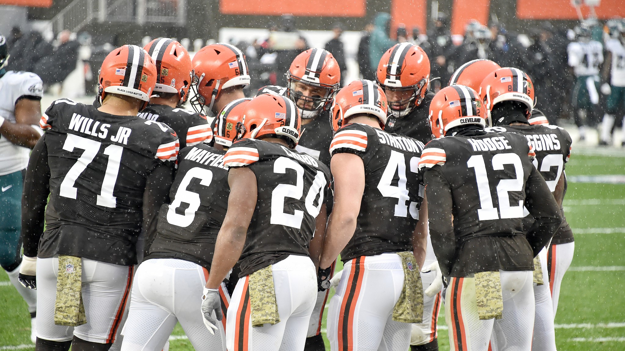
/cdn.vox-cdn.com/uploads/chorus_image/image/37158396/20140308_jla_sv7_139.0.jpg)

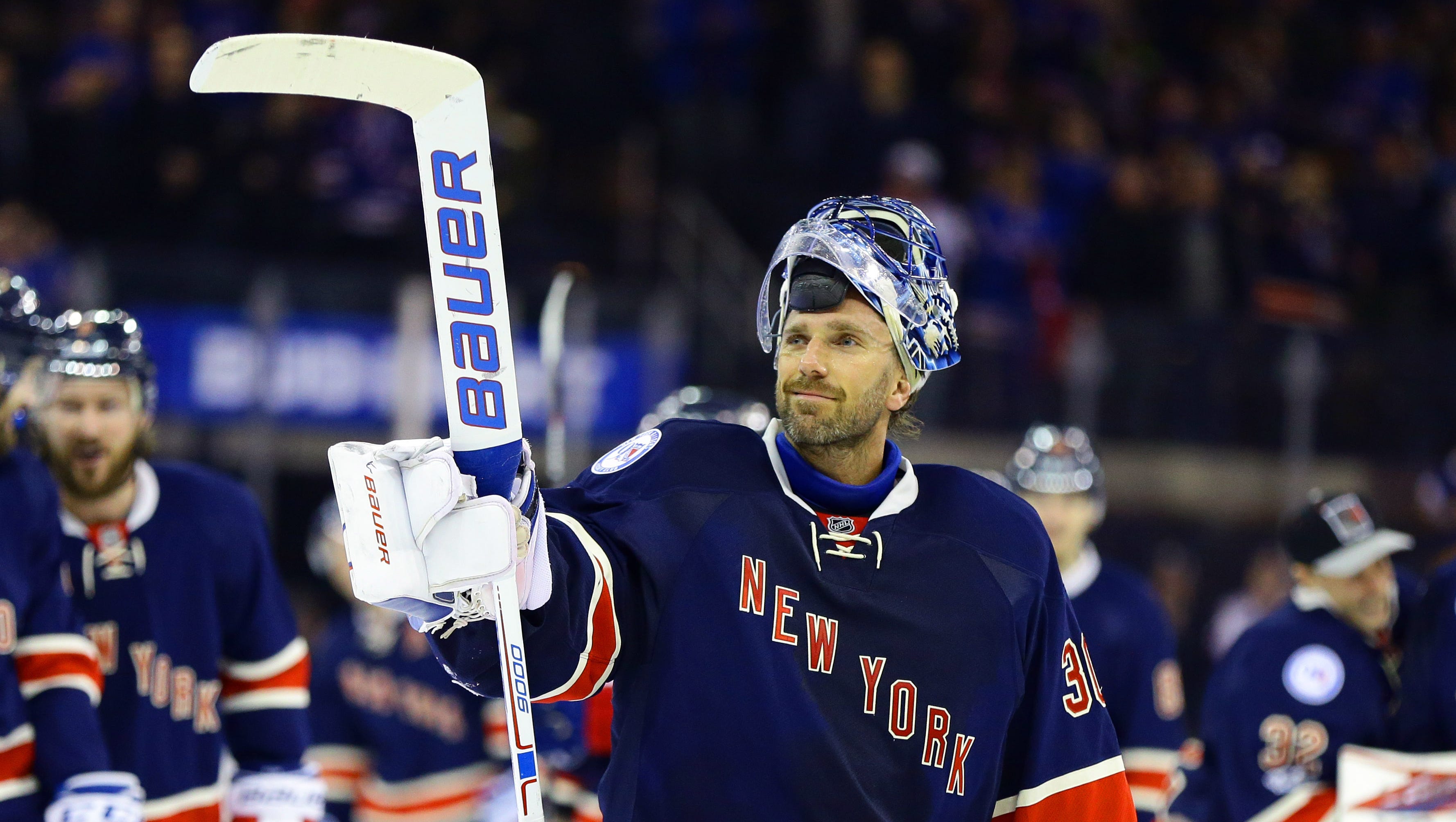


/cdn.vox-cdn.com/uploads/chorus_image/image/55058275/111938198.0.jpg)


Worst NFL Uniform Matchups of All-Time
in Sports Logo General Discussion
Posted
Oh my God I forgot this uniform existed