


AFirestormToPurify
-
Posts
913 -
Joined
-
Last visited
-
Days Won
2
Posts posted by AFirestormToPurify
-
-
6 hours ago, AndrewG70 said:
When you go to your local team store, you most likely will be shopping for a jersey and not a helmet.
He's not talking about shopping for a jersey, he's talking about watching the game. What a weird analogy
-
 1
1
-
-
4 hours ago, ManillaToad said:
They just made $650 million from Seattle. There are more ads on the ice, ads on the glass, ad banners by the scorebug show up throughout the game. More split-screen ads every time there's a slight lull in play. Not a single team would face serious financial hardship if they got rid of the helmet ads.
edit: Lol I forgot about the huge ESPN deal too. The NHL is rolling in money right now.
Greed. It's always been greed. I've said it from the beginning, it really isn't surprising at all that the helmet ads are sticking around
-
6
-
-
1 hour ago, ldconcepts said:
Hm, if it were up to me, the only thing I’d change about their current home and away jerseys is to go back to the yellow-black-white-black-yellow stripes on their away jerseys. Anything more than that is an overcorrection IMO, the spoked B with serifs is the best iteration yet.
They also need to go back to yellow socks with the black jerseys but agreed, they need a little more yellow on the away jersey
-
3
-
-
2 hours ago, CreamSoda said:
Strongly disagree. The aways are helped with the blue equipmentOh. Well I guess if you like the jorts then there's no point in continuing this discussion lol. Let's just agree to strongly disagree then
-
3
-
-
3 hours ago, CreamSoda said:
Nope, no way. The blue looks so much better.
Looks alright on the home jerseys but it's really just a lateral move at best imo. On the away jersey the blue pants and glove look objectively awful, though lol
3 hours ago, Nordiks_19 said:Nope, they finally made the right move. The only thing they need to do now is add a blue line on the road jersey, and make the numbers blue
And we all know they're not gonna do any of that and the blue gear will keep looking out of place on the away jerseys. More than the black gear ever did
-
41 minutes ago, Cujo said:
Need the Avs to abort the blue helmets and jorts, go back to BFBSish

Tick one of the following boxes
□ Yes
□ Also yes
□ All of the above
-
4
-
-
1 hour ago, BeerGuyJordan said:
I agree that it does look pretty good, in a vacuum. My main gripe is that there's enough blue in this league. I would have preferred to see them be a bit more adventurous, avoiding primaries that leaned too heavily into blue, red, or black.
Nine teams have home jerseys in some shade of blue (BUF, CBJ, NYI, NYR, STL, TBL, TOR, VAN, WPG). Depending on how close you consider teal, maybe you can lump SJS in there.
Three more have an alt (COL, EDM, WSH)If you want to throw the RRs onto the pile, we can add FLA and MTL.
There's just nothing about them that sets them apart from the pack. For all their other issues, Vegas knows how to stand out and their home set is sharp.
I wish they would have at least picked one color that's never been seen before or very rarely in the NHL. Lime green, salmon, anything. I love how Vegas went with steel grey and their color palette is instantly recognizable. I still hope their gear isn't solid blue at the very least. Now that would be boring
Edit: I know, seafoam is technically a new color but it's really just another shade of light/powder blue and the double blue combo was cool 10 years ago but now it's just overdone. Basically, they're just yet another red, white and blue team, except with a subtle twist
-
2
-
-
3 minutes ago, Morgan33 said:
You can't be the leagues de-facto teal team and have barely any of the colour on the your primary logo... Adding more teal was the one thing the 2007 re-design did right.
Yeah I guess I can see where you're coming from. Anywhere but ON the shark could still work, though. Maybe teal eyes? lol. Never liked the teal nose. Then again, the Blackhawks don't have any tan on their jersey and no one is complaining, the Sharks don't really need teal in the logo other than the outline of the triangle imo
-
40 minutes ago, NYRFan said:
The entire slate of California teams needs to make changes to their primary and/or away unis. While I kinda get the Kings and Sharks standing pat for a moment, the Ducks staying status quo is brutal.
With the Yotes, Flames, and Sens going full retro starting next year, the California teams have the distinction of the worst primary/away sets in the league, along with the Caps, for my money.
Agreed, the Ducks really need to bring back those '03 uniforms, with the eggplant and jade gear and the shoulder patch. And unfortunately, the Caps won a Cup in those jerseys so they probably won't start thinking about a redesign until Ovechkin retires or moves on and they start rebuilding. But yeah, they look pretty dated
9 minutes ago, DTConcepts said:... So just this jersey with their modern logo?
Please no. The OG logo is easily the best part about that jersey. The updated logo with the teal nosed shark looks way too cartoony with the wonky triangle and wacky proportions, it just looks awful. They just need to make subtle adjustments to the stick and leave the rest alone
-
2
-
-
14 minutes ago, Morgan33 said:
and add some teal highlights to the Shark.
I was 100% with you right up until that part lol. Just no, leave the shark alone, it was perfect
-
1
-
-
49 minutes ago, Nordiks_19 said:
Hopefully the Sharks will keep their much, much, much better Throwback jerseys around and make a full switch within 2 or 3 years. But after reading the Jersey watch, looks like i'm wrong..
Extremely disappointing. Why keep that crappy stealth jersey around if it's already been shelved for a year and you have not one but TWO better options? Mind boggling. The modernized logo still hasn't grown on me after all these years and neither has the orange trim. They got it right the first time and the late 90s redesign was pretty good for the era, maybe it would look a little dated now, but the Edge jerseys were massive downgrades imo
-
3
-
-
Full disclaimer, I'm a casual football fan at best so I have no idea if this is actually an unpopular opinion or not, but solid colored socks have really grown on me. Especially when they're not the same color as the pants but sometimes I don't mind the leotard look. So much better than the alternative, which is nearly every player wearing his socks "incorrectly". Solid socks are probably seen as a nothing more than lesser-evil option on here I'm guessing?
IMO, these look good
Say what you want about the Rams, they look better than the Cards in this one, mostly because of the Cards' outdated jerseys but also because they're all wearing their socks differently to the point were it just looks uncoordinated and random
What the hell is this?
Again, say what you want about the mono-black look but at least it looks like a uniform in every sense of the word. There's a cohesive element here, all the players wear black pants and socks and they look like a team
Last example, the Lions look so much better than the Texans here. Just a more complete, cohesive and professional look
-
4
-
-
6 hours ago, selgy said:
I dont think any of the Patriot unis have been good
6 hours ago, ManillaToad said:I think all of the Patriot unis have been good
The duality of man
-
11
-
-
2 hours ago, ManillaToad said:
I figured even the people who are okay with the "of Anaheim" don't like the "Mighty" part
I like both lol. Some people don't like the "of Anaheim" part?
 I guess I've been living under a rock all along
-
5 hours ago, ManillaToad said:
the Ducks should still go by Mighty Ducks of Anaheim
Unpopular opinion?
-
15 hours ago, Magic Dynasty said:
From now on every time that picture of everyone with gray facemasks gets posted I'll just post this new and improved one.
So is it just me or do the Panthers really need to switch to light blue helmets? The logo would need a white outline obviously. And there needs to be at least another red helmet team. Even just one. Falcons or Bills, whatever. Not enough red in this league imo
-
4
-
-
On 3/7/2021 at 1:45 AM, DustDevil61 said:
I don't know if it quite fits here, but the Winnipeg Jets' (v2.0) overall identity has really grown on me. The logo seemed underwhelming when it first came out, but it, along with the home, road, and alternate sets, by and large was designed (intentional or not) with a certain level of staying power, which is especially ironic given how quickly everything was apparently put together.
That's an unpopular opinion? I think their current set with the light blue alternate is a modern classic and better than what they used to wear in the 90s and 80s
On 3/12/2021 at 10:00 AM, WSU151 said:One of the few NHL teams where the away/white jersey is more interesting than the home (and I was impressed when I saw someone on the street wearing one...it looks great in person).
In 2011 I was hoping for a return to an 80s or 90s Jets look, but the current set has aged pretty well.
Agreed. Their white jersey does look great
-
2
-
-
On 3/9/2021 at 9:07 AM, _J_ said:
they had the pens in black helmets for the RR, but they're using white.
Right I forgot about the Penguins. Still, only one or two small mistakes is impressive for EA lol
-
1
-
-
2 hours ago, monkeypower said:
Well, that's not for certain yet. The Ducks have yet to put out anything about what the Reverse Retro getup looks like, besides the jersey.
The dark socks, and the pants for the matter, come from NHL 21 and we all know EA's uniform track record with uniforms.
EA have been surprisingly spot on so far with the RR jerseys. I'm really hoping this one is just a mistake. Dark socks would look awful with white jerseys and helmets
-
1 minute ago, Gothamite said:
That’s true. But in the NFL’s case, only the cheapest level has printed numbers. So I’m pretty confident that they don’t represent “98%” of jersey sales, which was the claim that started this digression.
Oh I totally pulled that number out of my ass lol but the point is, what the players wear on the field/ice is kinda irrelevant to us since we don't even have access to those jerseys cause even "authentics" aren't even close to what the players wear in most cases. Especially in football with the baggy cut and 3/4 sleeves "authentics" vs form fitting and short sleeves on field jerseys. All the tech and breathability in the world don't really matter if you're just watching the game on your couch
-
1
-
-
On 2/25/2021 at 10:01 AM, Gothamite said:
Do they?
Honest question, I have no idea. Would love to know what the breakdown is between the various levels.
It would be next to impossible to find reliable stats across different sports but counterfeit jerseys blur the line even further. To make matters more complicated, basketball and football have mid level options (swingman) available. Anecdotal evidence but when I go to hockey games, I see more knockoffs than replicas and authentics are excessively rare. When I go to CFL games, it's 99% replicas and 1% game worn since it's such a small league that counterfeiters don't bother making fakes and game worn jerseys are actually priced reasonably lol
-
1 hour ago, O.C.D said:
I think these outfitters are using adjective word salads in order to sell fans a bill of goods while they're saving money on mass produced jersey's. In comparison to what they used to sell fans, these new uniforms look cheap in design and in execution. This isn't even exclusive to the NFL. MLB and NBA have done the same thing (much less experience with NHL). I've got a closet full of what those leagues used to offer. There used to exist a quality of craftsmanship that you don't find today.
Most people don't buy on-field authentics though. It doesn't matter what the players wear when 99% of the fans buy the screen printed replicas anyway. And I don't know how different the "authentics" are from the actual team-issue jerseys are in the NFL compared to hockey, but even then, they're very different in quality. I do agree that replicas used to be much nicer in the past, especially hockey and basketball jerseys
-
1
-
-
15 hours ago, dont care said:
They’re all the same version, just different cuts that they couldn’t/wouldn’t make the stripes the same across the cuts and templates.
Yeah I know, I thought it was obvious that I meant that I liked the first template/cut. Just a little misunderstanding, I know they're all the same jersey, on paper
-
1
-
-
Wow the first version was actually not that bad imo. Still missing a bit of gold but it looks alright
-
5
-

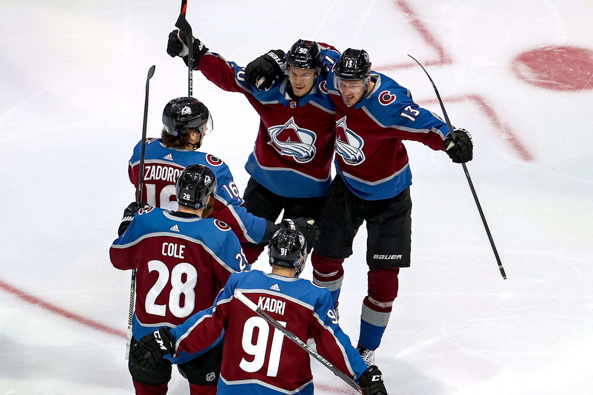


/cdn.vox-cdn.com/uploads/chorus_image/image/68439439/usa_today_15253025.0.jpg)

2021-2022 NHL Jersey Changes
in Sports Logo News
Posted
Well of course, I can't speak for everyone but I love hockey more than I hate ads