


AFirestormToPurify
-
Posts
913 -
Joined
-
Last visited
-
Days Won
2
Posts posted by AFirestormToPurify
-
-
31 minutes ago, SFGiants58 said:
Heck, blue numbers with red NOB’s would be better than double outlines for Montréal.
I think you're way more qualified to be talking about baseball (or furries lol) than hockey. But thanks for your opinion
10 minutes ago, DTConcepts said:I agree with all of this, but the difference between any and all of these teams and the Habs is that none of those colors clash as much as blue and red do.
Exactly. Both shades are too similar in terms of brightness. This is also why I prefer the Rangers home jersey. The text logo, name and numbers on the white jersey really bleed into each other. On the blue jersey, red and blue never touch, it looks much cleaner. Anyway, this is a pointless discussion, I feel like people only prefer single outlines because they're more traditional and not because they objectively look better, because they don't
-
50 minutes ago, spartacat_12 said:
This:
...is much better than this:
This:
...is better than this:
And this:
...is better than this:
I agree with all of those except maybe the Islanders where I think both look great. You could also add the early 00s Leafs/current Leafs to that list. You can cherry pick all you want, none of those teams are the Canadiens, though ;^)
-
Just now, monkeypower said:
Heck, Québécois/French Canadian French isn't even the same language as France French.
Alright now that's just a lie. I'm not a mod but let's not start a debate on that
Let's keep talking about double outlines instead

-
 1
1
-
-
2 hours ago, spartacat_12 said:
The numbers have nothing to do with the template. You said the red & blue look like purple when they touch, so why isn't it a concern on the home numbers?
The Blackhawks jerseys avoid having black & red touch on the striping, but I wouldn't want to see a white inner outline on the away numbers.
Nope, not a concern for me and completely different because the number is mostly white. I don't see any colours bleeding into each other when I look at the red jersey
Concerning the Blackhawks jersey, again just my opinion but I always thought the white jersey was overwhelming compared to the red one. Looks black and white from a distance. I wouldn't add a white outline but I would love to see the red outline become a little thicker. But that's a different situation, red doesn't really bleed into black. Or at least, it's not as noticeable
2 hours ago, BBTV said:The thing is, the red outline is pretty much the same width as the blue number. If there was a way to beef up the blue and reduce the red, that would be ideal. Maybe just grow the blue and reduce the white in between.
True, but only on sleeve numbers. The font is slightly different on the back numbers. The difference doesn't bother me at all
 2 hours ago, SFGiants58 said:
This. Double outlines always look bad on numbers, with few to no exceptions.
Either use a single outline or go with one-color numbers. Simple as that.
Nothing wrong with double outlines. Simple as that
-
6 minutes ago, spartacat_12 said:
Except that when they first introduced these numbers the blue on the collar touched the red shoulder yokes.
Also no one seems to have a problem with blue & red touching on the home uniform.
True, and like I said, I prefer the current version of the collar. Also, you can't really compare those two jerseys as they're not based on the same template and the colors are not used in the same proportions. What works on the home jersey doesn't necessarily work on the red jersey and vice versa. Could you imagine white shoulder yokes on the home jersey for example?
-
1 minute ago, HopewellJones said:
...I’m aware...
Why should their numbers match the French flag then?
-
1
-
-
2 minutes ago, HopewellJones said:
And the French flag.
The team is based in Quebec, not France
-
1
-
-
3 minutes ago, CreamSoda said:
Yup! They need those white outlines. It also matches the logo with the white outline before the blue.
Exactly, thank you. Those uniforms are just perfect. I even like the mismatching slightly lighter blue pants and helmet. It's a nice quirk I think and dark royal pants that match the blue on the jersey would bring the whole uniform down imo
-
56 minutes ago, spartacat_12 said:
Care to elaborate? The away numbers were blue outlined in red for 55 years. It matches the home uniform better, and almost all of the team's championships were won with that look.
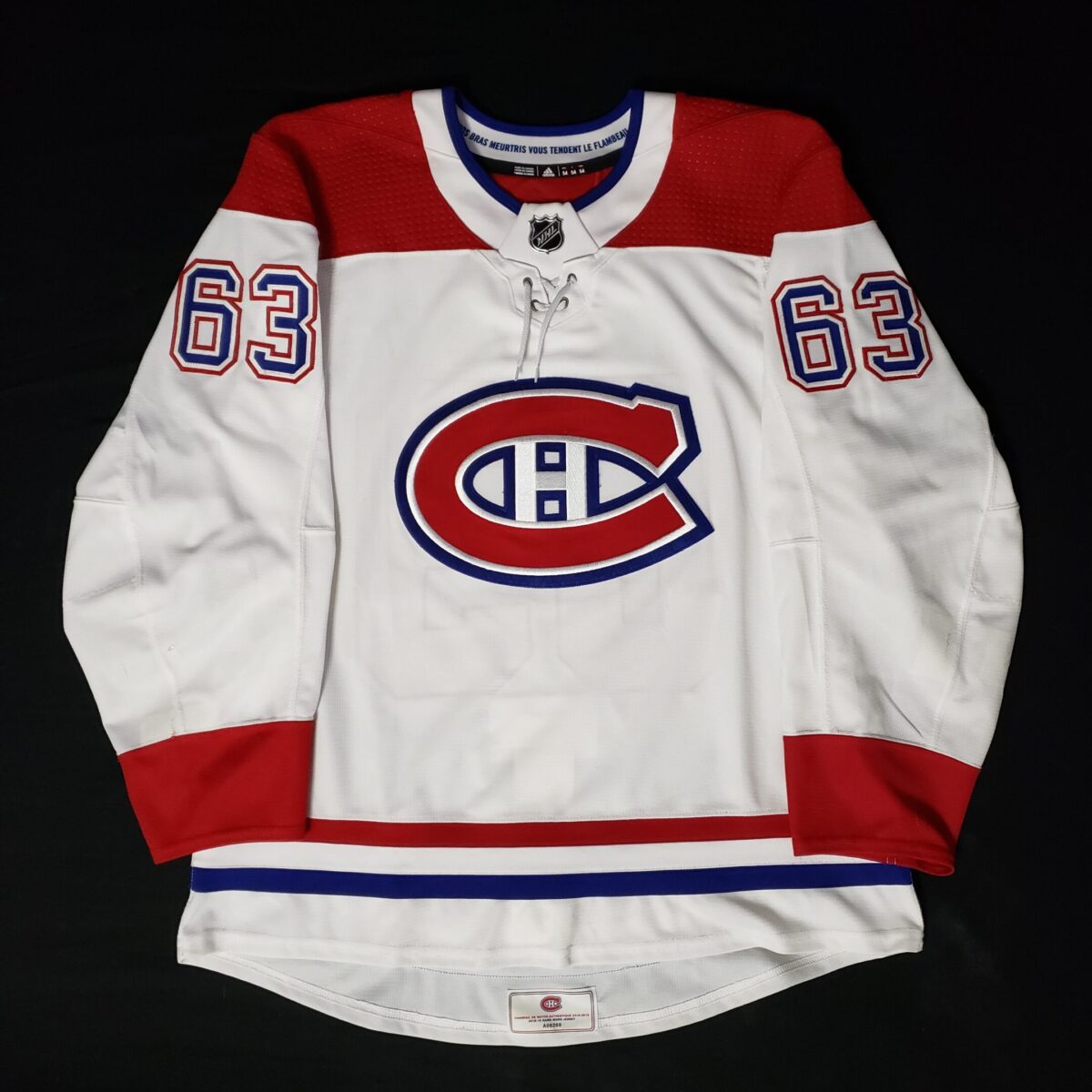
I think without the white between the blue numbers and red outline, the numbers look ugly and messy and the one element from older Habs jerseys that has aged poorly. It almost makes them look purple from a distance cause the red bleeds into the blue. It just stand outs in a bad way. Red and blue don't touch anywhere else on the jersey, why should they on the numbers? I personally think the current version of the Habs jersey is absolutely flawless. Including the rounded nameplate font, shade of red, laces on the neck and double outline on the numbers on the away jerseys. I wouldn't touch anything. I don't think it's the darker shade of red and double outline on the away jerseys that's the cause of our Cup drought lol
Messy:
Clean:
-
3
-
-
On 8/26/2021 at 1:17 PM, spartacat_12 said:
Montreal really needs to go back to the single-outline numbers on the road
Hard NO
-
4 hours ago, Survival79 said:
All ads cost the same amount and other teams get the first shot at purchasing them.
Should be the other way around. WE own those two teams, especially the Leafs ;^)
-
5 hours ago, kiwi_canadian said:
On TV or in the stands, they won't really be noticable. I remember going to a few Salmon Kings games back in Victoria when they were around and even right up on the boards, the Save-On-Foods patch was not noticable.
1 hour ago, Mr. Krabs said:All I really hope is that the ads on the jerseys will not have serious color clashes on any of them.
It's definitely gonna be jarring and ugly when the Bruins use a kelly green TD patch, the Penguins a light blue PPG patch and the Leafs a red Scotia Bank patch. And even if they do miraculously use team colors, it will still be noticeable and look out of place. Let's not kid ourselves here
-
3
-
-
Very fitting
-
4 minutes ago, mcj882000 said:
I genuinely dislike how much advertising creeps into literally everything anymore. Frankly I envy y'all who say this isn't a big deal, because I've found uniform ads in the NBA and NHL so distracting that I have to turn the games off after a while; they just steal my focus that much. It sucks and I hate it.
The CGI ads on the glass behind the net and inside the blue lines are the worst. So distracting and annoying and ugly
-
1
-
-
8 minutes ago, spartacat_12 said:
The helmet ads didn't even bring in any new revenue, they just allowed the league to retain ~$100 million in sponsorship dollars that the teams would have needed to return due to the missing games/lack of fans. Meanwhile, the Seattle expansion fee & the new ESPN deal will bring over $1 billion to the owners this season.
Thanks for the clarification. It's even worse than I thought, then
-
4
-
-
16 minutes ago, TBGKon said:
Since hockey jerseys tend to use the upper left and right chest spots for C/A patches and team related patches (anniversary/memorial/Cup Finals/All Star/etc), my gut thinks we may see the patches located where the NHL Centennial patches were at on the sleeves.
Not visible enough. It's gonna be on the chest, front (and almost) center
-
2
-
-
5 minutes ago, philly97flyer said:
Maybe reading comprehension is difficult, so I’ll explain again. I’m not “flaming” anyone for not liking an ad creep.
Well you did call me a moron
-
2
-
-
7 minutes ago, QCS said:
 this. I understand that teams lost money because of the pandemic. So did most of us! This is greed, plain and simple. I fully expected it, but I was hoping that somehow it wouldn't happen. Mad respect to any team that says screw it and just throws their own logo on the patch.
Let's face it. they're all gonna have a patch. The three richest teams, the Habs, Leafs and Rangers chose to go with helmet ads. I fully expect every team to disgrace their uniform further for a few extra bucks
-
4
-
-
4 hours ago, philly97flyer said:
Yes I am SHOCKED that the masses are not rushing to the streets to protest…(checks notes)…ads on NHL jerseys. Also the people who are complaining about this were probably the most pro-lockdown people over the last year+, so guess what? That lost money has to be made up somehow. Welcome to the real world, bud.
You're trivializing the point of the argument. It's not about the patches, it's about the blatant greed. It's about the average middle class family who can't take their kids to a game anymore because the tickets are unaffordable. You don't think they already made up for the loss money with Seattle's expansion fee and ESPN's contract? You don't think this is pure unadultered greed? You can be jaded all you want but I'm tired of seeing ads everywhere. They've made all the money they can with ads already. IIRC, helmet ads didn't bring much more than $1M in revenue per team. This is a joke. $1M to a billionaire is peanuts. It's not worth making the product look awful for what amounts to pocket change for these owners. I'm willing to bet a LOT of these owners didn't even lose money because of the lockdown. You think the Habs owner Geoff Molson didn't sell any beer during the lockdown? Just an example but you get the point. Amazon made a killing. So did ebay. The pandemic didn't hurt the upper-upper class
-
3
-
-
2 hours ago, philly97flyer said:
I love the morons on here blaming other posters and fans for this. “It’s all YOUR fault!” Lmao. Get over yourselves. This is being done because it makes the league and its teams more money. Period. Whether we all like or it not, whether we all pushed back or not, none of it matters. The fact is that it’s an untapped revenue source. No amount of bitching on a message board or twitter was ever going to change that.
Yeah no amount of protest ever changed anything right? All I have to say is, just cause you want to bend over and accept everything including blatant greed disgracing the sanctity of sports uniforms doesn't mean I should and maybe you're on the wrong forum, then. Also, keep the name calling to a minimum there, bud
-
6
-
-
I knew it was coming but not so soon. I'm pissed. I can't help but think it's because of the people who were okay with helmets ads, naively thinking it would stop there. There were all over social media posting stuff like "who cares, we can't see helmets most of the time" and my favorite "they'll remove the ads once people are allowed back in the rinks". There was almost no pushback from anyone, even on this very forum, we were a minority. And the league JUST welcomed a new expansion team with a $650M fee. Incredible. So damn greedy, and now the league is gonna look like a tier 2 minor league with all those ads. Bush league. This will help grow the sport in the southern states, no doubt
-
1 hour ago, NYRFan said:

They're absolutely right. The original logo was objectively better. They should 100% fix the butt end and blade tape on the hockey stick and bring this one back full time
Hell, even the old shade of teal (both of them actually) were better than the current almost-jade-and-too-dark teal
-
3
-
-
On 8/16/2021 at 9:19 PM, BBTV said:
I'm assuming due to the number font that the Patriots never got new practice gear after their uniform change, but the gray pants look fine and no reason they couldn't be worn in a game:
Especially with the white jerseys. That's the combo I always use in Madden. Gray on white on gray. So good. Of course it also works with the navy jerseys
-
3
-
-
I think the script on the hem makes it a little busy but it's a cool quirk


 this. I understand that teams lost money because of the pandemic. So did most of us! This is greed, plain and simple. I fully expected it, but I was hoping that somehow it wouldn't happen. Mad respect to any team that says
2021-2022 NHL Jersey Changes
in Sports Logo News
Posted
Well, trends come and go. Who knows, maybe we'll see triple outlines in a few years lol. Or maybe we'll see more gradient numbers. The current hot new trend everyone and their dog seem to be doing across all sports is single layer custom block font with quirks (Leafs, Colts, Stars, Falcons etc). Is it gonna last? Probably not. Like the poster above you said, it always depends on striping and colors. Sometimes it works, sometimes it doesn't. The Habs away jersey just looks more cohesive with double outlines, it matches the waist stripes and the logo. I'm not saying double outlines always look better either