


AFirestormToPurify
-
Posts
913 -
Joined
-
Last visited
-
Days Won
2
Posts posted by AFirestormToPurify
-
-
On 10/21/2021 at 4:06 PM, DTConcepts said:
Not sure how popular or unpopular this is, but I really dislike the all-white goalie pad trend. Jerseys aside, this:

Looks so much better than this:
Apologies for using DiPi as the reference, he's just the first goalie I could think of that had both maximalist and minimalist pads.
I don't think that's an unpopular opinion at all. And no offense, but you really didn't use the best examples lol. His "maximalist" pads are pretty white and his "minimalist" pads aren't minimalist at all and actually pretty colorful imo
Minimalist
Maximalist
Happy medium! imo
-
3 hours ago, dont care said:
I like the red accessories. It adds some much needed color to an extremely drab uniform, especially the navy ones.
Same, I love it
-
On 10/24/2020 at 10:09 PM, steve61 said:
Old post, and technically it hasn't been an alternate since the 06-07 season, but I absolutely agree that they need to bring these back as full time alternates to be worn at least a dozen times a year. Just close the C, please lol
-
18 minutes ago, Jamesizzo said:
Well yeah, it's a forum dedicated to sports uniforms.
I know and I'm often guilty of arguing about the most pointless stuff lol. Don't get me wrong
-
 1
1
-
-
34 minutes ago, Mingjai said:
Qualitatively, I’ve never considered Toronto, Tampa Bay, or Vancouver dark blue teams, especially in terms of their actual textile colors.Jfc people love to argue over the simplest things on this forum lmao. Since when does dark blue mean navy?
Pretty close to what the Leafs, Canucks and Lightning wear, don't you think? I'm done, let's get back on topic. This is just pointless bickering at this point
-
1 hour ago, dont care said:
Might want to use actual jersey colors rather than Pantone codes which are only used got print and digital.
as you can see the leafs uniforms are much lighter and brighter than the navy.
Still dark royal. I can cherry pick pictures too. Look how dark their blue is compared to the Rangers'. But it's pointless, what I'm saying isn't even debatable. I never said they were a navy team, I just said they were a dark blue team, and according to their pantone #, they objectively are
1 hour ago, VancouverFan69 said:The Canucks are a royal blue team, not a navy one. That's a mistake. Their royal blue shade is lighter than the Maple Leafs' shade.
It's the exact same blue. And they use midnight navy on their logo. But again, I never said the Canucks were a navy team
-
1 hour ago, IceCap said:
I wouldn't count the Leafs as a dark blue team.
That seems very...arbitrary.
Pantone 281C is almost navy blue. It's certainly not as vibrant as the bright royal blue the Rangers use or even as light as the royal blue the Islanders, Sabres and Blues use. I would definitely call them a dark blue team
And of course it's arbitrary. I only said I thought there were too many dark blue teams in the league. You're also arbitrarily not counting dark royal blue as dark blue. I only stated my opinion that a rare matchup with both teams in bright red looked good. No need to be pedantic and reply with a "uhm, akshully" post about navy blue jerseys which I've never mentioned in the first place
-
1
-
-
On 10/23/2021 at 4:03 PM, IceCap said:
I count three teams that have a primary that I'd call dark blue. That's not bad at all.
Columbus Blue Jackets
Seattle Kraken
Winnipeg Jets
It goes up to six if you count alts...
Colorado AvalancheEdmonton Oilers
Washington Capitals
But overall I would disagree with the notion that the league is too dark blue heavy.
I specifically said dark blue and not navy blue. The Leafs are dark blue, for example. I also didn't say anything about jerseys. Pants, helmets and gloves are also part of the uniform. So by my count, it's 12. I didn't count the Islanders, Sabres and Canadiens
-
6 hours ago, EddieJ1984 said:
This was the best they looked imo.
I hate those jerseys irrationally. Technically it's just a basic hockey template so it's not objectively bad or anything, and with Reebok we all know it could have been a thousand times worse with piping or just random blocks of color or incomplete stripes. Still,
The front numbers sucked
The custom block font sucked
Orange sucks, should have been silver
The new shade of teal was a slight downgrade
15 years later and the logo still hasn't grown on me
The white jersey was slightly better. But like O.C.D. said above, the jerseys were so generic it just didn't feel like the Sharks anymore.
This is what I meant by "could have been worse" (save for the logo, of course ;^))
3 hours ago, Patchey13 said:The jersey looks much more blue there than I remember it.
It's the lighting. They were much greener in person
-
1
-
-
Beautiful matchup in a league with too many dark blue teams imo
-
8
-
-
43 minutes ago, monkeypower said:
We're just differing on the semantics of "colour balance" because I don't see flipping the primary colour or changing the colour hierarchy being "colour balance". Colour balance, to me, is the balance of colours and their respective usage on a jersey, or logo, in the vacuum of that specific jersey, or logo, and how the amount and placement of the different used colours impact the look of the jersey, not taking a pre-existing jersey and flipping the colours. In my sense, I think you can complain about colour balance on a Reverse Retro because colour balance isn't Blue Canadiens when they're red or Purple Coyotes when they're green or Grey Sharks when they're white, it's how the colours are applied on the Grey Sharks.
Regardless, the point of the Reverse Retros wasn't to throw "colour balance" off, it was to do throwback jerseys with a twist. For most, that twist ending up being changing the colour hierarchy.
There's a decent amount of people, Ducks fans and otherwise, who prefer the webbed-D.
Fine, you're right about color balance being different from color hierarchy but two concepts still go hand in hand
Habs going blue has an effect on both. Red becoming a trim/secondary color changes its hierarchy and throws off the balance since they did not go with red gear to compensate, which was completely intended and not inherently a bad thing of course. Which is my point, you can't complain about color balance OR hierarchy in RR jerseys since in most cases, the teams intentionally messed with those concepts. The Sharks could have went with teal gear to maintain the balance and/or hierarchy but that wasn't the point. Of course both the color balance AND hierarchy are gonna be thrown out of the window when you promote a secondary or even tertiary color in the Sharks or Coyotes' case to primary color
"For most, that twist ending up being changing the colour hierarchy."
Which in turn also changed the color balance/distribution, see what I mean?
All in all, it was just a fun experiment that wasn't meant to last and we're both overthinking it lol. Let's just agree to disagree
-
5 minutes ago, monkeypower said:
Nobody seems to have a problem with the Blackhawks logo barely having any red and that's why I wasn't talking about the Blackhawks logo. I was referring to the discussion from like a page or two back about how that old Sharks logo has barely any teal on it. I also didn't say in my post if I had a problem or not with that Sharks logo having little teal.
And the whole point of the RR wasn't to throw colour balance off.
I'm telling you that the Sharks could use more teal in their logo but obviously don't NEED to, as evidenced by the Blackhawks' logo and uniforms routinely rated a top 3 uniform in the league. Teal isn't the primary color on the RR cause the point was to see what a gray Sharks jersey would have looked like. They promote a tertiary color to the main color and you wonder why the balance is off?
Yes, the point was to say "What if the Habs were a blue first team? What if purple was now the Coyotes primary color instead of a trim color only used in their logo? What if the Blues were the Reds?" Maybe when they pitched the idea to teams and announced the project the main idea wasn't necessarily to reverse color hierarchy, but it's still what ended up happening for most teams. Of course some teams like the Islanders, Rangers and Flames chose not to participate and teams that went with white jerseys or blended different eras made it less obvious but my point still stands, complaining about color balance on RR jerseys isn't fair
5 minutes ago, monkeypower said:Also, not for nothing (because it is really nothing), but in an Athletic fan Q&A out today, Zegras said he prefers the Mighty Ducks logo over the Webbed-D.
Other than the Samuelis, does anyone else in the whole wide world prefer the webbed D to the classic logo? lol
-
29 minutes ago, monkeypower said:
I think this picture really highlights the lack of teal in the logo, being on a grey jersey with the teal and black fighting for secondary status.
Meh. There's barely any red on the Blackhawks logo and nobody seems to have a problem with it. I don't think it's fair to complain about color balance on any RR jersey anyway. The whole point of the RR program was to throw the color balance off
-
2
-
-
4 hours ago, PlayGloria said:
Maybe it's just the extensive Shark discussion, but I'm not sure I like any of the Sharks jerseys/logos at this point. None of them are very good. The original shark is so wonky that I guess it gives it a little character, but other than that, maybe they would be best to just start from scratch with a teal base for continuity. They are caught somewhere between cartoons and clip art on every logo.
What's the general opinion on these? I think they looked absolutely incredible with the swooping arm stripes and especially the early version of the jerseys with the shimmery/dazzle material on the sleeves. The shade of teal was perfect and they had just the right amount of gray/silver. Very fitting look for a 90s expansion team called the Sharks. And they managed not to look like the Flyers in teal. The font was also cool imo.
So were these any good or am I just blinded by nostalgia?
I also liked the RR version in gray, save for the back name and numbers that were practically impossible to read from the usual TV broadcast angle and distance
-
3
-
-
31 minutes ago, Chromatic said:
Someone tell the Coyotes and Senators their new uniforms are a mistake and they need to go back.
The Coyotes definitely look like a team from the mid 90s though? And the Sens logo isn't as cartoony and doesn't exactly scream 90s. I never said those jerseys were a mistake either. They have a precedent at least. They're not modern logos that look outdated, just old logos lol
-
21 hours ago, habsfan1 said:
The Canadiens are on their way to break the Capitals 1974-75 losing record, if they keep playing this way.
Hardly surprising considering half the team that took them to the SCF have either signed somewhere else or are injured. The effort level does worry me but it should get better soon. Too much roster turnaround, it was bound to happen
-
Just now, -kj said:
That logo would be fantastic in the NHL, even.
Back in 1995 maybe lol
-
22 hours ago, nash61 said:
So, how are we feeling?
Looks perfect.
SpoilerFor an AHL/minor league team
-
2 hours ago, gosioux76 said:
I think this is what I was thinking of when I suggested the current shade was brighter. I recognize now that it's not necessarily brighter, but to me it at least seems more vibrant. It could be that the addition of orange just makes it seem that way. I just always thought the original teal/gray set was bland.
Gotcha. I think you meant "less saturated" as opposed to darker, but yeah, I agree that the original shade of teal was a little too dull or muted
-
1
-
-
On 10/19/2021 at 1:49 PM, Sport said:
If you think it's 10x better then I'm not sure I can explain why one is good and the other isn't because that comes down to personal taste, but I'll try.
I don't want my sports logos to be photo-real depictions of the thing they represent because at that point you might as well just use a photograph of the animal as your logo. This is the emblem for your team, not just a depiction of the animal you're named after. I want the logo to be a logo because these aren't literally jaguars, they're a football franchise named the Jaguars. That's an important distinction. I want it to convey the subject in a sharp way while also being the instant identifier for that team. One of these accomplishes that, the other is an overly-detailed illustration reminiscent of the cheap images found on stock websites. One is a bespoke sports logo befitting a franchise in the National Football League, the other would look at home on the wall of a high school gymnasium.
Fundamentally speaking the old logo is stronger, literally. Uses heavier, consistent line weights throughout, conveys motion, and manages to cast it all with a not so serious tone, which gives it a charm and character that the new one lacks. The new logo uses lines too thin, colors too many, and is just too literal for my liking. Is the new one mechanically better? Yes, but I don't always want mechanically better. Same reason I'd rather listen to a human play a guitar solo than listen to the same guitar solo played through Garage Band. When you get too technical and literal you lose some soul. Does that make sense? I want a logo a kid could effectively draw on his notebook, a logo that could be easily embroidered on a hat without losing too much detail. The current logo on the other hand is so detailed you need to be a studied artist to replicate it.
Most of what you said also applies to the discussion we've been having for the last few days over in the NHL thread about the Sharks old vs current logos lol. Someone actually made the comparison with the Jags in that thread, maybe it was you? But yeah, very well said, I wish I could like your post twice!
-
4
-
-
2 hours ago, gosioux76 said:
So is the general consensus that the orange is unnecessary to the Sharks look?
I actually think the color looks great next to the teal. It's just that, in the current set, it's so underplayed that it seems extraneous. I can see making the case for dropping it altogether. But If I'm being honest, I wouldn't mind seeing what it looks like if orange became a bigger part of the brand.
My biggest issue with the Sharks' original color scheme is that, despite teal being a new-at-the-time trend color for the league, the whole thing felt drab. The brighter teal they're using now certainly helps, but using black or gray as secondary colors just brings it down a notch for me.
I hate orange for the Sharks, their tertiary color should be silver imo. Doesn't help that the Ducks are currently using orange, even if they should be in eggplant and jade but that's another discussion altogether
And they've darkened the shade of teal not once but twice, the current teal not only isn't brighter than the original but it's too green-ish. The first shade of teal was a little too blue and too light, the first correction in the late 90s was perfect imo. So I'm not sure what you're talking about here
-
2
-
-
41 minutes ago, Survival79 said:
Here's my MSPaint job from a little over a year ago. It uses the original colors.
Not bad at all! But how would you deal with the outline on the teal (and black?) jersey? Just white?
-
6 minutes ago, monkeypower said:
That fixed one still has the issue I was talking about with the inner black outline.
Yeah I think I made the outlines on the shark worse. I hadn't even noticed lol. Well, sounds I'm in over my head with this photoshop job
But if you squint it looks good, no?

-
How about something like this? Quick MSPaint job. I tried to fix the stick buttend, blade tape, triangle outline and lack of teal
Old
-
3
-


/cdn.vox-cdn.com/uploads/chorus_image/image/70029416/1236038069.0.jpg)

/cdn.vox-cdn.com/uploads/chorus_image/image/70029353/1236038846.5.jpg)


2021-2022 NHL Jersey Changes
in Sports Logo News
Posted
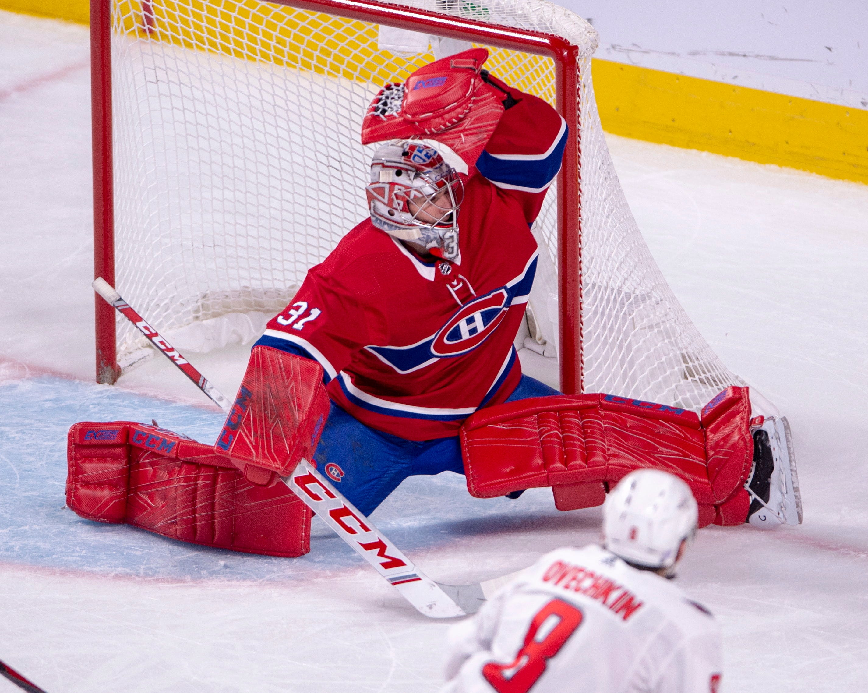
And of course not only do I have to watch my team play like ass but I also have to watch them lose against a team that LOOKS like ass lol
If anyone keeps track of that kinda stuff, is it me or do teams really like to wear their crappy 3rd jerseys when they play Montreal? More visibility maybe? Does that also happen to the Rangers and Leafs a lot?