


AFirestormToPurify
-
Posts
913 -
Joined
-
Last visited
-
Days Won
2
Posts posted by AFirestormToPurify
-
-
8 minutes ago, CreamSoda said:
lol what? That script is so so bad
So so bad? I think you're overreacting. It's just a simple cursive script. Generic or boring maybe, but I don't see how it could be considered inherently bad. Maybe Devils would have been better than Jersey? Either way, it's the extremely derivative and mostly black and white jersey that is the main problem to me. How hard was it to take their Brodeur or Christmas era jersey and swap red for black?

-
1 hour ago, kiwi_canadian said:
Please enjoy Patrick Warburton explaining the new Devils third jersey.
Okay getting Puddy to narrate your video unveiling is great, but other than that it's like every other decision they made was wrong or stupid or just to piss me off personally lol. Solid black gear, why? Captain letters on the wrong side, why? Drop shadow on the numbers like their archrivals the Rangers, why?
Why does this jersey even exist?
15 minutes ago, CreamSoda said:This was hard:
I'd argue it looks even worse now lol. It's not the Jersey script that is the problem, it's everything else surrounding it imo
-
2 hours ago, spartacat_12 said:
It always makes me think of those old collectible mini mugs that had the logo on one side & the team's wordmark on the other.
Oh wow thanks for the trip down memory lane. I'm pretty sure I had the Capitals one and maybe a few others I think when I was a kid
-
 4
4
-
-
3 hours ago, NYRFan said:
Why chrome? Why not metallic silver? I don't get it
-
2 hours ago, NYRFan said:
However fearful they are of using yellow is dwarfed significantly by their apparent apprehension toward using brown in their color scheme.
(Because...poop and pee?)
Bruin literally is a folk term for brown bear!
You're absolutely right, and I mentioned earlier how their alternate could instantly be 1000% cooler by simply swapping black for the same shade of dark brown they used in 2010 and 2019 on their outdoor game jerseys. It's a nice shade, didn't give me any peepee-poopoo vibes and I'm a Habs fan lol. But I'd only use brown for an alternate, not on their full time uniforms
-
2
-
-
1 hour ago, Digby said:
I liked the simplified striping and lettering on that 2016 Winter Classic one but the old-timey logo did not translate well to "regular" games. Of course that's the only special jersey they have that actually became a semi-permanent third for a while and it's the least interesting/different one among them.
They sell loads of "gold" merch and there's historical precedent, just seems like weird stubbornness that the only alt that color was last year's that turned out to be rarely used and set up to self-destruct anyhow.
The Bruins FO really seems to think that black is badass and cool and yellow is wack or something which is a shame. From the logo to the socks to the away jersey being so black heavy and the last three or four third jerseys being black, they're afraid of embracing yellow as a team color for some reason. Why couldn't the away jersey have yellow shoulder yokes?
-
1
-
-
On 11/14/2021 at 6:07 AM, pepis21 said:
Compare to 2018 jerseys these ones look much much better. It look like this diamond pattern will be on all teams.
More of Finland:
I like how the chest stripe is broken up in the back. Panthers and Wild, take notes, this is how it should be done
I would have preferred the colours flipped on the dark jersey though, Finland in navy looks weird
-
5 hours ago, Sport said:
I think they look like a generic approximation of a Bruins look for a movie or commercial who couldn't get the rights to the actual Bruins uniforms. This is just a completely statement-absent, third jersey for third jersey's sake look here.
Spot on. Wish I could like this post twice cause that's exactly what they feel like. They're not awful by any means, no piping, no weird gimmicks, it's just a solid yet boring classic hockey design but at the same time, nothing about it says "Bruins"
They could have done something to make it less boring. Yellow socks or swapping black for dark brown are the two most obvious things they could have done imo to give this jersey a reason to exist alongside the regular black home jerseys
-
2
-
-
2 hours ago, NYRFan said:
Finally a leak! Interesting. I don't usually like script logos but this one looks decent. Might look alright on an old timey jersey with lots of stripes, ideally a black version of their original Christmas set
As for Pittsburgh, I thought they were introducing a new alternate? Am I missing something here?
-
13 minutes ago, TBGKon said:
Stadium Series is Lightning-Predators, interested to see what ends up being worn. Going by the neon inspiration on the logo, maybe that’s a possible direction.
wow I completely forgot about that game lol. Perfect opportunity for the Lightning to bring back their original shade of electric/hawaiian blue
8 hours ago, DTConcepts said:I bet $20 the Devils go a Sharks-type route and unveil a "Stealth" jersey that's only black and red.
"
 "
"

-
1
-
-
Oops yeah I meant Stadium Series. I'm really looking forward to seeing what the Sabres will wear. So many possibilities. A return to the goat head and/or black and red colors? A tribute to the Bisons maybe?
As for the Leafs, meh, like the Blackhawks, you know there's a decent chance it looks good but it's still gonna be a variation of a maple leaf logo in blue and white. Hardly exciting. Unless they go with St Pats colours?
36 minutes ago, TBGKon said:The Lightning black alternate they currently wear was released in January of its season, so I presume anything's possible.
Gotcha. I know some alternates are released halfway into a season sometimes but I'm just surprised we haven't seen any leaks yet. Not even rumours. The only clue we've had so far is the stealth Devils logo on their pants. And maybe it doesn't even have anything to do with their new alternate
-
Thread is dead
Does anybody know when the Devils and Penguins are unveiling their new alternates? Winter Classic? How about ASG jerseys? Any rumours? I bet Vegas has something wild and flashy and not tasteful at all even by normal ASG standards in store for us lol.
In the meantime it was fun to see several new uniform matchups that couldn't happen last year due to division-only opponents
-
6
-
-
16 hours ago, spartacat_12 said:
Yes, the Sens & Hawks have some extra colours in their logo, but they still have black & red in there. The gold/green/blue/etc. are there to compliment the primary colour scheme, not compete with it. As for the Panthers, I think the best thing about the reverse retro was that the shade of gold they used actually matched the logo.
The Mighty Ducks logo was missing the team's primary & tertiary colours altogether, on top of including two colours that weren't used anywhere else on the uniform (not counting the brief black equipment period). It felt like the logo & uniform were designed separately, then got thrown together.
The Leafs & Flames flip the logos because the primary one matches the colour of the home jersey. The jade triangle doesn't get lost on an eggplant background the way a red flaming C gets lost on a red background.
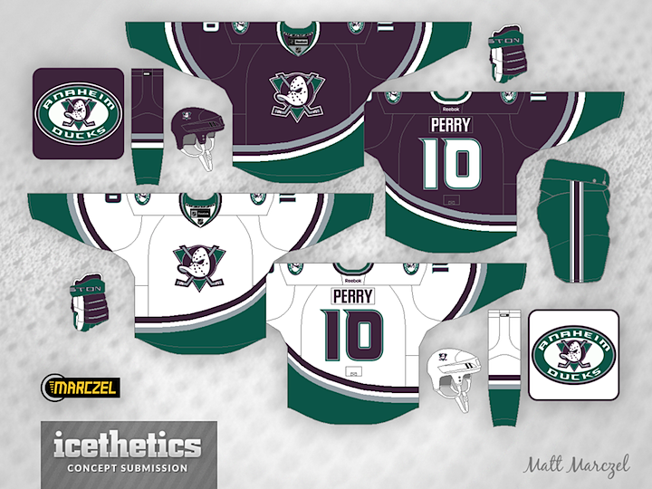
This concept shows what I'm thinking of, and imo it looks much more coherent.
I get where you're coming from on most points and it mostly boils down to personal preference imo so let's just agree to disagree
The concept you posted shows why the black background is absolutely necessary on the eggplant jersey to me. I hate using "pop" lol but the logo just doesn't pop. Looks muddy to me and frankly it has that concept quality to it where it's not that it doesn't look good on paper but I think it would be underwhelming in real life. I find it hard to put it into words but it looks like a concept, if that makes sense lol. I have to say that the eggplant and silver version works better than I thought on the white jersey though. But was it absolutely necessary to remove golden yellow from the logo? The jersey looks really cold and lifeless without it
-
Yeah the shoulder patches were great. Looking back on the jerseys without them, they just look like something is missing.
Also, I feel like the jade stripes on the pants and jade fingers and thumbs on the gloves are severely undervalued and underappreciated. The solid eggplant (03-06) and solid black gear (97-99) really brought down the overall look of the uniform
-
1
-
-
1 hour ago, spartacat_12 said:
This was my favourite uniform in sports growing up, but if they were to go back to this they should really update the logo colours. Doesn't make sense to have a black, jade, and yellow logo on a eggplant, jade, and silver jersey. Change the black to eggplant, and make the sticks silver, and it would be perfect. Also the triangle should stay jade on the dark jersey.
Your Sens have gold on the logo but nowhere else on the uniform. The Blackhawks and Wild have like 32 combined colors on theirs logos that aren't found anywhere else on the jersey and they're routinely considered some of the best logos in hockey. The 90s Ducks, Sharks, Coyotes and Panthers are all uniforms that a LOT of people like and have the same "problem". You can probably even include the original Thrashers jerseys on that list, I think a fair amount of people would say they were nice uniforms
Why does it not make sense exactly? I think the gray triangle in particular makes perfect sense. I've seen plenty of Starter jerseys from the 90s that had the jade triangle and it didn't look all that good. Again, the Leafs and Flames flip their logo colours on their jerseys and nobody seems to mind?
The Mighty Ducks jerseys from 1996-97 and 2000-03 were absolutely perfect and I will die on that hill lol
-
54 minutes ago, Ridleylash said:
I think you could get away with tinkering with the Mighty Ducks look a smidge, maybe by replacing the silver stripe with orange and putting the orange sticks on the primary (and also using the jade triangle on the dark jersey), like so;
This solution marries both eras together pretty well, I feel. Orange adds a nice burst of bright color to the design while not being overwhelming, and the Ducks get to have a totally unique color palette in the league.
Yikes. No thanks lol
-
2
-
-
1 hour ago, RyanMcD29 said:
Guess it's time to dust off the "Nike alts were the best jerseys the Ducks/Mighty Ducks have ever had" take. I dunno, jade as a primary works a little bit better than eggplant as a primary
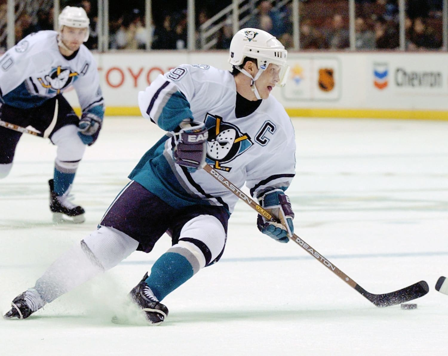
I'm a huge fan of the white version from 1999-2000 with the eggplant gear and jersey-specific socks. Very underrated uniform imo
But I think the jade version was a bit underwhelming with the black gear and regular away socks
-
2
-
-
Just now, monkeypower said:
I like the socks too. It's just that the striping is wrong.
Yes, it was the home jersey for the 2006 playoffs and I would have to imagine that it had an impact on the 06-14 set.
I dislike these jerseys immensely.
Yeah you're right about the socks but since this isn't my team and I'm not watching them 82+ times a year, it didn't really bother me ahah. I didn't even notice the inconsistencies until you pointed them out. Honestly, I'm not a huge fan of that alternate either, it badly needed some jade stripes. Or maybe swap black for eggplant and eggplant for jade, I dunno. It was way too close to a Kings jersey. I'm just saying that while I can't prove it, I feel like this jersey is probably the reason why they went with another script logo for the rebrand
-
10 minutes ago, MNtwins3 said:
Ducks should blow everything up and start over
Nah
And then maaaaaybe bring back this one with a few tweaks as a permanent 3rd jersey to acknowledge the logo they wore when they won their only Cup. But they really only need two jerseys
-
6
-
-
2 hours ago, monkeypower said:
The home socks are wrong too. They attempted to do a Mighty Ducks thing in flipping the jersey striping, but didn't flip the gold and white stripes.
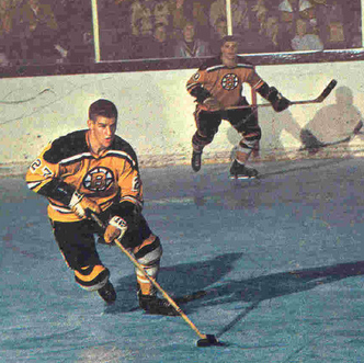
Funny, the mostly orange socks are one of the very few things I like about that uniform. Reminds me of when the Bruins still wore yellow socks with their black jerseys
2 hours ago, Sport said:The decision to use the wordmark as the crests from 06-14 was so weird. It's like they were worried people wouldn't know what team they were anymore so they had to spell it out and if that's the case then don't change at all, dingdongs.
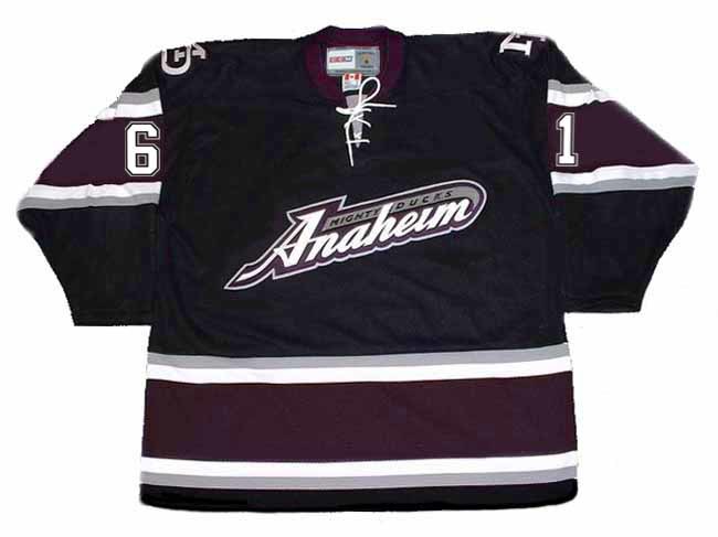
It was probably inspired by the 03-06 alternate with the script logo and black base which was extremely popular with the fan base and even became the default home jersey near the end of the last season and playoffs as the Mighty Ducks IIRC
-
1
-
-
2 hours ago, spartacat_12 said:
Well based on your definition, the Kraken home jersey falls under the 'stealth' category. They put a lot of time into the design, and I'd expect it to stick around for a while.
To be honest, I do find that jersey a bit underwhelming lol. It's very dark, which I know is kind of the desired effect, but still. I know, hot take. I much prefer their road uniform. I wouldn't call it a stealth jersey though cause there are too many colors and it's not exactly minimalist or lazy. What I mean by lazy is in the Sharks, Oilers, Flyers and Stars (I could maybe even add the Canes to that list) case, just take the regular logo and remove as much white as possible, make the jersey striping as minimal as possible, maybe use some hollow numbers if you really wanna make it as repulsive as possible and of course, use the darkest color in your palette as the base of the jersey. There you go, stealth jersey, any team can do it. No effort needed and you can definitely spot some common themes and they were all introduced recently, so it IS a trend. The only one I wouldn't call lazy cause it's innovative in its own right, is the Lightning's storm jersey. But it also looks like dog poop so nice try, I appreciate the intent but I don't have anything nice to say about that jersey other than that.
But in general, this is a good example of why I often think road jerseys look better than their home counterpart. I'm not a huge fan of home jerseys with no white on them. They often look gorgeous in person but muddy and drab from a distance imo(Kachina, early 00s Kings and Canucks, Kraken etc)
-
1
-
-
23 minutes ago, CS85 said:
Q out in Florida. Looks like they’re hiring Torts.
That's actually shocking
-
2 hours ago, dont care said:
You keep using the word “objectively” and I don’t think you know what it means.
Are you telling me the stealth jersey trend isn't actually a trend and that it takes a lot of effort and skill to just come up with a dark jersey with minimal or no white on it?
Objectively speaking, in a way that is not influenced by personal feelings or opinions, it's clearly a trend and it probably won't last much longer, as with all trendy things that come and go. This has nothing to do with my own belief that these jerseys often suck
-
2 hours ago, DTConcepts said:
The only issue I have with the Sharks' "Stealth" jerseys is how goddamn minimalist they are. They've got the same issue as the rest of their jerseys, where there's just nothing happening on them. I can excuse the teal-only color scheme since it is an alternate jersey, after all, and the circuit board pattern is pretty cool, but they're just so boring.
The Sharks' whole identity pisses me off. They have so many options and opportunities to be an exciting, modern, and unique brand, yet they choose the most boring designs possible.
Meh. Stealth jerseys CAN look good, and really it's just a matter of opinion anyway. But they're also objectively lazy and trendy and it's so typical of the NHL that they would jump on the "murdered out" bandwagon 10 years past its peak in pop culture popularity lol. And then again, it's the third boring/minimalist black Sharks alternate, so it's kinda their thing now
2 hours ago, Ridleylash said:Losing stripes makes them go faster, so they have to lack stripes!
 Don't look at all those striped teams that are doing pretty well, the Sharks clearly go faster without them.
Ah yes, what this thread needed was another sTrIpEs ArE hEaVy joke
-
1
-


Up to date IIHF Jerseys
in Sports Logo News
Posted
Same. If not for the team USA/Finland double blue hybrid that is a bit of a headscratcher, both teams look okay I think. All in all, these Olympics will probably look better than the last few. Team Russia (or are they still forced to use the dumb Olympic Athlete from Russia™ generic red jerseys?) might tip the scales here. We know Sweden will look fine, as usual