


AFirestormToPurify
-
Posts
913 -
Joined
-
Last visited
-
Days Won
2
Posts posted by AFirestormToPurify
-
-
Would it have been better with white facemasks? I say yes, but only slightly

-
44 minutes ago, jp1409 said:
Stupid white lines on their home jerseys are a good example of why you shouldn't "update" just for the sake of it though...
I like the white stripes. I think what's really stupid is when a team doesn't have any white on their home jerseys ;^)
-
The Habs are (very subtly) updating their crest like every other team, as rumored. Nothing fancy, which was to be expected. Not sure how I feel about this. Mostly indifferent lol
-
5 hours ago, Ridleylash said:
Personally, I love that they're going full throwback and not really :censored:ing with it, because :censored:ing with it in modern sports design can often result in an inferior design than what fans were asking for.
Most of the 'Yotes fans I've seen have been ecstatic about the return of the originals as they were.
This. When teams "update" their throwbacks most the time it just looks like a half assed compromise. One notable exception is the Sabres
-
2 hours ago, spartacat_12 said:
I don't think this is necessarily true. Plenty of NFL teams with strong brands use multiple pants for their primary home & away uniforms (Chiefs, Browns, Bills). Often a team will choose contrasting pants at home to avoid a monochrome look, but it sticks out when used with the white jersey.
Different sport. You're comparing apples to oranges. White pants (or any light pants, silver, yellow etc) work in football, they look stupid in hockey
2 hours ago, Sport said:Yeah I was going to say. When the Blue Jackets introduced the blue pants for the stupid red jerseys it opened the door for this. Prior to that it was always just a thought, but once the pants became real then I think we were all hoping they'd try it with the road uniforms. They waited until the last road game of the season, but I thought it looked pretty good and definitely better than the red pants with the white jerseys.
I would love to be the team that wears red pants at home and blue on the road. It solves two problems: 1. The red pants don't really feel like they belong with the white jerseys and socks and 2. Having home and road pants gives them a unique uniform quirk, which helps further set them apart from the other blue/red teams.
It's funny cause I think the red pants look better with the white jersey than the navy jersey. The home uniform is just completely navy save for the pants, I always thought it looked weird and stuck out like a sore thumb, even more since the adidas "update" where they removed even more red from the socks. It pains me to say that cause I think red hockey gear looks great and that there are too many teams with navy gear, but the Blue Jackets do look better with navy pants
But I don't think they need any quirks. They don't look like the Rangers or Capitals at all and I don't think even the most casual fan would mix them up
-
3 hours ago, NYRFan said:
No surprise at the bottom!
HOME jerseys, correct? Biggest head scratchers: ARI first, Dallas near the bottom, Blackhawks being almost smack dab in the middle. Lot of recency bias in those rankings which is understandable but I'm guessing not a lot of people voted in the first place
-
 2
2
-
-
I think this one belongs here
I really like the pads, though!
-
1
-
-
25 minutes ago, monkeypower said:
Obviously, eggplant was the obvious choice for the Mighty Ducks just as maroon or blue should have been for the Avalanche from day one.
See that's what I mean, "maroon OR blue". You said it yourself. No obvious, no-brainer choice here
25 minutes ago, monkeypower said:I think there are a lot of similarities between the Mighty Ducks and the Avalanche jerseys and I don't see how you can call the Mighty Ducks colour balance perfect with eggplant equipment and yet have problems with the Avalanche using maroon equipment
Easy solution would be, keep the Avs dark jersey the exact same, swap the mountain stripes to blue instead of maroon on the white jersey and go with burgundy gear (with maroon numbers as well). There's just not enough blue on the white jersey and it's been a problem from the start.
Either that or reverse the dark jersey and keep the white jersey intact. Basically, if both mountain stripes were the same color on both jerseys, you could go with either color for the gear and the whole thing would look much more balanced
The Ducks didn't have a lot of eggplant on their white jersey either but that's never been a problem because of the eggplant pants. I don't see how YOU don't see the difference
 Sure they look like a jade team if you're just looking at the white jersey by itself but the uniforms were designed as a whole, with the equipment in mind, I think. So when the players were wearing the white jerseys, they looked like an eggplant team. And that's the main difference with the Avs, their jerseys look fine by themselves when a fan is just pairing it with some jeans, but they will never be able to please everyone with the whole uniform because there's no obvious choice for equipment color. Every color had its own set of flaws imo, cause the main problem is that it's kinda hard to tell which is their primary color. Technically it's burgundy but with blue gear, that line is blurred
Maybe the real solution was a compromise. Black gear, except not solid black. With burgundy and blue stripes down the pants and with both colors also included in some way on the gloves. Maybe a burgundy cuff roll with silver text and blue fingers. Just an idea. Might have helped the black gear look less generic
-
1
-
-
2 minutes ago, Ridleylash said:
I think the main issue is black has never been prominent in their colorway; so the solid black equipment looked really out of place in a uniform that was 99% burgundy/blue/white. A pair of thin stripes and a collar stripe was all the black the actual original jersey had; compared to the blue, which dominated the arm and hem (and hell, black wasn't even on the white jersey outside of the logo and NOB!).
The black equipment felt very last-minute because of that, and I think the burgundy works much better as the dark color for the Avs' colorway, anyways. It'd be like making the Ducks' buckets, gloves and pants gold; yeah, gold's part of their colorway, but it's not nearly prominent enough in the jersey to justify making it the equipment color.
It looks last-minute because it probably was ahah. I think it kinda worked in a very late 90s way. Everything was dark and moody back then, so the black gear didn't look so out of place, if that makes sense. The blue gear just gives the uniform a whole different vibe, which I'm not sure I like yet, but it certainly does look a bit more modern and less grungy/xtReMe
Unless I'm just wearing nostalgia goggles, but I don't really feel like there's anything wrong with having a jersey associated with a certain era. If the Oilers, Islanders, Penguins, Flames and Flyers can wear their 80s and 70s throwbacks full time, why can't the Avalanche keep their 90s looking uniforms?
I'm not even sure what my point is anymore

-
8 minutes ago, monkeypower said:
Ah, fair enough. So three then, still pretty unusual and novel.
It's not an awful comparison because it's exactly what I was explaining. A youth hockey team that's not black using black equipment because it's the default hockey equipment colour available for retail. That's what the Avs looked like.
They had barely any black and it barely worked. Everybody just got used to it. In the words of Amir Blumenfeld, "Garbage becomes perfect over time as you get used to the garbage and forget what made it so bad".
Like I said in my post above, the inclusion of the little black piping (on only the home) and then the black numbers (only on the away) seemed to only be there to justify the use of black equipment or vice versa.
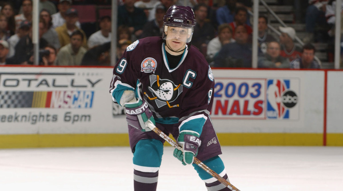
Yes, the Ducks did have trouble getting the eggplant equipment (or at least that's the story that gets told, I don't know if I've ever seen that "officially" confirmed anywhere) but then they got the rightful eggplant equipment back after two seasons. They didn't have trouble getting the non-black equipment for 24 years like the Avs did.
The Ducks even had more black in their logo than the Avs do and they were able to use the eggplant equipment perfectly fine without having resorting to black equipment or black numbers.
Which looks better?
Of course the Ducks look better with eggplant gear. But in the Ducks' case, eggplant was the obvious choice since the bottom stripe of both their jerseys were jade. Jade equipment was probably never considered. Their color balance was perfect for both jerseys, jade never fought for attention the way slate blue does on the Avs jerseys. Unfortunately for the Avs, the choice was never as obvious. Burgundy equipment would have made the white jersey look better, but the burgundy jersey would have been a mess. Pick your poison, basically
I still disagree on the Habs comparison. The Avs clearly had black in their color scheme (even if it was a tertiary/trim color), the Habs never did. Not a good comparison at all, the Mighty Ducks comparison is much more fitting, I'll give you that
So basically, the Avs will never have an ideal gear color because the color balance on their uniforms is far from ideal. I still think black wasn't perfect but a much lesser evil option than blue or burgundy could ever be
-
1 hour ago, DTConcepts said:
This is the correct take. I'm not sure why everyone is so dead-set on only having one set of gear -- it's not an unusual or novel idea to have different home/away gear.
Not only is it unusual, novel and unpractical like others have said, but it also means your uniform is poorly balanced if you need two different sets of pants for your home and away jerseys. It just creates a different problem instead of fixing anything imo
But to be fair, they could just use pant shells instead of new pants. Not sure why teams stopped doing that. Only works if the player is using the correct size obviously!
-
2 hours ago, CreamSoda said:
Not sure why the gloves have a white trim. They should have made that gray to help balance that color out more:
Yeah either gray or burgundy maybe, since they don't care if blue and burgundy touch anyway lol
1 hour ago, monkeypower said:All you pro-black, anti-blue people have been Stockholm Syndromed into thinking the black equipment and numbers looked good. The black striping and the numbers were extraneous and the black equipment looked like a youth hockey team, but youth hockey has a pass because black is the default retail hockey equipment colour.
I think it's a chicken or the egg scenario where I don't know which came first in the design process, the black numbers/dark jersey stripe or the black equipment colours, but they ended up only existing to justify each other like some sort of paradox.
If the Avs and Kraken were swapped in the timeline and the Avs were the expansion team with their previous uniforms with the black equipment and numbers, it would be called out.
And I'm constantly surprised that everyone (the collective everyone) seems to be fine with the Avalanche using the Rockies logo. If it was the same franchise, than sure okay whatever, but it's not, so get your own logo Avalanche!
A Canadiens jersey with black gear looks bad because there's absolutely no black on the jersey and the colors are much brighter. Awful comparison, sorry
It worked for the Avs because they had black stripes/numbers on their jerseys. I think I recall reading somewhere that black gear was supposedly temporary at first, and that they ended up keeping it, probably because they won a Cup right away. Can't remember where I read that and if the gear was originally supposed to be in their brighter original shade of burgundy or slate blue. Either way, don't quote me on that lol, maybe it was just a rumor. But they didn't even have white helmets at first so I'm guessing there's some truth to the rumor that they had equipment problems at first. The Mighty Ducks also had trouble getting equipment manufacturers to get the eggplant right around the same time and also went for generic black gear because of that so maybe the Avs had trouble getting the right colors?
-
36 minutes ago, CS85 said:
The Avs, like Gollum, have been clutching tightly to the ring of the 96/01 cup unis, dank and hideous in the gloom of these wretched uniforms that have long been bereft of life. After what feels like centuries, they're slowly being dragged into the light of day, and the course correction is somewhat staggered and painful.
That said, there is a good hobbit in there somewhere, but it will take a couple more years to get the slime and neglect scraped away.
What's the realistic alternative? Going with the alternate full time? Kinda like the Wild did, pretending they're an O6 team and not a (semi) recent team? Do all teams have to look the same?
There was nothing wrong with the 2001 uniform. It looks like it's from the 90s with the mountain stripes, weird number font, triple outlines and slightly cartoony logos, sure, but I wouldn't say it looks outdated or that there's anything wrong with any of that. It was tastefully updated with the switch to adidas imo. Then again, I've been in your position before and said basically the same thing about the Oilers and that they should get over their Stanley Cups and change their outdated logo and uniforms so I can see where you're coming from lol
-
3
-
-
2 hours ago, CreamSoda said:
Blue numbers confirmed for the Avs!
If it was up to me they'd still be wearing black gear but this isn't too bad. Honestly it's the gloves that bother me the most now that they no longer have black numbers. The white cuff roll just doesn't work. Especially with the home jersey
-
3
-
-
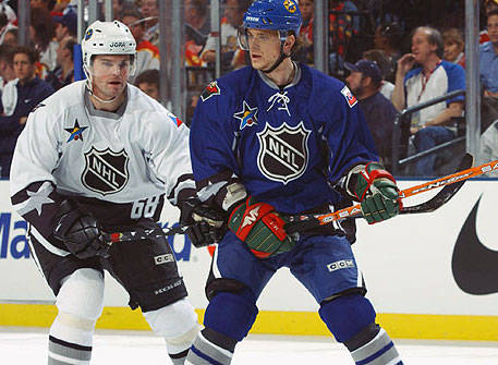
8 hours ago, nash61 said:
I didn't originally like the blue helmet until I saw this picture.
Ha, bonus points for accuracy then. That does make it a little better
-
1
-
-
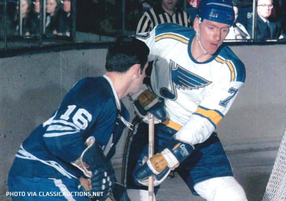
Yet another Blues jersey right in their usual very-good-to-great range
As expected, it looks amazing but it would have been a perfect 10 in true bright white. The blue helmet brings the whole thing down a few notches
-
13 hours ago, DTConcepts said:
The original Wild Wing socks were knit. The Reverse Retros are modern material. It wasn't the Ducks being cheap, it was a bad aesthetic decision. This debate is stupid.
I'm talking about the 2013 one-off socks. The debate isn't stupid, you're just uninformed. Asking why the Ducks would be the ONE team wearing dark socks with a white jerseys is a perfectly legitimate question. Especially considering the context that teams are trying to save money with the pandemic, the Ducks have historically never been big spenders and that they probably didn't even want to participate in the RR program in the first place since their jerseys were worn the least amount of games possible, only twice if I'm not mistaken. Little details like going with solid eggplant gloves when they should have had jade fingers and thumbs and cuff extensions and wrong helmet stickers also tell me that they don't care much for accuracy either
9 hours ago, dont care said:Reusing practice jerseys year to year is a lot different than keeping socks in storage for 7 years because you might use them again. The team would spend more in storage costs than they would just buying new socks. You are being ridiculous dude
Storage costs? For a cardboard box with a few socks in it? And I'm the one being ridiculous? lol
It's highly possible that they sold off those socks years ago in those pro stock and game worn equipment sales. But it's also not that farfetched to think that they would have kept a few socks around
-
 1
1
-
-
1 hour ago, dont care said:
You really think they just held on to socks for 7 years?
I know you're probably just being cheeky but actually yes, I wouldn't be surprised if they did that. The Rangers and Devils were known to use old practice jerseys, for example. It's not that unrealistic to think that maybe they figured "eh, close enough" cause the average NHL exec isn't your average sportslogos forum poster. How else would you explain the dark socks and white jersey combo? It's not a common thing at all
-
 1
1
-
-
14 minutes ago, Ridleylash said:
It's because those are the same socks the original Wild Wing used;
The RR only reversed the white and jade on the jersey itself.
I know. I'm just saying they should have used the white socks. They're the only team as far as I can tell that have ever used dark socks with a white jersey. And now we know why. It throws off the color balance and it looks cheap. Is it a cost saving measure because they still had those socks laying around from the 2013 one off game?
-
1
-
-
24 minutes ago, dont care said:
What’s wrong with the ducks one? It even has lighter socks than the pants like you say you like?
Well you're right, the socks are mostly jade but the bottom is still eggplant. Anyway, I said I liked when the socks were lighter than the jerseys, not the pants lol. I find it puzzling that they didn't go with the white version of those socks. It would have looked so much better
Unless it was meant to be a shout out to the Mighty Ducks movies and/or early pre-season games from the inaugural season? Either way, it made them look like a beer league team that can't afford or just don't want to buy more than one pair of socks
-
2 hours ago, OnWis97 said:
Absolutely. I'd bet the majority of us prefer the tops not match the bottoms in football, while preferring they do match in basketball.
(Though you're still wrong about dark tops in baseball; match them with white or gray pants.)
Speaking of which, how about hockey? I've always liked contrasting socks in hockey, as long as the socks are lighter than the jersey, like these:
But NOT these. I feel the leotard look is even worse in hockey than football
\Is this an unpopular opinion?
-
I don't mind cream/off-white/vintage stripes on jerseys but they should never be the main color imo. Cause cream helmets would obviously look awful, like those grimy home appliances that become this disgusting shade of pale yellow after years and years of smoking inside the house

 so then you're stuck with a dark helmet paired with a light jersey and that's such an unprofessional look. Reminds me of those CHL teams that don't have the budget for a home and away helmet so they just go with a dark helmet. It just looks cheap
Both of these jerseys would look much better in normal white with normal white helmets
Let's hope the Blues don't make the same mistake
-
16 hours ago, MinnyHockey said:
Hm, interesting. I guess they conflated dusk with sunset or it's supposed to depict both.
I'm pretty sure it's just an abstract beast logo with outdoorsy elements inspired from an intentionally vague name and you're all overthinking it.
I don't think there's a correct or wrong answer, unless the logo designer himself comes out and says it's a sun in a bear head, it's whatever you want it to be
-
1
-
-
24 minutes ago, SFGiants58 said:
Believe me, I’m qualified to talk hockey. Just because you don’t like what I’m saying doesn’t mean I’m not qualified.We'll you've yet to make a compelling argument as to why double outlines are bad other than "cause they're bad". I can't take you very seriously when you suggest the Habs should use baseball style single layer number with the name in a different color as an alternative that would look better than what they currently use. That's such an outlandish claim. I'm not trying to convince anyone that they're wrong for not liking double outlines but at least I try and explain where I'm coming from. Just saying "they're bad cause they're terrible" isn't really conducive to a fun or constructive back and forth argument. Shoutout to spartacat_12 btw lol. Arguing with you is always fun bud


/cdn.vox-cdn.com/uploads/chorus_image/image/67668504/220815.jpg.0.jpg)


 \
\
/cdn.vox-cdn.com/uploads/chorus_asset/file/9679981/476865339.jpg.jpg)

2021-2022 NHL Jersey Changes
in Sports Logo News
Posted
Thank god they didn't. I hate that every new logo has to be designed with a thumbnail version in mind