


johnnysama
-
Posts
1,767 -
Joined
-
Last visited
Posts posted by johnnysama
-
-
On 7/14/2022 at 11:10 PM, sayahh said:
Also Mets paid tribute to Dodgers (blue), Giants (orange) and Yankees (pinstripes). Did I miss another element? And they were never interstate rivals since Dodgers moved to LA and Mets came out in, what, 1962?
Coincindentally, the Mets colors are also the colors of NYC's city flag.
-
 1
1
-
-
You know, in all of sports, there are some rivalries that are well known (Yankees/Red Sox, Cardinals/Cubs, for example), and then there are those that are just as great, but not as well recognized.
So, with that said, here is one that most aren't paying attention to: The New York Mets/Los Angeles Dodgers.
I think it is epic in that it links both of NYC's past and present baseball traditions, and these guys, they just love to hate each other.

What do you all think? Agree or disagree?
-
Personal opinion time, the NBA should have made it color at home from the get-go, like the NHL since 2003 and before 1970.
-
2
-
 2
2
-
-
Turning to the NFL:
Around 1983/84, some Buffalo Bills players (linemen, mostly) cut off the bottom stripe of their jerseys:https://www.greyflannelauctions.com/lot-17273.aspx
While some players would keep the full two-stripe pattern, gradually, as the 1980s continued, the one-stripe jersey became standard, but it wasn't fully phased out when, I believe, Scott Norwood, the last two-stripe holdout left the team after 1991:

-
4
-
-
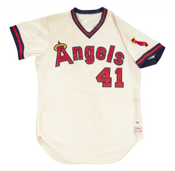
Moving towards another team, the Angels:
From 1973-78, the sleeve ends were a sewn-on soutache trim.
Starting in 1979, they became a elastic knit.
-
1
-
-
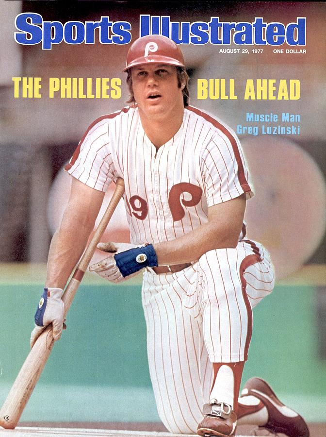
9 hours ago, Ferdinand Cesarano said:
Good stuff!
To stay with the Phillies, I am a little confused about when they added the baseball stitches to the middle of the P on the uniform. That feature was always in the cap logo; but for a long while it did not appear on the uniform logo.Here is a 1977 Sports Illustrated cover showing Greg Luzinski in the jersey logo without the stitches.
And here is a 1978 spring training photo showing the wacky combo of Brusstar, Garber, McGraw, and Johnstone in that uniform.
I believe that the stitches didn't go in the P on the uniform until some time in the 1980s, as we can see that the stitches are still not there in this 1982 Sports Illustrated cover...
...or in the 1983 World Series.
By the late 1980s, the stitches were there.
So, then, how to explain the picture on Steve Carlton's 1978 Topps card?
Re: Carlton's jersey: It was probably a deadstock leftover from the early 1970s. I can kind of make out the chain-stitching on the number and the P crest.
-
1
-
-
Hi, all. In this thread, let's talk about some little-noticed uniform details that aren't talked about much.
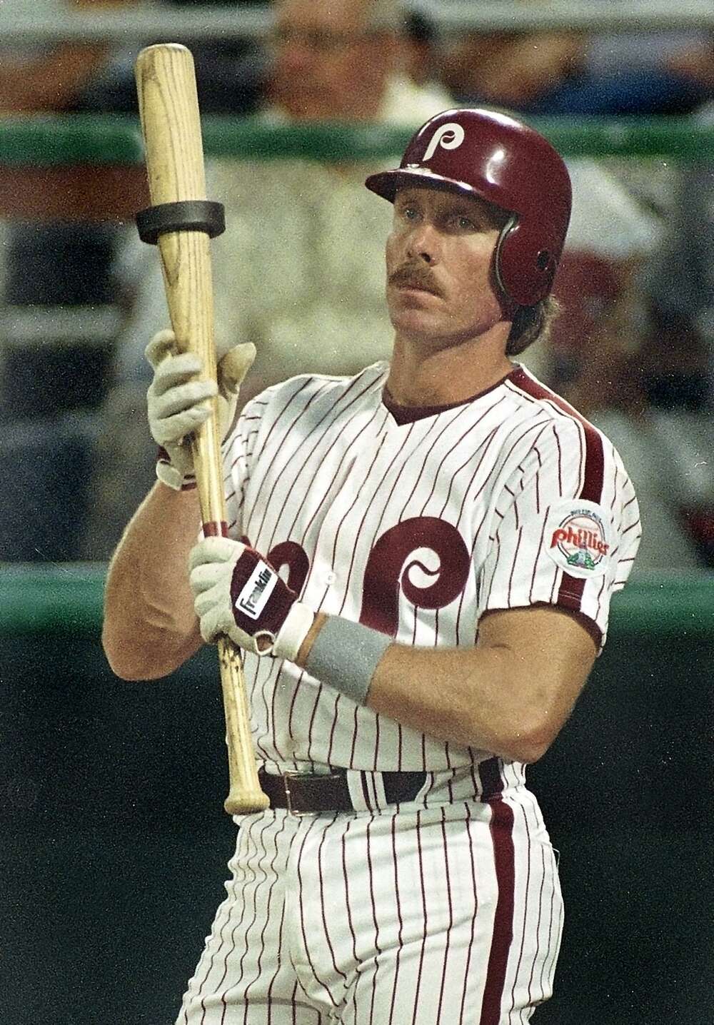
The Philadelphia Phillies 1970-91 uniform went through minor tweaks in its run, but here's something that hasn't gone noticed too much about it until now:
From 1970-81, the racing stripes on the jersey and pants did not connect with each other:
https://www.vsaauctions.com/lot-34469.aspx
Starting in 1982, however, they did:
https://goldinauctions.com/1982_pete_rose_game_worn_philadelphia_phillies_hom-lot14593.aspx
-
1
-
-
I also found a Boston Red Sox, San Francisco Giants and a copy of the 1977-80 Seattle Mariners jersey. Yay!
-
Got a New York Yankees and 1999-2006 Cincinnati Reds jersey for $15 each.
-
Got a blank 1990s Buffalo Bills jersey for $4.
-
1
-
-
They said they'd get in touch with me in the months ahead. Stay tuned.....
-
1
-
-
^ I'll see what I can do about that.
UPDATE: I sent them my info. I will let you know when I get a reply, if I do. -
https://www.gridiron-uniforms.com/GUD/CFL/controller/controller.php?action=main - Hi, guys. A while ago, I made a CFL uniform database that covered the years 1977-1993 only. Well, the guys at the Gridiron Uniform Database have made their own CFL Uni Database site. So far, it only covers 1945 to 1960 (year three of the current CFL).
")
-
5
-
 2
2
-
-
Another cap: The 1991-2003 San Diego Padres cap, with a 1998 World Series patch for $4.
-
Found myself a black crown/red bill Cincinnati Reds cap for $1.50.
-
On 9/29/2021 at 3:49 PM, DCarp1231 said:
If Stafford can manage to get the Rams to the Super Bowl and win (which is doable this year) I would argue this is will end up being his right uniform
Your prediction came true.
-
 2
2
-
-
-
I got a 1980s-era Washington Huskies football jersey for $6.
-
And so I begin 2022 finding a 2007-11 Seattle Mariners Cliff Lee BP jersey for $6.
-
So, I guess we're doing this again?
Okay.
-----For me, nothing..... yet. Watch this space.
-
1
-
-
Orel Hershiser, the ace extraordinare for the 1980s Dodgers, wrapped up his career in 2000 wearing the "Los Angeles" script road uniforms. Just looks..... not right.
-
4
-
-
AFAIK, the Pittsburgh Steelers, from 1968-96, were the only NFL team to position its TV numbers between the shoulder and sleeve; sort of a compromise placing them between those two aforementioned points.
-
^ They should reinstate those numbers, considering how (it's likely) the software has improved in the past quarter-century.
-
4
-
-
Speaking of the WFT, here's another one-time meeting in video form: The last year of the yellow pants set for WFT, the first year of that set for the Atlanta Falcons in 1978.
-
3
-


Who do you think should host the 2024 MLB All-Star Game, still unannounced as of posttime?
in Sports In General
Posted
Me, I pick Toronto. It's crazy they've only had it once, and with the Rogers Centre renovations, they're long past due.
What say you? Let's hear ya.