


johnnysama
-
Posts
1,767 -
Joined
-
Last visited
Posts posted by johnnysama
-
-
There were actually two different uniform sets the Seahawks wore from 1976 to 2001; the plainer 1976-82 set, and the jazzed up 1983-2001 set.
-
 1
1
-
-
This is not quite the same as the Unpopular Opinions thread, but it is about your logo/uniform related confessions, however popular or not they may be.
-----
I wanted the New York Mets to appear in the 2000 World Series wearing their 1986 racing stripe uniform set.
-
On 12/23/2019 at 4:51 AM, jc... said:
The Seattle Seahawks are the only NFL team to have played every home game on artificial turf.
On a semi-related note regarding MLB, the Toronto Blue Jays and Tampa Bay Rays have this same distinction.
-

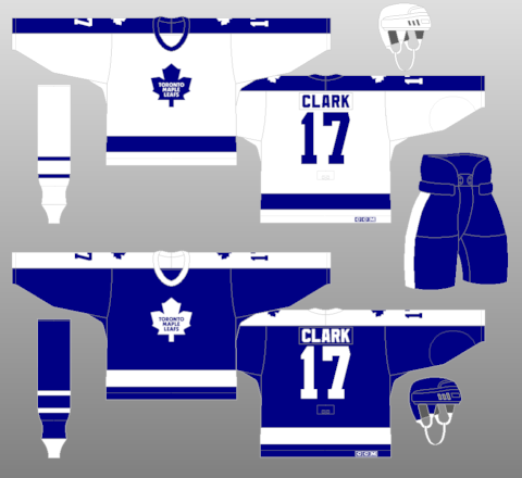
This look worn by the Toronto Maple Leafs from 1972-73 and 1975-92 gets kind of a bad rap for the fact that the guy who owned the team for most of this uniform's lifespan was a rather skinflint kind of guy (which I'm not here to discuss), but there's something about the simplicity of this design I kinda like. I wish the Leafs didn't abandon this logo; it's a simple yet effective logo, and uniform set for the 1980s. I wish they'd bring this back.
-
4
-
-
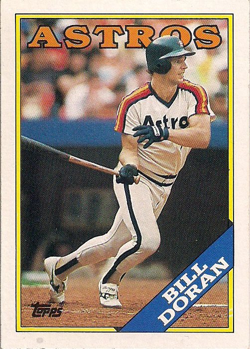
This 1980-88 Houston Astros "rainbow shoulder" uniform (a button-front/belted trouser version was used from 1989-93) doesn't quite get that much love. I like it. It served as a nice compliment for the "Tequila Sunrise" uniforms.

-
8
-
-
- How did this get into the Sports Logos News page? Please move it to the Sports Logos General Discussions Page.
-
I'm being randomly logged out for no apparent reason. What's going on?
-
In honor of tonight's Thursday Night Football matchup, from 1997; the only year these two uniform sets conicided for the Ravens and Jets.
-
3
-
-
^
I don't know whether it's a case of the Mandela effect, but the directional arrows were all red! However, the top and bottom hashmarks alternated between red and yellow, as you can see in this video. XD
-
1
-
-
11 hours ago, pitt6pack said:
They actually may have had them in 1972, at least by my research.
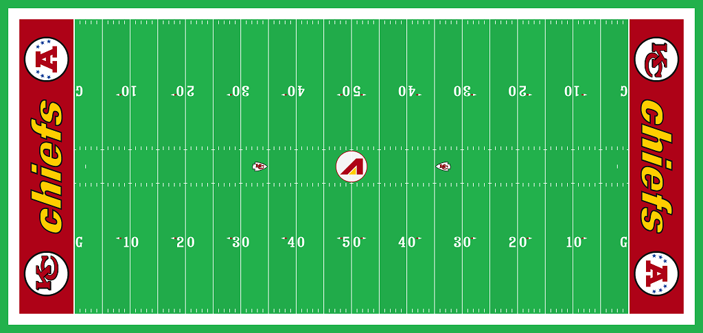
The first team with the directional arrows. The grounds crew at Arrow Head was also in charge of the Super Bowls for years, and in Super Bowl XII (1977 season) the same style of directional arrows made it on the Super Bowl field for the first time:
Directional arrows were required by rule the following season, in 1978.
Some of the arrows @ Arrowhead stadium were colored yellow, I should mention. Today, the arrows on the yard markers are purely triangular shaped.
-
On 11/17/2019 at 9:43 PM, scraw28 said:
The 1994 field is when the converted to grass the same field design at the previous but also with the 75th season logo on the 30 yard lines each side's
In 1973, Arrowhead's second year of service, they added those little arrows by the numeric yard markers to indicate the closer goal line; early on, they resembled little Indian arrowheads, and were marked in either yellow or red.
")
-
1
-
-
https://www.ebay.com/itm/202802021067 - Not quite a counterfeit, per se, but look at the bad quality of the NOB/number. XD
-
Rod Carew as the Angels hitting coach in the late 1990s. The guy has no business in the "Disney style" periwinkle-and-blue era uniforms.
-
3
-
-
^ To be fair, however, there weren't too many "real" jerseys being sold at retail to the public in that era.
-
1
-
-
The Raider running back extraordinaire Mark van Eeghen completed his career with the New England Patriots.
-
http://www.gridiron-uniforms.com/GUD/controller/controller.php?action=single-weekly&game_id=1974_SD-OIL^1 - I can't seem to find any in-game pics, but in 1974, the (then) San Diego Chargers emerged with their new look complete with the first colored facemask in football and navy blue helmets and in its regular season debut, met the powder-blue helmeted Houston Oilers for the only time. The Oilers went to a white helmet the next season (everything else on the uniform went unchanged).
-
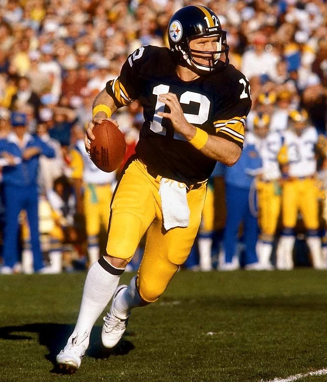
On 2/16/2019 at 4:51 PM, Davidellias said:
Not Only is it Bradshaw in a Black facemask, it's not his traditional double bar one either.
The first facemask he had were Dungards; this is a Schutt model. He actually won Super Bowls XIII and XIV wearing the Schutt model pictured here.
-
2
-
-
I actually dig the pullover jersey.
It needs a bit more red, though.
-
https://www.worthpoint.com/worthopedia/1976-grey-cup-cfl-canadian-football-442131593 - Going north of the border, but the third pic in this 1977 CFL yearbook featured a rare one-time matchup: The 1977 Toronto Argonauts changed their logo to a newer version of the "boat football" logo (which is still loved among fans of that team) and 1977 was the final year the BC Lions wore their black helmets with the older-style BC logo. They changed their logo the next year.
-
 - From 1973, which was also Johnny Unitas' last season. It was the first season of that Rams uniform, and the last for that Charger white-helmet look.
-
6
-
-
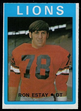
Heading north of the border again.....
Like his Eskimos teammate during the dynasty years of the late 1970s/early 1980s Larry Highbaugh, Ron Estay started his career as a BC Lion.
-
1
-
-
- Is it possible to delete this post? Yeah, I think I should've thought of this further. Thanks.
-
On 12/3/2017 at 8:19 PM, johnnysama said:
 -vs-
-vs- 
Again, no game action pics, but these two uniform sets met just once in 1986 (last year for that Dolphins set, before they added the Dolphin logo on the sleeves, and the first year for that Saints set, w/ the Louisiana state insignia on the sleeves).
Some video for you of the match-up.
-
2
-
-
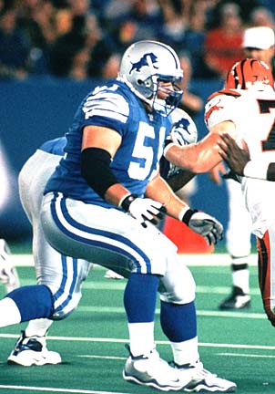
The Detroit Lions longtime center Dominic Raiola spent his first two campaigns wearing the black-less Lions getup. He's more associated with the black-trimmed Lions.
-
3
-


Rare team matchups
in Sports Logo General Discussion
Posted
The late 1980s/early 1990s in MLB was RIFE with rare team matchups. This one is from 1991, the first year of the orange/navy blue Padres and the last year of the Cardinals' pullover jersey/betlless waistband uniform set.