


spartacat_12
-
Posts
2,663 -
Joined
-
Last visited
-
Days Won
4
Posts posted by spartacat_12
-
-
On 8/7/2023 at 5:13 PM, Unocal said:
Will we actually have a real SCF this season worth watching? VGK/FLA was anything but
Please, enlighten us on what a "real" Stanley Cup Final would look like
-
 5
5
-
-
Most Caps fans seem happy about this deal, but it isn't even going to kick in until he's 30. I'd say there's a near zero chance that he makes it to the end of this contract in Washington. I'm guessing either a buyout or he gets to live out his last days on LTIR.
-
10 minutes ago, Sodboy13 said:
I always thought that was a lock of hair falling over the mask, not a chip in it.
I've always thought that too. Bret Hart was known for his hair, so I assumed they did it as a tribute.

-
1
-
-
9 hours ago, Chewbacca said:
I don’t intend to ruffle any feathers in this thread but I thought Edmonton changed their name and brand to get away from anything to do with Aboriginal branding, yet now they are wearing an indigenous logo.
1 hour ago, JQK said:The Rĕð§ƙïŋ§ logo was made by an indigenous artist as well... and they decided to throw that baby out with the bathwater...
There's a big difference between using an indigenous person as a mascot (plus using outdated terms/slurs as nicknames), and incorporating indigenous design into a logo. The Seahawks have used a First Nations-inspired logo for their entire existence, and obviously that's never been a problem.
-
3
-
 4
4
-
-
4 hours ago, seasaltvanilla said:
Real snoozer of a logo from Vegas.
I'm thinking the V logo might go on the shoulders, with the Vegas wordmark being on the front of the jersey. A team using an alternate logo for Winter Classic merch isn't unprecedented.
-
On 8/1/2023 at 6:58 PM, M59 said:
Here's a question for the Blue Jays fans in the audience: any idea why they broke out the red jerseys and hats for a game on July 31? Is that combo part of their regular rotation now? IMO, they looked good.
I believe it was a request from Chris Bassitt. I know last year Berrios had the team wear them for a couple of his starts too.
Their record in the red isn't great, so fans are starting to hate them. I'm still assuming whatever they come up with for the City Connect will just be a more elaborate Canada Day style jersey.
-
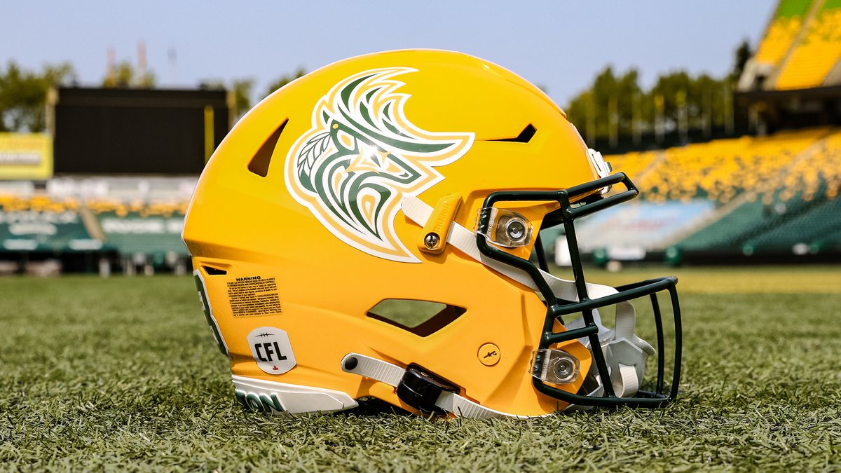
The Elks unveiled a new logo for their Indigenous Celebration game next week. It might be the nicest logo they have.
-
10
-
-
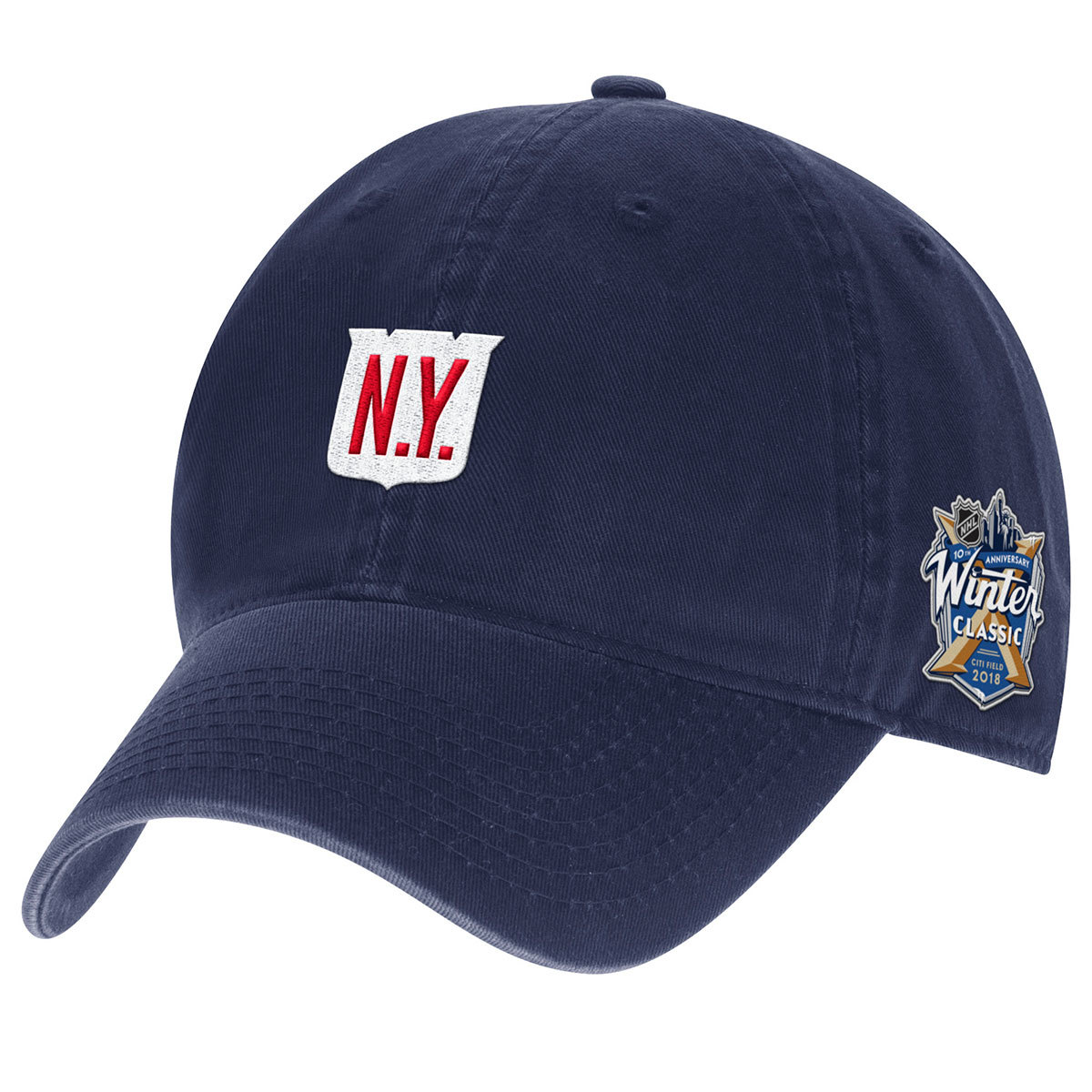
14 hours ago, Ridleylash said:
We have hat leaks for the Knights and Kraken Winter Classic;
While they aren't going full Metropolitans, I'm still hoping they use barberpole striping on the jerseys.
*EDIT: I just realized that the Vegas logo is two swords forming the V
-
2
-
-
13 hours ago, Digby said:
The more I look at the Suns set, my feelings on the white ball aren't changing... but I'm also missing the black in this set. Phoenix is one of the rare cases where throwing all the colors in somehow works (as long as mid grey isn't one of the colors), and works even better when white is tertiary at best. The home in particular just ends up too Stormtrooper for me, given this team's design history and what you'd expect of a team in Phoenix.
I completely agree with you. On the '90s purple sunburst jersey white was only used for the script, numbers, and NoB. All the white in this set feels distracting, especially using a white script on a white jersey.
-
On 7/28/2023 at 3:59 PM, Nordiks_19 said:
Now bring this panther as their official logo instead of the boring one they have, bring back their first Rever retro and a matching white, and call it a day
The first RR would make a great alternate, but the Panthers should be a primarily red team. Maybe just take the inaugural jerseys and swap yellow for metallic gold.
-
3
-
-
I feel like both of the Rangers reverse retros were just worse versions of the original Lady Liberty jersey. They were forced to make changes for change sake to get the jerseys to fit with the RR program, but now that it's a regular alternate they might as well just bring back the original one.
-
4
-
-
I'm really not a fan of city nicknames going on uniforms, especially ones that are just "___________ City". It also feels like the Pelicans are really pushing the Crescent City thing. When it started getting incorporated into the branding I assumed they just made it up. Googling crescent city doesn't even bring up New Orleans as a result.
Is "The Big Easy" just something tourists say that annoys the locals or something? It's always seemed like a pretty iconic city nickname, and if you were gonna throw something on a gimmicky jersey I would figure they'd go for that.
-
1
-
-
I know people are saying this will finally be the end of the Bruins, but I'd still be surprised if they miss the playoffs this year. Obviously they're incredibly weak down the middle, but they've still got one of the best goal scorers in the league, a solid d corps, and one of the top goalie tandems. Even if they win 20 less games than they did last year, they should still be able to land a wild card spot.
As a Sens fan I hope they fall out of it, but I wouldn't bet on it just yet.
-
10 hours ago, LakeShow24 said:
Me waiting for the Rams new alt uniforms
You're going to be waiting a while. The team has confirmed nothing will be added this season, and we won't see anything new from the team until 2025 at the earliest.
I'd be fine with yellow or a navy & white Fearsome Foursome throwback, just please let this mean they're abandoning any plans for a "Hollywood Nights" BFBS alt.
-
1
-
 1
1
-
-
1 hour ago, DCarp1231 said:
Shhhh you’ll awaken the “Utah should be [redacted]” crowd
Do we really need to get bogged down by the Oilers in Houston broken record? It’s not happening. Tennessee and the Adams family clearly choose to keep the name and history to themselves. End of story. Fin.
I'd have no problem with both teams staying the same, but my point was that if one team was going to rebrand it should be Houston.
-
17 minutes ago, DCarp1231 said:
What do you mean “Houston go back to the Oilers”? The team never had that name in the first place.
Do we really need to get bogged down by semantics? Houston's NFL team is currently called the Texans, and their NFL team was previously called the Oilers. Whether or not these were the same team doesn't matter, much like how it didn't matter that the Charlotte Bobcats never technically had the name Hornets before they changed it.
-
9
-
-
It's funny that Rodgers is basically wearing a Packers jersey with the fill tool clicked a couple of times.
2 hours ago, IceCap said:Here's my hot take...
Get rid of the Titans. Tennessee Oilers and Houston Texans.
"Titans" as a name had potential but between the super "turn of the millennium" first set and the Toronto Argos-lite second set... between their most notable moment being losing the Super Bowl by a yard and getting pantsed by the Brady Pats in the snow, what great legacy do the Titans have? McNair? George? They were Tennessee Oilers too.
No, Tennessee Oilers doesn't make a lot of sense but who cares? Neither does Los Angeles Lakers. Bring the Oilers back... in Nashville. Let it be a weird quirky thing, with awesome uniforms.
I'd rather see Tennessee stay the Titans and have Houston go back to being the Oilers. Titans is a great sports name in general, you've got the alliteration which always is a plus, and it ties into the whole "Athens of the South" nickname. It feels like a much more established brand than the Texans, and the Oilers name works better in Houston.
-
10
-
 3
3
-
 2
2
-
-
On 7/22/2023 at 9:05 PM, tBBP said:
That's something I've long wanted the Angels to do.
I'll take it one step further: strip out all the navy, swap all the silver for gold, brighten the red juatasmidge, and be the red-and-metallic-gold team in MLB. That I'm aware of right now the 49ers are the only other major pro sports team to use that colorway.
I've always thought this would be a good, unique look for them. Maybe they could use some navy sparingly to help things stand out, sort of like what the Florida Panthers do right now.
-
2 hours ago, Lights Out said:
"Pigskins" is the type of name that a single-A baseball team would use for a promotional night. It's unbecoming of an NFL franchise.
I'm still confused about this take. It's old-timey enough to seem like a name that's been used for a century, combines the team's mascot with the inoffensive portion of their old nickname, and presents a lot more branding opportunities than names like the Packers, Steelers, or Browns.
I don't see how that's comparable to names like Sauerkraut Balls or Flying Chanclas.
-
2
-
-
3 hours ago, tBBP said:
Imma need everyone to just quit it with the _____skins thing at this point. (And seriously, "Pigskins"? Ain't no grown man football team finna wanna be called that!)
I agree that we passed the point where the team could be called anything with the 'skins suffix. I think if the team had been more proactive and changed the name before essentially being forced to, Pigskins would have been the perfect choice. References classic football imagery, the team's hog fans, and is close enough to the old name that most people would've accepted it.
Considering all the names in pro sports, why would players care at all about being a Pigskin? We've got 2 different teams called the Sox, the Nets, the Magic, the Wild, the Kraken, etc.
-
1
-
-
1 hour ago, j'villejags said:
Stranger Things could've made sense -- taking place in the fictional town of Hawkins, Indiana.
Good catch. Not sure how I forgot this one. I guess when you take 3 years between seasons people can forget.
Plus the WNBA team did a Stranger Things inspired uniform.
-
6 minutes ago, j'villejags said:
The Tom Petty lyrics they used for the tweet start making more sense as the song goes on.
--
She grew up in an Indiana town
Had a good lookin' mama who never was around
But she grew up tall and she grew up right
With them Indiana boys on an Indiana night
...
Last dance with Mary Jane
One more time to kill the pain
I feel summer creepin' in and I'm tired of this town againI'm a Tom Petty fan and have listened to that song dozens of times, but even I didn't make that connection, so it seems like a big stretch by the marketing department. I can't really think of what notable impact Indiana has had on pop culture outside of Hoosiers and Parks & Rec.
-
1
-
-
29 minutes ago, dont care said:
Whats different about the edge set other than socks and ofcourse template but they wouldn’t change from adidas’ template
The only difference is the socks & the double outlines on the numbers/names.
15 hours ago, ebod39 said:"so maybe we see the old Edge set for that game." Nope
I thought I had seen a reference to the 2011 uniforms in their "Era Nights" announcement, but I guess they're honouring the entire 2001-present period so it looks like it'll be the current home jersey then.
-
2 hours ago, DTConcepts said:
I think the implication is that the Bruins will be unveiling a new alternate/centennial jersey with the crest, not replacing the current one.
Actually, I believe the plan is for them to wear a new home & away centennial set just for this season. I know they're going to be honouring the 2011 Cup team during the year, so maybe we see the old Edge set for that game.
This video shows two versions of the centennial logo, so it seems like the yellow B will go on the home jersey & the black B will go on the away jersey.
-
1
-


2023 - 2024 NBA changes
in Sports Logo News
Posted
But basketballs are orange