


spartacat_12
-
Posts
2,662 -
Joined
-
Last visited
-
Days Won
4
Posts posted by spartacat_12
-
-
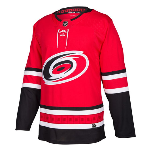
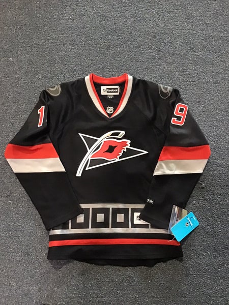
42 minutes ago, ruttep said:
Nostalgia aside, Cooperalls are objectively dangerous and (in my opinion) look terrible. In other words, par for the course for this franchise.
Also, the Whalers nostalgia money grab continues!
I'm almost certain they won't be worn during the game. The Flyers wore them in warmups with their reverse retros last season, so I'm guessing Carolina will do the same thing.
-
 4
4
-
-
22 hours ago, Ridleylash said:
I mean, just slip it into the striping like the originals had it instead of just having nothing in the middle. Just having the two outer colors and nothing in the middle just makes the stripe look unfinished; there's a reason teams with two-color striping like this tend to follow the formula of having the outermost stripes be one color, then having the jersey base color, and finally having the largest stripe be a second color.
I don't mind it. It mixes things up a bit from the traditional Blackhawks or Northwestern 3 stripe design.

-
On 11/2/2023 at 5:07 AM, adsarebad said:
In Texas we have a whole row of people trying to draw attention to themselves, wearing yellow banana suits and the likes.
In Arizona we have a seating placing behind home plate (and only behind home plate) that looks like it was placed there with the sole purpose to distract the pitcher/TV audience!!
You don't have this in Basketball, Hockey or Football.
...... what the
 are they thinking when they build these new arenas??
Basketball games literally have fans sitting on the court. When a visiting player is shooting free throws you get multiple sections of fans trying to distract them. The Clippers are purposely designing their new arena to have no clubs/suites behind one of the nets to maximize the amount of fans that can create distractions.
Hockey has fans sitting right up against the glass, frequently banging against it whenever the play is close. You also get people sitting directly beside the penalty boxes.
Professional athletes don't even notice this stuff.
-
13
-
-
-
10
-
 4
4
-
-
12 hours ago, FiddySicks said:
Sharks might just be the worst NHL team ever.
If the Sharks had been allowed to carry over every goal from the previous games they still wouldn't have won last night.
-
 1
1
-
-
The fact that they're using single layer captain's patches on the orange jerseys (which I don't think they've ever done) is proof that there'd be no legibility issues with white names on the back.
-
3
-
-
I wonder if we'll see any players publicly complain about these courts. Although Adam Silver might have a sniper ready for any players saying anything negative about this stupid tournament.
-
2
-
-
When the Capitals first entered the league they wore white pants with their red jerseys before eventually switching to blue.
-
I came across someone selling a book that was used by the Nets when they were pitching Carmelo Anthony to sign with them as a UFA. This was when they were prepping for their move to Brooklyn, but hadn't completed their rebrand. It includes an unused Brooklyn jersey in the old Nets colours photoshopped onto Carmelo.
-
5
-
-
3 hours ago, tigerslionspistonshabs said:
Can anyone give me a quick rundown of this in-season tourney? Seems absolutely mental to risk injuries for some Dollar Tree trophy.
They're just designating certain regular season games as "tournament games", so they count towards both their regular season records & tournament group standings. Only the two teams who make it to the finals will play an extra game.
It remains to be seen whether or not the players will actually care, but there is a financial prize, and the league is likely pressuring the PA to make sure guys know that this is important to the league.
-
12 hours ago, ruttep said:
This is dumb -- there's a reason that every single league in the world makes players wear their actual last names.
Well MLB did do the Players Weekend jerseys that had nicknames on the back, and the NBA did nickname jerseys 10 years ago as well.
It would just be boring in hockey because 95% of the jerseys would just have a 'Y' or an 'ER' added to the end of the guy's name.
-
3
-
1
-
-
15 hours ago, kimball said:
This is the DUMBEST reason for a design element I've heard in quite a while.
Between this comment, and the Oceans Eleven inspired 'Heist' ad that the league has been running, they really seem to be leaning on the finals in Vegas as a selling feature for this gimmicky tournament. What are they going to do once Nevada inevitably gets their own team and the novelty of the league being there isn't around?
-
58 minutes ago, ruttep said:
I do think that the punishment should happen anyway, because one of the consequences of acquiring a faulty organization is dealing with the fallout of the previous regime. The fact that a new owner took over in Ottawa since this happened does not change the fact that they (allegedly) screwed Vegas over in the trade. I won't speak on whether the punishment they decide on is valid (it sounds like they will be getting more punishment than the Blackhawks did for Kyle Beach), but there should still be some consequences.
Well like I said, there is precedent for a reduced punishment due to an ownership change.
-
On 10/28/2023 at 9:35 PM, ruttep said:
What does this even mean???
Vegas allegedly were misled to believe that Dadonov hadn't submitted a no-trade list when they acquired him from Ottawa. They tried to flip him to the Ducks later that season, but found out that he actually did submit a list of teams, and Anaheim was on it, so the trade was not allowed to go through.
There are rumours that they may have to forfeit a 1st round pick, but Elliotte Friedman believes that because ownership has changed since the violation occurred, it likely won't be that steep. He compared it to the situation with New Jersey & the Kovalchuk contract issue. New ownership was in place, so the league reduced the penalty.
-
1
-
-
5 minutes ago, Cujo said:
The NBA is really wasting their time with this tournament. Players don't care. Fans don't care. Yawn.
I can't wait to see the reaction when we see the first team raise an "NBA Cup Champions" banner to the rafters. It'll be even better if it ends up being a non-playoff team.
-
20 hours ago, monkeypower said:
Hypocrites?
The NHL having deals with sports betting sites doesn't mean players are allowed to bet. That's pretty much been a fundamental rule of playing a professional sport forever.
The players are actually permitted to bet on other sports as long as they're doing it legally. In this case Pinto has allegedly been allowing a third party to place proxy bets using his account. This is considered fraud, is illegal in a lot of states, and brings other potential issues like money laundering into the mix. The league had to make an example out of someone to make sure no other players think of trying anything sketchy like this.
Between the Pinto situation, Brannstrom's scary injury last night, and Chabot now missing 4-6 weeks with a broken hand, it's been a tough 24 hours in Sens land. It already feels like another lost season, but hopefully this means DJ Smith & Pierre Dorion are finally shown the door. They're the last remaining holdovers from the Melnyk era, and the team desperately needs to turn the page.
-
1
-
-
1 hour ago, BShaw20 said:
Magic release the “city”
This looks like it should be a Mavericks jersey.
-
2
-
-
14 hours ago, Ark said:
Literally not a single plural ending with S
These executives must think women's sports are a joke.
For Ottawa & Montreal I guess I can see it because they want to avoid issues with having a non-bilingual name. The Ottawa Alerts were a pro women's hockey team that played during the First World War, but I guess they were worried about the plural version not being French.
-
Well it appears that the team names have leaked, and they are all terrible.
I'm really hoping this league can be a success, and I know team names might not mean all that much in the grand scheme of things, but this isn't going to generate any sort of positive interest. Also, the Montreal Canadiens have frequently used a torch to represent their franchise, so it seems like a poor choice for a team in Toronto.
-
3
-
 1
1
-
 2
2
-
 1
1
-
-
21 hours ago, throwuascenario said:
I mean, their alternate from 2008-2016 was pretty much a black version of the originals, with only the logo changed. A straight black recolor wouldn't have been all that different from that.
Aside from the warning flag pattern, they didn't really carry much over from the red/white uniforms. The sleeve striping is completely different, and they used way more grey. A black jersey with the original striping, main logo on the chest, and white numbers instead of red would stand out on its own.
I've always thought a grey version of the originals would look good, but I can understand them not wanting to do another grey Reverse Retro.
-
1
-
-
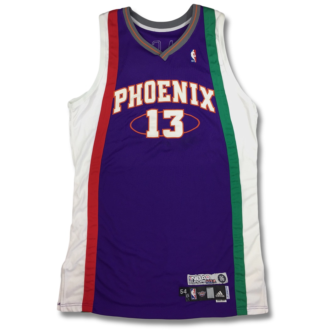
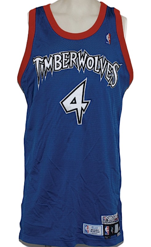
On 10/25/2023 at 1:04 AM, Old School Fool said:
People talk about how weird NBA uniforms are now but I'm remembering that this dates back to 2006 when they had teams playing in Europe for a few years they gave them special uniforms with the countries flag and colors. The photos below are just a few examples of how weird and stupid it got.
Meh, you can at least still tell which teams are playing. The base colours still match the team, and they have the actual team name or city on the front, not some obscure nickname.
19 hours ago, dont care said:People also bought the buffaslug too. Doesn’t mean it was popular or good, just that it was new, and they still wanted to support their team.
Exactly. Most fans will buy whatever is for sale in the team shop just because they like the team. Hopefully this year the two purple jerseys end up being the top sellers.
The branding strategy the NBA has moved to is pretty frustrating. They no longer have interest in teams using a cohesive set of uniforms that represent the team well. They just want to make every team's set as diverse as possible, which means everyone loves at least one of their team's jerseys and hates at least one of them.
-
On 10/21/2023 at 7:14 PM, the admiral said:
When the Senators' attendance was dropping below five figures, you never saw me crowing about how this proves that Ottawa is a failure and their team needs to be moved to a southern Yankee Containment Zone with a surprisingly good craft beer scene.
Plenty of people (including the team's owner) brought up relocation when the Sens were having their attendance issues. I was commenting on the "move 'em to Quebec City" crowd who seem to have convinced themselves that it would be a slam dunk success of a market, just like Winnipeg was when the Thrashers moved there.
I'm not advocating for moving the Jets anywhere, but this situation is why the NHL is in no rush to put another team in a small Canadian market.
-
1
-
 1
1
-
 1
1
-
 1
1
-
-
I don't love the Eagles current look, but I don't understand all the hype around the throwback. The shade of green is nice I guess, but beyond that there isn't much I like. The old eagle logo is way too horizontal & overly detailed. From a distance it looks terrible. The jersey also has nothing going on. It's just a plain green t-shirt with the logo slapped on the sleeve.
The colour balance is completely off too. The helmet is green, silver, and white, with no black anywhere. The jersey is green, black, and white, with no silver anywhere. I think the '70s/'80s set is miles better than this one. Let the Jets be the lighter green & black team. The Eagles should use a darker green (not midnight) and silver combo.
-
6
-
2
-
-
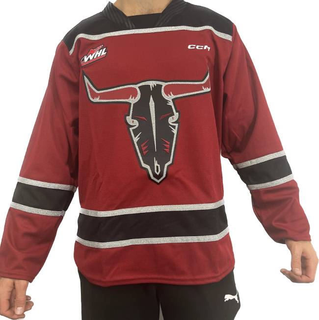
On 10/21/2023 at 9:21 PM, officeglenn said:
New alternates for the WHL's Red Deer Rebels:
Not a fan of the way the yoke outline cuts across the collar. It looks like they accidentally sewed the logo onto the back of the jersey.


2023-'24 NHL season
in Sports In General
Posted
It seems like a combination of a few things. They lost around 2000 season ticket holders during the pandemic, which was due to people cutting spending, changing entertainment habits, and issues around vaccine mandates. They started their first season ticket campaign since initially moving from Atlanta this spring, but I don't think the veiled threat of "buy tickets or the team might move again" went over very well.
The honeymoon period of the NHL being back in Manitoba is over, but their owner is still one of the richest people in Canada, and is committed to keeping the team there. I think we're still a long ways away from relocation being a realistic option.