


spartacat_12
-
Posts
2,713 -
Joined
-
Last visited
-
Days Won
4
Posts posted by spartacat_12
-
-
I'd love to see the White Sox bring back the winged sock in some capacity. Maybe a hybrid of these logos:

-
 14
14
-
-
12 hours ago, BBTV said:
Similar to Vancouver, the Padres also don't have a single iconic look. They have an iconic color pallet, but not any one look. I grew up with the brown-orange look that magically got recolored to navy-orange with no explanation, but can't say that either of those were the "right" look. Their current set has the potential to become their right look, but will take a while. The yellow-front caps are kinda iconic, but there's not enough memorable things that happened in those for them to be memorable to outside of SD.
So no Padres player can make this list.
I'd argue the Phillies have two iconic looks (if we say that the '50s are close enough to today's). Mike Schmidt doesn't belong on this list despite wearing the various versions of the swirl P - but neither does Jimmy Rollins or Chase Utley or Robin Roberts.
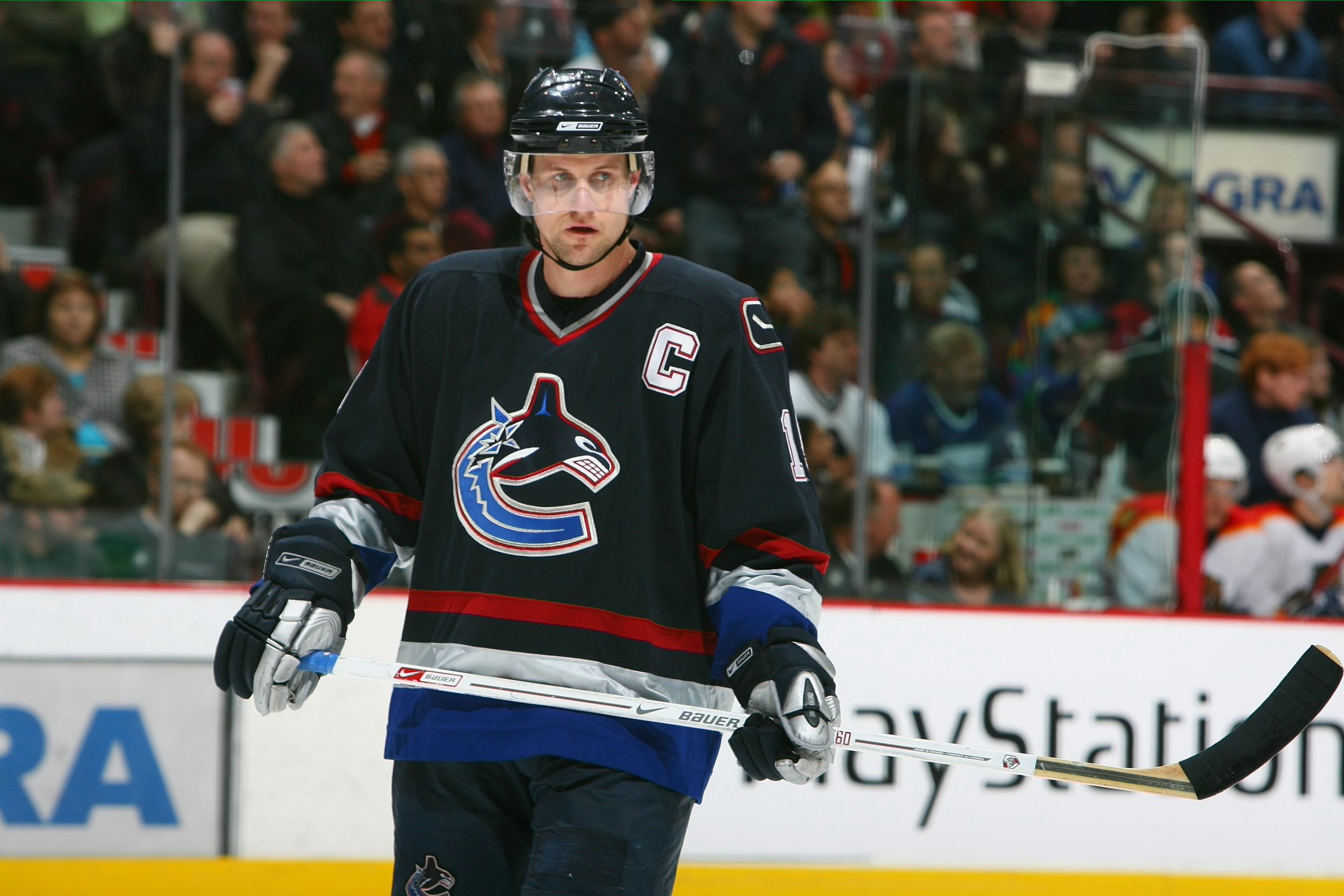
Teams like the Canucks & Padres might not have one particular "right" uniform, but that doesn't mean they don't have any "wrong" ones. San Diego's navy & sand is definitely a wrong jersey, although I can't think of any iconic players associated with those exclusively. And this is definitely a wrong Canucks uniform:
-
1
-
-
2 hours ago, maz said:
Which brings me to the debate about the meaning of this thread - I think they mean "wrong for their team" as in "not their best aesthetically," and not "one that isn't most iconic." A lot of people equate success with what the "right" and "wrong" uniform is. Example: the throwbacks the Pens went to a few years ago? They were sub-.500 for 9 of the 13 seasons they originally wore it, including the three worst seasons in their history. I can't help but wonder if people would have longed for them to come back so much if the Pens had changed before they won their first back-to-back cups.
When I made the thread I was thinking of "most iconic" as a team's "right" uniform, not necessarily the best looking one. For example, the Tom Brady-era Patriots uniforms weren't particularly pleasing aesthetically, but they would definitely be the uniform most people would associate with the franchise. I'd say that most people think of black & yellow + the skating penguin when it comes to Pittsburgh, so Jagr in the robo-pen seems like it would fit.
Some teams are trickier though. I thought about mentioning Trevor Linden in the Canucks flying skate, but with them using it as a throwback & inspiration for their latest third jersey, I figure some people in Vancouver still see it as the "right" uniform.
-
On 2/24/2023 at 9:14 PM, Dilbert said:
Sun Devil, Desert Financial and Mullet are all in Tempe at the ASU campus. If you want concert or sporting events in Tempe, they already have the venues to do so. The NHL failed in Phoenix and Glendale and are gonna fail in Tempe too. Might as well put arenas in Mesa, Chandler, Peoria, Scottsdale, Surprise and every Phoenix suburb to see if the Coyotes can fail there too.
When they initially played downtown in Phoenix they were averaging close to sell-out crowds. The arena was the primary issue, with it being optimized for basketball, not hockey. Despite the fact that most of their fans were located in the East Valley, they built an arena in Glendale because they got a better deal there. At the time everyone knew that Scottsdale was the best place for the team to be.
23 hours ago, the admiral said:It's of unending fascination to me that Meme Magic turned the tide and made everyone online into insufferable defenders of the Coyotes/Predators/Panthers/Hurricanes. durr put a team in wood buffalo
You included Nashville in that group of teams despite the fact that they've consistently gotten good crowds over the last decade, and have made it to the post-season 8 straight years. Their franchise value is higher than "traditional" markets like Ottawa, Columbus, Winnipeg, and Buffalo. But I get it, these facts don't really fit your "warm cities bad" narrative.
It wasn't that long ago that Tampa Bay was an irrelevant organization that had trouble bringing in fans, and now they're one of the league's model franchises.
-
19 minutes ago, Dilbert said:
Thats true however the Phoenix area already has Footprint Center, Arizona Veterans Memorial Coliseum, Chase Field, State Farm Stadium, Desert Diamond Arena, Sun Devil Stadium, Desert Financial Arena, Mullett Arena, Phoenix Rising Soccer Complex, Phoenix Raceway, not to mention the many spring training ballparks. Do they really need another arena for sports and concerts?
Almost all of the venues you mentioned are in other cities. If I'm a Tempe resident I'd prefer to have entertainment dollars going into my local economy as opposed to Phoenix/Glendale/etc.
-
52 minutes ago, IceCap said:
That doesn't change the fact that the Kings' switch to black and silver prompted a lot of other teams to adopt black-heavy uniforms or replace a colour in their scheme with black. Or that the next two expansion teams after that rebrand went all-out on black sweaters with metallic logos.
Maybe the Kings' 1988 rebrand doesn't fit your definition of bfbs but it started the trend in the NHL.
I know I'm splitting hairs, but I just think there's a difference between a team saying, "We're doing a full rebrand, and people seem to like black so let's make that a main colour" (Kings, Sabres, etc.), and a team saying, "Let's just take our normal colours/uniforms, but add black" (like the Leafs Bieber jersey).
Both ideas are capitalizing on the popularity of black, but one is much lazier in it's execution than the other.
-
6
-
-
On 2/21/2023 at 3:03 PM, BBTV said:
The Devils change may have been the beginning of the bfbs era of pro sports. If not the beginning, then near it. The timeline doesn't match up exactly, but their garden-state neighbor Jets also unnecessarily added black.
On 2/21/2023 at 3:36 PM, IceCap said:The first "bfbs" thing in the NHL was the Minnesota North Stars adding black highlights to their home whites in 1981.
That being said it didn't really kick into high gear until 1988 when the Kings landed Gretzky and went full Raiders with a rebrand. Which is the same year the North Stars added the black highlights to their road greens.
By 1991 the North Stars had gone to black primaries very reminiscent of the Kings' black Gretzky sweaters and in 1992 Ottawa and Tampa Bay joined the league with black primaries. That's also the year the Devils switch out green for black. And while it's not strictly bfbs, 1992 was also the year the Whalers changed out their kelly green and royal blue unis for navy, green, and silver. Darkening a colour scheme was a trend that went hand in hand with bfbs.
So I'd say the Kings' Gretzky look kicked it off in the NHL, with the North Stars as a precursor.
I've never really considered teams doing complete rebrands that involved a change to black as 'BFBS'. No one calls the Penguins switch from double blue to black & yellow BFBS. If the Devils had kept the red & green, but just added some black trim the way the North Stars & Flames did, that would fit the definition a little better.
MLB seemed to be the most egregious offender. Around the turn of the century, the Royals, Reds, Mets, and A's had all lazily slapped black trim on their uniforms and/or come out with a black alternate jersey.
-
2
-
-
1 hour ago, TBGKon said:
The Lightning haven't worn their blackout alternates this season, and based on this post from their official arena store they've been retired.
Makes me wonder if we'll see a new Lightning alternate for the 2023-24 season or if they wait until the new uni manufacturer in the 2024-25 season.
Good riddance. Tampa might have the worst collection of alternate jerseys of any team in the league. The only decent one was the blue Edge third jersey, but even that got brought down by the 'BOLTS' wordmark & the armpit stain/chest piping.
-
10
-
-
15 hours ago, FiddySicks said:
I'm assuming that this is some sort of dig at the Coyotes, but a 16,000 seat arena & a 3000 seat concert hall will offer plenty of other events besides hockey.
-
1
-
-
On 2/21/2023 at 1:40 AM, GDAWG said:
I am most curious to find out what happens if Tempe votes no the Coyotes.
I don't see any reason why residents would vote no. It's a completely privately funded project that will create jobs, bring in world class entertainment, and provide public facilities for the community. Even if you aren't a hockey fan, that's a pretty good deal.
If for some reason they don't win the vote, that's when the relocation talk will go from twitter/reddit/message board hyperbole to actual reality.
-
15 hours ago, Andrew_Gamer_NZP said:
Looks like they came to their senses a bit and got rid of the giant black rectangle surrounding the ad patch. It still looks awful, but at least it's slightly less invasive.
-
1
-
-
2 hours ago, insert name said:
This is gonna be super controversial but the black uniforms originally lasted 15 years, plus a few more and counting with its recent comeback. Can an argument be make that, specifically the black home jersey is becoming more of a "right" Mets uniform? They've already lasted longer than the 80s racing stripes and those are super iconic for obvious reasons.
I'd say that any time a franchise has decided to bring back a throwback uniform as the primaries, that means the throwback is the "right" uniform. The Mets (and Flames, Oilers, Sabres, etc.) had memorable runs in their '90s/'00s unis, but at the end of the day they returned to their beloved classic look.
-
To prevent this thread from getting Bill-jacked, here's a few more I thought of:
-
5
-
-
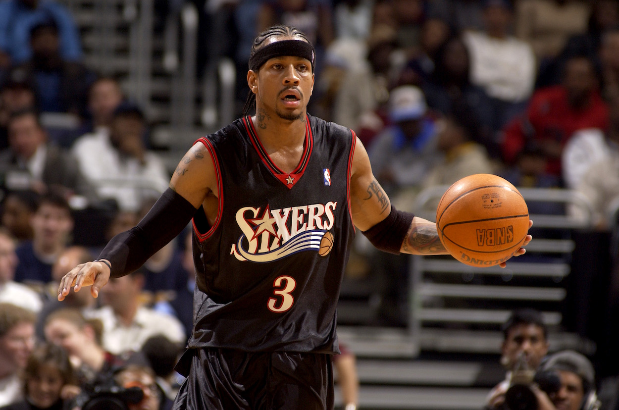
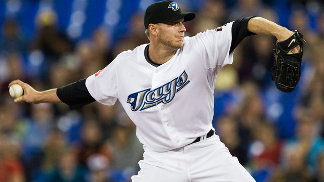
With another entry in the "wrong uniform" thread series, I thought we could share examples of franchise players who's most recognizable uniform is a departure from their team's "right" uniform. Here's what came to mind for me:
Grant Hill being known for the Pistons teal horse set
Roy Halladay
Dominik Hasek
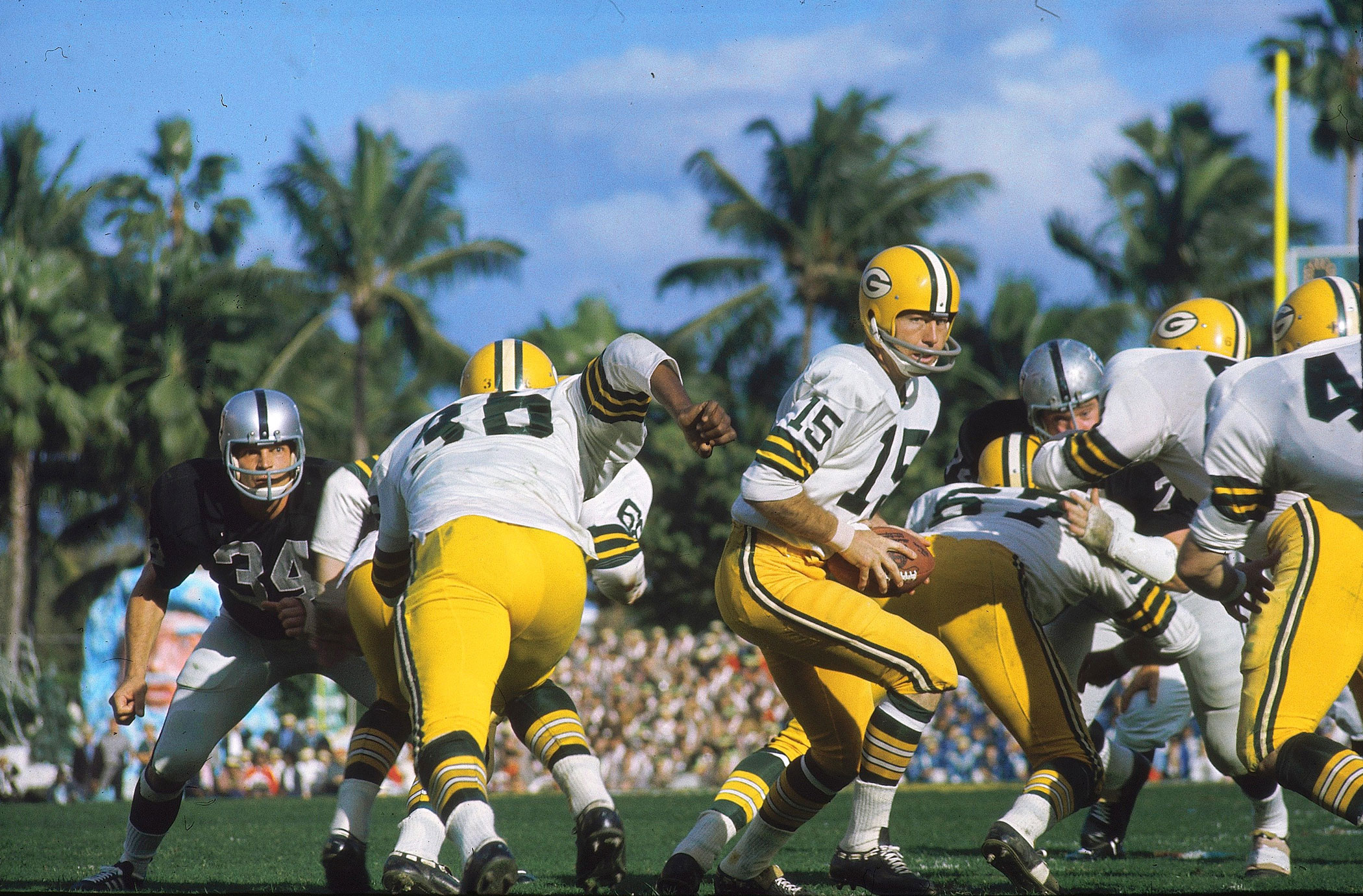
LT in the navy blue
-
6
-
-
On 2/15/2023 at 9:55 PM, monkeypower said:
We don't have a next season thread up yet I don't think.
I like it and it's the first anniversary logo they've used that includes both Mighty and non-Mighty eras.
I'm personally not a big fan of this. If you take away the webbed D this wouldn't immediately jump out as a Ducks logo. The beveled font looks like something from Dallas's set, and going with black, yellow, and silver was an odd choice. No orange, no bronze, no jade, no eggplant.
There's basically a 3 in the negative space of the webbed logo, so that feels like a missed opportunity. Would have made more sense than how they incorporated it into their 25th anniversary logo.
-
23 hours ago, OnWis97 said:
The 1980s "Christmas" Devils is my favorite NHL look of all time. That said, I think your (our) opinion is extremely unpopular. When I first got on these boards, I figured a lot of people would agree with me...red/black is pretty overdone and the red/green look was unique. Turns out that 1) like pineapple on pizza, the red/green is polarizing and mostly not liked and 2) red/black is preferred to red/green because it's more "devilish."
Red & green is also one of my favourite colour combos, and I'd love to see it used more. However, with the Devils it isn't so much about them using "devilish colours", as it is about what the black & red represents. The red & green era was associated with an irrelevant franchise that Wayne Gretzky literally called a "Mickey Mouse" organization. The switch from green to black coincided with them bringing in guys like Brodeur, Niedermayer, & Stevens, and becoming a model franchise.
-
3
-
-
On 2/14/2023 at 11:57 AM, GDAWG said:
I had heard of a few different groups, but this is the first time Remington has been brought up, so it's an interesting choice for Reynolds. This was the same group that had tried to build an arena in Markham a little while back with the hopes of getting a 2nd Toronto NHL team. Considering how much development potential comes with the Sens moving downtown, it makes sense.
For a while it has sounded like Michael Andlauer (Hamilton/Brantford Bulldogs owner) and his group were the favourites to buy the team, but I'd say with Reynolds on board this should make Remington the front-runners.
-
On 2/13/2023 at 6:35 AM, Burmy said:
Whichever city ends up with the Bulldogs after Hamilton's arena renovations are complete, I believe the other one will get an OHL expansion team.
The question is, who would be a second expansion city for the league?The Brantford Civic Centre is nearly 60 years old, and holds less than 3000 people. I know the Bulldogs are pumping some money into it, but it really doesn't seem like anything more than a stopgap solution.
-
2
-
-
I went to a fairly new high school, and our nickname was the Avalanche (we didn't have anything close to mountains around, but I guess they were dead set on alliteration). We used burgundy & blue as our colours, and our logo was a rip off of Colorado's.
Oddly enough, our hockey team didn't use the Avs jersey template. Instead they slapped this logo on the Canucks old West Coast Express jerseys.
-
Still waiting to hear the full trade, but it sounds like Sammy Blais will be returning to St. Louis, and that the Blues are eating a big chunk of Tarasenko's cap hit.
-
5 hours ago, OnWis97 said:
I'm sure I'm in the minority but I love that Toronto jersey...I prefer that leaf and I like the double outline. I don' think the name-on-back font fits, but I otherwise really like it.,
The NOB was meant to match the wordmark from the logo.
-
2
-
-
On 1/12/2023 at 10:31 PM, DTConcepts said:
I love weird captain/assistant captain patches on hockey jerseys. Having something more unique than a 'C' or 'A' from the normal letter kit goes a long way in making a jersey more unique and fun.
The Avs should have just kept the Big Foot on the shoulders and used the state flag C as the captain's patch.
Also, the Canes should be using the Stadium Series C on all their jerseys (and use their actual logo on the road instead of the wordmark).
-
6
-
-
Really surprised this matchup hasn't been posted yet. These are probably my 2 favourite uniforms in the league & they pair together perfectly.
-
14
-
-
Pretty rare/unique situation here. A Western Conference All Star Jersey with an Islanders logo on the shoulder.
-
 1
1
-


NHL Anti-Thread: Bad Business Decision Aggregator
in Sports In General
Posted
Well there is a big difference from watching a sport on TV, and getting to see it in-person. In fact, most casual sports fans appreciate hockey a lot more once they see it live.
And as for the kids, a lot more of them are playing the sport now. Here are some quick USA hockey registration stats:
Registered players in Arizona
1999 - 3,382
2022 - 9,232
Florida
1999 - 5,606
2022 - 18,725
North Carolina
1999 - 2,149
2022 - 7,191
Tennessee
1999 - 1,176
2022 - 4,932
Texas
1999 - 5,932
2022 - 16,032
So the NHL's presence is making an impact, even if it hasn't necessarily led to sold out crowds everywhere. We're even seeing a lot of American-born players coming out of non-traditional areas who grew up playing for the NHL sponsored youth teams (ex. Jakob Chychrun & Shayne Gostisbehere grew up playing for the Jr. Panthers in Florida).