-
Posts
2,713 -
Joined
-
Last visited
-
Days Won
4
Posts posted by spartacat_12
-
-
On 12/4/2022 at 9:48 AM, WSU151 said:
NFL brands are like Oreos…they can offer 12 different flavors but everyone still knows what a true Oreo is.
If Oreos were only available to buy 17 days out of the year, and for half of those days the only kind on sale were Swedish fish or cherry cola flavour, most people would rightfully be disappointed.
-
 13
13
-
-
On 12/2/2022 at 10:48 AM, simtek34 said:
I wouldn't hold my breath out for that, as supposedly, the Yankees were the team that was pushing for the Nike swoosh to be on the front of MLB jerseys instead of on the sleeve like Majestic/Russel/Rawlings/etc...
I'd hope they would sell the naming rights to the stadium before they ever decided to tarnish the pinstripes with an ad.
-
 2
2
-
-
12 hours ago, dont care said:
It being in the bubble, back to back champs, and an original 6 team are all more reasons in themselves to be remembered more than 07. I had to look up who the played. It was the Senators that no one cares about, and it was right after Anaheim changed to the most boring uniforms in the league at the time.
I mean a lot of casual fans have already forgotten that New Jersey played in the Finals in 2012, that Tampa lost in 2015, and that Dallas lost in 2020. 2007 was also the last season before the switch to Reebok Edge, so the uniforms around the league got a whole lot worse immediately after.
-
 1
1
-
-
On 12/2/2022 at 8:40 PM, insert name said:
At least the Fisherman had character.
It also still had some semblance of a connection to the franchise's roots. They stayed somewhat true to the classic colours (aside from darkening the blue & adding teal to be trendy).
5 hours ago, pepis21 said:Why is this not a good idea? The Lakers have worn this colour combo briefly as a one-off alternate, and it's essentially a simplified version of the '90s Jazz colours.
-
 1
1
-
-
19 hours ago, DTConcepts said:
This might belong in the unpopular opinion thread, but these jerseys should be the basis for the Sens' identity. (Albeit with the 2d Centurion logo)
That's definitely a popular opinion among a group of Sens fans. Back when the AHL team was in Binghamton they used a similar design for a few of their jerseys.


I've said it a few times on here, but I'm not a huge fan of putting more emphasis on gold. Even though Ottawa had the design first, the sparkly gold stripes with laurels seems a bit derivative of Vegas's brand, especially since both teams use a gold-helmeted ancient warrior as their logo.
-
2 hours ago, WSU151 said:
I think may have been a late change...there's a seller on eBay selling 22-23 RR InGlasco pucks, which feature the front crest/jersey design for the other 31 teams, but for the Sens the Senagoth logo is on the puck with the red swoops.
Hmm, interesting. If that's the case it's funny that Ottawa is 2 for 2 on making last minute changes to their RRs after merchandise has already been released.
-
 1
1
-
-
13 hours ago, Kramerica Industries said:
I don't know if this is the first time Ottawa's wearing their RR's, but I'm deeply unimpressed. I just thought my eyes were playing tricks on me with thinking these were their current black sweaters but, like, maybe they got tweaked over the offseason and I just missed an announcement. Apparently they're a "stealth" version of these?
They could've done much better than just replacing the white areas with red and leaving the black stripe completely untouched (not to mention leaving the 2D logo instead of the 3D). Instead, it looks like a Walmart knockoff of their main set.
They aren't the worst jerseys the team has worn, but are definitely too similar to the primary home uniforms. All they really had to do was swap the red & black on ^ those jerseys. It feels like they were afraid to put the 'Senagoth' logo on the chest, so they went with a half-measure by putting it on the shoulders.
13 hours ago, habsfan1 said:Also, I miss the updated 3D Centurion. A missed oppurtunity to bring it back.
I'm sorry, but I don't know anyone who misses that logo. I'm fine with seeing the original 3D logo back for the purposes of the Reverse Retro, but it really doesn't bring much to the table besides nostalgia. The updated 3D was also only abandoned 2 years ago, so not exactly retro.
-
 3
3
-
-
On 11/27/2022 at 4:31 PM, Digby said:
I thought there was precedent for the black trim at least. But yeah, the all-black kits that are as standard teamwear as it gets... too bad. At least that typeface was kind of fun and certainly stood out.
Oh yeah, there's definitely precedence for Canadian national teams using black, and I can tolerate it when it's used sparingly. The problem is that most of the teams have gone overboard with it.
-
23 hours ago, DTConcepts said:
The cream gloves keep it from being a perfect 10/10. They don't mesh well with the bright yellow cuffs, imo.
Pretty sure the gloves are supposed to be yellow, not cream. Although it must be tough to get the material to match the jerseys/socks, because they look more mustardy.
5 hours ago, pepis21 said:How someone in Detroit and adidas accepted that is a mystery for me and an even bigger mystery is how the designer could have thought giving the Red Wings black was a good idea.
Well the Leafs already use a black alternate, so we shouldn't be surprised at this point. And most of my 'normie' sports fan friends really like the Bieber jerseys & the Red Wings' RR, so I'm sure they'll sell well in Detroit.
Sad that we're already in the 2nd wave of BFBS.
-
On 11/22/2022 at 12:39 PM, LA Fakers+ LA Snippers said:
Maybe it's because I'm too young, but besides the star on the helmet this just looks like the Colts & Lions uniforms had a baby.
The Cowboys should be a navy & silver team. I don't really care what shade of silver/grey, but they need to just pick one & stick with it.
-
 2
2
-
 2
2
-
-
2 hours ago, Digby said:
Yeah it kind of sucked seeing the biggest moment in Canadian men’s soccer happening in plain black t-shirts.
Canada should only ever wear red & white. Preferably with no black trim anywhere.
-
1 hour ago, DTConcepts said:
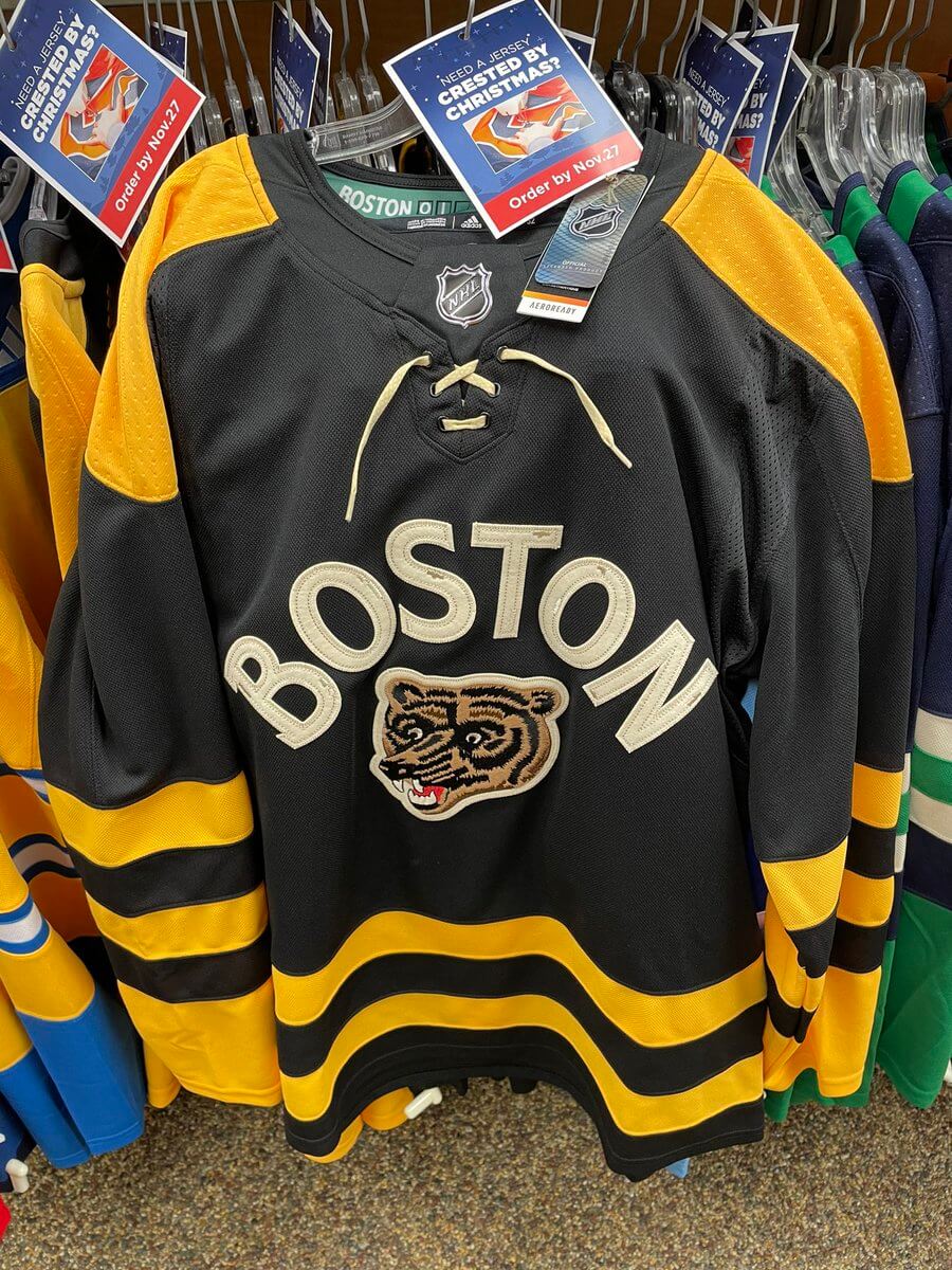
Per Uni-Watch, the Bruins' Winter Classic jersey has leaked:
Looks like the inspiration for most of the design comes from the ‘50s/early ‘60s white jersey.

I’m guessing the arched wordmark is a tribute to the local college hockey history.
I don’t hate it, but clearly they’re running thin on ideas for new outdoor game jerseys.
-
4 hours ago, simtek34 said:
It's with alternate uniforms in general, not Color Rash. Every other Alt helmet team besides the Panthers are wearing their Alt helmets with an Alt Jersey. The Panthers got around this by designating their Black Jersey/Black Pants/Black Socks as their other "Alternate," since their primary uniform is Black over Silver.
That's my point. The poster I was quoting was implying that the Bengals could only wear the white helmets with their colour rush set. I'm saying they could've done what Carolina did and just designated the primary white jersey + white pants as their alternate.
-
 1
1
-
-
16 hours ago, Bathysphere said:
This was their exact thought. It clearly was made specifically for this, but the ever cryptic rules which surround color rush meant that they couldn’t designate a new “color rush” until next year because apparently their current all-whites with the normal helmet was designated such a year ago. So they brought up the old color rush for it because it technically didn’t get bumped out of its alternate slot when they changed their other three jerseys. I think it’s designated now as a normal alternate that happens to be all white so maybe next year they can wear it with their current whites as intended, though I don’t know if designating the white helmet to their old now-normal alternate “color rush” started a new timer for when the new helmet can be designated to a different uniform. I don’t know, color rush is literally a make believe concept that the league decided is an integral part of uniform rotations in the most important sports enterprise in America for some reason. I don’t know.
Wouldn't the easiest solution have been to designate the white jersey + black pants as the primary road uniform, and make the white jersey + white pants look the alternate? That way they could use the white helmets with the all white alternate.
The Texans wore their red helmets with white pants, so there's no rule that says alternate helmets can only be worn with colour rush uniforms.
-
20 hours ago, Ridleylash said:
I think the reason they didn't go with red lettering because it would end up bleeding into the base powder color too much, and adding the yellow outline would only exasperate that issue, especially since they're placed between the yoke and hem.
Navy contrasts sharply with powder, red and yellow, making the names and numbers quite easily legible from a design angle; especially in motion where you have a dark color surrounded by light, as opposed to two light colors with a thin dark outline, or three light colors all competing for attention.
I'm not sure why you think red & yellow would bleed into powder blue more than a darker shade of blue. They're literally the 3 primary colours. The red & yellow yokes/stripes pops nicely off the powder blue base, so why wouldn't the numbers?
Also, people's biggest complaint with this uniform has been that the names/numbers are hard to read, so your second point has already been debunked.
-
 1
1
-
-
Panthers wearing their reverse retros tonight. Everything looks great except for the numbers/NOB. They're barely legible on TV, and the cool coloured numbers don't match the warm coloured stripes. They really should be red outlined in white or yellow, with solid white NOBs.
-
 1
1
-
-
Just got caught up on Infantino's opening news conference, and boy did he pack a lot of stupidity into one statement.
Says that because of how Europeans have acted over the last 3000 years we should all just turn a blind eye to the slave labour, LGBTQ+ discrimination, and general human rights abuses going on in Qatar. Then he said that he knows what it's like to be discriminated because he got bullied as a kid for having red hair & freckles.
He also brushed off the alcohol ban by saying, "If you can't drink beer for 3 hours I think you can survive", even though the issue people have is that they waited until the last minute to change the rules & break their promise to the fans. If they can flip-flop on beer sales like that, how can anyone trust anything else they've "promised" (i.e. the safety of members of the LGBTQ+ community who are in attendance).
-
 6
6
-
-
13 hours ago, M4One said:
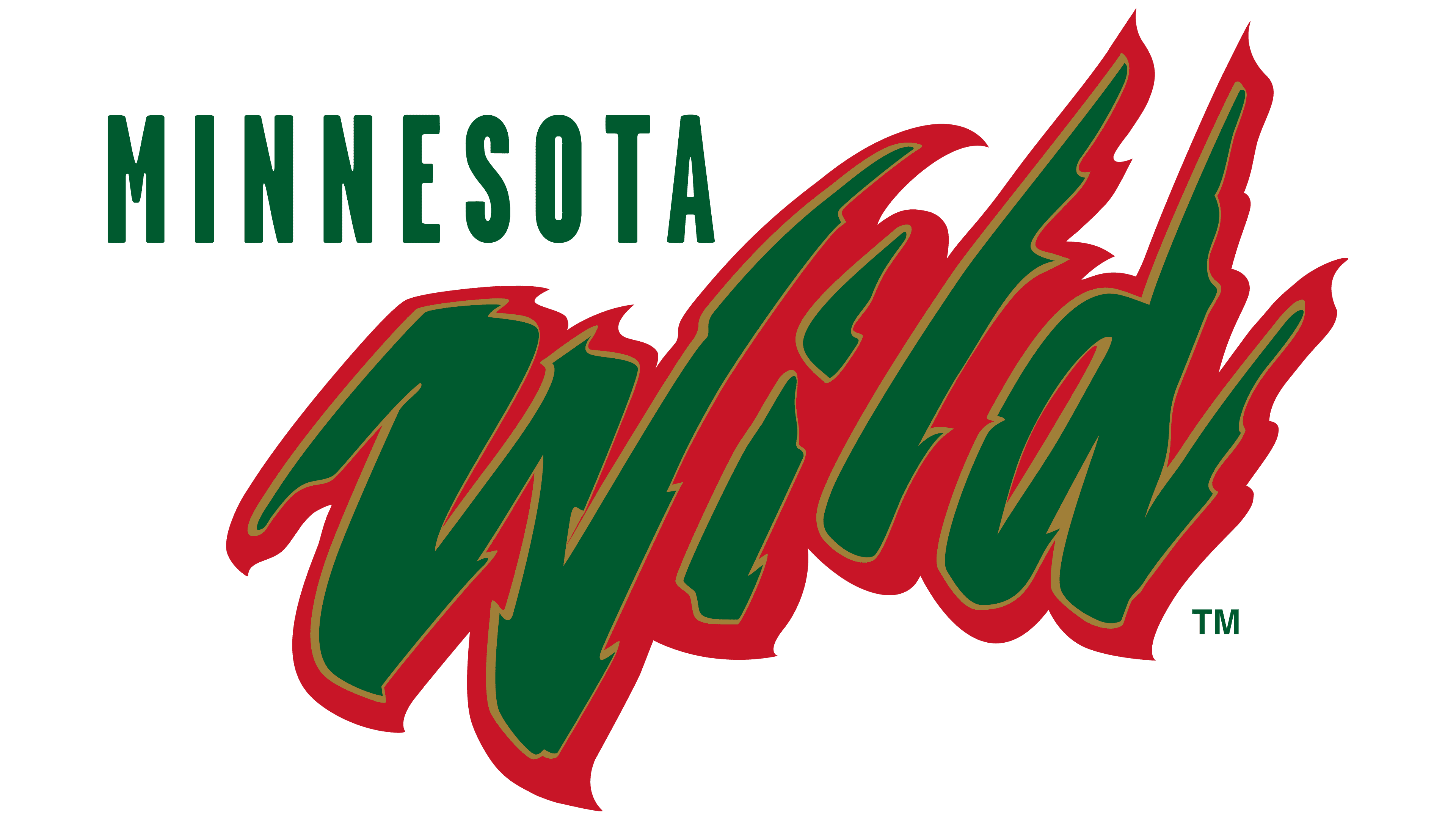
If the NHL does something like the retro's again, then the Wild should throwback to...the Wild. The name might seem awful to some, but they have had spectacular jerseys throughout their history. After going with a North Stars jersey the first time, they definitely should have gone with something from their own history this year. A red version of their original green jersey with green sleeves would have looked nice.
This script on a red inaugural jersey would be a cool RR.

-
 6
6
-
-
On 11/11/2022 at 12:15 PM, SSmith48 said:
Got polls on social media too. New uniforms are coming, there’s not doubt about that now. Just have to wait and see what unfolds.
It’s a bit refreshing seeing the fans consulted on this. I know they were waiting to sell the team to start the process. Let’s just hope they take some fan input into account, and don’t pull a Rams/Commanders and overdesign everything.
Except too much fan input can end up leading to trying to please everyone and ending up with a convoluted mess.

-
 5
5
-
 2
2
-
-
On 11/17/2022 at 9:07 AM, maz said:
Royal Blue - Any time a team changes to this from a darker shade, everyone loses their minds like it's the best aesthetic decision that team has ever made when it almost always is a lateral move at best, downgrade at worst. I'm not saying there is no place for royal blue, or that it looks bad. Some teams look great in it. But this idea that anytime a team moves to it from dark blue that it is objectively a big brain move, and better color than any darker shade they've used, is a fallacy. I think that, at least in the case of the Sabres, Oilers, and Islanders in the NHL, this is often due to nostalgia.
I think the praise you're seeing is more about teams returning to their roots rather than just people loving royal blue in general. Teams like the Sabres, Oilers, Rams, Bills, & Warriors jumped on the navy bandwagon in the late-90's/early '00s because it was trendy, and wisely went back to royal.
I don't think you'd see the same reaction if the Yankees, Bears, or Michigan Wolverines decided to switch from navy to royal blue.
-
 5
5
-
-
23 hours ago, DTConcepts said:
I would've preferred if they went with this look for the Winter Classic instead of a Pirates throw/fauxback.
Oh well, I'm sure they'll be in at least one more WC in the next 5 years, so maybe we'll see it then.
-
 4
4
-
-
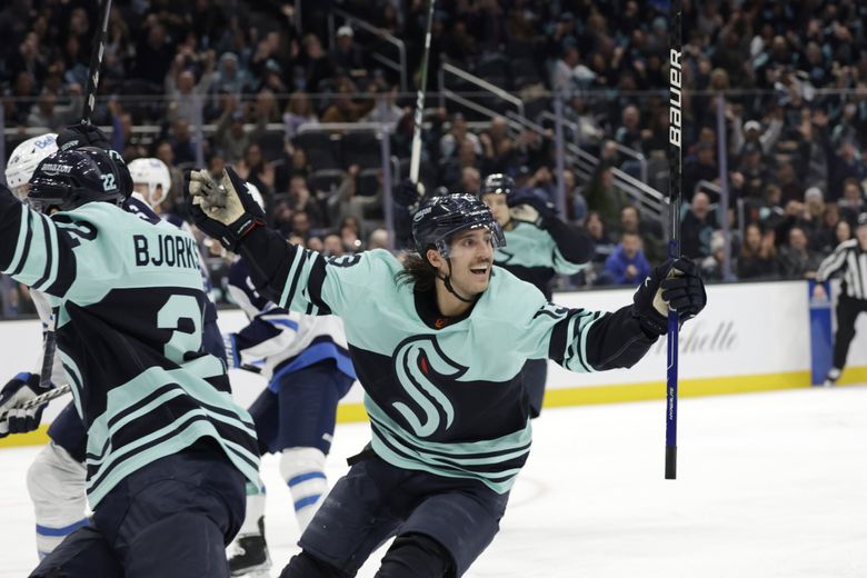
The Kraken logo is great, but I think it looks even better on the RR with the beveling removed.

-
 4
4
-
-
5 hours ago, BBTV said:
I get that - but that's not my point. My point is that if you already follow the blue-check, then the imposter wouldn't appear in your feed unless you sought it out.
If an athlete is trending, you’ll see people you follow & people you don’t follow tweeting about them.Earlier today a fake Woj account with a blue check posted that the Nets were releasing Kyrie. It got thousands of retweets before Twitter did anything about it.
-
 1
1
-
-
On 11/8/2022 at 11:20 PM, habsfan1 said:
Why?
As a fan, I’m not a fan. This was my problem with Phillips getting his number retired. It just opens up the floodgates for fringe guys getting their numbers in the rafters. I’ve even heard people around the team saying that Craig Anderson should be up there next.
There is also a ring of honour at the CTC, which is where guys like Neil & Phillips belong. They were loyal & did a lot for the community, but that doesn’t warrant a number retirement in my eyes. Would I have been upset if a new player tried to wear 11 after Alfie left? Absolutely. Would I have felt the same way if a player tried wearing 4 or 25? Not really.
Of course all the gatekeepers on Twitter & Reddit would say I’m not a real fan for disagreeing with the decision.


/cdn.vox-cdn.com/uploads/chorus_asset/file/11469479/harvey_martin_dallas_cowboys_dl_image_taken_color_slide_73824076.jpg)




2022 NFL Season week by week uniform match-up combos: From HOF Game to Super Bowl LVII
in Sports Logo News
Posted
I mean the Jets might end up wearing black jerseys and/or black pants 14 times this season. Obviously that isn't as much of a departure from their normal brand as Cherry Cola Oreos are from regular Oreos, but it still dilutes it.