


spartacat_12
-
Posts
2,723 -
Joined
-
Last visited
-
Days Won
4
Posts posted by spartacat_12
-
-
On 8/5/2022 at 6:16 PM, WSU151 said:
If that's not a change to their full time helmet, it should be.
I've thought for a while this would be a good route to go for a modernized throwback look, but it really doesn't fit with the rest of the current uniform. They should use this jersey as inspiration, either for a new primary set, or an alternate.

-
 2
2
-
-
It also helps that Minnesota essentially invented what we think of as a "fauxback" uniform. When they unveiled their original red alternate, stuff like cream/vintage white coloured numbers and a felt roundel logo were unique & original. They even extended this branding to the All Star Game uniforms they hosted.
Now that every Winter Classic involves some sort of cream fauxback look it feels a little overdone, but it does make sense for Minnesota, regardless of when they were formed.
-
3
-
-
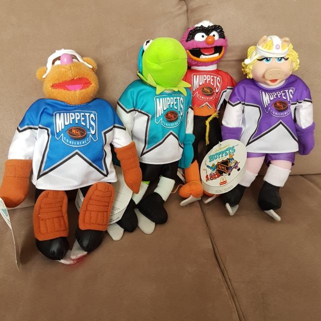
It might have just been in Canadian restaurants, but in the '90s McDonalds sold plush Muppet NHL All Star collectibles.
-
 1
1
-
 1
1
-
 1
1
-
-
18 hours ago, the admiral said:
I think the SkyDome looks even worse from the outside than it does from the inside. It's just concrete and glass.
All this renovation does is turn cheap seats no one was buying into lifestyle seats no one will be able to afford. Everything that has ever been bad about it as a ballpark will continue to be bad. They would be better off starting all over, but that assumes that there's any real estate left in Toronto that hasn't been given over to money-laundering condos.
The new outfield patio areas won't be ticketed. They will just be standing room areas that anyone in the stadium can watch the game from, similar to the Flight Deck. Maybe if they're hosting a playoff game they'll sell SRO tickets for that area, but they would literally be the most affordable option.
The stadium itself will never be perfect, but it's in a perfect location. The two options for a new stadium would be to either build in a much less convenient spot, or to find a temporary home for 4-5 years while they teardown the dome and build on the same spot.
18 hours ago, slapshot said:So these changes are mostly from the foul lines to mid-center? The seating area below the scoreboard was redone a few years ago, and the only change I see with those bleachers is that they will now extend right to the outfield wall, instead of having that gap that drops down about 10 feet.
They're also replacing the entire lower bowl. The seats along the foul lines will be reconfigured to actually face the plate, instead of facing center field like they currently do. You can see a bit of what it will look like on the right side of the second rendering.
-
Glad they're getting the bone games out of the way early. Hopefully Week 3 is the last we ever see of it.
-
6
-
-
37 minutes ago, Digby said:
I was thinking this week how terrible the Red Sox City Connect jerseys look over the white pants. OTOH, I don't want any more of that banana color in my field of vision, either. So no good solution there.
I mean there is one solution.
-
2
-
2
-
-
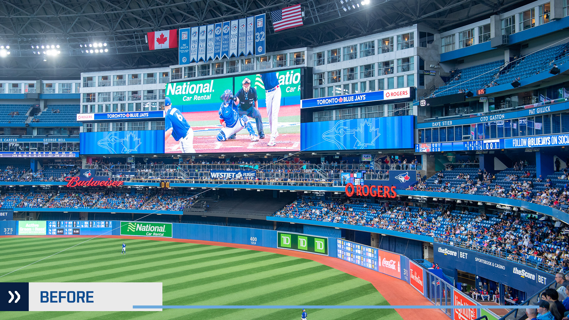
Late last year the Blue Jays announced they would continue to try and upgrade their stadium with a $300 million renovation project. They have released renderings of what the changes will look like, specifically to the outfield. The big changes are raised bullpens, adjustments to the wall (including moving seats right up against it), and replacing the upper deck seats with more standing room/bleacher-style/patio seating.
It's never going to be a classic ballpark, but this is definitely a big improvement.
-
16 minutes ago, Krz said:
Nike with the opportunity to control all four leagues
They've already ruined the NBA, and are in the process of ruining the NFL & MLB with the alternate helmets and city connect stuff. Why wouldn't they take a shot at ruining the NHL now that most of the teams look better than they ever have.
-
9
-
-
2 hours ago, DEAD! said:
The "original six" is such a misleading term anyways. I am surprised nobody wants to cosplay as the Montreal Maroons or Quebec Bulldogs.
I mean the stripped down Coyotes look was almost identical to the Maroons lol.
-
1
-
2
-
-
1 hour ago, aupa said:
They aren’t alternating between both. They are wearing the Color Rush once, at home, on Thursday night. I assume the regular white will be worn for every road game unless the home team wears white at home.
I agree it seems silly that the white helmet pairs perfectly with the new away, but the press release makes it pretty clear the NFL won’t allow them to do that this year at least
But can't they just say that white over black is their primary uniform and the all white is the alternate? Isn't that how the Panthers are getting away with pairing the black helmet & black uniform?
-
1
-
-
12 minutes ago, WSU151 said:
Blue Jackets was not only a play on Yellow Jackets, but also was based on the Augusta Green Jackets' popularity in MiLB, no?
I enjoy seeing Stinger on goalie masks and other tertiary items even if neon green/volt no longer fits the identity.
I don't think the insect theme was even on their mind when they came up with the name. According to the team, this is the official meaning behind the name.
QuoteThe Blue Jackets name was selected because the name pays homage to Ohio’s contributions to American history and the great pride and patriotism exhibited by its citizens, especially during the Civil War as both the state of Ohio and the city of Columbus were significantly influential on the Union Army. Ohio contributed more of its population to the Union Army than any other state, while many of the Blue Coats worn by the Union soldiers were manufactured in Columbus.
Having a bug logo/mascot was something added after the fact. They already had to stretch the logic to think "blue jackets is sort of like yellow jackets, which are a type of wasp". It was just the way sports branding was done in the NHL when it came to new teams in the '90s/early-'00s. The Sharks broke merchandise sale records when they launched, so the league wanted teams following that model. Ottawa's original Peace Tower wordmark was rejected by the league because they didn't think it would sell well with kids, so they had to come up with the gladiator. The rest of the new teams either had an animal mascot/logo (Ducks, Panthers, Coyotes, Thrashers, Predators, Wild), or some sort of extreme weather brand (Lightning, Avalanche, Hurricanes).
-
4
-
-
17 hours ago, FaZe_EraZe77 said:
I’m gonna miss the Edmonton Oilers black jersey with the orange logo. The logo all orange makes it look like a cool neon compared with the all dark background which I really like. I’m sad it’s going away next season, but I still can’t wait for the orange and blue jerseys to come back.
The Oilers have never worn black. The most recent alternate was navy blue, and was the same shade that they used on their regular jersey.
-
2
-
-
17 hours ago, Volt said:
This is what the Bengals should've built their new uniform set around, so this is just a correction. The block numbers, black cap sleeves, and black collar details make this the superior away look.
I'm thrilled they'll be wearing these again.It would be a correction if these were replacing the current away look, but they're going to be alternating between both. It would be like if the Chargers decided to bring back the powder blue throwbacks to wear alongside their powder blue, throwback-inspired primaries.
-
1
-
-
41 minutes ago, MNtwins3 said:
The Ravens have two purple jerseys
The Cardinals have two black jerseys
The Raiders have two white jerseys
The Texans have two navy jerseys
The Browns have two brown jerseys
At least these all use different coloured numbers from the primary to try and mix things up.
It was obvious when the Bengals rebranded that they were basing the set on the colour rush design. I'm sure they wanted to use the white helmet with the updated set, but that would be too simple for the NFL.
-
2
-
-
These alternate helmets have introduced a lot of ridiculous design elements to this league, but the fact that both of these uniforms are going to be worn in the same season makes no sense. Different helmets aside, this must be the most redundant alternate jersey I think I've seen.
-
21
-
-
15 hours ago, Toronto206 said:
Im really confused i thought people wanted johnny
I can't really get a read on the Canucks fanbase as far as what they want. It seems like they're never happy with what they have, and no matter what the current look they just want some sort of throwback. It seemed like the switch back to royal & green 15 years ago was a unanimous hit, but all of a sudden in the last few years people want to bring back the skate logo full time. On twitter I've even started seeing some replies hoping for a return to the West Coast Express era colour scheme.
-
3
-
-
Icethetics is reporting that the Devils will be going with a white Kansas City Scouts-inspired look for their RR. They mention it could be the Scouts jersey in Devils colours, or maybe the Devils logo will get the KC colour treatment.
My guess would be the top design but with the Devils primary logo. I'm sure they want to avoid any potential controversy that might come with bringing using Indigenous imagery as a logo. I know it's an actual statue, but I'd think they would just play it safe.
And I don't know how Devils fans would feel about their logo in Rangers colours.
-
4
-
-
On 7/13/2022 at 5:08 PM, DoctorWhom said:
Tampa once again proving the salary cap doesn't exist.
I mean they had to trade away McDonagh and let Palat walk for nothing. And I like Nick Paul, but giving a 27 year old 3rd liner an 8 year deal in order to get the cap hit down isn't always the best long term strategy.
-
I've said it before, but I think the late-'60s/early-'70s Giants look balances the best elements of the current look and the throwback/colour rush look. The ny logo on the helmet and the single layer numbers, plus a proper balance of blue on the white jersey. Maybe just add the GIANTS wordmark below the collar.
-
11
-
2
-
-
On 7/18/2022 at 1:21 PM, AFirestormToPurify said:
Hmm, not sure this is a good idea. This could result in a scenario where you would have the Oilers or Canes wearing their stealth jerseys for seven games in a row lol. I really don't want the NHL to become the NFL or worse, the NBA when it comes to relaxed uniform rules. Teams have to be protected from their own stupidity
They wouldn't really be relaxed rules. Teams would still only be able to wear 2 uniforms throughout the playoffs (unlike the NBA or MLB). Teams can already designate a third jersey as the home uniform for the playoffs, so you being upset about the stealth looks showing up in the playoffs is a different argument altogether.
If the Jets & Coyotes were to face off in a series it would just look like a pre-2003 matchup with both teams wearing white at home.
11 hours ago, BJ Sands said:I wonder if this opens the door to teams having home and road breezers.
Some teams that could conceivably add road pants, based on their color schemes:
Panthers (red)
Capitals (red)
Avalanche (burgundy)
Stars (green)
Predators (yellow)
Sharks (teal)
The Panthers' & Avs' blue pants work on the road because they match the numbers.
-
On 7/18/2022 at 3:27 PM, throwuascenario said:
Am I the only one that missed the Jazz' 360? I must have missed something and can't find anything about them reverting to their old jerseys.
They announced a rebrand to black, white, and yellow using the hashtag "Purpleisback", scrambled to include the throwback jerseys in the rotation this coming season, and already showed purple jerseys that will be worn in 23-24. They might not be the primaries right away, but I'm sure it's just a matter of time.
On 7/18/2022 at 4:48 PM, LA Fakers+ LA Snippers said:Upon the move to Brooklyn, the Nets went from different shades of RWB to B/W.
For this thread I wasn't really considering teams that rebranded due to a relocation.
-
On 7/15/2022 at 2:07 PM, AFirestormToPurify said:
No weirder than teams still pushing for "whiteouts" in this colour-at-home era. Like why the hell would I want to feel like I'm encouraging the other team? lol
That’s why I’ve advocated for changing the rules to allow teams to designate any uniform they want as the home set for the duration of the playoffs. Knowing ahead of time shouldn’t cause any logistics issues, and teams like the Jets & Coyotes can match the fans.-
2
-
-
With the Oilers returning to their old uniforms once again, this is going to go down as a wrong look for McDavid.
-


/cloudfront-us-east-1.images.arcpublishing.com/gray/2OFBCDFIEFERTK743T7D3O7UHQ.jpg)


/cdn.vox-cdn.com/uploads/chorus_image/image/65522637/1176303315.jpg.0.jpg)
NFL 2022 Changes
in Sports Logo News
Posted
I thought that a white helmet might look ok, but the logo is just too white-heavy for it to work.
On another note, the Rams held their celebrity flag football game the other day, and the pictures show how much better the yellow numbers look without the awful gradient, sublimated design, & fruit roll-up texture.