


spartacat_12
-
Posts
2,713 -
Joined
-
Last visited
-
Days Won
4
Posts posted by spartacat_12
-
-
Even fan giveaways aren't safe from the jersey ads


-
 2
2
-
 1
1
-
 1
1
-
-
8 hours ago, SHaMROCK said:
Nope, the new look is fine the way it is... Do the Toronto Maple Leafs wear too much blue?
Well the Leafs have always been a blue & white team, so it isn't really an appropriate comparison.
Tampa wears too much blue, and would benefit from black pants, much like the Sharks.
-
Based on the quotes provided, my guess would be that they do a Blue Jays-esque cleanup/refresh of this uniform.
-
 9
9
-
 5
5
-
-
23 minutes ago, DTConcepts said:
that's literally just the leaf's beiber jersey with a witchita flag
Their primary jerseys are also exact copies of the Leafs' home & aways, so I guess it's on brand.
-
On 9/22/2022 at 12:29 PM, SSmith48 said:
Denver has just unveiled their new Statement uniforms. As leaks suggested, it remains royal blue, but focuses more on yellow and red. Similar to previous Statement in theming, but a bit more colorful and distinct. I honestly think it's good, gives off Colorado/Denver flag vibes.
The Denver Globetrotters
7 hours ago, Chawls said:People hating on the ʟᴀɴᴅ jerseys while forgetting that the sKʏ have been around since 2006

Just wait until the Sonics come back and we get a City Edition with SEA across the chest.
-
1
-
 3
3
-
1
-
-
9 hours ago, M4One said:
It's a small thing, but it doesn't look right without the pant stripes.
Personally I didn't love the old pant stripe design. The white stripes being the same width as the green stripe didn't match the jersey/sock striping, so it looked inconsistent.
They should have gone with the Islanders-style pant stripe instead.
-
7
-
1
-
-
On 9/19/2022 at 12:30 AM, Bathysphere said:
It feels silly that they’d go after Gay specifically when 90% of the league is constantly violating these rules now. Though, it does appear in this pic that he actually cut them that high with scissors, which makes it even funnier that he’s mad. Boohoo they won’t let me chop up my yellow performance pants that were designed in a literal laboratory to offer the least restrictive range of motion possible. Im only on the field for like five plays a game so no one should even notice wahh.Meanwhile, Jalen Ramsey is probably gonna walk free for wearing yellow socks with his yellow pants when every other player on the team, including usual offenders, was wearing blue.
Ramsey in the yellow socks again. Either he got fined & doesn’t mind paying, or he avoided the fine last week and decided to press his luck.-
1
-
 1
1
-
-
Carolina has revealed the patch for their 25th anniversary, and I guess this answers the question about where patches will go now that ads have polluted the jerseys.
-
2
-
-
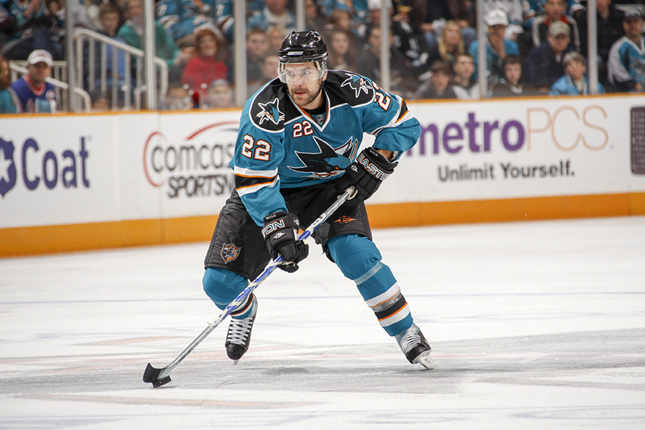
On 9/9/2022 at 9:31 AM, thesieve22 said:
I really liked the orange on the Sharks jerseys
I prefer grey as a tertiary colour for them, but I didn't mind when they made a point of featuring orange throughout the jersey. On the set they just got rid of it felt like the orange was an afterthought. Personally, I think this is the best set they've worn since the pre-Edge era.
-
9
-
1
-
-
17 hours ago, pepis21 said:
Yes but this is their temporary house. What after that? IIRC there were plans in past to move Coyotes out of Arizona.
-
3
-
-
1 hour ago, Ricky_Roby said:
Here's one for my fellow Senators fans if they missed it, but the team shop has a new logo that incorporates the logo into the O... or, wait, was it the logo that incorporated the O first? Anyway, it's kinda neat and a step up from their previous logo, which was no logo at all.
It's strange that the official team shop has such a makeshift looking website. For a while I didn't realize it was actually run by the team, since they don't even use Senators/Sens anywhere in the name.
It's not a bad wordmark. It reminds me of the script the Ottawa Lynx used to use on their road jerseys.
-
1 hour ago, PlayGloria said:
While I agree that a team called the Golden Knights should wear a gold primary jersey, I just don't love their shade of gold. It comes across more as a mustard color to me. I would think a gold jersey would pop a bit more, but it just seems drab. IDK, something isn't right with it, but I can't really put my finger on it. The crest gets lost somehow too.
It seems like the type of jersey that looks really nice up close, but the shade gets muddled from a distance/on tv.
On another note, the Coyotes centre ice design has been revealed, and like it had been reported it features both their logo & the Sun Devils pitchfork.
-
3
-
-
13 hours ago, BBTV said:
Looks better without white. Also probably without red (or replace the red with white.)
They should wear this full time, using a white sweater only as a clash shirt for when they play a team like the Flyers, though even then it might not be necessary.
Well they'd need to have a white jersey for when they play in Nashville.
I don't mind that they've simplified their colour scheme a bit here. Black for Vegas is basically what navy is for Vancouver. Used prominently in the primary logo and some alternate jerseys, but nowhere to be found on the main uniforms.
-
46 minutes ago, gosioux76 said:
I've never understood the need to market a grocery staple in this way. In the '80s, the whole "Got Milk?" campaign came to be as defense against sugary sodas, which was apparently cutting into milk sales. But as a consumer, I've never needed a reminder that milk is a thing and that I need to buy it. It's not like I suddenly would start putting orange juice in my Cheerios in the morning.
It would be different if it were a certain brand of milk, but the idea of marketing milk in general has always felt odd to me. And if it is necessary, why stop there? Do they have a "butter" campaign? Why don't they put "milk" on the home jerseys, "butter" on the away and "cheese" on the alternates?
I'm sure it's similar in other places, but in Ontario the dairy farmers are basically a cartel. The government controls the supply of milk & sets the prices for the entire market, so they advertise it as a commodity. They aren't competing with pop/sugary drinks anymore, but there has been a rise in dairy-free alternatives that have likely put a big hit in their sales (oat milk, almond milk, etc.)
40 minutes ago, ManillaToad said:The breast of the jersey is as inoffensive as it can be?
I wasn't referring to the location of the patch. That was set in stone by the league. I was talking about the design of the patch. A fairly basic wordmark in team colours is much better than a bright red square with a Scotiabank logo.
39 minutes ago, DTConcepts said:As long as they retire those terrible chrome helmets, I'm a fan. It makes sense for the Golden Knights to wear gold, and I'm honestly surprised they didn't go with these from the get-go.
I believe Bill Foley mentioned that they weren't happy with the first attempts at a gold jersey. I guess they initially weren't able to get the right shimmer on the fabric.
I normally am not a fan of an alternate jersey being promoted to primary status, but in this case it's literally an inversion of their away jersey, so it makes sense. Grey pants on the road is a good choice too, although the tiny black trim on the collar doesn't really fit anymore.
-
1
-
-
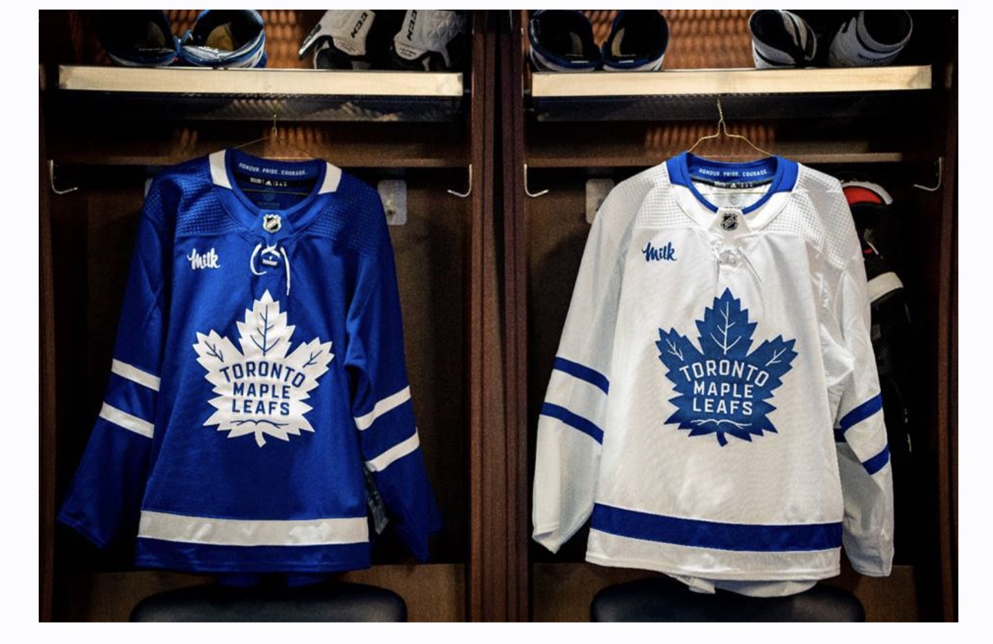
The Leafs have announced their jersey ad for this season.
If the league insists on ad patches, this is about as inoffensive as they can be. Can't wait for all the sour milk jokes when they inevitably collapse in the first round again.
-
1
-
2
-
4
-
 2
2
-
1
-
1
-
3
-
-
On 7/26/2022 at 2:07 PM, OhioSportsMan61 said:
Up next: Ottawa Senators
Just getting caught up on this thread now. Great work!
The only changes I would make here would be to put the sleeve numbers in between the stripes, and on the alternate I'd have actual stripes across the chest instead of contained in the crest. That logo worked fine as a shoulder patch, but looks awkward on the front of a jersey.
-
On 9/16/2022 at 5:50 PM, LA Fakers+ LA Snippers said:
What is the Edge template, and why do we hate it?
One of the things people hated the most was that Reebok pushed their new templates on teams, so there were a few who ended up with almost identical designs, just in different colours.
-
5
-
-
14 hours ago, Mr. Krabs said:
I wonder how long it will be before the Hurricanes fanbase demands they go back to these full-time and change their road whites accordingly.
The reaction I've seen has been either "go back to these", or "aren't these just our regular jerseys?" I get that very few people care about uniforms the way we do, but it baffles me how little people pay attention to detail.
7 hours ago, M4One said:First the Lions and now the Canucks. Would like to know the reasoning behind dropping the stripes on the pants. Seems like an unnecessary move. Did the team need to cut some money on the pants budget so the owner could make some political donations for the upcoming civic election?
He might just be wearing the solid blue pants that they use with their alternates. A few days ago Ekman Larsson was seen at practice in the usual pants.
-
3
-
-
The trim on the Magic jersey definitely looks green to me. Maybe it's one of those, "is the dress blue & black or white & gold?" things.
-
1
-
-
1 hour ago, throwuascenario said:
The reds they just got rid of have some elements that are better (replacing a lot of the silver with black) but its flaws (ghosted warning stripe, generic/weak number font) bring it down. Their perfect jersey would be the 2017-2021 reds but with the NOB/numbers of the originals and a non-ghosted warning stripe.
Meh, the last red jerseys just felt like a watered-down version of the inaugural jerseys. The silver & warning flag pattern were the main things that made the Canes distinct from the other red & black teams. The Sharks rebrand looks just as generic, but at least teal is a unique colour.
49 minutes ago, throwuascenario said:Comparing these to other teams who have gone to old jerseys is pointless. The Senators old/new jerseys stink. It's not because they're old. It's just because they're bad. Same with the Coyotes.
Care to elaborate?
-
3
-
-
They were the Sens' ECHL affiliate last season, so they're a year late on this one.
-
With the new pants, the Sharks run into the same problem that the Oilers & Blackhawks deal with. The pant stripe matches the white jersey perfectly (a white stripe surrounded by black & teal), but it doesn't match the teal jersey striping.
I also agree that the black numbers don't really fit with the teal-heavy look. If they were using black pants it would work better. It feels a bit like when the Avs first switched to blue equipment but still had the black numbers on the away jersey.
-
2
-
-
5 hours ago, Glover said:
Hurricanes posted some phone wallpaper today on their Twitter, and it contained this.
It's the 25th anniversary of the Whalers moving to NC, so I guess it makes sense to bring back the original jerseys as a throwback.
I can just imagine these selling so well that in a few seasons time they end up going back to them. Tom Dunden doesn't seem to like going a year without some sort of uniform change.
-
2
-
-
1 hour ago, DEAD! said:
Yes, which has their logo. A company logo is still company logo.
You're right. These would be such nice sneakers if they didn't have the big Nike ads on the sides.


2022-2023 NHL Jersey Changes
in Sports Logo News
Posted
Based on your username, pic, and location I can see why you're bitter, but this seems like a bit of an overreaction.