


spartacat_12
-
Posts
2,713 -
Joined
-
Last visited
-
Days Won
4
Posts posted by spartacat_12
-
-
On 2/3/2023 at 2:19 PM, Digby said:
So the reading between the lines here is that they "Ich bin ein Berliner"ed this one, right? At a time when colonial treatment of Indigenous peoples is under renewed scrutiny for historical atrocities in Canada? Incredible stuff. Good thing they caught it but really speaks to how poorly this franchise has been run for so many years.
More like Club de Foot in mouth, amirite?

-
 1
1
-
 3
3
-
-
1 hour ago, the admiral said:
Is "I'd prefer not to wear a rainbow shirt today" an unsafe environment for gay people? Do you really think that's equivalent to Kyrie Irving's deranged antisemitism? You don't, you just like the idea of managers punishing people.
I don't like the idea of managers punishing people. I just think that if a player or team's actions go directly against the league's inclusion policies then there should be consequences. I gave a previous example of a white player saying "I'd prefer not to wear Jackie Robinson's number" in MLB, which is more comparable than Kyrie. You don't think MLB would suspend that player?
If a player says "I'd prefer not to wear a rainbow shirt" what they are actually saying is "gay people make me uncomfortable". There's no other logical explanation for it. If I were a member of the LGBTQ+ community that wouldn't exactly give off the message that I'm welcome at games, especially if the team did nothing about it.
For all we know there could be closeted gay players on the Flyers or Rangers who are dealing with even more anxiety about their identity because of these situations.
-
3
-
-
15 minutes ago, the admiral said:
At the actual end of the day, there's a players' union that wouldn't stand idly by while new administrators invent new fines and suspensions to impose on its members. This isn't a normal email job where HR can just do whatever it wants to at-will employees. Morally speaking, players shouldn't be opting out of participation, but legally speaking, they shouldn't be punished for not doing so, and practically speaking, trying to weave social change into a sponsored promotional calendar is gauche anyway.
Kyrie Irving got suspended for anti-Semitism, and while the NBPA didn't necessarily agree they weren't able to do anything about it. And the NBA players have much more influence over how their league is run compared to the NHL.
There is also a literal Declaration of Principles that the NHL & NHLPA agreed to put in place a few years back.
https://www.nhl.com/info/nhl-declaration-of-principles
One of these principles is "All hockey programs should provide a safe, positive and inclusive environment for players and families regardless of race, color, religion, national origin, gender, age, disability, sexual orientation and socio-economic status. Simply put, hockey is for everyone."
I'd say there is just cause to suspend or at least fine any player who's behaviour does not adhere with this principle.
-
4
-
 1
1
-
-
On 2/2/2023 at 10:36 PM, BBTV said:
Can we stop with the phrase "maker's mark"? Nike didn't actually make the uniforms for the past few years, and in both baseball and NFL, the uniform advertiser (Reebok, Puma, Russell, etc) didn't "make" the uniform.
It's an advertisement. There's absolutely no other way to look at the swoosh other than as an advertisement. And it sucks - just like these ads do.
I'll never understand anyone defending ads on uniforms.
We get it, you don't like the swoosh on the uniforms. But you can't honestly look at these giant, distracting ad patches and say that the Nike logo is equally as bad. Just look at this picture and tell me which patch is more of a distraction.
-
2
-
 1
1
-
 2
2
-
-
20 hours ago, McCall said:
I've always thought they should have moved the Rays to Miami so that they'd get a new stadium and Miami would finally get a well-run, always-contending team. But there is no way contraction will ever happen, so they would've just been relocated.
A MLB club splitting home games between Tampa Bay & Miami always seemed to make more sense than the ridiculous Montreal-Tampa shared team proposal.
-
2 hours ago, the admiral said:
I agree. Community investment is a better path, and I think it will have better long-term effects than the head-pats of warmup jerseys. I think players should support causes if they want to, and they should want to, but shouldn't be made to partake in empty gestures under penalty of DEI administrators if they don't want to. I'd even say that players can go out and express whatever they want in warmups, maybe that's rainbow tape every night, but then it's just about the team once the real game starts. I just don't think Black Night and Gay Night are good culture fits.
So what would happen if an MLB player said they didn't want to wear 42 on their jersey for Jackie Robinson Day because of their "beliefs"? At the end of the day these athletes are employees of the league, and you forgo certain rights when you show up to work. If you don't want to be involved than you should lose the privilege of playing that night.
Obviously there needs to be a holistic approach that includes educational elements rather that pure punishment, but the optics of dropping these nights altogether is just as bad as one or two players declining to participate.
-
3
-
-
On 2/2/2023 at 6:56 PM, AFirestormToPurify said:
Vintage white is a meme, and a trend that's overstayed its welcome and stay polite, old man lol
Besides, I'm not saying you can't have a home jersey with vintage white on it, if it's just a trim color it looks alright. I'm just saying the away jersey has to be pure white or you end up in the same situation as the Rams when they wear bone and it just looks like a dingy white uniform that's never been washed
@seasaltvanilla demonstrated a few replies earlier why cream helmets don't work. It looks absolutely disgusting and just looking at it makes me feel ill
So the only other option is a dark helmet and it looks amateurish
The problem with the Rams is that they didn't incorporate bone into any elements of the brand other than the away jersey. They also made the mistake of having pure white design elements on an off-white jersey, which just makes it look even dingier. I think if you have a full uniform set that uses vintage white instead of actual white it can work. I really loved the old Quebec Remparts set, which was based on the old Wild alternate, although they used black helmets with both uniforms.
18 hours ago, SHaMROCK said:The Chiefs are bad example of anything... From the neck up they are a red, white and black team. From the neck down they are a red, white and yellow team...
Well if it were up to me they'd remove all the black from their logo/helmets.
-
3
-
 1
1
-
-
On 1/30/2023 at 7:54 PM, the admiral said:
Well, they botched it again: the Rangers advertised a Pride Night and then pulled back on it.
At this point, it's almost better not to try. Part of the whole idea of hockey, more than any other sport, is that the big rickety machine does not work unless the individuals subsume themselves to the group. That goes back to the Catholics and Protestants agreeing not to hate each other if they found themselves on the same team. That team-over-everything-and-we-mean-everything concept just doesn't map to modern identity politics well, which is all about atomizing people and then specifically marketing to them. (The other problem is that hockey, being Canadian, never really mapped to American politics all that well to begin with; that changed in 2020 when the American culture war truly went hegemonic.)
So what if you just didn't? What if you didn't have We're Fine With The Gays Night Presented By Chase? How do you still make sure everyone can derive a sense of belonging, or at least not a sense of not belonging, without dressing people up in rainbows if they don't particularly want to be dressed in rainbows? No Chinese night, no Irish night, no fragmentation of any type. Do you just take your game-night promotional budget and reallocate it to grassroots stuff? What do you do to stop faceplanting on this stuff?
So your solution is to just give up and let the bigots win? If the NHL is actually serious about this stuff it would have thorough diversity & inclusion policies that would allow them to punish players who choose not to participate in something like a pride warmup jersey night. Unfortunately the majority of influential executives around the league are still conservative, white men, so it's clear that the "hockey is for everyone" slogan is nothing more than a ploy to try and make some extra money.
The interesting thing is that while men's professional sports seem to be behind the rest of the world when it comes to this stuff, women's pro sports are some of the safest spaces for members of the LGBTQ+ community.
-
7
-
1
-
1
-
-
On 1/30/2023 at 6:29 PM, DTConcepts said:
Big move for both the Isles and Canucks today. While Bo is a great pickup for the Isles, giving up a prospect as good as Raty stings. Rumor has it the Isles already have an extension in place, something in the ballpark of $8.5x7.
This is a rare case of a trade that I don't think is great for either side. The Canucks didn't get an extra shot at Bedard, got an intriguing prospect that seems like a major project, and got a serviceable winger who can maybe be flipped before he becomes a UFA next summer. Considering how much time is left before the deadline I'm surprised they wouldn't wait to see if any better offers came up.
The Islanders might not even make the playoffs with Horvat, and with most of their core near or past 30 they seem to be putting off the inevitable rebuild. The Canucks got Horvat's prime years at $5.5 mil, and if he does re-sign the Islanders are going to be paying him a higher salary for his declining years.
-
2 hours ago, maz said:
I did not say that every team that wears red and yellow needs to add black or looks boring. The Chiefs have one of the best looks in all of football, because it works perfectly, head to toe. It thrives in its simplicity, and that's why they haven't changed in over half a century. So no, they definitely do not need black. You don't always need black, and I didn't say you did.
Kelly green and yellow just don't work together by themselves like red and yellow do, and the A's and North Stars wearing them is a product of the 60's, where such a color palette belongs. Which was my actual point - black brought something to the table for the North Stars. So while the Flames are fine without black (which I did say), the North Stars adding it is, at worst, a lateral move. If they'd moved to a darker green like Oakland did, then I'd agree they wouldn't need black.
Then again, the "whatever they wore in the 60's or 70's = superior" philosophy reigns supreme on this site.
So the Chiefs uniform "thrives in its simplicity", by using basic yellow & white stripes on a red jersey + block numbers, but the Flames uniform is boring & generic? I understand people here are going to have differing opinions, but it just seems like you're contradicting yourself here.
Also, what exactly did black bring to the table for the North Stars? This wasn't a Los Angeles Kings situation where they rebranded around black-focused uniforms. They literally just took their home jersey and added a couple black stripes & some outlines to the logo & numbers. They didn't even bother making the green uniform match until 7 years later. That's about as BFBS as it gets.
Btw, when I first posted the report about the Wild I mentioned that I want them to keep their current colour scheme, so I'm not saying that everyone needs to go back to the '60s.
-
1
-
-
14 hours ago, maz said:
The North Stars and Flames both benefit from the black because it adds contrast to uniforms that otherwise feel too bright. For them, unlike other teams, it isn't for black's sake, but functional, IMO. Helps keep them both from looking painfully generic, also (I mean damn do the Flames look boring nowadays).
I'm in the same boat as all the others who say the Wild logo and colors are too good and unique to throw away for North Stars nostalgia.
EDIT: Don't get me wrong with Calgary. Sometimes less is more, and their look works. But at the same time any beer league team could slap their logo on it and nobody would know it's a Calgary jersey.
Do you think these uniforms look generic & need unnecessary black trim added?
-
4
-
4
-
1
-
1
-
-
22 minutes ago, Ridleylash said:
If the Wild do move to North Stars-style branding full-time, they need to use the 80's-90's version with the added black. You'll get more sales with new designs than just promoting the RRs to full-time status, since most people with those won't double-dip on identical jerseys where the only real difference is the inside of the collar;
The North Stars, just like the Flames, Mets, Knicks, NY Jets, and Detroit Lions, never needed to add black. I don't know how you can look at those pictures next to the ones the Wild based their RR on and say they're an improvement.
I'm sure there are plenty of fans in Minnesota who haven't bought a RR yet, but would if they're wearing it for the next couple years.
-
12
-
1
-
1
-
-
On 1/27/2023 at 8:07 PM, SSmith48 said:
However, I see this as a good move. Letting teams wear a color on the road, rather than grays, is more practical, and I think more stylish. I hope more teams lean into this.
Until they're playing a series in Toronto, Texas, or KC who are wearing royal blue at home. They've said they'll wear teal against teams wearing navy, but I don't expect them to care as much if their opponents wear royal.
-
While this initially seemed like Weekes's typical, throw a bunch of stuff against the wall and see what sticks reporting strategy, Michael Russo (Wild beat writer) has confirmed that they will remain part of the rotation as an alternate. Minnesota will join Calgary in turning a reverse retro into a full-time third jersey.
-
2
-
1
-
-
1 hour ago, Indigo said:
Leave the silvers alone, but just use one shade of blue. that's all I ask of them. The mismatching pants have become part of their lore, but the blues need to be streamlined.
Most casual fans probably don't even realize they use mis-matching pants. If they just made their uniforms, you know, uniform, and didn't make any announcement about it, just about everyone not on these boards wouldn't have a clue.
-
3
-
-
Normally I think a standard block font looks good on just about every uniform, but with this Coyotes alt it just feels lazy. It's like they were about to submit the final design then realized they forgot to put numbers on the jersey.
The Yotes have never worn block numbers since moving from Winnipeg, even when they simplified the colours/uniforms in '03. A custom font with rough edging similar to the wordmark would've been nice. Even just using the font from their home & away uniforms would've been better.
-
2
-
-
1 hour ago, IceCap said:
The moon captain patch is the only thing that works, and the cactus A patch kind of negates that.
I just realized that the Yotes don't even have a captain, so the only jerseys the moon patch will be on would be custom ones worn by fans.
-
1
-
3
-
 1
1
-
-
This situation has been handled about as poorly as possible from all angles. The Flyers decided to let him play after he refused to take warmups. After the game, Tortorella, a man who openly stated he would bench players who kneeled for the anthem, says he "respects Provorov for staying true to himself". Now the league has confirmed that players are free to be as ignorant or bigoted as they want without any consequences.
The fact that he cited his religion as the reason is a complete cop-out. If he actually took his faith that seriously he wouldn't be playing on Saturdays (the Orthodox Sabbath). Just another hypocrite cherry picking elements of their religion to discriminate.
And people wonder why none of the league's gay players (and there are definitely a few) have decided to come out.
-
7
-
 1
1
-
-
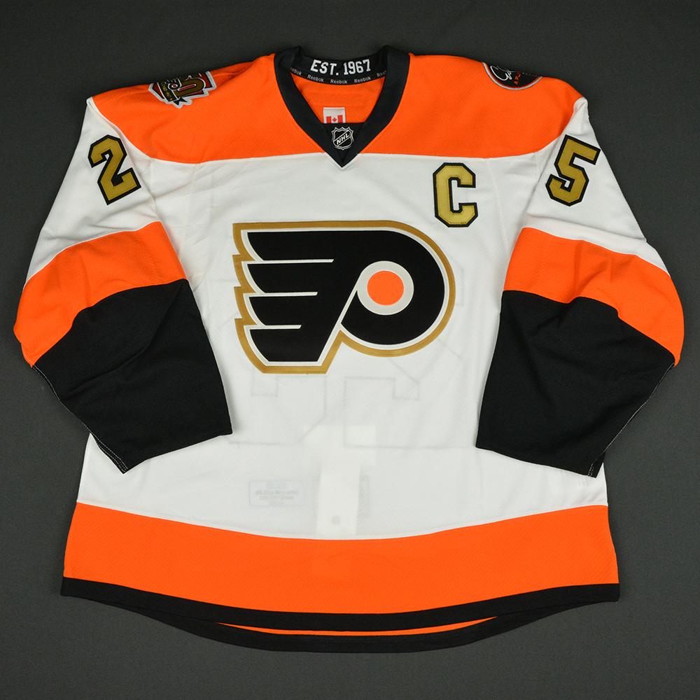
1 hour ago, chcarlson23 said:
I actually really like the current shade of orange, and even the contrasting nameplate on the home sweater. (Mostly because it’s true to the throwback that way)
You realize that the white nameplates were worn on the orange jerseys for one season, right? The league forced them to add player names to their away jerseys in the '70s, so they just used the same ones that were already on their home jerseys. For the rest of the '70s/'80s/'90s their orange jerseys always had white names.
-
4
-
-
17 hours ago, Nordiks_19 said:
Maybe something based on their 2012's winter classic look, but with white and no contrasting nameplate ? They didn't mention it was a " brand new " design so who knows ?
11 hours ago, pepis21 said:I'd say if Flyers really have a feeling they need to change their sweaters and it couldn't be a Hextall/Legion of Doom era then they should go with this:
But to be fair they should leave it as is it and maybe introduce new alternate.
I really hope neither of these options are brought back. The Winter Classic one was a fun, one-off fauxback, and I liked the idea of incorporating the '80s/'90s sock striping onto the sleeves, but it doesn't really feel like a Flyers jersey. The 50th anniversary one is just a completely generic jersey that has zero connection to the history of the franchise.
The Flyers probably have the most classic brand of any non-Original 6 franchise, and a big part of that is the full length sleeve yoke. Every primary uniform they've ever worn has had it, and aside from Colorado & maybe Columbus, no other teams are really associated with it. A Flyers jersey with basic sleeve stripes & shoulder yokes just looks like something you'd find at Wal-Mart.
-
3
-
3
-
-
23 hours ago, TBGKon said:
Now thinking about it, there are a few teams that will have to potentially unload a jersey.
- Mariners (home, road, cream, navy, teal)
- Red Sox (home, road, red, blue, Patriots Day?)
- Rangers (home, road, light blue, royal, red)
- D-Backs (home, road, home w/aqua, black, red)
- Phillies (home, road, red, cream, blue throwback)
- Pirates (home, road, white military, Pirates black, Pittsburgh black)
- Blue Jays (home, road, royal, light blue, red?)
I'm wondering if the Jays would get away with the red jerseys being their +1 (I haven't heard any rumblings of them releasing a CC uniform anytime soon). They really should only be worn for the Canada Day game though. Last season guys started getting superstitious, which led to them being worn on random days.
The royal & powder blue jerseys are incredibly popular with the fans, so I'd be surprised to see either one dropped.
-
The only thing the Flyers need to do is ditch the contrasting nameplates. Everything else is fine.
But I'm fully expecting them to come out with a downgraded design, and keep the nameplates unchanged.
-
7
-
-
On 1/11/2023 at 7:48 PM, WestCoastBias said:
Change the halo to gold, slap it on the sleeve, and call it a day.
If they want to call themselves Los Angeles that's fine (I'd personally prefer to see them go back to 'California'), but the interlocking LA belongs to the Dodgers.
-
4
-
1
-
-
1 hour ago, _RH_ said:
I guess the two-color scheme isn't terrible but IMO inferior to the green/orange. Interesting that after the revival of the popular Kachina logo theyd go with text - anything to make a buck, I suppose. IMO worst downgrade is the hem pattern- the original is just worlds better than this.
The design is an interesting mixture between the Kachina style stripe pattern and the brick & white Glendale era jerseys. The crescent moon C patch is a nice touch, and I don't mind the wordmark (I feel like I enjoy wordmark hockey jerseys more than the average fan).
What really makes me nervous is the side panel stripe.


.jpg)


/cdn.vox-cdn.com/uploads/chorus_image/image/71703049/1430150490.0.jpg)


NHL Anti-Thread: Bad Business Decision Aggregator
in Sports In General
Posted
I'm not sure what else they could possibly saying. The teams aren't asking players to change their routine, they're literally warming up the same way they always do, just in a different jersey. And when a player cites his religion as the reason, it's pretty clear that the decision is rooted in ignorance.