

kmccarthy27
-
Posts
1,475 -
Joined
-
Last visited
Everything posted by kmccarthy27
-
It looks like an app icon probably because an app will come out with that as the icon during the competition to stream stuff on that is separate from MLB
-

Buick Unveils New Logo as Company Enters into Electric Scene
kmccarthy27 replied to DCarp1231's topic in General Design
In my area all the GMC stuff was tied with Pontiac. So I thought Pontiac/GMC was the equivalent to Chevy. The Buick and Olds were the semi-luxury brands and then it all funneled to Caddy. -
This is the rumored cities and coaches for each city: https://sportsnaut.com/xfl-teams-coaches/
-
Little background. Dunkin Brands (BR and Dunkin) got purchased by Inspire Brands. They own Buffalo Wild Wings, Arbys, Sonic and Jimmy Johns as well. I get the feeling this logo change was done of new overlords wanting to change something to put their mark on the company. I expect Dunkin to have some modified logo soon as well. This is the exact same move that Keurig did when they took over DrPepper/Snapple and changed the Snapple logo for sake of making changes to put their mark on the company.
-
Washington Commanders to debut new NFL identity
kmccarthy27 replied to DCarp1231's topic in Sports Logo News
I kind of mean more into the military like embellishments on the uniform itself to put over the COMMANDERS theme even more: -
Washington Commanders to debut new NFL identity
kmccarthy27 replied to DCarp1231's topic in Sports Logo News
I really really really hope she did not lean into the military theme with the marching band uniforms -
Washington Commanders to debut new NFL identity
kmccarthy27 replied to DCarp1231's topic in Sports Logo News
Is this their consistent uniform or the one of 75 different ones they wore over the the past years being Under Armour's Oregon. -
XFL 2023 Logos, Names and Uniforms
kmccarthy27 replied to The Golden One's topic in Sports Logo News
It was also rumored they swapped Houston and Dallas' names too. -
XFL 2023 Logos, Names and Uniforms
kmccarthy27 replied to The Golden One's topic in Sports Logo News
Its just the intro to the new logo set to stock footage of XFL 2.0 games https://twitter.com/XFL2023/status/1511735486825390080?s=20&t=OiJ0JbL896FzwT-JJYBT1g Reverse color image on the website: Media Assets page: https://xfl.photoshelter.com/galleries/C0000OKu6bQBZ4OY/G0000uqVSqWlSPmM/XFL-2023-Brand-Identity Marketing Speak for logo: New Logo and Visual Identity The new visual identity centers around the idea that the XFL is the intersection of opportunity and captures the essence of the league’s vision: the XFL is pushing football forward. To do that, the brand needs to be modern, dynamic and inviting. The “X” represents those intersections, the point at which everything comes together: sports and storytelling, players and fans, partners and a passion for innovation. We elevate it to unlock the opportunities that will push football forward, so that together, we can build tomorrow’s league. As a platform for co-creation, the XFL’s new identity seeks to elevate the stories and communities that enhance the game. Built as a platform, the league’s black-and-white color palette ensures the individual personalities of the teams are able to seamlessly coexist and stand alongside the league as partners versus separate organizations. -
Did The Rock just tease a new league logo: https://twitter.com/TheRock/status/1510875912509689859/photo/1 https://twitter.com/XFLNewsHub/status/1510958500461092865/photo/1
-
My best guess the Gray was the call back to the Negro League team, and the off white is the color of the monuments
-
I dont mind it, I am surprised that DCA was not used, as much as its the Airport code, I recall that being used a lot in the area growing up there. DC I think is too common for what they were trying to do as Nats had DC branding at somepoint, and I miss the interlocking DC logo. At least they did not go with WAS
-
I really like that WSH on the jersey, wonder if they could adopt that block letting for a normal looking alt in the future.
-
Minor/Independent/Collegiate League Baseball Logo/Uniform Changes
kmccarthy27 replied to BigMac12's topic in Sports Logo News
I still think this is happening in some form like: GEICO Eastern League or Eastern League sponsored by GEICO And if not the leagues totally whatever AllStar/Championship games that eventually come to MLB Network (not that they already are not there) -
Washington Commanders to debut new NFL identity
kmccarthy27 replied to DCarp1231's topic in Sports Logo News
HE usually does that by signing a Jersey mover every other year. I swear I think his free agent signing and draft picks have less to do with how they do on the field and more to do with how many jerseys they can sell from the idea. Don't think them getting Wilson, Rogers, is an attempt at getting a good team on the field. Its everything to do with that player selling jerseys -
Washington Commanders to debut new NFL identity
kmccarthy27 replied to DCarp1231's topic in Sports Logo News
I knew there was something else with it and some similar controversy that people felt that was not the one voted for. -
Washington Commanders to debut new NFL identity
kmccarthy27 replied to DCarp1231's topic in Sports Logo News
I would think you would spend more than 2 months on jersey designs. They def show the lack of time associated with it. -
Washington Commanders to debut new NFL identity
kmccarthy27 replied to DCarp1231's topic in Sports Logo News
There was a mail in suggestion thing. That somehow ended up on the top 5 list. They did a “fan vote” thing with NBC4 and they said that won. It could be Polin liked and did what Snyder did with Commanders and just do some false vote to make it seem the people wanted it. -
Washington Commanders to debut new NFL identity
kmccarthy27 replied to DCarp1231's topic in Sports Logo News
She was the one responsible for all the Mall locations of the Team shop closing. She wanted them to be more boutiques and not one stop team shops. Essentially she thought there was too much merch in stores. Numerous people I know got let go from just her taking over. -
Washington Commanders to debut new NFL identity
kmccarthy27 replied to DCarp1231's topic in Sports Logo News
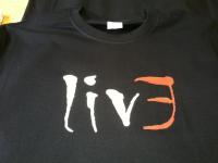
The polo shirt they made us wear on game day and working at the Team Store around that time was roughly the color pallete what middle design looked like. It was all black and the shoulder area had stripes like the pants with the logo on it. It was this one -
Washington Commanders to debut new NFL identity
kmccarthy27 replied to DCarp1231's topic in Sports Logo News
I am convinced MLS teams have 0 power. They tell the league office they want a change and they hire some tone deaf logo designer and adidas just does what they want, and the league forces them to keep it. -
Washington Commanders to debut new NFL identity
kmccarthy27 replied to DCarp1231's topic in Sports Logo News
Essentially Arlington and Alexandria -
Washington Commanders to debut new NFL identity
kmccarthy27 replied to DCarp1231's topic in Sports Logo News
The practice jerseys already have them -
Washington Commanders to debut new NFL identity
kmccarthy27 replied to DCarp1231's topic in Sports Logo News
Can you secretly share that somewhere? -
Washington Commanders to debut new NFL identity
kmccarthy27 replied to DCarp1231's topic in Sports Logo News
Those look like the waistband of some basic sweatpants.


