


cajunaggie08
-
Posts
1,622 -
Joined
-
Last visited
-
Days Won
2
Posts posted by cajunaggie08
-
-
10 minutes ago, MJWalker45 said:

New Red River Rivalry logo. Previously it was the AT&T Red River Rivalry, and then the Red River Showdown.
Speaking of Allstate, they are also the sponsor of the newly created Crossbar Classic. Rather than some natural-site game getting a bowl treatment by getting a sponsor and name, LEARFIELD has created a game name and will slap it on an early season game that they want extra focus on.
-
 2
2
-
 2
2
-
 1
1
-
-
11 minutes ago, tBBP said:
To be real, that gray was probably the one thing that distinguished them from aTm at a glance. May be an unpopular opinion, but I also think removing the script from the chests was also a mistake.
I figured the grey was Mississippi State's and Adidas's way of trying to make sure A&M and them looked just different enough. I get why it didnt stick around as it just felt unnecessary with their traditional primary look. Now you can tell the two maroon SEC Adidas schools apart by knowing one has white numbers on the sleeves and the other has white stripes. VERY DIFFERENT
-
14 hours ago, Germanshepherd said:
Mississippi State going with baseball script full time. Sigh. The 2011 helmets were all they ever needed to be.
Here is the rest of the home uniform. Grey has been removed from the shoulder stripes so what was previously a W-G-W pattern is now W-M-W. The team wordmark has also been removed from above the numbers. The white and grey neck collar has been replaced with maroon. The M-State logo is added to the bottom of the collar which is didnt think was possible with this new Adidas template.
2022 Mississippi State primary uniform
-
1
-
 1
1
-
-
I
14 hours ago, Germanshepherd said:Mississippi State going with baseball script full time. Sigh. The 2011 helmets were all they ever needed to be.
I like it as an alternate look, but this is a horrible choice for a primary helmet. Sure they are the only school to use the state part of their name in the SEC since LSU literally is only called LSU unless the New York Times is writing about them. But in a sport that features MANY schools with State in their name, I think its silly to just slap the word state on your helmet an expect the casual public to recognize who that is.
-
1
-
-
14 hours ago, Chawls said:
With the Oilers throwback unveiling only a week away now, are we prepared for the all the traffic that’ll inevitably crash the boards?
Because the boards will crash.
I've been sharpening my pitchforks
-
 1
1
-
-
1 hour ago, dont care said:
Because it was. They made the change on short notice. Catalog uniforms is all they could order in this time.
Plus their deal is with a wholesale supplier, not with Nike directly. They wont be getting anything custom until this deal ends.
-
Here is the logo for Big 12 media days. It seems the Big 12 may have switched their default color for the conference logo to be black and white with Houston coming in with the same shade of red that the logo previously had. The black and white logo is all over their social media pages ,website, and present on all the mic stands at the media days.
-
3
-
-
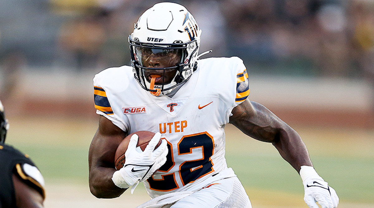
New uniforms for UTEP as they switch from Nike to Adidas. Its a much cleaner shoulder stripe as Nike used a single decal last year to act as the stripes
-
8
-
-
14 minutes ago, TBGKon said:
Because orange and gray are their official school colors.
I know UTRGV and UT Brownsville merged recently, and UT Brownsville is orange and navy, so that might be why UTRGV uses navy as well.
Close. UTRGV is the result of the merger between UT Brownsville and UT Pan American and UTPA's colors were orange and green so thats why green and navy are still shoehorned in for a school that is officially orange and grey
-
2
-
-
These wont see the field until 2025 but the University of Texas Rio Grande Valley (UTRGV) released 3 helmet options yesterday. UTRGV is starting up a football program that will play in the WAC/United Athletic Conference
https://goutrgv.com/galleries/football/football-helmets/2855
-
1
-
-
UCF's new road uniform. I see it lasting a game before the NCAA forces them to add an outline.
https://www.instagram.com/p/CuKUh0eOBsf/?igshid=MzRlODBiNWFlZA==
-
 1
1
-
 1
1
-
1
-
3
-
-
Close-up look of the new Adidas template on Texas A&M. Besides the template, the only change for A&M is the new Adidas logo.
-
Everton home kit
Everton Goalkeeper
-
2
-
-
14 hours ago, VampyrRabbit said:
The new Villa crest is an update of the roundel the team used from 1973 untill 1992, the current Chelsea crest was introduced in 2005 as part of their centenary season. The two have lions and are roundels with the name at the top, but the similarities end there.
The lion, the font are quite different, the Chelsea crest has roses and footballs, and the Chelsea lion is holding a staff while turning it's head to look to the east.
Here are the two crests side by side in greyscale
So no, it's not a recoloured Chelsea crest, not even close.
Its a lion in a roundel with a the club name on top. Yea, its pretty damned close.
-
6
-
-
New badge for Burnley
Here is the old one for comparison
-
4
-
-
-
5 minutes ago, j'villejags said:
My guess is battle red primary.
Thats my best guess since the only bit of uniform they show is the current uniform sleeve number. They could unveil the 2024 look now, but they would lose out on a whole year of uniform and merchandise sales. Sure, WE know they will look different in 2024, but many more would know if they debut the new uniforms now
-
2
-
-
On 5/24/2023 at 10:54 AM, gosioux76 said:
This is such an interesting discussion, because I can't disagree with anything in @FinsUp1214's post, but at the same time find the Texans look to be completely forgettable.
Looking back, it was unveiled in an era of relative design restraint, right before Reebok got high on piping and side panels. I think about the Eagles and Patriots redesigns at the tail end of the '90s as being in a similar class: lacking in gimmick, simple in execution, not flashy, but following much of the traits of traditional football uniforms with small touches of panache.
The big difference is that the Eagles and Patriots actually won things in their boring uniforms. Save for the heroics of JJ Watt, there's almost nothing memorable about the 20-year history of the Texans other than the fact that they have nice, but boring uniforms.
Is that a case for changing it up? I'd argue that it can't hurt. We've seen teams change their look for worse reasons.
Nailed it. If the Texans won anything beyond division titles in their entire existence then the uniforms would be classics that shouldnt be touched. Instead they get called boring as they represent a boring franchise. Maybe some day they'll accomplish something beyond a divisional round playoff exit. But until then, they are just a schedule filler for a national NFL audience.
-
1
-
-
22 minutes ago, CaliforniaGlowin said:
that Texans shirt is 70 DOLLARS btw
 this is getting ridiculous for a piece of cotton.
For a shirt with the schedule on the back? I didnt think those sold well when they were $15 plaint white tees, let alone some "brand name" high end shirt
-
1
-
-
1 hour ago, HOOVER said:
Also....looks like a WWE tee for The Undertaker.Who happens to be from Houston. OMG its all coming together! American Bad Ass Texans are on the way!
-
2
-
6
-
-
9 minutes ago, MJWalker45 said:
So for football are we expecting a bare bones look? The sleeve inserts from the UA uniforms obviously won't be worn if they go with the teamwear version of the Fusion template.
I hope the football team is able to keep the Lindner Center inspired triangle pattern somehow but I doubt they will while they are using catalogue uniforms for the next few years until Nike can give them a personalized uniform.
-
2
-
-
23 hours ago, CS85 said:
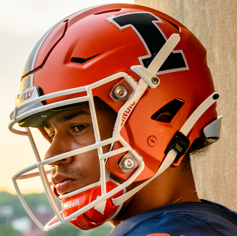
Curious what direction they go. It'd be nice if they added, I dunno, anything to give their uniforms flavor. They pivoted so damn hard post-Chief that they've left themselves virtually nothing to lean on branding-wise. "Hail to the Orange" doesn't really mean anything besides "go orange team," and they refuse to adopt a mascot, so....what now?
The helmet they revealed in 2021 feels like the optimal and timeless helmet they can trot out game in and game out:
My guess is they'll add a little bit more white and probably return to a block numeral.
Maybe a couple touches from the Butkus era? Dunno. The uniforms could stand to have a little bit more but they should stay the course and not have a boatload of alts. Iconify the helmet, embrace the orange, and introduce a pinch of flavor.
I'm not a close follower of Illinois athletics but the football team never seemed to have any sort of strong branding that tied it to the chief or Native American imagery. The basketball team had the chief logo at midcourt so I associated it more with them, but to me Illinois football was always just a bland looking team with an orange helmet and navy jerseys. Basically a midwest Syracuse. Bland can work if your team is winning in it.
-
2
-
-
1 hour ago, TGroce said:
I was surprised by this list in the SI article:
"With an average annual value of about $9 million, Notre Dame’s apparel deal ranks in the top 10 nationally along with Texas (Nike), Louisville (Adidas), Kansas (Adidas), Washington (Adidas), Ohio State (Nike), Nebraska (Adidas), Michigan (Nike), Auburn (UA) and Wisconsin (UA)."
It seems like Adidas really overpays to stay in the game
Its why A&M is with Adidas. We switched to them in 2007 because they offered way more than Nike would. Nike knows schools want them and they dont need to throw out top dollar to everyone unless the school is delivering for them,
-
2
-
-
2 minutes ago, aawagner011 said:
Overall, nice job. Also interesting: this is another team going away from a logo on the collar (Texas was another). Both have chest wordmarks but this could be the start of a trend to more minimalist designs. Maybe teams have seen how cluttered that area can get with patches?
I dont mind the collar logo, but I do feel you shouldnt have it AND a wordmark on your jersey. Pick one or the other. I'm glad teams that have traditionally had wordmarks are steering away from the logo. To me, the purpose of the logo is to help identify what team it is for fan replicas.


/cdn.vox-cdn.com/uploads/chorus_asset/file/23427805/1285158257.jpg)


/cdn.vox-cdn.com/uploads/chorus_asset/file/23943099/1364304179.jpg)

College Football 2023
in Sports Logo News
Posted
Yes. The Pigskin Classic which started as a neutral site game in Anaheim then it became a home game. Both the Kickoff Classic and Pigskin Classic served as a special game that allowed the participating teams to play 12 games in a year back when the college football season was only 11 games. They both died off when the season expanded to 12 games.