


cajunaggie08
-
Posts
1,622 -
Joined
-
Last visited
-
Days Won
2
Posts posted by cajunaggie08
-
-
Hannah McNair, Texans CEO's wife, talked about the new uniforms at a team charity golf tournament the other day.
"You'll have your blue, your white and ... you know ... the other," Hannah said, careful not to reveal what the other color might be.
Including any Oilers nostalgia — like say some Columbia Blue — in the new designs could be tricky, because Amy Adams Strunk, the daughter of the late Bud Adams and owner of the Tennessee Titans, owns the rights to everything having to do with the Houston Oilers, including the colors, logo and uniforms. The Titans, in fact, plan to wear Oilers throwback uniforms at some point this season, possibly against the Texans.
The earliest the Texans could debut any sort of redesign is 2024 because changes require the NFL's approval. Hannah alluded to some issues the team's redesign ran into as it worked with the NFL, although she didn't specifically mention the Titans.
"We’re trying to meet all the deadlines," said Hannah, referring to the NFL's approval. "We did get paused there for a minute with the NFL. We had to renegotiate some things, but we’ll get through it and I hope the fan base will be really happy."
-
4 hours ago, MJWalker45 said:
This is why I've come to hate any Ravens concept that includes the Maryland flag and any Texans concept that makes the state flag the biggest element. You're a pro team who has fans outside of the state, why stick to that as a main element?
While being a valid point about it possibly limiting fans from out-of-state, I don't think the Texans have been successful in getting any fans outside of the Houston metro. The Cowboys are so ingrained as THE NFL team of choice for the rest of the state that it will take the Texans winning a Super Bowl or two to actually get any fans from beyond Houston.
-
13 minutes ago, MJWalker45 said:
It wasn't across the board for the Giants, but they were used under the Reebok brand when they were still owned by adidas. That Texas A&M uniform was right before they moved to Techfit jerseys. It has that similar insert to the Denver Broncos designs when Reebok took over.
Ah youre right. Here's A&M in 2012 with a cut similar to the previous Giants uniform

-
4 hours ago, MJWalker45 said:
More Techfit designs.
I think rolled out early versions of the techfit design the last few years of the Reebok deal. Here are the Reebok NY Giants and Adidas Texas A&M uniforms from the same year. Not identical, but to me they appear very similar. I seem to recall the Giants were the first to get them in the NFL and had tighter looking jerseys than the other teams for a year.
-
 1
1
-
-
On 4/23/2023 at 8:46 AM, DCarp1231 said:
The math wasn’t mathing in my head I so did a super quick google search.
Turns out the Brady-era Patriots uniforms were an Adidas brain child from 2000.
I still firmly believe the Texans saw this new style uniform and made it better. The two sets were essentially the same style. The most telling features are the shoulder stripes and pants stripes. Houston just removed the piping and rearranged some of the colors
I always assumed the Texans just copied the USC uniforms but they both debuted the shoulder wedge stripe in 2002.
-
4
-
-
On 4/19/2023 at 12:56 PM, WSU151 said:
It’s kind of shocking in this day (from a ticket/revenue standpoint) that CU still has the “Colorado” hill past the endzone…but everyone would complain if it was removed. Just an odd quirk that it’s there because it’s seemingly always been there.
I always thought of the CU endzone being black and gold because of the Nerf Vortex commercial with John Elway throwing the ball that lands on the black Colorado hill. Now that I see the commercial again I realize you never actually see the endzone.
-
 1
1
-
-
16 hours ago, HOOVER said:
The lack of Yellow, and how it’s only on the sleeve stripe, really makes these “meh”.The flag was really a big part of the identity. This is an over correction.
The flag wasnt just a part, it was the entire football team identity for the past decade. While it is a great flag and I wouldnt mind it being used as elements in the uniform, the flag alone shouldnt be the sole identity for the school athletic programs.
-
6
-
-
12 hours ago, FiddySicks said:
Hey look, it’s a map of my town.
Always strange that Bonanza, which is seen as this ultimate old western show, was filmed and based around a ranch on the California/Nevada border which sits at the bottom of a ski resort hill.
I'm sure in the 1800s it probably was a lot more like the wild west like so many shows and movies have been based on. That area has just as much claim to the wild west as DFW these days.
-
1
-
-
1 hour ago, TenaciousG said:
Nothing says city connect like the state on the jersey and hat

Well they cant do a Dallas only or Fort Worth only city-connect because they try to pull from both and I don't know how you'd do an Arlington city-connect so they tried to combine references to the baseball history of all three.
-
Brown-haired insurance salesman Herbie is out and blonde-haired farmer Herbie is back at Nebraska
-
2
-
 1
1
-
-
UCF having some fun with their split identities for the spring game. They also have the Big 12 logo on the field. I'm a little surprised they can get away with that since they are still currently AAC members, but i doubt the AAC cares about markings on the field for a spring game.
-
1
-
-
8 minutes ago, McCall said:
The orange Marlins color scheme debuted in 2012, the year before the Astros in 2013.
oops
-
1 hour ago, coco1997 said:
Replace "navy" with black and I see parallels with a certain NL team...
I remember when they debuted this look a year after the Astros did and being slightly annoyed there would be two teams fighting over the orange cap look. Little did I know just how quickly both would abandon them.
-
2
-
-
3 minutes ago, Bmac said:
The initial look from 2013 at the time of unveiling gave us hope!
But then they went heavy on the navy

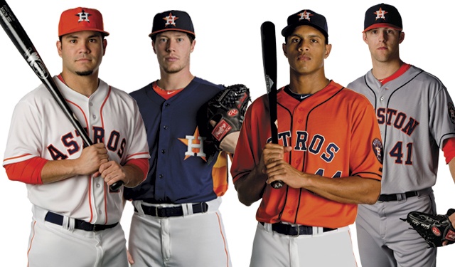
I disagree. The navy cap was always going to be the primary, especially since it features the logo in the same colors as the primary logo. Also, the navy cap has a slight edge over the orange cap from 1965 through 1993 as the primary cap of choice when the H-star was previously the primary logo. At least they wear the orange jersey fairly often so there is still plenty of orange featured. I do prefer an orange cap with the home whites though as it is a more balanced look.
-
UMass has a new logo which is supposed to me used in conjunction with the "UMass" logo that is currently the primary.
-
1 hour ago, BC985 said:
This hat never looked right to me. If Houston made the bill orange, it would make a great Sunday cap with the home whites. I believe the Astros did that at one time.Yes. From 2013 to 2015. In 2013 and 2014 it was worn for as a home day game cap if they were wearing their white uniform. It must have fallen out of favor with the players by 2015 as it was only worn 5 times that year. 4 times in the first 2 months then it made a final appearance in august.
-
3
-
2
-
-
I still hate that there is an ad patch, but I do like that the Astros Oxy patch is gold too. I don't like that there are Oxy logos along the baseline to go with the huge as sign in left-center.
-
2
-
-
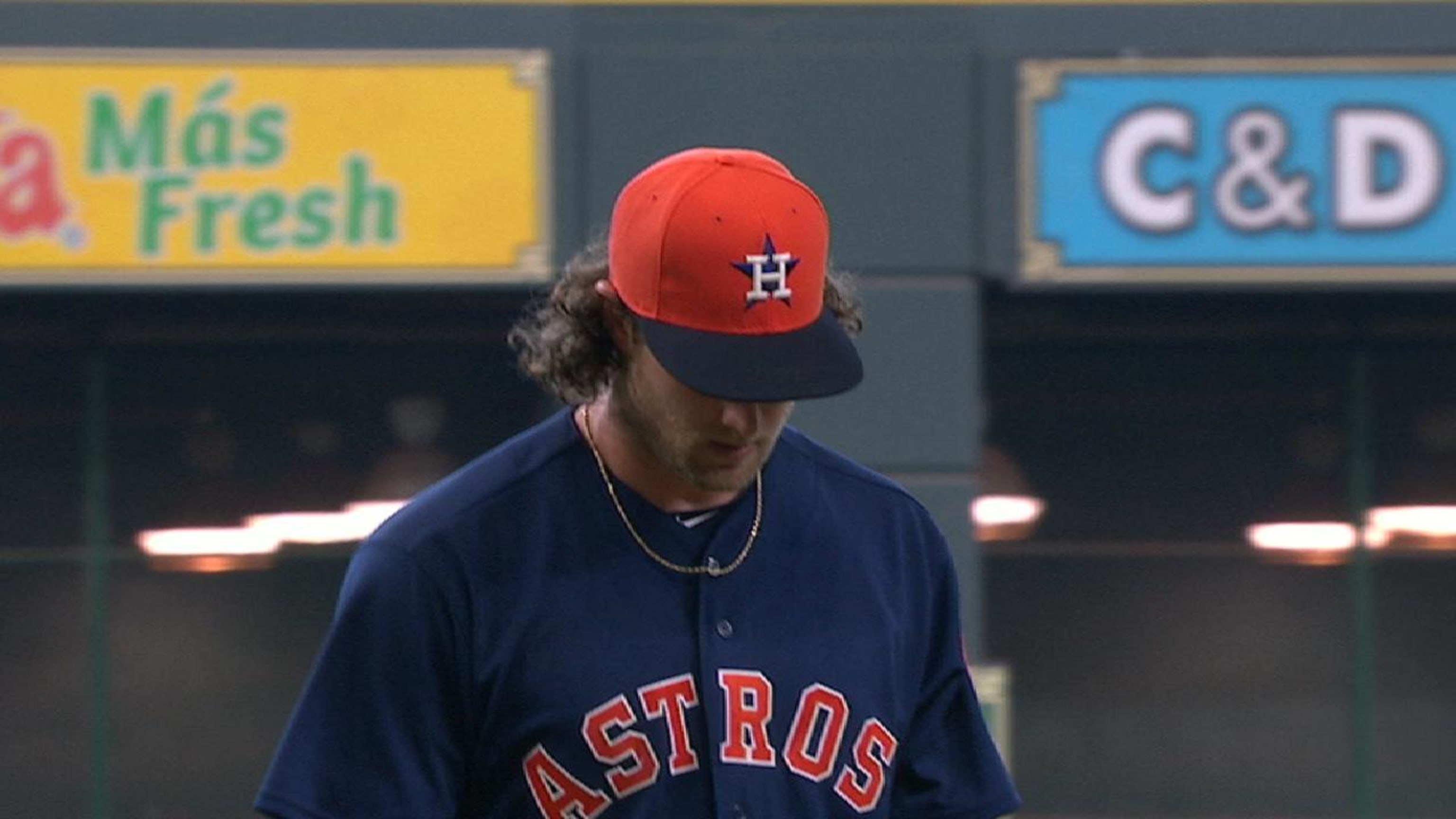
I saw in the parent site's MLB Change Summary that the Astros have officially removed their orange caps from the rotation for this year. They haven't appeared on-field since 2018 but they were listed as an official option and included as official team merchandise the entire time. I even picked up one with a 2022 World Series Champions patch on it the night they won. Oh well. Until next time orange cap. We know you'll be back at some point.
-
2
-
1
-
 2
2
-
-
On 3/28/2023 at 6:31 PM, TrueYankee26 said:
Speaking of companies that modernized their logos
I didnt know bp brought the Amoco brand back. My mom worked for Amoco/bp for 20 years so we always had tons of Amoco gear around the house
As far as the modernization of this logo....ehhhhhh. The gradients are very unnecessary.
Back on the original topic. I think the new pepsi logo is an improvement in that it brings back the style of logo that most people associate with the brand while trying to capitalize on the 80's nostalgia that is going on with many brands. The black works for me as it makes the wordmark stand out and catch your eye when walking past it on a shelf.
-
I just thought it was a neat video showing NRG stadium change from rodeo setup to Final Four over the course of a few days
-
2
-
-
On 3/19/2023 at 12:36 PM, aawagner011 said:
New cream uniforms for Georgia. I am curious if this is possibly an indication of future changes to come. With the football team moving away from the Bulldog Bold font, this could be foreshadowing for baseball, too. We saw how Georgia football introduced two alternates in 2020, neither of which had Bulldog Bold and then the font was gone from the uniforms completely by 2022.
Its a clean look and script team names should work for a baseball uniform, but when I see Bulldogs in script I immediately think of Fresno State. It just doesnt look like a uniform I would associate with Georgia. Maybe if the uniform had a black outline or trimming it would fit better
-
4 hours ago, VandyDelphia Mike said:
Vanderbilt went with Lou Gehrig tribute jerseys in their matchup versus Belmont at the Sounds' home.
Normally without name on back, names made an appearance, since everyone had a 4 on their back. Their everyday uniform number was rendered in small font on the sleeve.
Neat way to make a V out of the New York Yankees logo font. Does Gehrig have any ties to Vanderbilt or Nashville to have a dedicated uniform for him or is this just a reason to have a fun alt?
-
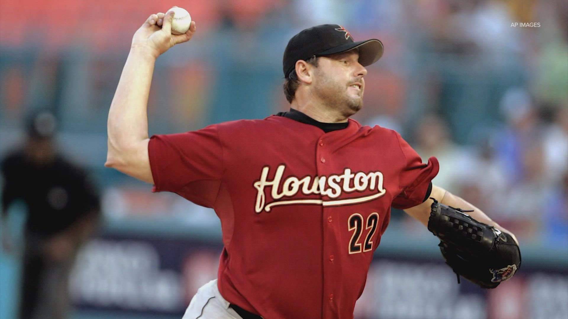
1 hour ago, spartacat_12 said:
Is an Astros jersey really Clemens's right uniform? Sure, he helped them get to a World Series, but when someone mentions his name I think of the Red Sox or Yankees before I think of Houston.
its the right uniform when you think of his time as an Astro, but its not the uniform I would choose when you want to showcase the Astros. Perhaps Roy Oswalt or Lance Berkman would have been a better choice from that era
-

/cdn.vox-cdn.com/uploads/chorus_asset/file/19935385/458222176.jpg.jpg)


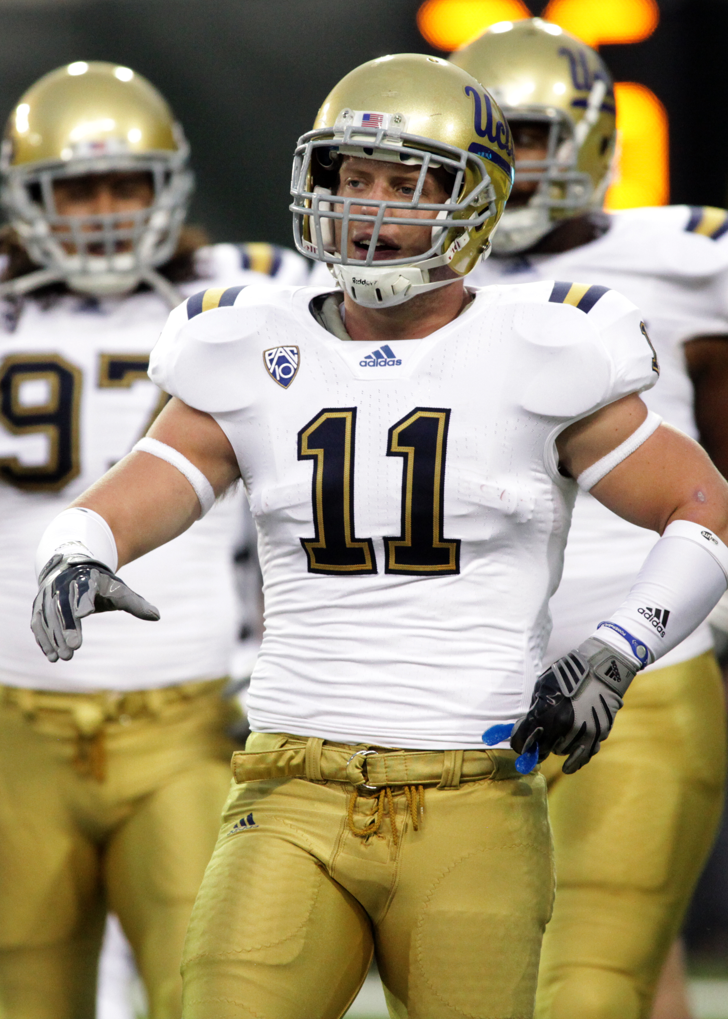
NFL 2023 Changes
in Sports Logo News
Posted
I would think so. I'm skimming through the current trademarks associated with the Oilers and nothing seems to keep another Houston team from using those colors. Now, the league may be wanting to protect the Titans ownership of past Oilers history and doesnt want the Texans to get too close to that just to avoid the owners fighting it out.