


coco1997
-
Posts
4,885 -
Joined
-
Last visited
-
Days Won
14
Posts posted by coco1997
-
-
Dodgers City Connect cap leak:
Pretty much what I expected.
-
1 minute ago, Silent Wind of Doom said:
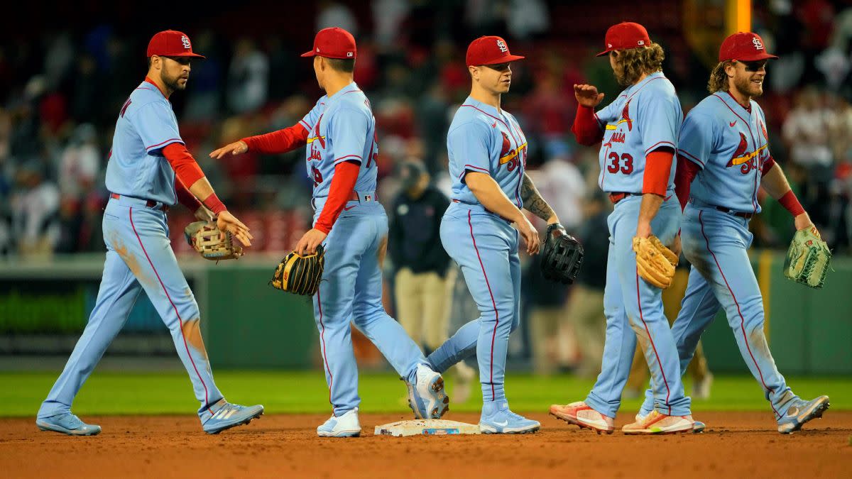
Two things. Firstly, the St. Louis cream is back!

And it was in seeing this that I realized the Cards have a memorial patch! I was confused, at first thinking that a player was wearing one of the Musial ones from last year and shamefully ditched for the ad patch. But in tracing the number I realized it's a Whitey Herzog patch. Haven't seen this mentioned anywhere. I do wonder how this affects the City Connect, as they seem loathe to put the ad patch and a memorial patch on the same sleeve. Will they replace the Fleur and Arch patch?
Also, quite frustratingly, another '24 City Connect to leave the socks out of it. Except for Cleveland, it seems they've been leaving that part out of all the reveals.
Secondly, the Cleveland City Connect is confounding me a bit. At first, I thought that the pants were cream in the reveal. It's subtle, but the seams seem a clear cream. But then there are other shots where they seem clearly straight white, so it seemed it was a trick of the lighting. The lettering, front panel, and pants all look different colors according to different color lighting. The detail shots look white. The article about it on the mothership says the front panel of the cap is "sandstone".
Meanwhile, their first time wearing them was during the afternoon. In every shot, these features are mostly in shadow, and the coloring can be easily seen as reflecting the bright light off of the dirt.
But what is shown in the light above the waist and far from the dirt looks pretty bright white for the most part.
I'm completely lost. Features look deep cream or fluorescent white depending on the lighting. I can't tell. And if the lettering does have a sandstone element, I'm unsure if it's the detail atop white lettering, or if the lettering itself is also sandy.
I watched the game on Friday and the pants and cap front panel were definitely off-white. -
8 hours ago, Coiler said:
Sandstone is amazing.
Thanks!
On 5/17/2024 at 1:29 PM, maxwasson said:This is an interesting rebrand decision here for the Rays, they keep the "Rays" name but they go back to their Devil Rays color scheme and logos, giving this a very 2000s feel, but also very colorful.
Thanks! I love those original Devil Rays uniforms, but the inclusion of black when they could have used dark purple as their base color was unnecessary. Then again, this was at the peak of the Black for Black's Sake trend, so it's not surprising.ST. LOUIS CARDINALS
HOME:
ROAD:
HOME ALT:
ROAD ALT:
CITY CONNECT:
Notes:
- Not long ago, the Cardinals had one of the strongest, cleanest identities in MLB. But in recent years, it’s gotten a bit muddled. I tried to remedy this by replacing the “Victory Blues” with a new navy road alt and making the Sunday home alt a straight throwback to the team’s 1942 look which, in addition to being off-white with T-bars, also featured a navy-crowned cap and different bird-on-the-bat jersey design.
- The road jersey now uses the “St. Louis” script from the Sunday alternate.
- Since St. Louis played it safe with their City Connect, I did the same with my tweak, going all-in on the flag motif. As much as I love the wavy pinstripes idea, I think white/blue/white trim based on the flag is more distinct and would certainly be more visible on the field.
- “The Lou” is being mocked mercilessly online—both due to its phonetic similarity to the British slang for a toilet, and because apparently no one living in St. Louis actually calls it that—so I went with the 1920-21 arched “St. Louis” wordmark that inspired the cap “STL.”
- The cap now mimics the sleeve patch with its combination Fleur-de-lis/Arch logo. I figured a white front panel would help dispel criticisms that it’s too similar to the team’s everyday cap.
C&C appreciated!
-
 2
2
-
-
10 minutes ago, CaliforniaGlowin said:
The font on the hat kind of looks like the Mets font.
It's based on the Cardinals' 1920-21 jersey wordmark:
-
12
-
-
Cardinals City Connects officially unveiled:
St Louis Cardinals Unveil New “The Lou” City Connect Uniforms – SportsLogos.Net News
-
1
-
-
2 minutes ago, adsarebad said:
Insane that they believe they are beyond a CC uniform but just fine with an ugly ad patch on the sleeve...

A Navy blue jersey in the style of this St. Louis CC jersey would not exactly tarnish their brand.
:censored:, you can get pink, purple, red, green Yankee caps, and 10 million different kind of merchandise with the NY logo on it. From purses to underwater to soap dispensers!
Are they really trying to tell us, that they are so precious and holy that a CC uniform is beneath them!?
Agreed. As soon as the Yankees adopted an ad patch the whole "sanctity" of their brand kind of went out the window. Plus, nothing stopped them from participating in the Players' Weekend promotions in years' past.A monochrome navy design with something that pays homage to the city of NYC and/or team history and doesn't incorporate any off-brand colors would be fine.
-
3
-
-
1 hour ago, AnPheitseog said:
wait, a source on this? I never heard this, but would love it to be true.
To my knowledge the team hasn't come out and confirmed it, but the fact that the Yankees are one of only two teams (the other being the A's, for obvious reasons) who won't have debuted at least one design by season's end should be some indication. -
33 minutes ago, McCall said:
If you click on the picture above, it shows white pants with the thicker red piping down the side.
After seeing other CC uniforms, I'm actually delighted that they are "underwhelming". I expect the same treatment to the Yankees.
The Yankees seemingly opted out of the program. I suppose they could always change their mind after this year, though. -
57 minutes ago, adsarebad said:
Is this real?
If so.... :censored:, here we go again with the cap, just like Detroit

Big difference between the front of a cap having three letters (see the 1976-86 White Sox) vs. seven. I think this cap is fine on its own merits, but given how similar it is to the Cards’ everyday cap, it leaves a lot to be desired.-
2
-
-
It seems the Cardinals took the Dodgers’ (first) route of essentially recoloring their regular jersey and changing the script. But I think there are enough interesting flourishes here, such as the wavy pinstripes and the fleur-de-lis sleeve logo, to put this one way above the Dodgers’.
Side note, someone on Facebook observed that the “Th” in “The” looks like the Pi symbol, and that the area code in St. Louis is 314. Could be deliberate or just a happy accident.
-
1
-
-
1 minute ago, aawagner011 said:
Those look real to me. I think it would be hard to photoshop the new script and subtle pinstripes faithfully on all three models without a slip up somewhere. The jersey mostly feels like a standard alternate until you read the script. The cap feels somewhat disjointed from the rest, but as far as City Connects go, these are good. They still look like the Cards.
Yep, they’re real. Here’s a good look at the sleeve patch, which is really nice:-
1
-
-
1 hour ago, BC985 said:
I am not sure how St. Louis does it, but it is the town of NO LEAKS. The St. Louis City away kit failed to leak and now the Cardinals City Connect is not leaking.
-
 2
2
-
-
Congrats on finishing this series! Looking forward to the sequel.
-
1
-
-
1 minute ago, Silent Wind of Doom said:
They're definitely one to whiff bad on theirs. So much culture and they go for the thing a housewife in Peoria would go with. Even so... there's a bit of a feeling you get looking at these considering that they took one team color (not the same shade, but still) and left the other off that it's incomplete. If they had gone with black outlines that also faded out, it would have been an improvement. But they went with a light shade of orange (and not even the bridge's shade) and the base color of the jersey, which makes it look like a printing error.
I'm actually fine with the lack of black and the decision to use only orange--the problem is they used the wrong shade!-
2
-
-
47 minutes ago, Silent Wind of Doom said:
Oh! And we had some returns on a random Tuesday night!
Man...I would like those Giants City Connects so much more if there was something else on the front of the jersey. Either front numbers or a "San Francisco" script would make such a difference. I also wish they had used International Orange (the actual color of the Golden Gate Bridge), which is a much more reddish shade.-
4
-
-
20 minutes ago, Marlins93 said:
And this is my main point. And that's not a subtle design element here.
Anyway, I'm just completely over City Connect in general. There was a moment of promise when the Marlins and the White Sox released theirs, but since then most of the new additions have either been "mid at best" or "nuke from orbit bad." I'd categorize the Cleveland ones as being "mid at best" just because Nike is having difficulty being more creative than an airport code for some teams.
City Connect seemed to peak in 2022 when we got the Nationals, Astros, Royals, Rockies, Angels, Brewers and Padres. All decent-to-great designs that made great use of color and didn't look remotely like one another, unlike the onslaught of black and navy we've been getting since 2023.
I suppose Nike could stick the landing with the next three teams on the schedule, but I won't hold my breath.-
4
-
-
On 5/11/2024 at 3:44 PM, cubbeblue88 said:
Green city connect is so
 !!!
On 5/11/2024 at 8:31 PM, Coiler said:
!!!
On 5/11/2024 at 8:31 PM, Coiler said:Like the City Connect.
If you wanted to be REALLY crazy with it, you could make it ivy patterned.
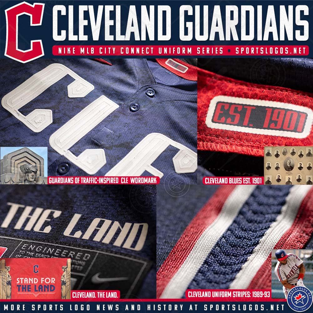
Thank you both! @Coiler, I did something similar to what you suggested for my Cathedral Connect Cubs concept.CLEVELAND GUARDIANS
HOME:
ROAD:
HOME ALT:
ROAD ALT:
CITY CONNECT:
Notes:- The Guardians’ identity is decent enough, but I’ve always found their uniforms to be a bit lacking. Therefore, I added TV numbers across the board, along with different piping on the home and home alt and additional collar trim on the road and road alt.
- I like Cleveland’s City Connect, and while I LOVE the use of racing stripes, I’m not convinced they work on a uniform without a matching jersey and pants. I wanted to go monochrome, and since black and navy are played out at this point, I decided to go all-in on the sandstone color from the “CLE” wordmark.
- Creme replaces plain white on the front panel of the cap and within the racing stripes and wordmark.
C&C appreciated as always!
-
3
-
-
I’d hesitate to use off-white only because the Angels did something very similar, and I’d probably go with a blue cap logo for visibility, but the Dodgers Stadium sunrise pattern is inspired. Great job!
-
1
-
-
13 hours ago, MJD7 said:
Boston's City Connect was definitely shocking at first, but after visiting the city earlier this spring and seeing the City branding in the team store, it seemed to really "fit" and, from an outsider perspective, seems to be something that really "connects" to the city, no pun intended.
When I asked a native Bostonian what he thought about the City uniforms, he seemingly didn't even understand that I was speaking strictly aesthetically, because the Marathon and what it means is so deeply tied to the city Boston, that it almost wasn't even a question of whether it was worth it to have as part of their identity.
In my opinion, they did go a bit overboard with its use when they had that winning streak where they kept on wearing them, but I wouldn't mind it to be something they continue to wear around the time of the marathon and a few other times throughout the year.
Yeah, I wasn't a huge fan of Boston's City Connect (I'm pretty sure most people weren't) when it was first unveiled, but it's grown on me, especially when viewed in the context of the program as a whole. It's definitely better than most of the designs from the past year or two.-
3
-
-
On 5/11/2024 at 1:22 PM, Silent Wind of Doom said:
Well... Two past opinions I had have changed drastically.
While I believe the full retro replica is the right way to go and don't care about the difference in drop shadow as I believe every single one of us on this board is in full agreement that black is okay quarantined as a throwback rather than a modern piece of the identity... I'm shocked seeing it in action that the shininess of the blue fabric actually causes the blue and black to contrast quite well under the lights at night. I thought it would all blend together like the Marlins of the last few years or the original Braves' navy alt. I can't believe it, but it seems to actually work.
Eh, the previous design with white is still way better. The new version is made even worse by the fact that they removed the white from the script and numbers but kept it for the swoosh.-
3
-
-
48 minutes ago, PlayGloria said:
Now I wouldn't hate that. That being said, other than the Braves, we haven't really seen one of these uniforms get based off of a throwback, so I'm not holding my breath.
(Devil) Rays, too.-
3
-
-
6 hours ago, adsarebad said:
Cleveland the most brutal one yet..... so bland, and no sleeve patch, except the ad patch! Which complete ruins the 1 once of dignity these may have.
CINCY, MOTOR CITY, PHILLY, NYC, CLE, LOS ANGELES .... Those terrible huge block letter front scripts keeps coming
The Mets' "NYC" is Tuscan, the same style as the "New York" on their road jerseys. -
40 minutes ago, Silent Wind of Doom said:
I feel dumb for trying to make sense of that hashtag and my brain's first pass at it being "It's The
 in' DiamondBacks" before immediately realizing what it actually is.
What's with the birthday cake ice cream speckles? I'm honestly shocked they just haven't gone the way the Clippers went.
Do they have a large segment of the fanbase that would be alienated by such a design?
It just seems like Los Angeles has so much culture and the Dodgers are on their way to whiffing again, but there may be references here that go over my head because I'm not a local. I do like the LAD logo.
Not totally sold on the jersey design as a whole, but that hybrid LA/script “D” logo is pretty sharp. -
Dodgers City Connect leak? This is from the same guy who leaked the Mets and Tigers caps.
-
2
-
1
-
 2
2
-
 1
1
-
 2
2
-


City Connect tweaks (Mets Redesign, Tigers, Guardians & Cardinals 5/22)
in Concepts
Posted
I realized I've been neglecting this threat a bit, so I decided to catch up on the last few City Connects released. First up is a new spin on the Mets:

Notes:
- For this version of the Mets, I decided to go all in on the subway signage and color scheme that inspired the team's actual design.
- I originally planned to use racing stripes but changed course after the Guardians stole my thunder.
Next up are some tweaks, all of which are cross posted from my MLB Nike 4+1 series:
TIGERS:
Notes:
- I wanted to address the biggest (and most legitimate) criticisms of Detroit's newly unveiled City Connect design: the total lack of orange and horrible cap logo. The TV numbers and tire tape pattern on the sleeves and pants are therefore recolored orange, and the "DETROIT" wordmark on the cap is replaced with the tiger eye "headlights" that appear above the jersey's jock tag. Shoutout to @Victormrey for helping out with the tread pattern!
GUARDIANS:
Notes:
- I like Cleveland’s City Connect, and while I LOVE the use of racing stripes, I’m not convinced they work on a uniform without a matching jersey and pants. I wanted to go monochrome, and since black and navy are played out at this point, I decided to go all-in on the sandstone color from the “CLE” wordmark.
CARDINALS:

Notes:
- Since St. Louis played it safe with their City Connect, I did the same with my tweak, going all-in on the flag motif. As much as I love the wavy pinstripes idea, I think white/blue/white trim based on the flag is more distinct and would certainly be more visible on the field.
- “The Lou” is being mocked mercilessly online—both due to its phonetic similarity to the British slang for a toilet, and because apparently no one living in St. Louis actually calls it that—so I went with the 1920-21 arched “St. Louis” wordmark that inspired the cap “STL.”
- The cap now mimics the sleeve patch with its combination Fleur-de-lis/Arch logo. I figured a white front panel would help dispel criticisms that it’s too similar to the team’s everyday cap.
C&C appreciated as always!