

_DietDrPepper_
-
Posts
2,723 -
Joined
-
Last visited
-
Days Won
1
Posts posted by _DietDrPepper_
-
-
Guardians and defenders look better than I would’ve ever imagined an xfl team looking. Houston and Dallas are fitting the bill though. Their more of what I expected. Hopefully they’re the worst to come and the rest are like NYC and DC.
-
8 hours ago, Dilbert said:
Florence Y'alls has significant meaning to the area. Across the highway from the ballpark is a water tower and the Florence Mall. The water tower originally read Florence mall but was changed to Florence Y'all after legal concerns. I got a feeling this name will win out. They already have Wally, the water tower as their mascot.

Go-Goettas also works locally after a local meat called goetta (pronounce "getta"), usually made with pork and or beef with oats and spices. Its similar to scrapple (a similar version found on the east coast).
As someone who’s frequently been in Florence I can agree with this.
Never been to a freedom game but the Y’all’s definitely are something I might go see. Would be interesting to see them build an identity around this if it is picked.
-
4 hours ago, simtek34 said:
Just 6 years ago, it was this beauty.
Beautiful indeed! I miss it so much
-
 1
1
-
-
4 hours ago, Friedrich Stuart Macbeth said:
It is still Chicago's logo, though. He may as well remove the Florian cross altogether.
The Fire don’t own the Cross, he’s allowed to use it. He’s design outside of the cross is different enough from the now unused fire logo so I think it’s fine
-
3
-
-
The logo package is okay, the colors I really like, but I think they’d be much better off as the Moose, rather than the Paddleheads
-
2
-
-
Love the Canadian team updated, the only problem comes from Montreal, the stripes are small as it is and when put on the helmet and pants it becomes a blurry mess, maybe simplify a tad? Also your ship on your alt helmet is backwards
-
3 minutes ago, DG_Now said:
Agreed. With the exception of this...
I think everything they've done post bird-head logo has been routinely terrific. All of these are awesome:
The gold pants are in their rotation anymore though, thankfully, it was the only part that didn’t work
-
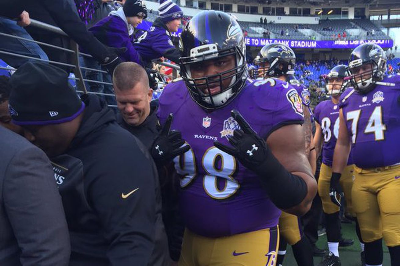
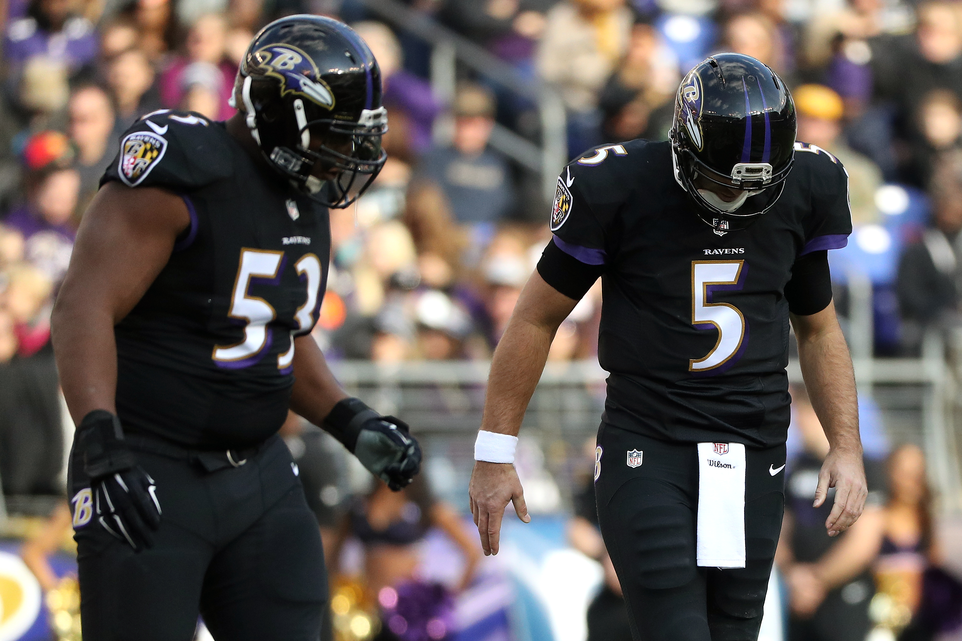
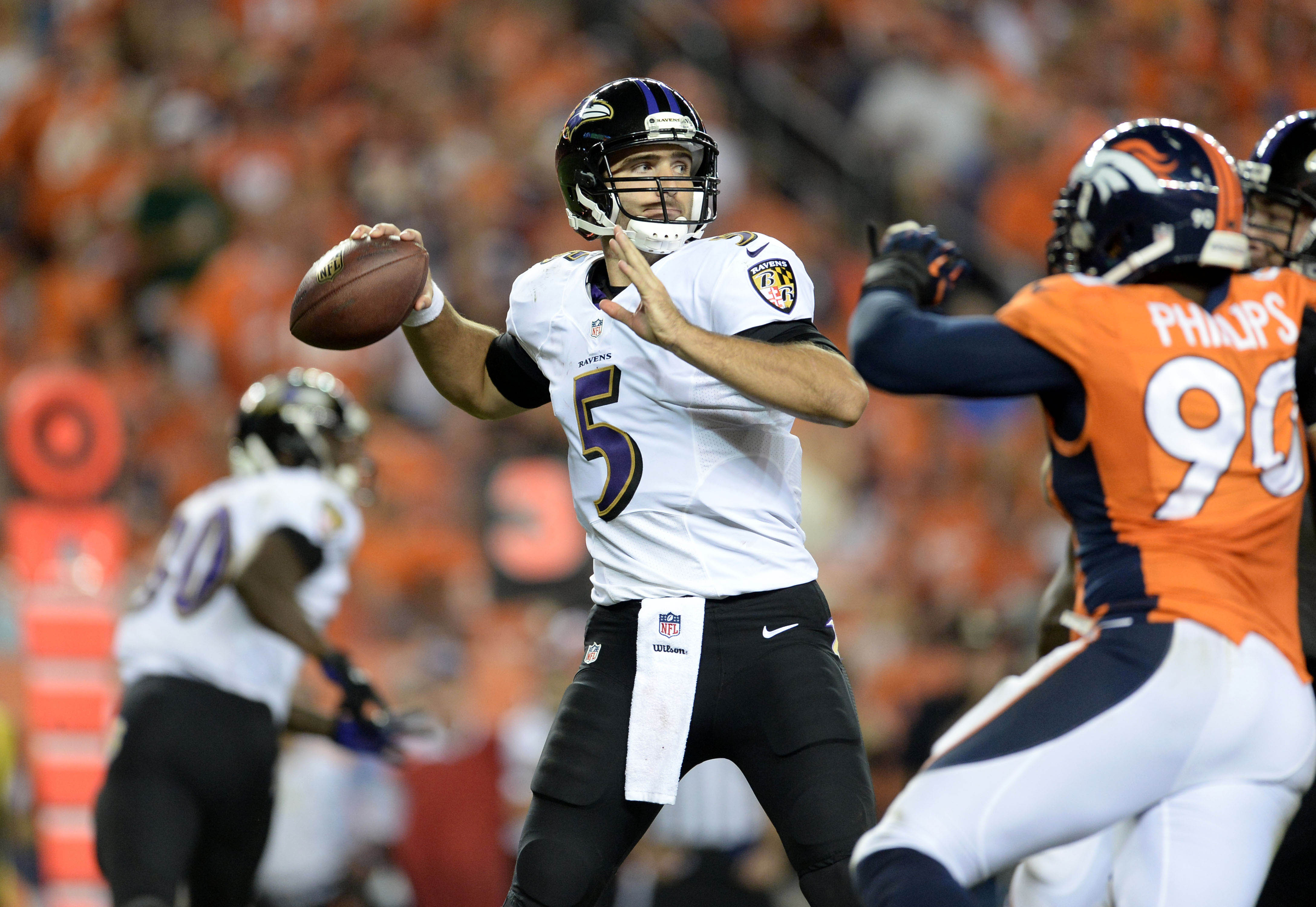
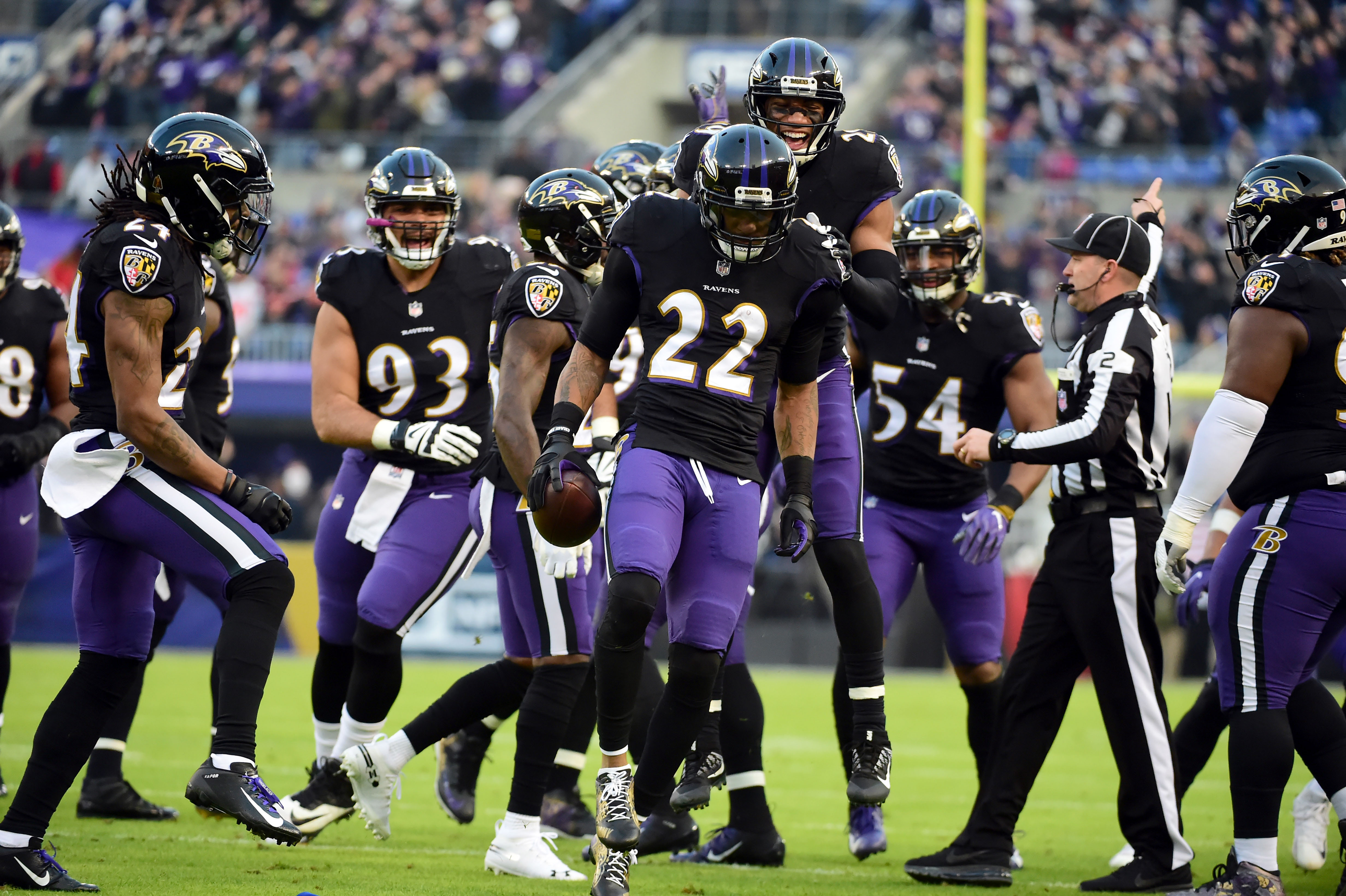
The Ravens are one of the few teams that don’t need to change their identity ever. It looks beautiful.
-
2
-
-
7 hours ago, jn8 said:
Not a change, but an interesting list my school Tweeted out:
Crazy that We were almost the Omaha Unicorns. Kinda makes me wonder how that would’ve been done, like would it be a corn pun? Hol up... heading on over to concepts
That’s really interesting, demons is also super interesting. Also they spelled Wendi’s name wrong, it’s right there on the drawing, that’s embarrassing
-
7
-
-
Black and blue looks the best for Jacksonville.
Montreal looks amazing, I prefer it to the Royals so if you’re going to change someone’s name, I’d personally chose the royals. And that secondary logo for St.Louis is gorgeous! That might be your best logo yet!
-
Norwich Narwhals might be the best identity I can think of (that’s an original name) since the Yard Goats, please don’t mess this up
sEa UnIcoRNs
-
2
-
-
19 hours ago, sc49erfan15 said:
"Trash Pandas" is literally named after a meme. It's a meme that got an extra boost thanks to Guardians of the Galaxy, but it's still a meme.
Memes are almost universally short-term phenomena. That's kind of the point.
It'll last 10 years, max. How long would have teams called the LOLcats or Dancing Babies or All Your Base Are Belong To Uses lasted? Not long. This isn't too different.
That said, they did a great job with the logos.
I feel like Trash Pandas was an unofficial term for raccoons before the “meme” either way it’s a trash identity and I hope people come to their senses and it gets dumped in less than 10 years, see the Baby Cakes
-
3
-
-
14 minutes ago, the admiral said:
Houston is more like living in a fat guy's ass crack than Los Angeles is
I never said it wasn’t hot, it’s not tropical though, atleast to my knowledge, or at least known for its tropical-ity like Miami or LA.
-
I’m sorry @Htown1141, the Oilers look is overrated, the Columbia blue is the only good thing to ever come out of the identity, but it would’ve been much better for a team in a tropical setting such as Miami or LA, the logo and striping is more boring than the Texans identity ever has been. The Texans look is gorgeous
-
1
-
-
4 minutes ago, oldschoolvikings said:
Out of curiosity, can you see it now? It's showing up on my laptop, but not my phone. Weird.
On my phone right now and I can’t see either of them or your older throwback inspired look from a couple days ago, I’ll check my laptop when I get home
-
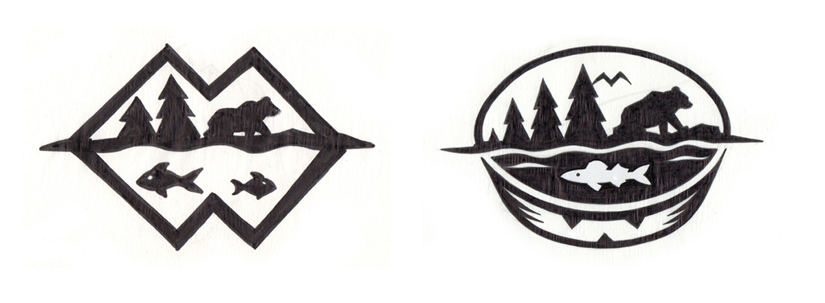
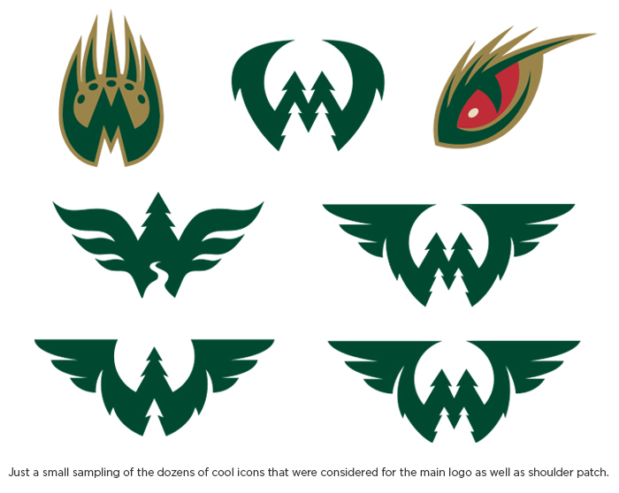
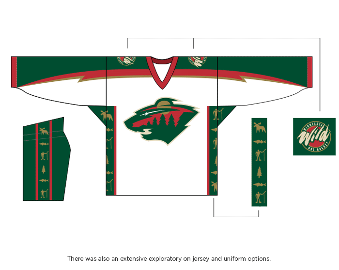
On 9/20/2019 at 12:08 AM, mcrosby said:
I don't think this has been posted yet: https://www.behance.net/gallery/42321255/Minnesota-Wild-Identity?tracking_source=for_you_feed_activity
Such great logo possibilities wasted on such a bad name
-
3
-
-
I’m honestly a big fan of the current redskins look, i think it’s one of the best in the league, the only change I’d make would be maybe the spear helmet idea, just to shift away from the controversial name a bit
-
1
-
-
I really want to like it, but it’s weird, how would a red jersey with orange shoulders look?
And way to beat me, I have a couple Bucs concepts in the works myself lol
Edit: maybe it’s the colored shoulders in general, it feels almost more Bengals than than Bucs, especially the white uniform.
-
1
-
-
4 hours ago, insert name said:
It doesn’t even look out of place.
I have a feeling you’d get the same thing with a bunch of teams if you put their logo over their wordmark. It really shows off how good most of these logos are.
-
1
-
-
Got it, discussion may not be the best word for it but to be fair I can’t really think of what else to call it, because with news comes discussion, and then there’s kind of a problem.
-
How do you decide what’s discussion and what’s news, what about discussion over news? And why is a topic called Los Angeles NFL Brand Discussion in the news section? I just think it’s a little arbitrary, not bad but just kinda what’s the point.
-
15 hours ago, Dirwicky said:
In the "What Could Have Been..." Category. This was reported on PWInsider of the names that Alpha Entertainment applied for:
St. Louis Phantom
DC Stars
Tampa Bay Predators
LA Gold
New York Gothams
Dallas Blaze
Houston Comets
St. Louis Archers
DC Sentinels
Tampa Bay Stingers
LA Stunners
Houston Wildcatters
New York Power
Dallas Bandits
St. Louis Greywolves
DC Knights
LA Wings
Dallas. Renegades
Houston Nitro
Dallas Lobos
Tampa Bay Vipers
LA Legion
New York Guardians
Tampa Bay Sharks
Houston Roughnecks
New York Grind
St. Louis Battlehawks
DC Armada
Tampa Bay Frenzy
New York Cannons
St. Louis Aces
DC Defenders
LA Wildcats
Houston Octane
Dallas MustangsThe best nicknames per city;
DC Knights
New York Cannons
St. Louis Aces
Tampa Bay Vipers
Dallas Mustangs
Houston Roughnecks
Los Angeles Wildcats
Seattle Dragons
-
The Marlins rebrand has grown on me, at first I wasn’t so keen, and while the black uniform is still not the greatest, the home and roads have definitely grown on me, so much so I can say confidently that I really like them. I don’t know why, but the uncanny valley-ness of their scripts have disappeared as I’ve adjusted to them, the colors are (not used the best but still) gorgeous, the cap is great. I like this update for the Marlins, it could be so much better. But it’s definitely an upgrade. I really like it
-
1
-
-
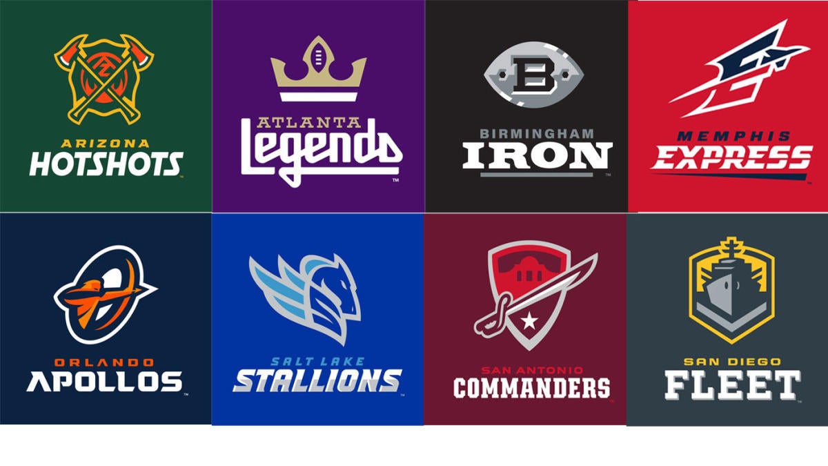
2 hours ago, Ferdinand Cesarano said:
The Atlanta and Salt Lake AAF logos were remarkable in the amount of detail they displayed without resorting to cheap faux-3D effects. They were a testiment to the proposition that anything can be done in the two legitimate dimensions. On top of that, the Atlanta wordmark was superb. (The Salt Lake wordmark less so, for it incorporated shadows.) @CaliforniaGlowin mentioned "love at first sight" of the Birmingham AAF logo. However, to me that's the only clunker in that league, due to its clumsy use of bevels, shadows, and depth. Every other AAF logo and wordmark had plenty of merit; and the use of colour by Arizona, Atlanta, and Salt Lake was most impressive.
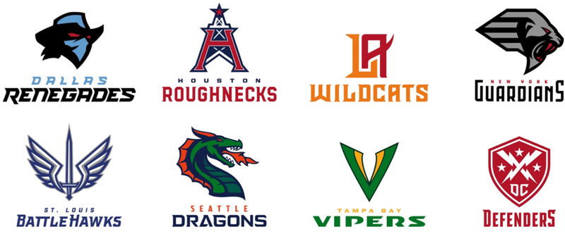
The XFL logos keep to a good standard, generally higher than the first time around (due mainly to the absence of abominations such as the Rage and the Maniax). Of the XFL logos, the strongest are the ones using letters: Los Angeles, Houston, Tampa Bay. St. Louis's graphic logo is impressive; though it, too, contains a kind of hidden letter-based component. The only bad logos are Dallas's, which is blocky and clunky, and New York's, which is undecipherable at smaller sizes. All of the wordmarks except Dallas's are good, being distinctive and full of personality. As far as colours, the ones chosen for Los Angeles and for Tampa Bay are the most striking. It's nice to see bright rather than dull shades.
However, taken as a group, the AAF's logos and wordmarks come out a step or two ahead of the XFL's.
Of this group of 16, the best logo overall is that of Los Angeles; and the best non-letter logo and best wordmark clearly belong to Atlanta.
First, I’d actually be super interested in a 16 team league with them. Really would love to catch an Apollos v Dragons game or maybe a Hotshots v Guardians game. Both would be great logo matchups Atleast.
Second, how is LA’s logo the best? It’s a good monogram sure, but I really think the Hotshots, Dragons, Apollos, Guardians and Fleet are all better. Maybe even add in the Renegades and Defenders.
-
2
-


XFL 2023 Logos, Names and Uniforms
in Sports Logo News
Posted
Why does St. Louis have black. Take black out and it’s such a better uniform!