


PlayGloria
-
Posts
484 -
Joined
-
Last visited
Posts posted by PlayGloria
-
-
This might be waaaay to broad of a stroke, but I just tend to hate any uniform that is designed with an "urban" feel. It just tends to come out borderline cheesy to me. This fits the bill as well.
-
 3
3
-
 1
1
-
 1
1
-
-
1 minute ago, Survival79 said:

There is a joke somewhere here with Yeti cups and Stanley cups and the Stanley Cup... haha someone smarter than me can come up with it.
-
3
-
-
2 minutes ago, Lights Out said:
The Texans' old uniforms were as boring, mediocre, and anonymous as their play on the field for 99% of the time they were in use. Frankly, the horn stripes from the new set are the kind of thing they should have done all along instead of ripping off USC.
The new uniforms might be "trying too hard" (I don't think so) but the old ones weren't trying at all. They finally have a real identity now.
The only thing I don't like is neither of the home jerseys matching the road and alternate, but that's nothing we haven't already seen countless times in the NFL.
I don't think you are wrong about their last set, but I disagree on this new set (if the leaks are true). Personally they just went from a super boring identity to a super cheesy identity overnight.
-
2
-
-
17 minutes ago, DCarp1231 said:
It would be absolutely poetic if the Texans set turned out to be even worse than the Titans set
It's as if both franchises are fighting to be Guy Fieri's favorite team, and his favorite colors happen to be navy, red, and powder blue
-
1
-
 5
5
-
-
21 minutes ago, CardsFan79 said:
The Cardinals are unveiling their CC on May 20, and debuting them May 25. This is going to be bad.
https://www.facebook.com/share/fBXVbGh2vr94qhDe/?mibextid=WC7FNe
I've never been more petrified of a new uniform for one of my hometown teams.
-
On 3/28/2024 at 10:12 AM, PlayGloria said:
This might end up being a case of "careful what you wish for," but I'm kind of ready for a new Lions set. I have never really loved this current set, even when they use the right combos. Not a fan of the slanted numbers. I also want more white involved in the color scheme instead of primarily gray/silver with the Honolulu blue. If you look at the balance that the Barry Sanders era had, I think the white numbers and inner pant stripe really helped with that.
I posted this a few weeks ago and it looks like I got my wish! These new jerseys just look very balanced. Love them. And I think adding white really helps with that balance. Great work Detroit.
-
1 minute ago, HOOVER said:
Alright, since I've been talking about it forever, I ran a quick & dirty mock-up of my ideal Falcons uniform with Dark Silver helmet (sans Gold):
Add a Gold outline to the helmet stripe, logo, and the Swoosh & accessory details (like on cleats) if you wanted to go that route. Either way, this would do it.(I wouldn't even be completely heartbroken if they added a small 1" tall "ATLANTA" above the number in a clean new non-italic font.)
That's fantastic
-
 1
1
-
-
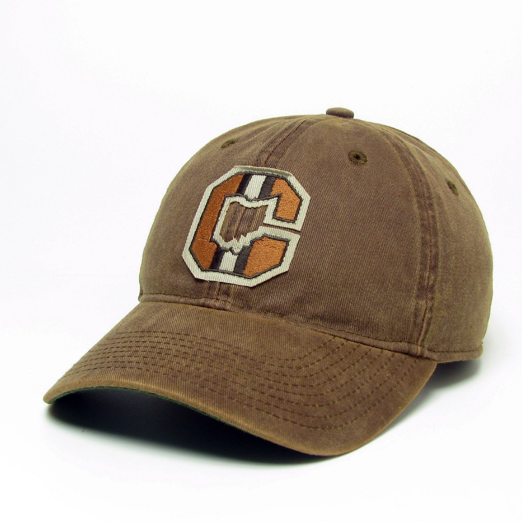
Just now, Cujo said:
Like the logo like the one seen on this hat -- This goes 1000000x harder than that blank-ass circa 1989 default helmet they continue to recycle.
Part of the beauty of the Browns is that they make almost no sense. A team called the Brown with an orange helmet, an weird elf mascot, the dog pound, etc. The helmet logo just fits with the rest of the weirdness.
As others have said, all teams used to use a 2D helmet as their primary logo pretty much. I personally dig that the Brown still do it.
-
4
-
 3
3
-
-
8 hours ago, Foxxtrot44 said:
What are people feeling for colors?
Green and yellow like the Eagles? Will this annoy the Minnesotans??Something purple to tie it to the Jazz? Seems we'd be the only purple squad.
I've always felt green and orange was an underused "Utah" color scheme, but I understand how it could be more polarizing.
I am kind of hoping for brown as a base color. Like a brown/yellow or brown/orange color scheme with a rich brown being the true primary color. Something like Wyoming football's color balance.
-
15 minutes ago, Digby said:
Well, edibles are marketed and sold to professional classes for whom weed is no longer a taboo, not the people of the street. Plus old habits die hard. Smoking all sorts of things in public is a societal annoyance that's nothing new though.
(Also, side effect of legalization is that corporate dispensary weed suuuucks. It's like if we ended Prohibition, but the only legalized alcohol was Bud Light, and half the bottles came out of the brewery flat.)
Really?? I used to smoke a ton in college. Like all day every day. I don't really care for it at all anymore, but the few times I have smoked anything from a legal dispensary, it kicked my teeth in
 That might just tell you what kind of dirt grass I was smoking back in the day I guess.
-
1
-
-
10 minutes ago, Anubis2051 said:
They're incredible and some of my favorites, but Homage is softer I think...
Nice! I'll have to make that my next purchase. Thanks for the tip
-
14 minutes ago, DCarp1231 said:
Honestly, the Cardinals new uniforms do have a nice classic and timeless feel to them. It has everything anyone would want out of a football uniform. Every component by itself is very well done. Whether or not they decide to mix and match and not go monochrome for 17 games a season is on them.
1 minute ago, Sec19Row53 said:I'll grant you classic if it were a college or high school uniform, because the aesthetic of nickname or location on the front of a football uniform is not a classic NFL aesthetic.
Totally agree on your monochrome statement.
I actually really like the Cardinals new set. All they need to do is throw away the red pants and the white socks. The only combos they need are white helmet - red jersey - white pants - red socks at home/white helmet - white jersey - white pants - red socks on the road. It would look like a modern set of their traditional uniforms from AZ and STL. The elements are there. They just aren't paired right.
-
11
-
-
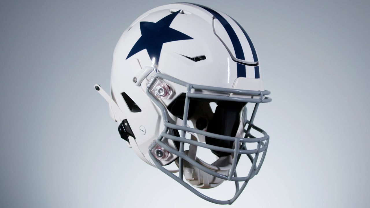
13 minutes ago, DCarp1231 said:
I’d welcome an inverted version of this Cowboys helmet. White star and stripes, navy blue base.
Dallas alt helmet idea: a royal blue star outlined in black, with navy blue stripes, and a helmet shell that has a gradient from seafoam green to true silver. Just make everyone's heads on this board completely explode
I like your idea though.
-
2
-
3
-
-
13 hours ago, Anubis2051 said:
It appears '47 is still private
Please no one touch 47 brand. One of my favorite brands in the world. Their stuff has gotten a bit overpriced, but what hasn't. I love their hats and their shirts are probably the softest on the planet.
-
1
-
-
14 hours ago, MDGP said:
Watch those reddit rumors be correct but for only the alternate jersey and third helmet.
That would really be best case scenario and I would be perfectly fine with that. I am fine with a traditional classy home/away set with a slightly more modern alternate design. And if the Broncos roll out a traditional home and away paired with an alternate of white helmet/orange mountain jersey, that would be okay in my book.
-
4 minutes ago, dont care said:
Those aren’t monochrome, and you’d be kidding yourself if you didn’t say they’d look even better with different pants
The Colts would not look better. I know that for sure
-
2
-
1
-
-
Sorry if this was already mentioned (also not directly uniform related) but the NHL is creating two schedules for the Coyotes next year - one in AZ and one in SLC. So it seems like this is actually gaining traction
-
22 minutes ago, spartacat_12 said:
You still seem confused. No one is suggesting taking the horns off the helmets and replacing them with a logo.
You say a ram head is generic, but it would be miles better than the gradient-filled L@ logo that's currently used as the primary logo. The Rams just need to pull a Chicago and swap the designations of their two logos so that the head is the primary and the LA monogram is the secondary.
Neither logo is any good IMO, ram head or LA.
-
3
-
-
There's something that I just don't believe about this rumor. Just throwing it out there.
Also, the rumor was that the 5280 was the same color as the pants so it was more of a hidden element.
-
1
-
-
23 minutes ago, MNtwins3 said:
Is it tire tracks? Or is it just some orange bars a graphic designer thought looked cool?
You could be correct... but none of these teams has just straight up rolled out retro uniform. They need the city connect element from somewhere. Motor City is the perfect low hanging fruit to snag
-
I said this earlier, but that Tigers CC graphic had tire tracks on the right hand side. There's going to be some kind of Detroit Motor City element to this thing.
-
26 minutes ago, projectjohn said:
Tigers City Connect is debuting May 10, with merch available May 6.
Most I've seen are believing it will be navy/orange and feature the '90s Tiger face logo.
Are those supposed to be tire tracks on the right?
-
24 minutes ago, bbush24 said:
Is it just me or do these jerseys not match with the pants?
Uni Watch has covered this issue a couple of times. Pretty unbelievable. The Cardinals had the same issue in ST so i guess we will see what they look like on the road vs the Dodgers today. This is pathetic
-
1
-
-
This might end up being a case of "careful what you wish for," but I'm kind of ready for a new Lions set. I have never really loved this current set, even when they use the right combos. Not a fan of the slanted numbers. I also want more white involved in the color scheme instead of primarily gray/silver with the Honolulu blue. If you look at the balance that the Barry Sanders era had, I think the white numbers and inner pant stripe really helped with that.
-
11
-


2024 NFL Changes
in Sports Logo News
Posted
Great post. Somehow this was exactly what I was thinking, but couldn't put it into words.