


PlayGloria
-
Posts
483 -
Joined
-
Last visited
Posts posted by PlayGloria
-
-
14 minutes ago, Michael Bolton said:
Potentially unpopular take, but even as a uniform detail enthusiast, I find these reveal tweets absolutely cringey and just stupid. What other league in the world tweets out "here's what color our helmet, pants and SOCKS will be next weekend." I miss the days when you found out what teams were wearing when they ran out onto the field on Sunday/Monday. Throwback announcements once or twice a year are fine but these "helmet -- jersey -- pants -- socks" detail announcements make my eyes roll further back in my head than human anatomy allows.
I'll go a step further... I miss the days when you knew what the team would be wearing because they only had one combo for home and one for away. I love an occasional throwback or an alternate, but there shouldn't be this much guessing as to what teams might look light on a week to week basis.
-
 8
8
-
-
6 hours ago, Silver_Star said:
I'm with you. It looks like classic Rams and also solves the issue of the navy helmet/royal jersey that people seem to hate (never bothered me). I love this.
-
I could go into critiquing the jersey itself, but I would rather just ask the question of why it is even necessary? The Rangers just don't need a third jersey. And if they decided that they absolutely need one, this isn't the route. The Rangers are in the realm of the Wings, Hawks, etc. They just need their classic home and away. If they add a third, even if it is a good design, just won't feel right in my eyes.
-
3
-
 1
1
-
-
7 minutes ago, Carolingian Steamroller said:
At this point, the Seahawks in action green kinda is their traditional vibe.
It's their thing. Until this year, we hadn't seen the royal and silver look for two decades.
I get your argument, but full on color rush barf pea soup green is not their traditional look at all. I would probably agree with you if they rolled out in navy over gray or something. But not this garbage.
-
1
-
-
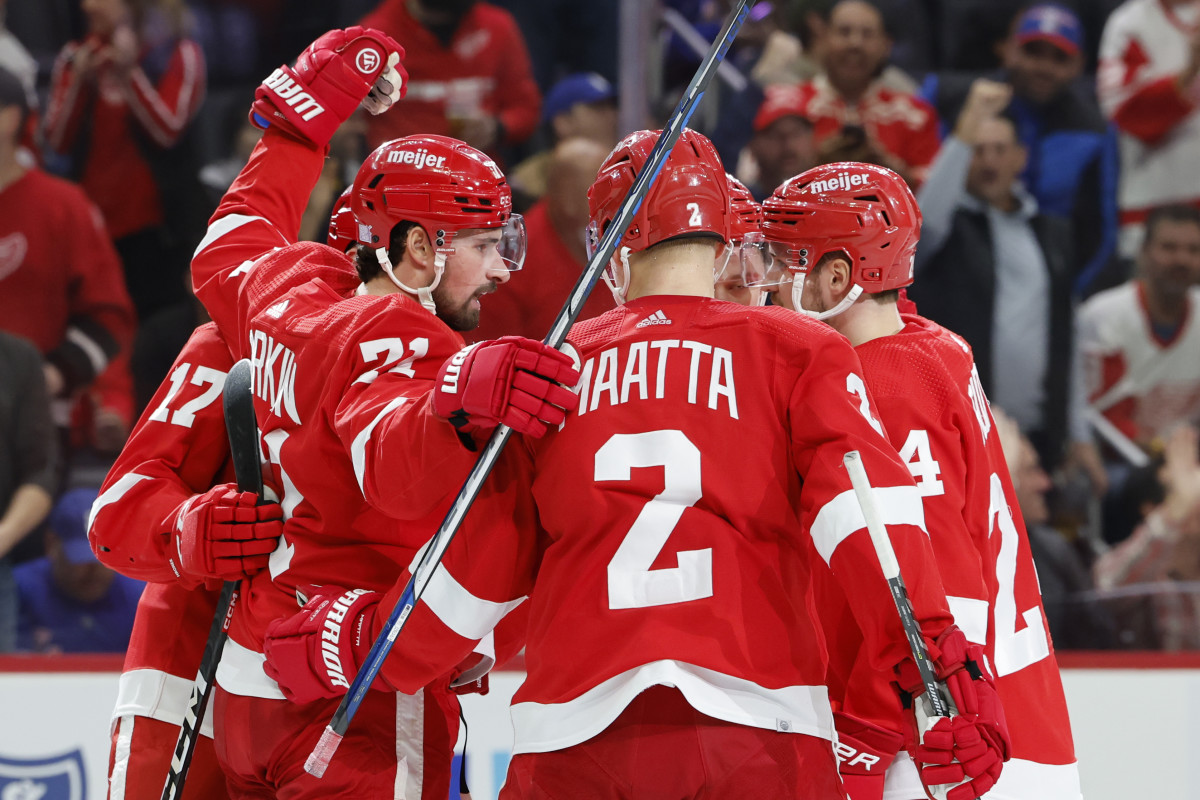
40 minutes ago, ruttep said:
Honestly, if they're trying to reduce the amount of equipment they bring out to Sweden, this would have been a good opportunity for color vs color. I'm not the biggest fan of it, but Leafs in blue vs Wings in red would have been great contrast.

That would have been a nice shoutout to the old bubblehockey games
It was always Blues vs Wings when I played. That was the only time the Blues could beat those Yzerman teams

-
1 hour ago, MJD7 said:
Wow! I’m not a fan of the headspoon (although I don't think it looks quite as thin as I had feared), but everything else is an upgrade. The biggest relief is that "D-Backs" is no longer a part of the set, hopefully for good.
Although I've personally started to sour on the turquoise, as oppposed to sand, I am glad they finally settled on one color scheme, even if it's maybe not the one I would've chosen. On the positive side, it makes the City Connect stand out as more unique, while still keeping sand in the set to a degree.
Making the home uniform off-white was a great move. I also appreciate the heavier emphasis on sedona red, as the previous set was too black-heavy (adding sedona red caps to the road jersey was a huge upgrade). I think the full "Diamondbacks" looks a little too condensed for my liking, but it's honestly not as bad as I would've expected.
I’m honestly halfway convinced the team saw my concept for them & ran with it, but I’m not complaining:
Wow there are some real similarities between your concept and what was released.
-
1
-
-
I might get roasted, but I kind of like it. I dislike it for the Canes because it's just another element to their weird persona. But something kind of works for the Leafs there.
-
 1
1
-
-
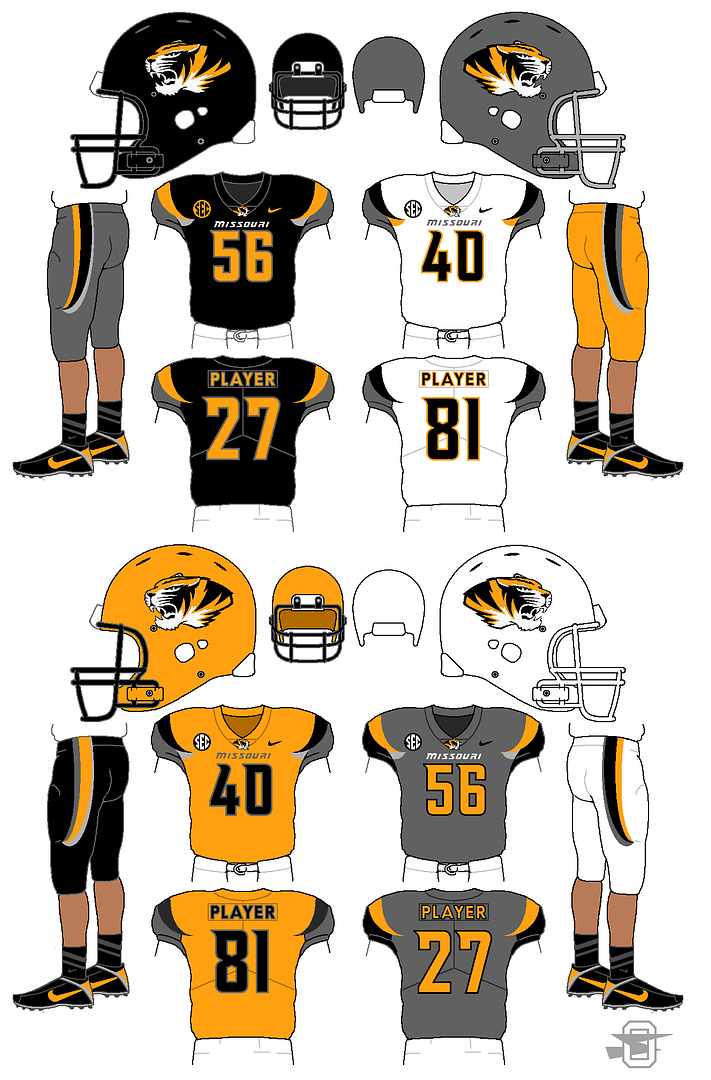
On 12/18/2017 at 1:56 PM, oldschoolvikings said:
The black helmet with the tiger head sans the oval is really cool. As a Mizzou fan, I was never a big fan of the addition of grey to their palette. But that black helmet is really nice.
-
I have always wanted a Blues jersey with the 90s trumpet shoulder patch as the crest. I think it would make a great alternate jersey
-
This Patriots set is nice when paired with the silver pants. Without those pants, nothing matches the helmet base color. But there is no reason to dog the uniform. It has the same problem that over half the league has every week. It just isn't paired right.
-
13
-
-
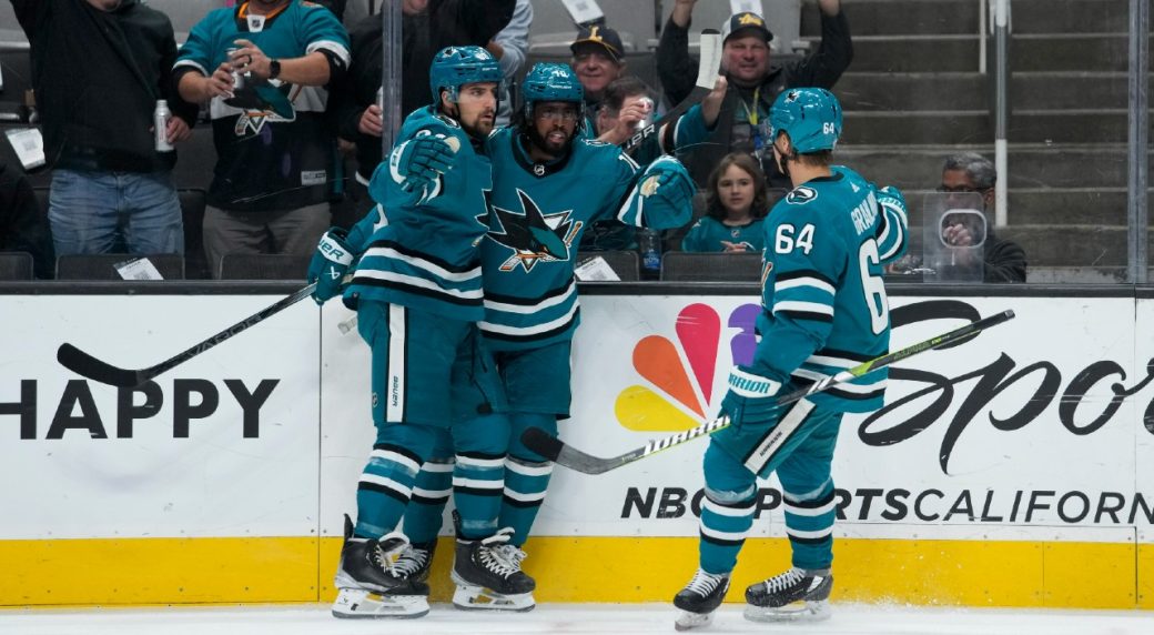
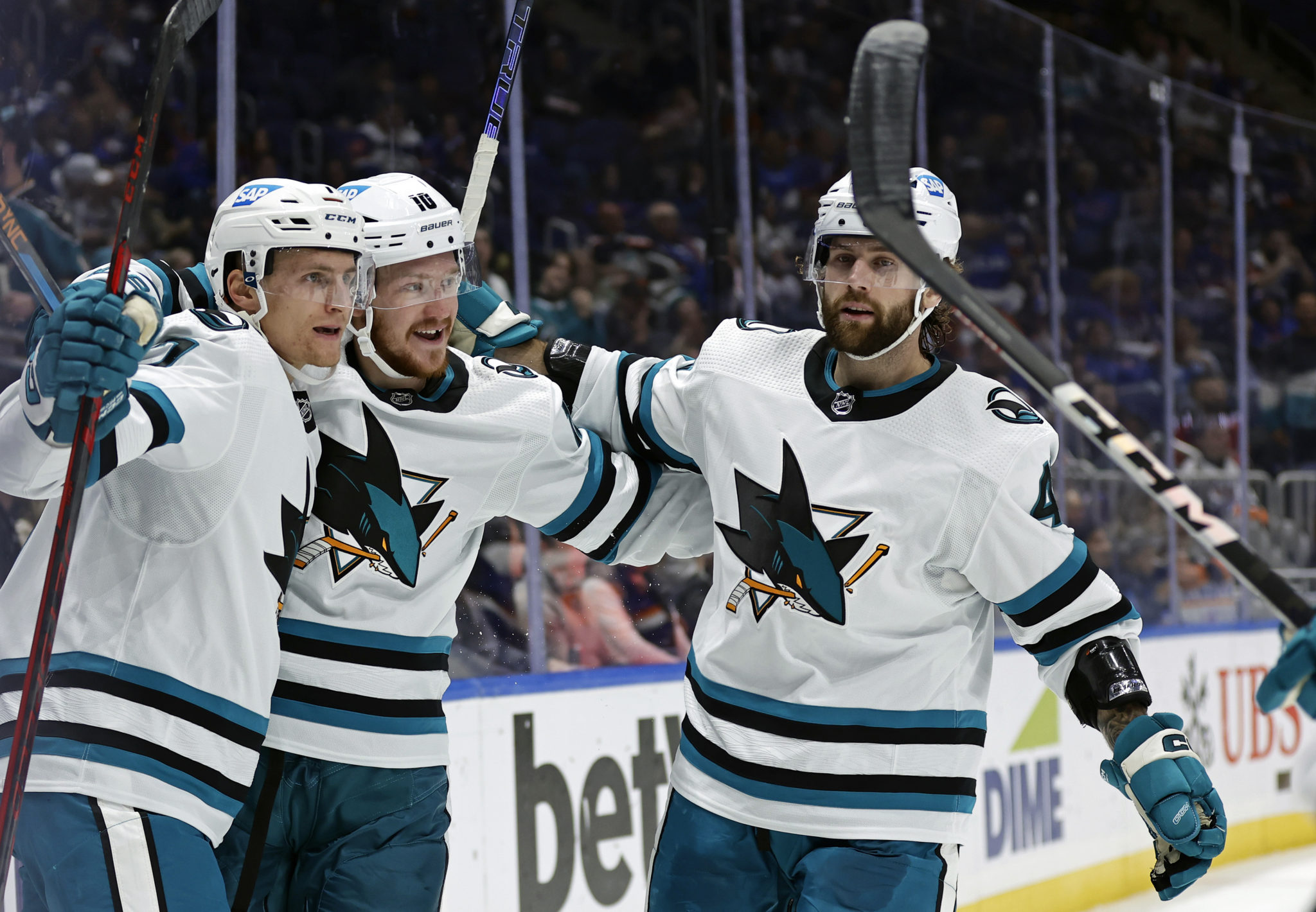
1 hour ago, ruttep said:
The team is terrible (although they beat the Flyers lol), but this Sharks set is quickly becoming my favorite look they've ever had
(The only change I'd make would be making the road jersey numbers teal with black trim, instead of the other way around)
I love them too. Part of me wants some of the gray/silver from the original set in there, but I don't know where and I wonder if it would take away from the teal's dominance. They did a great job on this set.
-
1
-
-
3 hours ago, Cujo said:
Fan stuck in the past: "The original, tired and lazy looking Seahawks logo was better!"
The same fan stuck in the past: "The original, tired and lazy looking Bills logo was better!"
The exact same fan stuck in the past: "The original, tired and lazy looking Cardinals logo was better!"
To each their own. But I've gotta believe these fans probably have orange shag carpet and pea green appliances in their homes.
So basically if a animal logo isn't angry AF, then the animal is lazy? I've never seen a pissed off cardinal in my life.
I get it. Sports are aggressive. I get why logos get cleaned up and trending towards a more aggressive look. But, they also lose personality in that process.
I also wouldn't say that my personal tastes are stuck in the past. rather, I like uniqueness. At least unique elements that still add up to a good looking uniform. I perfer the uniqueness of the Seahawks throwback look, but personally I prefer the Eagles current look over their throwback. I think their current shade of green is unique and they own that color so well.
-
1
-
 1
1
-
-
I agree with RH on the Seahawks logo. Love the orignal. I just feels like every new logo or logo update after 2000 had the requirement of being a swooshy angry animal. Every logo had to be slanted as if to evoke movement or speed.
Jags
Panthers
Ravens
Patriots move to the swooshy patriot head
Falcons bird gets meaner and slanted
Cardinal head gets meaner
Detroits lion gets more defined and aggressive
Etc Etc Etc
IMO it takes some of the personality out of the logo.
-
1
-
-
1 hour ago, Sport said:
Someone really wanted these guys to look like some future "Rollerball" skating Megaman armored superheroes. The league wanted the guys in tight fitting jerseys for some reason. I remember going to the 2007 draft where they introduced the Blue Jackets new EDGE uniforms. They poured Jody Shelley and Dan Fritsche into those jerseys. Then the season came and every guy just wore the jerseys a few sizes bigger and then the jerseys started getting more tailored to a traditional hockey sweater cut. Still looks weird to look at those games and see those tight sleeves.
When I was a kid, Brett Hull was my idol. In 1994, McDonalds had a 3 book set of comic books with Brett Hull as the super hero. The premise was that Brett Hull had to defeat these hockey robots in the future.
Your description of the rebook era reminds me of those comic books
Side note, I have two sets of the comic books. One set that my dad let me read and another set still in the plastic. Thank god he made me save those
-
5
-
-
5 minutes ago, spartacat_12 said:
I don't love the Eagles current look, but I don't understand all the hype around the throwback. The shade of green is nice I guess, but beyond that there isn't much I like. The old eagle logo is way too horizontal & overly detailed. From a distance it looks terrible. The jersey also has nothing going on. It's just a plain green t-shirt with the logo slapped on the sleeve.
The colour balance is completely off too. The helmet is green, silver, and white, with no black anywhere. The jersey is green, black, and white, with no silver anywhere. I think the '70s/'80s set is miles better than this one. Let the Jets be the lighter green & black team. The Eagles should use a darker green (not midnight) and silver combo.
I agree. Of all of the throwbacks that debuted this year, the Eagles is the one I like the least. There current set is a much better look when paired correctly. I wouldn't mind a slight update to the current set while keeping the current green and leaning more into silver instead of black.
-
4
-
2
-
-
1 hour ago, TGroce said:
The Block M! I wish it was a yellow M on a black helmet, but oh well. Good to see it still exists. I was starting to wonder.
-
That Browns set wasn't good, but I don't feel like it is even on the realm of the Buc's alarm clocks or Rams all bone or Jags barf colored with a two tone helmet.
The biggest issue was that they are such a classic identity that didn't need anything changed at all.
-
9
-
-
1 hour ago, Lights Out said:
Besides how the color makes them look gross and unwashed, whatever they were trying to do with the sleeves looks horrific, and the yellow trim on the jerseys and pants vibrates against the bone color and disappears from a distance. The stripes on the bone pants having only yellow and white was a questionable decision too. They also sometimes ruin the superior blue jerseys by wearing them with bone pants.
I'm waiting for the day they go with white-over-bone or vice versa... now that will truly be an atrocity.
The shoulder horn has always reminded me of a side view of the Gateway Arch ironically.
When the Rams first moved to St. Louis, they used this logo below. That shoulder horn always reminds of the yellow of the arch in that logo. The angles are different, but I see it every time.
-
1
-
-
15 minutes ago, pepis21 said:
IIRC there was a reason of that. Reebok planned sweaters to be tucked into pants, but NHL banned that in last moment.
Wow that is something I did not know. Honestly, that's even more bizarre than the piping and the hem stripeless jersey. What in the world was going on over at Reebok during that time?
-
1
-
-
2 minutes ago, PlayGloria said:
Ok then 15 years ago did people say?
SLEEVE STRIPES ARE RIP.
JERSEY PIPING IS GOING NOWHERE.
IT'S NOT 1980 ANYMORE.
YOU DON'T LIVE IN CLEVELAND.
Trends are trends and I'm sure eventually there will be leggings made to mimic socks with stripes and will thus kill the leotard look. Just because it's a trend doesn't mean its looks good. And if you can't complain about it on this forum, there where would you? It's beaten to death, so I get your point. But, it really is a dead horse that deserves the beating it is getting.
Furthermore, Green Bay doesn't leotard. Pitt doesn't leotard. We just saw the Chiefs do it and it looked terrible compared to their normal set. It's not like it's impossible to wear contrasting socks.
-
4
-
-
8 minutes ago, Cujo said:
One final time...
SOCKS ARE RIP.
LEGGINGS ARE GOING NOWHERE.
IT'S NOT 1980 ANYMORE.
YOU DON'T LIVE IN CLEVELAND.
Ok then 15 years ago did people say?
SLEEVE STRIPES ARE RIP.
JERSEY PIPING IS GOING NOWHERE.
IT'S NOT 1980 ANYMORE.
YOU DON'T LIVE IN CLEVELAND.
Trends are trends and I'm sure eventually there will be leggings made to mimic socks with stripes and will thus kill the leotard look. Just because it's a trend doesn't mean its looks good. And if you can't complain about it on this forum, there where would you? It's beaten to death, so I get your point. But, it really is a dead horse that deserves the beating it is getting.
-
8
-
1
-
-
5 minutes ago, ruttep said:
I feel like the Canes are a team that tries way too hard to be "cool" and "different" with their brand. It started out with the "Bunch of Jerks" thing, which I think was a good response to old hockey men throwing a tantrum, but between making the black warning flags their primary, a road uniform with a nickname on it, randomly shuffling between different red jerseys, and wearing the red helmets on the road, stop it. You look ridiculous. Innovation is welcome, but what the Hurricanes do doesn't make any sense.
P.S. you don't deserve to wear Whalers throwbacks, stop it. Same way I feel about the Titans wearing Oilers throwbacks. You screwed your former city over, you don't get to dress up in your former look to make a quick buck in merchandise sales.
Agree 100% with this post.
First on the Canes... on top of all of their weird uniform choices, none of them are actually "innovative." They are choices just to be different.
As far as the Whalers/Oilers throwbacks, you hit the nail on the head. It's a complete money grab. Which tears me apart because both the Whalers and Oilers are two of my favorite looks in both sports. I love seeing them being used, but deep down, it just doesn't feel right. This is also coming from a guy that owns two Whalers hats, so I guess my will power isn't strong enough to resist the money grab

-
2
-
-
I want full time Creamsicles and I don't care who knows it. I think it is mainly because they are so unique and offer up a visually appealing color scheme when many NFL games don't.
-
3
-
1
-
-
2 hours ago, Sport said:
They didn't need to change the shape of the stripes to update the orange. I actually like the single color numbers, but the jerseys now are the same amount of "clean" as before. They just chunkified the sleeve stripe and it's no longer the shape that made those Flyers jerseys the famous Flyers jerseys. Now they look like the 80's jerseys, but they don't have the extra black outlining and it feels like it's missing something. I watched it in action last night for the first time and we're discussing personal preferences now, but I don't think it's an improvement.
I'm torn on if I want the black outline or not, but I'm seeing where your at with it now. I looked it up and they added the black trim in 1982. I think your right that it might feel more complete with the black trim especially with the black sleeve numbers. It's a definite upgrade over the previous set, but now you have me wondering if they should have just returned to that 80s set.


fouhy12's NFL Concepts - Championship Weekend Edition (Lions, Chiefs, 49ers added)
in Concepts
Posted
100% agree. I would love to see a white helmet with the current helmet logo.