


PlayGloria
-
Posts
521 -
Joined
-
Last visited
Posts posted by PlayGloria
-
-
1 hour ago, BadSeed84 said:
You don't find a jacked up bird whimsical?

I will say the Cardinals do need to go back to the "You lookin at me?" bird
 - A cardinal perched on a yellow bat wearing a cap over a baseball inside a red circle reading St. Louis Cardinals in white SportsLogos.Net")
This will forever be my favorite Cardinals logo.
-
 2
2
-
 1
1
-
-
The Canucks issue is exactly like what we are talking about on the NFL thread about the Texans. It's extremely tough to establish a brand when your name is so vague. Your looking for a logo the identifies the team, but how do you visually create that when the name itself is so abstract? I don't know the right answers for either team . I'm not sure any of Canucks logos in the past have done a good job either.
-
2
-
-
It's pretty tough to make a dynamic brand when your team is named the Houston Texans. I mean, right from the hop, their branding couldn't be any more lifeless. Pair that with a red white and blue color scheme that has been used by countless teams in all of sports and you get a super generic product.
-
6
-
-
On 5/17/2023 at 1:43 PM, spartacat_12 said:
I know Coyotes is a fairly generic name that would work in a lot of places, but if they are playing somewhere else next season I hope they find a way to rebrand. If it’s rushed maybe we get stuck with a Tennessee Oilers situation for a year or two.
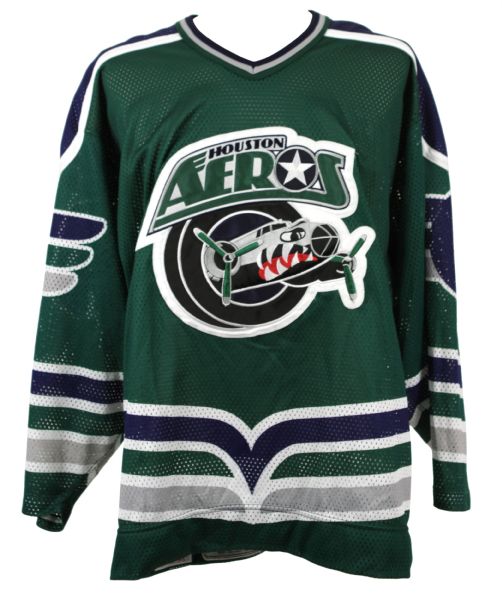
If it’s KC or Quebec I think it’s safe to say they’d bring back the Scouts/Nords name. Not sure about Houston. The Aeros name & double blue scheme is too close to the Jets brand.
I always LOVED the Aeros green sweater
-
2
-
1
-
-
1 minute ago, jerrylawless3 said:
Jersey ads are one thing, but I don't particularly enjoy the grandiose, cinematic production with no tie-in for a sponsor reveal. Stop trying to make it a bigger story than it actually is – they are giving you money so that they can be on your uniform. It's not that deep.
Although seeing Snitker try to keep a straight face after saying "Quiquee" was pretty funny.
No kidding. They unveiling these like we are supposed to be excited about the "jersey patch partner." As if it's a new tradition that we should all be proud of.
-
9
-
-
49 minutes ago, HOOVER said:
Highly confident they wouldn't leak it on an acid wash tee in their online team shop. Especially for a tee design built on the 2023 season.
Also, this has a "concert tee" feel to it, both in the blank garment and the design. I'm sure there was some thought in the font selection, but highly doubt this is an official wordmark.The first letter in HOUSTON is the same "H" that was leaked previously. I don't think that's coincidence. A worn-out black shirt with a navy/red/white logo is throwing me off to where I don't want to pass judgement just yet. But my initial reaction is that it does not look good.
-
1
-
-
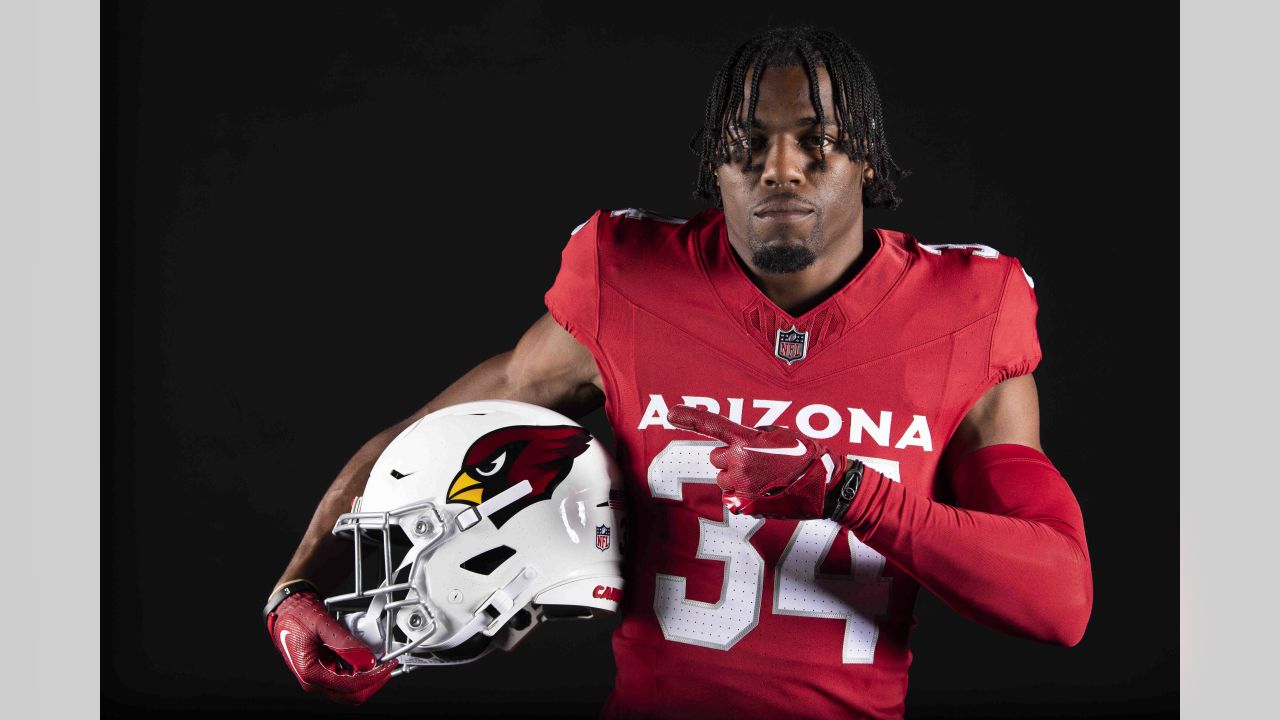
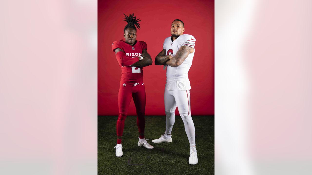
On the Cardinals: If they just had pants stripes on the red set, I think its an A+ set. I'm just ignoring the fact that they will wear red on red a ton. That's a losing battle. But pants stripes on the red set would do wonders. Other than that, I think its a good update for a classic team that only needs a clean look with that helmet.
On the Texans: This H-Town thing with the "H" logo that has circulated has disaster written all over it. My fear isn't that they will look too much like the Titans. I just have a feeling it's going to be a messy cluster all on it's own, regardless of the color scheme. This seems like a total rebrand. Their current branding is bland, but nothing that has been leaked or rumored makes me excited either. H-Town is cheesy, the font is cheesy... IDK what the right answer is, but this doesn't feel like it.
-
3
-
-
8 minutes ago, HOOVER said:
Someone posted this swap in reply to the Cardinal's "fashion" tweet, and it makes things feel so much better:
Of course, it would be better yet if the socks were swapped, too.Now swap the red and white sock and we would really have a good set
-
7
-
-
On 5/13/2023 at 5:42 PM, the admiral said:
It's a St. Louis that doesn't make bloggers mad
This might be the truest statement ever muttered on these boards. I've lived in STL my entire life and it always confuses me how much people from other areas hate everything about the city. Trust me, there are aspects of this town that are a complete and utter mess. But traveling to other midwest cities like Indy, Memphis, KC, Cincy... i don't see much of a difference. I feel like I'm in the same town, with the same small pockets of high crime, same cool bar areas, etc. But, you bring up provel cheese or pork steaks to an outsider and they immediate go on a rant about how terrible it is

-
1
-
-
28 minutes ago, Nordiks_19 said:
Why are people upset about the Flyers ? It's a subtle change, no big deal.
I'm on the opposite end of the spectrum. I think it's a great return to the previous shade.
-
2
-
 1
1
-
-
4 minutes ago, bowld said:
Yes, bear head logo now primary instead of the C
An alt helmet with the bear logo might look pretty cool instead of that orange alt. Might almost have a college football feel.
-
1
-
 1
1
-
-
36 minutes ago, AFirestormToPurify said:
Agreed except for the last part. It's Seattle that needs to ditch the red. Salmon would be perfect for them
This. The red always felt like a VGK stripe to me. Just make it salmon. Not only would it fit with the branding and color scheme, but deep down, a salmon third might actually be awesome if done correctly.
I'm guessing that maybe the eye didn't stand out in salmon as much as red, but would mind seeing one of our talented people mock that up.
-
1
-
-
On 4/29/2023 at 9:18 AM, Lights Out said:
I was just about to say how much better this looks than their current uniforms, but then I noticed the mismatched hem stripe.
Let the great "Calgary need black" debate begin!!
I disagree that they need black and feel that their current set is perfect. That's not to say that there isn't a space for an alternate containing black since it is part of their history. It just feels like it will lead to an inevitable slide back being part of their main identity in 10-15 year. Rinse and repeat.
Now that you mentioned that hem stripe, I can't unsee it. Good eye.
-
1
-
-
19 hours ago, AFirestormToPurify said:
I thought we were talking about the Devils? Who said anything about the Canadiens?
Comparing the dynasty-lite 1995-2003 Devils to the 2007 Sens or Sabres is just hilarious, sorry
By the way, even if you don't count pre-1967 Cups, the Habs still have the most by a landslide lol
Your response pretty much sums up what I was getting at. It seems like you belittle other franchises sweater history and "glory years" because you have an affinity for the Habs. You didn't say anything about the Canadiens, but in reality you did because you go out of your way to scoff at other teams success or the fact that they haven't had the same sweater for 1000 years.
Not a big deal. I'm just saying, different franchises need to be viewed through different lenses. 90% of each league is made up of franchises that rarely win championship and have changed branding for one reason or another. So while you may have the response of:
On 5/3/2023 at 7:42 PM, AFirestormToPurify said:...Winning?


...to that franchise, even just that Stanley Cup Finals appearance was their pinnacle.
-
2
-
1
-
 2
2
-
-
I just don't love gold and silver mixed. The design of the trophy is actually okay in my book. I would like to see a solid gold version.
-
1
-
-
13 hours ago, AFirestormToPurify said:
...Winning?
I mean, there are like 3 franchises in every major sport that have the winning traditions as your beloved Habs. The rest of each league is a hodge podge of a few special championship years (or close to it). To compare all franchises to the candiens is honestly not even fair considering many of their championships came when the league had way less teams and was dominated by Canadian based teams. For a fan base to look upon a jersey with fondness because it was worn during one of their peak eras is totally valid in my book. Doesn't mean they have to wear them for eternity.
Just for the record... its been 30 years since the Habs last lifted the chalice.
-
6
-
1
-
-
After letting the dust settle on this reveal, I gotta say... they are growing on me. If there is a team in the league that should have very simplistic uniforms, it's the Cardinals. These are clean, i LOVE the white set, and if they mix the pants up (AKA lose the leotard look) with the red jersey, I think these are going to look really solid on the field. I've been against them adding black to their look since it was introduced in the last set, but even that one is a really balanced set. It'll be nice not to see the piping this year, and in reality, that's all I really wanted.
Sorry if I derailed the template discussion.
-
5
-
-
2 minutes ago, 8BW14 said:
Mother:censored:er. That’s gross. :censored:. :censored:. :censored:. Glad Yadi and Albert never had to wear that
 I their sleeves. Hopefully they take the money from the god damn ad and buy some better :censored:ing pitchers
Hey STIFEL, I get that you are a St. Louis based company, but I have no idea WTF you do besides brand our sports teams uniforms and buildings with your garbage ad. Kiel Opera house, Blues helmet, Blues jersey, and now the Cardinals jersey. Why don't you move out of the city like all the other Fortune 500s already and take your ads with you
-
2
-
 1
1
-
-
Re: The Devils - They have always had a fantastic logo with a meh sweater in my eyes. Red/Green, Red/Black, with or without the hem stripe... the sweater itself really doesn't do much. And maybe it's best that way. But the lack of hem stripe doesn't bother me because the sweater with the hem stripe is just ho-hum as well.
-
2
-
-
2 hours ago, Shumway said:
That Louisiana hat

Agreed. I want it
-
1 minute ago, nuordr said:
If the Cardinals decide to wear the white jersey with the red pants, then the pants really won't tie into the uniform without the stripes. But if they decide to wear the black jersey with the white pants, the stripes are aligned, and it makes the look cohesive. Then again, if they wear the red jersey with the white or black pants, the jersey doesn't have the stripes and once again it is not uniform, rather it is asymmetrical.
I just like all parts of the uniform to match for cohesiveness and symmetrical design. This is why I agree with the person that designers should have OCD, that way all parts of a design is cohesive and aligned.
Your thoughts sum up all of my issues with the Bengals new set. So many people rave about them, but the inconstant Bengal striping between the helmet, jersey shoulder, and pant stripe drives me up a wall. Our brains must work similarly.
-
3
-
-
How could anyone blame TruColor for just sharing what he had heard and literally saying the entire time that he even had doubts? I get that this board takes uniform design to another level, but come on. Just because the board went crazy with the idea of a new color scheme isn't his fault.
I'll be honest, without those rumors, the last few weeks wouldn't have been as fun. The build up with zero leaks was more fun than the reveal.
-
7
-
-
14 minutes ago, MJWalker45 said:
For a program that is supposedly no longer necessary, why are teams still making Color Rash their third design? And now we know what college teams would look like if they kept those big wordmarks with the Fusion template. And if I were them, I wouldn't use that template.
Smaller wordmarks will work well with it, but this is just too low.
The home uniform is the worst look of the three. The white uniform is the best. I'd hope the red pants aren't used as much, at least with the home uniform. They should have at least added stripes to match up with the other pants. And with 9 players showing off three sets of uniforms, how about you change up the combos instead of three all white, red, and black?
Honestly, this thread could just end with your post. Perfect summary. Three things are needed:
1 - Red set needs stripes to match the other sets
2 - Red jersey paired with white pants instead of plain red
3 - I would love to see a combo of black helmet, red jersey, black pants, red socks. Basically CHANGE UP THE COMBOS FROM THE COLOR RUSH
Most of the elements are there, they just need to put it in the right order and add stripes to the red pants. I would love horizontal stripes on the socks too, but we all know that just isn't happening anymore, so I wont harp on that.
-
3
-
-
6 minutes ago, Dilbert said:
Why do I have a feeling that after all this hype, we are going to be extremely let down? I mean it is the Cardinals so I wouldnt be shocked.
If that doesn't fit Kyler Murray and the Cardinals, nothing does.
-
1
-
 - A cardinal perched on a yellow bat wearing a cap over a baseball inside a red circle reading St. Louis Cardinals in white SportsLogos.Net")


 I their sleeves. Hopefully they take the money from the god damn ad and buy some better :censored:ing pitchers

NFL 2023 Changes
in Sports Logo News
Posted
I know I shouldn't... but there's something I like about Washington Space Commanders