


PlayGloria
-
Posts
498 -
Joined
-
Last visited
Posts posted by PlayGloria
-
-
26 minutes ago, henburg said:
At the end of the day they will not go back to R*******, it's a slur by definition and Josh Harris said as much recently-
"Obviously, I grew up in D.C. and I was there during the glory years, so I understand why fans love the former name," Harris said.
"But look, there was a portion of our fanbase that felt disrespected by the former name," Harris continued. "Sports are supposed to bring people together and not be a distraction. I don't want distractions ... I thought it was important that we end the conversation."
Like you point out, one Native American group saying otherwise is just that, one group amongst a diverse group of people with opinions to the contrary. I don't think it's really worth discussing anymore.
Well, I think it's worthy of a discussion to be honest. In my view, it seems like the name in particular was the issue. If the Chiefs, Blackhawks, Seminoles, etc are all okay because their name isn;t a slur but their NA imagery is fine, then why change the entire branding? Why not change to a tribe name? And keep the helmet logo that was created by a Native American.
Furthermore, I think that the concern that this group of Native Americans is bringing up is legitimate. They have stripped the branding of all NA imagery for a brand that leans on military imagery. The same military that at one point corralled them into reservations and took their land.
There was a real opportunity in my eyes to do something really great to honor these cultures. Instead, they completely erased it.
-
 1
1
-
-
On 6/10/2023 at 11:58 PM, SSmith48 said:
Would have loved them to go the old NASL route and pick up the Sockers names, but that's already taken by a local MASL team. Leaning into a Mexican-inspired club name/imagery would be a nice touch, although a "Club San Diego" is a bit generic. Maybe an Atletico/Club Atletico name? Or lean into the SoCal roots and go with San Diego Sol?
Whatever name they go with, there's enough cultural heritage in SD to get a brand that's visually impactful and connects locally, as long as they don't over-corporatize it. I'm a proponent for a bright and bold color scheme with some Mexican visual elements included, given the city's proximity to the border and heavy Latino presence.
As long as it isn't the lazy route every other team seems to take when trying to tie into Mexican heritage: San Diego Los FC or something stupid like that. 99% of every team that tries to tie branding into their Mexican fanbase does something awful like that.
-
One thing I noticed about the white Cleveland set was that some of the guys were wearing the striped socks with the stripes waaay low by their ankles. It threw off the entire set.
Agree with others on the pants stripe.
-
7 minutes ago, AFirestormToPurify said:
Amazing. Those colors just feel right for that team. It's been 17(!) years, enough with the black and orange. Feels like it should have been a 2-3 year failed experiment but unfortunately they won a Cup in those jerseys so that's probably why it stuck around for so long. But even then, the jerseys they've been wearing for the past several years aren't even the Cup winning ones (which were just baaaarely better, desaturated and painfully dull or ugly piping mess with garish orange panels? Pick you poison), and they've had no success with the current set. What the hell are they waiting for? Does anybody actually like the black, orange and beige? Why is it taking them so long to go back to their original set?
Spot on with this entire post. It's as if the more people clamor for the original set, the more dead set they are against bringing it back. They just keep dancing around it but wont fully commit.
Back to the mask, it's fantastic. And the pads are incredible.
-
1
-
 1
1
-
-
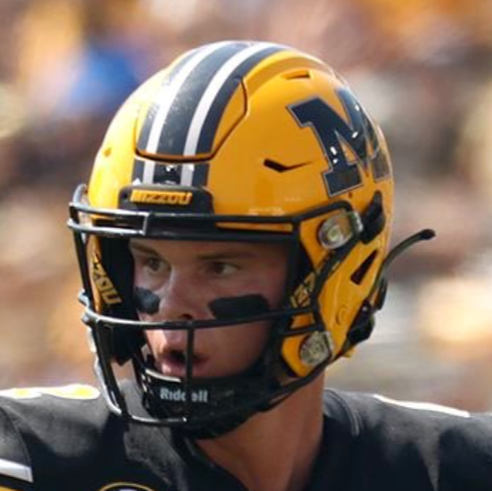
On 9/16/2023 at 2:04 PM, NOLAPelicans23 said:
Mizzou updated the striping on the gold helmet this year to match the uniform (New Below, Old Above). I wonder if the gold pants will follow suit?

The entire game all I kept thinking was that they needed yellow pants. As a Zou fan, they can wear whatever they want if they win games like that though

-
2
-
-
"We proudly announce our new uniform partner Northwestern Mutual. And in sticking with the theme of no longer having a soul, we would like to ask for public tax dollars to build a new stadium or we will threaten to leave. Welcome aboard Northwestern Mutual!"
-
4
-
-
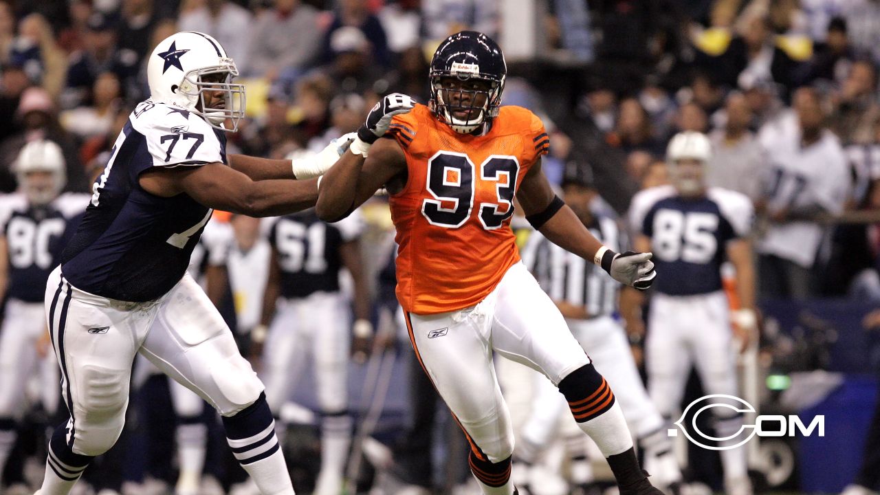
11 hours ago, Carolingian Steamroller said:
I post this all the time but the key flaw of the Bears' orange jersey is the white numbers. White numbers on an orange jersey is exactly what the Broncos, Bengals, Bucs, and even the Browns for a while (wow the team names all start with B).
When the Bears originally wore orange jerseys in the 1930's and then again in a throwback game in 2004, the numbers were navy blue outlined in white. That is how they should look:
And if you're curious what they would look like with the iconic rounded numerals, something like this:
Now that you say this, you are spot on. Also, i hate the shoulder stripes on the current orange jersey. They get so muddled up with the white-blue-white pattern. The ones you posted above are definitely better with the simplified shoulder stripes.
-
1
-
-
1 hour ago, Pigskin12 said:
Chicago does in fact appear to be wearing orange in Tampa. I like this, since we've seen Bears navy vs. Bucs white numerous times.
I despise this orange helmet. Mostly because I hate it paired with the orange jersey. Nothing about it feels like the bears.
-
12
-
-
You know, maybe just maybe, the bone could be salvageable. White needs to be completely gone. All it does is make the bone look dingy. Then, if you add a blue-yellow-blue pants stripe and keep it paired with blue socks, it might not be that bad. I honestly think its the way the secondary colors are used that make it look horrendous. The color isn't bad, its really almost every other aspect of the uniform that just terribly designed. It brings attention to the color in the worst possible way.
Plus, naming it bone and releasing a new logo that sort of resembles genitalia didn't really do it any favors
-
7
-
-
"How do we fix this logo now that people are calling us out on it?"
"Straighten the wordmark, curl the hornets ass up a little, and call it a day."
-
3
-
-
1 hour ago, Sec19Row53 said:
The Vikings have already shown that will work

That was literally my first thought when I read about the horned helmet. How are they going to do this without looking like the vikes? Even if they flip the horns towards the front, that still just seems too close to the Vikings for me.
-
2
-
-
CBJ needs a complete overhaul. There is just nothing about their identity that resonates with me.
-
6
-
1
-
-
The best way to establish a strong identity is to have 4 uniforms that are completely unrelated to each other. Everyone knows that.
-
12
-
-
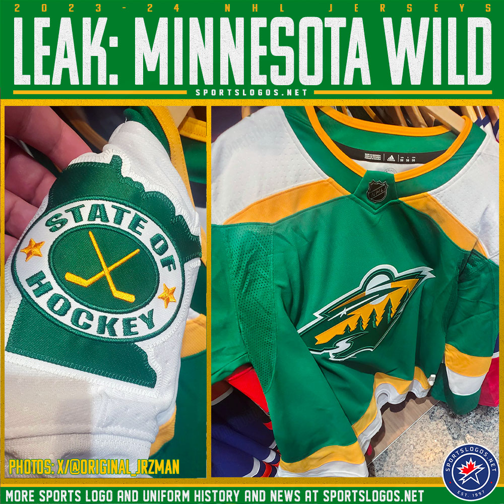
8 minutes ago, spartacat_12 said:
A leak confirmed what had already been suspected, Minnesota is bringing back their most recent Reverse Retro as a full time alternate. It looks like the only difference is the State of Hockey patch being added to the shoulder, and the regular NHL shield being used in the collar.
I wonder what the odds are that they eventually move to some version of these as their full time set? I'm not saying they should, but this is how it starts many times.
-
2
-
-
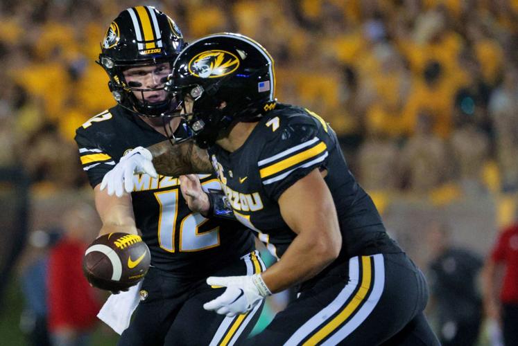
Watching Mizzou last night, and I gotta say, I like the switch to the white numbers and the addition of the MIZZOU word mark. Mizzou not having yellow numbers made me feel uneasy at first, but the white really helps the balance.
It's reminds me a lot of when the Blues went from yellow numbers to white. While I feel strange about the Blues veering from traditional yellow numbers, the white has really grown on me.
-
2
-
-
3 minutes ago, DCarp1231 said:
The Cardinals uniforms are a vast improvement over their predecessors.
I think what’s throwing a lot of people off is Arizona’s unwillingness to forgo monochrome.
One the white set, I would even be okay if they went all white if the white socks had horizontal stripes at the top. I think that would look killer.
-
3
-
-
Don't mess with anything in Green Bay. Not even the template. That's my two cents.
-
11 hours ago, oldschoolvikings said:
I get that a lot of people feel this way. Personally, I've always had a soft spot in my heart for the white helmet over colored jersey and pants look, provided the pants are gold or silver, and significantly lighter than the jersey. (The Titans' white/columbia/navy combo was horrible.)
This may be a candidate for unpopular opinions, but these are some of my favorite uniforms...
Man I LOOOOOVE Wyoming's unis. Something about that set at night in that stadium just does it for me. I go out of my way to watch them. I've also always been a big fan of Air Force. The unis, the unique offense... I love it.
-
2
-
-
22 hours ago, Carolingian Steamroller said:
One more. (Side note: with the one shell rule officially dead why can't these come back? Sans Sleeve patch.)
I've mentioned this set a few times on this site and I 100% agree. This should have been the basis for their new Commanders set. It reminds you how historic the franchise is, even if they had a new name. This is one of my favorite football uniforms ever worn.
-
5
-
-
16 minutes ago, Brave-Bird 08 said:
That helmet really is beautiful, not going to lie. The fact the horse is white and the color orientation between the logo and helmet stripe are agreeable, it's nice.
Just would prefer the Broncos to look like the old Broncos, but this is not the worst of the alternates -- not close, in my opinion.
I agree. I love the white helmet. I just want a classy set to go with it. I think it would be a fantastic starting place for a uniform redesign for the broncos.
-
1
-
-
13 hours ago, VikWings said:
The NFL needs a contrasting sock rule.
"Socks may only be the same color as pants if they include stripes, otherwise they must contrast."
There, someone go paste that into the NFL rule book somewhere.
This. This is it. If you look at every team's uniform combos and take out the ones where the socks match the pants, it drastically improves every set. It also cuts down on the number of combos and keeps continuity in the brand.
-
4
-
-
14 hours ago, the admiral said:
Both the bird logo and the old wordmark were terrible. The Eagles were in desperate need of a rebrand by 1996, but they've been in desperate need of another one since about 2008, too, when you finally started to see some resistance to the dark-n-fade across leagues (Oilers, Brewers, Rams, Penguins).
I agree with you to an extent. I think the overuse of black recently has made their current set much more drab. That said, something about the hunter green I like. Navy was very overused in the darkening trend, but their current green is fairly unique. And while I like the throwbacks, they aren't the answer either.
Part of me wonders if a mix of kelly green, hunter green, and silver would make a nice set. Using the hunter green as a "black" for number outlines and stripes. IDK just spit balling.
-
2 hours ago, DCarp1231 said:
I wouldn’t say Arizona looks dated. While not the greatest, it’s a solid and safe set. Complete with traditional striping. Much like in comparison to the uniforms you selectively chose to try to prove a point.Also, you’re comparing Arizona’s entire, very traditionally aesthetic set to two throwback uniforms.
Tennessee- The Titans have one of, if not, the worst regular set in the league. A set that is very much ridiculed by most.
Seattle- Nike’s guinea pig from 2012. All the manufacturer’s aesthetic bells and whistles which pales in comparison to the very traditional throwback of the 90s and rightfully so.


If you want to accurately portray outdatedness, compare the regular sets of all three teams
I agree that AZ's set is much much better than the Titans and Seahawks regular set. But, that wasn't the point of the post.
Just to counter on the bolded above, the red set has zero striping. And I wouldn't say that a sparkled helmet with monochrome jersey, pants, socks, and shoes isn't "traditional."
Full disclosure, I actually liked the Cards set when I first saw it, especially hoping that they will mix and match the pants and socks between the sets. But after seeing these throwbacks, it just feels like they leave a lot to be desired.
-
It's sort of funny... after seeing all of these throwbacks with striped socks, sleeve stripes, etc, somehow it has made the new AZ Cards set look dated already and they haven't even stepped foot on the field

I mean, you tell me which one looks out of date. To me, it isn't the throwbacks:
-
10
-
 1
1
-


2023 NFL Season week by week uniform match-up combos: From HOF Game to Super Bowl LVIII
in Sports Logo News
Posted
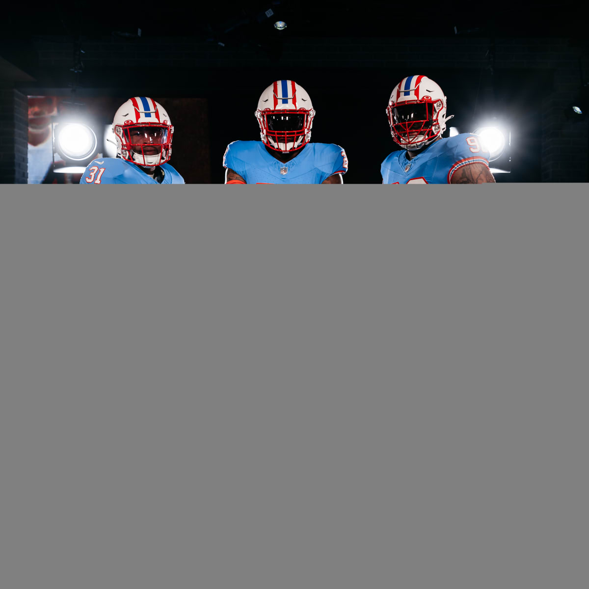
While I don't love the Texans identity (or lack thereof) this looks really good. Three things crossed my mind when I saw this:
1) This is so much better than a navy blob. This might actually be their best set.
2) As much as I think they need a brand refresh, I'm scared about what they will reveal. In reality, just side stepping to this full time with red as the primary color would be fine in my book. But instead, we are going to get a mess dropped on us. These are really clean but still has some interesting design elements.
3) AZ Cards, take notice of how good red jersey, white pants, red socks looks. Now do that exact thing.