


PlayGloria
-
Posts
484 -
Joined
-
Last visited
Posts posted by PlayGloria
-
-
7 minutes ago, TBGKon said:
You were saying the Rays we're not getting a City jersey?
I really hope the Cardinals pull a Lou/NY Islanders and just put out something extremely bland. I'm not going to be able to take it if they are trotting out there in some obnoxiously loud mono colored uniform with an arch slapped on it. It's bad enough that we have to watch 38 year old Matt Carpenter out there again this year

-
1 hour ago, HOOVER said:
Not sure who the guys are behind ProLine Mockups but they're doing the Lord's work:

I still prefer Green/White/Solid Green socks and White/White/Solid Green socks.Looking at these makes you realize just what a difference a pants stripe makes. It takes a boring mono look and turns it into a great uniform. Definitely prefer the stripes socks as well, but that's another story.
-
 3
3
-
-
A little surprised about the reactions to these Jets unis on the forum. I think this is a great move. The throwbacks looked fantastic last year and moving them to primary is going to look fantastic as well. The black alt is what it is. I don't love it and it's not needed. But for some reason, much like the Mets, the black alt seems like it is going nowhere.
-
7
-
-
29 minutes ago, SCL said:
The flying G logo is underrated and reminds me of Major League, the Guardians deserve a ton of credit for the seemlessness of their transition.
100%. I love that logo. I keep dancing around the idea of getting a hat with the logo. One of these days I'm just going to bite the bullet.
-
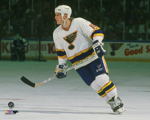
2 hours ago, Nordiks_19 said:
I'd see the Blues dust off their late 80s - early 90s look
I have been wanting that for years. This is my favorite Blues set of all time mostly due to childhood nostalgia. Just the perfect touch of red and I'm a sucker for the rounded blue note. Other kids liked Batman. My super hero was below
-
3
-
 1
1
-
-
14 minutes ago, gosioux76 said:
As I've gotten older, I've come to prefer the '47 Brand "cleanup" style, which is a snapback. I only buy fitted if it's an on-field authentic.
That's my fav hat too. I really want to do a mystery hat where they send you a random hat.
Currently wearing a navy Hartford Whalers hat that I get compliments on literally everywhere I go
-
1
-
-
25 minutes ago, Pigskin12 said:
Maybe it takes years in terms of approval/finalization/supply, but there's no way the Arizona Cardinals spent more than a couple hours or days to come up with those generic catalog uniforms.
Unless of course the genius who thought of putting "Protect the Nest" on the collar set aside a year or so of brainstorming time.
I could see the Seahawks going full retro and that wouldn't take years to develop.
The Titans on the other hand does seem like a stretch, although it is definitely time to do it.
-
30 minutes ago, BBTV said:
LOL, Phillies one has a logo they retired 4 years ago.
It's retro now. The late 2010s are trendy again

-
1
-
-
21 minutes ago, GoGreenGoWhite said:
Would be hard for the Titans to downgrade.
I wonder what would be worse... what they have now, or a 4 uniform set with 4 completely separate designs
Never underestimate the ability of teams to completely botch a rebrand

-
22 minutes ago, WSU151 said:
Simpler would probably be better. The sleeve stripes are supposed to look like the exterior blue-white-red-white-blue lights of MSG (as the lights highlight the home blue jersey stripes)
Ah that makes sense. Thanks @WSU151
I must have not read the details when it came out
-
1
-
-
22 minutes ago, WSU151 said:
The sleeve stripes are royal-white-red-white-royal for a specific reason though
My main point was that simplified sleeve striping pattern would benefit that jersey.
What is the reason for the sleeve color pattern? Maybe i am missing something
-
Speaking on the Rangers, I watched a game about a week or two ago in which they wore their new alternate. And I have to say, the shield as the crest has grown on me. The sleeve striping pattern is waaaay to busy. I wonder what it would look like if they took the hem stripes, changed them to either royal-white-royal or red-white-red, and then duplicated that on the sleeve striping...
I do agree with @ruttep though. I much prefer royal to navy.
-
Boy nothing screams Philadelphia Phillies like a blue to black gradient jersey with yellow trim. If this leak is true, that is truly comical.
The funny part of these CC uniforms is that the teams regular uniforms connect with the city more than these f-ed up designs. Show me a Phillies "P" logo and I know exactly what city is represented.
-
1
-
-
Is it just me, or does any one want just one DC franchise to just go nuts with stars and stripes? I just want either the Caps or the Nats to just be unapologetically patriotic.
-
3
-
-
I don't think I will ever like a jersey with a nickname on it.
The Islanders basically have taken every special jersey opportunity and spent about 5 minutes on it. RR, RR2, and now this. Brutal effort.
The rest of them are just fine to me. I have come to not really look forward to the jerseys for this event. I get the purpose of making somewhat outlandish jerseys, but it's just not my cup of tea. That's probably why I like the Flyers the best out of these four.
-
Uni Watch has had an ongoing series going on. I will let you read the premise of the series because I don't feel like explaining it. But the second Jags set is really nice
https://uni-watch.com/2024/01/21/uniform-on-11-just-how-much-more-uniform-could-it-be-volume-iii/
-
1 hour ago, WBeltz said:
The Falcons are tweaks away from a good uniform set. I like what they have, but they need a few small changes to make it great. If the just used the CR but inverse the colors on the numbers and had white pants that would've been a perfect start.
I do feel like it would be solid with some tweaks and the right pairings. I will say this much, I absolutely love their current helmet.
-
4
-
-
4 hours ago, PERRIN said:
Honestly, I feel like going from 3-13-1 to a game away from the Super Bowl in 2 seasons, without a QB or head coaching change, is one of the most impressive turnarounds I've ever seen. Maybe not greatest ever, but gotta be in the conversation. Should they make it to or win the Super Bowl, then yeah, it's one of the best ever.
99 Rams have to be #1.
I lost the franchise already. Please don't take this away from me.


-
3
-
-
Those are unbelievable horrendous. Wow.
I was looking back at old all star game jerseys. Besides the ones with the star hem, these are obvious classics. It makes me miss the orange and black NHL shield:
-
5
-
-
If that truly is the new Broncos set, I would be speechless. Talk about a total missed opportunity. They keep a consistent, albeit somewhat dated, look for decades only to switch to that?? Every aspect is inferior to what they have currently.
-
2
-
-
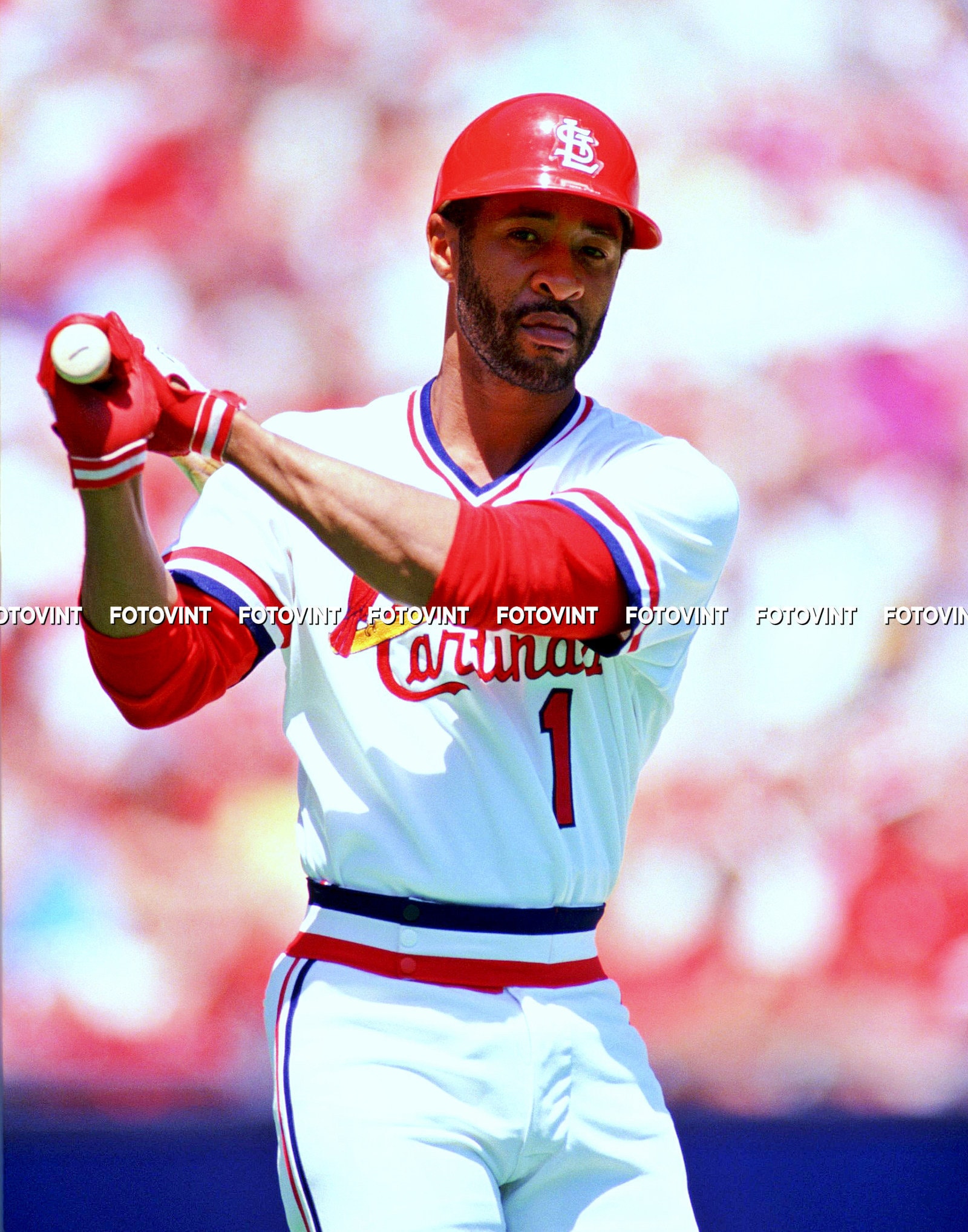
20 hours ago, VampyrRabbit said:
How many fanbases would welcome back pullovers though? The only one that I can think of that would be for going all in on pullovers would be Cincy due to The Big Red Machine.
I would not want this full time as that would be sacrilege, and this probably 1000% has to do with nostalgia, but I love this Cardinals era. Like loooove it. I would rather trade out the baby blue jersey they do now to add this to the rotation.
-
5
-
1
-
-
15 hours ago, DCarp1231 said:
Now with new ownership terminating the 5 year rule, I wish we had news on a Commanders uniform change. Unfortunately, I don’t see anything happening until 2025.
Even then, that would reach the end of the original duration. So not exactly a win people would think it is.
This would be a perfect year for a new set. Change coaches, changes uniforms and move past the craziness that this franchise has gone through recently
-
3
-
-
I know they will probably stick with black/white/silver primary color scheme, but I would love the addition of a purple/yellow alternate or throwback to their rotation. Either way, they definitely need an update.
-
1
-
-
20 hours ago, JustABallCoach said:from The Texans twitter today. Hopefully new colors
Do people in Houston actually use the phrase H-Town? I'm asking because I honestly don't know and have never heard it until these rebrand leaks over the last few months.
From an outsider with no knowledge of "H-Town" it feels very cringe. Even the font is cringe to me, but again, there could be some Houston tie there that I have no idea about.
-
1
-


2023-24 NHL Jersey Changes
in Sports Logo News
Posted
For sure. I'll throw Buffalo's hat into that ring as well. Their away set is great.