


PlayGloria
-
Posts
484 -
Joined
-
Last visited
Posts posted by PlayGloria
-
-
1 hour ago, LAWeaver said:
I'll vouch for this.
I've never been a die-hard hockey fan, but I've been to 2 CBJ games in my lifetime and despite both being losses, I had a blast each time. Looking to go again before the season's over to take my girlfriend out for her birthday. A ton of my colleagues are season ticket holders as well.
You'd think the 'Jackets were annual playoff contenders the way the crowds show up at Nationwide. Not only is it a great venue itself, but there are tons of great restaurants and bars within a short walk.
That's great to hear. Honestly it's pretty impressive that the crowds are that good for a team that's pretty much had no chance at a championship.
I will say this though... I'm pretty much an all around sports fan. I watch most major sports, golf, etc. The Jackets are super forgettable from an outsiders perspective. That probably mostly has to do with the fact that they haven't been relevant in the standings. I think it also stems from a pretty strange identity with the neon hornet, to the cannon, etc. For a non Columbusian, there is almost no reason to follow them since they aren't a good hockey team and I don't find their visual identity appealing. Plus I follow the Blues, so I watch a lot more Western Conference teams.
But this post isn't meant to dog the franchise, just FYI. I'm glad that Columbus is supportive of them. And the posts you gave have written make me think a Blues road game in Columbus would be cool.
-
 2
2
-
-
16 minutes ago, WBeltz said:
What if it's like the Cardinals from last year, but when they come out it's just some really subdued version of what they were wearing?
Mono blue, mono white, same helmet but with sparkles in the paint. No side panels. Denver on the chest above the number so you know what team it is.
Done.

-
 3
3
-
-
1 hour ago, The Impaler said:
I'm probably in the minority judging from other comments, but I've always LOVED that Wyoming uniform. White lid, brown jersey, yellow pants and the license plate logo. It's uniquely Wyoming all over the place.
I'm with you 100%. Something about those Wyoming unis in that stadium at night is just awesome.
-
1
-
-
53 minutes ago, Morgan33 said:
How? Blue completely overpowers their main colour at home and on the road, you have burgundy and blue touching, which as their Edge disasters proved, looks awful. The blue numbers on the road, outlined in burgundy look terrible too. The whole set is just a mess. Every change they've made since 1996 has been a downgrade including darkening the burgundy. Give me the Forsberg, Roy, Sakic look any day of the week. There was nothing wrong with that set until Reebok destroyed it and Adidas forgot to bring back the double mountain stripes when attempting to fix it.
This a balanced uniform

This is a blue-heavy mess
They're still using all those colours anyways. It's not as if black is completely absent from the uniform.
Seeing this side by side, you are right on the money about the double mountain stripe. Something about that really hammers home the mountain idea. And with that black stripe, the black equipment works.
I was on the fence on the equipment color change, but you may have just won me over with this post with caveat that the jerseys also revert back to the original design.
-
2
-
-
6 hours ago, Morgan33 said:
It's been 4 seasons and I still absolutely loathe the Avalanche in blue equipment. Championship or not, it still looks awful.
The original uniforms were designed for Blue to be the secondary colour and for blue and burgundy to never touch... Yet this idiotic decision breaks both of those rules. It looks the worst at home where the blue completely overpowers the burgundy base.
It's time for the Avalanche to bring back the uniforms that hoisted the cup in 2001... The colours were properly balanced, the numbers were more legible, the mountain striping looked better and the footprint shoulder patches actually matched the art style of the primary logo. Everything about that set is superior to the dogs dinner they have now. Bring back the original set, keep the navy alternate and don't change anything again.
I don't blame you here. I don't love the blue either at least with the current color balancing of the rest of the uniform. But, I also don't think black is the answer either. They don't need a complete overhaul. Just some tweaks (especially on the road set) to make the blue equipment work. The blue pants just look strange with the road set. They look just as out of place as black equipment would.
I kind of feel like they need to decide if they want to be primarily an icy blue team or primarily a maroon team. It seems like both colors are fighting each other for supremacy a bit.
-
14 hours ago, upperV03 said:
Luckily for the Timbers, the new jerseys were initially manufactured without the sponsor logo so there should be some stock laying around. It’ll take a while for new runs of the jerseys to get produced, though. The most pressing thing is for the EQ staff to get jerseys ready for matches, but I believe they received blank shirts (both the primary and new secondary) before the season and were applying the DaBella logo in house anyways. Here’s my thought on what they’ll do for the rest of the season:
This just shows you how great soccer kits would look without a massive ad on the front. Not trying to start a debate on why they need them financially. Just pointing out the obvious. Universally, MLS and soccer just seem to get a free pass on the ads. I can't stand them aesthetically.
-
2
-
-
52 minutes ago, SilverBullet1929 said:
Did you all see the article by Mark Feinsand on MLB.com like two days ago with Nike explaining the long process of creating the new uniforms and how much work went into them and how much time and research it took and how much they consulted with players and highlighting all the positives of the new designs, etc etc?
It was informative but the timing absolutely made it feel like a defensive tactic with A LOT of jabs with things like saying that the players and the union were involved in the process and nobody complained until now and a lot of stuff like that.
It was very much like a retaliation, like when a scandal breaks out and someone or an organization has to release a statement pleading their case.
-
8
-
-
So does this mean that the Lions current alt helmet is history?
Broncos have a new alt because the current alt is now primary?
I can't even guess on the Vikings other than a shell color change which would be pointless.
-
39 minutes ago, tigerslionspistonshabs said:
No one cares about the Blue Jackets. Why is it in Columbus?
They might be the most forgettable team in all of pro sports.
-
4
-
-
1 minute ago, Nordiks_19 said:
Speaking of the Stadium Series, i wonder what kind of atrocities they have in store for the Jackets next year.
I'll say they lean into that old bee/hornet/yellow jacket thing they used to have. The jersey will be that gross neon pea green color and the hornet will be front and center but enlarged.
-
 1
1
-
-
27 minutes ago, MCM0313 said:
Since this is a sports-related board, can I say how jealous I am that Russell Brand’s ugly ass got to score (insert Beavis and Butthead laughter) with Katy Perry for several years?
It really just proves that anything is possible if you truly believe in yourself. We could all learn a little something from Russell
-
1
-
-
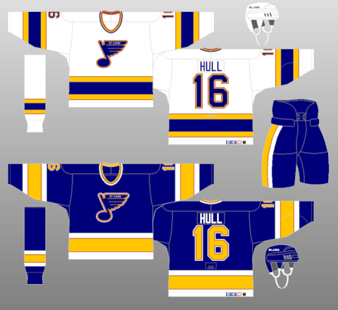
15 hours ago, The_Admiral said:
It's time to realize the third jersey Mike Keenan scrapped on sight. It's just another Chicago Winter Classic, it's an automatic win for the road team, have fun with it.
That would be epic.
I assume you're talking about this one. If so, I would buy one the second they are available.
I've read some other things that happened around this era. Apparently there are drawings indicating that Blues management wanted the team to skate onto the ice out of a large trumpet, much like the Sharks skate out of the shark head.
I have also always thought a jersey designed around the 90s trumpet logo as the crest could be really great.
-
5
-
 1
1
-
-
The other side of this coin is that the Blues and Blackhawks rivalry is about as rich as it gets. No need to have the Blues playing dress up as a different franchise. They have too much untapped history of their own to dive into that well.
-
2
-
-
25 minutes ago, TrueYankee26 said:
New jersey patch for KC
Somehow, it feels even more gross when it is a team that usually has a bottom of the barrel payroll and fields a crappy product year in and year out. Oh and they are getting a new stadium to boot.
-
1 hour ago, gosioux76 said:
I'm more interested in understanding what type of person gets joy out of duping people. I'm going to assume, if this leaker is indeed not legitimate, that they read these boards religiously and will see this. So if that's the case, here's my question: What do you get out of it? What sort of fuel does this give you when you log off and walk back into the world? I'm asking because I genuinely can't imagine it.
It does make me wonder if there is some kind of legitimacy to this. I mean, this dude is putting in hours of time and doing an interview. That's a lot of time spent just for a hoax. I would understand if there was some kind of way to monetize the hoax, but I just don't see how someone would go to these lengths just to fool people. But, people do some weird stuff. Especially on the interwebs.
-
1
-
-
3 hours ago, VampyrRabbit said:
I would be, the team lasted for a single season and were absolutely rank rotten, and the stale cherry on top was that they were the only team to play in an arena with racially segregrated seating.
The Blues still have some nice sweaters that they haven't thrown back to. No reason to bring back the Eagles (even though I kind of love that jersey). I bet less than 1% of the city even knows who the Eagles were.
I said this earlier on the thread. The Hull/Cujo/Shanahan era seems to be really logical to me.
Red in blues jerseys acted like black for other teams. It worked so nicely on this set and then the 90s insanity took it to the extreme. But I love this set.
-
5
-
 1
1
-
-
26 minutes ago, Cujo said:
Okayyy.. And the Blue Lives flag has only been around for 8 years or so..
Anyhow, dropping this topic because it's probably gonna expose people's views on human rights.

Sounds fantastic. I'm glad the TB third jersey didn't expose my satanic beliefs.
-
2
-
-
1 hour ago, gosioux76 said:
Fabric weight seems to be an underlying theme with every apparel innovation Nike introduce into the organized sports world. And I can see how that has made a difference in American football and maybe even soccer.
But was this ever a complaint in baseball? Were players actively saying, "man, I'd play so much better if we could only get rid of all this embroidery." It's the same in the NBA. I don't think polyester and tackle twill ever held a player back from greatness.
All of these uniform innovations feel like solutions in search of a problem.
Totally agree
This might sound stupid, but I've always just assumed that baseball unis were thicker so it would protect the players when sliding or diving. I would think a thinner sleeker uniform might cause some more boo boos
-
2
-
-
13 minutes ago, Cujo said:
I just don't get how you build that uniform and NOT see the Blue Lives Matter flag. That's the very first thing that comes to mind in that "ViCtOrY StRiPeS" image they tweeted out.
Black, blue, and white have literally been the team colors for 30+ years. Stripes have been on hockey jersey sleeves for eternity.
-
5
-
1
-
-
I like that STL kit. So clean.
I just love that red/magenta color
-
1
-
-
The crest of the new TB third works really well IMO. Better than I thought it would. It's funny that after a period that roundels were overused, it's kind of nice to see a jersey using one again.
The rest of the jersey is meh other than the numbers
-
2
-
-
48 minutes ago, WSU151 said:
Cardinals’ president Bill DeWitt provided comments to Uniwatch in a December 2023 column:
His response had a mix of good news and bad news: “We are maintaining the chain-stitching next year with the new Nike template — I had to fight hard to keep it. But the compromise was that it will need to be applied to a patch, which will then be applied to the uniform.”
Uni Watch has a good write up on the differences in the stitching.
https://uni-watch.com/2024/02/13/breaking-our-first-look-at-the-cardinals-new-jersey-script/
As much as we all hate changes, the new stitching looks really good IMO. I want to hate it because of all of the other issues with these new jerseys, but it looks sharp.
I still don't understand why all these corners need to be cut. I know nothing about jersey manufacturing other than what I have learned from this board. But in my eyes, if you are making uniforms for the best baseball league in the world, I wouldn't think you would have to cut corners on the manufacturing end.
-
4
-
-
17 minutes ago, Cujo said:
Fanatics deserves jail time for this !!!
What on earth??
I'm going to be completely fair here. The changing of material on MLB uniforms doesn't bother me as much as it does other people. I actually think the colors seem to pop a bit more on this new fabric/template.
But how on earth do those jerseys make it on a field with that small of a name font??? That's comical.
Seriously, if the MLB logo was back to its old location and the NOB was normal size, it think all of these are probably fine. But that's insane.
-
2
-
-
23 minutes ago, VDizzle12 said:
Do italic numbers ever look good on uniforms though? I guess the Chargers/Lions are fine, but would be better off with different fonts. The Steelers numbers have always looked horrible.
If the Jets do go that route they will have to thin out the font a bit and reduce the slant to make it work.
Honestly, I don't even love it for the Lions. It works for the Chargers for some reason.
In NCAA football, slanted numbers have bothered me for Mizzou for quite some time. Something about it just feels gimmicky, while simpler more block style numbers makes any set feel more classic. Especially with teams that have a decently deep team history.
-
3
-


2024 NFL Changes
in Sports Logo News
Posted
Maybe after watching an adult film from the 70s?