


PlayGloria
-
Posts
526 -
Joined
-
Last visited
Posts posted by PlayGloria
-
-
2 hours ago, DCarp1231 said:
I wouldn’t say Arizona looks dated. While not the greatest, it’s a solid and safe set. Complete with traditional striping. Much like in comparison to the uniforms you selectively chose to try to prove a point.Also, you’re comparing Arizona’s entire, very traditionally aesthetic set to two throwback uniforms.
Tennessee- The Titans have one of, if not, the worst regular set in the league. A set that is very much ridiculed by most.
Seattle- Nike’s guinea pig from 2012. All the manufacturer’s aesthetic bells and whistles which pales in comparison to the very traditional throwback of the 90s and rightfully so.


If you want to accurately portray outdatedness, compare the regular sets of all three teams
I agree that AZ's set is much much better than the Titans and Seahawks regular set. But, that wasn't the point of the post.
Just to counter on the bolded above, the red set has zero striping. And I wouldn't say that a sparkled helmet with monochrome jersey, pants, socks, and shoes isn't "traditional."
Full disclosure, I actually liked the Cards set when I first saw it, especially hoping that they will mix and match the pants and socks between the sets. But after seeing these throwbacks, it just feels like they leave a lot to be desired.
-
It's sort of funny... after seeing all of these throwbacks with striped socks, sleeve stripes, etc, somehow it has made the new AZ Cards set look dated already and they haven't even stepped foot on the field

I mean, you tell me which one looks out of date. To me, it isn't the throwbacks:

-
 10
10
-
 1
1
-
-
52 minutes ago, McCall said:
The Rams relocation back to LA had more to do with Kroenke wanting to move to LA than the stadium itself. True it wasn't up to the standards that the Rams eventually added to the lease, terms that may never have been in there with the Stallions. If the Stallions had been brought into the league as an expansion team, there's no guarantee that that ownership, or any after, would have a target market like LA to move to, especially since there's a strong change the Rams had stayed put to begin with and LA never lost both teams. I mean, yeah, they still could've been sold and moved elsewhere, but it's not a stretch to think this scenario could've wound up with both markets keeping their teams.
I think you summed up exactly what I was trying to say in all of my mumbling. Totally agree
-
2
-
-
4 minutes ago, BBTV said:
Help me understand the logic here. The Stallions would have been playing in the same lousy TWA Dome that the Rams eventually abandoned (albeit they had established an agenda towards the end). It's not safe to assume that the city would have maintained it any better than they did when the Rams were there.
The Rams could have still left, as there were a few open markets at that time (Nashville for example). I get that Georgia Frontiere had St. Louis roots, but if they wanted to move, they still could have.
The Chargers were never going to "figure out something" in San Diego, and may have ended up being the first team to return to LA. In this scenario, the only way history is dramatically different is that it may have been the Raiders and Chargers sharing LA.
Oh trust me, my revisionist history is definitely looking at the situation through St. Louisan colored glasses

The Dome sucked at the end, but the city passed a bill for a new stadium before the Rams left. And that was for a team that had no desire to stay. I'm sure working together with an expansion franchise like the Stallions that would have wanted to be here would have been even more constructive. But that's an entirely different conversation. And I have no doubt that our garbage political atmosphere would have screwed up that hypothetical situation as well.
As far as the other teams moving, sure anything could have happened. I just always wondered where we would be if STL would have gotten the Stallions. Relocations suck. It just never feels right. Especially when you've lived through two of them

-
2
-
 1
1
-
-
1 minute ago, PlayGloria said:
As a St. Louisan, that entire situation pisses me off too. The Jags were this close to being the St. Louis Stallions. If that happens, we probably still have a team, the Rams never leave LA, Chargers would have eventually figured out something in San Diego where they belong.
Oh well... at least we had the Greatest Show on Turf years, I guess.
Plus, to piggy back off of my own post, if you look at the design of the never-to-be STL Stallions, you can see that the Broncos basically ripped there current helmet design right from it. Every time i see the broncos helmet, it makes me wonder what could have been.
-
4 hours ago, FiddySicks said:
It’s mostly just a gentle ribbing for all of the controversy recently. That and the Rockets were annoying as all hell during the Warriors run. I’m a Giants fan so I mostly think it’s funny as all hell what happened to the Dodgers in 2017 rather than outrageous, but yeah, that was kind of outrageous.Also I feel like Houston barely put up a fight to keep the Oilers, only so they could be replaced by the most generic and forgettable team in the NFL. I really don’t get some of the 90s NFL moves. Oilers, who rocked, bounced because they were scared they wouldn’t get a new stadium, just so they could get replaced by an expansion team, the Texans, who are a snooze fest, who had basically zero issue getting a new stadium. It all just seems so frivolous, shortsighted, and reactionary. It’s like Jacksonville getting a team over Baltimore which led to the whole Browns controversy. Like, ultimately, was ANY of that actually necessary?
As a St. Louisan, that entire situation pisses me off too. The Jags were this close to being the St. Louis Stallions. If that happens, we probably still have a team, the Rams never leave LA, Chargers would have eventually figured out something in San Diego where they belong.
Oh well... at least we had the Greatest Show on Turf years, I guess.
-
Pitt - really nice modernization. I love the small blue stripe.
Vegas - This is literally better than what they wear. I have long said that the red stripe on the current set makes no sense. It just floats on the arm. You fixed that. A+++
NJ - F'ing amazing. The darker red helps them stand out against other red/black teams. The mordernized logo is fantastic. And somehow that green alternate works incredibly well. The addition of black to that sweater really help it not look like a christmas sweater. This is not a case of BFBS at all. Black enhances that design alot IMO.
Avs - I love anything bigfoot, but the crest is a bit too busy for me. I am very curious about the "A snowflake" logo though. I wonder what that would look like on the primaries replacing the bigfoot crest...
All in all, I love the start to this thread.
-
6 hours ago, throwuascenario said:
First of all, a lot of people that watch football are in their 20's. Second of all, I've seen the uniforms. That doesn't mean it fits their current brand. They currently wear navy and neon green. When I turn on a Seahawks game, I'm expecting to see navy and neon green. Them not wearing that makes them not look like the Seahawks.
If they ever change back to blue/silver full-time, that would change.
BTW, whoever called my last post a troll-post, I don't feel like digging back through to quote you but THANK YOU for your valuable input. Seriously, you exploded my mind. What would I have ever done without that? What a valuable contribution. I had never thought of it that way before. What a new way of thinking. Such an original thought. Your existence now has meaning.
I think you are correct in the fact that navy and neon have become their identity, but I don't think that means that they are tied to it for eternity. Maybe it is just my brain, but anything with a neon color like that just makes me think of a Monster energy drink. That branding might work if you are trying to get your drink to stand out in a cooler against other cans, but on the football field it has always just felt like a gimmick to me. I also don't think that the set as a whole has improved. The early 2000s era uniforms were pretty clean. Now the Seahawks, like many teams, have mixed and matched all of these elements into Frankenstein sets every week. Plus this newer set that they moved to in 2012 has so many little details that they have almost aged like the Bucs alarm clock uniforms in my mind. It's just too busy, especially for a color scheme that is already "in your face" with the neon green. The shoulder yokes are a mess, the pattern in the numbers is overkill. The pants stripe might be okay if those elements weren't there. I have also never loved the way the Seahawk logo gets lost on the helmet in the navy. I prefer the silver helmet because the logo pops a bit more.
All in all, I think you are correct that the color scheme is their current identity, but that doesn't change the fact that I don't think it is a very good uniform.
-
Honestly, the stupid part about this broncos reveal has nothing to do with the helmet. I actually think its a great looking helmet. It's the color rush uni that makes it look bad. The color rush unis on almost every team are god awful and this is no different.
Pair this new helmet with a set that makes sense and I think it would look fantastic.
-
3
-
-
2 hours ago, spartacat_12 said:
You're going to be waiting a while. The team has confirmed nothing will be added this season, and we won't see anything new from the team until 2025 at the earliest.
I'd be fine with yellow or a navy & white Fearsome Foursome throwback, just please let this mean they're abandoning any plans for a "Hollywood Nights" BFBS alt.
I just want a helmet with the full horn. Navy/white, Blue/yellow, whatever... just give me the old horn.
-
6
-
-
7 minutes ago, spartacat_12 said:
I'm still confused about this take. It's old-timey enough to seem like a name that's been used for a century, combines the team's mascot with the inoffensive portion of their old nickname, and presents a lot more branding opportunities than names like the Packers, Steelers, or Browns.
I don't see how that's comparable to names like Sauerkraut Balls or Flying Chanclas.
I have long held this exact opinion. It could have played out almost exactly like it did in Cleveland with the Guardians. "Shift" the name but it still rings a bell for that franchises history since they sound similar. "Shift" the uniforms to the new name but keep your identity.
Also I have posted this a few times back when they first came out with the Commanders branding, but I think the throwback below were absolutely fantastic out of Washington. If I were in charge of the rebrand, this would have been my basis for the rebrand - sans the old logos. This set and the name Pigskins would have worked really well IMO
-
4
-
2
-
 2
2
-
-
This site is so much fun when there is a terrible uniform revealed. I'm laughing so hard that I'm crying at some of these posts.
-
5
-
 3
3
-
-
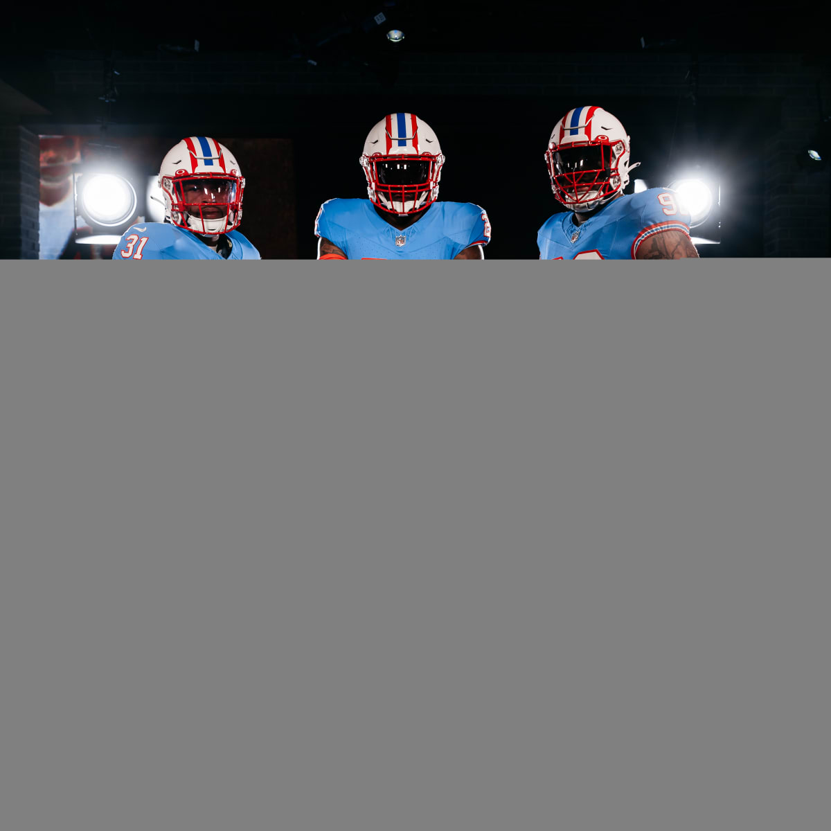
I'm wondering if NFL aesthetics are finally turning a corner. I know these are throwbacks, but my god it looks so good to have pants, shoulder stripes, and sock stripes back in NFL uniforms. It just adds so much to the overall look. Maybe, just maybe, the leotard look is starting to be phased out.
-
11
-
-
Wow pants stripe AND sock stripes????
Looks really nice!
-
I said this before, but I enjoy the Angels CC. I also think the Rockies, Nationals, and Red Sox are good uniforms and fit the program perfectly. I'd even go out on a limb and say I like the Rockies CC better than their normal set which is so f'ing boring.
-
4 hours ago, OnWis97 said:
I'm surprised by the amount of hate the Ducks Jersey is getting. I really like it. I prefer the mask on the original logo, but otherwise, I like the subdued look of these horizonal stripes and I think the loss of the crossed sticks behind the mask is an improvement. Forgetting the advertisement (which I can't, but, you know...) I think this is my favorite Ducks jersey. I do agree with the poster(s) that mentioned that the tiny little webbed-D is pointless but it's also small enough not to detract.
I really like this jersey.I think if the duck mask was less quirky I would dig it. It's like the entire jersey is serious, clean, and classic looking but then the duck mask is cartoony. I like all of the pieces of the jersey, but somehow they just don't fit together.
It also just seems like they want to do anything BUT bring back the originals. They just keep dancing around it hoping the clamor for the original set goes away.
-
1
-
-
1 hour ago, Survival79 said:
The stockiness of the WILD wordmark makes me want to pronounce it as willed in my head.
Without reading your post, I literally did the same thing
I like the wordmark though. Looks nice.
-
1
-
 1
1
-
-
24 minutes ago, spartacat_12 said:
And you’ve completely missed the point of the pride celebrations. It has nothing to do with “what people do in the bedroom”, it’s about acknowledging a group that’s historically been vilified by western society & generally unwelcome within the world of men’s sports. Kids don’t view it as a sexual thing in the same way that they don’t view straight couples as sexual things. It’s conservative adults who seem to keep projecting sexuality onto the whole debate.Ok. I mean, you can say that, but sexuality is literally the only thing that makes the LGBTQ community a community. Just because you spin it into "acknowledging a group that’s historically been vilified" doesn't mean it isn't about sexuality. It's literally 100000% about sexuality. If it wasn't, there would be no group to acknowledge
Just like if there weren't different races, there would be no reason to celebrate the great Jackie Robinson. That celebration is 100% about race.
Race issues - a good lesson for children
People's sexual activities - your free to do what you want, but doesn't really need to be a topic at a Blue Jackets and Red Wings game
-
4
-
1
-
 1
1
-
 3
3
-
 3
3
-
4
-
-
32 minutes ago, spartacat_12 said:
Oh no, we really need to be going out of our way to protect the fragile masculinity of a handful of bigots who don’t like being told to respect people.
I’ve used this example before, but what do you think would happen if an MLB player refused to wear 42 on Jackie Robinson Day? Do you think the commissioner would just scrap players wearing the number altogether?
I think this is comparing apples to oranges a bit. What makes this a bit different is that the players that don't want to wear the uniforms are doing so mostly because of religious beliefs. Whether or not you agree with those religious beliefs doesn't matter. They have the right to those beliefs under the First Amendment. So what you call bigotry is just the belief system of their religion.
I'm not arguing for or against the NHL's decision to not do warmup jerseys. I'm claim zero religious beliefs so this statement isn't coming from an uber-Christian point of view. But you have players from Russian background, Christian backgrounds, etc that have the right to their beliefs.
Full disclosure here: I don't care what people do in the bedroom. Have a great time as long as everyone is consenting and of age. But I've never understood why an arena of people would need to celebrate that by wearing pride jerseys. Especially when half of the stadium is children who should be more concerned about picking up a bobble head than celebrating people's sexual orientation.
-
5
-
1
-
-
10 minutes ago, WSU151 said:
They’ll still have the theme nights. Warm up jerseys were always a ridiculous idea in hindsight, especially if the league’s most prominent reporters were advocating players be banned, arrested, and deported for not wearing the warm up jersey. Seinfeld’s “Who’s not wearing the ribbon?” episode was spot on in this case.
Fans will just have to donate to charities without expecting something in return.
One of my favorite Seinfeld episodes

-
4
-
1
-
1
-
-
5 minutes ago, tBBP said:
Okay, so...for all y'all who don't know, "Pgh" is the actual shorthand Pittsburghers use and have used since well before I moved there--shoot, even I still use it sometimes. It's purely a local thing. (So there's your "City Connect"ion. Now that we done got that out the way...
You can do that for literally every major city though. MIA for Miami, CLE for Cleveland. Slapping PGH on the front is just lazy.
At this point, I wish it was just an alt uniform rollout and drop the City Connect BS. The City Connect aspect seems like it is causing every one of these uniforms to have some cheesy element. In reality, I actually like this set a lot. Change that PGH on the front and this would be a killer alt uniform for the pirates. The PGH just downgrades the entire thing IMO
-
4
-
-
They should have made a new black alt that matched the primaries. That would be a great three jersey set
-
1
-
-
This is perfect for the Flyers honestly. The return of the original shade is great. They didn't have to reinvent the wheel here.
The alternate is whatever. But that primary set is pretty close to perfect.
-
1
-
-
14 hours ago, _RH_ said:
Well I guess I'm in the minority ... I see 12 likes for Anaheim's tiny logo being worse than VGK. I'll respectfully fully disagree. Sure that logo needed to be bigger and it was boring and BFBS (and even worse when you consider they should've been in their eggplant/jade) but man...these gold jerseys are way worse! the colors are better but man the striping is just all over the place!
I think I dislike Anaheim's more, but I will agree with you (and we seem to be in the minority). As time goes on, the VGK arm striping bothers me more and more. I said it earlier on the thread, but that red stripe makes zero sense. Hell the white barely makes sense. Gold, black, and charcoal is all they need on that sweater. If you must enter either white or red or both, then at least do it in a way that is cohesive throughout the sweater.
The gold doesn't bother me. Its the fact that they just used the original sweater design and paint bucketed the colors around to make a gold version that bothers me. It just doesn't work for some reason.
-
1
-


NFL 2023 Changes
in Sports Logo News
Posted
I agree with you to an extent. I think the overuse of black recently has made their current set much more drab. That said, something about the hunter green I like. Navy was very overused in the darkening trend, but their current green is fairly unique. And while I like the throwbacks, they aren't the answer either.
Part of me wonders if a mix of kelly green, hunter green, and silver would make a nice set. Using the hunter green as a "black" for number outlines and stripes. IDK just spit balling.