


AFirestormToPurify
-
Posts
913 -
Joined
-
Last visited
-
Days Won
2
Posts posted by AFirestormToPurify
-
-
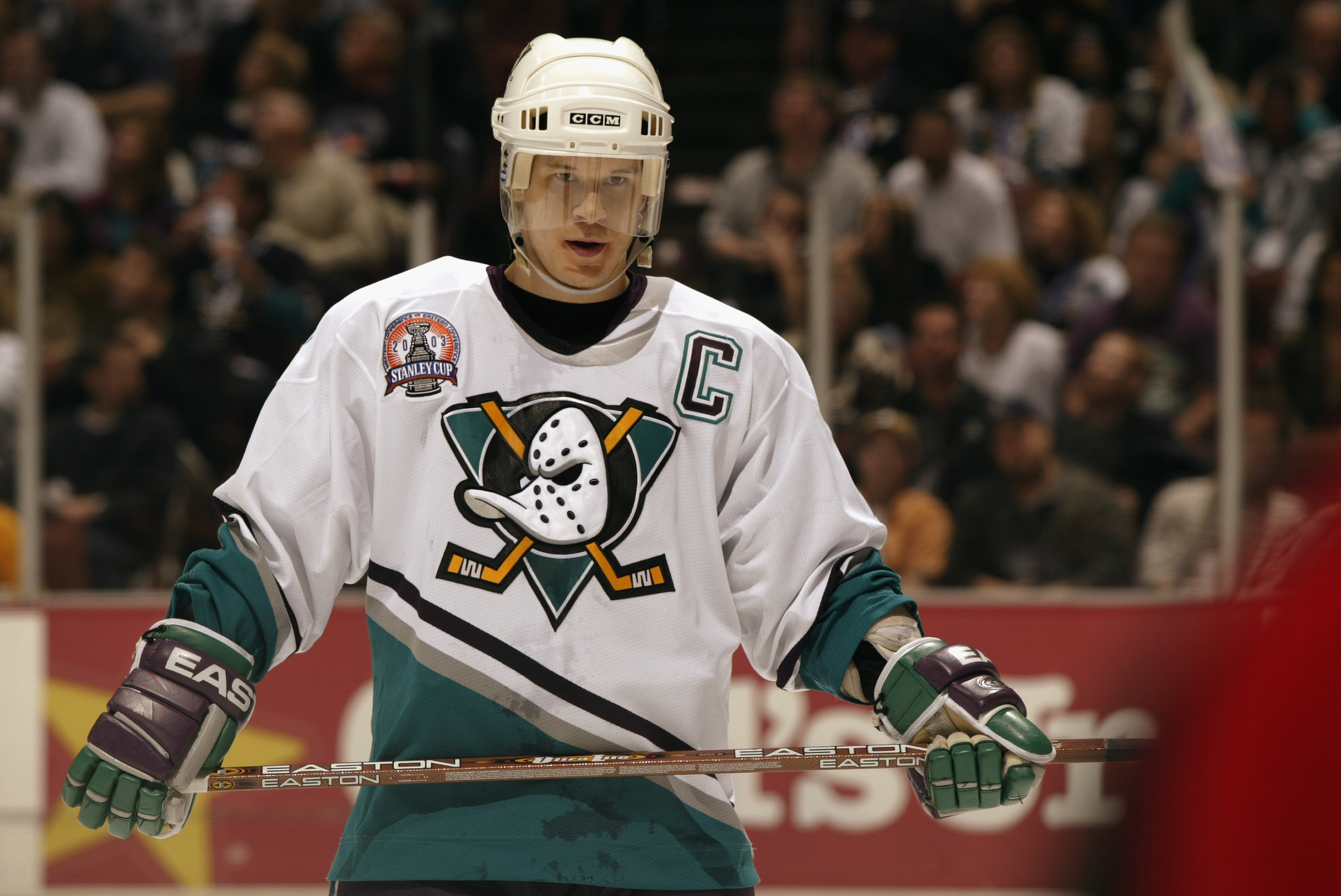
What kind of moron decided it was a good idea to wear white pants and blue helmets with those???

-
 5
5
-
-
14 hours ago, M4One said:
Also, a rare game involving both teams wearing their alternates.
I love those alt vs alt games. I wish more teams had white alternates
Has there ever been a thread on this board for this particular topic? I feel like there should be one lol
-
6 minutes ago, dont care said:
who has praised the current set on here? Literally everyone has said it looked dated the second it debuted with ever Edge bell and whistle that existed at the time. Piping, random panels, elimination of hem stripes, ect. The only nice thing ever said about that uniform is “atleast they won a cup in it”
In either this thread or the 2021-2022 thread I've argued with a few posters who were defending them lol
I'm guessing they grew up and/or started watching hockey during the late 2000s-early 2010s and have fond memories of that era. This is the only rational explanation
-
1
-
-
Why couldn't they have done this at least?
Or maybe even a bigger nod to the Expos with red numbers?
Either way, still another very strong batch of jerseys overall!
Florida is clearly the winner here, both jerseys are absolutely phenomenal
Detroit managed to f*** it up once again while Toronto have nicely recovered and put out one of the best RR this year after dropping a deuce last year
Some teams got lazy again (ahem, Carolina, NYI and Minny)
Again, only a few stinkers, most of them fall in the good to great range
My top 5
Fla: So good. I'm speechless
Ana: Once again, more Mighty goodness
Was: Again with the screagle but I like this one much better than the red one!
Pit: Should be their primary imo
LAK: Hate to be that guy, but they look so CLEAN
Honorable mentions: Van, Cal, Ari, NJD
Bottom 5
Car: Really didn't understand the assignment and the jersey itself isn't really good either
Det: Yikes. What hasn't been said about those before? How hard was it to reverse the home jersey? Or even away jersey?
CLB: This is uhhhh... why not stinger? Probably my least favorite
TB: Should have been BLACK! Why the hell would they make it white?
NYI: Not THAT bad, just a bit of a disappointment
-
1
-
-
2 minutes ago, MinnyHockey said:
Coyotes burnt orange
Same user also posted this
Very disappointing
-
2
-
 1
1
-
 4
4
-
-
2 minutes ago, Ark said:
How did we get to this discussion
Also
It's simple really, I saw an opportunity to derail the thread and went for it, cause that's what I do lol
While I love old school Doggystyle era Snoop Dogg, his G-funk doesn't strike me as good hockey music
-
1
-
-
1 minute ago, BadSeed84 said:
I said modern rap lol. This is old as dirt
-
6 minutes ago, CaliforniaGlowin said:
I know plenty of more examples than that
Well I don't doubt it but it's not my fault they always choose modern trap garbage in those videos lmao
Then again, I get it. This is what people listen to these days. They're just trying to please as many people as possible and I'm just a 30 year old boomer who yells at clouds and thinks rap hasn't been good in over 20 years. This isn't a hill I wanna die on lol. I just miss the days when guitar-based music and hockey (or just sports in general) went hand in hand. We've derailed the thread enough I think. Let's just agree to disagree
-
 1
1
-
-
1 minute ago, Krz said:
So all rap/hip hop is never fast or energetic?
As long as it sounds like Party (Up in Here), sure, but modern rap isn't like that anymore lol
-
2
-
 1
1
-
1
-
-
4 minutes ago, EddieJ1984 said:
Trash music in those teaser videos. Sometimes the NHL's marketing is just odd to me and seems like such a stretch.
Completely off topic but agreed lol. Rap/hip hop should NEVER be paired with hockey. It just doesn't work. It's a fast, hard hitting sport, you need hard rock, metal or hell, even EDM or techno, but something fast and energetic
-
3
-
 1
1
-
9
-
-
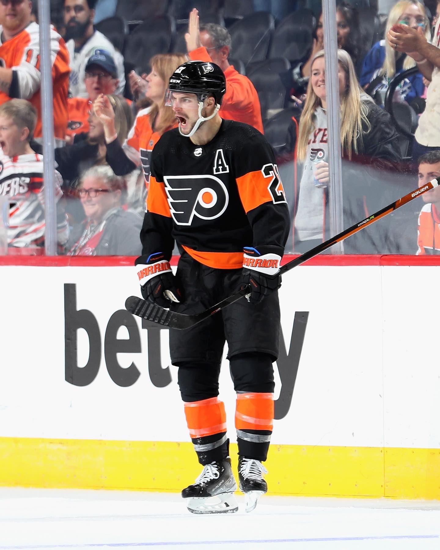
3 hours ago, tBBP said:
And while we're discussing hockey aesthetics, not that I've ever really paid it close mind before, but the more I look at this set, the more I'm inclined to declare this among--maybe even arguably as--the very best uniforms in the league. I know the sleeve number treatment may not be everyone's cup of tea but it's their thing, it works--but that orange and white just pop off that black so vividly, so simply. Just great to look at.
Hard disagree here. Some teams get it right the first time, others like the Flyers improve upon their original jerseys after a few years (the 80s, 90s, pre-Edge set)
The contrasting nameplate will never not suck
The hollow numbers on the alt and hollow captain letter on the away are just as dumb as gimmicky as the nameplate
And lastly, that shade of orange is brutal
So close yet so far, for me. They should just go back stitch for stitch to the Lindros era set. With or without the black alternate
1 hour ago, WSU151 said:Avalanche sleeves are hinting at a '96 vertical-sleeve style (not an original Rockies striped look). Teaser shows current number font too.
Wow very intriguing and unexpected!
-
5
-
-
I'm not feeling the new gloves, at all. They look especially bad with the third jersey
I never thought I'd say that but boring, safe, solid black gloves were clearly the best option
Unpopular opinion?
-
1 hour ago, officeglenn said:
Another small tidbit on the Flames: white helmet straps are back. Apparently this is something the players vote on.
The Habs and Rangers need to follow suit! Any team that doesn't have black in their colour scheme, basically
-
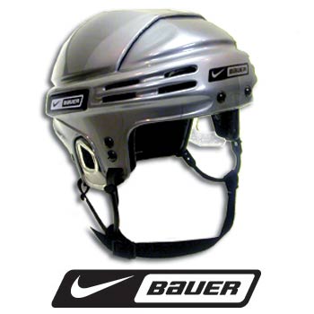
8 hours ago, mafiaman said:
The Kings look ridiculous with the silver brain buckets on their heads.
If they were actually silver and not chrome, it would look great imo
8 hours ago, CaliforniaGlowin said:I like this gold vs. silver game
-
3
-
 3
3
-
-
My Habs looked so good last night without the disgraceful helmet ads and sponsor patches
I almost forgot how much I hated the Bell/CIBC sticker on the helmet because of the new patch
Now THAT looks like a major league game. It's a shame it won't ever happen again
:censored: you Bettman
:censored: you Geoff Molson
-
2
-
-
Much better! Is this a pre-season thing, along with the weird font for the names or have they finally decided to come to their senses and put the captain letters back where they belong, on the left side of the chest?
Either way, it's probably just to make room for a disgraceful sponsor patch on the other side. For shame
-
15 hours ago, DTConcepts said:
The Bruins have announced a five year (!!!) jersey ad deal with cybersecurity company Rapid7.
Correct me if I’m wrong, but this is the first announcement to acknowledge that the ads aren’t a one-year deal.
Wait, some people thought it was just gonna be a one-year deal?

-
3 hours ago, VancouverFan69 said:
Forget all the sour milk jokes, the Leafs did it right with their corporate ad, much unlike the Habs.
And you "can take that to the bank".
That's like saying 💩 is better than diarrhea. Both are terrible
-
1
-
 1
1
-
2
-
-
30 minutes ago, habsfan1 said:
This is what the current logo would look like with matching outlines.
Still looks like a soulless DisneyXD-ified version of the original
-
54 minutes ago, FiddySicks said:
Yeah and those were terrible, and didn’t last. Sharks had that dumb color on the stripes for over a decade.
-
1
-
2
-
1
-
-
4 minutes ago, FiddySicks said:
2). The ducks never took that yellow and adopted it as an actual team color
-
3
-
3
-
-
38 minutes ago, DTConcepts said:
I don’t understand how people are complaining about the Sharks keeping the orange in the logo but are also pining for these jerseys to make a return:
How come one team gets a pass for using a color only in the logo but another team is getting chastised for it?
Plenty of people on here love to whine about the black in that Ducks logo actually lol. We even argued about it a week or two ago ITT
This one is an even better example
-
1
-
-
19 hours ago, riccirulesall said:
curious why you dont like the white cuff? don't think it's particularly common or overdone and i think it's needed to break up the color of same colored gloves and jersey, much like the leotard look in the nfl. unless it's a two-color team like detroit
There's just too many teams with either solid coloured gloves or just a contrasting cuff roll. And the contrasting cuff roll (often white) seems to be especially trendy and I think more teams could make an effort to have a unique colour scheme on their gloves like Montreal, New York Rangers, Arizona and Vegas do. I just think the basic Leafs white cuff roll template is kinda boring
Just a small nitpick but I've always been a gear nerd so I care more about this stuff than most people on here who just like the jerseys I guess lol
I'm talking about the cuff roll on the gloves by the way, not the cuffs on the jersey
-
29 minutes ago, B-mer said:
No surprises really
I'm not crazy about the black numbers, they might grow on me eventually though, but I'm mostly disappointed about the white cuff roll on the gloves. So boring and overdone
Overall still an update over the previous two uniforms I guess


/cdn.vox-cdn.com/uploads/chorus_asset/file/23055408/snoop.JPG)


/cdn.vox-cdn.com/uploads/chorus_image/image/71421901/usa_today_19111267.0.jpg)
/cdn.vox-cdn.com/uploads/chorus_image/image/71455662/1429786605.0.jpg)


2022-2023 NHL Jersey Changes
in Sports Logo News
Posted
It COULD have looked good with blue pants and white helmets. Now it just looks stupid. There's absolutely NO logical reason for the blue helmet if they're going for a "#WHITEOUT

 " type of uniform
These, on the other hand were executed (EDIT: almost) perfectly and look better than their regular home jerseys