-
Posts
913 -
Joined
-
Last visited
-
Days Won
2
Posts posted by AFirestormToPurify
-
-
-
I just bought a $36 Alouettes jersey at a Lids store, which is a a pretty steep and unusual 60%-ish off discount
Between that and this year's new helmets, could this mean anything?

Is there a 5 year rule in the CFL?
-
12 minutes ago, Sport said:
Lost the plot. Nobody would mistake the Panthers for an O6 team, which is what Original 6 Dress-up means.
To me, playing O6 dress up means trying to pretend your team is older and more prestigious than it actually is
Just seems insincere and fake. Just trying to cash in on a trend
The Wild should still be wearing their OG jerseys with the jagged numbers
I don't think the Panthers are doing that. Other than the chest stripe, it's not really a faux-retro uniform
Modern doesn't have to mean gimmicky like the templated RBK monstrosities. Modern is also Winnipeg and Vegas, both contemporary classics imo
In short;
Traditional =/= O6 dress up
Modern =/= gimmicky pseudo tech
-
 1
1
-
 1
1
-
-
On 7/24/2022 at 11:38 AM, IceCap said:
The Jackets may be a younger franchise but between their nickname and locale it feels like they could have been around longer. They're in the hockey hotbed that is the Great Lakes region, their name references the fricken Civil War... yeah. Sure. Absolutely. They can pull off the fauxback look. Florida? Not so much.
Yeah such a classy and timeless franchise. Could have sworn they'd been around since the 1700s when they starting wearing that generic pseudo-retro trendy cashgrab alternate lol
You're grasping at straws
"Loud, bright jerseys and agressive logo" You sure you're talking about the Panthers?

-
 1
1
-
 3
3
-
 3
3
-
-
3 hours ago, Ricky_Roby said:
Good gravy, that is still - after all these years - one of my favourite NHL jerseys.
Wish they'd go to that cannon logo full-time too.
I'll never understand why people love that jersey. The very definition of a soulless and generic jersey. An expansion team from the early 2000s playing O6 dress-up because double blue jerseys, roundel logos and vintage white were trendy in the early 2010s


Especially now that we have yet another navy blue + light blue team in Seattle. They don't wanna look like the Rangers (which they absolutely don't, not even remotely close) but they wouldn't mind sharing their colours with the Jets and Kraken?
-
 1
1
-
 1
1
-
-
14 hours ago, BJ Sands said:
I wonder if this opens the door to teams having home and road breezers.
Some teams that could conceivably add road pants, based on their color schemes:
Panthers (red)
Capitals (red)
Avalanche (burgundy)
Stars (green)
Predators (yellow)
Sharks (teal)
I had to google yellow hockey pants and honestly, with the white jersey, I think it could look alright. As a once in a while thing, of course


I don't think any team has ever worn teal pants but why not? If bright royal blue and kelly green have been worn before, I'm sure teal wouldn't look that weird. While we're at it, their gloves could use some more teal on the fingers or cuff roll

With all the trends that have come and gone, I think it's about time the more imaginative glove colour patterns make a comeback along with pant stripes. Vegas is the only team with different home and away gloves, I'm not saying every team should do it, but gloves are a very important design element that's often undervalued
The difference a little splash of colour can make is huge. Best example is when Hossa was on the Penguins. They had solid black gloves that year but his gloves had a vegas gold pinky stripe and the following year the whole team now had vegas gold accents on their gloves

Another example. Owen Nolan's gloves look way better than the generic black gloves worn by Turcotte

Sorry for all the pictures lol
-
 1
1
-
-
The black Panthers helmet is alright I guess, Carolina Blue would have been a thousand times better, though. Slightly disappointing but hey, it was so predictable so it's not like I had high hopes
The white Bengals helmet is good, as expected, it will look incredible with the rest of the white uniform, BUT I had no idea white tigers were a product of inhumane inbreeding practices. This is new information to me and I'm not sure how I feel about the Bengal's white tiger look anymore

With that being said, I have no choice but to buy Madden 23 lol. Choosing uniforms is gonna be more fun than actually playing the game
-
 2
2
-
-
21 minutes ago, gosioux76 said:
I don't generally have a lot of faith in the intelligence of the human race these days, but I would at least trust the fans — and the players — to understand that the home fans aren't rooting for the visitors just because they're all in white. Literally nobody is confused by this.
Literally not what I'm saying at all
I know no one is confused. I just think it makes no sense to wear white to encourage the navy team while the visiting team is white. It made plenty of sense back when teams wore white at home but the effect is just not the same anymore. What I'm saying is really not that hard to figure out, you don't need to misquote me
-
 1
1
-
-
59 minutes ago, spartacat_12 said:
That’s why I’ve advocated for changing the rules to allow teams to designate any uniform they want as the home set for the duration of the playoffs. Knowing ahead of time shouldn’t cause any logistics issues, and teams like the Jets & Coyotes can match the fans.Hmm, not sure this is a good idea. This could result in a scenario where you would have the Oilers or Canes wearing their stealth jerseys for seven games in a row lol. I really don't want the NHL to become the NFL or worse, the NBA when it comes to relaxed uniform rules. Teams have to be protected from their own stupidity
7 minutes ago, Ridleylash said:People don't look at a Jets home playoff crowd and quip "look at all those road team fans!" for a reason lol
I do. I think it's dumb to encourage fans to wear white when the home team is wearing navy blue, especially since it's not even the same franchise that originated the whiteout. Not every single tradition is good or makes sense. The plastic rats are cool but they had to tell people to stop throwing real octopuses on the ice in Detroit. And don't get me started about the catfish thing in Nashville!
-
19 hours ago, WSU151 said:
I'm not sure about this. Edmonton had a sea of orange and the team never wore orange in the playoffs. The fans can still wear orange if they want while the team wears royal. Granted, it'd be weird if everyone just wore old orange jerseys...but in the playoffs, fans will generally wear whatever the team wants them to wear, and usually will give away free tshirts to make it happen.
No weirder than teams still pushing for "whiteouts" in this colour-at-home era. Like why the hell would I want to feel like I'm encouraging the other team? lol
-
 2
2
-
-
47 minutes ago, throwuascenario said:
I don't think it blends into purple from a distance. These numbers still look the same color as the pants to me.
Besides, the red jerseys have red touching blue and doesn't look purple. I actually prefer the striping you've presented on the bottom to their actual striping. The logo looks awful but that has more to do with all that being smushed together into a small space. It wouldn't look nearly as bad if you made the blue H the size of the white H instead of keeping the blue outline.
I dunno, it doesn't always look purple, depends on the picture and lighting (the one you posted is super desaturated and dull) but it always looks muddy and cheap imo. And it pretty much only happens when royal blue numbers are outlined with red. I think the NY Rangers away jersey (among countless other examples) name, numbers and script logo would also benefit from having a white gap but that's just me I guess
For some reason, blue and red touch on the home Habs jersey but it doesn't bother me as much. Then again, I think it only bothers me when red and blue reflective twill numbers touch. The 1945 throwback and 2016 WC classic with the blue chest stripes outlined in red look gorgeous to me, for what it's worth
Yeah the more I think about it, it only bothers me when the materials used are reflective. So if they were to use felt numbers (like on the 2016 WC) I wouldn't have any problems with it. Or maybe twill but with a much thicker red outline?
And of course the "concept" I made looks terrible, it was completely on purpose lol
-
2 hours ago, throwuascenario said:
Actually, the white coming between the red and blue reminds me more of a milksteak with ketchup than anything.
One outline is the exact correct number of outlines in all cases, sorry. Single color numbers and double/triple outlined numbers just aren't as good. Even worse when one of them is a ghosted outline. Even worse than that is when the outline is ghosted and then the outer outline is the same color as the number. So at least they don't have that.
Perfectly good and fine and consistent jersey:

Not bad but the numbers ruin the "red and blue cannot touch" rule applied everywhere else on the uniform, therefore it is inferior as it creates the annoying optical illusion that makes the number look purple from a distance

[MOD EDIT: I know you're exaggerating for effect, but don't please bring that into it]


-
On 7/8/2022 at 9:40 PM, Jer15 said:
I don't care enough to get involved with the Canadiens uniform debate (because I think they've got great uniforms and the small details aren't sig ificant enough to me) but dude. You've got to know you can't come on here and say this (quoted) line. It's very much debatable...and kind the point of what we do here.
I thought my well done steak and ketchup metaphor was ridiculous enough to show that I'm just busting his balls in the least hostile way that I can. I guess I should have used the sarcasm font? Come on lol
-
11 hours ago, throwuascenario said:
I think that the Canadiens' current white jerseys are more dated than their '70s counterparts. That ghosted number outline is awful and has been dated since about 2005.
Objectively wrong opinion. Like wanting your steak well done with ketchup on it and a glass of lukewarm milk on the side lol
Red and blue don't touch anywhere on the jersey, so why should they touch and bleed onto each other on the numbers? The double outline is absolutely needed here. Not debatable, sorry!
-
 1
1
-
 1
1
-
 1
1
-
-
24 minutes ago, WSU151 said:
These are the only real changes, though, with the collar being a manufacturer change and not a team update (though the current collar is heavily inspired by historical Habs jerseys)
Shade of red was changed in '99. Pretty obvious if you compare a jersey from 1998 or earlier to a current one
Pretty sure the shade of blue was also darkened that same year
Name and number font makes a HUGE difference, especially on the away jersey, but of course that's not the one you posted cause it wouldn't suit your argument lol
The color went from blue-white-blue with no laces to white-white-blue with laces and it's not due to the switch to adidas as they were wearing a solid white collar with laces the year before with Reebok so you're wrong again
The logo absolutely did change over the years. Sounds like you've never owned any older Habs jersey. I have. I know what I'm talking about
All subtle changes but all real changes. Nice job trying to shift the goalposts lol
-
 1
1
-
-
-
2 hours ago, chcarlson23 said:
I’m curious about why exactly you don’t like the Oilers Gretzky uniforms… I know you have said they are dated, but I’m curious about why else you don’t like them?
I don’t care either way, I just wanted to discuss it haha
I mostly dislike the colours and logo. Too WHA for me. I could list everything I think looks bad but nobody cares so I'm not gonna waste my time lol
1 hour ago, spartacat_12 said:Yes, that's word-for-word exactly what I said. Come on, don't be arguing in bad faith. You're better than that spartacat
1 hour ago, IceCap said:And if you did the vast majority of Habs fans would want him playing in the same uniform as the past Habs greats.
And they'd be right.
Nope. There are many, many differences with the current Habs uniform and the one from the 70s. That's what I've been saying all along. The Oilers should have brought back a MODERNIZED version of the Gretzky era jerseys without the dated quirks. If we traded for McDavid and brought back stitch for stitch our dated 70s jerseys, I'd be pissed
What I have in mind for the Oilers is something like the Bruins did when they switched over to Reebok. A modern day classic inspired by the past
1 hour ago, wildwing64 said:I also like the idea of them in navy and orange, or them being Canada's orange team.
THIS. Between the Leafs and Canucks (and Jets to a lesser extent) we already have enough teams wearing blue home jerseys
And correct me if I'm wrong but don't the Oilers wear the exact same shade of dark royal blue as the Leafs, Canucks and Lightning? Or is it now the same shade of blue as the Islanders (yikes) and Blues?
-
 1
1
-
-
5 minutes ago, mcj882000 said:
You're right, I guess I should have specified that they have not changed their jerseys since Jordan last played on the team*
4 minutes ago, mcj882000 said:You will come Thursday, so why stay living in the past, right?

Oof, probably not. #tankforBedard lol
-
So apparently this confirms that the Golden Knights are going with gold full time and dropping the grey jersey. Yet another disappointing jersey announcement this week lol

Although I'm not sure how reliable this is. It doesn't say anything about a possible RR jersey

-
1 hour ago, WSU151 said:
There's a certain contradiction in your argument...
The ice cream argument is your team doesn't need to move on to a new design even though its glory days are 30-50+ years ago.
The cake argument is other teams should move on to updated designs as their glory days are 30-40 years ago.
I think it'd be way easier to say the Oilers should stick with navy if they were a team that had very minimal success throughout their history.
Personally, I like the royal blue because it looks better on TV and in photographs. The Sabres realized royal looks way better than navy (even though Gilbert Perreault isn't suiting up anytime soon), and now Edmonton has realized that (again) too.
There's no contradiction, the Habs have never changed anything drastically but they've tweaked it several times along the way
The Oilers keep changing their colours instead of just sticking with something and fixing it gradually when it starts looking dated
If the Habs went back to a perfect replica of their glory days 1970s jerseys I'd be complaining for the same reasons
The Sabres comparison doesn't work at all because they brought back a new and improved version of the jerseys they wore in the 70s and 80s, there's a few key differences (mostly the much more vibrant shade of blue, texture on the logo and white stripes on the blue jersey etc)
So basically you're proving my point here. This is exactly what the Oilers should have done instead of trying to cosplay as Gretzky's team. Anyway, I'm done arguing about the Oilers, their jerseys suck and no one here is gonna change my mind lol
-
 3
3
-
-
12 minutes ago, IceCap said:
An interesting take from a Habs fan.
Not really. Our jerseys haven't changed drastically in decades and they never will either. They only modernized it a few times with subtle tweaks so that it doesn't look too dated. Same goes with every other O6 team. Not comparable to the Oilers at all, who've only known success for a few years in a specific decade and have changed their colours 3 times now only to go back to their "classic" and very dated uniform associated with a very specific superstar after a few years.
None of these things apply to the Canadiens
Edit: also, we definitely don't have a McJesus that we can build a new identity around lol
-
 1
1
-
-
2 hours ago, spartacat_12 said:
They tried moving on. Twice. It's clear at this point what the fans want.
I dunno about that. They really seemed to like the orange jerseys. But then again, they'll probably wear anything that has a 97 on the back lol

Besides, you don't have to agree with me. I know my opinion isn't exactly a popular one, but I'm not gonna change my mind. People are just blinded by their nostalgia goggles when it comes to the Oilers. The Gretzky era jerseys sucked and bringing them back without changing anything is a mistake. But my opinion doesn't matter since I'm not an Oilers fan and they will make a killing off of jersey sales anyway which is the idea behind the change, probably
-
 2
2
-
-
9 minutes ago, spartacat_12 said:
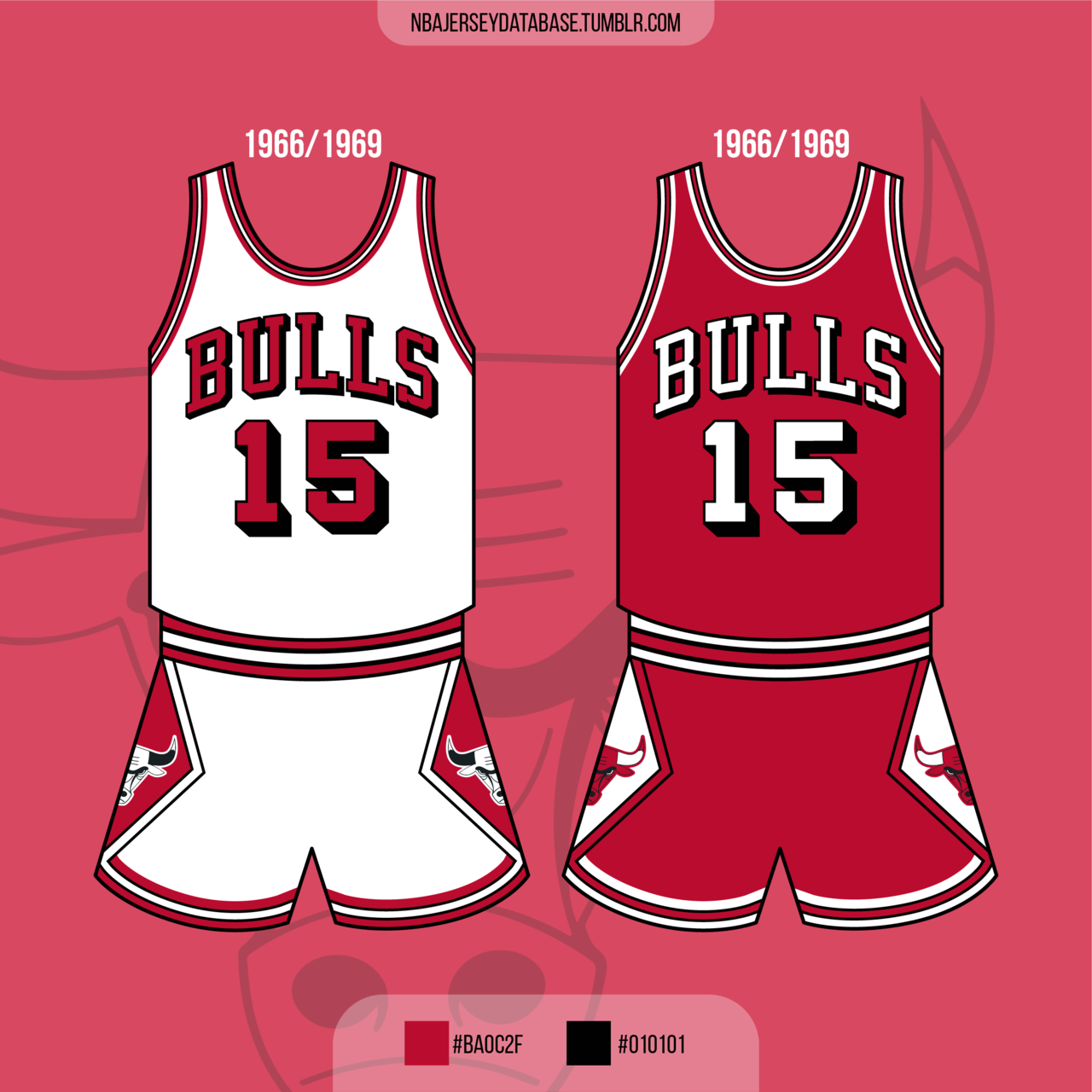
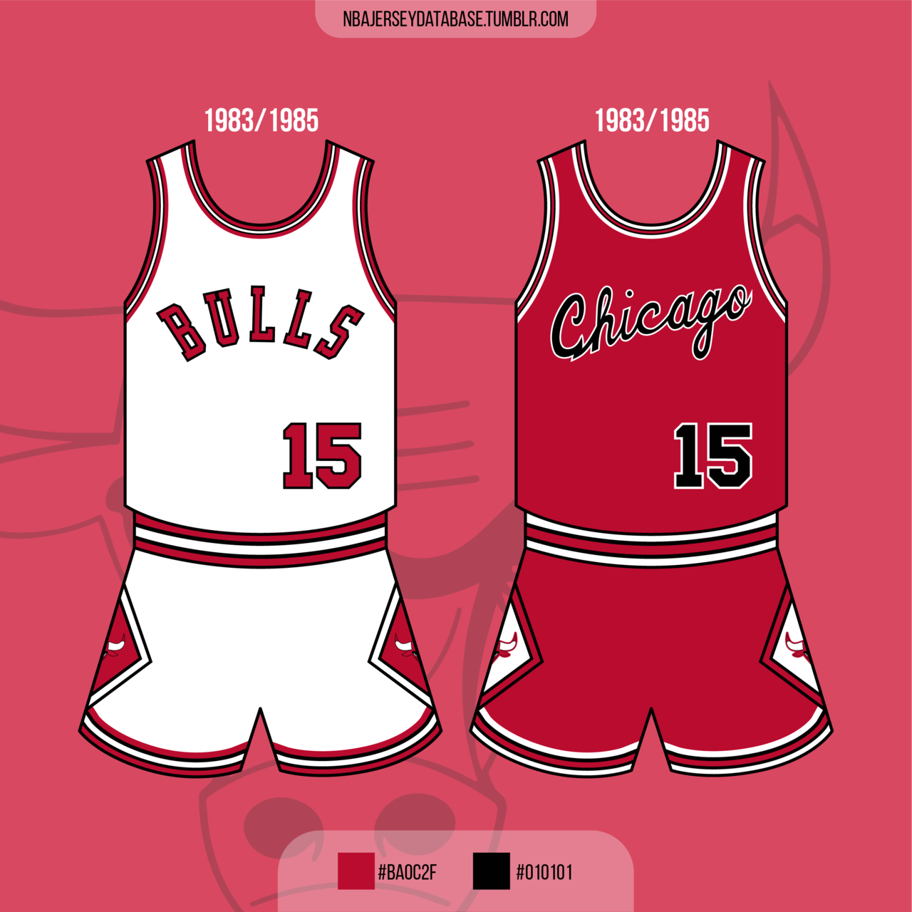
I'm not sure why this always seems to get brought up with the Oilers. No one says "the Bulls need to update their uniforms, the Michael Jordan era is over" or "why are the 49ers dressing like Joe Montana still plays for them". When you have a classic look that is beloved by most of the fanbase you should probably stick with it. Especially if you're Edmonton and bringing back that look for a second time.
Because the Bulls never changed their uniforms. I can't speak for the 49ers I've never been a fan of their uniforms or colours lol
Edmonton should have kept the Gretzky uniforms around and tweaked small details over the years but they didn't so when they bring them back it just feels like a shallow cash grab
Again, time to move on
-
 1
1
-
-
6 minutes ago, officeglenn said:
Fair enough, but if the Oilers haven't changed it by now, they're probably not going to. It's not necessarily a timeless design – or even a good design by today's standards – but it has become difficult for fans (and by extension the team) to fathom a change just because it has been around so long. I've seen a concepts around here that clean up the logo, make the letters follow the outer circle better, etc., and that might fly, but anything else will go over with the fanbase like a fart in church.
To me, the worst part of the current set isn't the navy blue; it's the pale highlighter orange. I feel like they could keep the navy blue and go back to the old orange, and that could be a nice compromise that grounds their identity without getting too far into Islanders territory.
I thought navy blue with a single outline on numbers and solid navy blue gear was a nice compromise, but of course they had to choose orange as the home jersey base colour. If they had gone with navy blue instead and kept the orange jersey around but only as an alternate, I'm sure they wouldn't be announcing a return to royal blue this year. Then again, who knows. I may be cynical but I'm sure they just want to sell more merch cause the owner is greedy and in another 5-6 years they'll probably go back to navy and copper again only to bring back the Gretzky era uniforms a few seasons after that lol


/cdn.vox-cdn.com/uploads/chorus_asset/file/19414781/Untitled_14.jpg)


/cdn.vox-cdn.com/uploads/chorus_image/image/61628601/usa_today_11303417.0.jpg)


NFL 2022 Changes
in Sports Logo News
Posted
This
But then again, while the bone uniform is a very cool idea in theory, I still think the white jersey looks better. Wearing bone twice a year strikes the perfect balance imo. It's a bit gimmicky but that's kinda what alternates are for, especially when all possible throwbacks look awful lol