


oldschoolvikings
-
Posts
10,506 -
Joined
-
Last visited
-
Days Won
193
Posts posted by oldschoolvikings
-
-
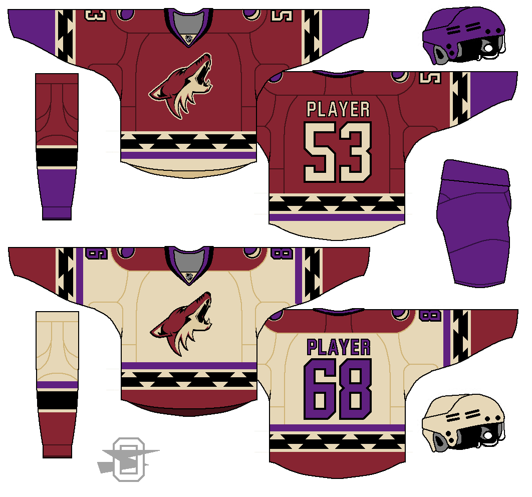
Arizona Coyotes. I tried to eliminate black altogether, but ended up leaving it in.
-
 2
2
-
-
-
Decided to make this a thread for all my NHL concepts. Here's the Calgary Flames...
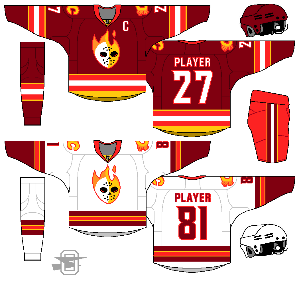
I'd like to see this with the logos reversed. As a Flames fan, I feel only the "Flaming C" should ever be our primary logo.
Yeah, I'm sure if I was a fan of the team, I'd be a lot less likely to mess with the logo. But, one day the idea of a flaming goalie mask popped into my head, and I thought it was too funny to pass up.
I dislike the logo but the uniform is very good. Except I think you should make the neon color more true red (maybe I'm just colorblind) and tone down the shorts color imo
Well, I was shooting for just a very bright red... certainly not neon.
I hate neon.
-
1
-
-
Decided to make this a thread for all my NHL concepts. Here's the Calgary Flames...
-
2
-
-
Do people complain about them looking too much like the Maple Leafs now?
Well, yes.
Pretty much constantly.
-
Pants need a lightning bolt on each side. Number font needs to match what the Lightning currently wear. Road jersey needs less gray. (This isn't MLB.)
Needs shoulder logos.
I thought about the lightning bolt on the pants, but since I was going with more traditional striping every where else, I wanted the pants to work the same. In my mind, you either run with the lightning bolt motif throughout or keep it limited to the logo.
I see no reason to match the Lightnings' current plain block font, especially with the cluttered split outline.
As for the road needing less gray? Nah, I like it this way... my favorite part, actually.
Shoulder logos? OK, yeah.
-
This works better as a Detroit Lions cross over concept. The addition of black would help this concept.
Weird that the Lions connection seems so obvious to everyone. I honestly didn't think about it until it was mentioned (although I see pretty clearly what you all mean).
My first thought about a Lightning concepts was, no black. Blue plus black (except maybe a true sky blue) is an awful color scheme IMO. If I had the keys to the Lions' uniform, step one would be to flush that useless black trim out of there.
-
I've never posted a hockey concept before. I just recently got a template together, so I thought I'd try it out. I had a lot of fun making it.
Thoughts?
http://i419.photobucket.com/albums/pp274/wingdog2000/litning_zpsbz6brzom.png
-
2
-
-
New Saints idea. I was looking at some Mardi Gras designs and kept seeing this diamond pattern reoccurring.
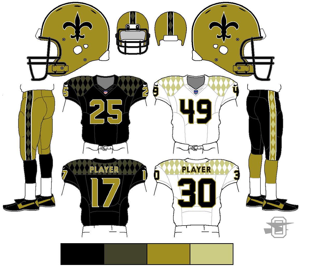
The pattern looks good on the black but I'm not a fan on the white. The number font looks good and really familiar for some reason.
It's a slightly modified Phoenix Suns font.
-
New Saints idea. I was looking at some Mardi Gras designs and kept seeing this diamond pattern reoccurring.
-
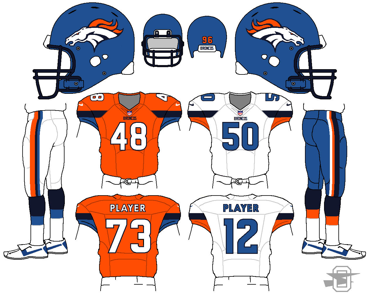
Having the navy and royal blue isn't working, especially with them right next to each other they bleed together and get lost.
Hmmm. The blue I was trying for was supposed to be slightly lighter than royal... sort of a desaturated version of their old blue helmet, which was definitely lighter than a standard royal.

To me, that isn't what I'd call royal blue. This is the blue worn by the Buffalo Bills...

That is royal blue... I was trying for something lighter and grayer than that. Also, you can see the Bills use royal and navy together, although I suppose you could argue about how successful it is.
-
New Broncos... old plus new.
-
A few tweaks, based on mbannon's feedback.
-
1
-
-
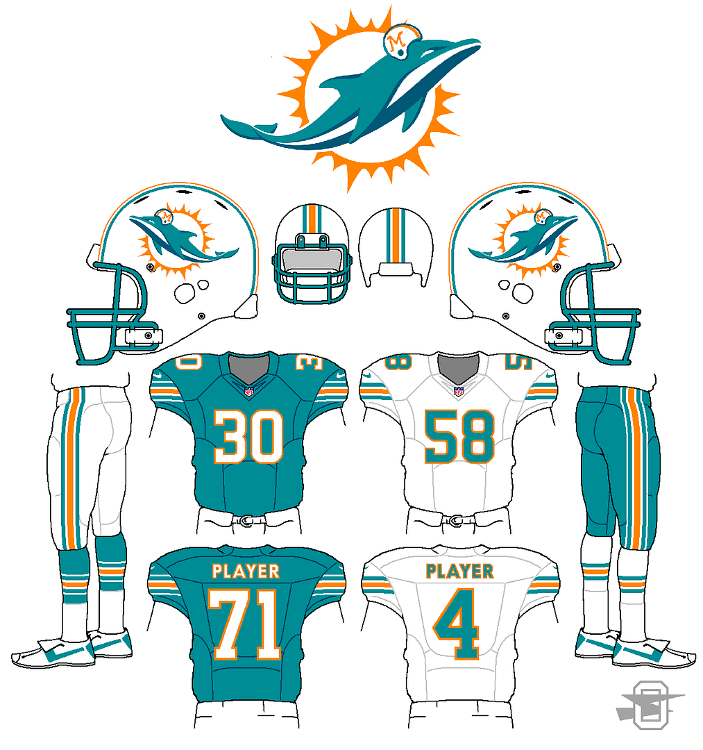
Ooh, I like that take on the striping. Never seen someone use stripes like the ones on the aqua elements and it works really well. I really like the number font too, though I would use a flat serif on the top of the 1 (like USC, Redskins throwbacks) to match the 5 and 3. And the helmet on the new dolphin doesn't look too shabby!s
Doh! You are spot on about the "1". I customized off the Dallas Stars' font, but I missed that.
By the way, thanks for all the feedback lately... it's been helpful.
-
Inspired by the new Dolphin throwback. No dark blue, stripes, and I stuck a little helmet on the new Dolphin. (Yeah, I know, it doesn't really fit on him, but I just wanted to).
-
3
-
-
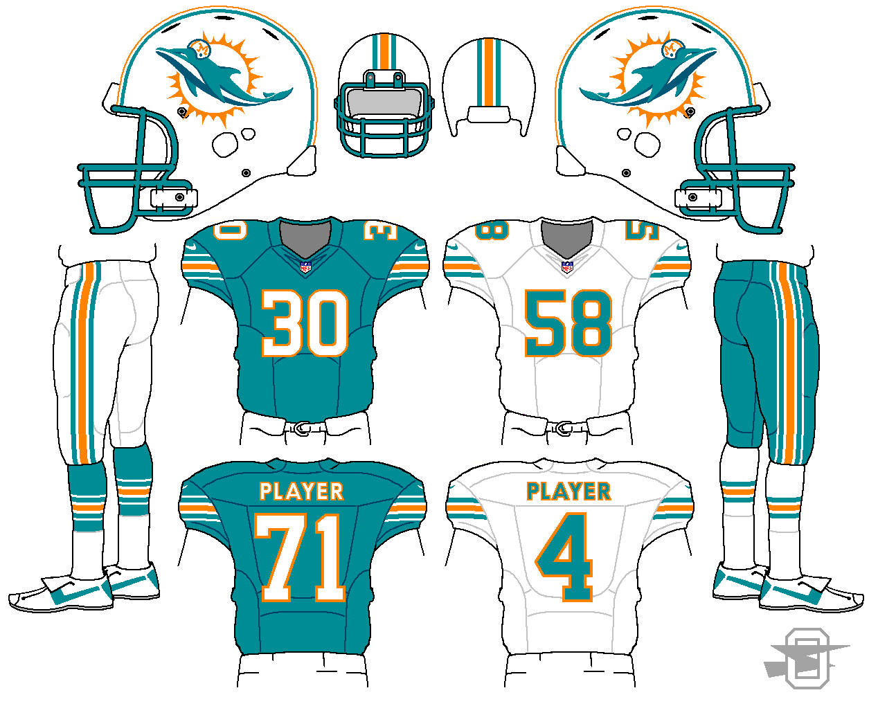
Yes, except I would use black trim on the white jersey. That way the stripe is just the reverse color of the helmet stripe. The trim ties everything together real nicely, though.
I tried it that way but it bugged me that the stripes were blue with black trim while the numbers were black with blue trim... personal preference I guess.
-
I like the striping a lot. Keeps the general idea of their current look but ties everything into the helmet better. My one suggestion would be to add silver trim to the striping on the black jersey/pants and black trim to the white jersey striping. That way it's more consistent with the helmet and silver pants.
Like this?
-
A cleaned up version of an older idea of mine...
-
My problem with the Eagles' midnight green uniforms is the inclusion of additional dark colors (black & charcoal grey). If they were just midnight green & white (or even silver) they'd be a lot more tolerable for me.
Also I gripe I have at times with the Ravens.
This.
Those three color together are a bit of a nightmare. There isn't anything that has any real contrast. If they switched out charcoal for silver at the numbers and pants stripe that would be a major improvement. I still would rather have the kelly, just because I love that color, but the dismal lack of contrast is the biggest problem.
-
1
-
-
Definitely no yoke. The red pants will help balance the white-heavy jersey and helmet.
On a second look, I thin you might be right, although the jersey backs look a little plain. Should I try to incorporate the stripe to the back somehow?
-
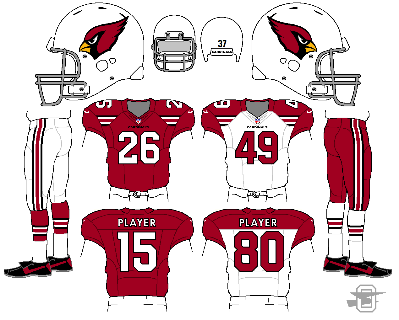
I like the idea a lot, especially for a team like the Cardinals that hasn't traditionally worn sleeve stripes. I'd lose the yoke on the road jerseys though. It doesn't really work with the striping.
Like this?
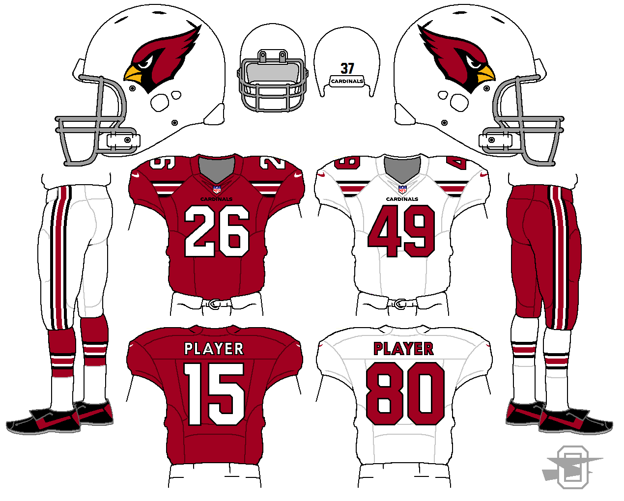
Obviously, I tried it both ways. My concern with this version is that the white seemed a little empty. Not as big of a concern for the equally empty dark jersey just because the color carries so well. But, I don't know... what does everyone else think? Yoke or no yoke?
-
2
-
-
Another Cardinals concept. Just an idea popped in my head, trying to colonize some new space on a football uniform like Cleveland and Seattle...
-
2
-
-
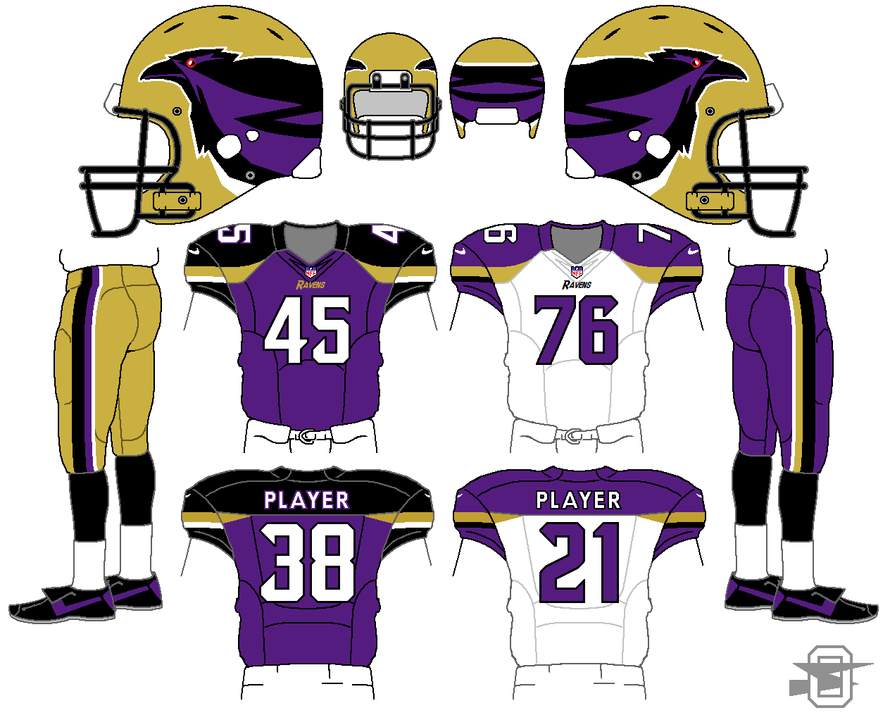
Another Ravens' concept... I think I've done about a dozen. This was just based on a helmet idea I had.
-
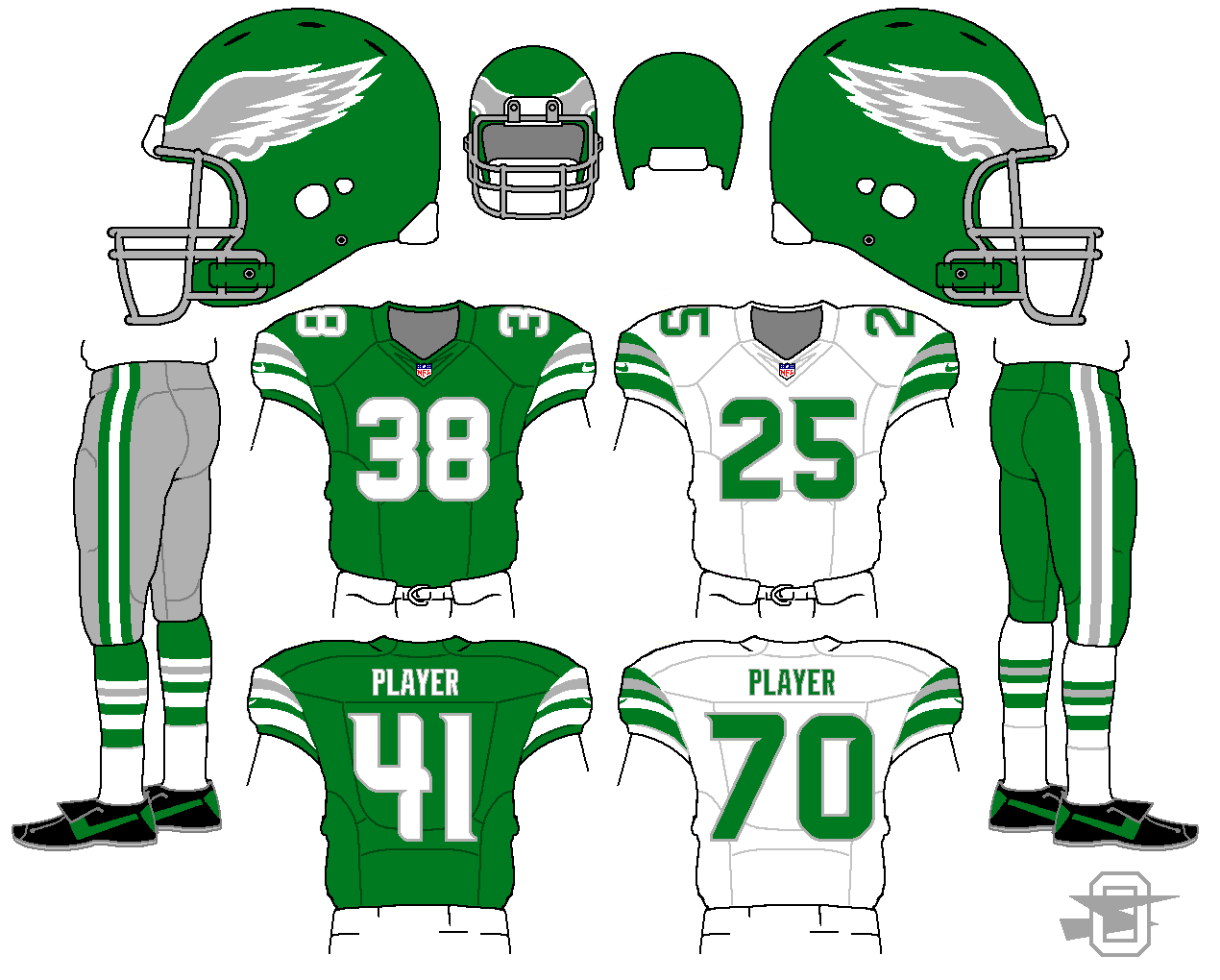
Here's a new Eagles concept, based on the late 70's/early 80's look...

-
2
-


Oldschoolvikings' NHL concepts - Ducks added, trying out more weird colors
in Concepts
Posted
Agree on the purple... it came out a little more toxic than I intended. Rather than darkening it, I might try just de-saturating (graying it slightly) it a bit.