


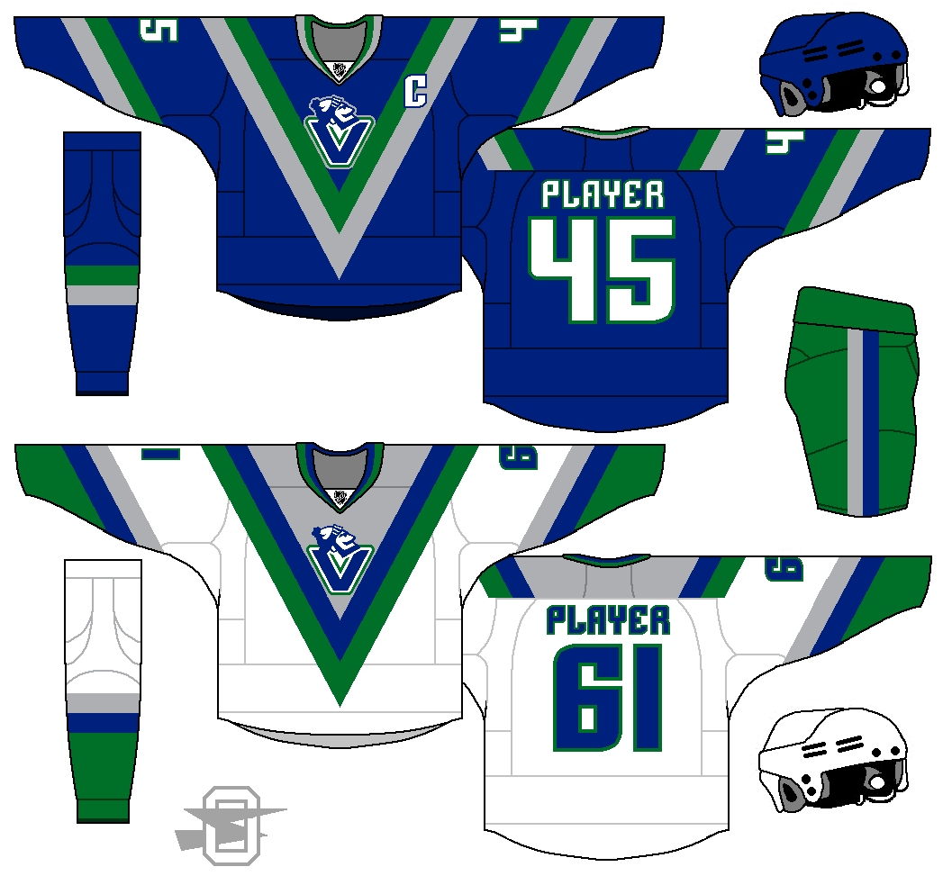
oldschoolvikings
-
Posts
10,506 -
Joined
-
Last visited
-
Days Won
193
Posts posted by oldschoolvikings
-
-
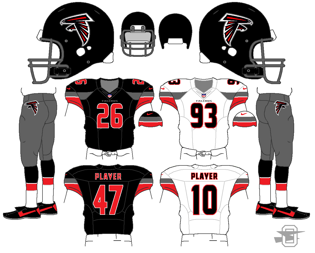
And finally a new Falcons idea. I was looking at a spaceship my kid built out of legos... he's only 7 but already fixated on color schemes. (I'm very proud.) He built it using only black, red, and dark gray bricks, and I started thinking what a great color combo it was. So I threw this together. (And yes, I stole the sleeve/chest stripe from myself on the Bucs concept above.)
-
 1
1
-
-
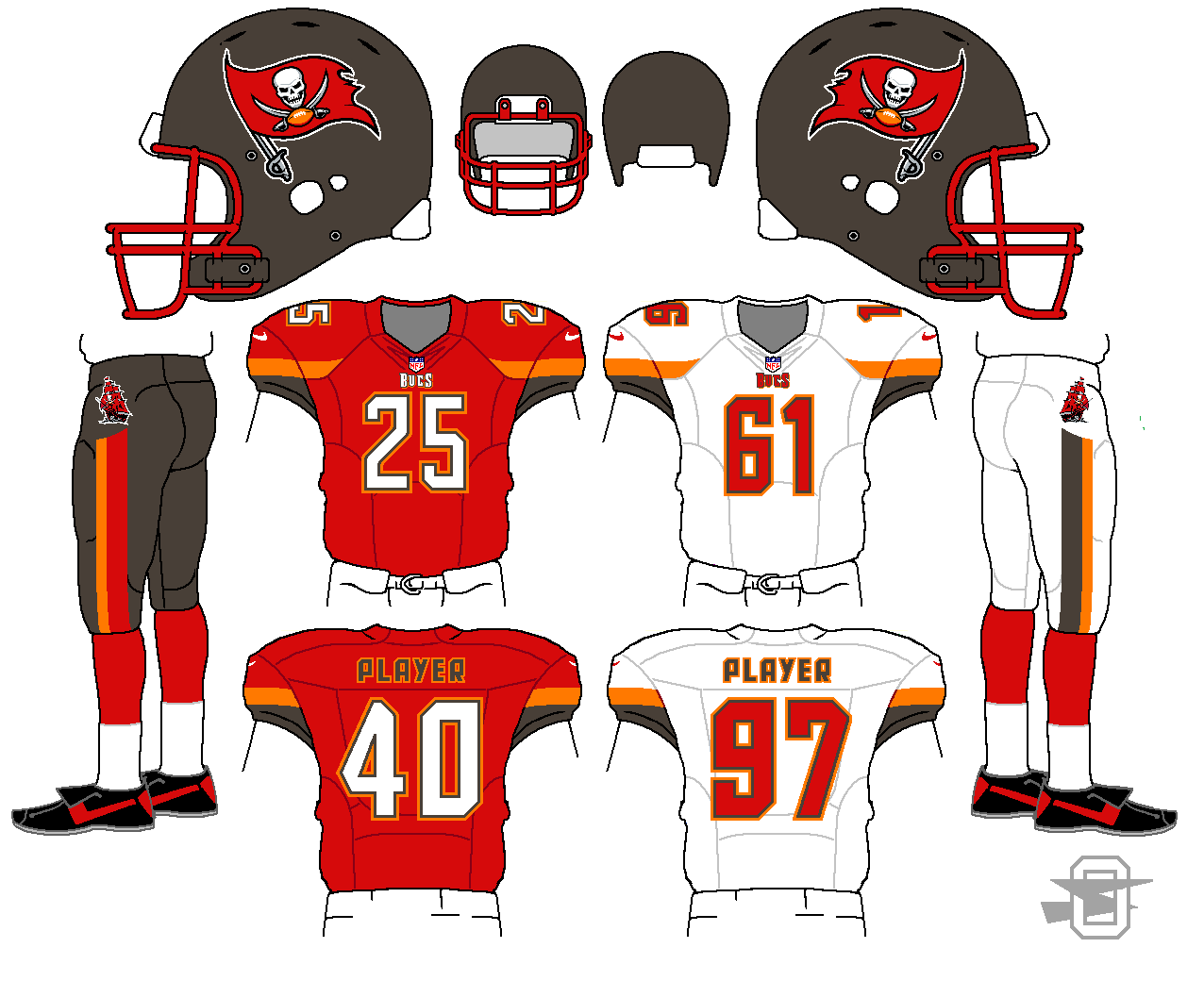
Next is a Tampa Bay Buccaneer set. For myself, like a lot of you, I'd just want to see them go back to the previous set. It was pretty close to perfect. But, I know they aren't going to do that. Teams can't just go back that quick... its like admitting they were wrong to change. Which they were, but still.
So, what if I was asked to keep the "feel" of the new uniform, but fix what just absolutely can't stay? Here's what I came up with.
Things that MUST go;
- Oversized helmet logo
- Pewter yoke
- Worst number font EVER
- Mismatched sleeve logos
- Blocky pants graphics
- Pewter socks
What I can work with to keep a bit of the new uniform's feel:
- New helmet logo at a decent size
- New emphasis on orange
- Modern number font
- non-traditional stripes on sleeves and pants
I decided to simplify overall... drop the sliver/chrome idiocy, reduce black to logos only.
Here's what I got...
-
Some new designs...
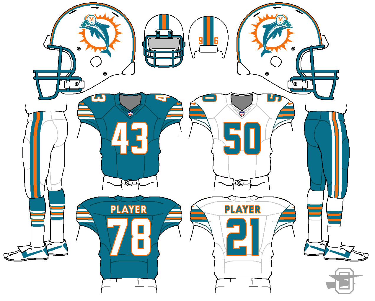
First, this is a Dolphin idea based on the current throwback. I already posted it in it's own thread, but I wanted here in my uber-thread.
-
1
-
-
-
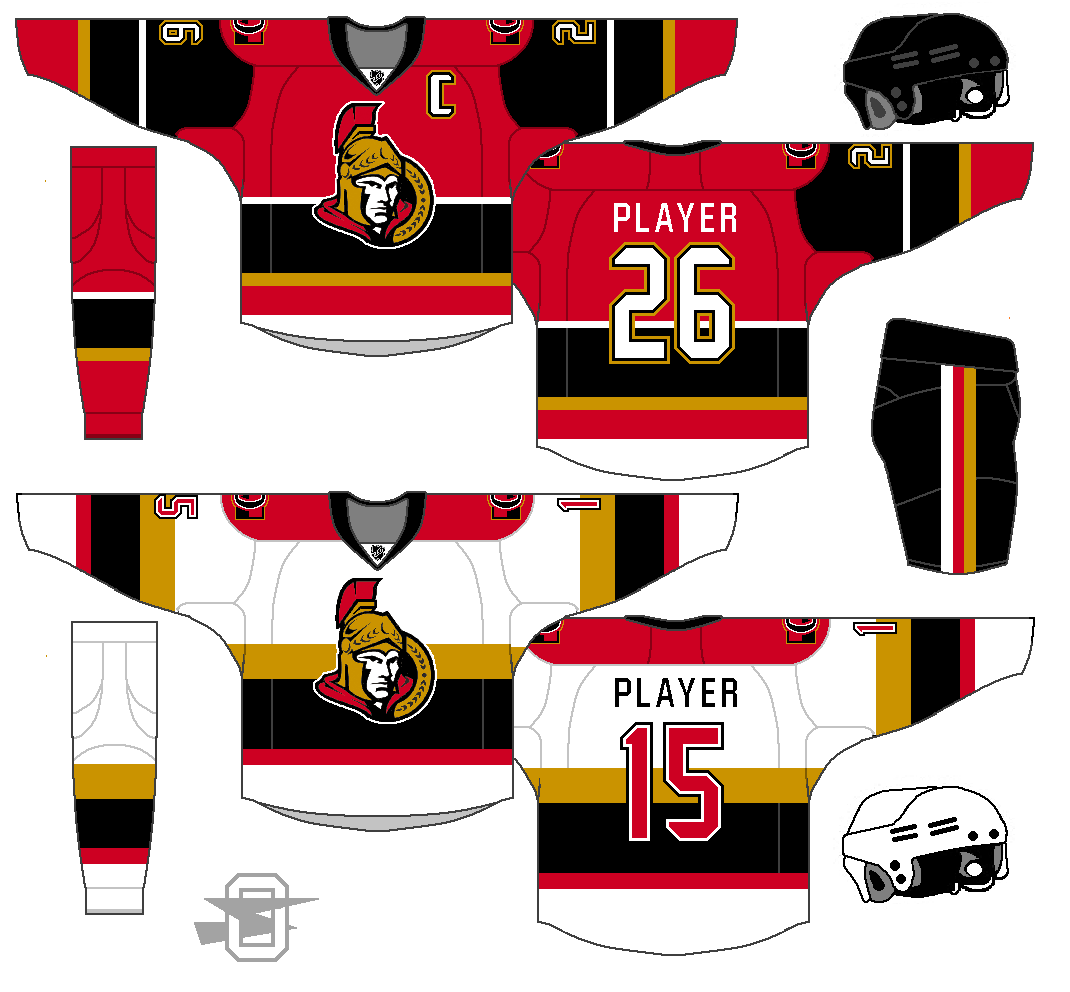
Trying to find a way to separate the Senators from all the other red/black teams.
-
3
-
-
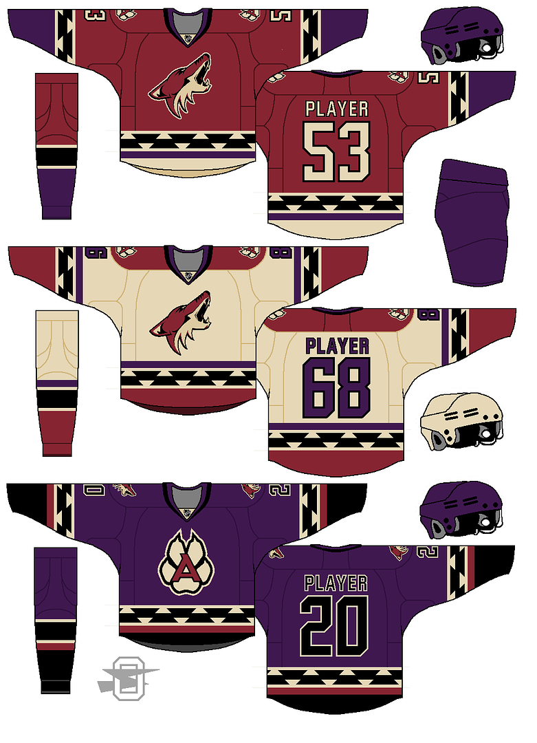
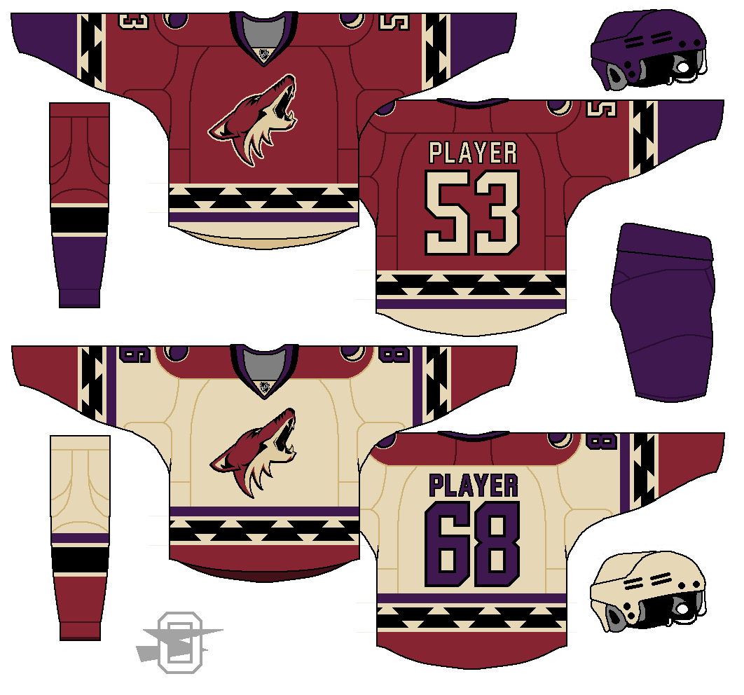
Added an alt for the Coyotes... plus changed some shoulder patches.
-
1
-
-
Added an alternate...
-
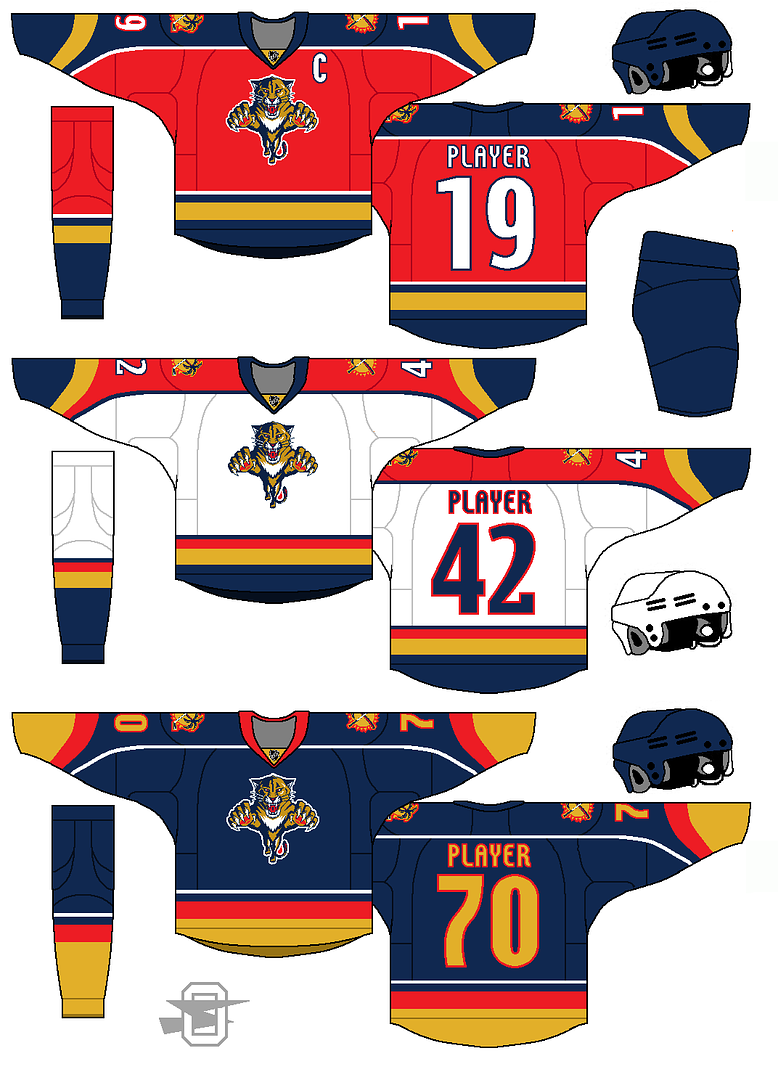
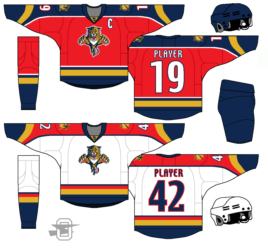
Florida Panthers... a return to the original, of sorts, with some updates.
-
If you're going for a very old-time throwback look with the striping, adding laces would be a nice touch.
I'm not sure how I feel about laces... It strikes me as a little cheesy in 2015. They really are just cosmetic, although I suppose you could say that about a lot of uniform elements.
-
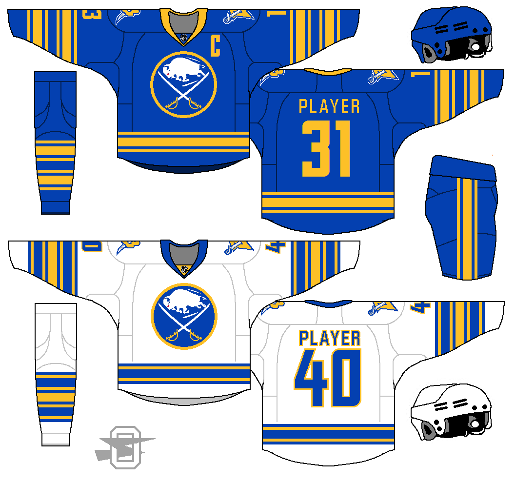
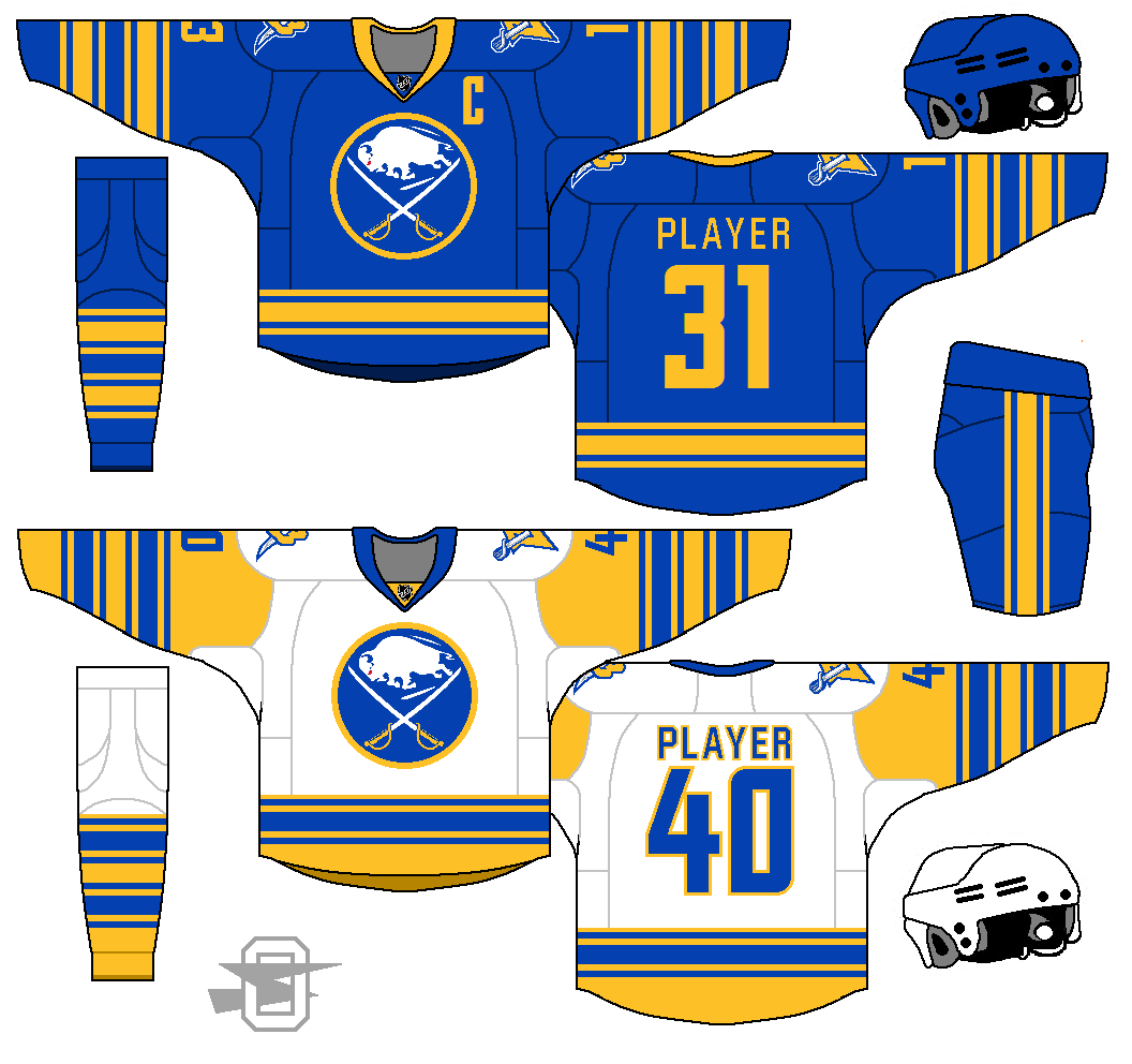
Home is fantastic, but the away has too much yellow. Switch the yellow and blue and you're golden
thats what i was going to say
How's this?
-
2
-
-
Still going stripe crazy...
-
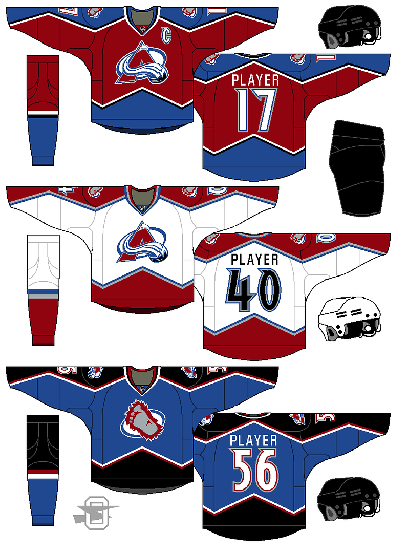
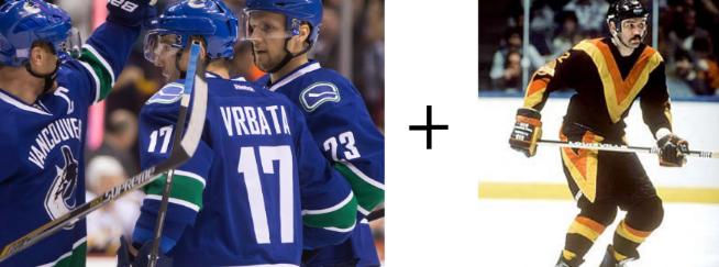
New Avalanche uniform is actually pretty much the old Avalanche uniform... just a few small adjustments, plus a new alternate.
The original Avs look is probably in my top 5 all-time NHL uniforms, it's a shame it got destroyed. And this particular alt design is something I've always wanted to see.
-
1
-
-
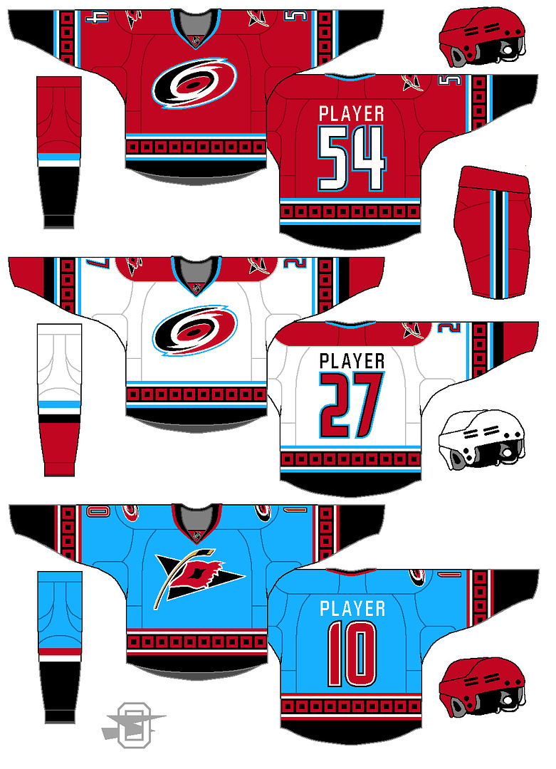
Carolina Hurricanes concept. I miss the wrap around flag motif, and I'm adding a color. Thoughts?
-
Dude stop using strips on all the jersey. Like same thing for every team. So simple anyone could cold come up with it. Just so boring see the same thing 50 thousand times
My goodness, I must be hallucinating again. All those unique stripe patterns that I'm seeing are actually boring and generic!
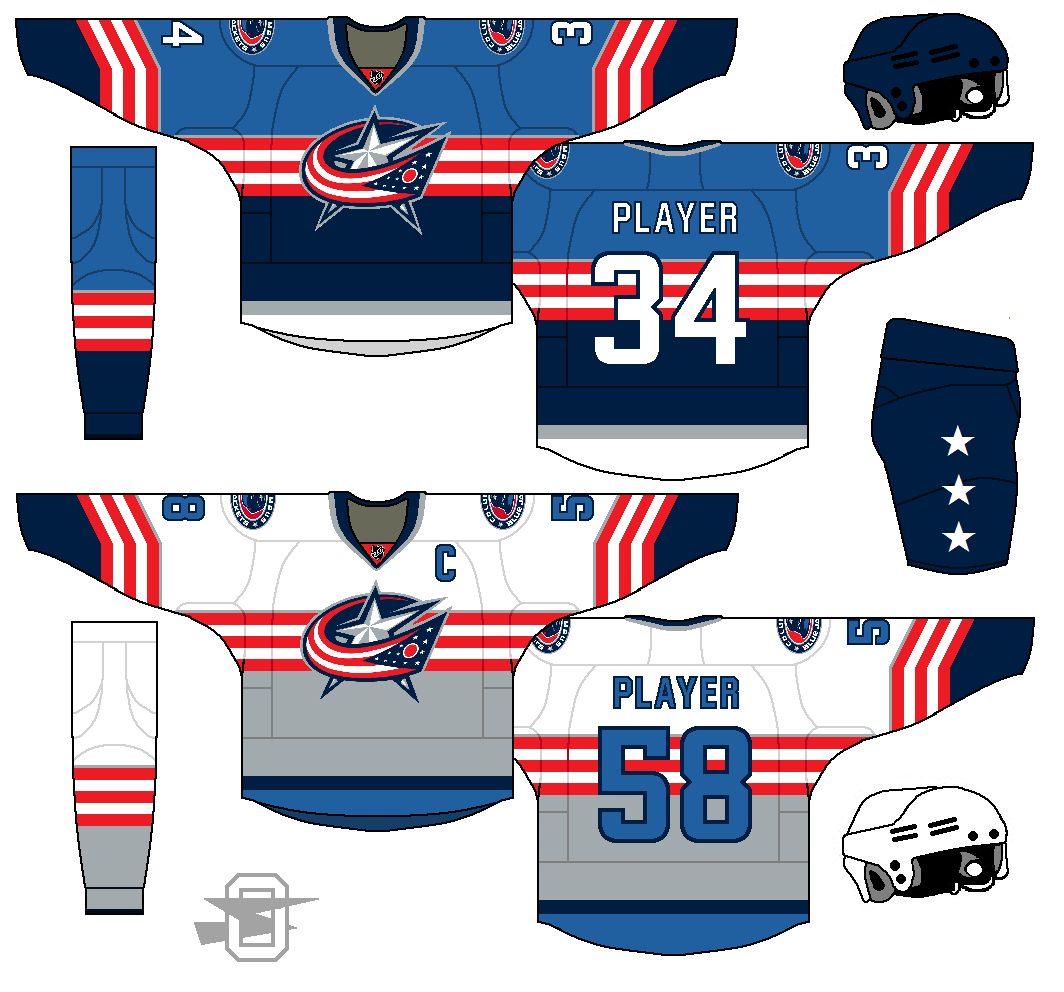
Love the work OldSchool. Some really ingenious ideas here, though I'm not huge on the Columbus road jersey, I'd stick to white. I know it isn't matching with the home if you do that, but it'd still be close enough where I think it could work.
Yeah, you may be right... I might have forced the gray into there for the idea of it. I'll revisit it.
-
Dude stop using strips on all the jersey. Like same thing for every team. So simple anyone could cold come up with it. Just so boring see the same thing 50 thousand times
I haven't used even one strip. Stripes? Oh, hell, yeah, lots of stripes, but I've made it a point to avoid strips at all costs.
Also, is "could cold come up with" some new slang? I'd like to know for sure before I start dropping it into my conversations.
-
4
-
-
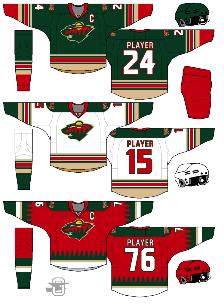
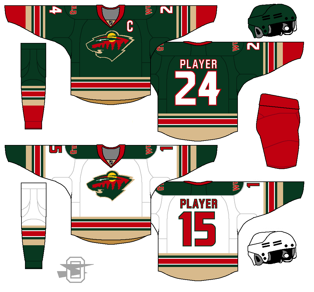
I like what you've done with the Wild. It's a look that doesn't malign what works with their current look, and tries to include all of their main colors effectively. I do agree with the other posters that the stripes on the green and white sweaters do need reduction, and I'll add that the font really doesn't work with the look (the Wild's old number font would be perfect) and that the red pants don't really work with the set (green breezers would look better). Other than that, I really like what you've done with the NHL, especially the simplified Ducks.
I was starting to think the same about switching the red breezers to green (especially since it would work so well with the alt) so your comment just pushed it over the top for me. Here you go...
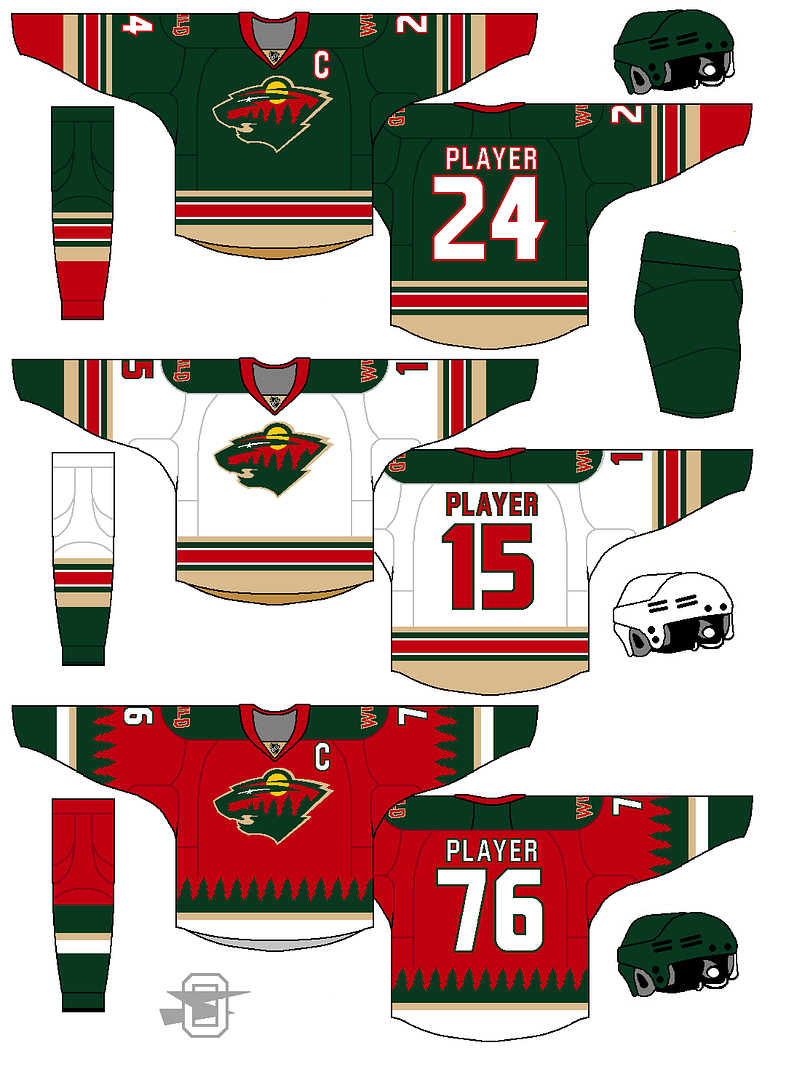
As for all the stripes... I'm going to be stubborn a little while longer, I think. There's an internal logic to the stripe pattern that works with other elements on the uniform, although maybe I'm the only one who can see it and/or cares.
-
2
-
-
Thought of an idea for an alt so I added it.
And, yes, I'm aware it looks like a Christmas sweater. Who doesn't love Christmas sweaters?
-
1
-
-
-
Can I make a suggestion for when you do the Florida Panthers?
Sure.
-
-
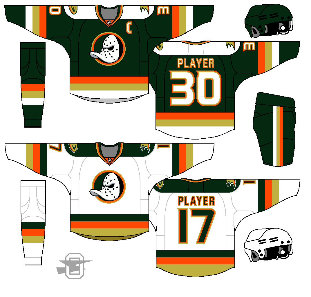
I've always loved the old duckbill goalie mask... I'm a sucker for cartoon mascots, in general. So I wanted to use it, but looking at the original it seems a little busy now... the mask was backed by a circle, and a triangle, and two crossed sticks... too much. So I simplified. As for the color scheme, I just went with the current, swapping out the black for a very dark green.
And here it is...
-
3
-
-
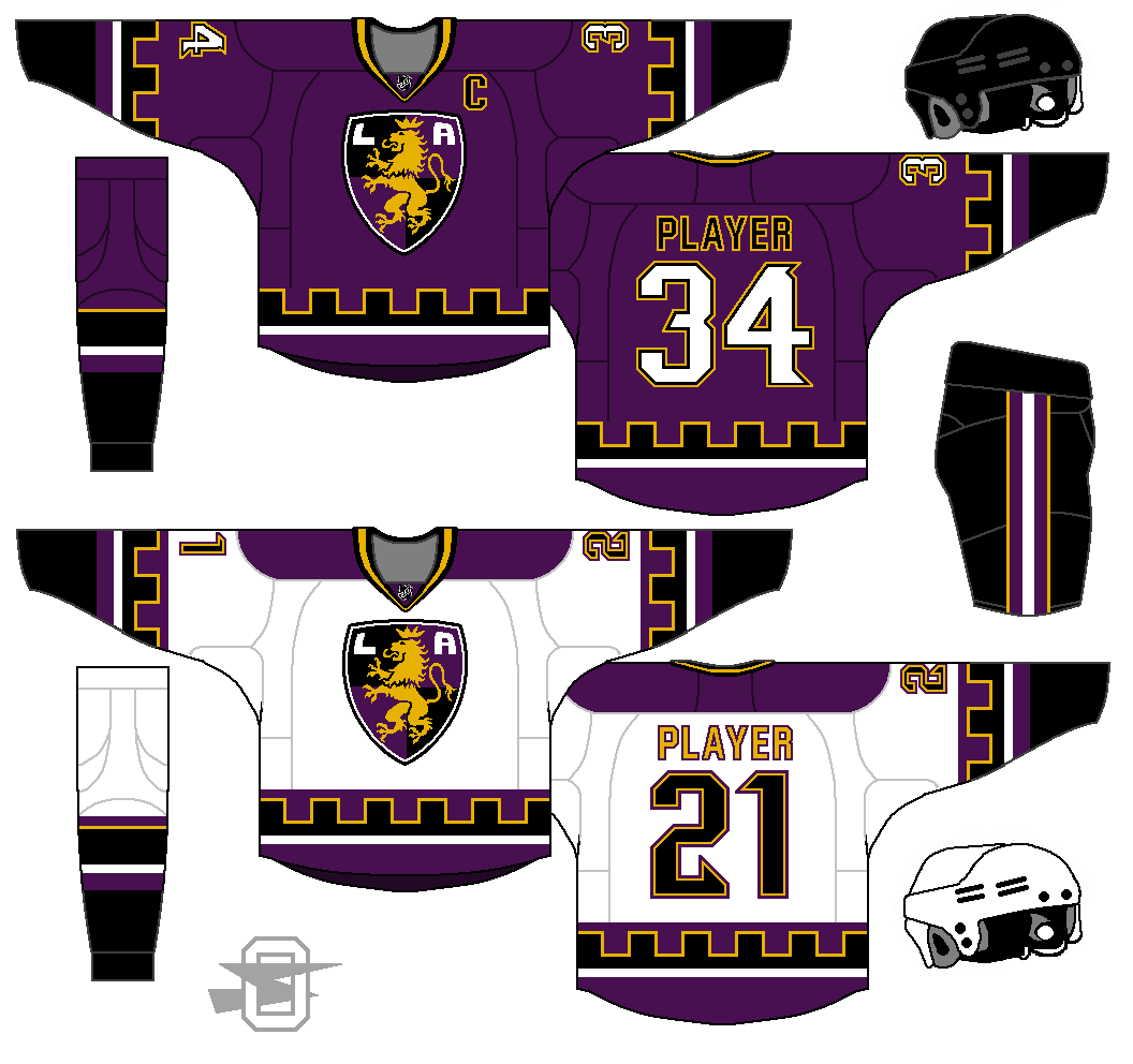
IMO, purple and gold > purple and silver > purple and black.
-
3
-
-
The logo could also use a small amount of purple to tie things together. I still like what you did overall. That's a take on their identity I haven't seen before, and the 'purple moon' shoulder patches are a fantastic tie-in to their inaugural look. Looking forward to seeing the update with desaturated purple!
Here it is with a slightly darker and duller purple. I've tried a few times to shoehorn some small amount of purple into the logo, but disliked every attempt.
-
1
-
-
I just don't like how the purple stripe is below the black zigzag on the home, and above it on the away. It's just a striping inconsistency
This was my thought process for that... I knew I wanted to get more of the dark red onto the white uniform, so I replaced the purple elements from the dark jersey with the maroon. ThAt meant adding a purple stripe above, or their wouldn't be enough purple IMO. I gave up a little stripe consistently for better color distribution.

Oldschoolviking's college football concepts - Golden Gophers added
in Concepts
Posted
*Update*
This is an old thread I made a few years ago, dedicated strictly to Big Ten uniforms. I've decided to re-purpose it into a general thread for all my college football concepts. The first few pages will be just the older B10 uniforms, then I'll combine in a few other older non-B10 stuff, and going forward it will be what ever college concepts I come up with.
IMO the current multi-uniform craze that's been strangling college football for the past 7 or 8 years now, has reached a point of maximum stupidity. At one time, you could argue that it was cool to be one of the teams that pulled off some unexpected out-of-the-box alternate look (I'd probably argue that it was never all that cool, but you could argue it was)... but now? When 4th tier nobody teams hit the field in chrome/matte/charcoal/pattered silliness "Jumped the Shark" doesn't even begin to cover it.
With that in mind, I'm remaking the 14 teams of Big Ten, each in a solid signature look. Each team gets just one home jersey, one road jersey, one helmet, one pair of shoes, one pair of socks, and a maximum of two pairs of pants. IMO if the elements are most clearly what each team should be wearing nothing else is needed.
I also wanted to put each team into a Nike template, the idea being that, if the conference was united in this "one best look" concept, they should also be united in a single template.
With that... here we go!