


oldschoolvikings
-
Posts
10,513 -
Joined
-
Last visited
-
Days Won
194
Posts posted by oldschoolvikings
-
-
23 hours ago, Has2916 said:
Those Blues jerseys are really well done! Great idea, playing on the theme on the mid-90s jerseys.
I don't know if the number font suits the jersey though. I suppose it's similar to the font used in the time of written music, but it just doesn't work IMO.
That was the basic idea, but I might have to agree with you that it doesn't have a particularly strong look. Maybe i'll try a few different fonts.
-
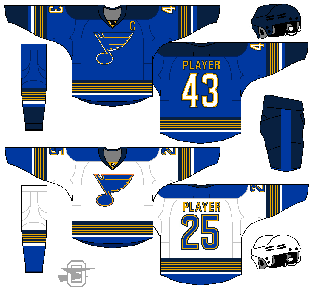
Trying to come up with an idea for the Blues, and looking at an older (and pretty ugly) uniform...

IIRC, the striping was supposed to bring to mind the bars on sheet music...

Interesting idea, but badly executed IMO. But as a general idea, I thought I'd give it another go...
-
 3
3
-
-
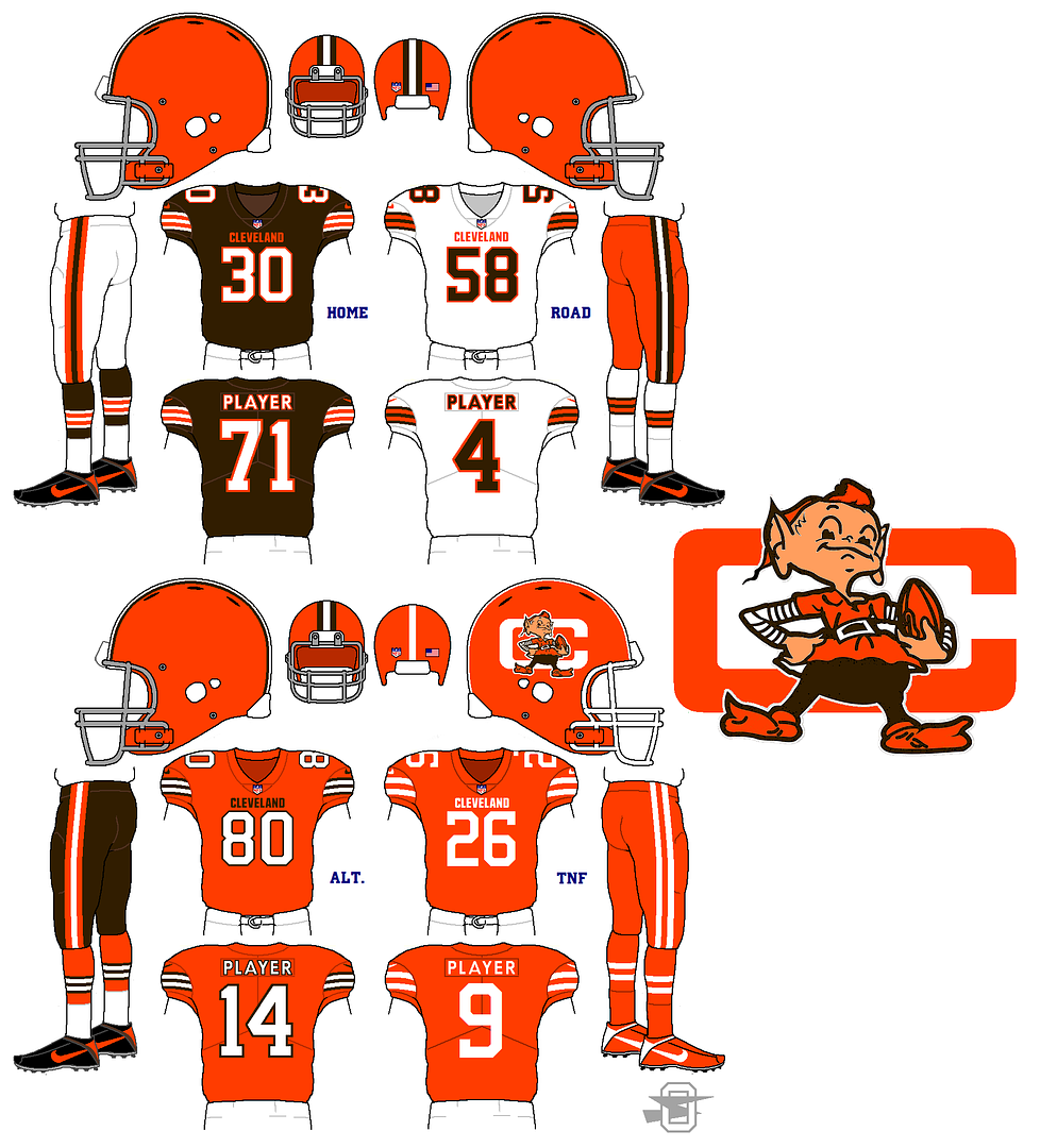
It's been a while...
-
4
-
-
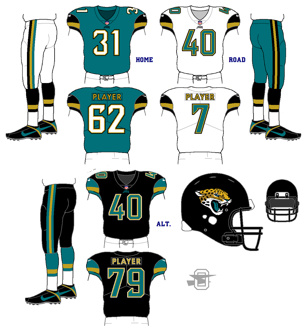
With the recent discussion of possible (and much needed) changes coming to the Jacksonville Jaguars, I thought I'd dust off an older concept and do some slight updating. This is a pretty much straight forward update on their first look from the 90's. I'm keeping the current logo and number font, but everything else is inspired by their first uniform.
-
5
-
-
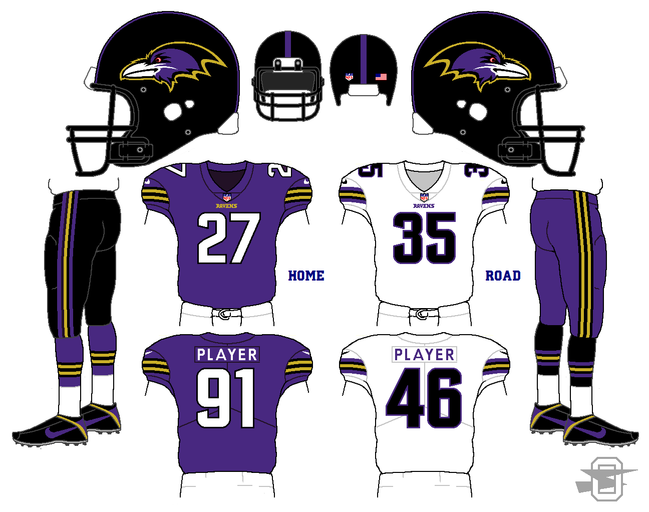
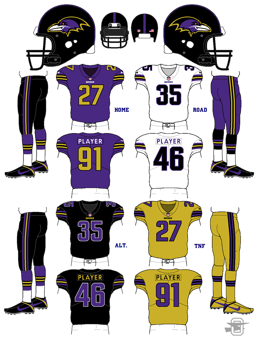
On 11/4/2017 at 10:23 PM, DeFrank said:
I really like the broad color combos you chose for the Ravens. I also really like the logo change. I really don't like the use of gold though. Really feels like a bad use of the gold, which I thought should stay relegated to tertiary status.
Here it is with white numbers... what do you think?
-
1
-
-
Thoughts appreciated...
-
3
-
-
A couple new things...


-
3
-
-
On 10/12/2017 at 7:13 AM, Heitert said:
I enjoy all of your work and that Eagle's concept is stunning.
Thanks!
-
-
2 hours ago, 8BW14 said:
It looks good. I love that there's minimal white on the colored jerseys. I think I would match the helmet stripe to the stripe on the black pants.
Not a fan of the gold color rush. Ideally there wouldn't be a need for it, but maybe something that fades from black up top to purple on the bottom would be a cool and unique look.
2 hours ago, osctheg said:That would be one of the bad color rushes.
So, one of the normal ones?
I'm not really a fan of any color rushes, but if you're gonna play that game, here you go...
-
1
-
-
C&C appreciated.
-
1
-
-
-
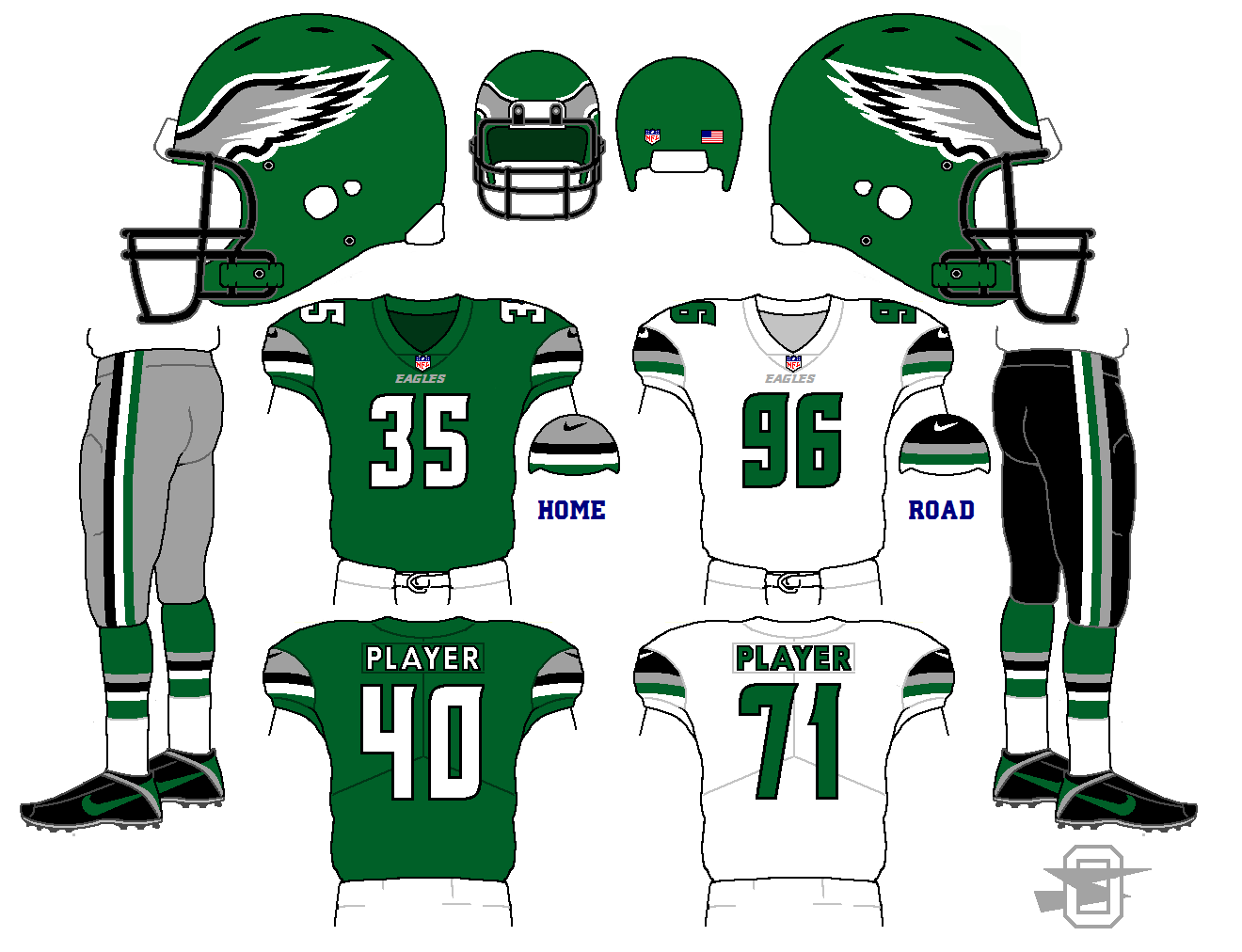
I'm a big fan of this year's Oregon looks. Especially this helmet color and finish;
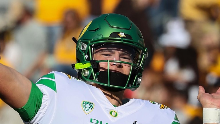
I love that color. With that in mind, here's a Philadelphia Eagle uniform that I'm picturing with that specific green, and that helmet finish;
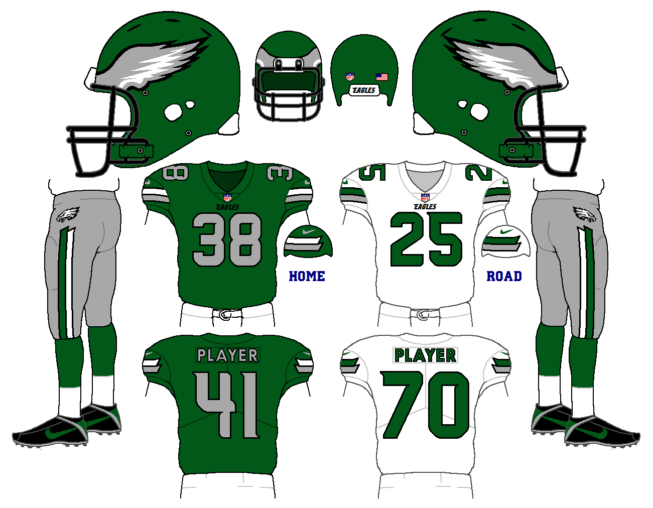
Thought appreciated.
-
7
-
-
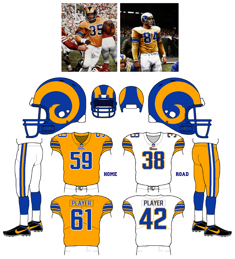
I know a lot of you would probably flip the home and alt, but I remain a sucker for those 50's gold jerseys...
-
2
-
-
I'm not saying I'd necessarily want to see this actually happen, but sometimes that old Michigan Panthers' helmet just gets in my head;
-
2
-
-
Updating a top 5 all-time great NFL uniform;
-
1
-
-
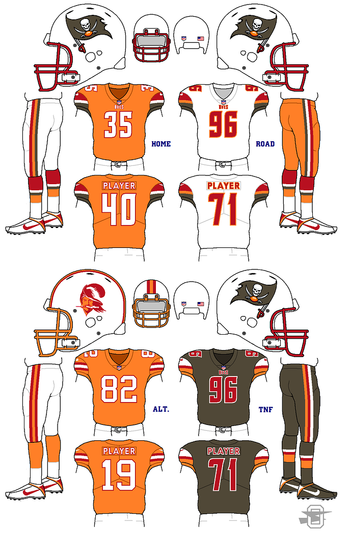
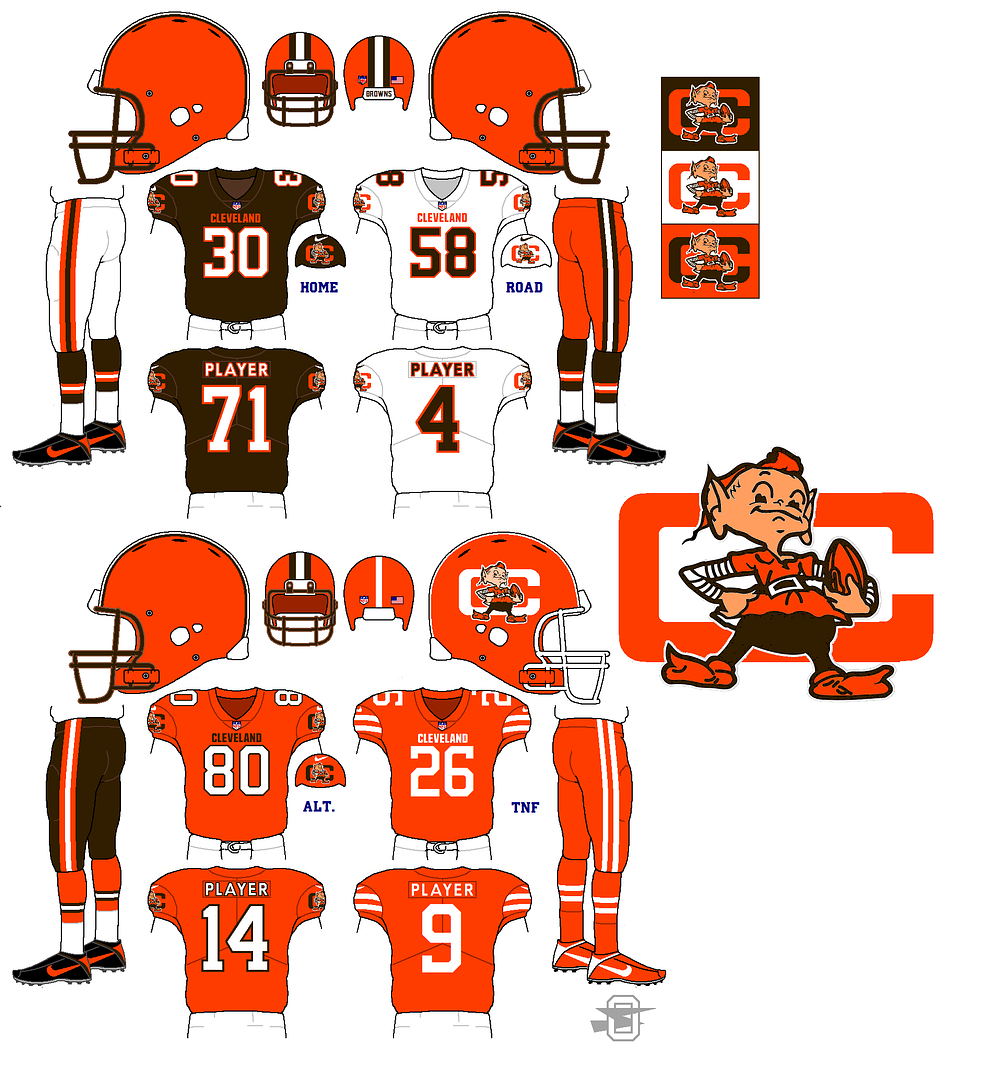
10 hours ago, SplashBoogie said:
I'll never understand why everyone is so in love with the Creamsicles. They weren't good uniforms and they weren't a good team wearing them. But if you must, this is a pretty inoffensive way to give them the throw back option. I echo the home base needing to be red and keeping the orange solely for the alt. I'd keep the flag red too.
I never had an overwhelming love of the creamsicles until this disastrous redesign. I guess the current Buccaneers look has soured me on the whole red and pewter look. And for me, a red jersey paired with white helmets and pants would be out of the question... boring. The white/orange/white is looked back on fondly because it's unique, and at least as a color scheme, attractive.
-
9 hours ago, MCM0313 said:
Ooh, all-pewter alt, I like. I'd make their primary home red though.
You don't miss the creamcicle Bucs?
-
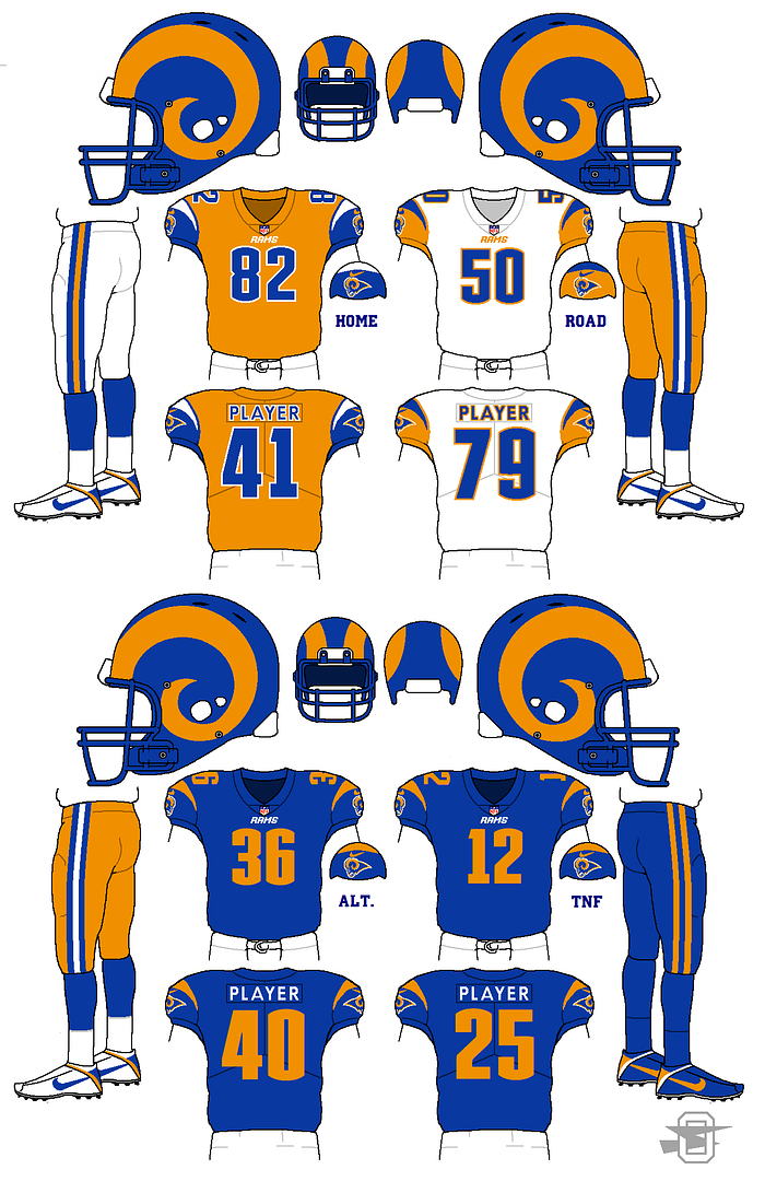
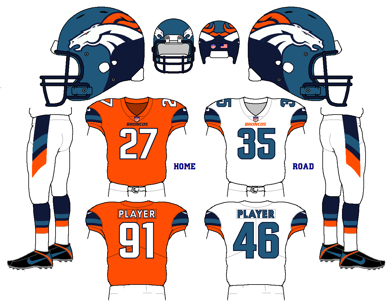
Another Buccaneers' concept. This one gives them the chance to use a throwback;
-
4
-
-
I think that on the road, a baseball team can wear whatever color jersey the want, but they need to wear pants that match. Sky blue jersey? Ok, sky blue pants. Navy blue jersey? Ok, navy blue pants.
How did we get to a place where monochrome uniforms are common place in football, but disappearing in Baseball? Cats are sleeping with dogs!
-
1 hour ago, ItDoesntMatter said:
I like the idea of throwing back to those uniforms, but (at least the way you've done it here) it reminds me way too much of the 49ers. I really like the rest of the set though.
I can see that.
-
5 hours ago, MCM0313 said:
Regular home and road look good. Not sure about the alt or the Color Rush.
Yeah, IMO "just OK' is about as good as a color rush uniform is gonna get.
As for the alt., it's a throwback to this;

-
37 minutes ago, ~Bear said:
I'd make the navy a tad-bit lighter then. It looks too close to black. I actually thought it was a BFBS uniform at first.
OK... it looks lighter on mine screen, but I can definitely tweak it.
-
51 minutes ago, FightingGoldenDevil said:
That color rush looks too close to black. And I hate bfbs uniforms
Well, it's navy, not black. Which is one of their colors.
-
1
-

Oldschoolvikings' NHL concepts - Ducks added, trying out more weird colors
in Concepts
Posted
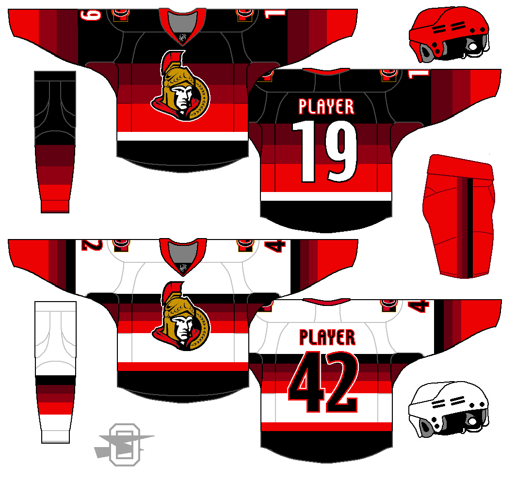
It has come to my attention (via a thread on this site) that the team is very possibly in the process of phasing out this logo as a primary. It seems it's somewhat unpopular with the fanbase and, if you think about it, doesn't make a ton of sense for a team called the Senators to be represented by a Roman soldier.
Anyway, here's the same concept with a different logo...