


oldschoolvikings
-
Posts
10,513 -
Joined
-
Last visited
-
Days Won
194
Posts posted by oldschoolvikings
-
-
Anyone? Can I even manage to just annoy someone?
-
 3
3
-
-
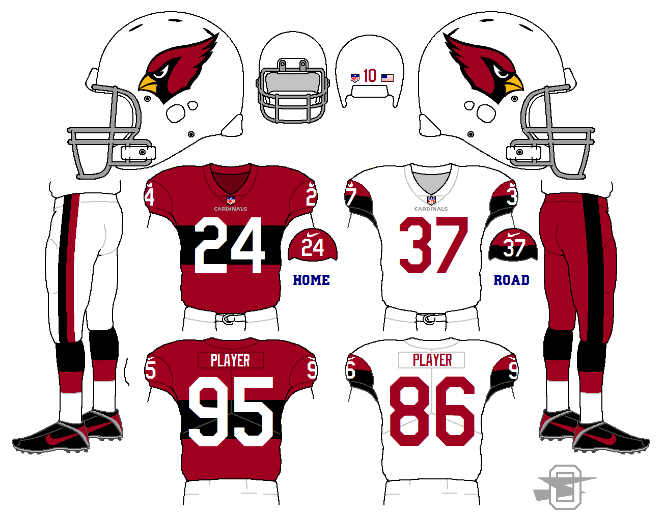
2 hours ago, 8BW14 said:
This Cardinals concept is really cool. I love the big chest stripe. It's a throwback look to way way back but it feels modern too, which is a perfect look for one of the oldest teams in the league.That number font works perfectly too.
That's exactly what I was shooting for so it's nice to hear. Thanks!
-
1
-
-
-
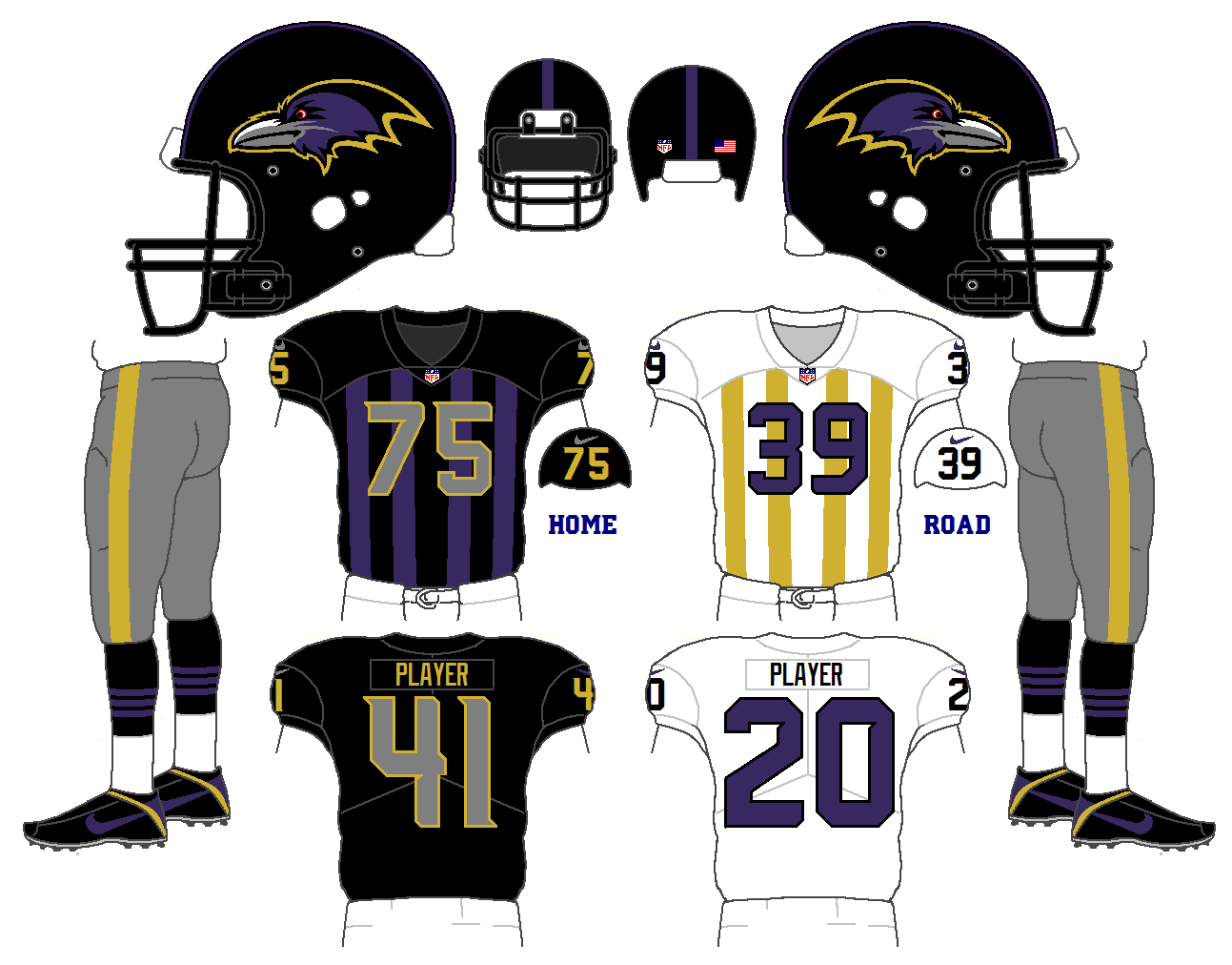
Now that they've won the Superbowl in that nasty dark blue-green color this will never happen, but here it is anyway;
-
5
-
-
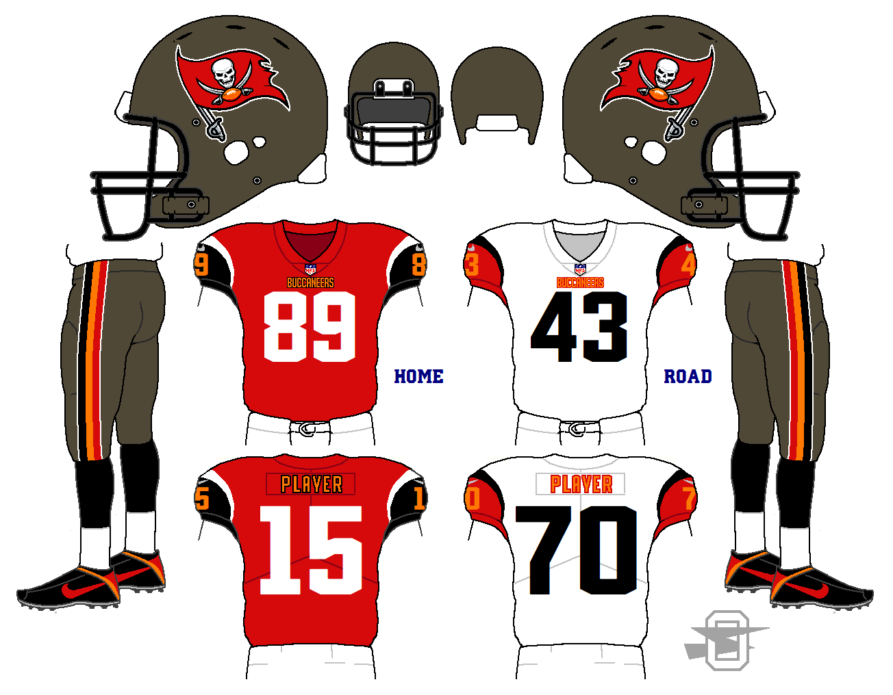
Latest Buccaneers... working with my current jones for single layer numbers;
-
1
-
-
Two new ideas for the Jaguars, based on the discussions going on over on the main board.
First, a newer look, with the idea of emphasizing teal and gold at home, and re-emphasizing black on the road;
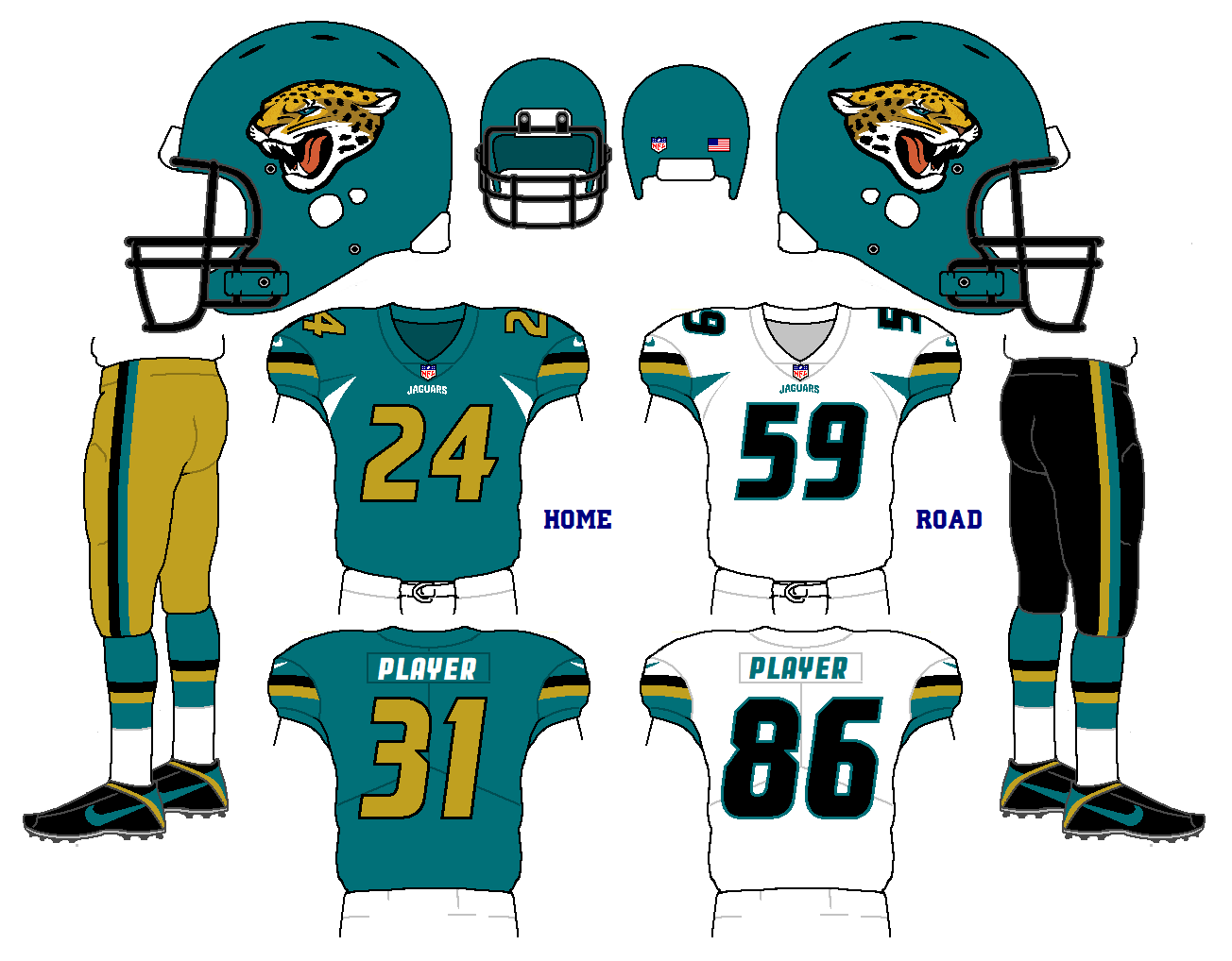
Then having finished this one, it occurred to me I could use the same basic idea in a way that's closer to what the Jags have done before;
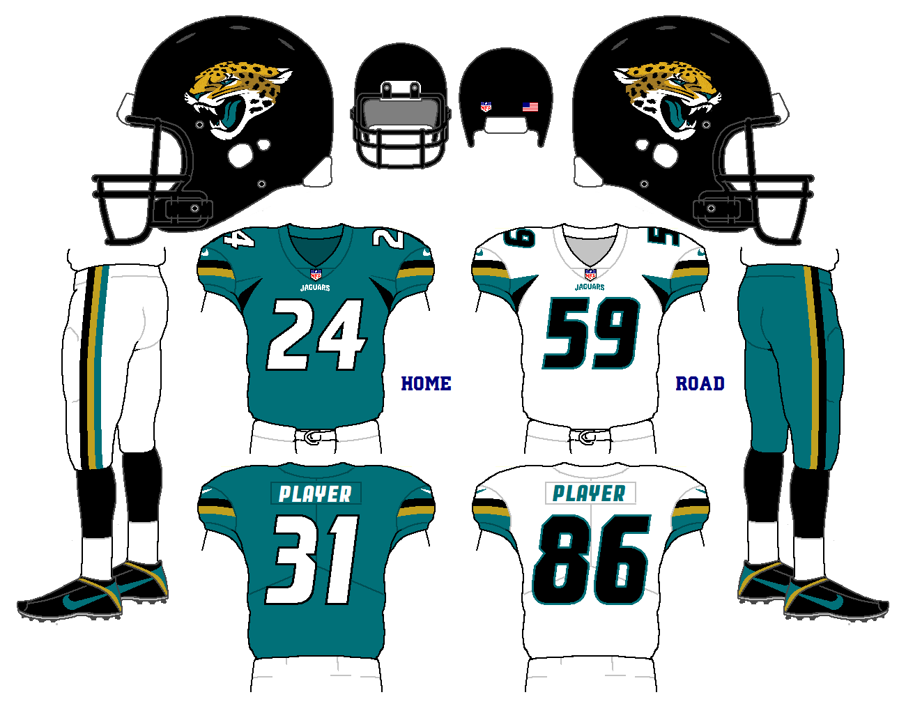
Thoughts and ideas appreciated...
-
1
-
-
So I came across a few old images of Johnny Unitas from his college days t Louisville...

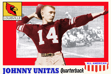
Admittedly, it is not much to go on, but since I hate Louisville's current uniform set, I thought I'd try out a fauxback;
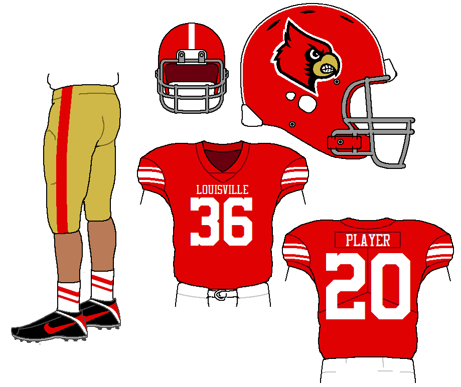
Pretty simple, I know, but this is a team that could certainly use some simplification.
-
2
-
-
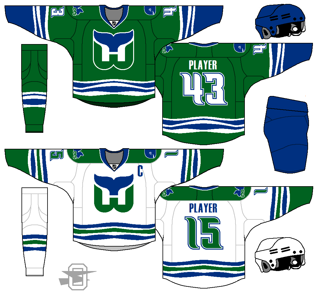
10 hours ago, Zeus89725 said:
Those Whalers jerseys are really good looking. What I'd do, though, is fill in the area underneath the waist striping, just like ya did with the arms, just for consistency's sake.
Yeah, that would be more consistent. I just have this weird aversion to having the color at the bottom jersey stripe match the color of the pants. I just always want a contrast of color there.
-
Not sure how anybody else will feel about it, but I had a ton of fun making it.
-
5
-
-
Try it again with the gold dropped;
-
10
-
-
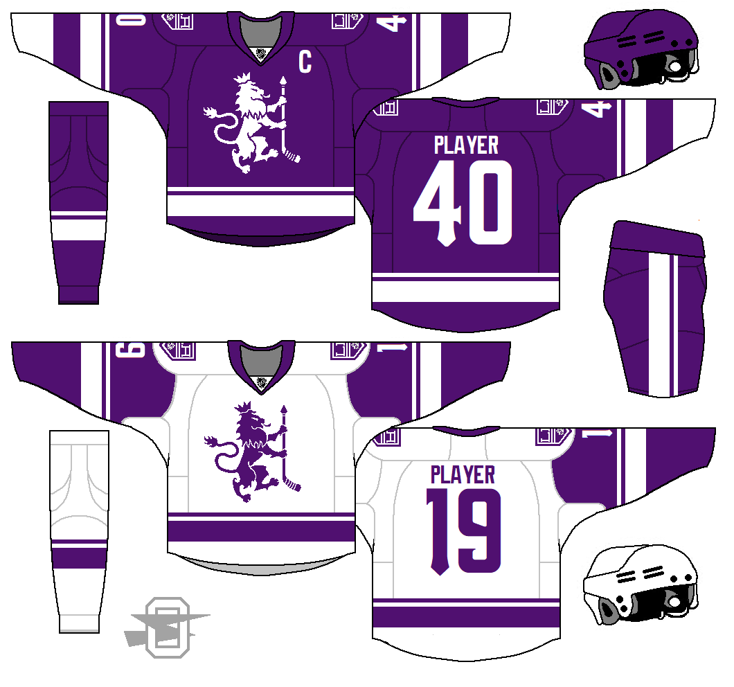
ANOTHER Kings' concept.
This is a team I just keep coming back to... purple and gold.
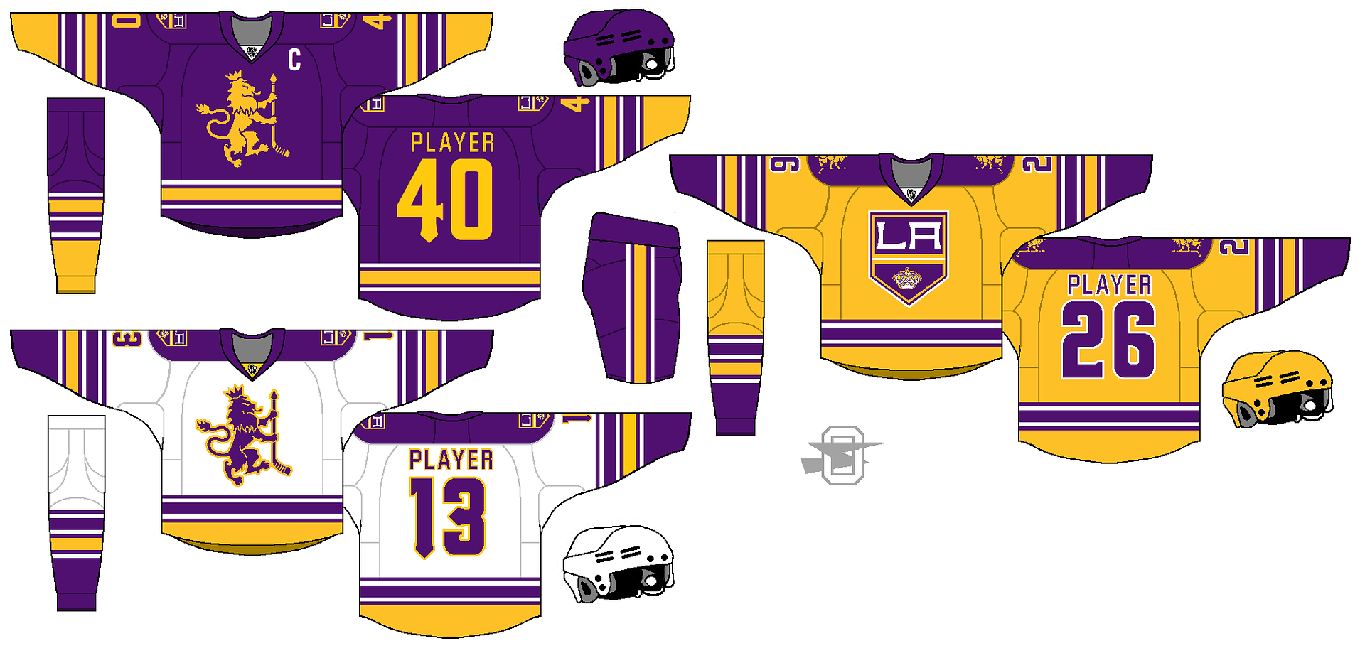
-
8
-
-
New Falcon idea, updating the Steve Bartkowski look;

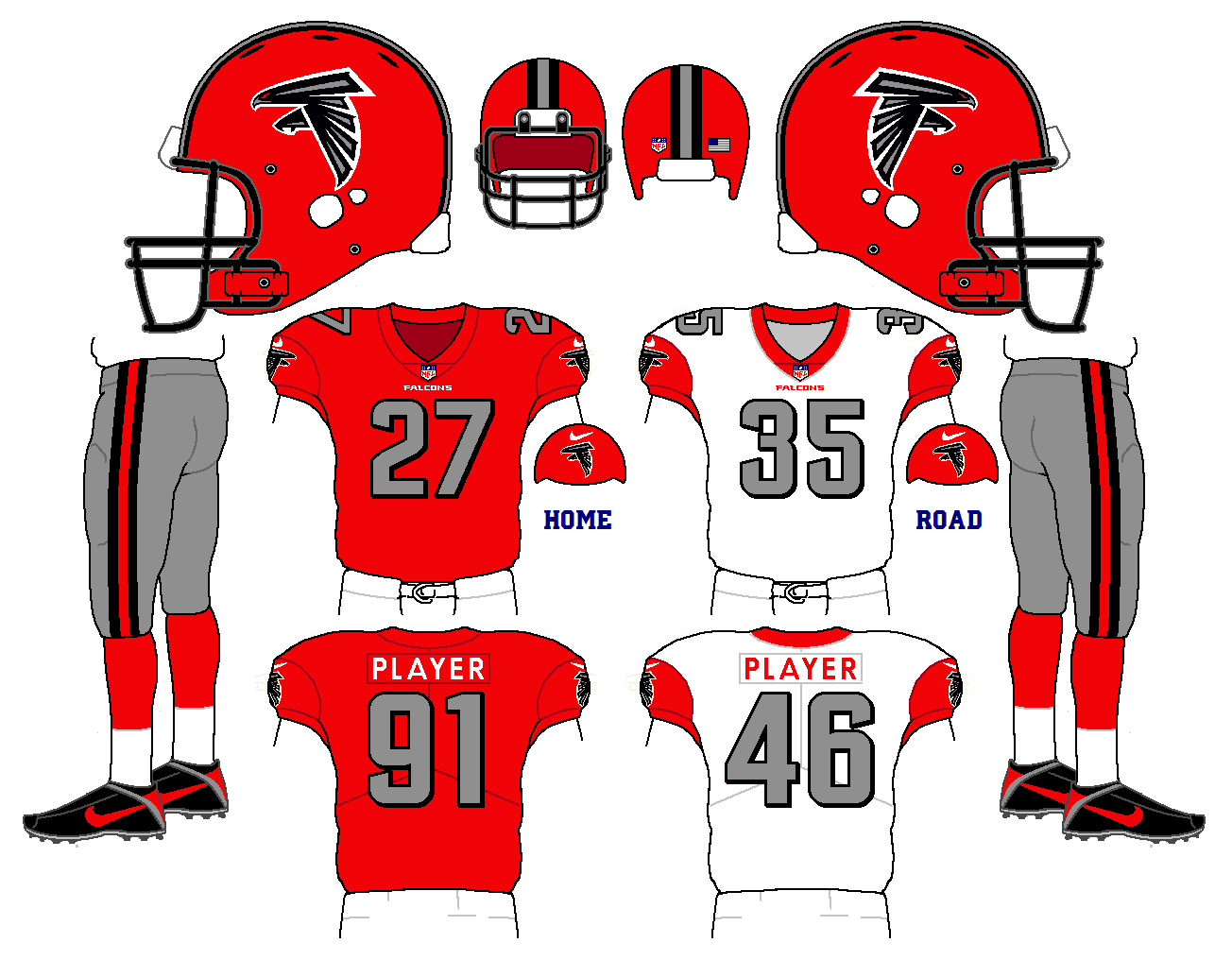
-
1
-
-
3 hours ago, MCM0313 said:
How about gold instead of red for the alt? I don't think they really use red as more than a trim IRL.
I thought about it, but honestly, I can't think of one Vegas gold jersey that works.
Plus, there's this;

-
1
-
-
Looking at this hurricane symbol;

And, obviously, the
San DiegoL. A. Chargers, I came up with this;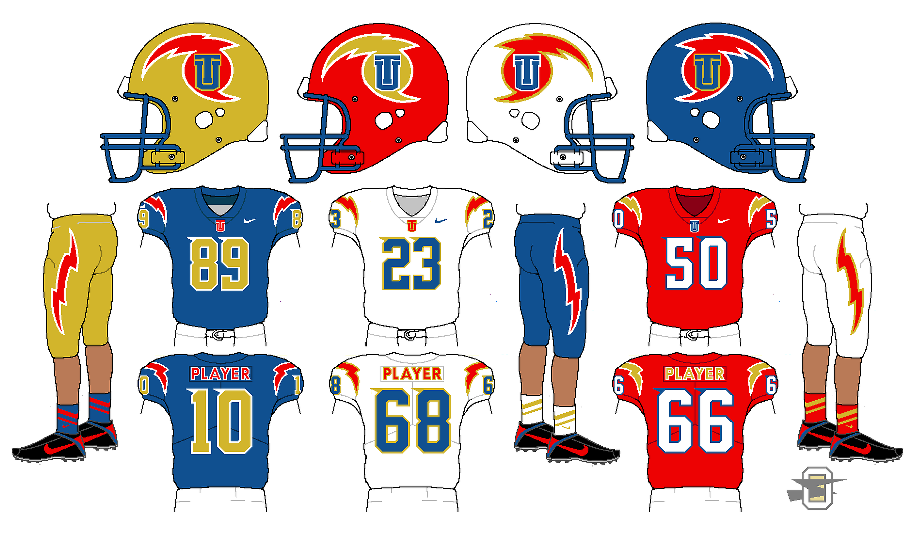
-
1
-
-
The logo is from Ren69's vintage logo update in the Concept section.
-
4
-
-
-
-
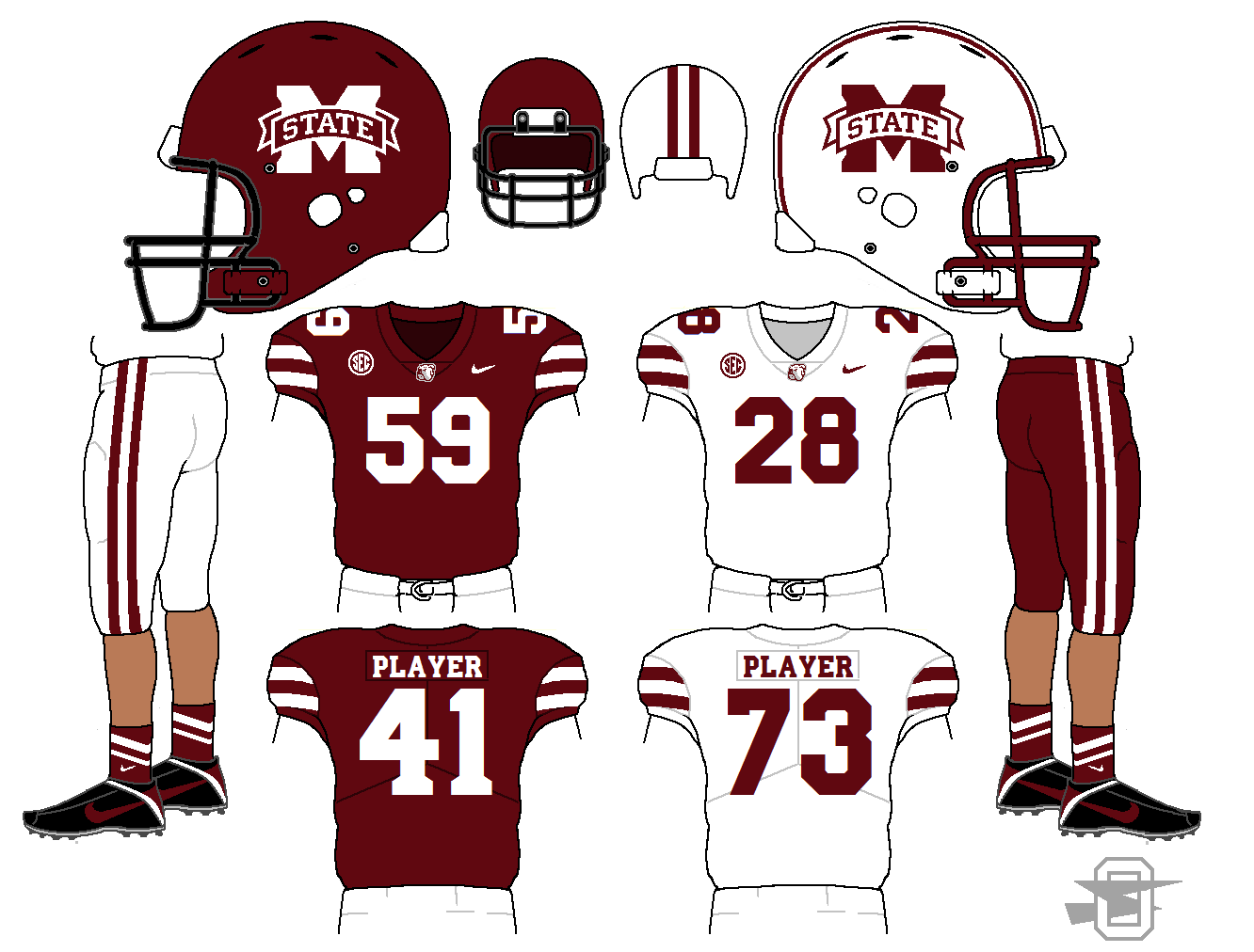
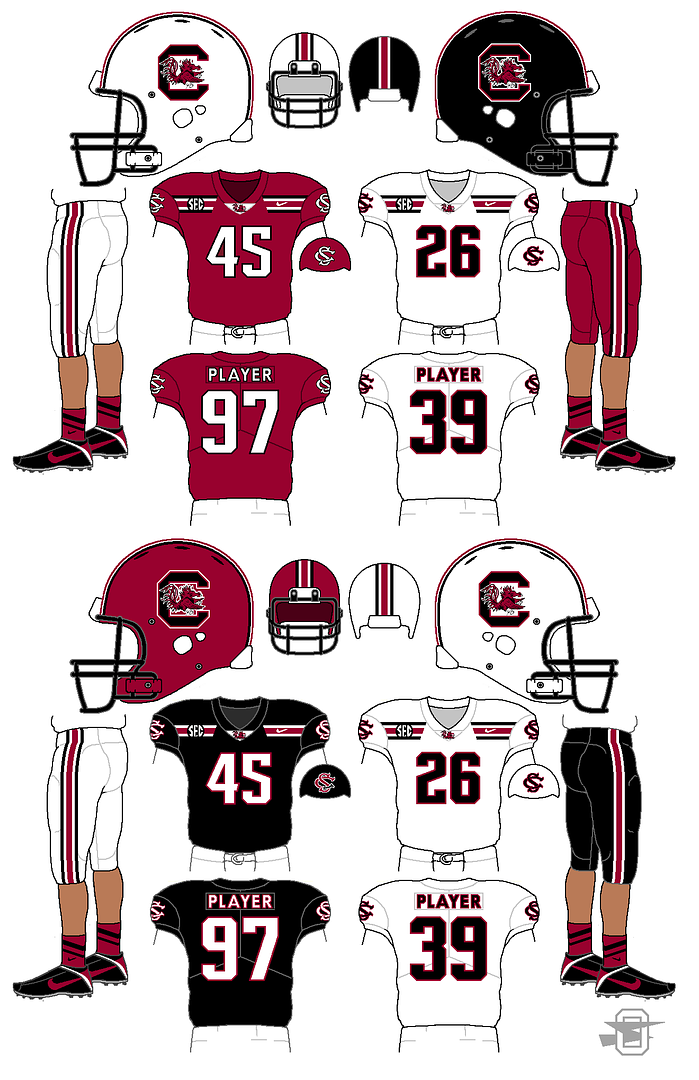
6 hours ago, Danny the Sheeb said:
Just one question: Why black masks for Mississippi State? There's no black elsewhere on either uniform.
I'm not sure, to be honest. I was just trying to differentiate all the different dark red over white teams... I guess I was going for a Minnesota Gophers thing.

I made that a while back now... I'd probably do something different now.
-
1
-
-
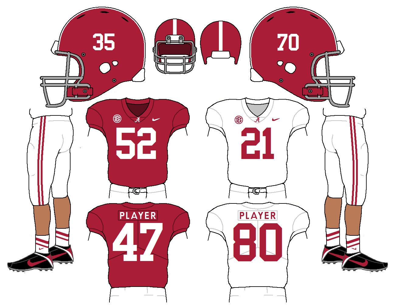
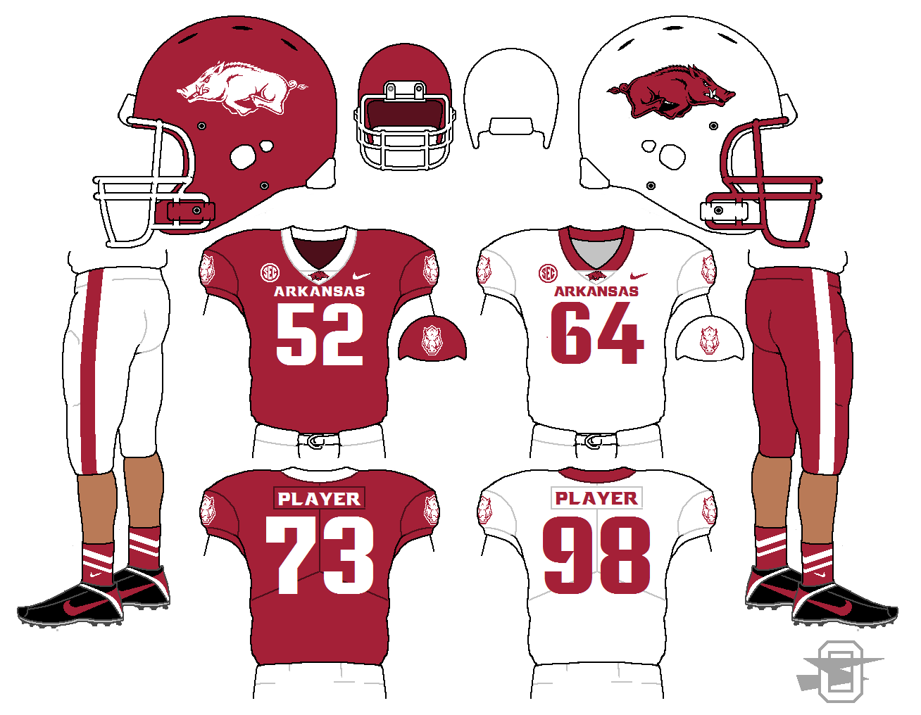
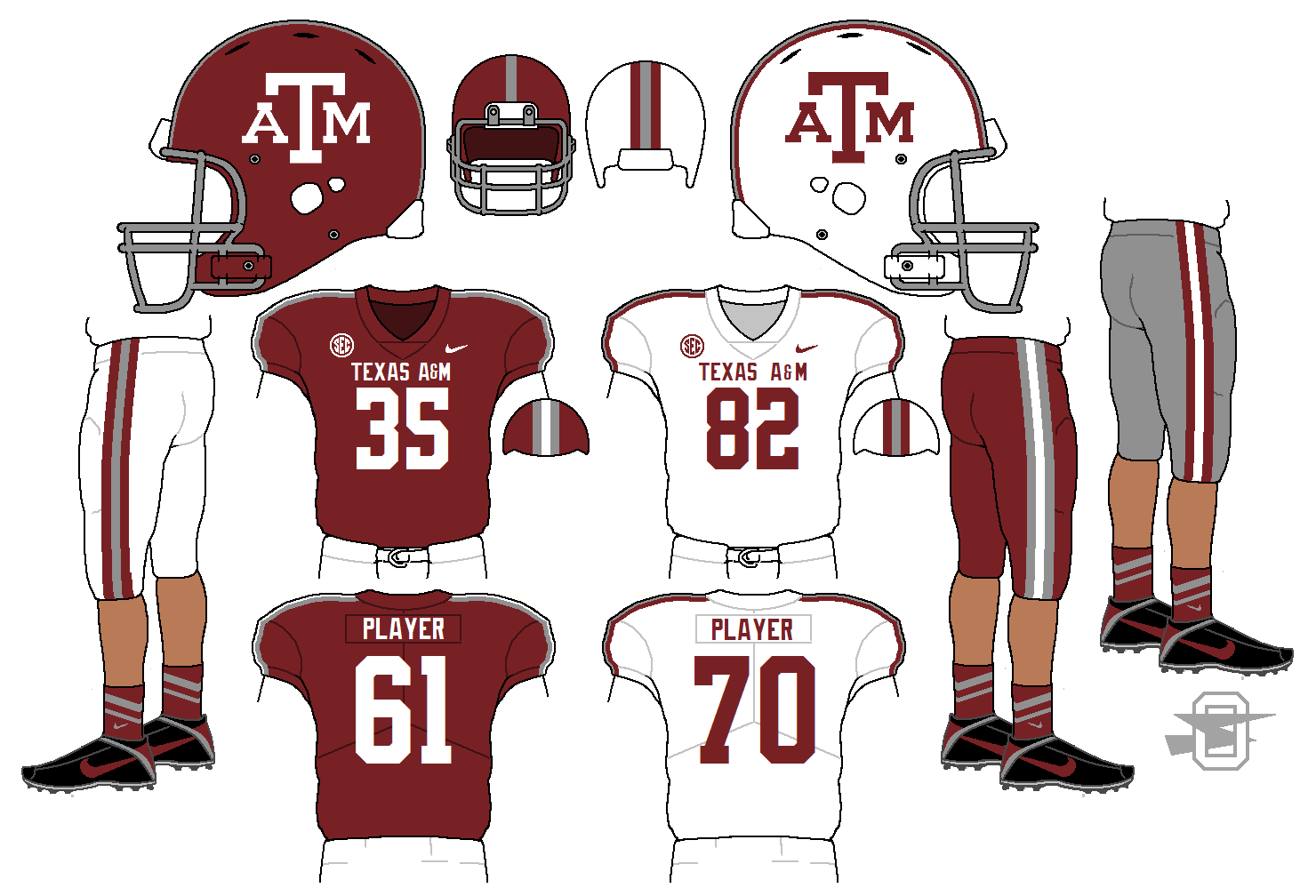
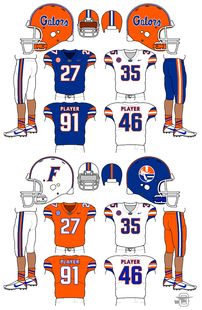
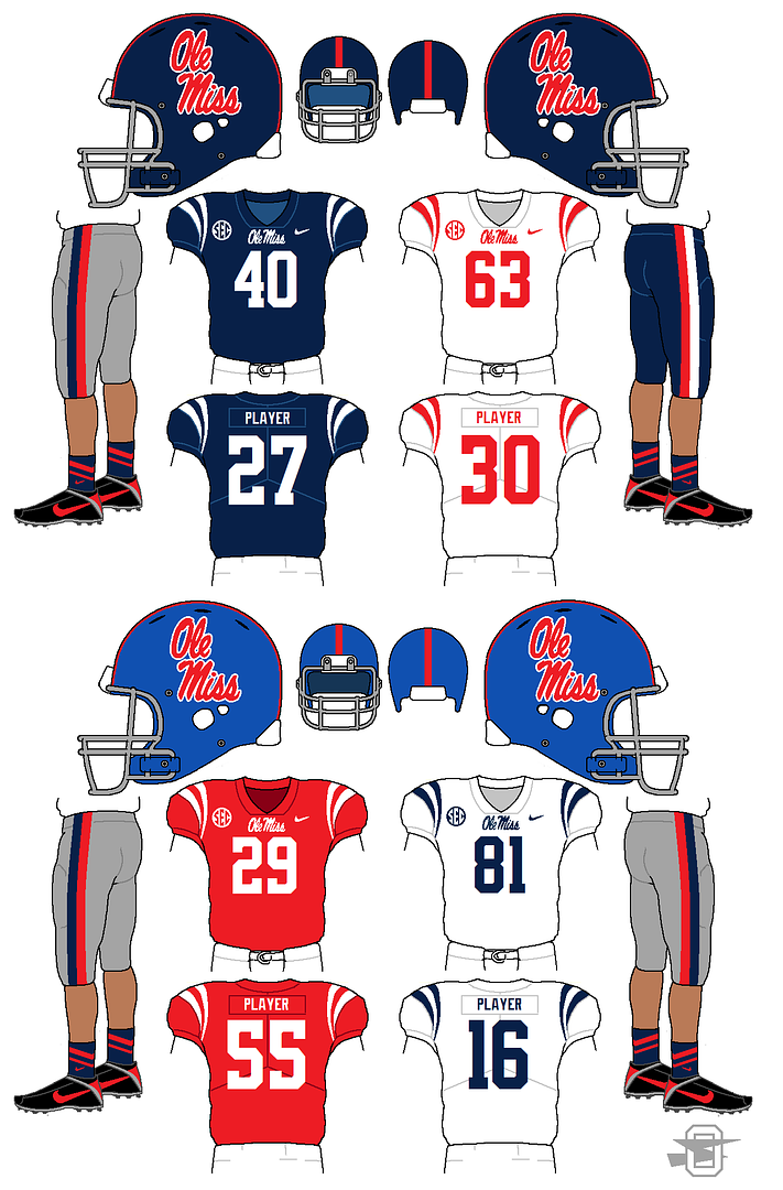
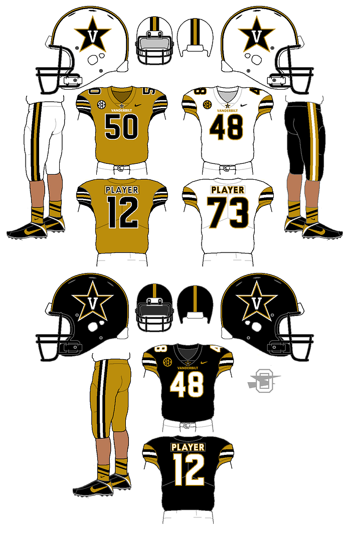
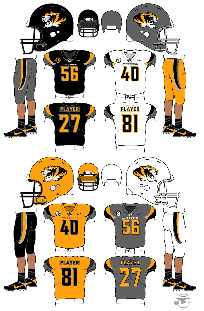
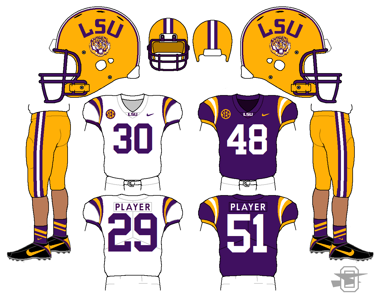
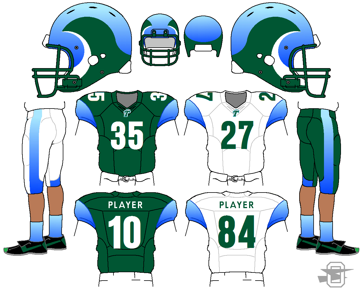
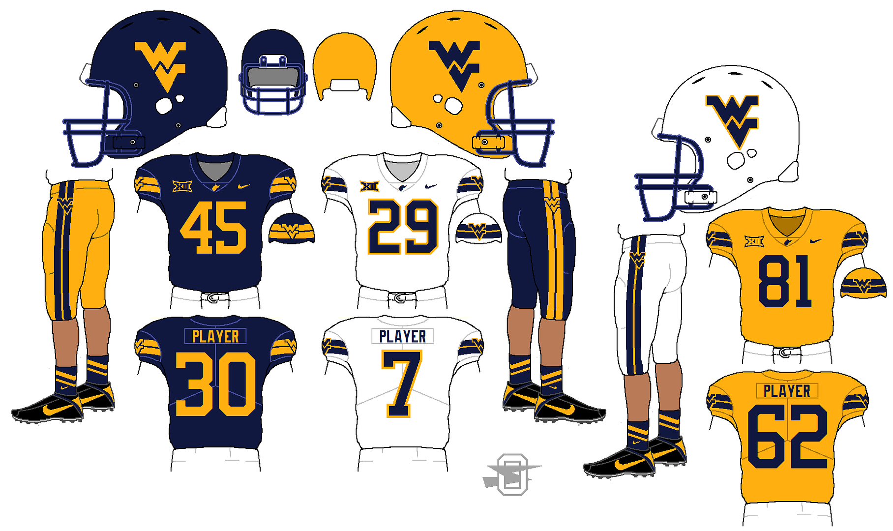
I've always been interested in the fact that the SEC has four teams wearing uniforms that are dark red helmets and jerseys over white pants. So similar, but each with it's own character. How do you keep them unique without over-worrying about "looking to much like the other guy"?
-
1
-
-
-
-
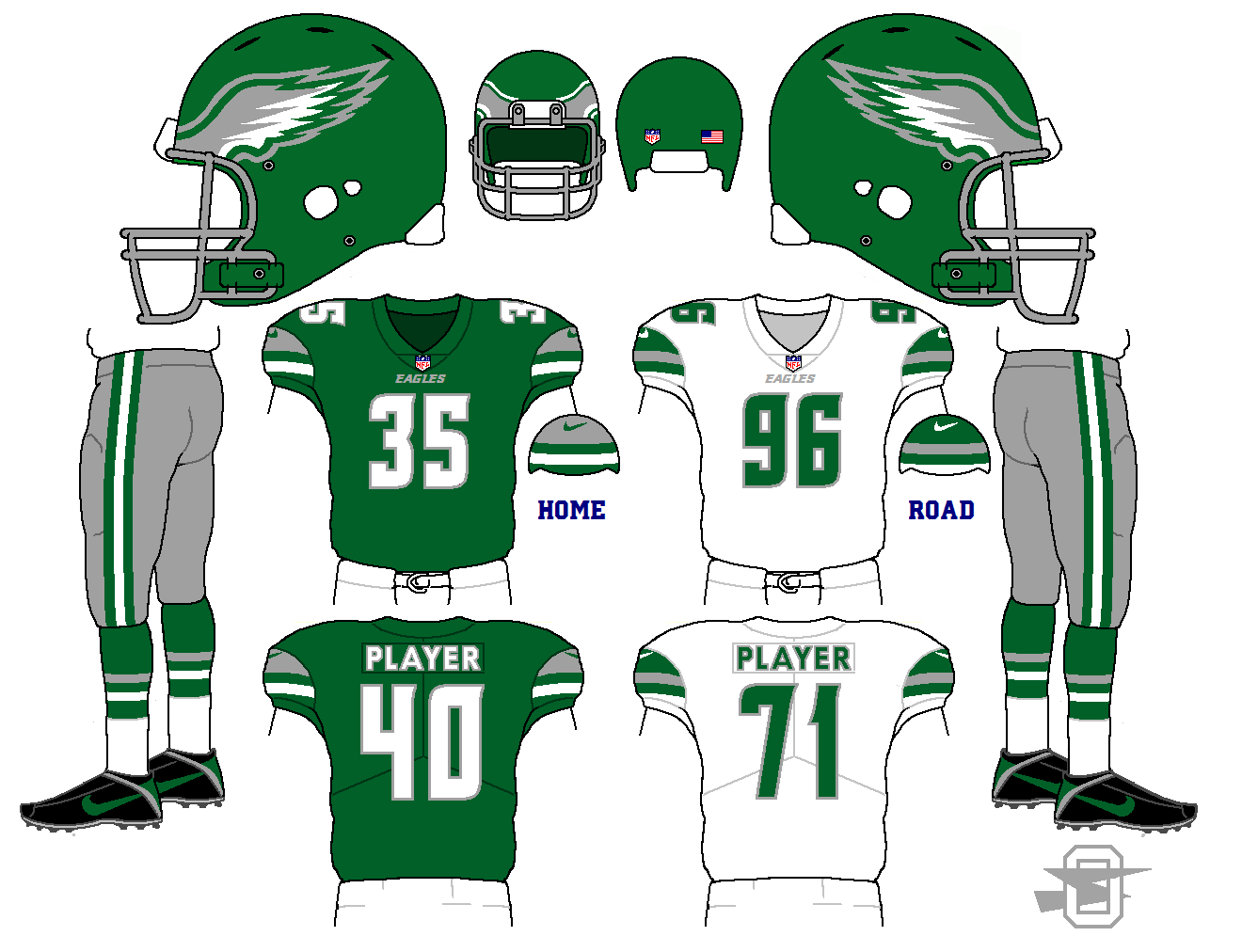
I will always be a huge fan of royal blue and kelly green...
-
-
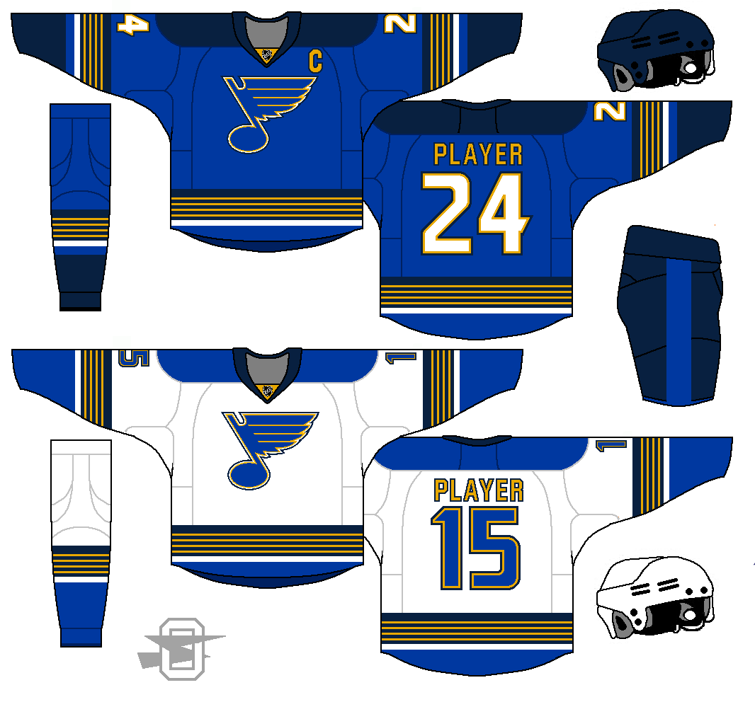
On 11/15/2017 at 11:47 PM, Has2916 said:
Those Blues jerseys are really well done! Great idea, playing on the theme on the mid-90s jerseys.
I don't know if the number font suits the jersey though. I suppose it's similar to the font used in the time of written music, but it just doesn't work IMO.
How about this one?


Oldschoolviking's college football concepts - Golden Gophers added
in Concepts
Posted
Kind of obvious, I guess. The PJ Fleck disaster made me want to do one.
I know I'll get hate for the logo on the white helmet, but what can I say... I'm a sucker for cartoon animal mascots.