


oldschoolvikings
-
Posts
10,506 -
Joined
-
Last visited
-
Days Won
193
Posts posted by oldschoolvikings
-
-
I kind of felt like I had no choice;
-
 1
1
-
-
On 3/10/2017 at 2:24 PM, oldschoolvikings said:
 14 hours ago, Zeus89725 said:
Not gonna lie, I like the logo a lot more. But to be honest, the jerseys don't look quite as good. I can't imagine them on the ice. I also think the yellow should be brighter, and less mustard-ish.
OK, I'm about to wave the white flag on the paw logo. I might try to save it as a shoulder patch, out of sheer stubbornness. I like the N-teeth, but it seems a little empty, so I might try to work with it a bit more.
As for the yellow-gold... it looked a lot brighter in my program, but posted dark... ill try to compensate.
Thanks for the feedback!
-
And here's the same uniform with a completely different logo idea....
-
2
-
-
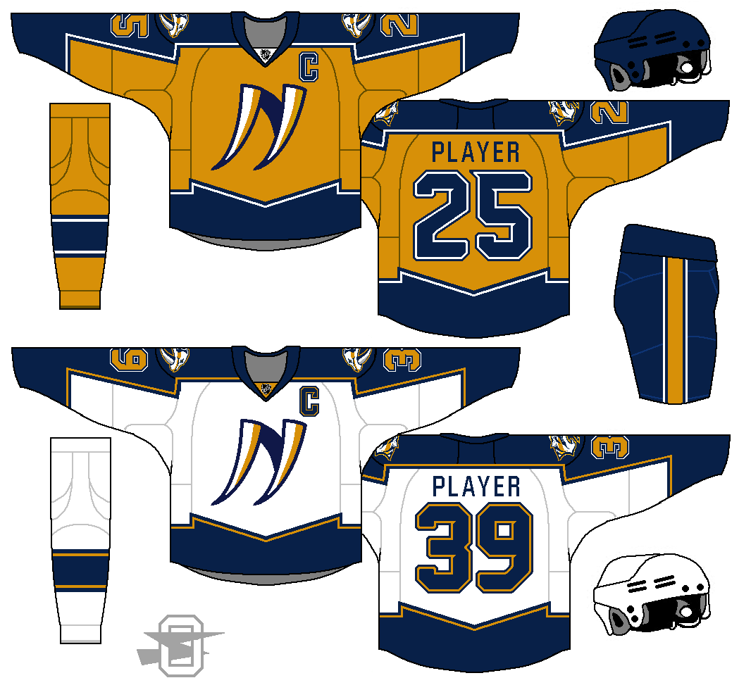
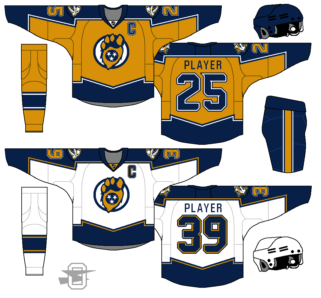
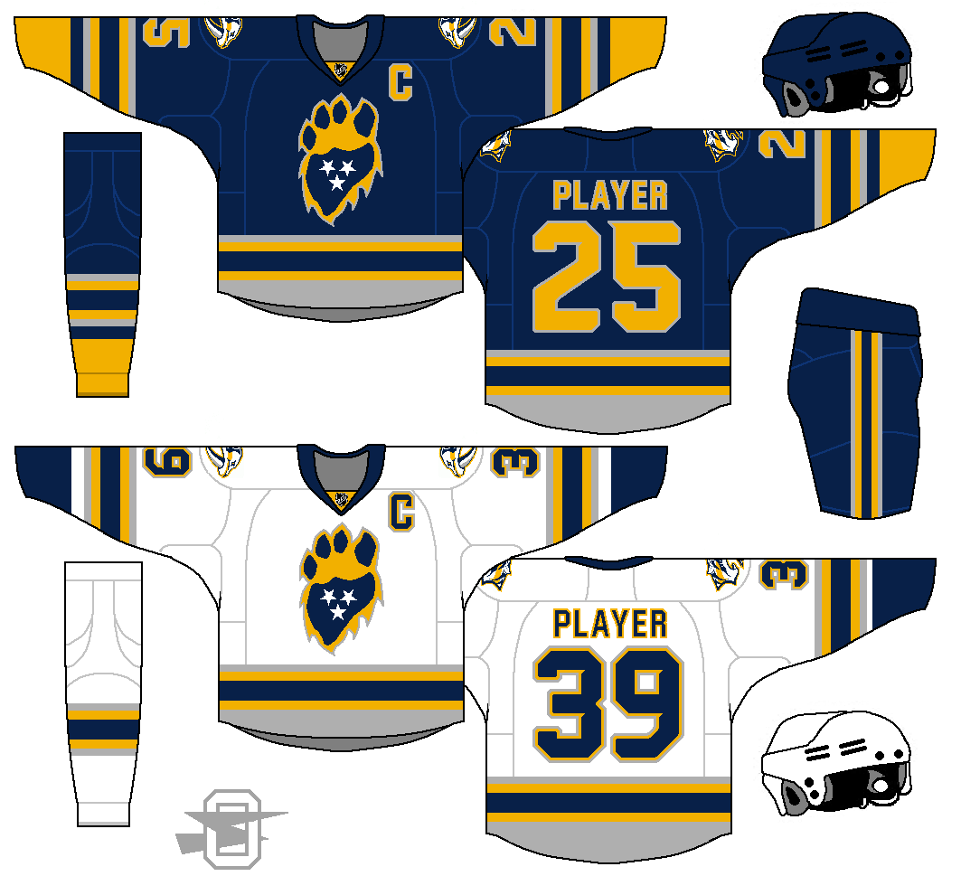
OK... here is take two on the Predators. I took everyone's advice about making the primary gold, and I'm glad I did. Also, dropped the silver... also glad I did. I'm still currently truing to save my Sabretooth paw print logo... I'm being stubborn. But I'm also working with some other ideas, so we'll see. Feedback appreciated!
-
12 hours ago, Zeus89725 said:
Here are my thoughts:
- The pawprint idea is a good one, but no one recognizes what a sabretooth cat's paw looks like. Without knowing about their current logo, it just looks like an oddly shaped bear paw.
- The jerseys are nice, but seeing as how Nashville has built a good identity around yellow, I think that should be the color for the dark jersey. Blue just doesn't seem like their color anymore.
- Lastly, I think there's too much of an emphasis on gray. It works well as an accent color, but unless you're the LA Kings, you won't be able to pull it off as a primary color.
This whole series has been pretty good, though. Just a few tweaks here and there.
12 hours ago, Bruins said:The logo is really unique (and I don't mean that in an underhandedly bad way), but it needs to be cleaned up a bit. The shape is just too unorthodox right now and doesn't really look like a paw. I think if you made the blue middle of it extend a little higher, towards the claws, and minimized the tufts and made them follow the angles more, that would improve it immensely. The jerseys look pretty good, but the colors scream Sabres to me. I would eliminate silver altogether on the uniforms and replace it with white, or at least decrease the amount of silver used. You've got something with the logo idea, just have to make some adjustments.
12 hours ago, Zeus89725 said:Thanks, guys, for the feedback. Good points all around, especially on the colors' similarity to Buffalo's. I hadn't really caught that because in my mind, the Sabres are a royal blue team to me (or at least, should be!), but now that you've mentioned it, I can't get it out of my head. I'll think I rework it to emphasize gold, and probably drop the GFGS.
As for the logo... again, good points. I knew all along that the footprint wouldn't be recognized as a sabre tooth tiger foot by anyone (who isn't a paleontologist, I guess) but I figured, since their team name is "Predators", not "Sabre tooth" I could get away with it. I think it does look like the print of some type of predator, and the sabre tooth connection to Nashville is inside knowledge anyway. Still, it could definitely get some reworking, I was just enamored with what I thought was the clever introduction of the Tennessee flag stars.
OK... back to the drawing board. Please check back in for the update and let me know what you think.
-
So, I've always hated the Nashville Predators' logo. I just think it's embarrassingly amateurish. It's kind of a cross between a Hanna-Barbara funny animal and an 80's heavy metal logo. So, I've avoided doing a concept for them, because I didn't want to use that logo, but I couldn't really think of a replacement. Then, while putting together a lecture (on cave painting, for an Art Appreciation class, strangely enough) I came across this image;
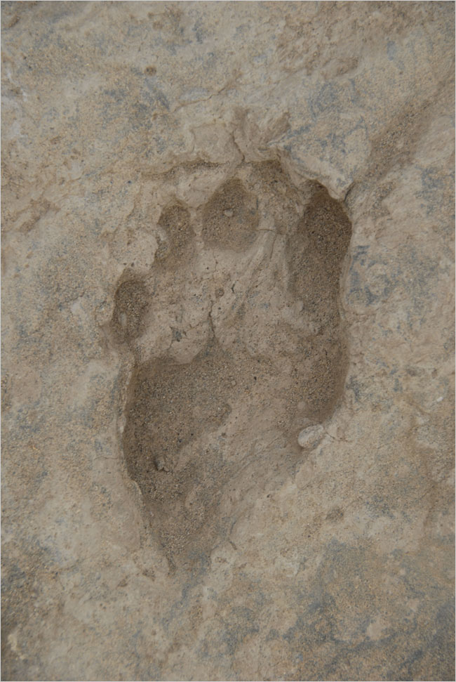
It's a fossilized footprint from a Saber Tooth Tiger, apparently. So I decided to work with that and came up with this;
(I kept the goofy cartoon cat as a shoulder patch, but I could get talked out of it.)
-
2
-
 1
1
-
-
23 hours ago, chcarlson23 said:
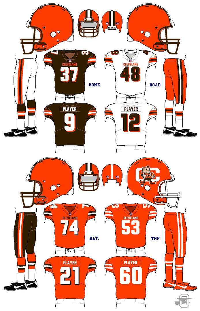
I love that Panther's set! Not sure how I feel about the Color Rush though...
Also the Cleveland color rush uniform should have a little bit of brown in it. I mean, they are the Browns after all.

I can see why someone would be annoyed by the lack of brown, but I wanted to do something other than just wear the orange pieces already provided. I was trying to make something unique from the other looks.
-
Not sure how we got this far without...
.svg/512px-Pirate_Flag_of_Blackbeard_(Edward_Teach).svg.png)


-
5
-
-
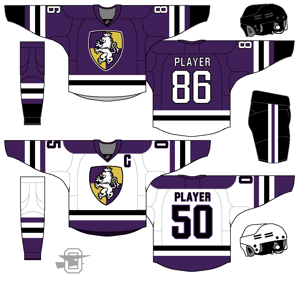
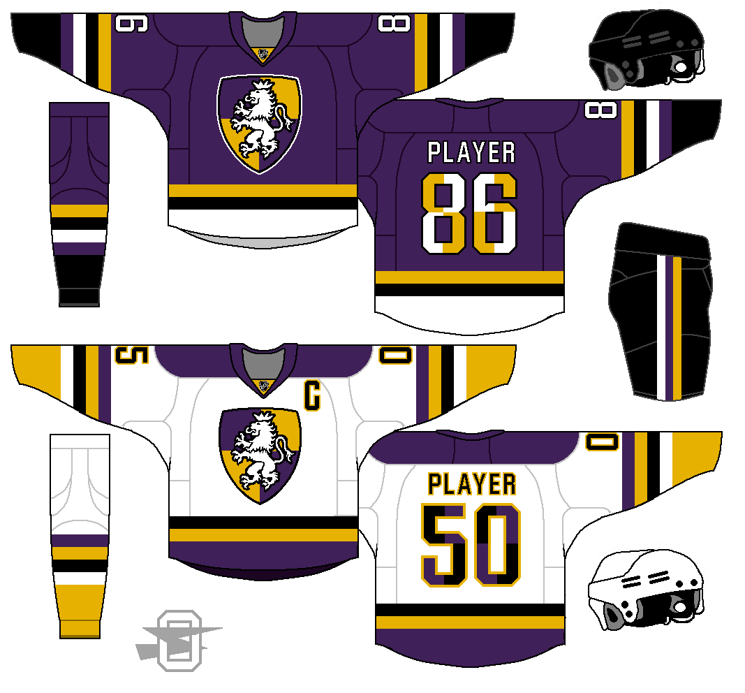
OK... here's a few variations on that Kings' design;
First, the I removed the black...
Then I brought the black back, but removed the yellow (replacing it with light gold in the logo)...
-
1
-
-
2 hours ago, 8BW14 said:
The color block numbers don't work. I think it might work with sublimation but I'd just scrap that idea since the uniform had so much going on otherwise
That was literally the last thing I came up with for that. I'm just in an anti-double-outline mood for numbers these days, and I thought it was a clever way to get all three colors onto the numbers and still keep a single outline.
I guess that's why we call them concepts.

-
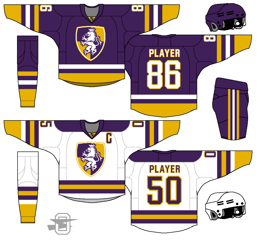
Here's another run at the Los Angeles Kings. I have an earlier one a few pages back... it's a little overdone, even for me. So, take two;
-
2
-
-
On 2/23/2017 at 11:40 PM, SFGiants58 said:
Canucks: I like what you've done with the template, and the color distribution is fantastic. However, I think using the full bodied-version of Johnny Canuck would really put it over the top. The Orca and the "Johnny Canuck head + v", while both fine logos, just don't do it for me. I'd also recommend adding green outlines to the numbers on the white sweater.
OK... I went with your idea on the full body Johnny... and I gotta say, I think you were right. This is pretty nice.
-
3
-
-
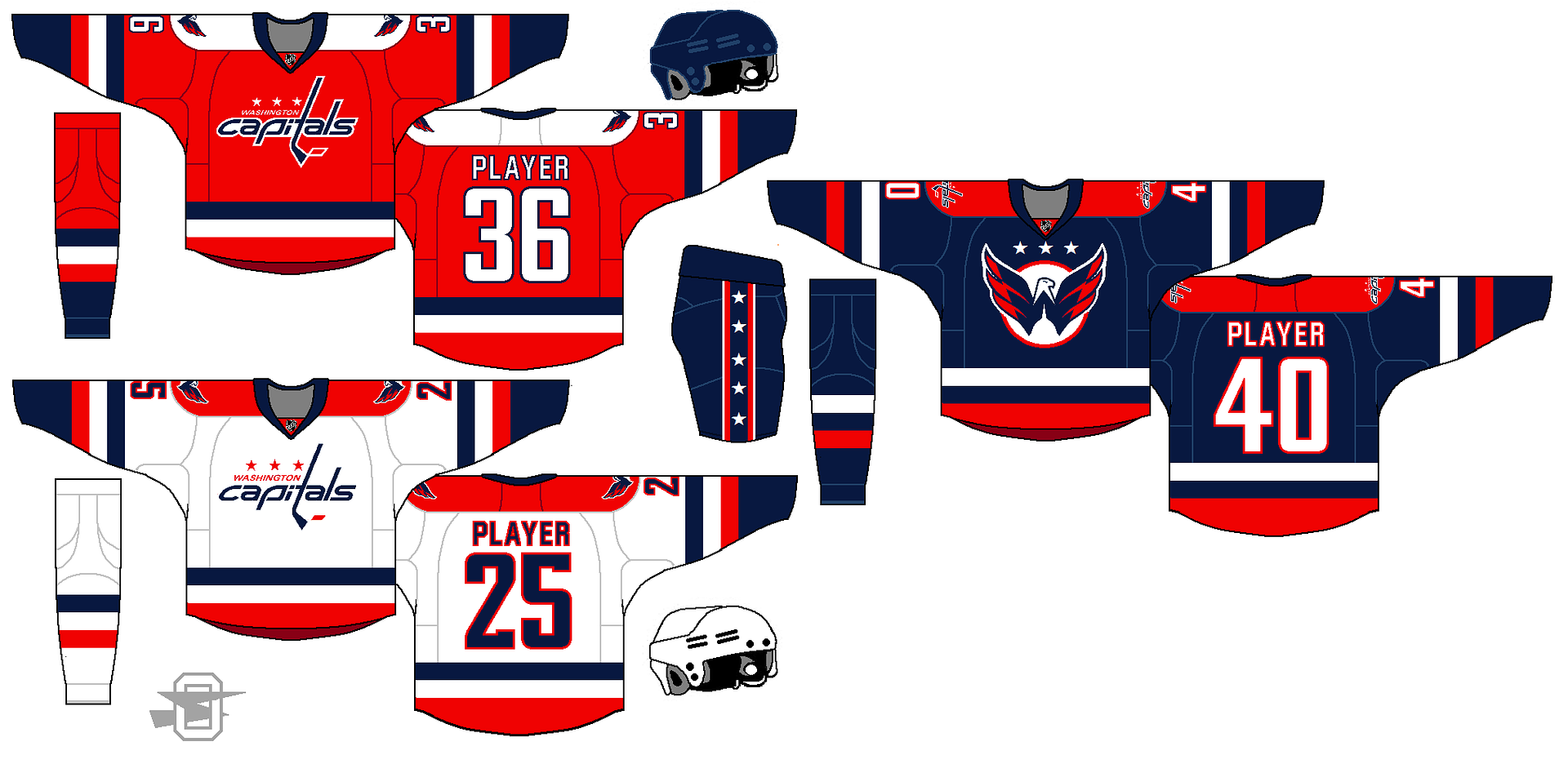
On 2/17/2017 at 10:57 PM, jujubeans said:
Weagel does not need a roundel.
On 2/17/2017 at 11:00 PM, Bruins said:Seconded
On 2/18/2017 at 11:32 AM, EJaws said:Thirded
21 hours ago, SFGiants58 said:I second the critiques that the Weagle on the third sweater doesn't need the roundel backing it.
Ok. I surrender.
-
8
-
-
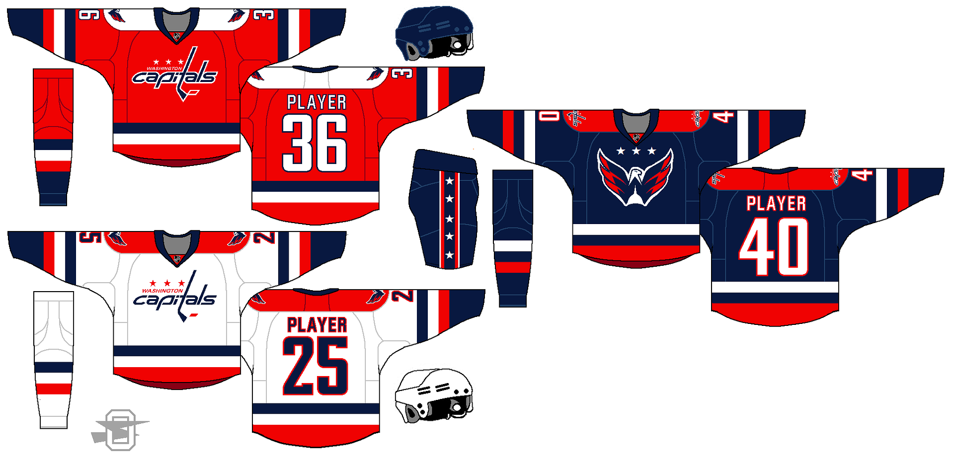
8 hours ago, SFGiants58 said:
I must say, you've really been on a roll with this latest batch of NHL concepts!
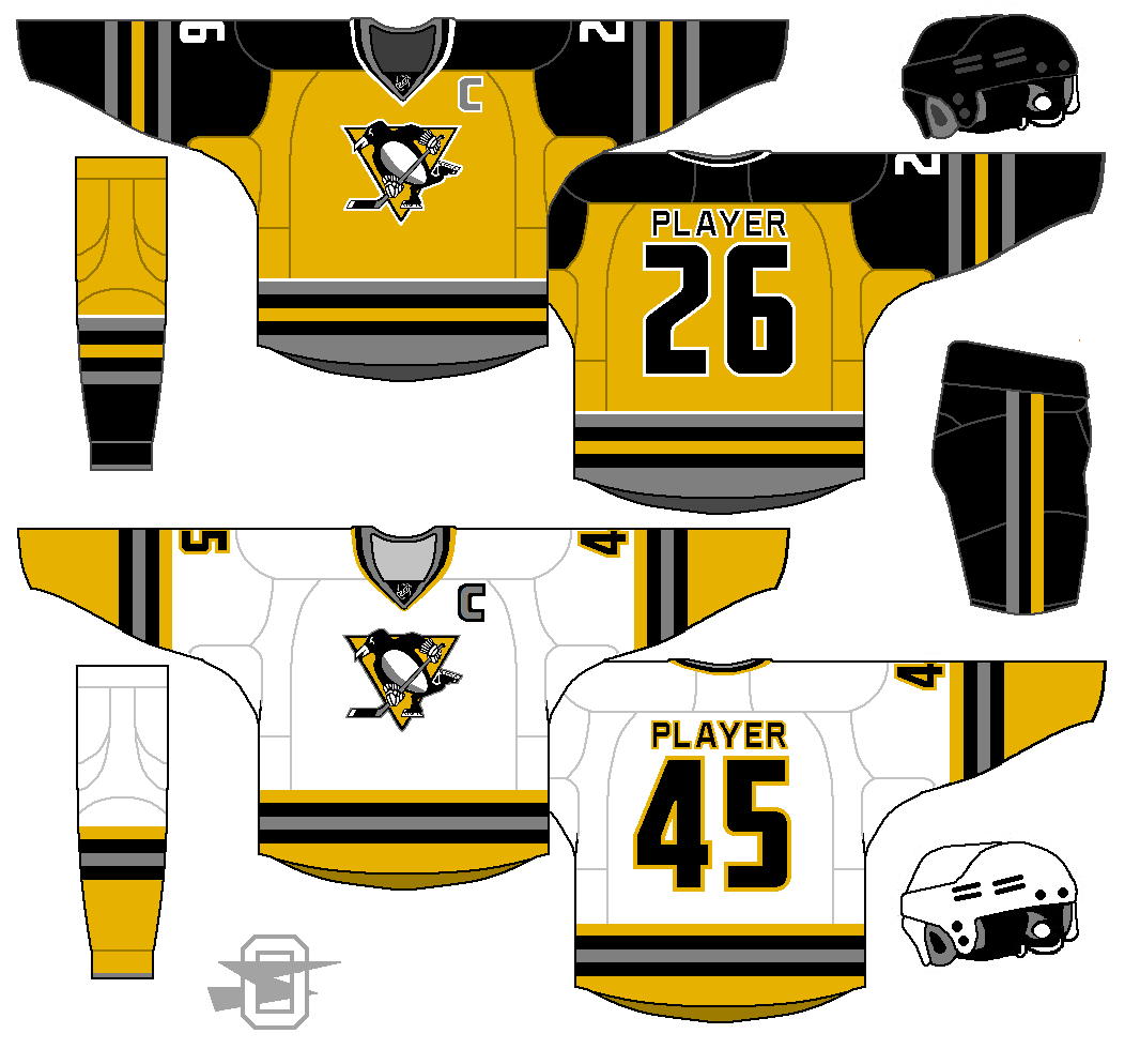
Penguins: The updated version would be my ideal modernized Penguins. Incorporating grey effectively (through both the striping and shading in the logo), while promoting yellow to the home sweater color (differentiating them more from the Bruins), produces a solid look.
Canucks: I like what you've done with the template, and the color distribution is fantastic. However, I think using the full bodied-version of Johnny Canuck would really put it over the top. The Orca and the "Johnny Canuck head + v", while both fine logos, just don't do it for me. I'd also recommend adding green outlines to the numbers on the white sweater.
Capitals: This is a fantastic modernization of their classic set with the current logos. I'm not a fan of the script logo, but you've managed to make it look good. I second the critiques that the Weagle on the third sweater doesn't need the roundel backing it. I'd also be curious to see what the red and white sweaters would look like with the Weagle as the primary crest.
Seals: You've managed to make the crest look halfway decent, and your uniform templates effectively balance the kelly/yellow/royal color scheme (something I thought couldn't be done). I can't really think of any way to improve it. Nice work!
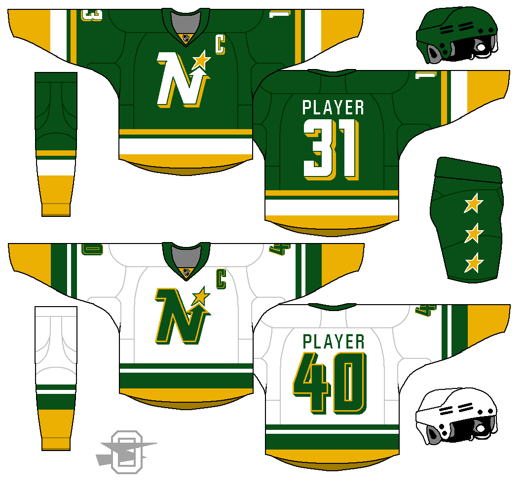
North Stars: Thank you for not including black, instead using that lovely dark kelly green as a primary color. Your striping pattern beautifully balances green, yellow, and white (no white yoke is also a good touch), and the drop shadow on the numbers (in a font that resembles the crest, which I like) is handled in a far better manner than the actual North Stars' uniforms. I think it might be my favorite North Stars concept I've seen here.
All in all, I look forward to more of your handiwork.
Wow, thank you for the awesome feedback... I really appreciate it. I'm enjoying making these but sometimes it feels a bit like I'm just doing it for myself so it's nice to hear someone is checking
I'll give the full body Johnnie a shot, but without the double blue orca logo I don't know if I even need the navy blue... incorporating the navy of the logo onto the uniform was the main idea.
And you're in good company with not liking the roundel behind the Weagle... universally disliked idea, I guess. My thought was to try to find someway to fill the dome shape with white... you know, like the actual building. But obviously the circle was too much. Back to the drawing board.
Thanks again!
-
1
-
-
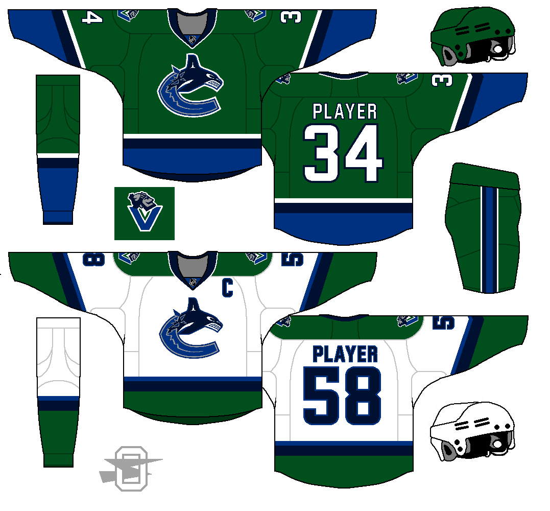
More kelly green...
-
3
-
-
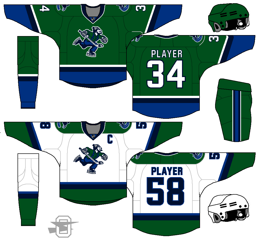
Continuing with my love of green and blue...
-
1
-
-
-
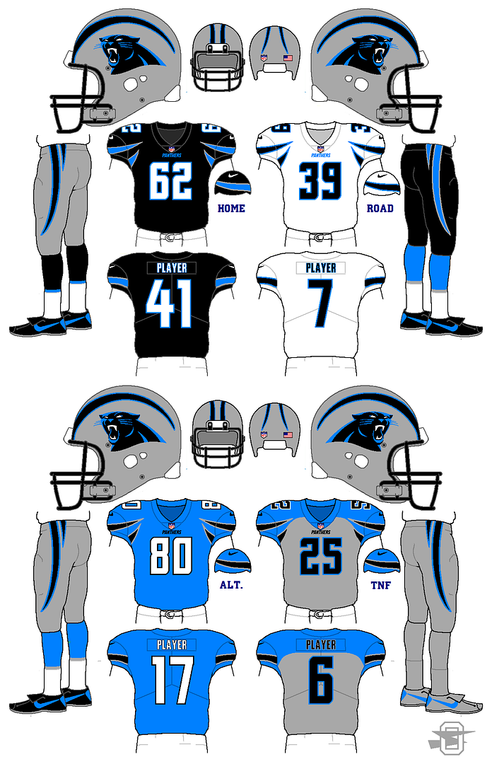
I know the Panthers' look is fairly popular around here, but I've always been bugged by the various inconsistencies in the striping and such. I made this with the thought that I'd keep the helmet untouched, and design the rest of the uniform to go with it.
-
4
-
-
4 hours ago, NoE38 said:
The design looks good! a couple of thoughts.
IMO the logo needs a bit of green on it, because it looks a little out of place right now.
Ever since the redesign, I've been annoyed at the lack of green in the logo, but, honestly, now I get it. I tried more than a few different ways to shoehorn some green into that logo, and hated all of them. I assume the designers went thru a similar process.
-
1
-
-
Some time ago I posted this concept...
Quote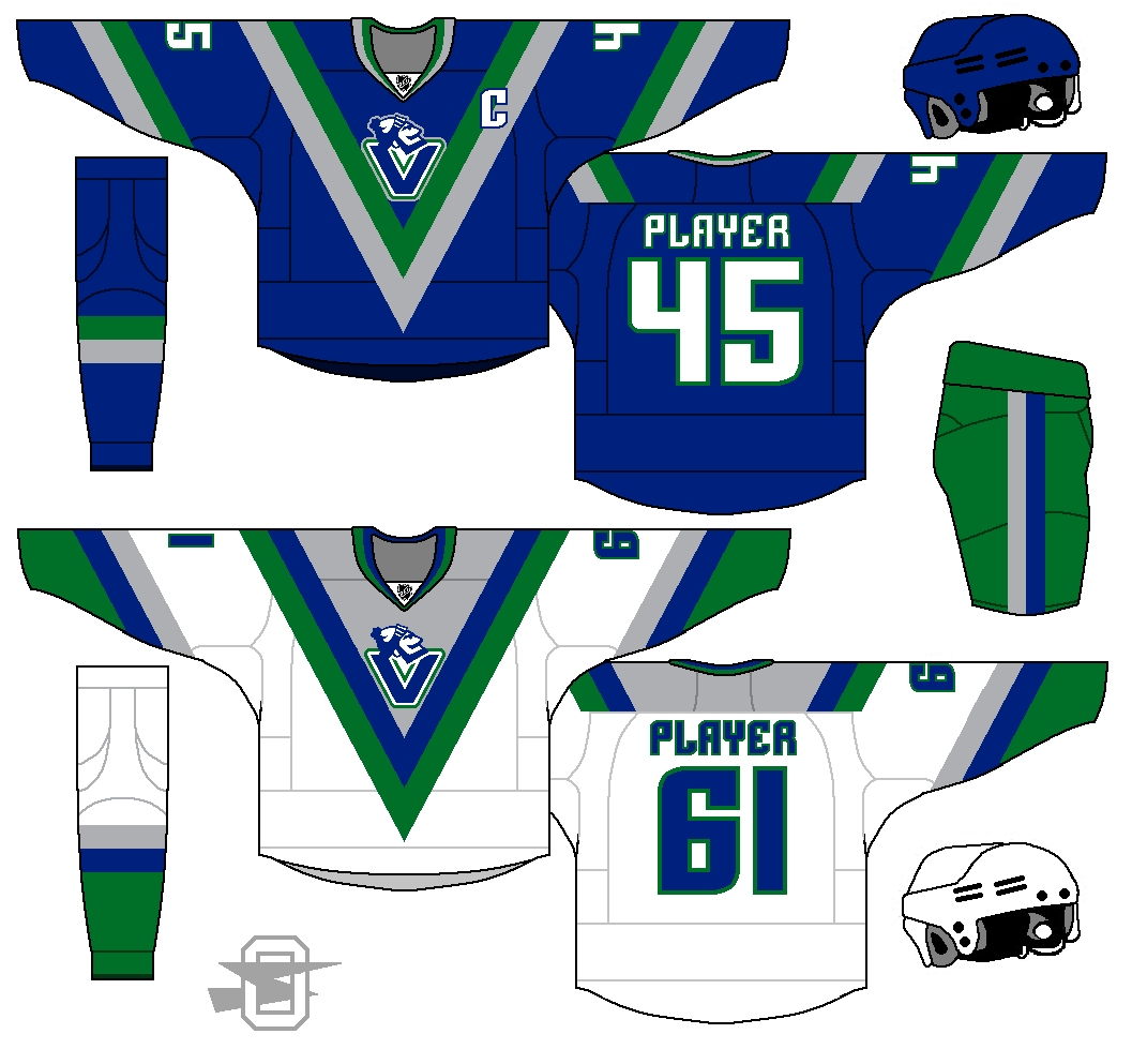
Based on my undying love of royal blue and kelly green as an amazing color scheme and my completely indefensible appreciation for what is widely considered to be the worst NHL uniform of all time, the "flying V" jerseys.
I feel like it wasn't well received.
So, back to the drawing board.
IMO, the Canucks current color scheme is beyond fabulous. I've loved the uniform of every team that's ever worn it... the original Seattle Seahawks, original Minnesota Timber Wolves, original Dallas Mavericks, the amazing Hartford Whalers... all great.
So, I went back into this Vancouver concept with two goals.... first make the kelly green more prominent. This color is criminally underused in modern sports. You have the Celtics, and that's about it. Secondly, I wanted to do something to make sense of the double blues in the logo, and carry those colors to the rest of the uniform.
Oh, and I wanted to get rid of the city name above the logo.
So, here it is.... thoughts?
-
2
-
-
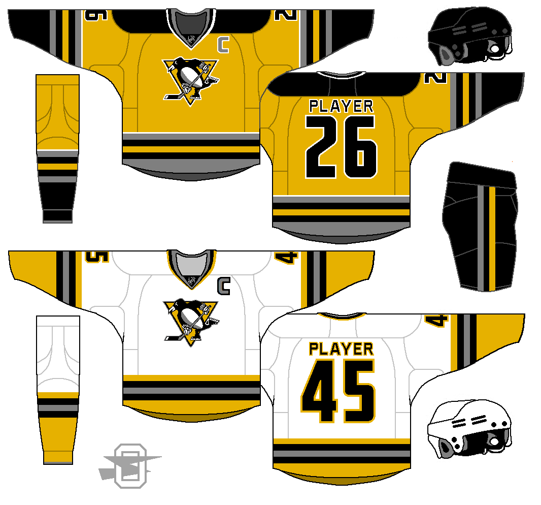
6 hours ago, ldconcepts said:
Look much better! I'd just also match the hem stripes.
Yeah, I definitely see why you'd say that. I just have this weird thing about wanting a contrast between the hem and pants. Just a personal preference.
-
13 hours ago, ldconcepts said:
I also really like your Penguins concept, the away jersey is perfect, but I'd just use the home sock pattern throughout the entire home jersey, while ditching the full sleeve/yoke black.
Taking your advice I tried with a recolor of gold on the sleeve and yoke, but I didn't love it. Just wasn't enough black for me, left it a little washed out. So I split the difference... I kept the yoke black, but recolored the sleeves to gold. I think I like it better than me first attempt... what do you think?
-
2
-
-
It's been a looong time between hockey concepts for me, but I thought it would be fun to pull this old thread out of mothballs...
Here's a Penguin concept.... any thoughts?
-
2
-
-


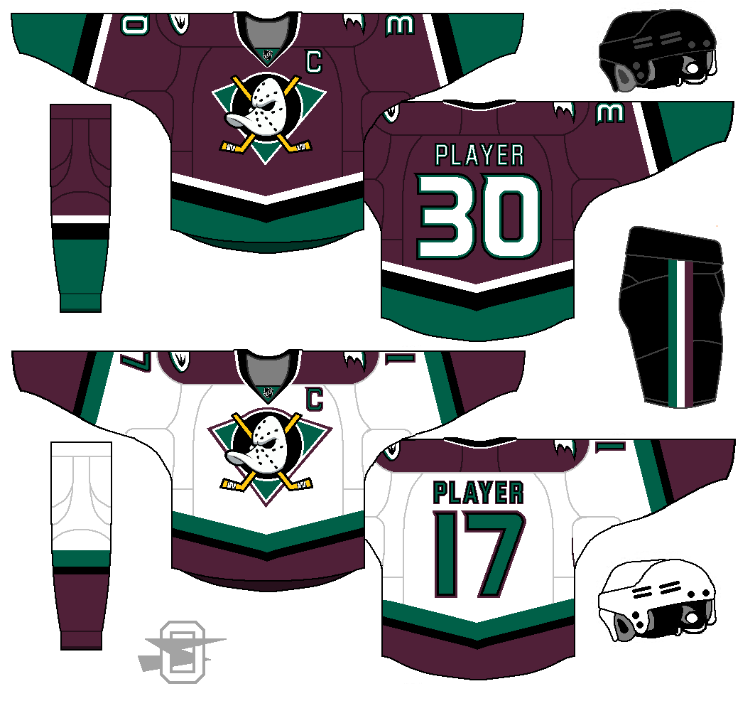
Oldschoolvikings' NHL concepts - Ducks added, trying out more weird colors
in Concepts
Posted
I wasn't really trying to make it bigger... I basically just did a straight up cut and paste and recolor job. Maybe it looks bigger on the white sweater because of the second outline?