


oldschoolvikings
-
Posts
10,513 -
Joined
-
Last visited
-
Days Won
194
Posts posted by oldschoolvikings
-
-
1 hour ago, SFGiants58 said:
I like it! Having only orange socks is a good option, especially with the simple pants stripe. The new font fits well with the wordmark. Overall, it's far cleaner than anything the team has worn since the pre-tiger stripe helmet period. Good work.
Yeah, I feel like NFL teams are so committed to the leotard look, the only thing to do is make sure that isn't even an option.
-
 3
3
-
-
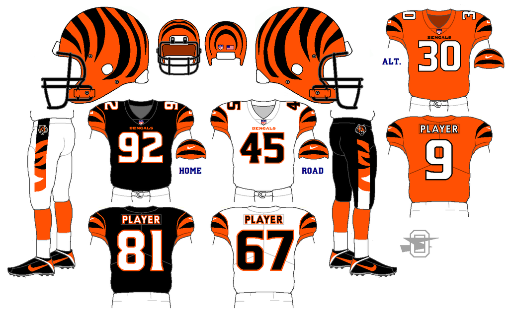
Reworking an older Bengal concept. Further simplifying the sleeves and new number font. Opinions?
-
3
-
-
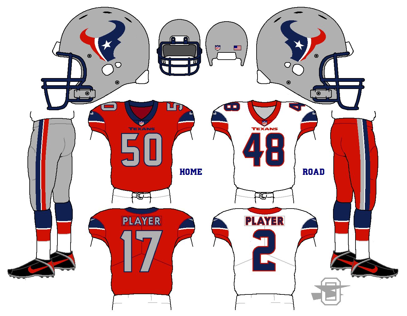
6 minutes ago, FightingGoldenDevil said:
That's a solid design, I just don't think the Texans need silver. It kind of muddles the look
I get that. I've just always been surprised that there's never been a silver/red/silver NFL team. This way you could refer to them as THE... Houston Texans.
-
-
On 5/15/2018 at 1:39 PM, MJWalker45 said:
Not a fan of the number font, they remind me of the score of a computer game from the 80's. The rest looks good.
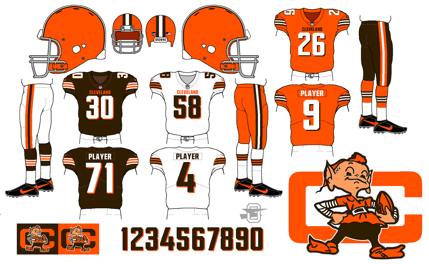
Yeah, looking it over again, that font isn't really appropriate. I think I just wanted to use it because I built it myself. Here's the same concept with a font I didn't build from scratch, but reworked and altered from an existing one;
-
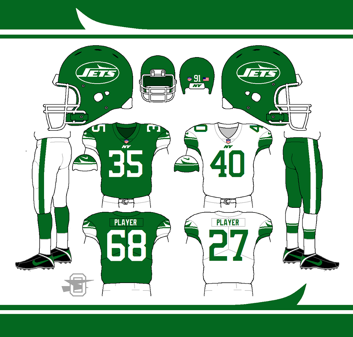
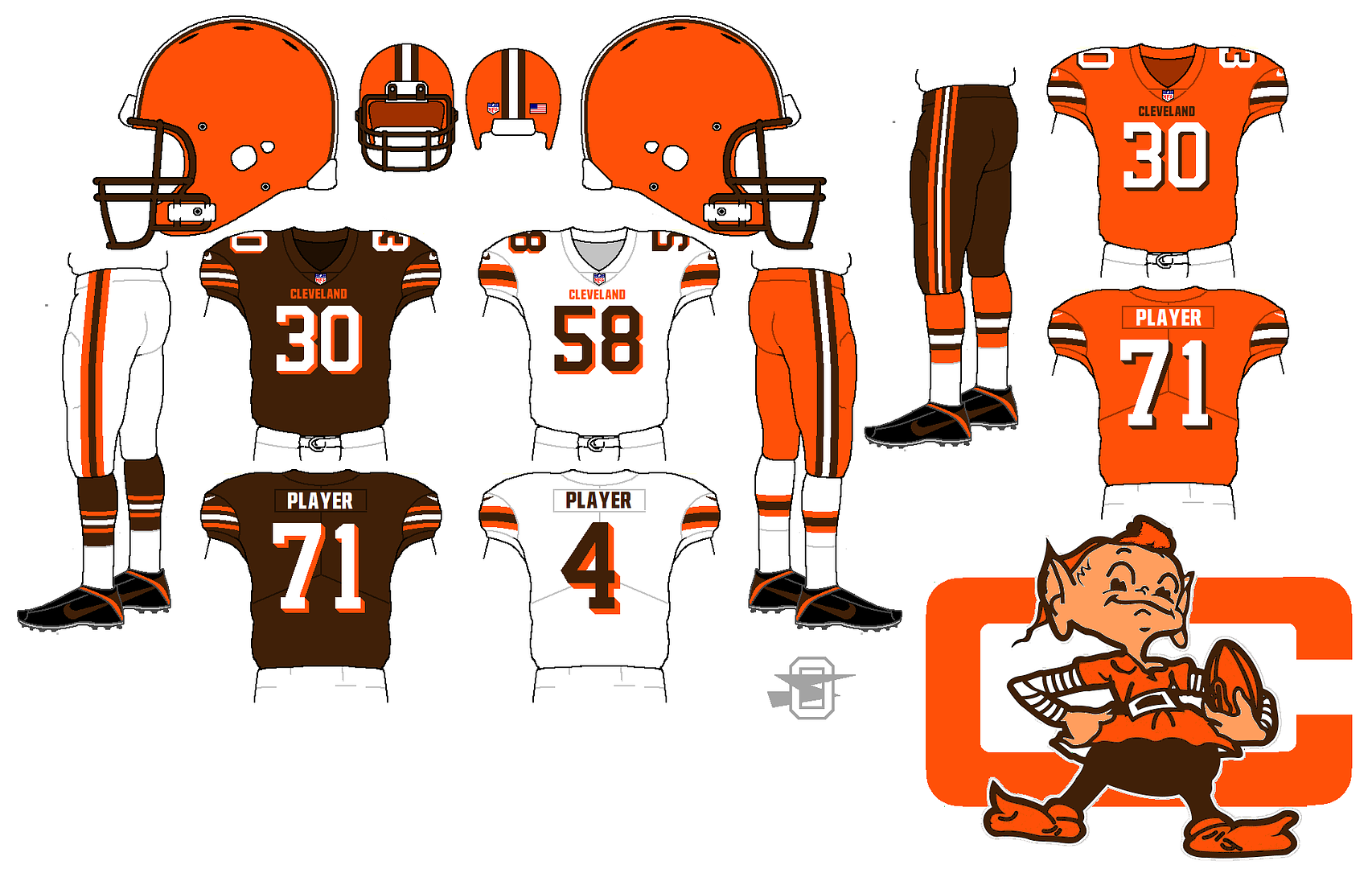
Saving two elements from the current mess... the "Cleveland" jersey wordmark, and the number shadow. Bringing back the gray mask and stripe patterns from the old uniform, and adding an actual logo and a custom block font. Whaddya think?
-
6
-
-
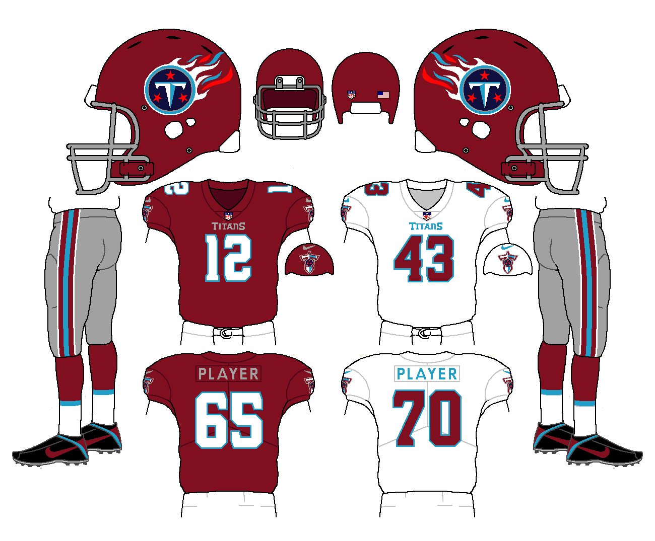
I have a soft spot for these weird football uniforms with the upside-down unbalanced look;


To me, it only works if the pants are a light color... gray, silver, gold... when the Titans wore light blue jerseys and dark blue pants, it looked like trash.
It also only works because it's unique... if it became prevalent, I'd hate it.
-
2
-
-
Marrying the old and older;
-
10
-
-
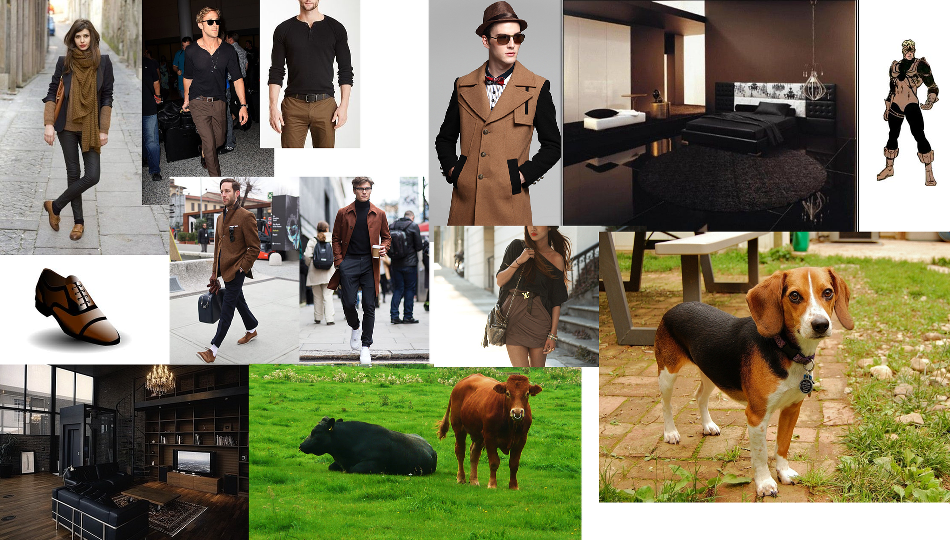
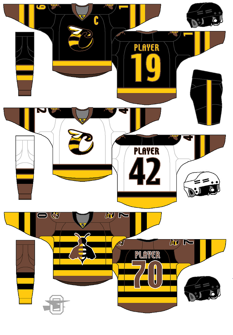
So, I seem to be running into some ridiculous prejudice against the color scheme Brown and Black... apparently ignoring nature's greatest design, the Beagle;

I give you this expansion team, the Beagles... (I await my check from the NHL);
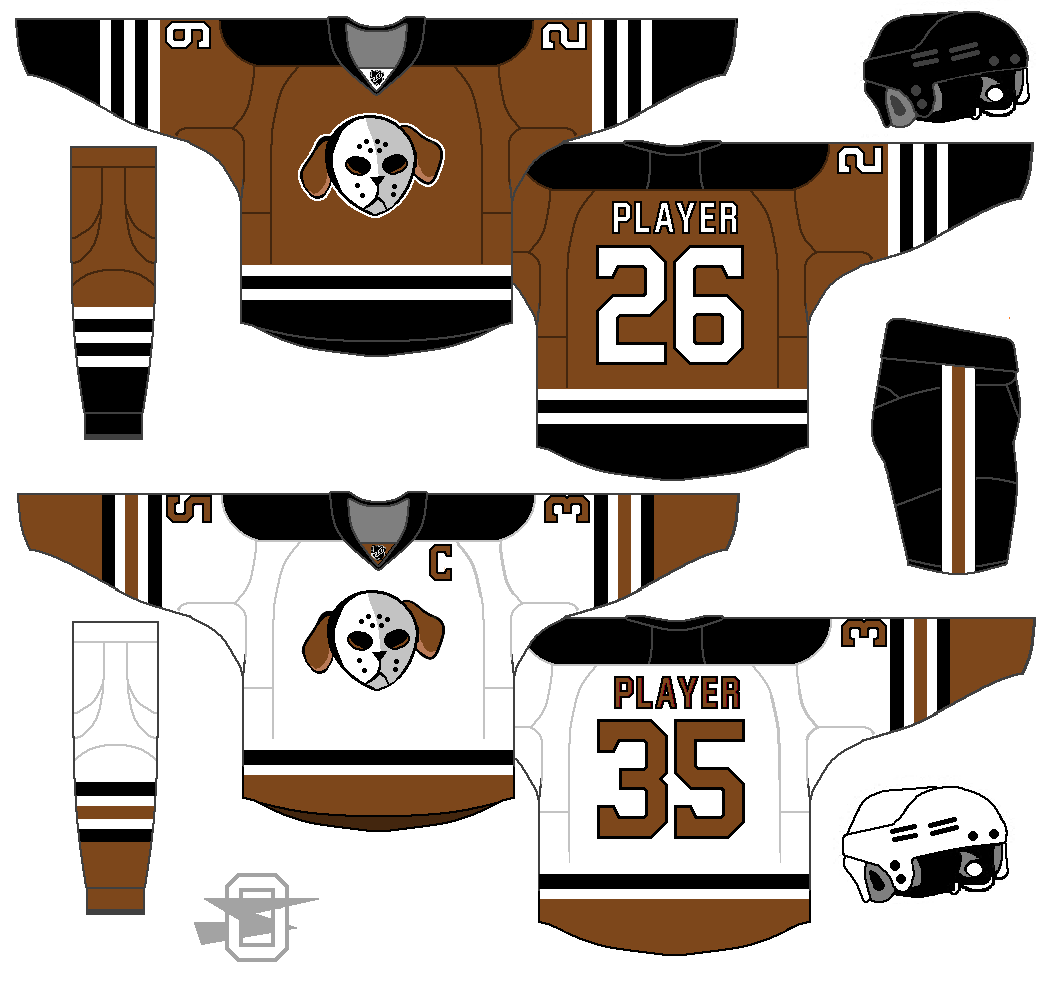
-
4
-
-
-
11 hours ago, Brown1 said:
One of the rules of fashion is not mixing brown and black, and the colors would bleed together a lot more in real life than on the concepts. It’s a really poor design choice.
-
5
-
-
46 minutes ago, Brown1 said:
Here I’ll put it in proper terms since you don’t take advice. Your Cincinnati Stingers suck. One of the rules of fashion is not mixing brown and black, and the colors would bleed together a lot more in real life than on the concepts. It’s a really poor design choice.

For someone named "brown" you're very hard on the color.
-
2
-
-
17 minutes ago, Brown1 said:
I absolutely can’t stand black and brown mixed. I coach a high school team that has had black and yellow uniforms with brown logos for 3 years now and I finally get to make everything just brown and yellow next week. I think this would be much better without the brown. Either find another color to add or just leave it black, yellows and white.
Bossy.
-
5
-
-
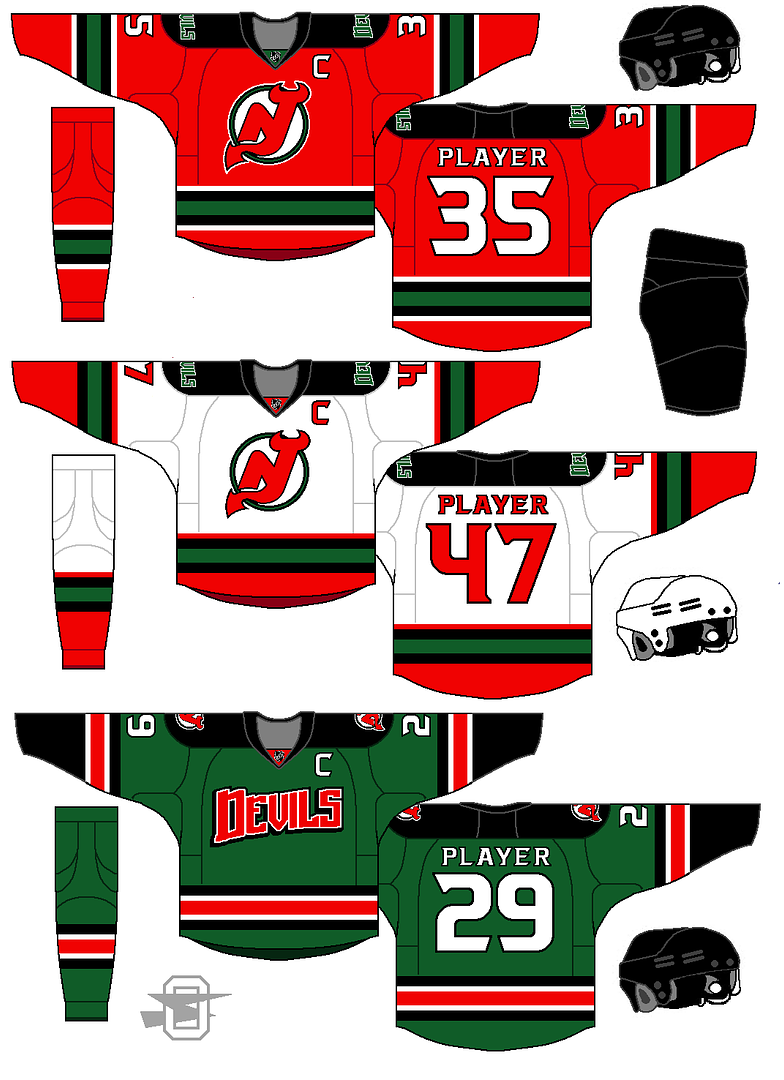
Here's the jersey of the old WHL team, the Cincinnati Stingers;

And my updated take;
-
Bringing back a touch of green...
-
5
-
-
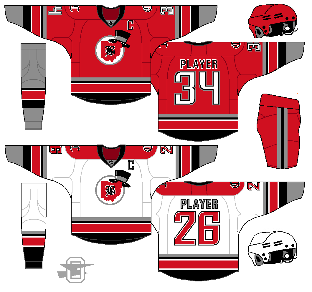
On 3/25/2018 at 1:55 PM, SFGiants58 said:
The Barons look pretty good! I like the Ohio State-style stripes, and the top hat is a good touch. My only complaint would be the grey socks on the home uniform and the number font (which doesn’t mesh well with the Old English lettering). Good work.
I keep trying to pull off the contrasting socks bit. I always liked it when it was a strange quirk that only the Boston Bruins ran with.

-
Yeah, it's hard to miss
 .
.
But how do you use red, gray, and black and avoid it?
-
Continuing with the defunct team concepts;
-
2
-
-
Obvious...
-
4
-
-
4 hours ago, henburg said:
I'd just like to say that I really love the way that you approach all of your concept threads. It's so nice to see people who try new things and take a lot of risks, and as a result I always love checking on your threads to see what you're doing. There are some really great and unique concepts in here. Your Wild concepts are my favorite.
Thank you so much... that's really nice to here.
-
3 hours ago, 8BW14 said:
I love it. Feels very "ducky" and outdoorsy. I'm not too crazy about the cartoony logo with that color scheme, but maybe that's just because I loved the Mighty Ducks cartoons so much as a kid. A more realistic depiction of a duck like the Quad Ciry Mallards logo would go great with your color scheme, IMO. It's a great concept nonetheless.
I see your point about the logo. Maybe I'll try my hand at one.
-
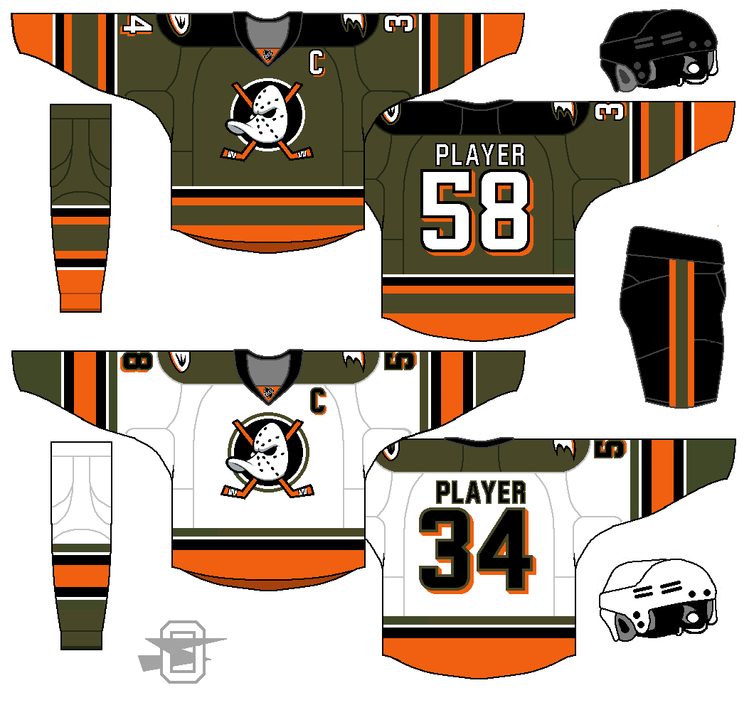
We recently bought my 9 year old a new backpack. It's olive green and orange, with silver and black details. I was looking at it thinking about what a nice color scheme it is and what team I could give it to.
So.....
-
4
-
-
OK... this one is out there. Keep in mind, I'm not advocating they actually do something like this.
After completing this, it looked a bit familiar, so I went searching, and found this. Maybe subliminally floating around in my head?

-
3
-
-

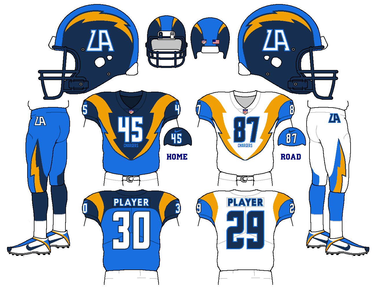
Oldschoolvikings' NFL concepts - Commanders concept added
in Concepts
Posted
I'm stealing this one from myself. This basic template I used for a Buccaneers' concept a few pages back... I thought I'd re-purpose it into a Ravens' concept...