


oldschoolvikings
-
Posts
10,513 -
Joined
-
Last visited
-
Days Won
194
Posts posted by oldschoolvikings
-
-
On 6/7/2017 at 1:38 AM, Ark said:

What's awesome about this is it looks like he isn't even concerned with the game, and is just coming at you to collect on a debt. And his little brother on the cap thinks it's hilarious.
And those absolutely need to be the team's game socks.
-
 5
5
-
-
Matte batting helmets work for me because they do a better job of mimicking the field caps. Wool caps aren't shiny, so why should batting helmets (a safety replacement of the cap) be shiny?
-
3
-
-
Reworking a Bronco project I've posted before. This one is similar, but slightly different striping, plus a new color rush and new throwback;
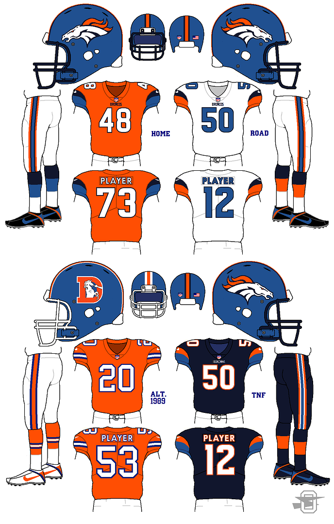
Thoughts appreciated...
-
On 5/13/2017 at 0:58 PM, DNAsports said:
The Cleveland Browns uniforms are great. I'd say they're in the Top 4 of Nike redesigned uniforms.
Wait... there has only been seven teams redesigned since the Nike takeover...
Seattle
Minnesota
Jacksonville
Miami
Tampa Bay
Cleveland
Detroit
So if you've got them at four, that's exactly in the middle, with three teams better and three teams worse. But they're still "great"? How does that math work? Or are all the Nike redesigns great to you?
-
2
-
-
-
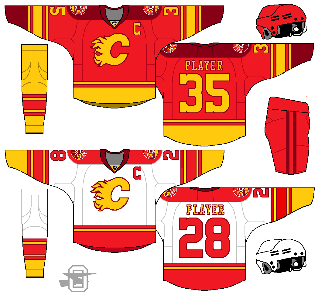
New Flames... going for a vintage look while still playing around with the double-red idea...
-
6
-
-
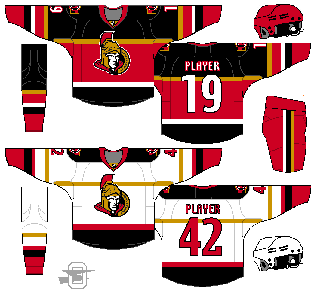
Another shot at the Senators. Still trying to add some gold to differentiate them from all the other red/black NHL teams.
-
2
-
-
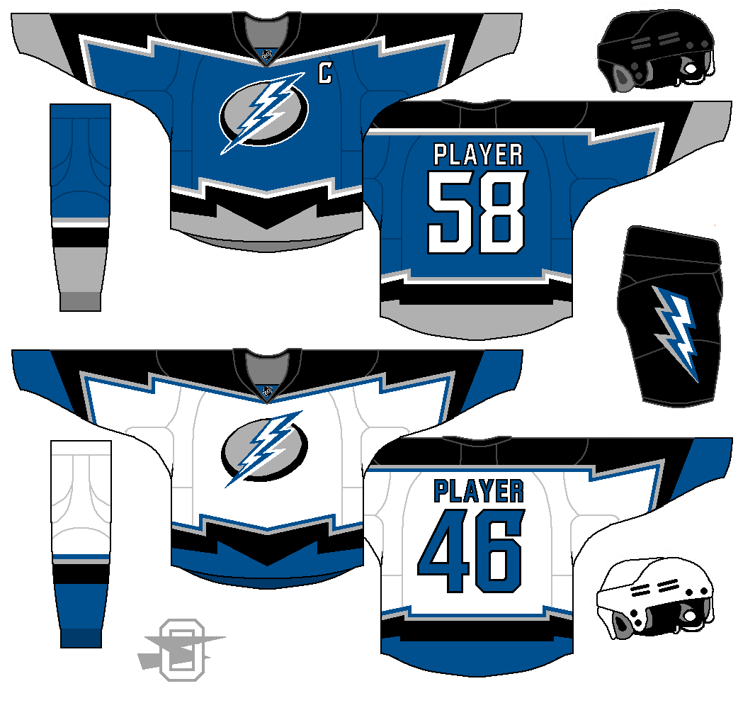
I started this thread with a Tampa Bay Lightning concept. I still like it, but it might be a bit traditional to some, so here's another...
-
2
-
-
Yeah, I was counting the spaces to get to nine... at that size the spaces would be basically indistinguishable from any other stripe. I don't think you can treat the top stripes as a traditional vertical stripe... you'd be using vertical and horizontal stripes together at such a close space (on the current tiny sleeve caps) that everything would butt together at strange angles.
-
7 hours ago, WavePunter said:
This could still be accomplished, even today.. Take the Carolina Panthers' jersey template for instance.. Shoulder TV numbers are present.. Carolina's shoulder loops are pushed a bit more down the sleeve than traditional shoulder loops (such as Indy's), do you could get the top set of tri-colored stripes in.. The location of the Panthers logo (mid sleeve) would be a prime location for the thick single-colored stripe, and a tri-colored sleeve cuff could be used to act as the bottom stripes that were eventually omitted in the original version of the jersey
Definitely true, but it would be undeniably crowded. We're talking about nine separate stripes in the space of a modern sleeve cap.
-
2 hours ago, OnWis97 said:
I will still haunt you until you use the 1980s helmet.
Point taken on the Chiefs jersey though. Is the custom font enough? If not, then I'd consider putting the gray stripe through both white stripes. Of course that will interfere with the swoosh, which reality dictates needs space. Maybe something that uses the current sleeveless template (the way the Vikings have done)?
Maybe take my idea but don't move the stripes down the sleeve. Then it's somewhere between the Colts and the Chiefs?
I dunno. I know your inspiration is from the 1980-ish jersey. That odd, unbalanced stripe pattern was the only negative in an otherwise great uniform. Then again, if I'm the only one thrown by it then maybe it's OK...
Anyway, I'd take the above as Eagles primaries if offered with no hesitation.
That particular sleeve design started out so oversized it had to be reduced years ago... well before the tiny sleeves of the 2000's.
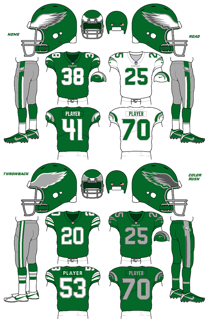
When it first appeared in 1974, it was this bit of craziness;


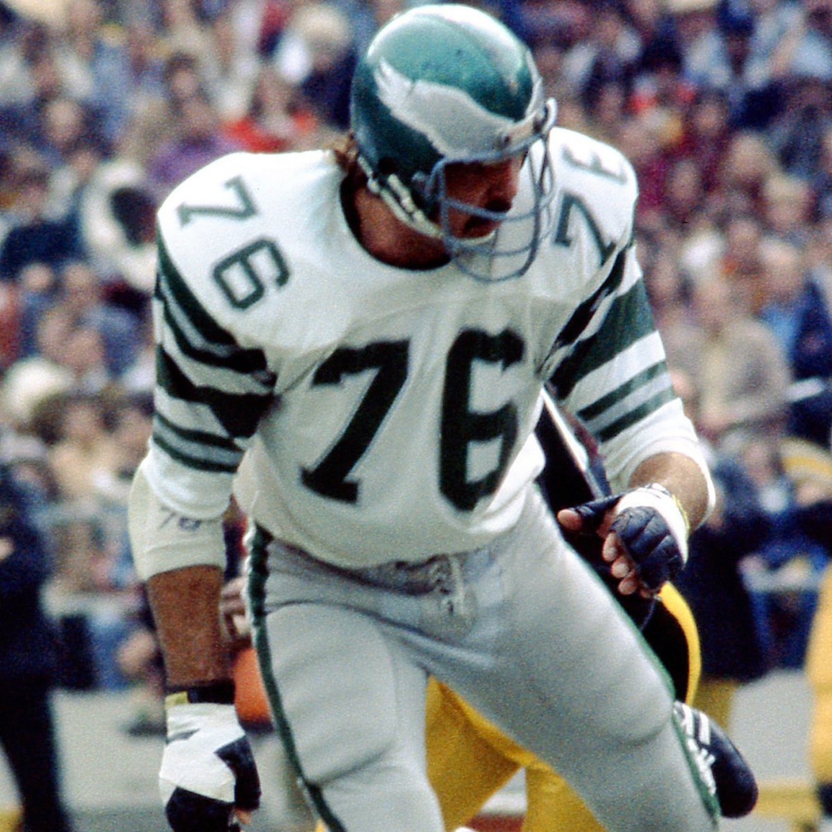
That's stripe overload (even for me).
After a few years the bottom white/gray/white was dropped;


It would seem a shame to me to dismantle it any further.
-
1
-
-
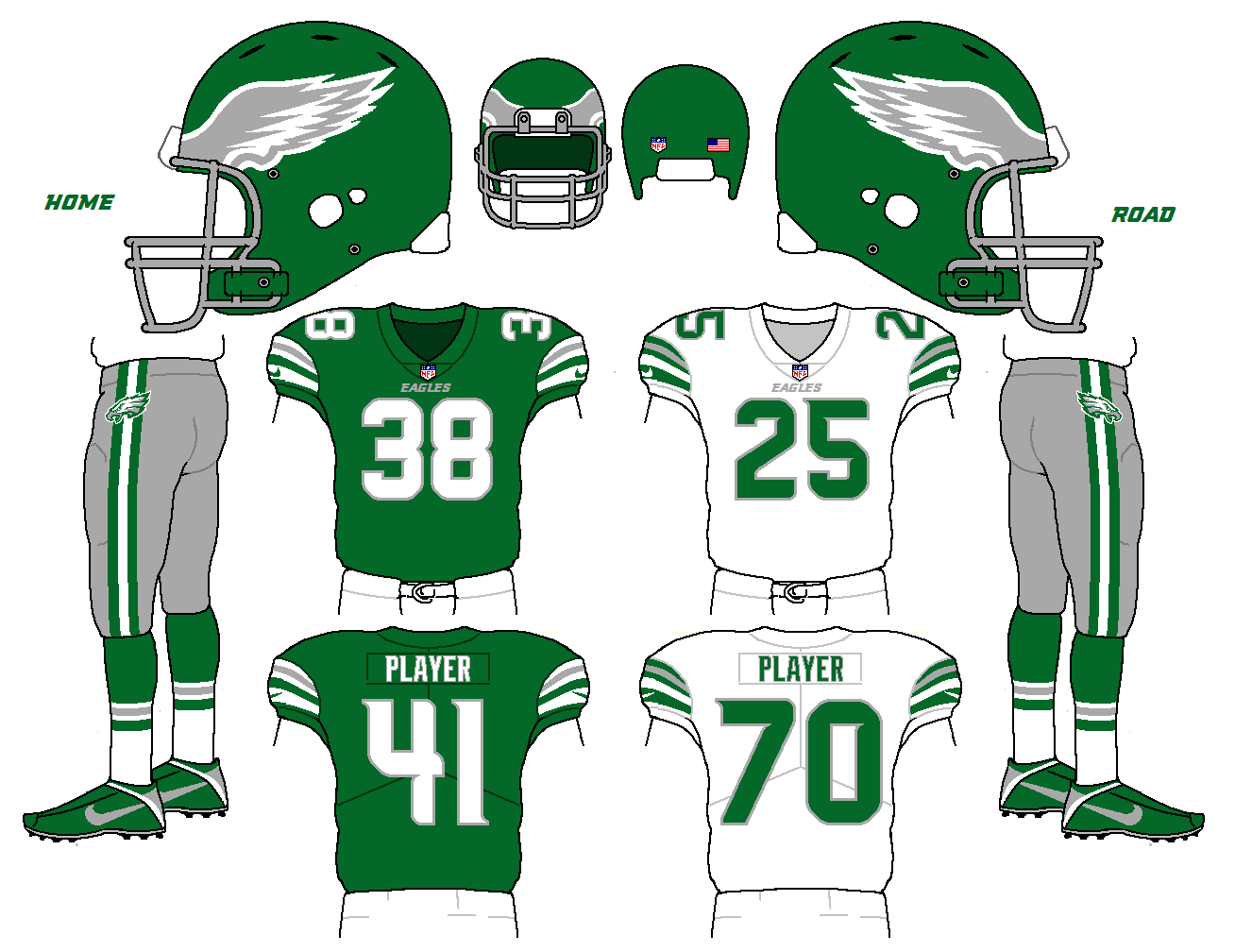
On 4/25/2017 at 0:33 AM, OnWis97 said:
I would love for the throwback uniform to be the basis for the primary. That helmet was perfect and the color combo was so, so nice.I'd bascially remove the sold white stripe from the sleeve and move the white/gray/white down a bit and leave everything else alone.
Yeah, I love the idea of updating that throwback, too. My only issue with your sleeve suggestion is that it would leave them with what's basically a recolored Chiefs' jersey. Not that there's much wrong with that, the Chiefs' jersey is pretty damn nice, but if keeping the white stripe saves some of the flavor of that 70's Jaworski uniform, I'm interested in leaving it.
How about this;
Updating the 70's look by... streamlining the pants stripe, updating the font, and splitting the difference between the old helmet wing and the new. Like so...
-
2
-
-
-
55 minutes ago, SFGiants58 said:
That's...interesting. I like the curved striping and I oddly don't mind the abundance of grey on the white sweater. Good on you for using the fin patch and a modern display font (block wouldn't really work here). I am curious to see how the new "alternate" logos would look on it.
I was just looking at the way the top of the logo curves, which I'd never noticed before. This odd idea popped to mind. I also did a version without the chest stripes and it was workable but I wanted to get a reaction from this.
-
-
15 minutes ago, #ConceptLeagues said:
Ehh, maybe not.
Yeah, I was being facetious. If you want to count ancient history...
-
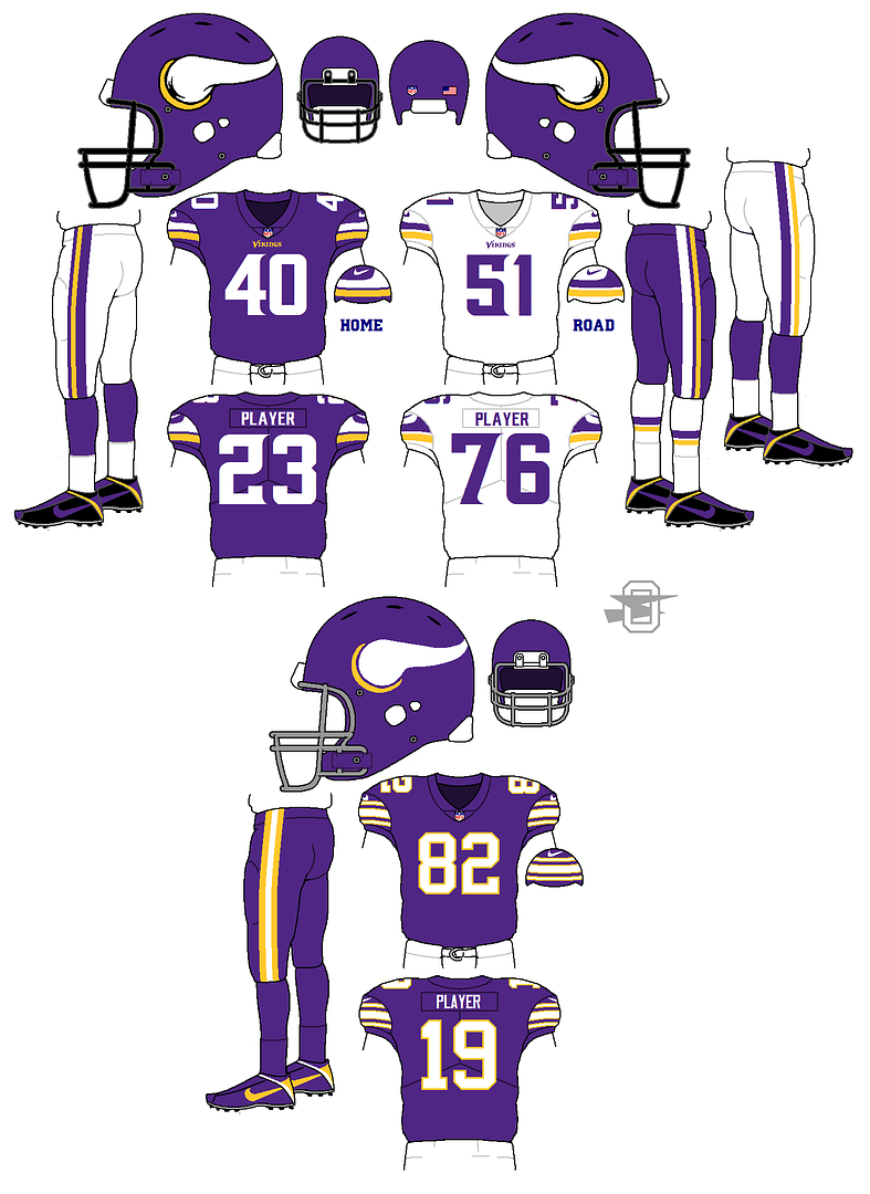
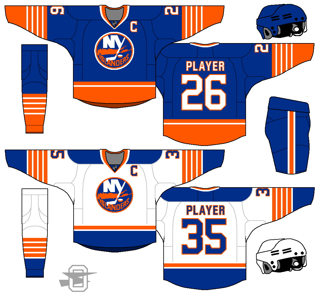
Home and road primaries remain relatively untouched. You could argue that I'm a homer (I am), but I think the Vikings current uniform is top 5 in the League. Most of the small details that bugged me at introduction, I've either stopped thinking about, or come to really appreciate. The only element of the current uniform I just can't lice with is the road sock situation. So I'm adding a second pair of socks and a second pair of white pants, so on the occasions when they'd want to wear all white (which I'd like to see a couple of times a year) the jersey and pants stripes link up.
Other than that, I'm adding a color rush uniform that's a homage to the accidental color rush uniform from 1964. Here you go...
-
4
-
-
OK... I've seen this once, I never need to see it again...

Awful.
Especially bad when you could make an argument that the Vikings are the NFL's original "Color Rush" team from way back in the 60's...


If you don't know the story;
"1964 was also the only season that the Vikings wore white jerseys at home games. This led to confusion when the Detroit Lions came to Bloomington with only their white jerseys. The game started with both teams wearing white jerseys. The Vikings retrieved their purple jerseys from Midway Stadium in Saint Paul. The Vikings changed from white jerseys to purple jerseys on the sidelines. That led to the Vikings wearing all-purple uniforms."
Anyway, with that in mind, I'm posting a slightly updated Vikings uniform below...
-
1
-
-
30 minutes ago, 8BW14 said:
Good point about the dark green. That thought hadn't even crossed my mind.
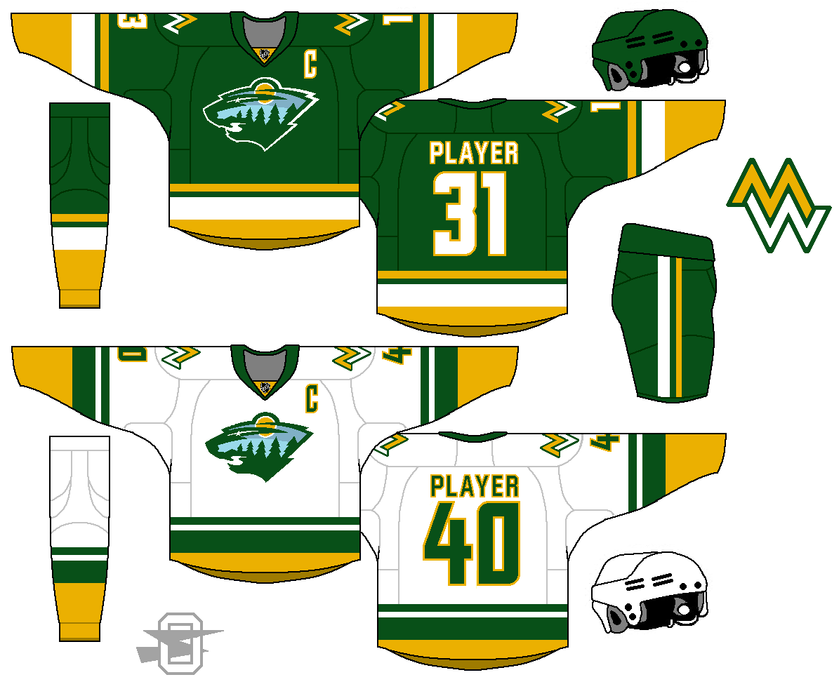
For the record, I like the blue sky. What if you incorporated the blue into the striping/numbers, darkened the green and promoted the blue to the secondary color ahead of gold? I know it's getting away from the NorthStars motif, but I think it might looks pretty sharp.
Ok, I gotta say, that IS a sharp color scheme.
-
5
-
-
1 hour ago, 8BW14 said:
I love it. I know you are using the north stars' colors but I think this would be even better with a darker, more piney green closer to what the wild actually wear I guess.
I like the shoulder patch for its simplicity but it might be too simple. Maybe try giving the letters a pine tree look, idk.
Overall I really like it though.
I know the kelly green doesn't look as "forest-y", but I'm pretty sure a team wearing dark green and gold wouldn't go over too well in Viking country.
As for the logo... I like your idea. I tried to add a bit of a tree element, but it didn't look like I thought it would, so I gave up. Maybe I should try again.
32 minutes ago, EJaws said:I think the blue on the WIld logo should just be white. The blue doesnt fit well
Tried white, but it looked unfinished and empty.
2 minutes ago, Griffinmarlins said:I disagree about the blue. I think it looks cool. The light blue is clearly representing a lake, while the darker blue is the sky. Great job on the uniform as a whole as well.
Thank you!
And thanks to all of you for the feedback... it's very appreciated.
-
1
-
-
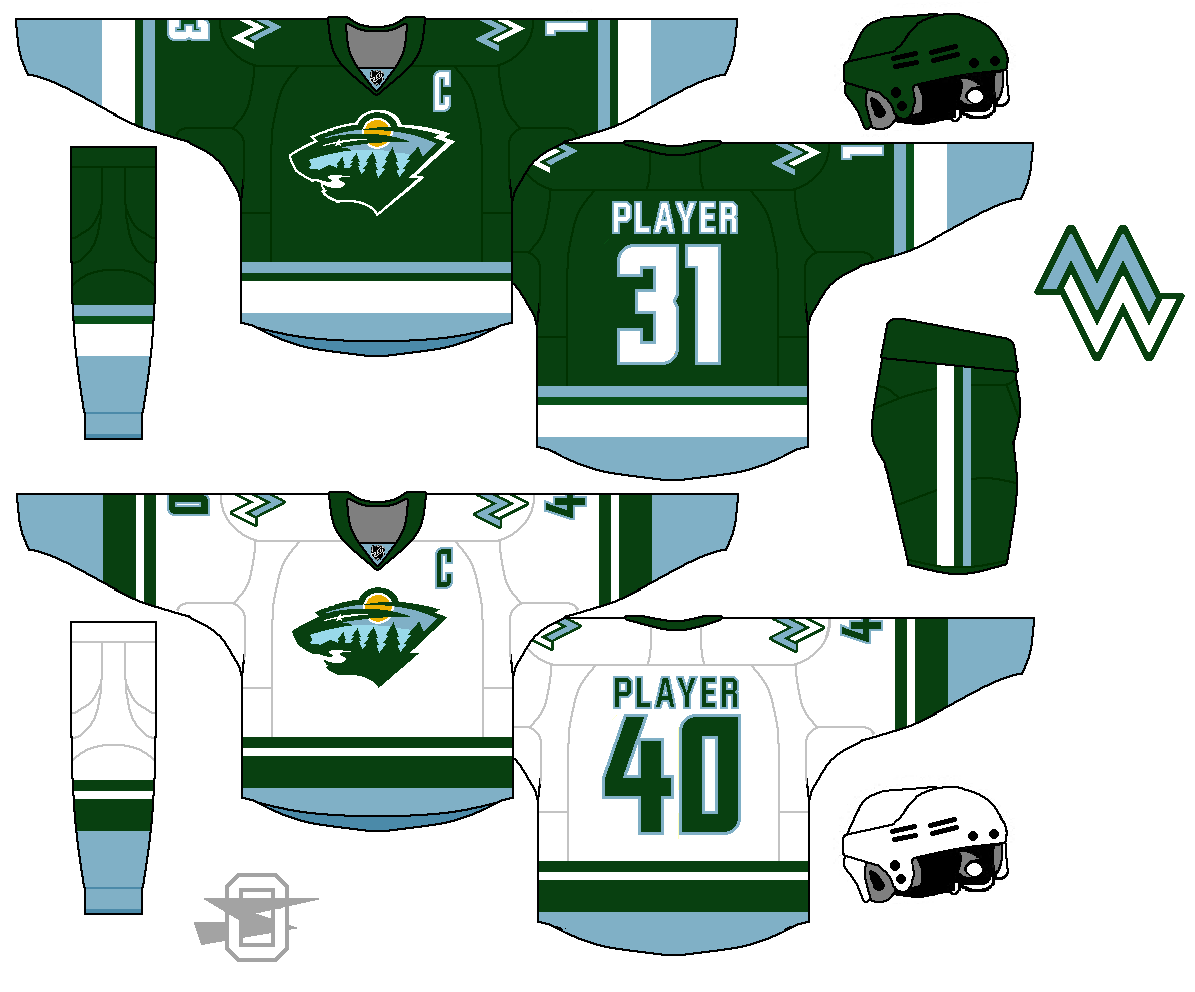
A few pages back I posted this basic uniform for the now non-existent Minnesota Northstars.
But, since the Dallas Stars are no longer using gold in any form...
-
8
-
-
Just now, WavePunter said:
I'd argue that the gold outline is more superfluous.. Changing it to white so it becomes a double outline would clean it up without changing the general aesthetic
I agree with that as far as how it works on the current uniform, but on a throwback-inspired look, a single white outline on the logo would nicely reference the numbers and the sleeve stripes.
-
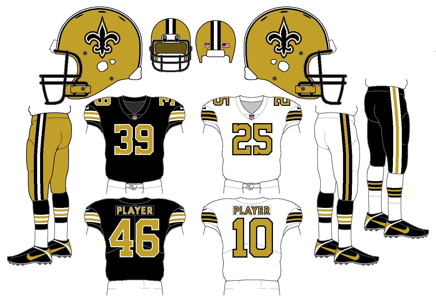
5 minutes ago, 8BW14 said:
Nearly perfect. I'd lose the extra black outline on the logo, but that's my only gripe. I'd love for the saints to adopt these for real.
You know, you're right... the triple outline stands out a bit on this. I just did a lazy cut and paste for the logo... now that you've pointed it out, it's gonna bug me. I may have to fix it.
-
New Saints, based (obviously) on the awesome color rush uniform. (First time I've ever typed the words "awesome" and "color rush" in the same sentence.)
-
5
-

Oldschoolvikings' NFL concepts - Commanders concept added
in Concepts
Posted