


oldschoolvikings
-
Posts
10,506 -
Joined
-
Last visited
-
Days Won
193
Posts posted by oldschoolvikings
-
-
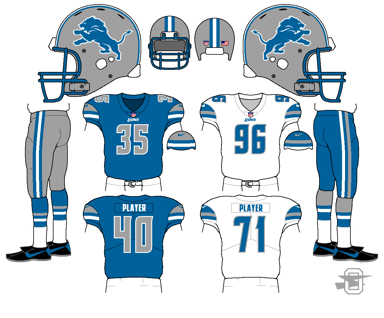
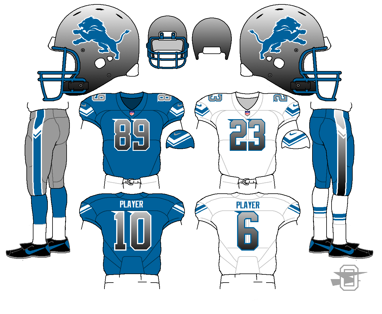
New Lions; concept. As usual, step one; dump the black trim.
Also, I've been fiddling with my template.
As always, C and C appreciated.
-
 2
2
-
-
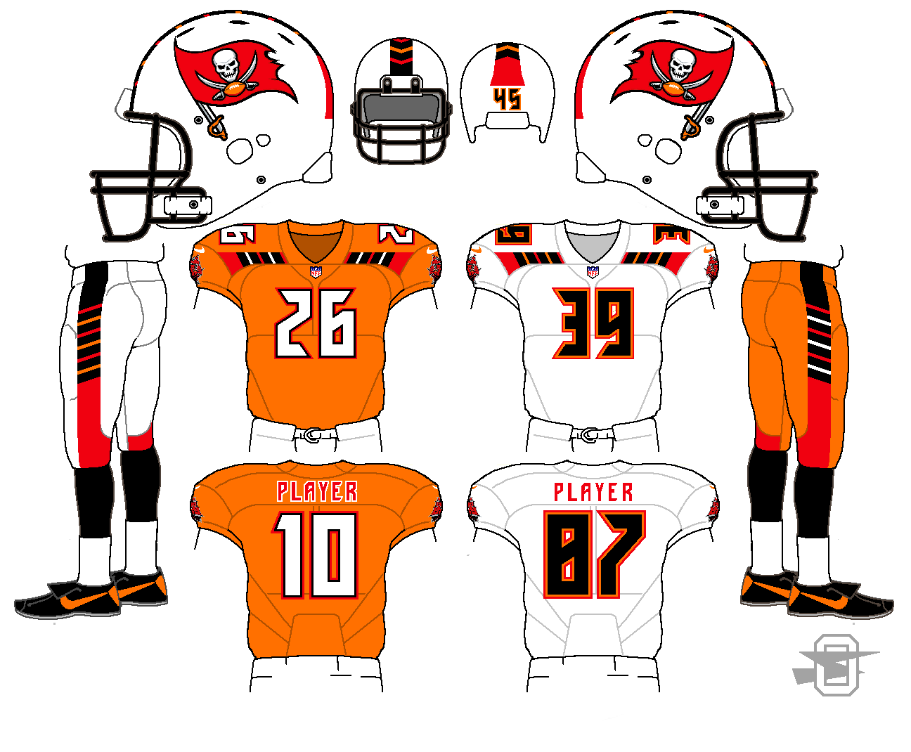
12 hours ago, bkknight95 said:
I don't get the pattern. I don't care. I think it looks great.
Yeah, I'm the one who made the pattern, and I don't get it either. However, if I worked for Nike I'm sure I could BS my way to some kind of conceptual explanation, involving pirate clothing, or sails, or something.
-
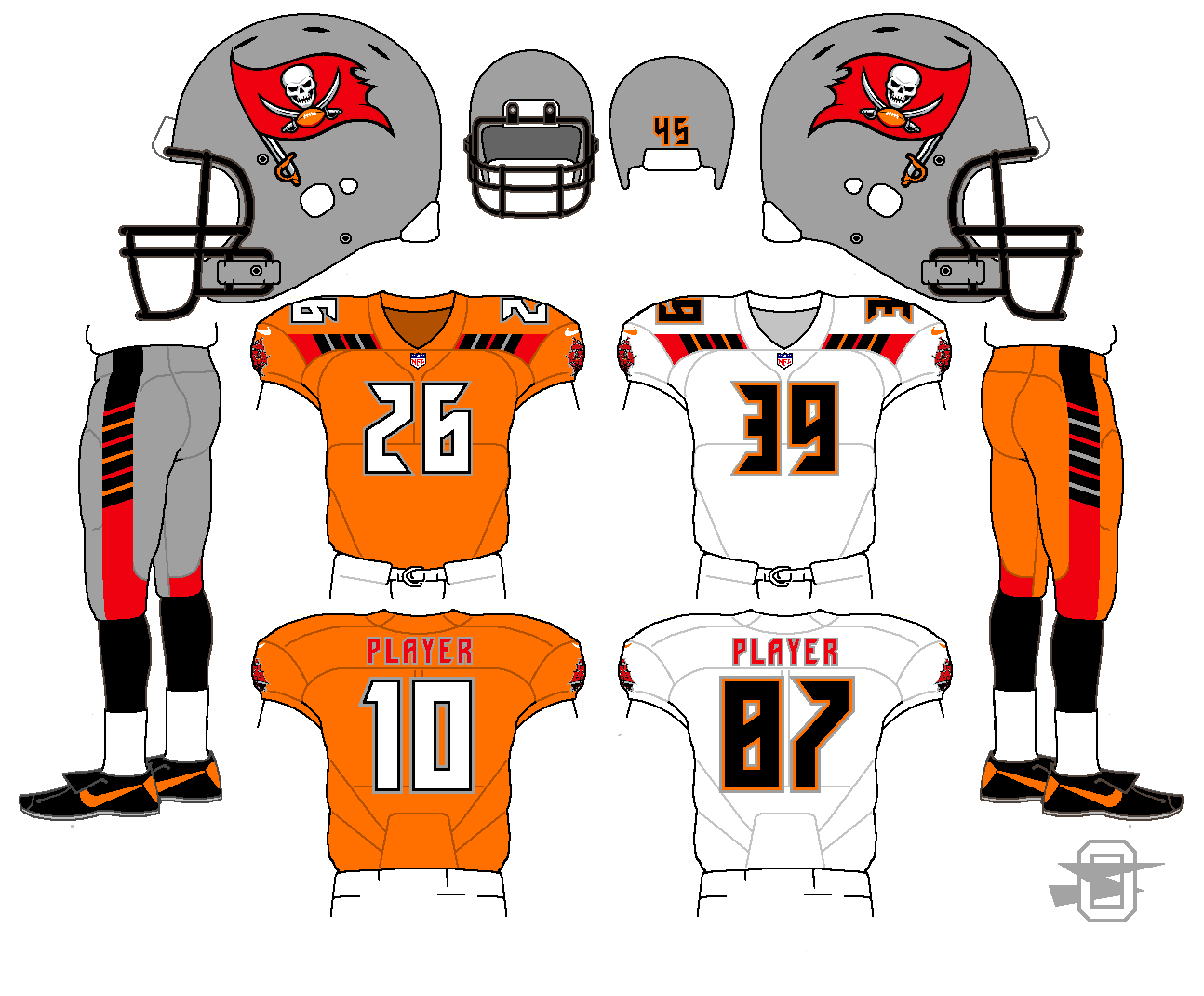
20 hours ago, Phil B. said:
I like the Bucs orange jersey but not the silver helmet or pants. White pants would look good.
OK, here it is with a white helmet and pants (and gray removed throughout). Plus a helmet stripe. Which is better?
-
What's that weird pattern mean?
I have no clue.
-
2
-
-
So when somebody now likes my post it just says "somebody liked your post"... am I not allowed to know who?
-
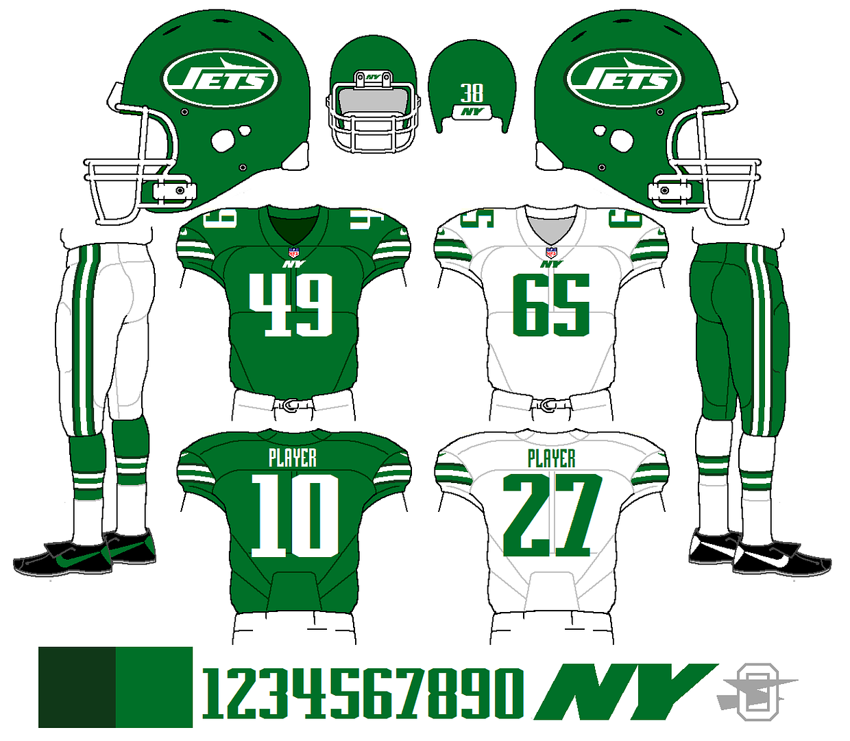
Someone recently posted a picture of the Jets' 80's kelly green and black uniform, and I was thinking that it looked nicer than I remembered...
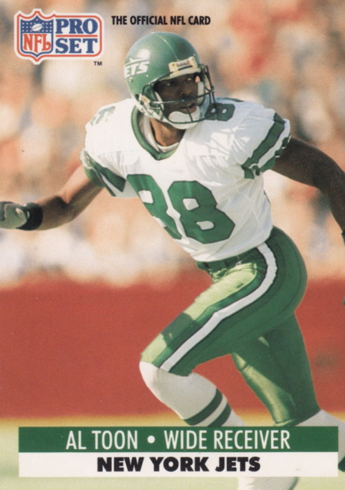
Also, I kind of like the idea of mixing two different shades of green, like the Jets did on their recent Color Rash uniform. So with this concept, I'm trying to marry a few elements from the current look to the above kelly green look, and use both greens, as well.
Thoughts?
-
2
-
-
Are gradients really needed? I think you can do without it.
Needed? No, most definitely not needed. I'm just playing around. Sometimes I think of these concepts as sort of like the concept cars they have every year at the auto shows... the one that they make to show off, but will never be put into production. This is absolutely not what I'd do if the Lions came calling. But I thought it would be fun to make.
-
2
-
-
-
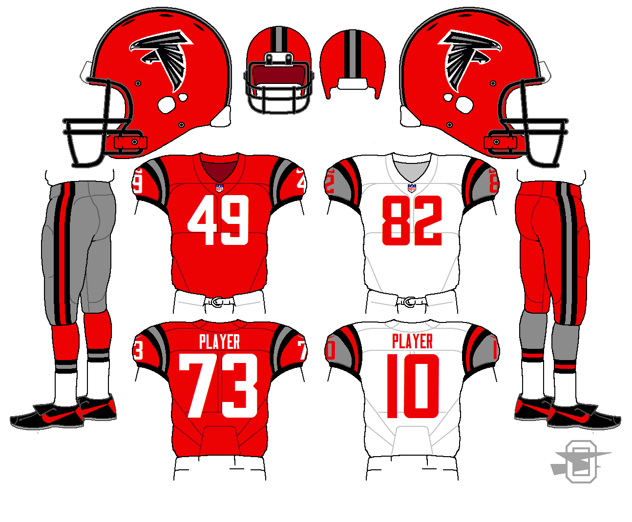
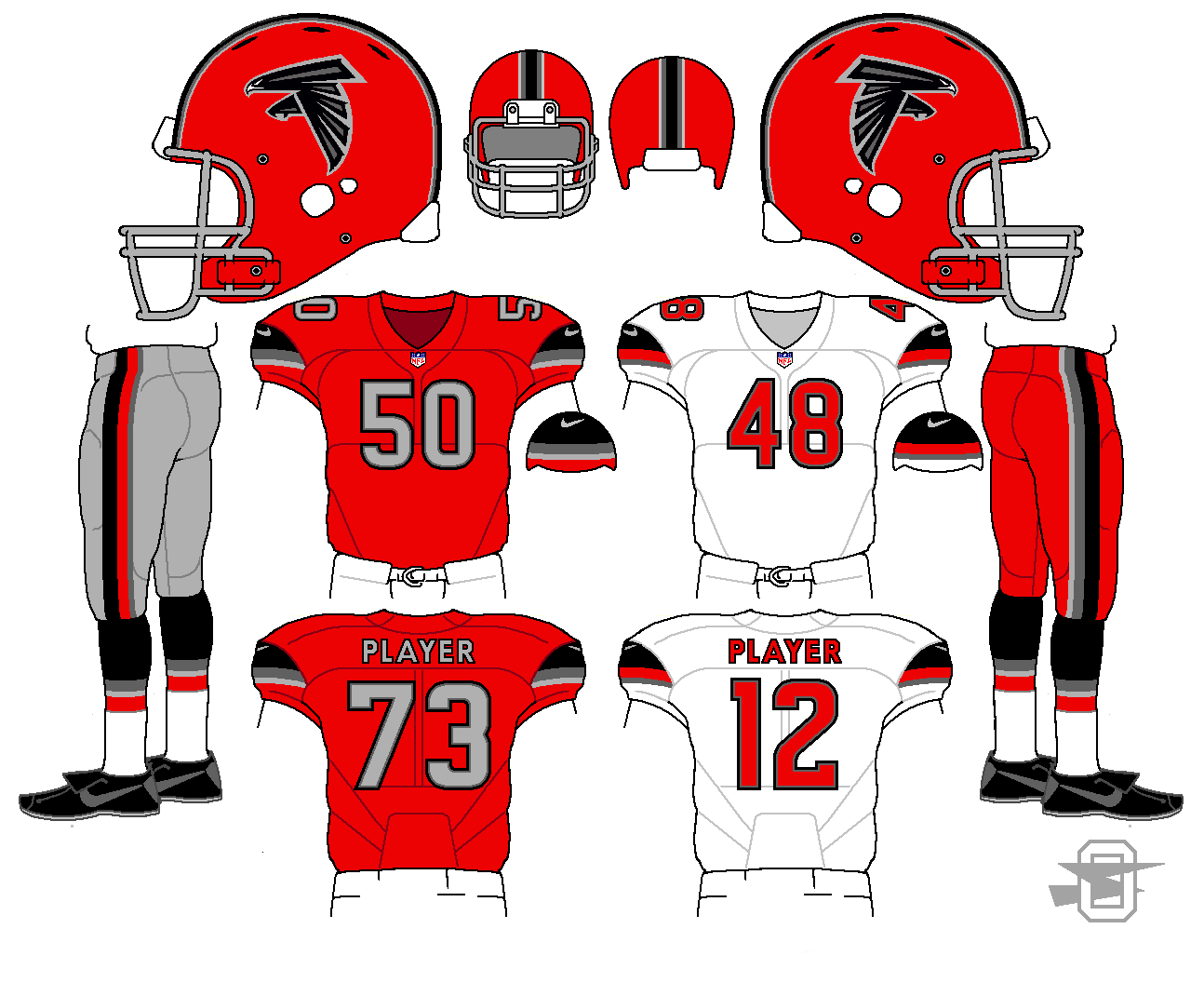
And, just a few days later, another new Falcons concept...
-
Another Falcons uniform. Based on the late 70's / early 80's version, plus adding a charcoal gray.
-
1
-
-
-
The Browns' new uniforms on Madden 16 for the Xbox 360/PS3 are bad:
The Browns' new uniforms are bad everywhere.
-
1
-
-
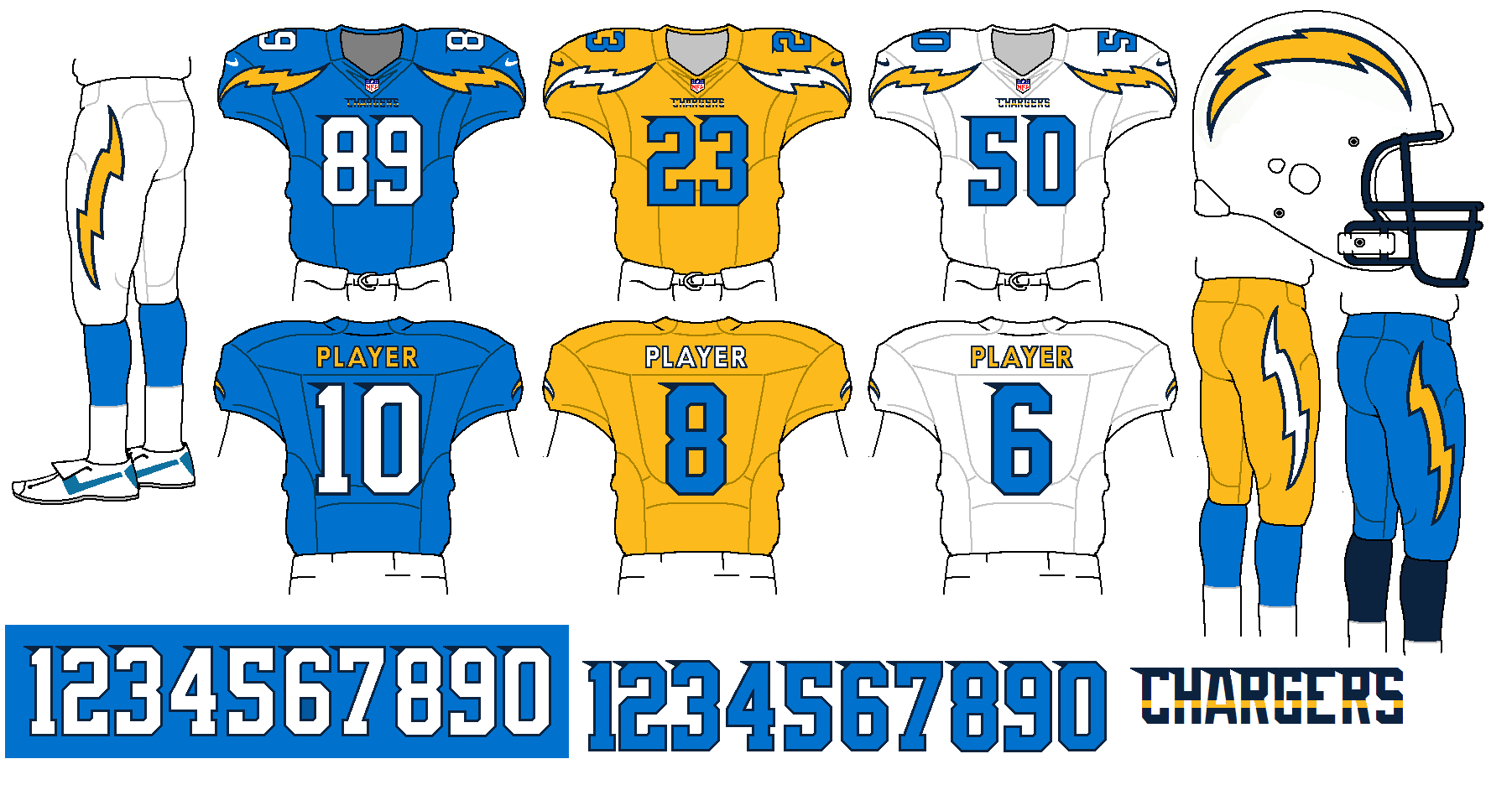
This is an idea I've tried before... trying to find some new real estate for the Charger's jersey bolts. I don't like the current treatment, and the old style shoulder bolts would be really squeezed on a modern template. This idea kind of follows the Seahawks' and Browns' use of the front upper chest area. As always, thoughts and comments are welcome.
-
3
-
-
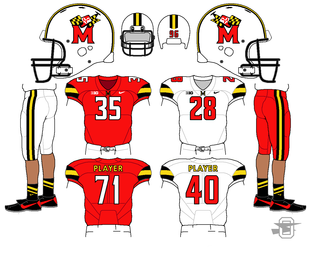
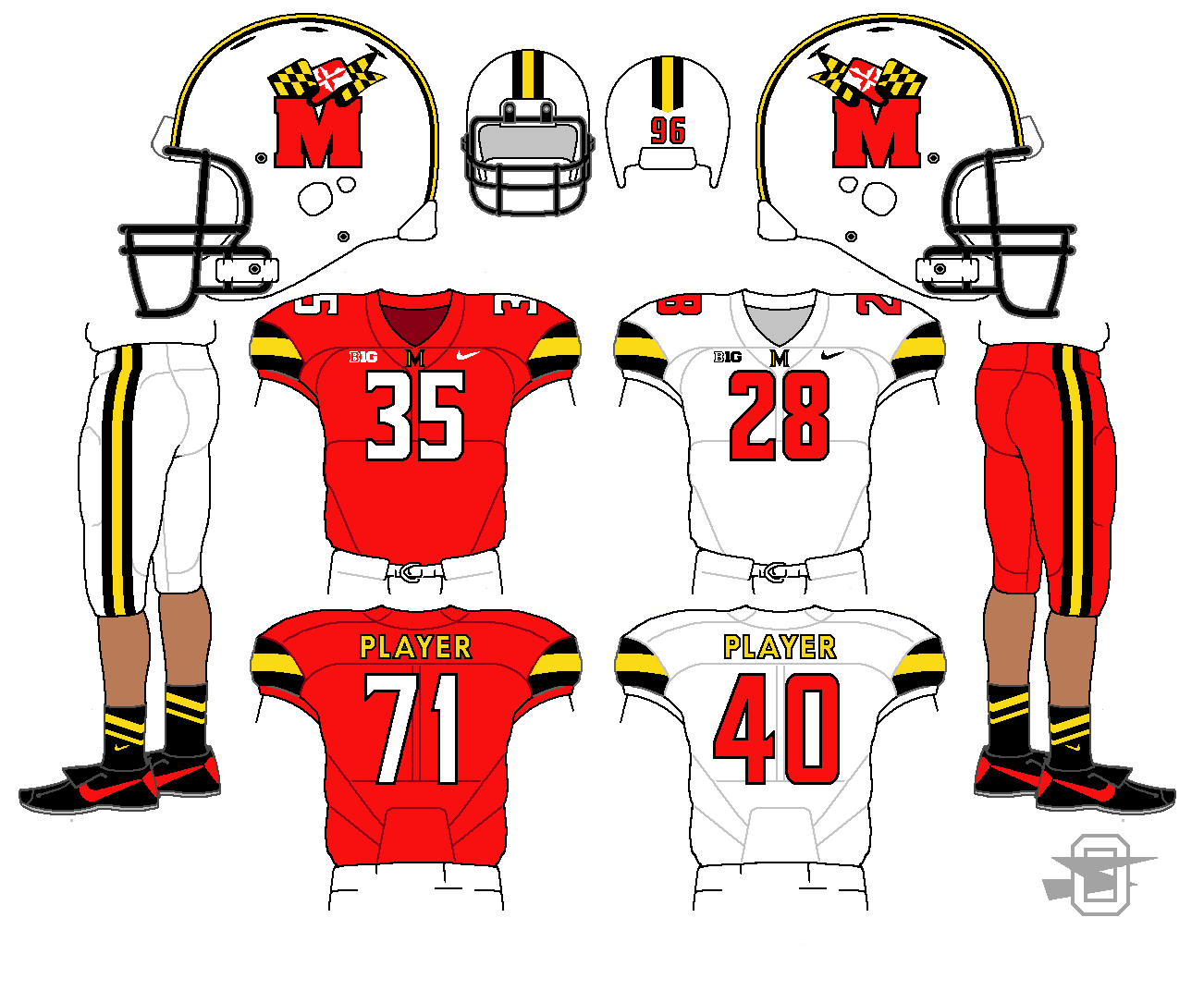
One quick update. It was suggested that the Maryland logo would look better with the modern "M", and I agree, so here it is...
-
2
-
-
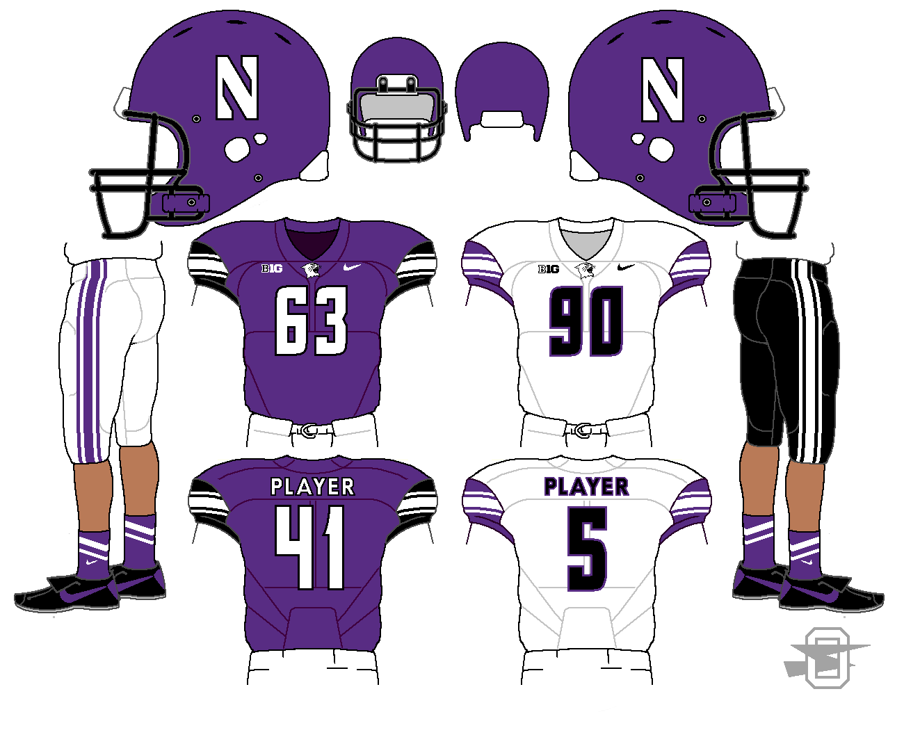
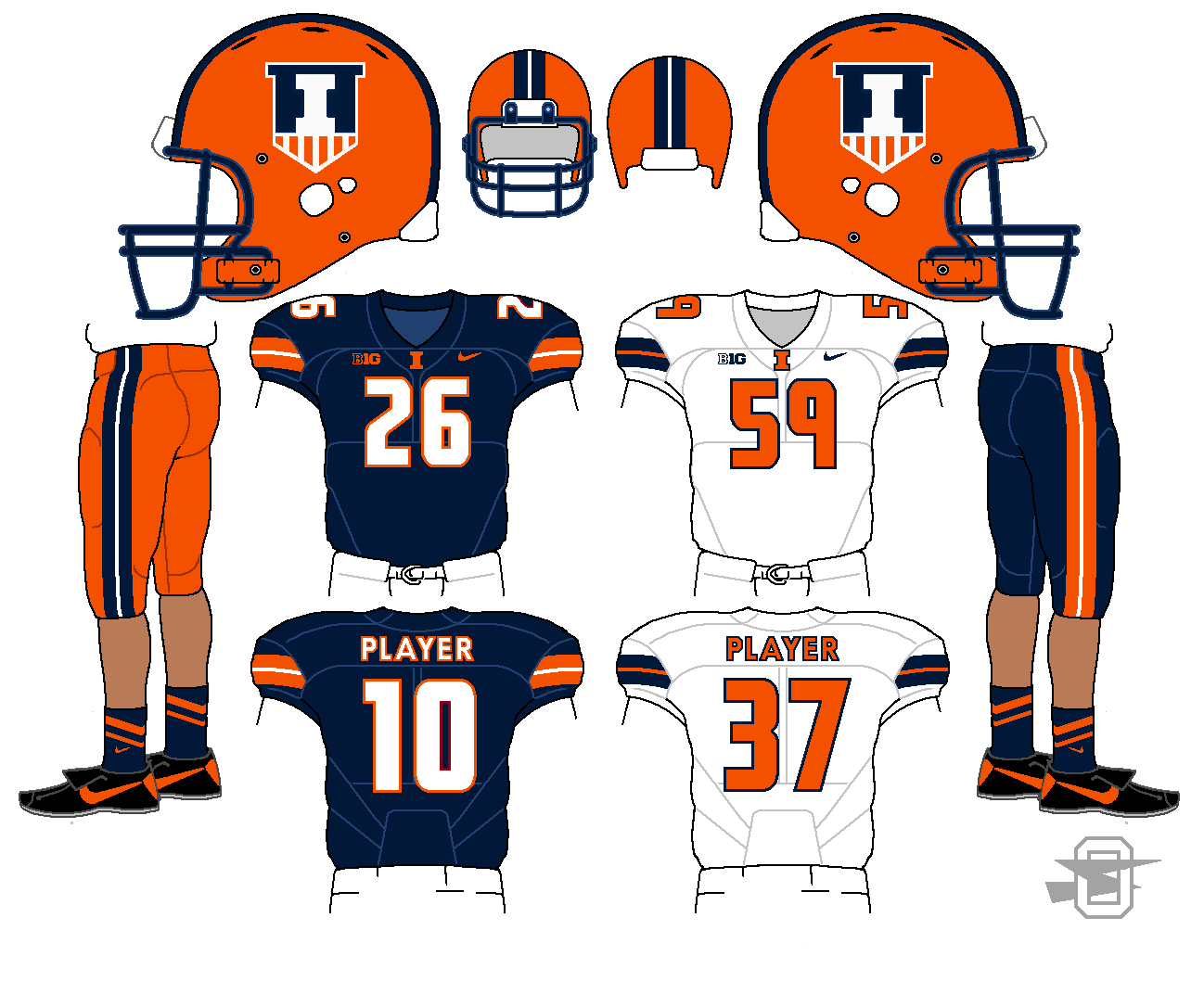
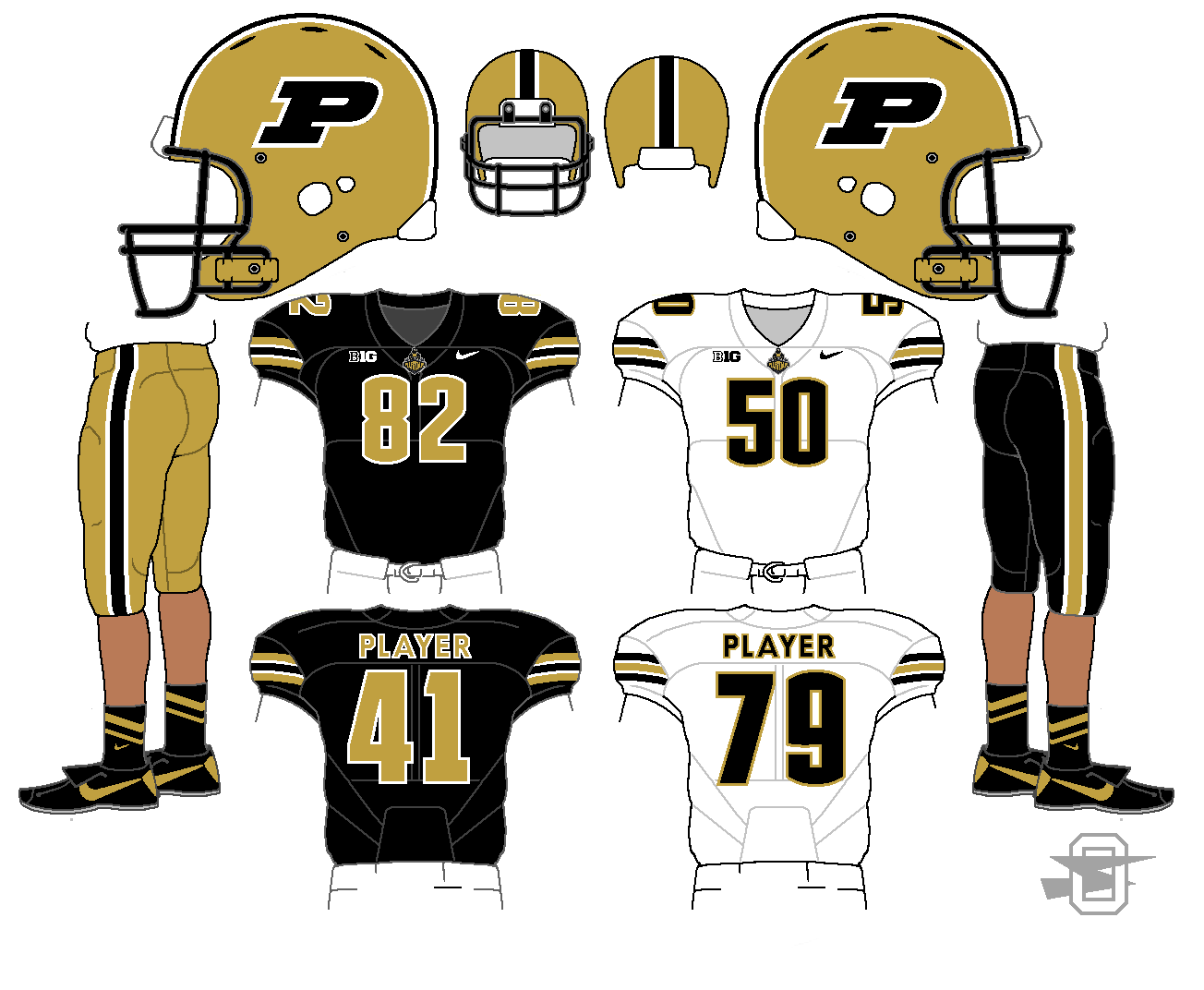
And to finish off, here are Northwestern, Illinois, and Purdue;
-
2
-
-
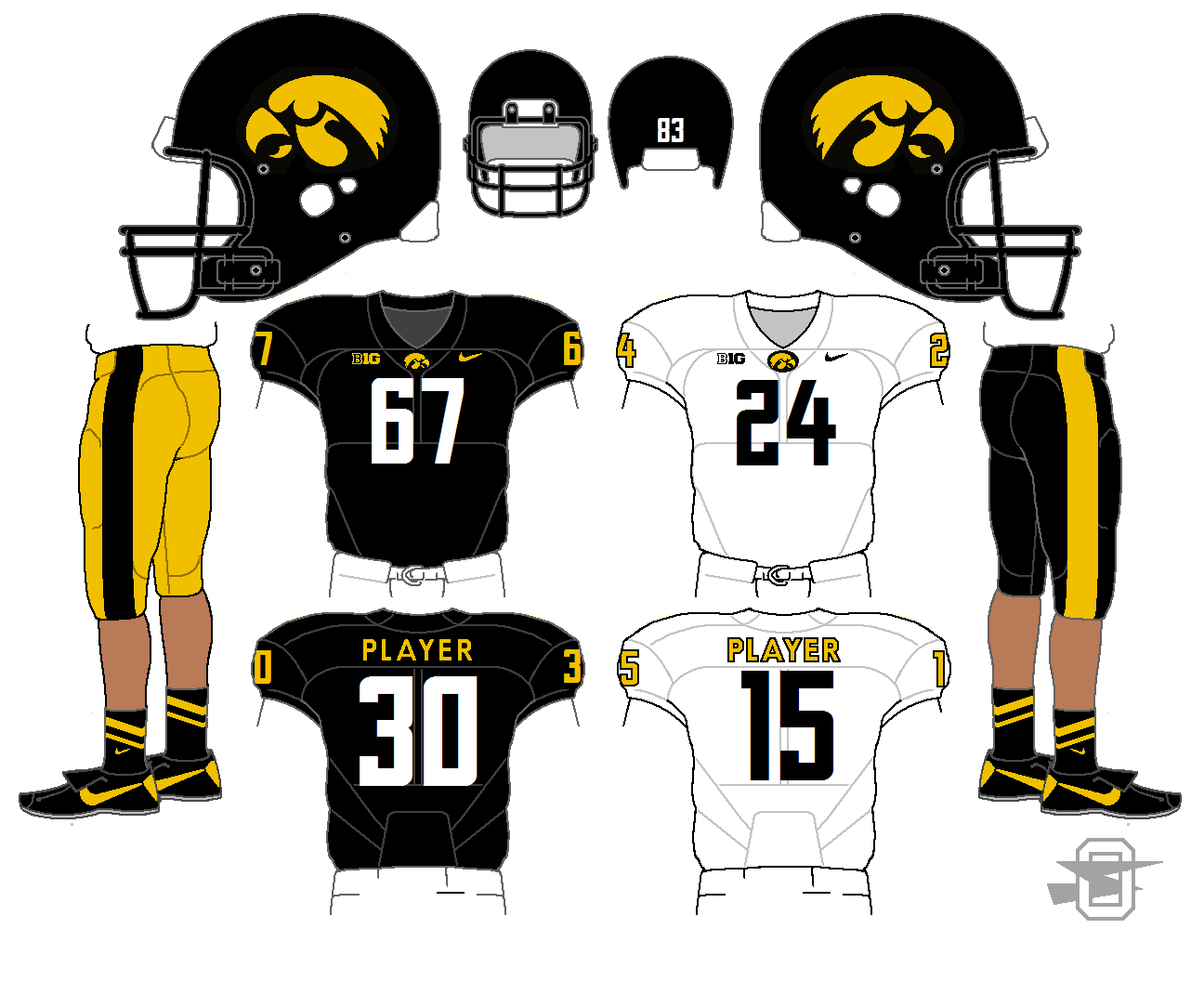
Minnesota and Iowa...
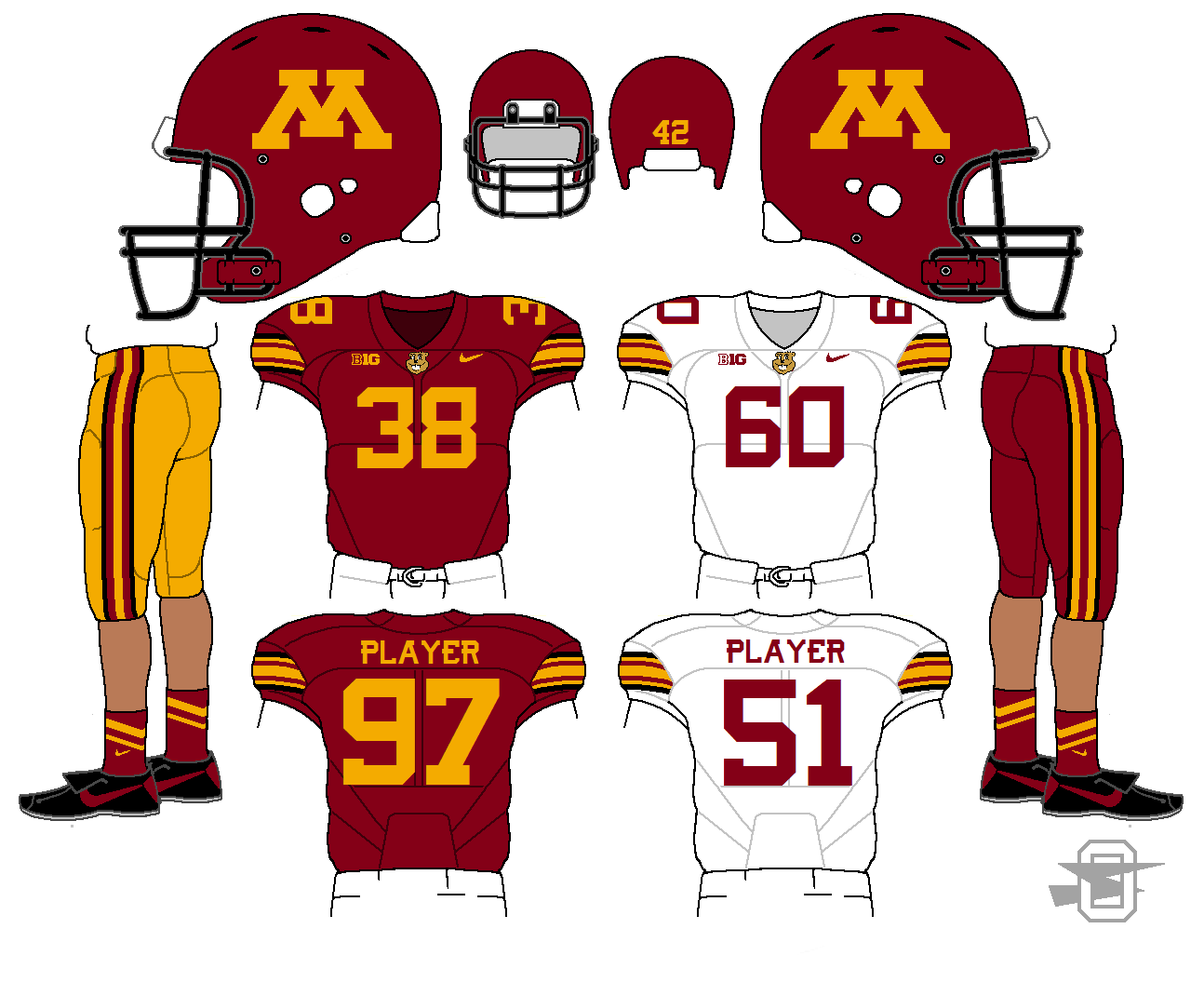
I know there are people who feel like Iowa's uniform is untouchable. I agree... it is untouchable... for the Steelers. As for the Hawkeyes, I tried to give them a look that would feel similar to what they currently wear but would be more their own.
-
1
-
-
PSU: Looks like Penn State. Not much else to say!
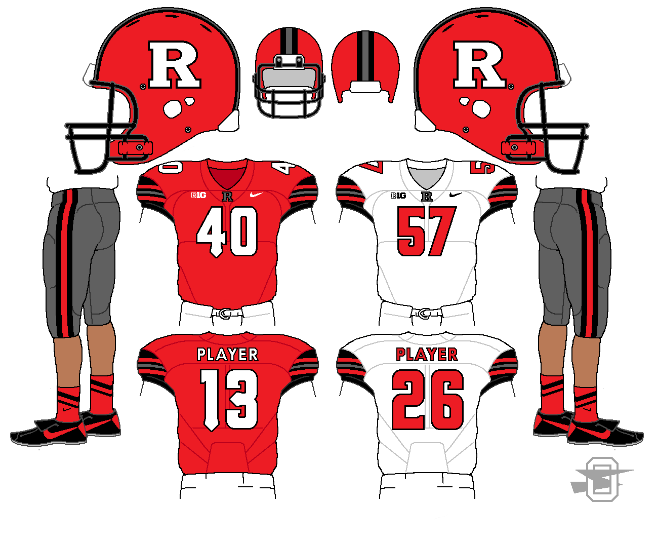
Rutgers: I feel like you could've gone more modern with the striping since you kept the number font. Maybe some tapering? Also not sure about the grey pants.
Maryland: Love it. Only suggestion would be to use their current M logo on the helmet. It looks like you have it on the collar.
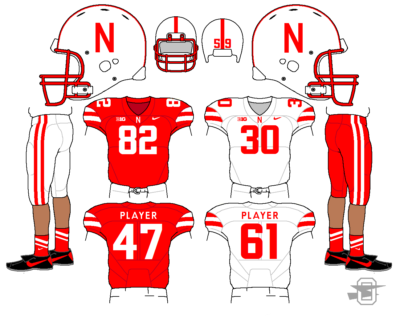
Nebraska: I'd stick with block numbers, since both their N logos are block lettering.
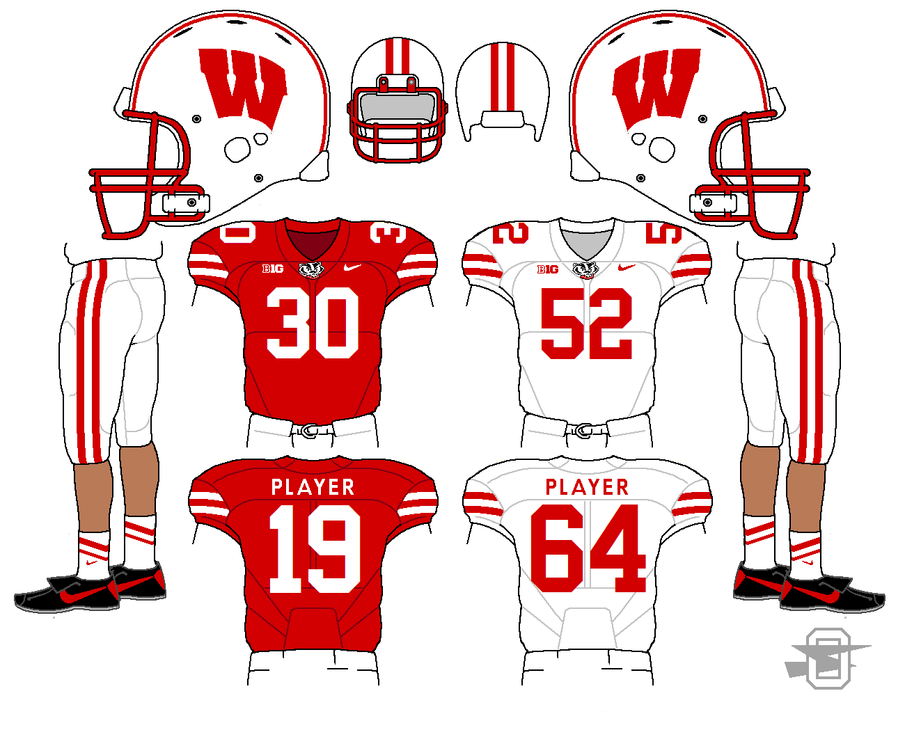
Wisconsin: I would've loved to see you change things up here. Maybe 4 vertical stripes on the sleeves to reference Bucky's sweater? Also I'd consider using Aachen for the numbers - Conrad made the Wisconsin-specific version and it has some lighter, more condensed weights.
I wasn't overjoyed with that Maryland helmet logo, either... let me give it some thought.
When approaching Nebraska and Wisconsin I knew I wanted to keep one in a standard block font, and give the other a (slightly) modern font... could be I should've switched who got what. Again, I'll give it some thought.
-
Here we go with Nebraska and Wisconsin. At first I thought the similarities would make the designs boring to do, but it was actually kind of fun to try to delineate the subtle differences. I like looking at these back to back.
-
1
-
-
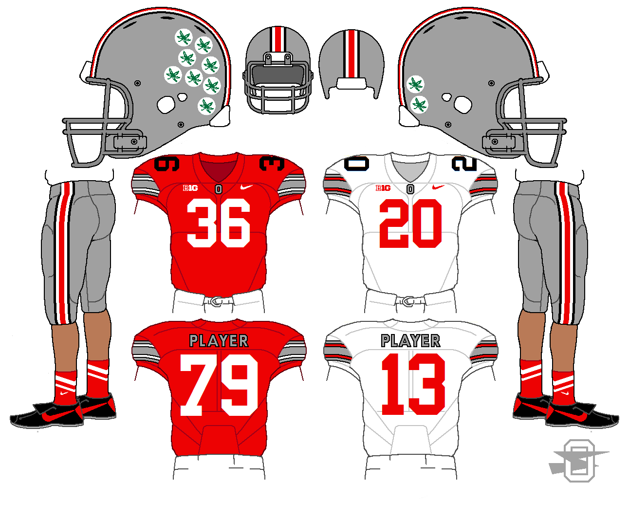
Yeah, I know that's the popular opinion, but I love the black TV numbers. I've been advocating that for years, so when they actually pulled it out for the play-off unis I was completely stoked. My main complaint was that they weren't black on the white jersey, too.
So as long as it's my concept, I'm keeping the black TV numbers.
-
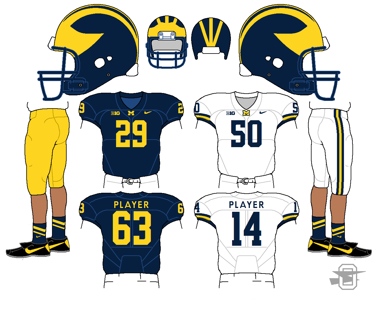
Pretty good so far! Couple things I'd change is the Ohio State shoulder numbers and yellow pants on michigan
Change to what?
-
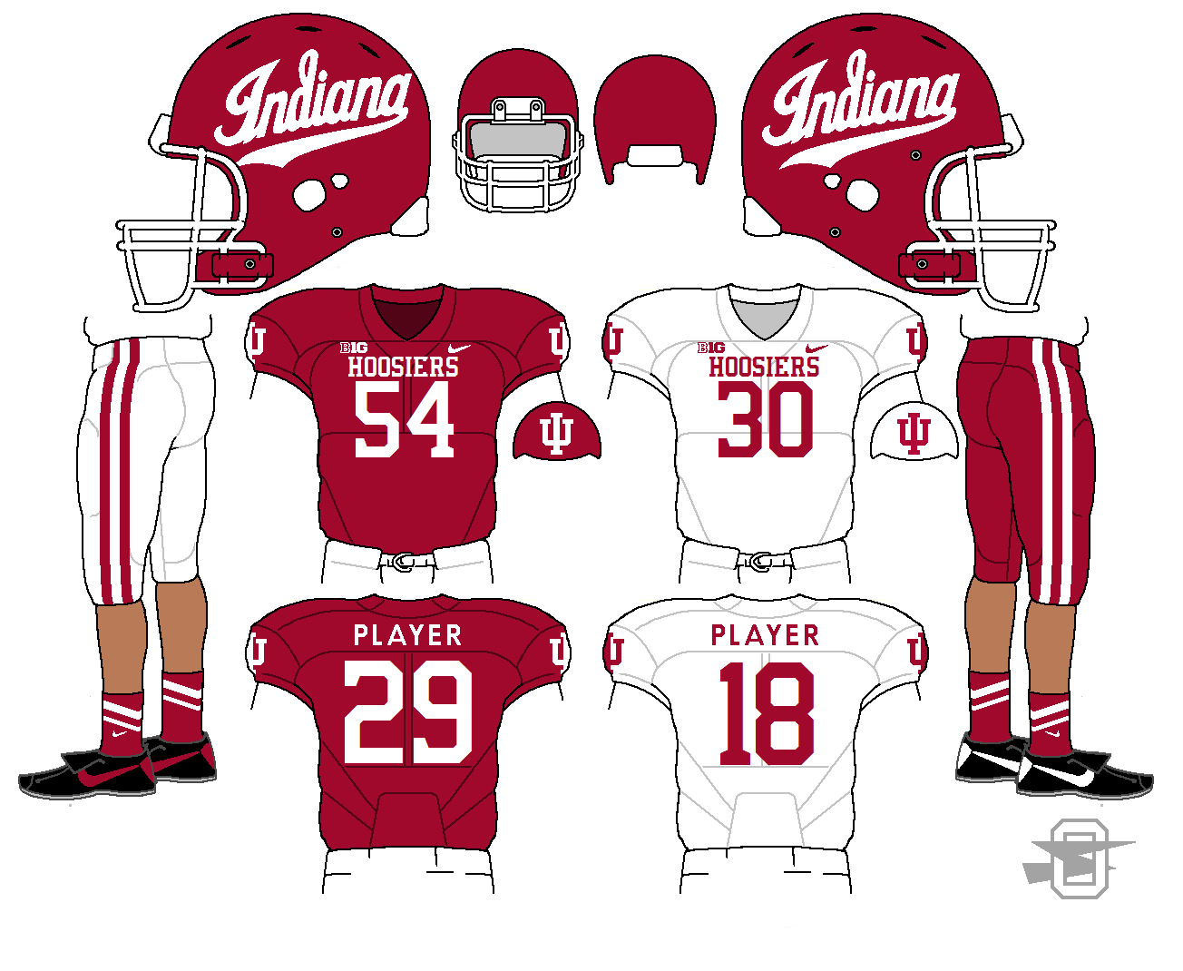
IU: The script on the helmet looks really nice, though it could be shrunk down just a tad.
I agree... I should rework it, but it took me so long to clean up the best version I could find, when I realized it was a bit big, I was out of energy. I'm sure I will eventually.
More...
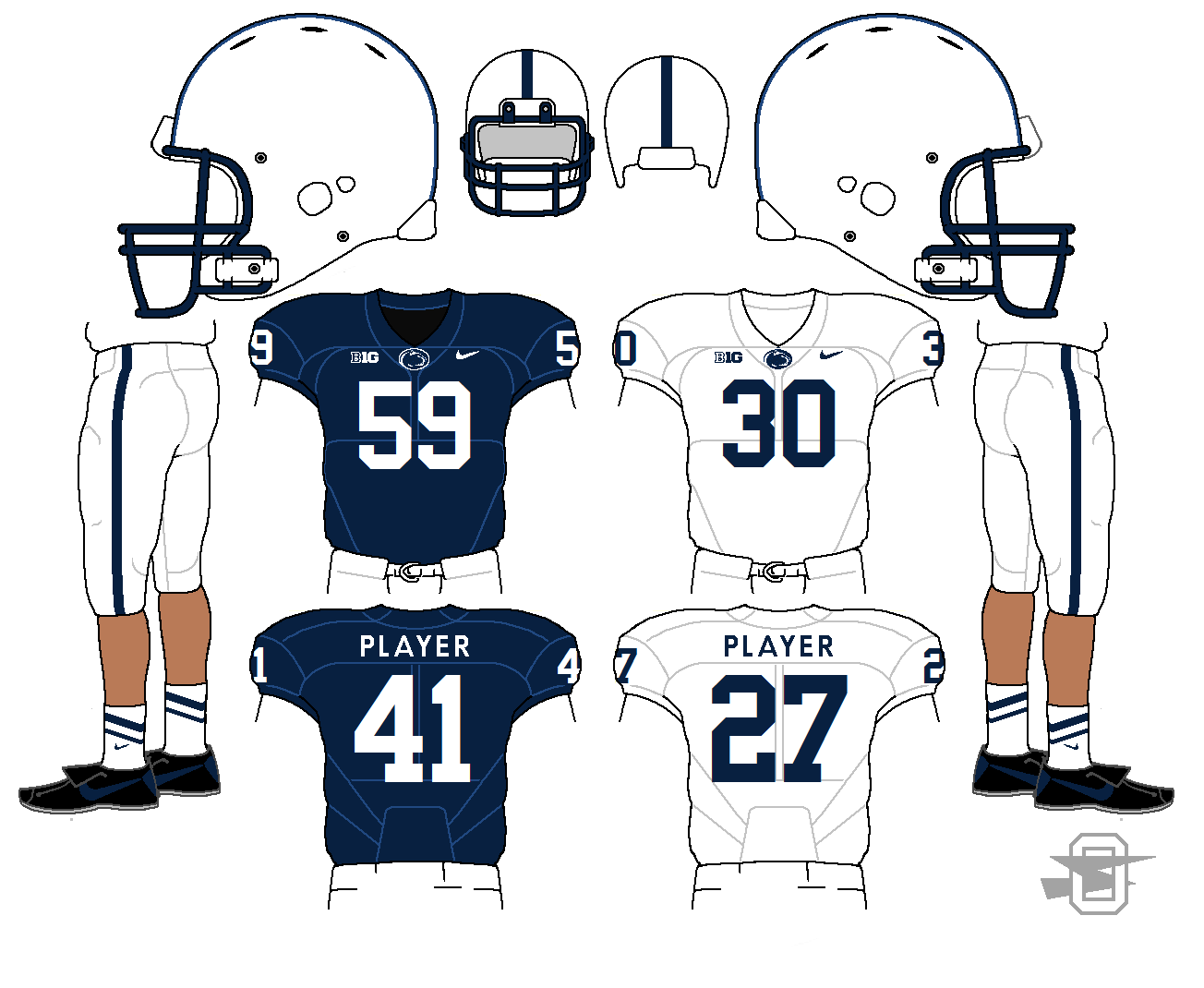
Penn State is another B10 team that's somewhat untouchable. I did want to match the helmet stripe on pants, and bring in a NOB.
Rutgers just needs to reel it back and calm down a bit IMO. The gray is supposed to be a bit darker than tOSU's. Kept their current font.
And as for Maryland, I spent a lot of time trying to get myself happy with their flag motif. But then, I got a look at their recent throwback, went back and researched some of their older looks, and decided to go in a completely different direction. Again, kept the current font.
-
1
-
-
And Michigan also has a pretty solid standard look that you can't really mess with. I am a fan of the new white road pants, so I kept them, although the yellow pants could be worn on the road maybe half the time.
-
1
-
-
Indiana isn't a team I have given a lot of thought to in my life, so they were a bit of a challenge. But with the intro a few weeks back of the script helmet logo, I could finally find something to get excited about. I left off the TV numbers because with the sleeve logo and large wordmark, the upper chest was starting to feel a little crowded to me.
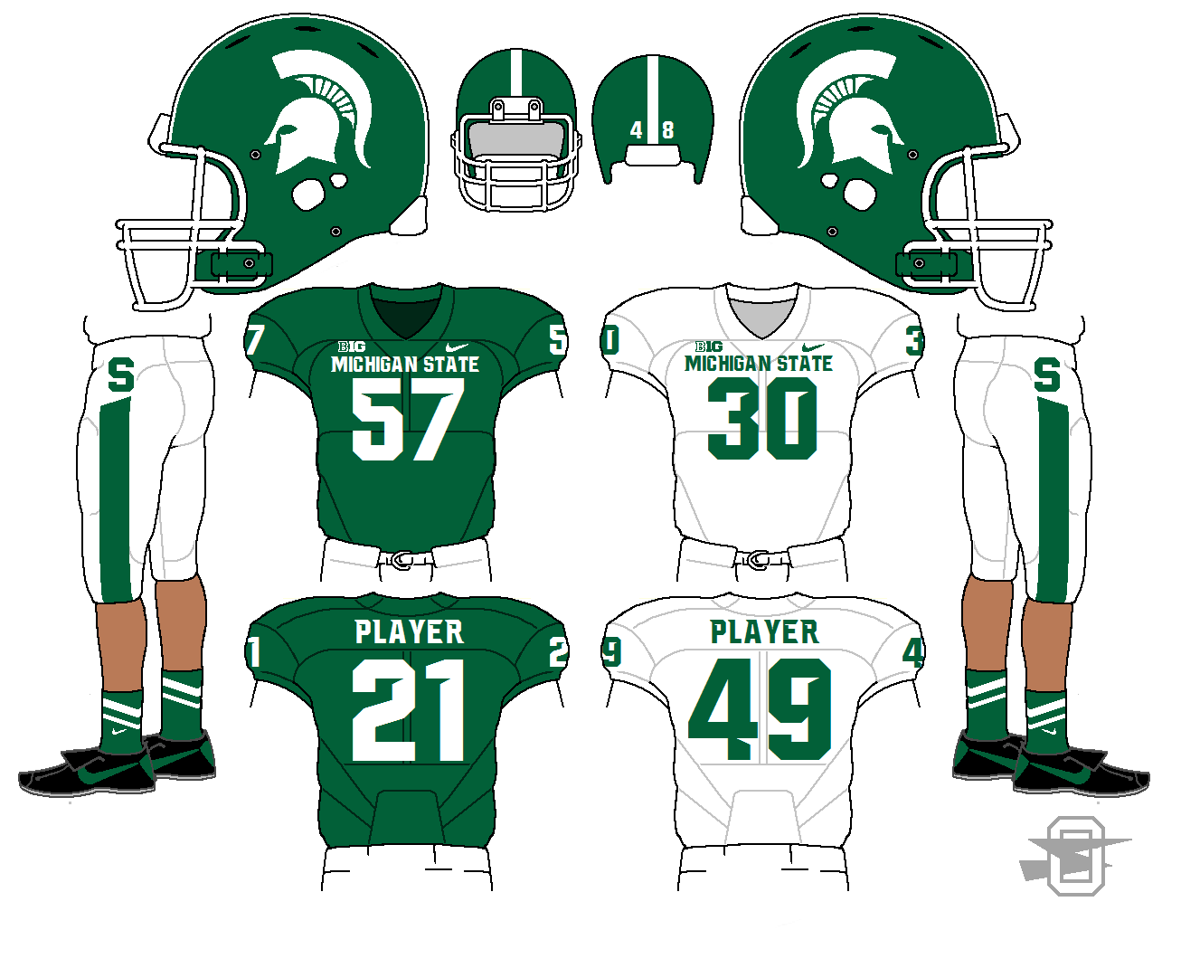
Michigan State doesn't need a ton of reworking IMO, just needs a little of the Nike frosting scraped off.
-
2
-
-
First up, the Ohio State University.
I was a big fan of last year's playoff uniform so I basically kept them in that, with just a few minor tweaks to make myself happy. No real surprises here.
-
1
-

Oldschoolvikings' NFL concepts - Commanders concept added
in Concepts
Posted
First the obvious one....
Then, the less obvious one...
C and C appreciated.