


oldschoolvikings
-
Posts
10,513 -
Joined
-
Last visited
-
Days Won
194
Posts posted by oldschoolvikings
-
-
9 hours ago, Ted Cunningham said:
Any particular inspiration for the sleeve stripes here, OSV?
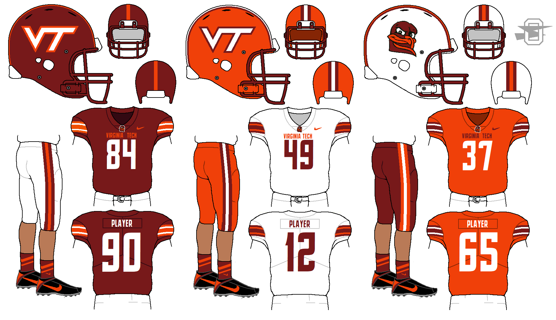
Not really. Va tech has such cool colors I just wanted to put them on to a relatively traditional template and let the color scheme do all the work.
-
-
-
-
-
5 hours ago, Dan O'Mac said:
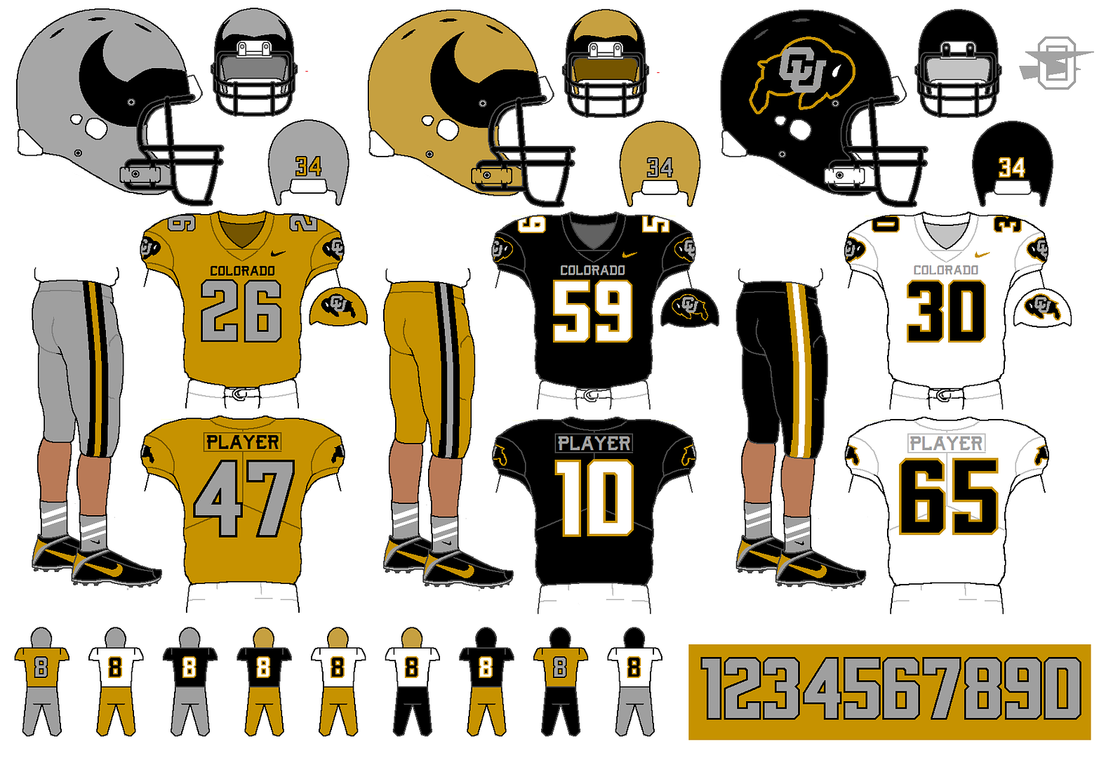
I love the return of silver to the Colorado set. One thing I don't like is the white in the pants stripe on the black pants. To me, with the rest of the set, it looks like that should be silver as well.
Yeah, the white stripe there isn't my favorite part either, but it kind of ended up there by default. I tried the silver, but I found that particular gold and silver just can't touch. There was zero contrast and the just mushed together. Maybe a black inner stripe? Go gold/black/gold stripe on the black pants?
-
-
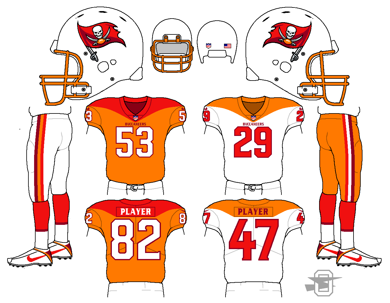
Here was my thought... sure the Buccaneers' current font is a horrible nightmare, and should probably just be wiped clean, but suppose you had to fix it? Is it even possible? Here's my attempt...
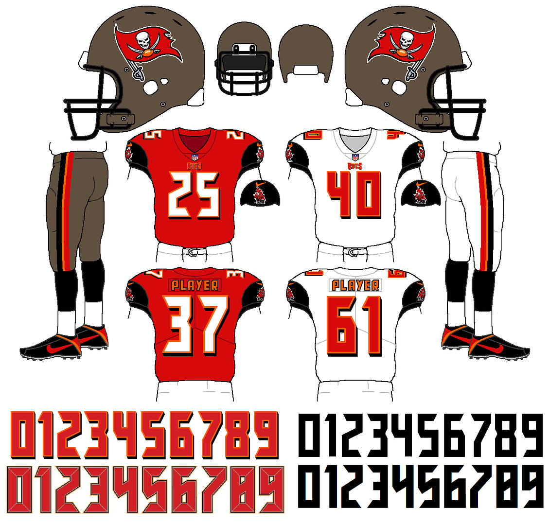
My clean up is at the top, and the current font underneath.
-
 6
6
-
-
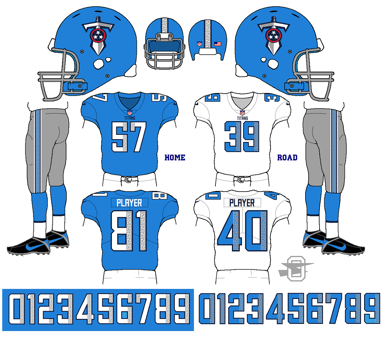
New titans'... concentrate on he Columbia blue, add a Greek pattern.
-
5
-
-
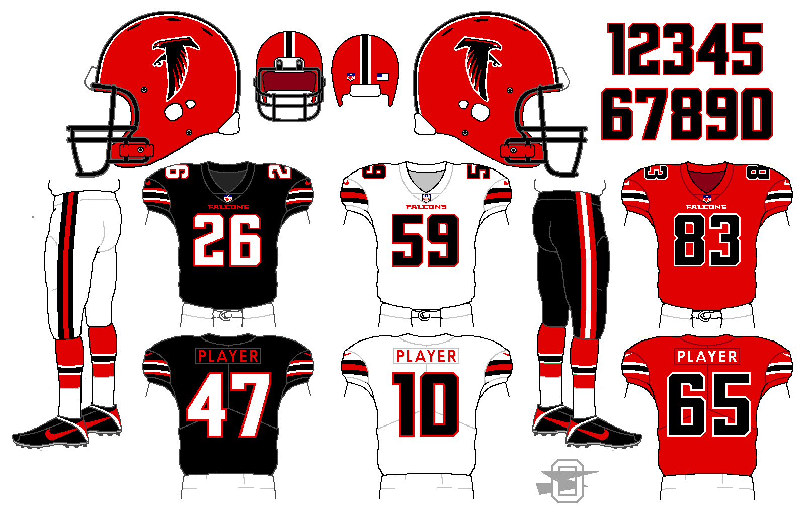
Falcons... unsure about the sleeve stripes, particularly on the black jersey.
-
7
-
-
3 hours ago, verno said:
So, l love your Cowboy concept, but, are those baby blue secondary stripes on the sleeves? Or, does my phone operate on the Flintstone plan? Obviously, silver secondary stripes are better, but...
It's the same silver/gray/blue color that I used for the helmet and pants... just replacing the current black.
-
I agree. I know it's a sign that I really need to get a life, but I swear that bottom of the page pop-up feels like the most annoying thing in my life right now. I keep thinking it's done, try to X off it, and miss, ending up God knows where.
-
-
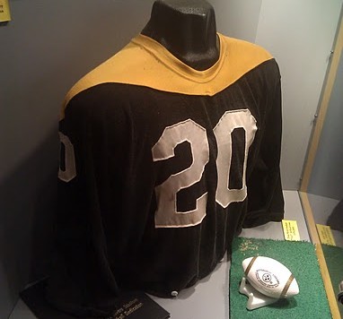
23 hours ago, nate.sweitz said:
I gotta say, the “Batman” look works even better on the Ravens than the ‘66 Steelers! Considering the Steelers keep passing on the chance to bring it back as a throwback, I guess someone oughta use it. I’ll have to click through all of them again some time, but this might be my favorite of all your Ravens concepts.
I was wondering how long it would take for someone to spot where I stole this from...
-
3
-
-
I think I've posted more Ravens' concepts than any other NFL team... just can't get completely satisfied.
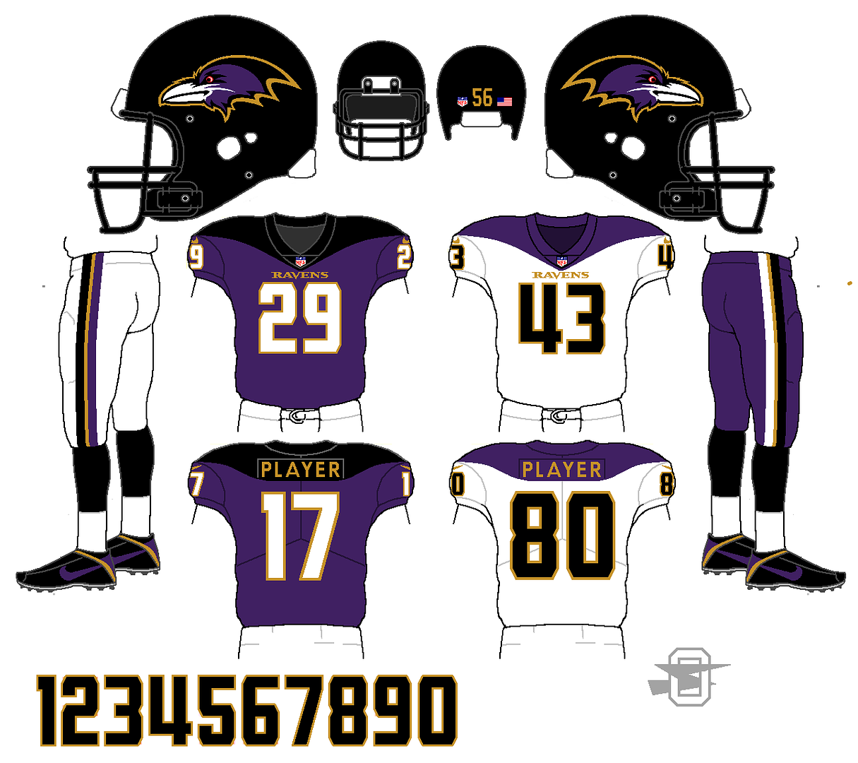
-
3
-
-
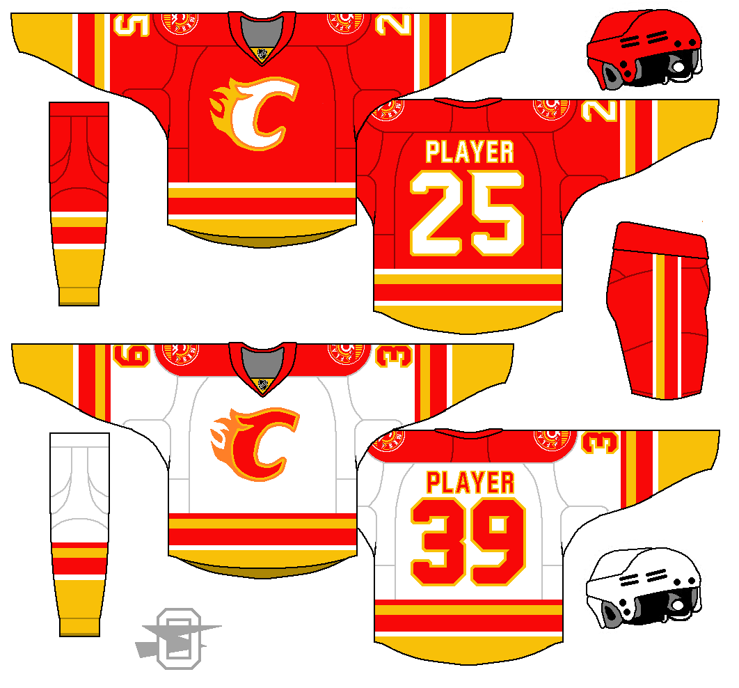
19 minutes ago, Vitalogy26 said:
I love the color but what exactly is going on with the logo? It would look great if it was their current logo.
Just trying something different, I guess. I don't have an issue with the current logo, I just wanted to try a different "C".
-
1
-
-
I'm not sure I like the extra color in the logo... thoughts?
-
2
-
-
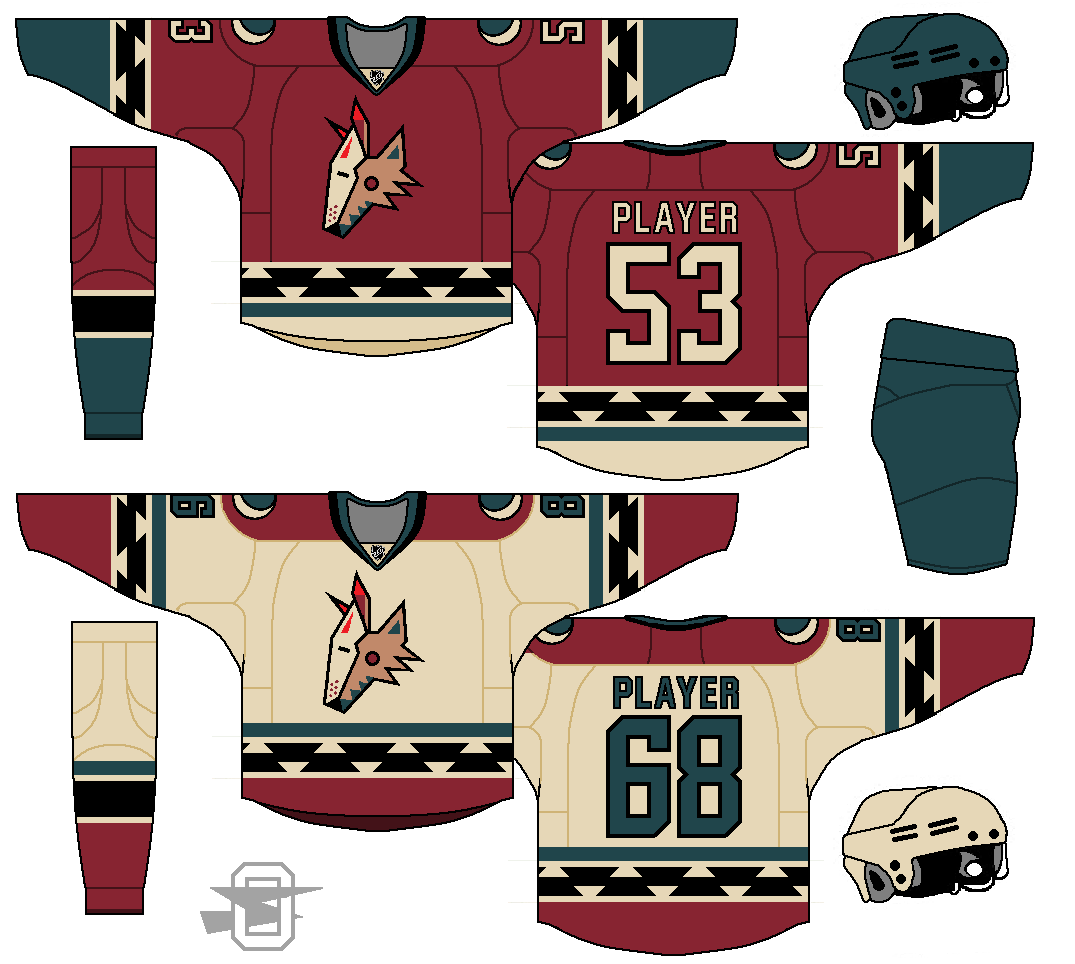
2 hours ago, Griffinmarlins said:
It's a great and underused color scheme. Still think dark teal replacing the purple would look sweet though haha.
Damn. OK, you have a good eye for colors... that's a beautiful color scheme.
-
14
-
-
1 hour ago, Cardsblues02 said:
I’d love to see your Coyotes concept with teal or green replacing purple. I do think the purple somewhat works, but it would look better with a different color IMO. Still and interesting and well executed concept.
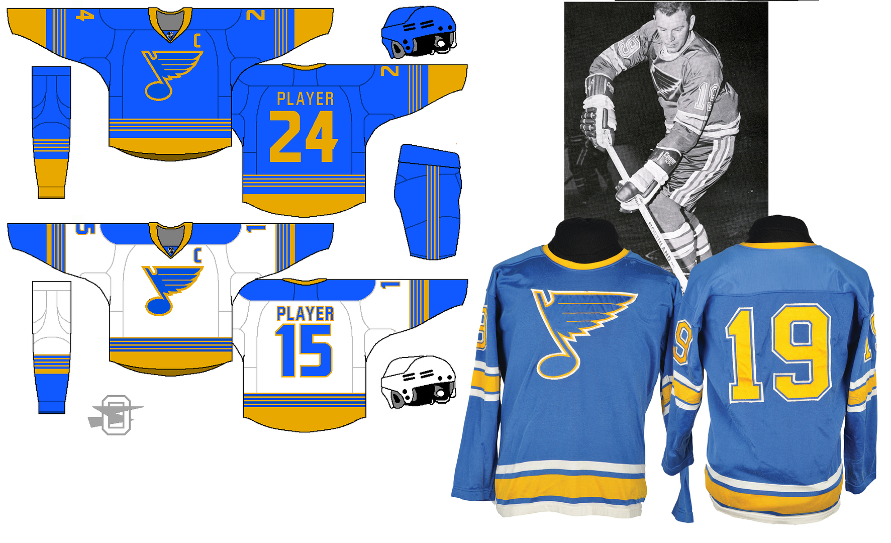
The Blues gold color you used is ugly. Other than that, I don’t mind the set. I actually like the double blue, but a return to just royal would be fine by me. Oh and the stripes remind me of the Nashville Preditors.
I was just looking at that concept on my tablet and the blue looks very different from what it does on my computer... I guess that's pretty common. (Not that you'd necessarily like it better, but still...) The stripes are supposed to relate to the lines from sheet music... that might be a bit to "Nikespeak" though.
-
1
-
-
On 6/29/2018 at 6:24 AM, Griffinmarlins said:
Love the Blues look a lot. That would be their best look ever if it were used in real life.
Regarding the Coyotes, could you try a dark teal instead of purple? That would probably go well with the red and sand. I think the simplified pattern looks great though.
Yeah, I know I'm pushing it with the purple. That seems to be a pretty common reaction to that particular concept (and I've recently been told I take criticism so poorly I should be ashamed!) and your dark teal is an interesting thought. I'll give it a go.
The purple/cardinal idea is something that's been stuck in my head for like 20 years, and I just keep trying to make it work. Back in the 90's I worked with a guy who had played football at a tiny school in Indiana called St. Josephs, and he told me their colors were purple and cardinal, and I was just fascinated. How would that even happen?

I've been trying to find a pro team to force it onto ever since. (I've got a purple/cardinal Arizona Diamondbacks concept somewhere, too.) But maybe I'll try a few other colors in it's place... just not black.
-
2
-
-
Years ago when I started this thread I posted an Arizona Coyotes uniform that I was rather fond of... you can find it back on page two. Anyway, with the Coyotes recently bringing back the Kachina sweaters, I was thinking about how much fun their original look was. That made me want to revisit my concept, but see if the old logos might work with it. Results below;
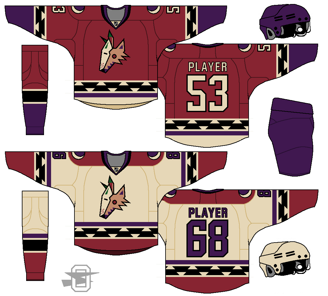
-
6
-
-
Recently in a thread about favorite color schemes, a fellow member said he was tired of the St. Louis Blues' "double blue" color scheme. And he was a fan of the team. Not being a fan, I've always been OK with the look, I thought they pulled it off, and it sets them apart from the Sabres. But the more I thought about it, I kind of soured on it too. Especially when looking at the Blues' distant history. It's sometimes hard to tell because of the varying nature of old color photography, but at one time the Blues had a noticeably lighter blue... almost sky blue in some pics.
So...
Here's two ideas... one with white trim at home, and one with the white removed;
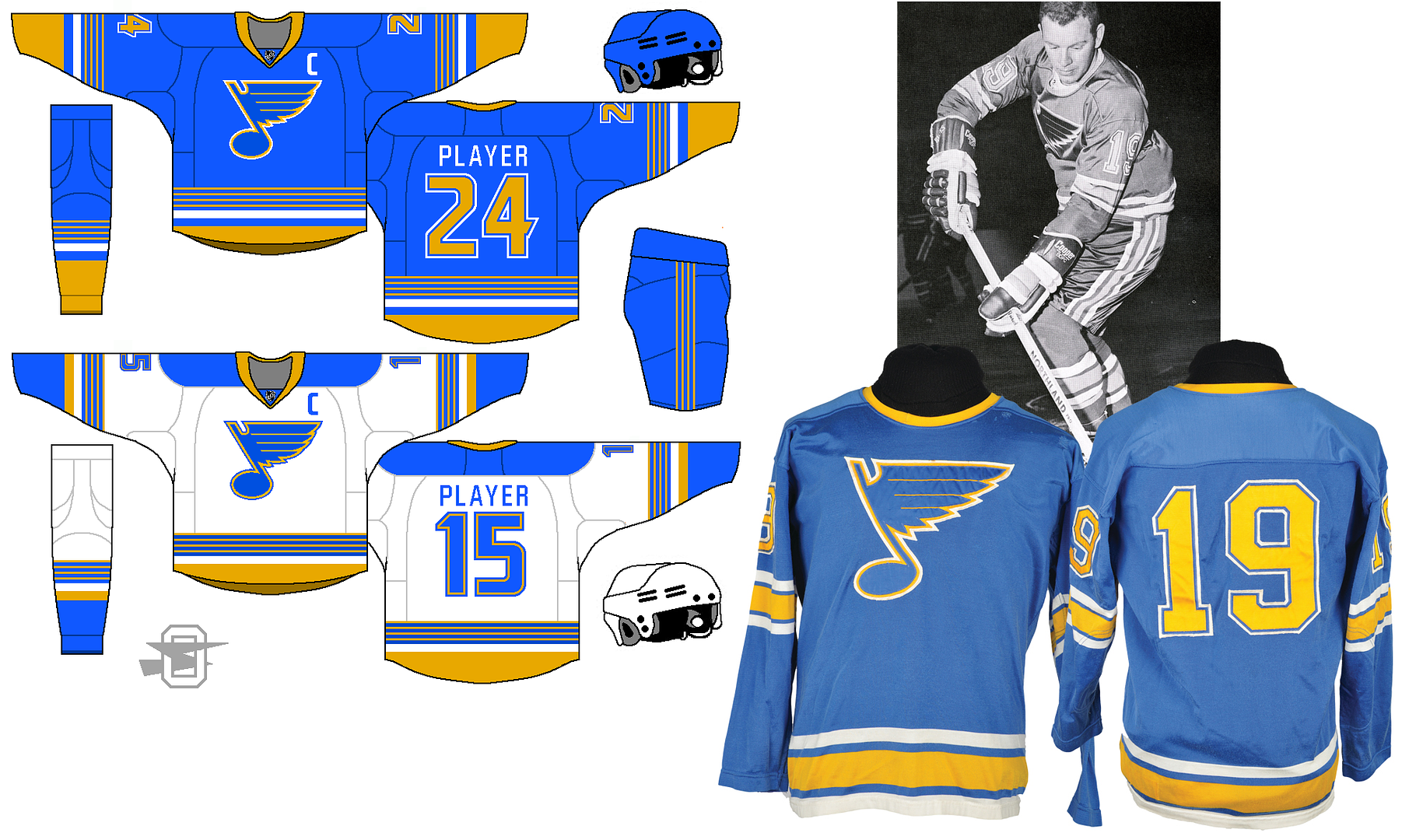
As always, thoughts appreciated.
-
5
-
-
4 hours ago, BringBackTheVet said:
The ad bar that shows up on the bottom of both mobile versions (iPhone, iPad) often pops up in front of contact, or right over a reply button you’re about to hit, and is often just blank and very distracting. Clicking the x to dismiss it just makes it docked rather than in a floating gray bar.
Yeah, I understand the need for revenue, and want the site to stay afloat, but jumping Jehosaphat, that bottom ad bar is a pain. I've actually found myself logging off the site because I don't want to deal with it. Hopefully, I'll get used to it.
-
It's pretty crazy... slowing everything down. I keep thinking it's done, then accidentally clicking on the wrong thing.
-
1
-

Oldschoolviking's college football concepts - Golden Gophers added
in Concepts
Posted