

raysox
-
Posts
7,588 -
Joined
-
Last visited
-
Days Won
22
Posts posted by raysox
-
-
Oh that GB concept is sharp. France is particularly nice too, although I think they could pull off a sort of cotton blend texture like Oregon's uniforms a few years ago. You know, for the sake of fashion.
I think Germany could use another pass. Not necessarily your fault but I think they could really use a fresh start. Their brand stands out as underwhelming for me with the Times New Roman D on the cap, and just a generic script on the front. Maybe something with a Germanic font, or take cues from their football team that's always really sharp. Dress em up like the Pirates in the 90s and you'll have yourself a solid concept.-
 2
2
-
-
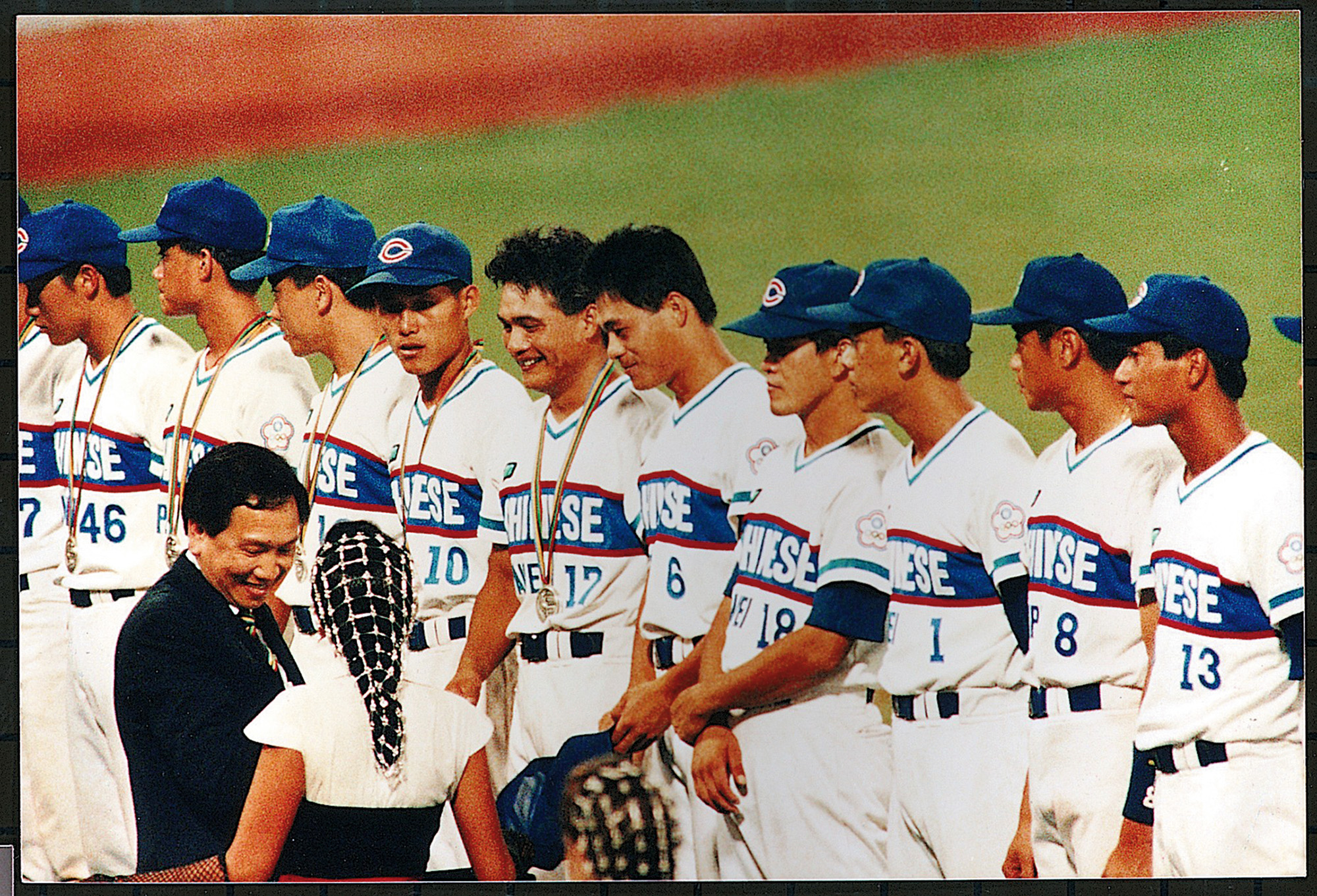
I think I found my favorite Cuba look - from the 1992 olympics

Couple good ones in there actually
-
9
-
-
Colombia and Taiwan are clean but China is top tier. What a great idea.
-
 1
1
-
-
My tweet had a lot of conversation around it, and a lot of people saying I forgot their specific favorite (as expected). There were a few pretty good ones though.
-
I really wish Venezuela still rocked maroon as it's primary color. Colombia could use a different font on the front and back (and yellow jerseys). I'm not one to tell someone how to celebrate their nation but if you have a unique color in your catalog, i expect you to blast it!
-
3
-
-
14 minutes ago, TBGKon said:
I don't mind the jerseys, but baseball really needs to simplify the cap logo.
I agree with you. The simplified logo looks decent on a jersey front. But that doesn't change the fact that their logo uses Copperplate and Bank Gothic and we're just expected to be cool with it.
-
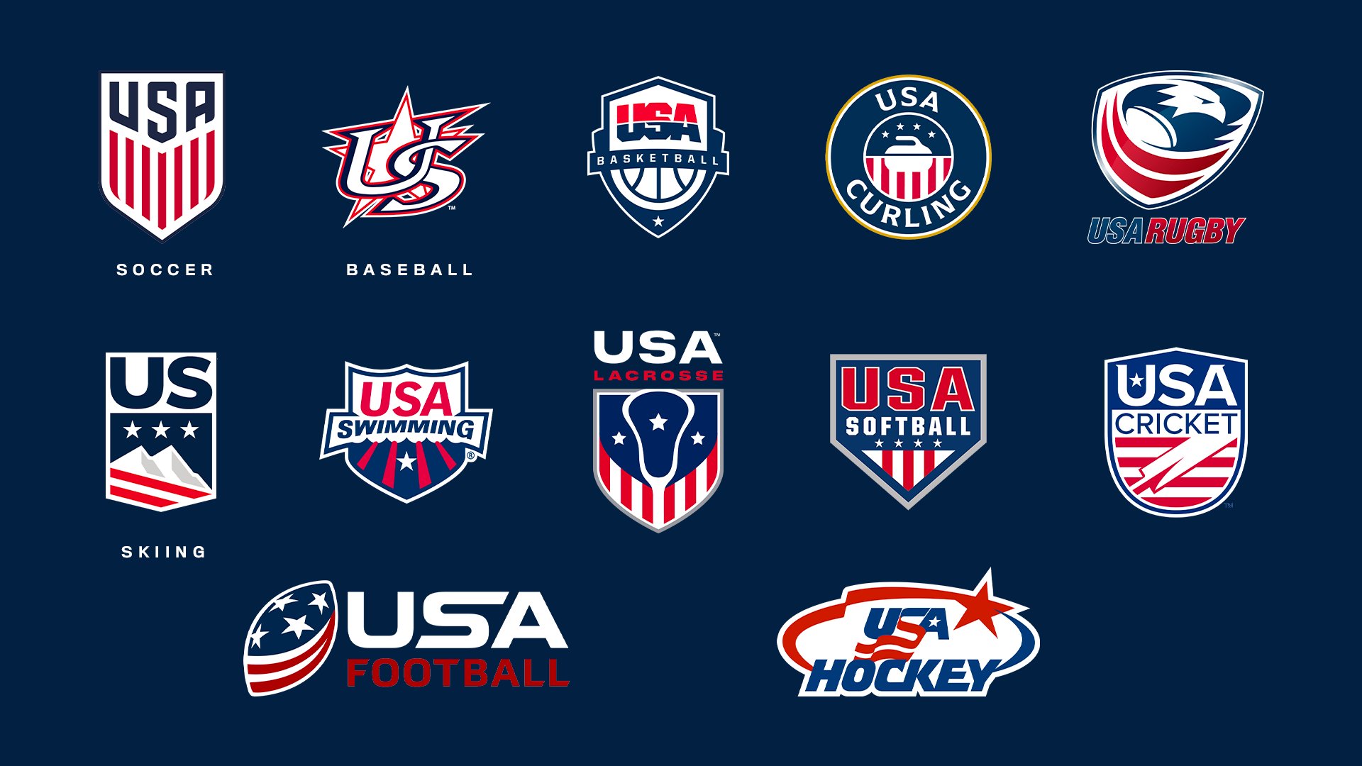
I made this graphic yesteday comparing Team USA logos that took off on twitter. My question is, what is your favorite? Is there one not here that you consider better?
Overall, baseball seemed like the most-despised. I do not like the soccer one, but A LOT of other people do. Skiing and Rugby seem to be the best designed of this batch.
-
4
-
-
3 hours ago, GriffinM6 said:
I know I'm kinda late to the party on Japan, but I gotta say I do like your idea of adding pink to the mix. Maybe you could try doing navy, gold, and pink? Like the Pelicans but with pink replacing red.
What if.... rose gold?
-
1
-
 2
2
-
-
Japan, Czech Republic, and Panama absolutely rule. Great job there.
I think Netherlands could use a fresh logo. The current crown representing all of the Kingdom of the Netherlands (Curacao and Aruba) seems generic and the NL monogram might be too. I prefer black to the current navy, but a little light blue to pair with black and orange could be really nice.
China i'm not so sure on, but I think it's 100% because the actual logos this WBC with the Dragon head blow the old english text out of the water.
Looking forward to more!-
1
-
-
Hyper specific reference but Cuba reminds me of the Clearwater Phillies and Charlotte Rangers
-
6
-
-
I saw these on twitter earlier and you absolutely nailed this. Can't wait to see the rest!
-
1
-
-
I'm sure Utah would love that.
-
Somewhat related to this conversation: I went to the Cheez-It Bowl at the Citrus Bowl/Camping World Stadium and had one of the worst stadium experiences i've ever had. The seats were on top of each other with no arm rests in between and made of flimsy plastic. The concourses were actually confusing to maneuver. There were no TVs in them either, so while in a 40 minute line to get a water bottle from an understaffed concession stand, we would all be crouching down trying to see the video board on the opposite side of the stadium. Oh and the upper deck looked straight up dangerous with how steep it was paired with metal bleachers.
So maybe it's good they aren't selling out that place. -
What makes you say that? The 500 million endowment gap to the lowest current Pac 12 member, or the 150 school gap in the US News college rankings to the lowest current Pac 12 member?
it's just where their conference championship game is. Hell, it would be nice geographically for UNLV and Nevada to join but it's the same reasons Boise State never really got considered either.-
1
-
-
As a Florida State grad, and the son of a NC State grad - noooooo I wanna stay in the ACC
-
2
-
-
this is a super fun series, kudos for the creativity
-
2
-
1
-
-
anyone else get big Amsterdam Admirals vibes from the Sea Dragons?
-
2
-
-
I think this logo is really nice! Who knows if they'll ever move on from the Chiefs but this is a good alternative.
However I think it could use some black as a base dark color. Right now the yellow and red are pretty similar hues and very bright. I don't know how it would look without trying it but I think making the red on the logo black, the yellow > red, then the outline yellow might look cool and give a little contrast. Don't incorporate it everywhere like the current brand.
-
On 2/19/2023 at 7:08 PM, Cujo said:
That new logo tho. Just recolor the original NY identity.

Orlando being a side-facing logo but with angled teeth kills me. This is my least favorite brand in the new launch
-
9
-
2
-
-
growing up, my high school (built in 1996) had this good logo for an original team named the Hurricanes
So imagine my disappointment that they transitioned to this to emphasize the "University" in the school name -
Let's hear it, what are some sports merch you have the pleasure of owning? What would only the nerds on a sports logo/uniform message board would think is cool. Think jerseys, shirts, jackets etc.
The idea for this thread came from posting my AAF Arizona Hotshots Starter jacket that I got when they were still on the Fanatics store in 2020.
I also have a Hotshots quarterzip jacket. Another entry would be a Matt Stairs Canada World Baseball Classic shirsey.
Would love to hear what you guys have, please post pics!-
8
-
-
obviously the Dallas kit uses the flame from the Dallas Burn logo but all I see is Hammerhead sharks
-
1
-
-
I've been sold on this logo evolution since LIV, but this is the best of the three where the Roman Numerals are filled in - due in large part to the Lombardi square in the middle. Although it would've been fun if the LV had a small stroke of color signifying Las Vegas in the one opportunity you'd have to do that.
-
3
-
-
I think this recent streak of great looking super bowls ties directly to the fact the Patriots dynasty ended. Although allow yourself to imagine this matchup both times they played.
-
1
-
 1
1
-


World Baseball Classic x NIKE 2023 (Venezuela: 30 of 30, Series Complete)
in Concepts
Posted
hah, yeah good thing to avoid. Just don’t feel bold and make a New Zealand NZ monogram if you get to them. Personally I like 1 and 2. I think with both you could do some effects on the text like the old nationals script where the “eutschlan” is arched and both D’s are bigger. Or maybe skew it on the right side and have a number on the front.
I think treating the font different than a straight line across the chest would move away from that negative connotation